In this blog, we will be learning about, “How to create Dual light effect in photoshop“. It could also be termed as dynamic lighting or dual lighting. I am Lalit M S Adhikari and we are at LTY. Let’s get started.
Table of Contents
Introduction
As I’m creating this post for teaching and developing the understanding of the Photoshop software. So, the method I chose to show here is not the shortest but it is meant for developing our understanding on, ‘How to work in Photoshop’ and ‘How one should begin creating an artwork’.
Dual light effect in photoshop has the subject in the center with 2 color lighting, one color on left and other on the right side.
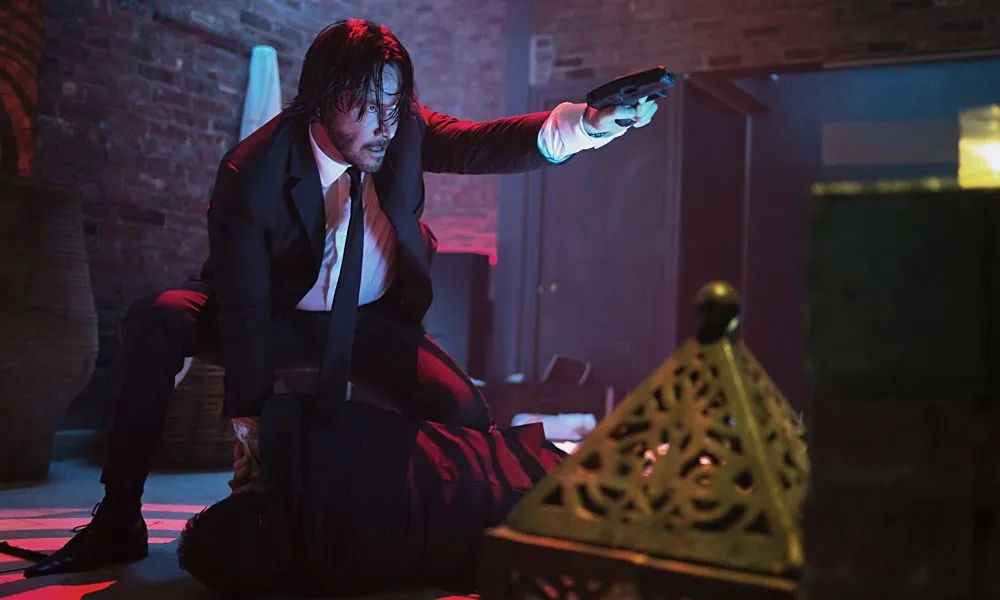
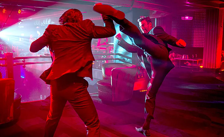
The best use of dual lighting could be easily found in cinematography. You might have noticed, how the lighting on characters change in movies according to the emotion required in the scene.
For example: In John Wick series, you can easily notice the change from normal lighting to dramatic dual lighting whenever an action sequence or intense scene was going on.
Related Topics:
Selecting an image
The most important aspect of creating an artwork in Photoshop is choosing the right image for our artwork.
Generally 2 types of emotions will give marvelous results in dual light. First, glamourous poses and second, obviously in serious, angry face look or action image.
I will be choosing an image from one of my favorite sources of royalty free images i.e., Pexels. I searched for the term ‘model’.
In Pexels, after searching for a term, you will find 3 filters to apply on the results. These filters are: Orientation, Size and color.
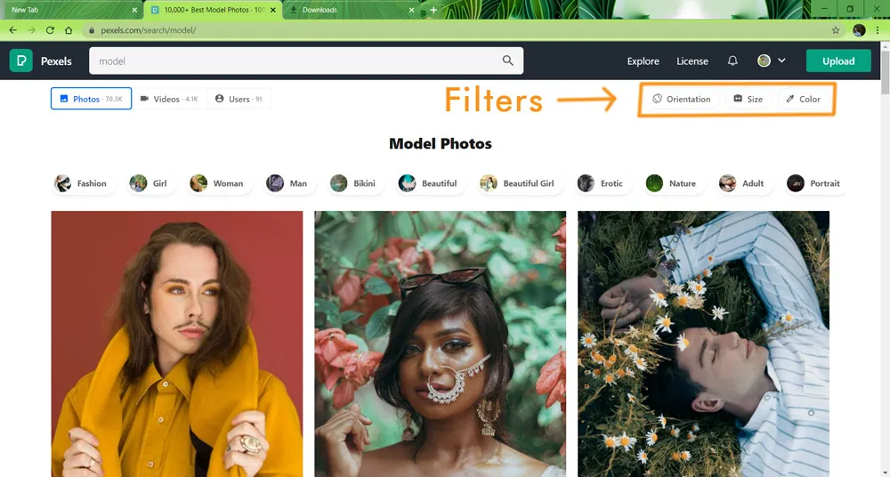
For the dual lighting effect, I will be choosing landscape orientation. Also I’m not a fan of portrait orientation. But, in this case, while we are working to create an artwork, the orientation of the image selected hardly matters. You may ask me, WHY?!!! Well, I will be answering it later.
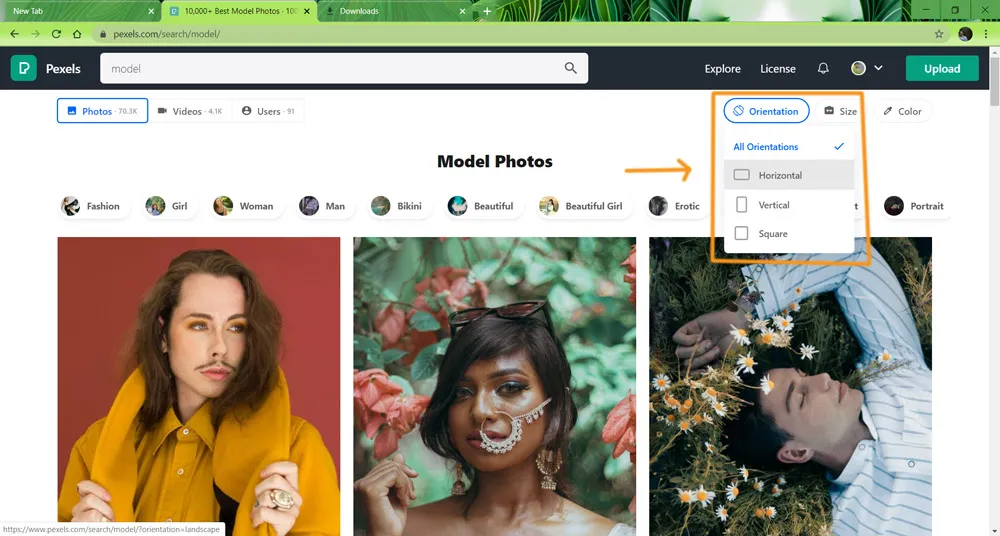
In Pexels, the landscape orientation is represented through horizontal as shown below.
Related Topics:
After choosing horizontal, the results will be filtered some-what like below.
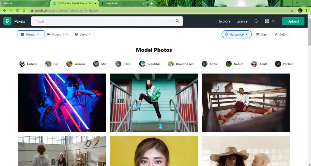
After searching for sometime, I selected these as potential images for a good output:
- Portrait of young woman
- Woman wearing gray shirt
- Woman wearing pink
- Man standing on street
- Woman sitting on yellow padded chair
- Stylish woman posing in yellow
- Man with muscular body
- Woman wearing white shirt
- Light city landscape fashion
- Man in black jacket
- Person hand standing
- Man dance jump selfie
- Couple
- Man Flexing muscle
- Man doing yoga
- Industry sport
- Man in black – 1
- Man in black – 2
- Man in black -3
- Man wearing red
You may use any of the above image to practice. I have spent more than an hour to select these images. After short-listing these images, I took a break for around (25-30) minutes. Then I returned to finalize the image which I will be using for this tutorial.
Images to avoid for dual light effect
All the tips, I’m mentioning here, act only as guidelines and should not be treated as rules. Always remember, be it Art or Design, we always have guidelines not rules.
These are some points to remember whenever you are selecting an image for dual lighting:
Image should not be edited already
Here, the point is to avoid images which already have a background changed or other type of raw editing. For example: Have a look at this image of a Smiling Woman.
If you zoom in to the background and hair part, you can easily see visible traces of previous background.
Images with subject looking away from camera
Even if the subject has an intense look but looking away from camera. It may not be worth it. You can try this on 2 images with same posture and emotion. One with subject looking into the camera and other with looking away from camera.
The one with subject looking into the camera would be much more compelling and attractive.
Try to avoid full body images
Although I have selected some images above with full body of models. While working on them, I would have cropped them or used close-ups. Full body images could useful in certain scenarios like an advertisement but not always.
Related Topics:
- How to Create Rain Effect in Photoshop
- How to Add Falling Snow in Photoshop
- Step by Step guide for Retro 3D Movie Effect in Photoshop
Selecting colors for Dual Light effect
I will be referencing to color theory or color harmonies in this section. If you are not familiar with color theory, please read this article first on color theory.
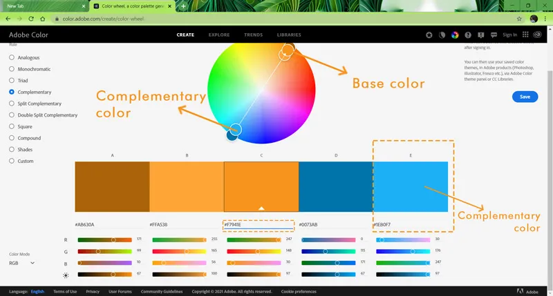
For Dual Light effect, we will need two colors. So, to select colors, we have to use Complementary colors. Complementary colors is a combination of 2 colors. So, I will be choosing Base color from our LTY logo (Brownish Yellow).
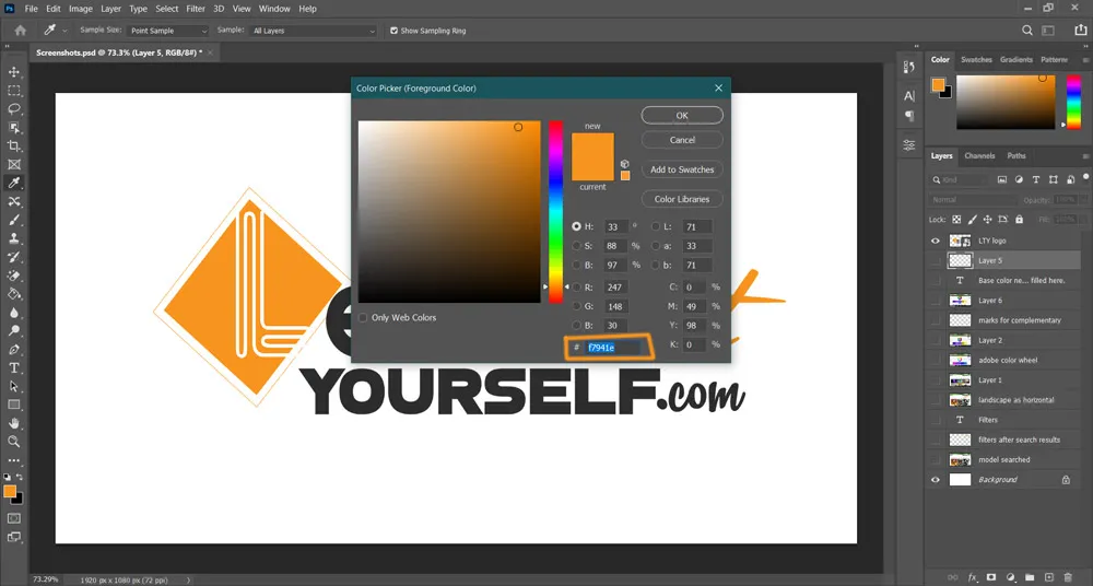
So, our Base color’s hex code is #f7941e and now let’s head to Adobe‘s Color Wheel to find out it’s complementary color.
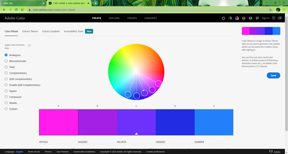
This is the Adobe’s color wheel website. You can use it to find out different color harmonies of your base color.
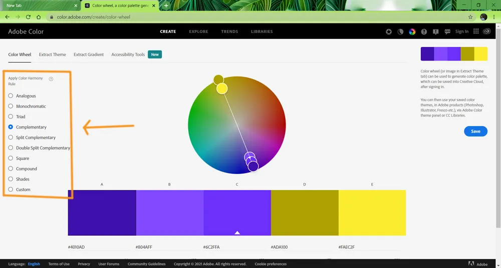
On the left side, you will find different color harmonies or combinations. I will be choosing complementary.
Related Topics:
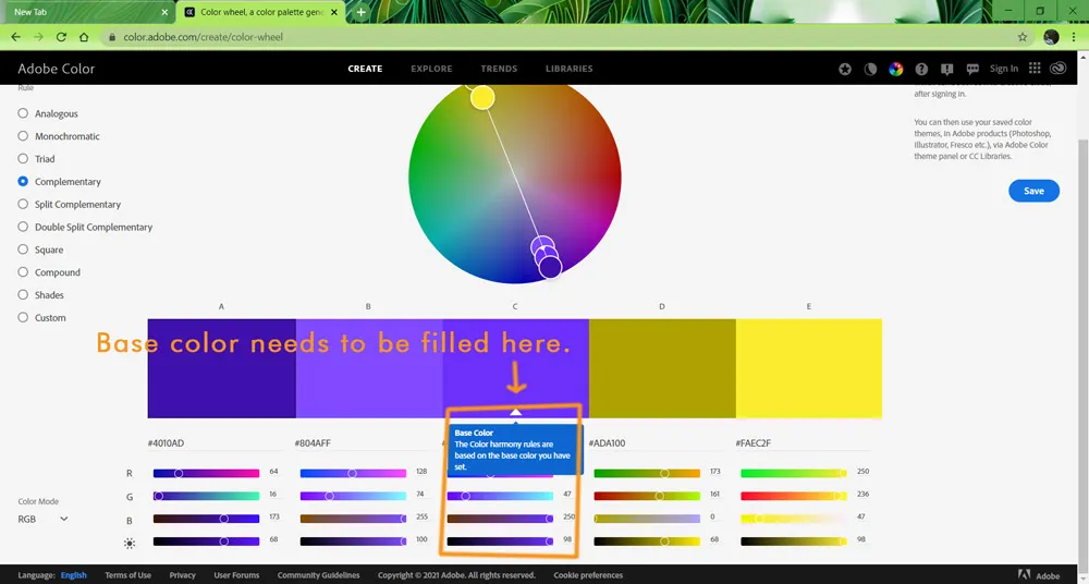
The value of base color needs to be filled in the base color section in middle.
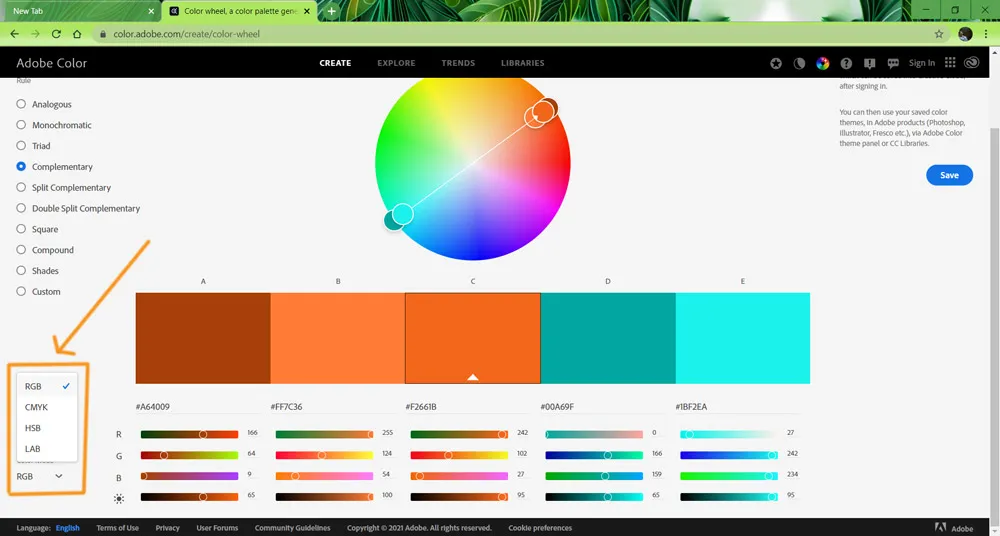
Other than the hex value, you can also use different color mode values as per your preference.
For our base color #f7941e, the complementary color hex value is #1EB0F7
Related Topics:
Creating document
Before starting to design, in any Graphic Software, remember the most important thing is to create an appropriate size document for it. Graphic Design always have a purpose behind it. According to our purpose, we have to chose the document size.
For this artwork, let’s assume we are creating it for our Desktop/ Laptop’s wallpaper. Both of them have Full HD screen resolution i.e., 1920px by 1080px.
Generally, for designs, artworks or compositions, you may use a different background than the one present in image. Hence, now you can understand, Why I said earlier that for this artwork orientation of image doesn’t matter.
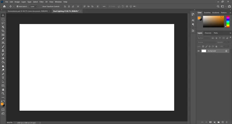
We will create the following document:
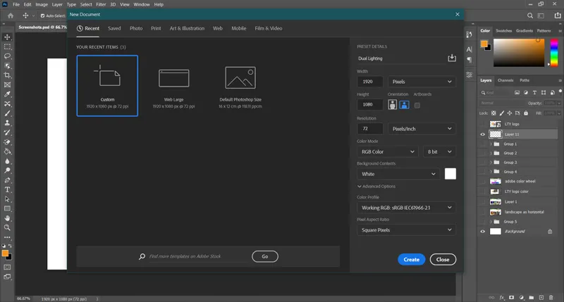
I have already named the new document as Dual lighting. This is how it looks:
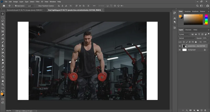
Now we will place the image, we have selected for dual light effect.
Related Topics:
Setting up image
While the image layer is selected press Ctrl + T on keyboard.
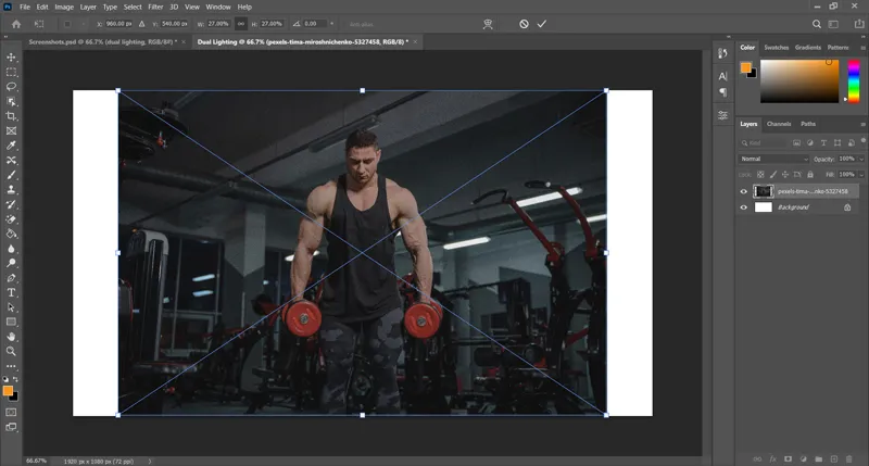
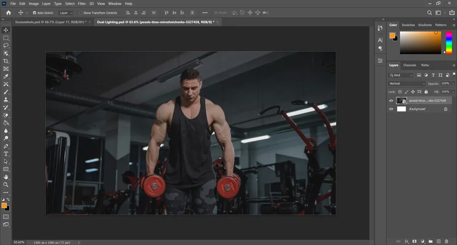
Bounding box will appeared, now we will rescale the image. Here I am increasing the size of the image from bottom right corner while keeping it centered by pressing Alt simultaneously. This will be our result after rescaling:
Related Topics:
Steps for dual light effect in photoshop
These are the steps on ‘How to create dual light effect in photoshop‘:
Select subject & duplicate it
You can use any selection tool for your choice. I’m using Magnetic Lasso tool and Lasso tool for selection here.
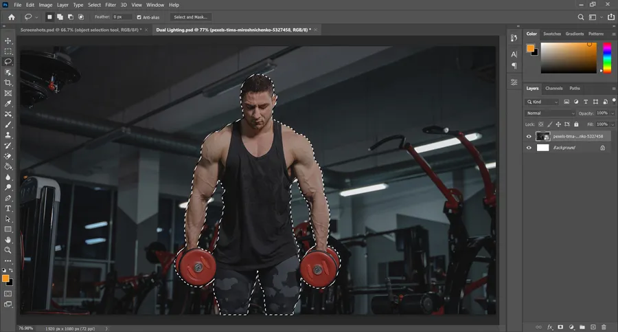
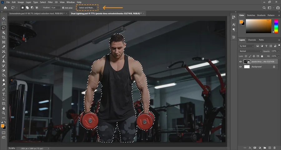
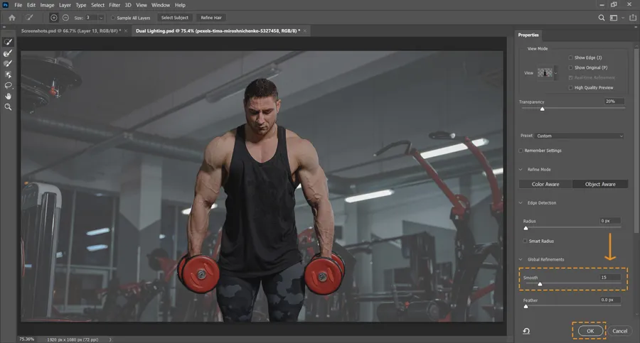
After that I used select and mask feather in option bar to add smooth of 15 value and click ok button below.
Press Ctrl + J to duplicate the selected part to a new layer.
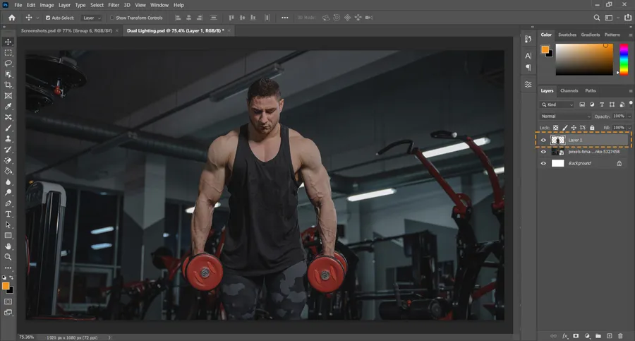
Right click on the duplicate layer or ‘Layer 1‘ and click on ‘Convert to smart object‘.
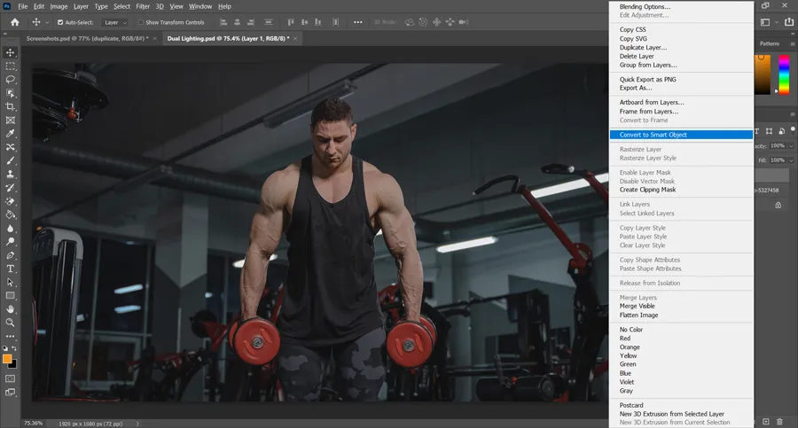
We have made the duplicate for referencing in future.
Now we have made the duplicate and separated in it’s own layer. Let’s take a pause and think what needs to be done and why!
To create dual light effect in any image, first of all the image should have a certain amount of darkness in it. Otherwise, if you will add light on a bright image, it will not look realistic, design worthy and may have minimum or no effect on it.
If we analyze the image we have chosen, you will notice that it has a dark background but it’s not dark enough. We can easily see the details of the objects in the background. So, we need to darken it a bit.
Related Topics:
Darken the background
So, this will be an optional step, it will depend on the level of light present in your image.
Currently our image layer is named something like ‘pexels-tima-miroshnichenko-5327458’. For clear understanding & referencing, I’m renaming it to ‘image’ by double clicking on the name of the layer and then typing in ‘image’ and hit Enter.
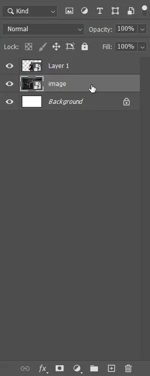
While our ‘image’ layer is selected, click on adjustment layer icon and chose Levels adjustment layer to darken the ‘image’ layer.
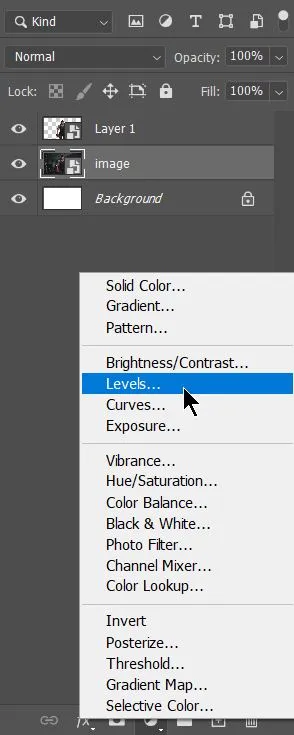
We will use the left black slider to make the image a bit darker.
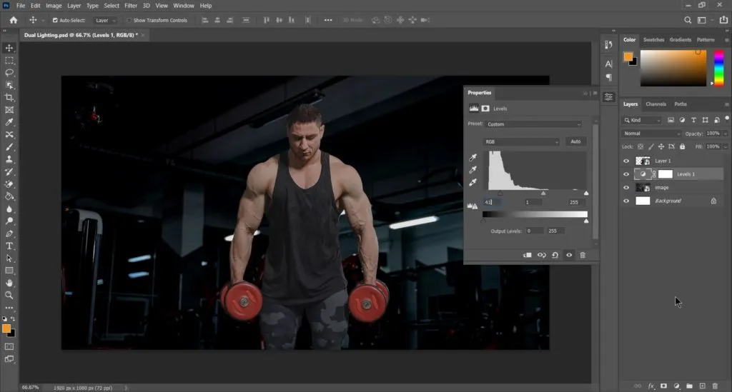
As the ‘subject’ was on ‘Layer 1’ and Levels adjustment layer is below ‘Layer 1’, it has no effect on the subject. ‘Image’ layer has been darkened and the amount of darkness can be changed later by Levels adjustment layer already created.
Create base for light from Right side
To bring the selection back, simply press Ctrl in keyboard and click on the thumbnail of the duplicate layer or ‘Layer 1’.
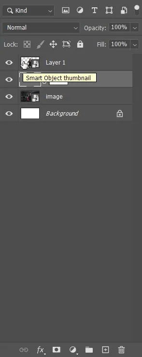
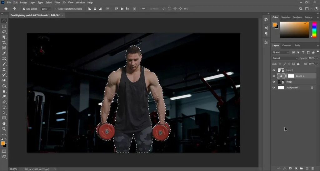
We have the selection back. In dual light effect, one light will be coming from left and other from the right. We can simply create the right light first and then we will duplicate, change it’s color and reverse the right light to create the left light.
But the main problem is to create the half selection of the subject. If we subject half left selection from the above. We will get something like this:
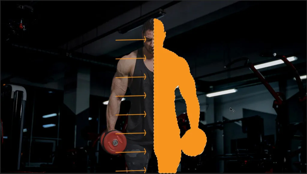
I have filled a color in the half area to show the exact problem, we will be facing. Remember, we are going to create light here. So, we have to follow the nature of light. How light falls on an object and if light is coming from 2 opposite directions, how they are going to merge.
Light will never merge in such a ‘hard’ edge border. So, to keep the left edge of the selection soft. We will create a Gradient adjustment layer with black (or any color) at right and transparency at left of the full selection.
Related Topics:
Gradient Adjustment Layer
Click on adjustment layers icon and chose Gradient Fill layer.
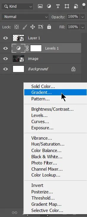
It will open a dialogue box like this:
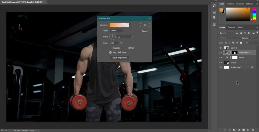
By default, it always have a gradient from Foreground color to Transparency. As already told color doesn’t matter, so we will keep this color for now. But we are not able to see our gradient as it is below ‘Layer 1’. So, we need to turn it’s visibility off from the layer panel.
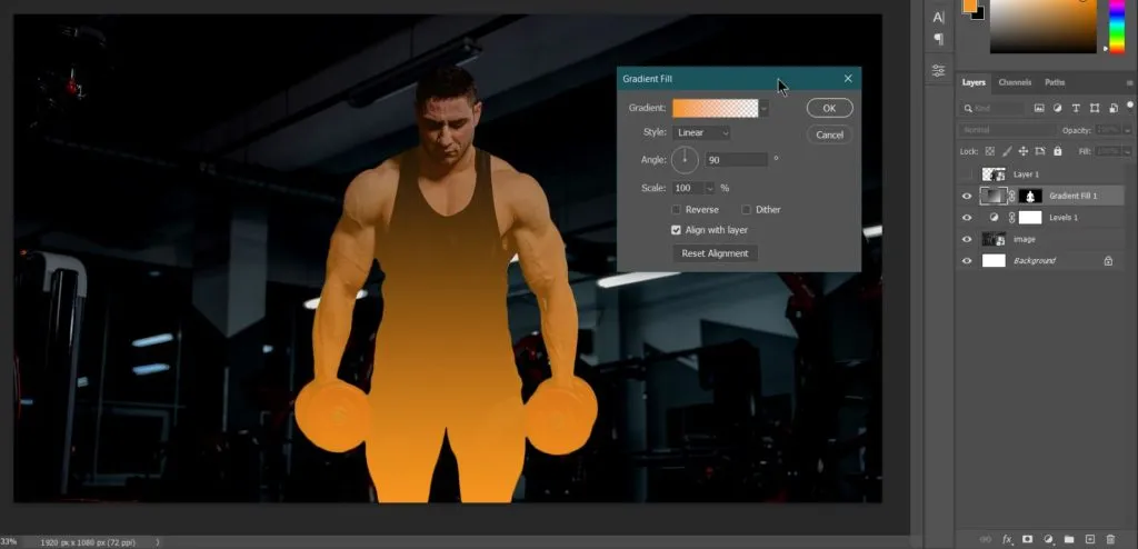
This is the default look of the gradient adjustment layer. Now we need to edit it’s angle to 180 degrees and adjust it by clicking and dragging on the image to make the gradient color occupy a little more than the 50% of the image. Something like this:
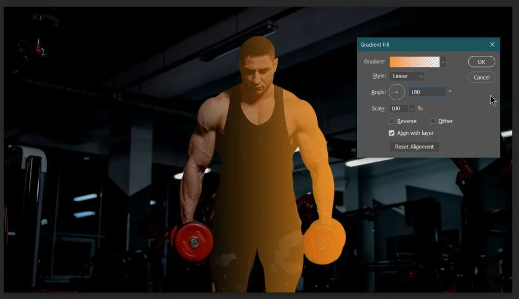
This gradient will act as a base for our light which we will be creating now.
Creating Right side light
As our Gradient Fill layer will act as a base for our light from right side, we need to clip mask the ‘Layer 1’ with our Gradient Fill Adjustment Layer.
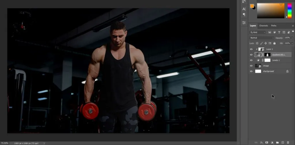
We can clearly see the difference after clip masking. The right side is brighter than the other part and it gradually changes to the dark. To create light here, we need to apply few Filters like Gaussian blur and Glowing Edges in Filter Gallery.
Gaussian Blur
First, we will apply Gaussian Blur inside Blur in Filter menu on the ‘Layer 1’. We need to apply Gaussian blur to nullify the small details present in the subject. Minor details like Skin Texture, surface texture of cloth.
The amount of Gaussian Blur will depend on the size and resolution of the image and document. As we already created this document as per our requirement, we don’t need to apply a large amount of Gaussian Blur.
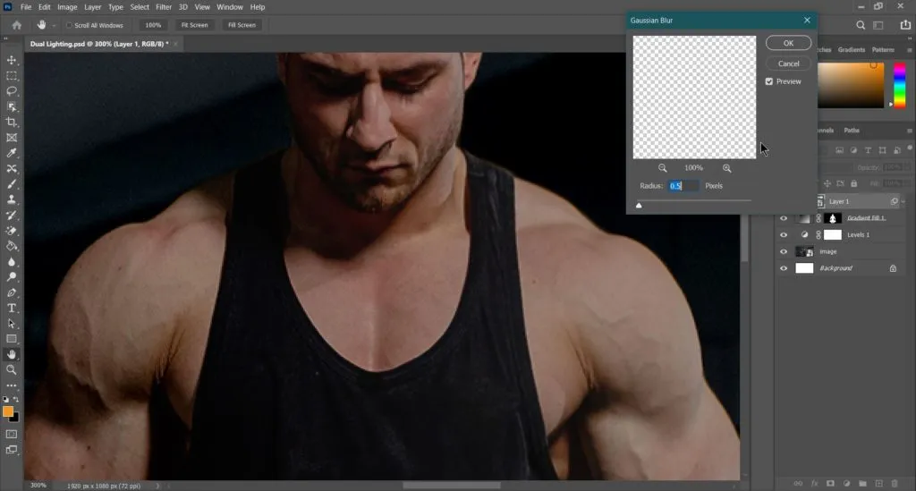
As we have to apply Gaussian Blur on the ‘Layer 1’, we can see the difference between the texture of left shoulder and right shoulder. This is the amount of Gaussian Blur required for this document.
Glowing Edges
Now we need to apply Glowing Edges inside Stylize from Filter Gallery in Filter menu on the same layer i.e., ‘Layer 1’. We are applying this filter to create ‘Highlights’ on our subject when light falls on it.
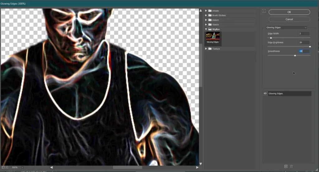
Now let’s try to understand ‘How’ and ‘Why’ I chose these values for Edge Width (2), Edge Brightness (20) and Smoothness(10) under Glowing Edges.
As we already applied Gaussian Blur, all the unwanted minor detailing is gone. Now Edge width will control the size of glow for each highlight of every detail available. This size should appear approximately double the size of the detailing after Gaussian Blur.
Edge Brightness is kept at full because we are creating light here. Lastly, Smoothness will end the hardness in glowing edges. That is also needed to be selected appropriately.
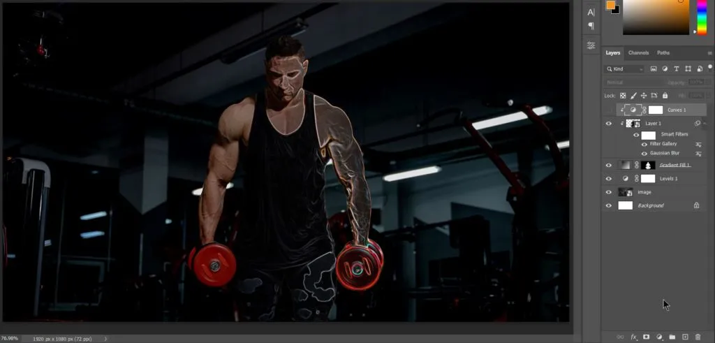
Related Topics:
Curves to Glowing Edges
As the glowing edges are not bright enough to be highlights. We have to brighten edge glow using either Levels or Curve. I am using Curves Adjustment Layer.
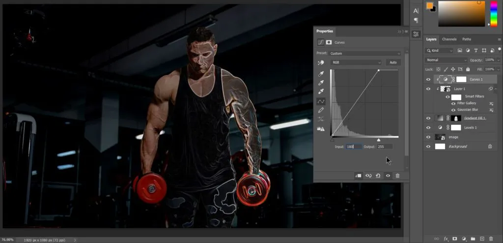
Solid Color Adjustment Layer
We have achieved the glow of highlights. Now, it’s obvious that when light falls on a surface, we have highlights as well as mid tones. Or we can say we will have fill light too in between the highlights.
To create mid-tone lighting, we bring subject’s selection back and add a Solid Color Adjustment Layer with white as color.
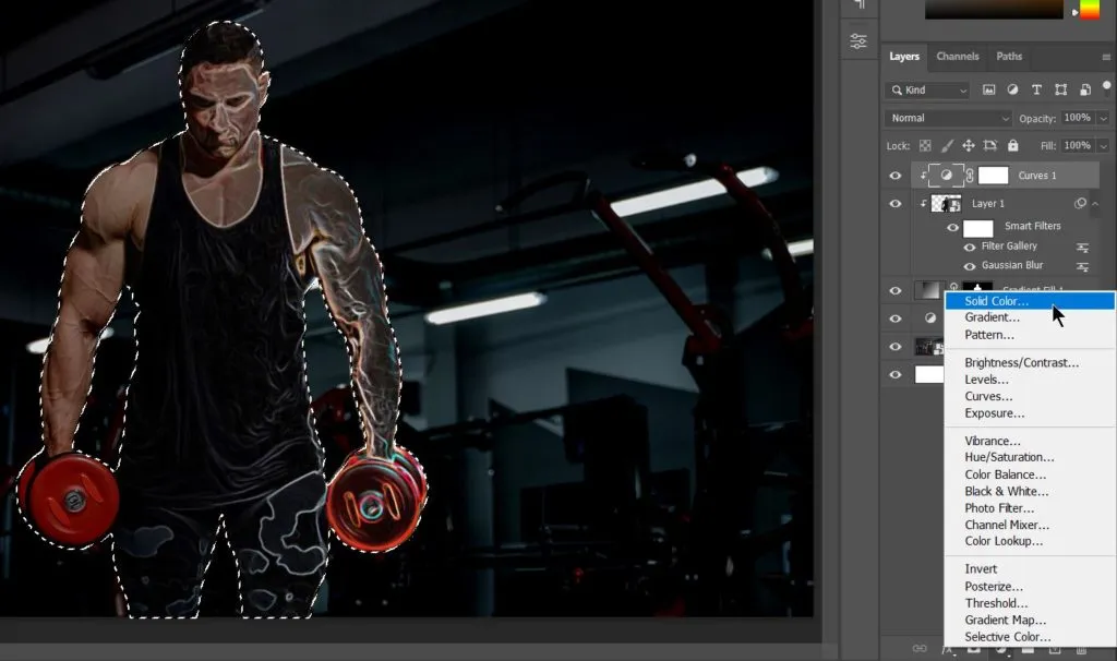
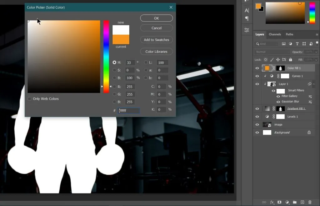
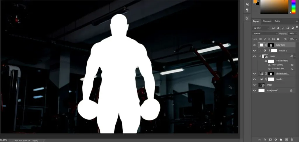
Now in Layer panel, click on ‘Color Fill 1’ layer’s mask and open properties panel.
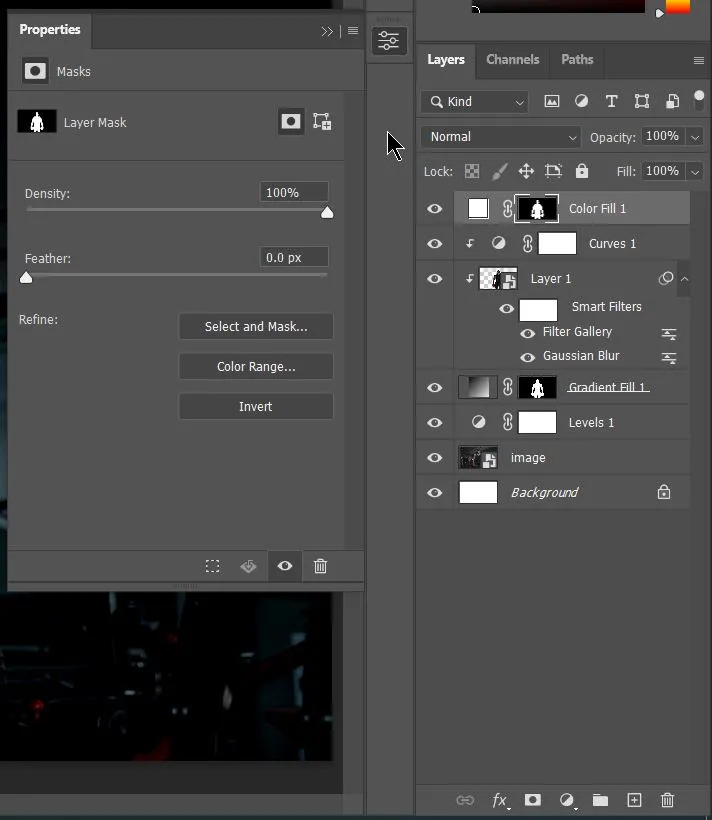
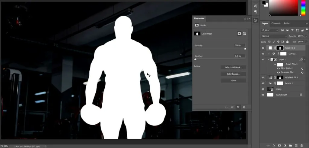
Now, as the light is coming from outside the body. We need to invert the mask as well as increase the feather value in the property panel. To invert mask simply, click on Invert button in property panel or use shortcut Ctrl + i.
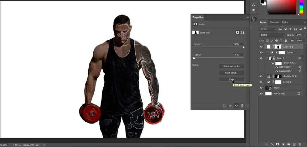
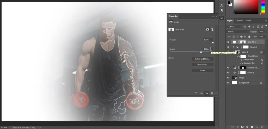
Now we need to add feather to the mask. We need to do this to make the white light getting in become soft. This is the result after adding feather to mask:
Now, clip-mask the ‘Color Fill 1’ layer to bottom layers.
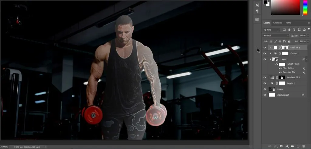
As you can see now, we have our light from right ready. Now we have to add color to this light.
Related Topics:
Add Color to Right side light
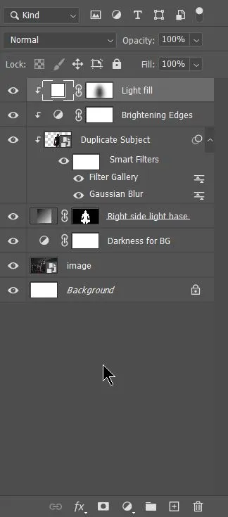
Before we go further, I took sometime to rename our layers and it’s always a good practice to rename your layers as per there work. Have a look here:
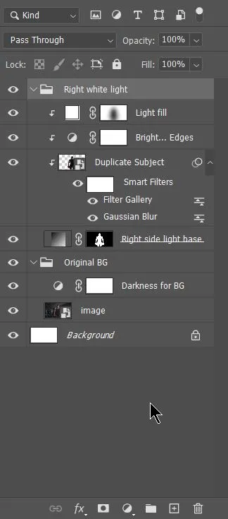
Now to make things easy for further work. Let’s Group our layers in proper Groups. Here, have a look:
Solid color layer
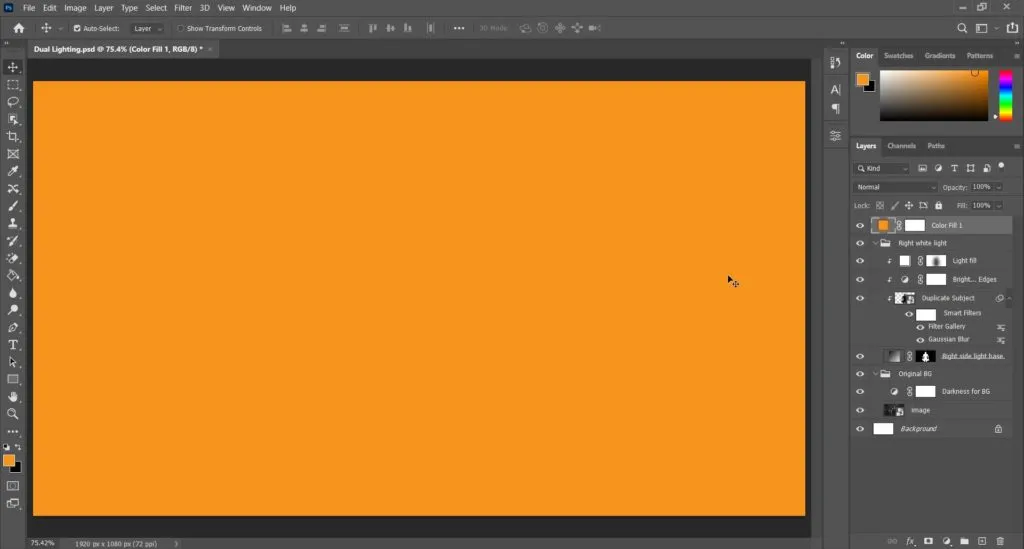
To add color to our White Light, create a solid color adjustment layer with your base color value. In our case, the base color value is #f7941e. It will look something like this:
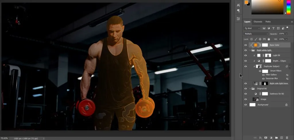
Note that this solid color adjustment layer should be outside the groups we have created. I’m changing name of this layer to Base Color and clip-masking it to the ‘Right White Light’ group. Also changing the blend mode to ‘Multiply’. Here’s the result:
Related Topics:
Add Gradient layer
Now, it misses the softness of a light. To add that softness, we will create a Gradient Adjustment layer from Base color to Transparent with blend mode as ‘Soft Light’. Here’s how it looks:
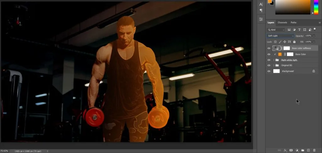
Changing blend mode to Soft Light, gives it a soft diffusion light effect. As you may have noticed by now that our ‘highlights’ have intensified too much. So, we have reduce this layer’s fill and apply blend-if to remove base color from highlights.
Apply Blend If
After reducing the layer’s fill to 60%. Let’s work on Blend If now. Following screenshots below:
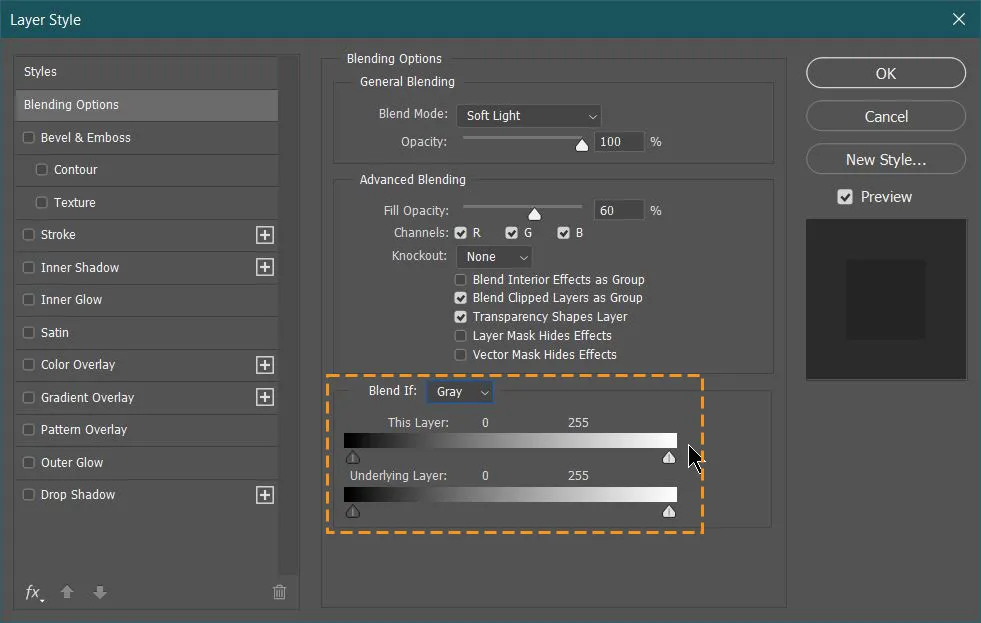
This is blend if option. Here, currently we are using Blend If with Gray as value because we need to work on highlights .i.e., white. As we all know the color value goes from 0 to 255. Where 0 represents black or shadows and 255 represents highlights or white.
If we take the slider at white point under ‘This layer’ of Blend If, to the left, you will notice the gradient color will start to fade away from the highlights at the bottom layers. It will be like this:
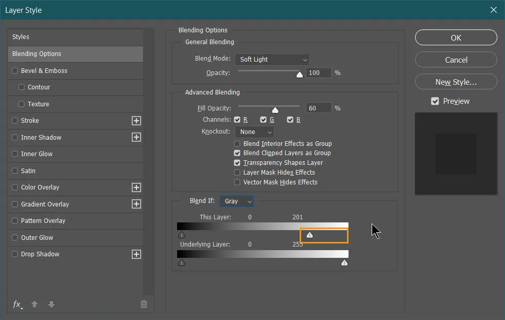
This will produce a harsh fading effect, we need to break these 2 triangles now to create a soft fading effect. To break them simply hold Alt key and drag left triangle towards left.
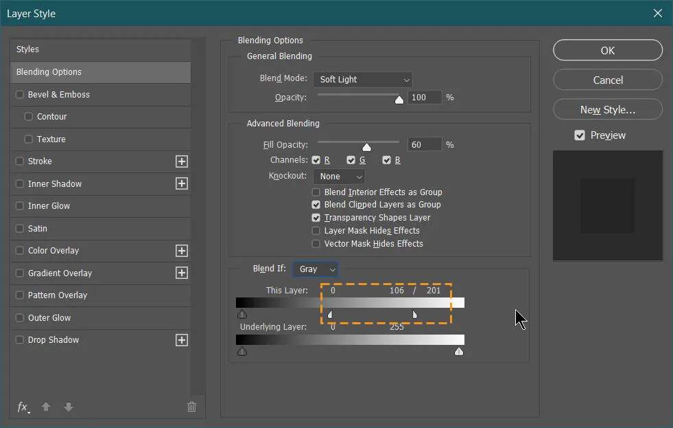
The result will look something like this:
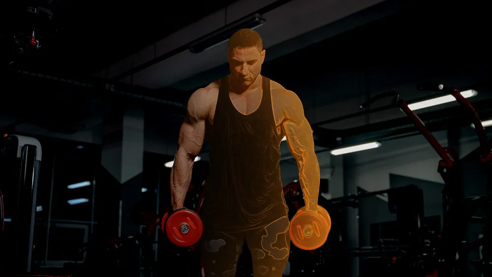
This is all we need to do to create light and add color to it. Now we need to replicate it on the left side with our complementary color.
Related Topics:
Left light & light color
To create same effect on left side, I’m grouping all white light and light color layers. Then I will duplicate the final group and change values with desired values.
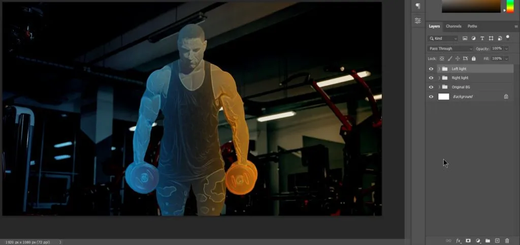
I had to adjust the gradient little bit as well as Blend If of orange side as it was dull compared to blue side. Now I’m grouping both these groups as 1 single group named, ‘Dual lights’.
Sharpen output
As you can see, we have successfully applied light on the subject but still it’s not impressive. What our artwork lacks currently is contrast and detailing which is combined know as Sharpness. Let’s begin with increasing contrast.
Increasing contrast
Duplicate original image layer and bring it to the top of all the layers and groups in the document.
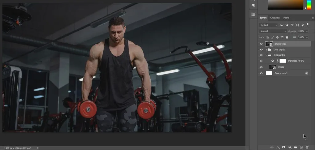
As the image layer was a smart object and we need to desaturate it. So, we have to convert it in raster layer. Simply, right click on layer and chose ‘Rasterize Layer’. Then go to Image menu, under Adjustments select Desaturate or use shortcut Ctrl + Shift + u.
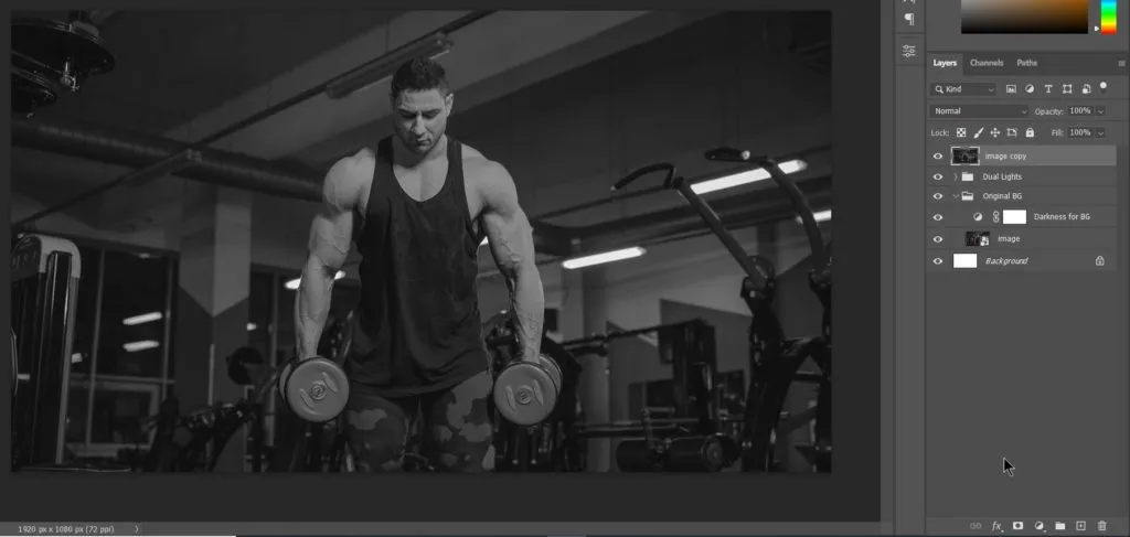
Change blending mode to Hard light and lower fill to about 50%.
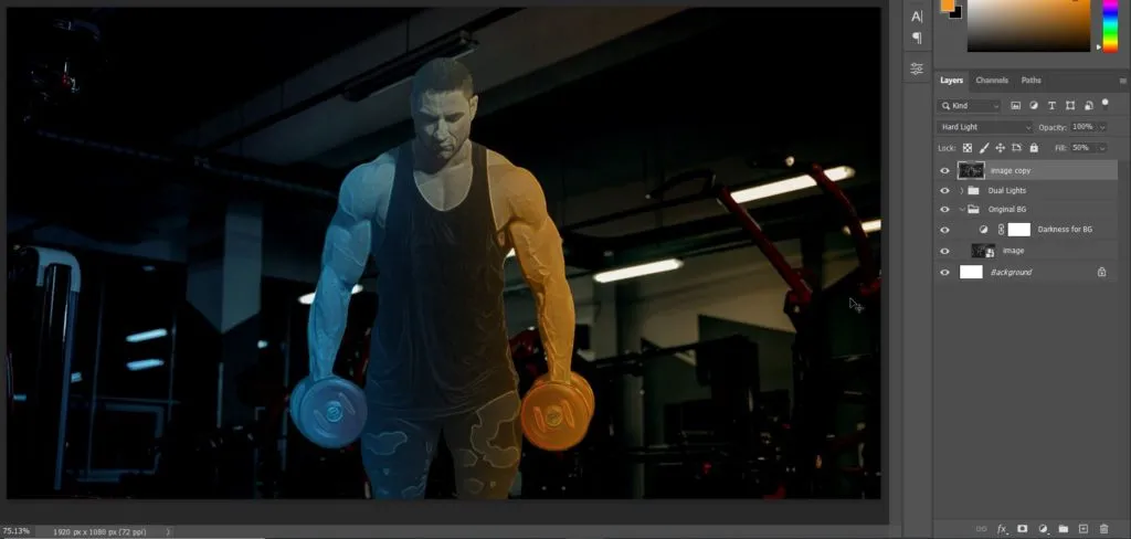
Related Topics:
Add Details
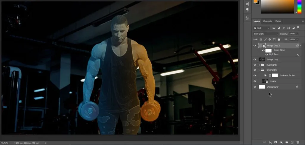
To add details, simply again duplicate the above layer and apply High Pass in Other under Filter menu. Now, while applying High Pass, we have 2 things. First if you want it to be normal then you can apply a lower value (around 0.5) of High pass like this:
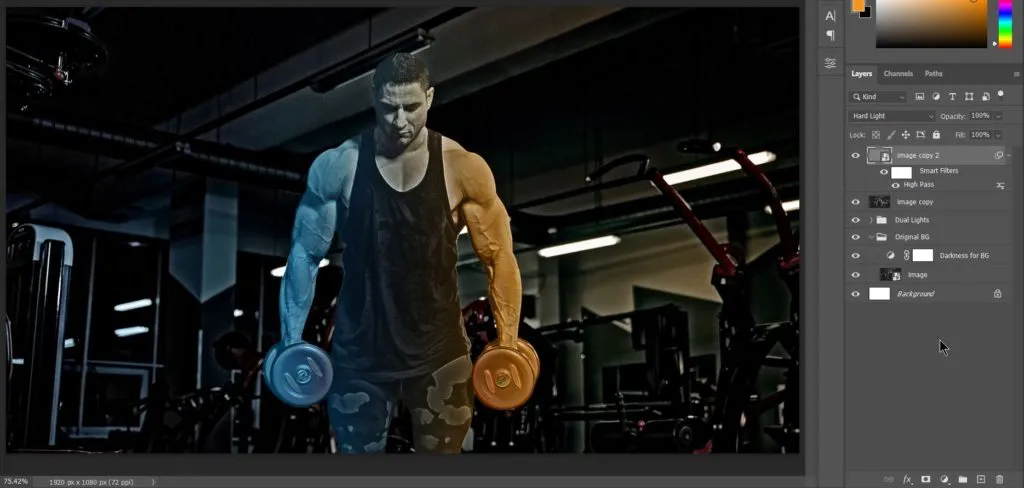
If you want a rigid and harsh look. You can go for a medium value high pass value around 10-20. It will look like this:
Or if you like Fantasy look, you can go for a really high value of High Pass more than 100.
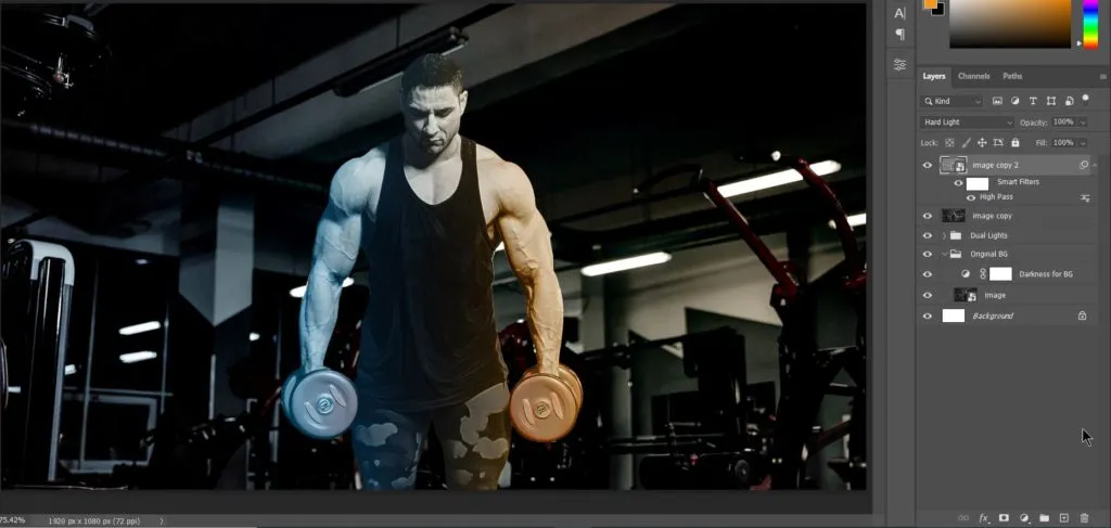
For this tutorial, I will be using it at a low value of 1. Here’s how it looks:
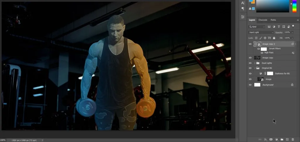
As we need all the sharpness only to our subject. We will apply subject mask after grouping both layers.
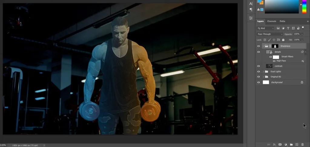
Related Topics:
Darken lower part
It is kind of ready. Now only few elements need to be added like inner glow, outer glow and few presentational aspects.
Gradient adjustment layer
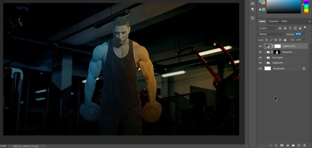
As you can observe, the lower part of the image doesn’t look good. So, let’s darken the lower part a bit by adding a gradient adjustment layer with black to transparency as color. These are the setting chosen:
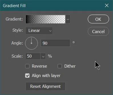
I have reduced the opacity of gradient layer to around 80%. Here’s how it looks:
Adding Inner Glow
Take subject selection and create a solid color adjustment layer of any color, like this:
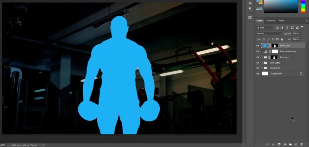
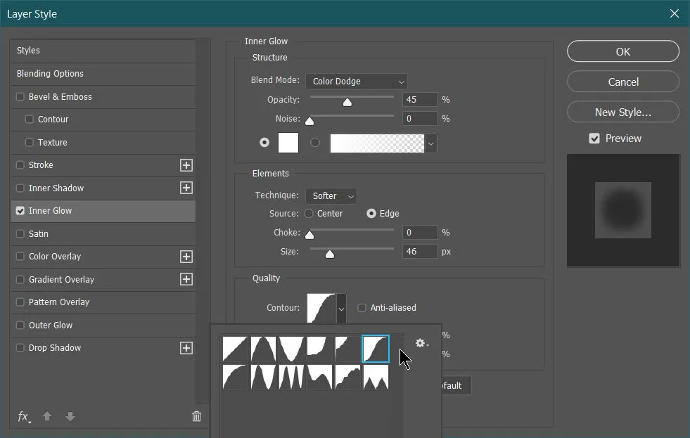
Now, reduce it’s fill to 0% and open Layer Style panel by double clicking at side of layer name. Apply Inner glow from the tabs at left side of the Layer style panel. These are the values, I have used:
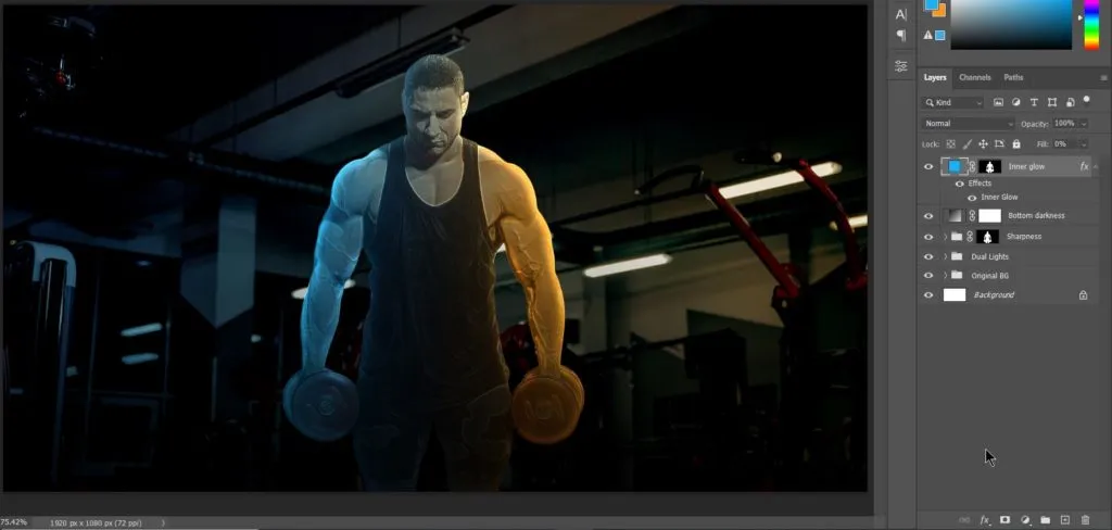
The output looks like this:
Related Topics:
Add Outer Glow
Apply same process as above but in Layer style apply Outer Glow. Here’s the value I used:
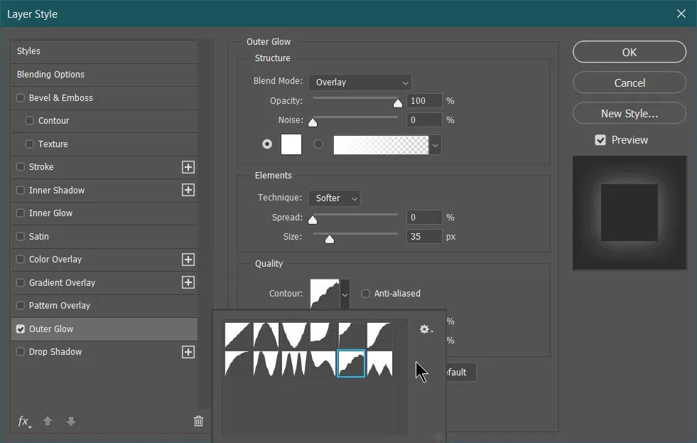
The result after adding outer glow:
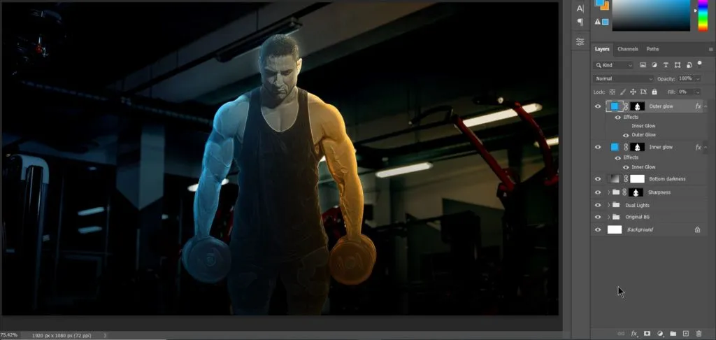
Add Vignette effect
To draw the attention at the center, we can add a vignette effect by using Curves adjustment layer. Create a Curves adjustment layer, change it’s blending to Multiply and apply a circular mask with feather to soften the edges.
Elliptical Marquee tool
Use elliptical marquee tool to create circular selection like this:
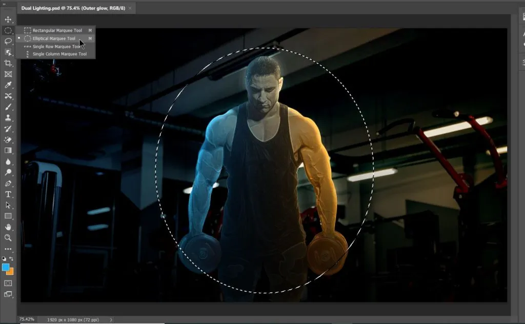
Add curve adjustment layer
With above circular selection on screen, create a curves adjustment layer. It will automatically convert the selection into a mask. Make sure to invert the mask and change blending mode to Multiply. After that add feather to the mask around 90px.
The value of feather will depend on your document. Here’s the final result afterwards:
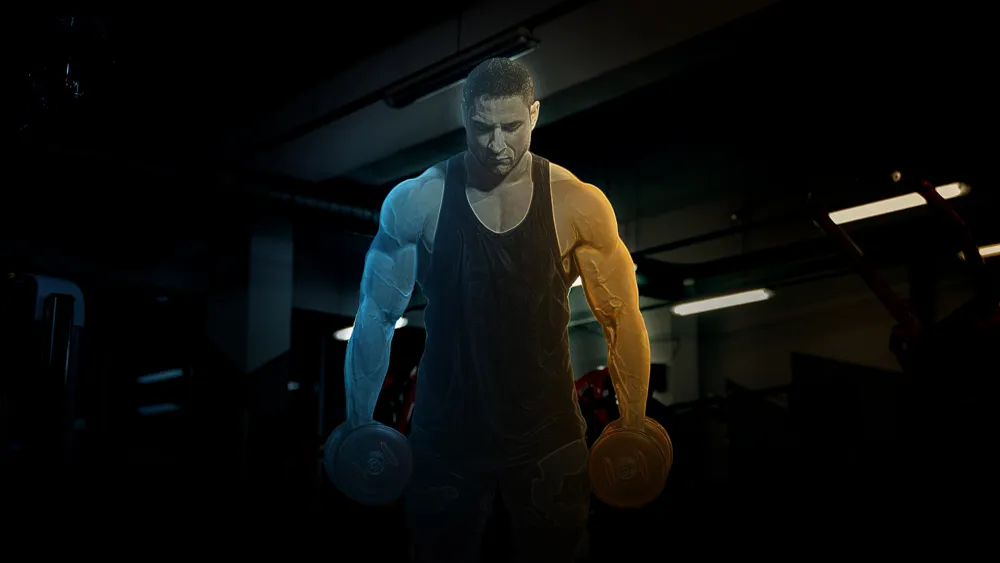
This is all you need for dual lighting.
Related Topics:
- Healing, Clone & Pattern Stamp Tools in Photoshop
- How to use Gradient Tool in Photoshop
- Burn, Dodge & Sponge Tool in Photoshop
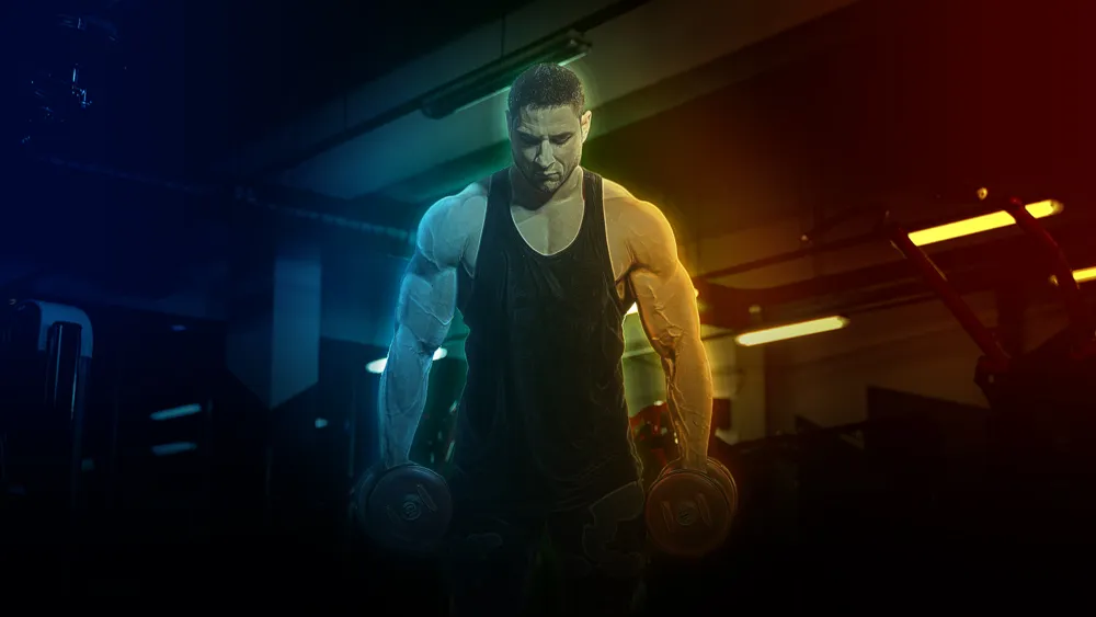
Final Output
After applying Dual Light effect in Photoshop. I have done some presentational work on the final output. It involves using our complementary colors as gradient in varying blend modes and fill percentages. I have renamed each layer with it’s blend mode and fill percentage below:
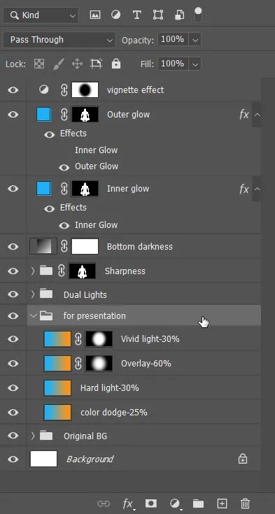
Here’s the final output:
Related Topics:
- Blur, Sharpen & Smudge Tool in Photoshop
- Foreground Color, Background Color, Stroke & Fill
- Eraser tool in Photoshop
- Skin Retouching
- Retouching – How To Do It Professionally
- Edit menu in Photoshop
- Image menu in Photoshop
- Select menu in photoshop
- Filter menu in Photoshop
- View menu in Photoshop











Hi! I could have sworn I’ve been to this site before but after checking through some of the post I realized it’s new to me. Anyhow, I’m definitely happy I found it and I’ll be bookmarking and checking back often! Great stuff for designing and graphic software. Thank you.
Thank you for your efforts. Please add more such blogs! Thank you in advance.