In this Graphic Design Lesson, we’ll be discussing about the Color Theory. My name is Lalit Adhikari at LTY. Let’s dive into it.
Table of Contents
Introduction to Color
Using colors is probably one of the biggest problems that artists face. Knowing how to use colors effectively, to adjust the mood or the atmosphere of your artwork or design is actually quite tough.
Color plays a vital role in the design and everyday life. It can draw our eye to an image, evoke a certain mood or emotion and even communicate something without using words at all.
Artists and designers have followed color theory for centuries.
If we use the colors correctly we can guide the viewer’s eyes to what’s important. But, if the color theory is not used then it can make your designs really unappealing.
So, colors can make or break your design. So, it’s one of the most important elements of your design or your artwork.
Related Topics:
What is Color Theory
In Art and Designing, Color Theory is a guide for mixing colors and special visual effects of certain color combinations.
There are three categories of colors base on color wheel:
- Primary Color
- Secondary Color
- Tertiary Color
Related Topics:
Color Wheel
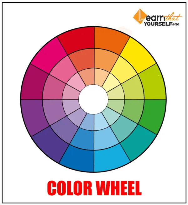
The most important basis of the color theory is complementary and secondary colors. Red, yellow and blue are the called Primary Colors.
Red and yellow make orange, yellow and blue make green, and blue and red make purple, these are called Secondary colors.
If we mix every two adjacent colors together we will get the color wheel.
Related Topics:
Main aspects of Color Theory
Saturation is the intensity or purity of the color and the second is the value which defines the darkness or brightness of the color.
Now, in graphic design saturation of a color is one of the biggest issues that a designer has to keep in mind.
Lot of newbie designers choose highly saturated colors because they think it will make their design look good but it is quite different from the truth.
Highly saturated colors not only look fake but using saturated colors gives your eyes nowhere to rest in your design which is really important in an image.
Now, my advice for using color in a proper way in your designs will be:
- Don’t usually keep the saturation value in its extreme.
- Use saturation value to guide the observer’s eye.
- Use it to change the mood of the design.
- Use it properly to draw attention to something.
Related Topics:
Color Schemes
Also called color harmonies, it means that some colors look better together than others.
Monochromatic Colors
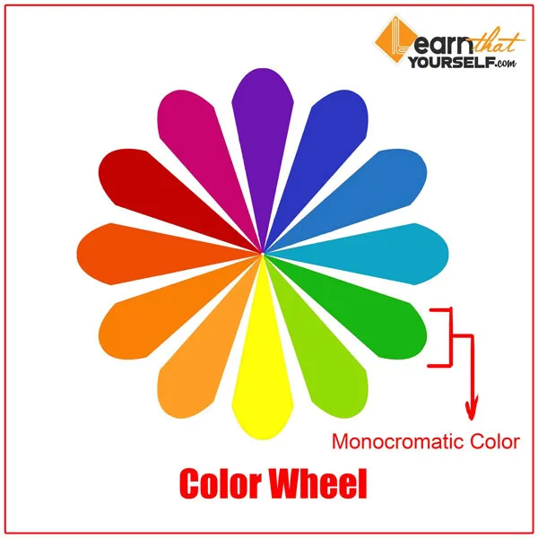
Now, the first set of colors schemes which is usually very simple is called Monochromatic colors. It means your entire image or design will be composed of only one single color.
This scheme is suitable for single subjects because it forces the viewers to focus on the details of your design or your image.
It can also be used to create very striking atmospheric effect when you are creating any kind of digital painting or concept art.
And the only thing that changes in the design is its saturation value. The best thing about this color scheme is that they are guaranteed to match.
Analogous Color Scheme
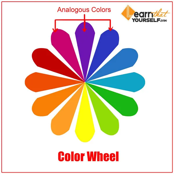
These are the colors which are adjacent to the color wheel. It is generally easy on the eyes. And the design or artwork made according to the color scheme is generally peaceful and is quite aesthetically pleasing.
The reason for this is because this is seen in nature, that’s how colors are related. For example, pink, purple and blue goes really well with each other.
Triadic Color Scheme
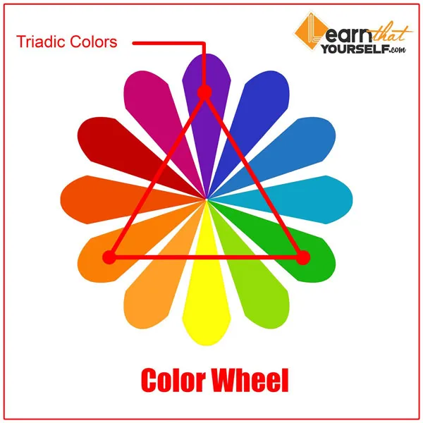
Colors which are equally distant from the wheel. This color scheme forms a triangle that is evenly spaced. And this scheme is generally used for cartoon and surreal scenes. For example, orange green and purple.
Complementary Colors
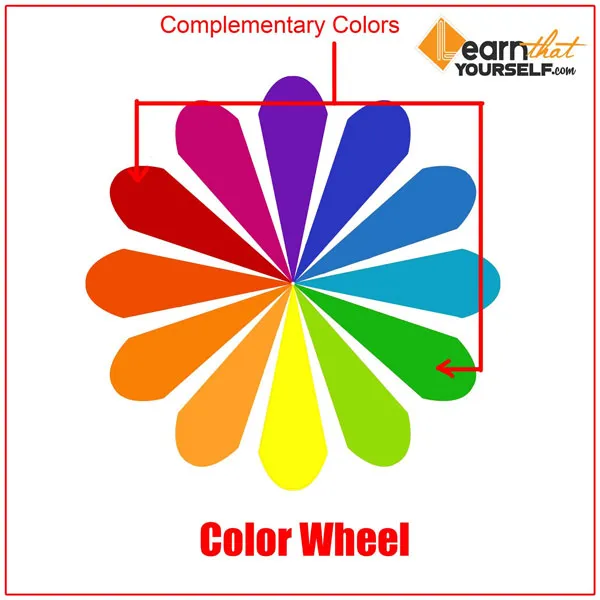
Most popularly and most used color scheme. And these are the opposing colors on the color wheel. Another reason designer’s use this color scheme is because it is naturally pleasing to the eye.
But one thing I would like to recommend here is that do not use these colors equally. For example, if you are using 50% red do not use 50% green. Predominantly using these colors is a better option.
Warm and Cool colors are naturally complementary.
Split Complementary Color Scheme
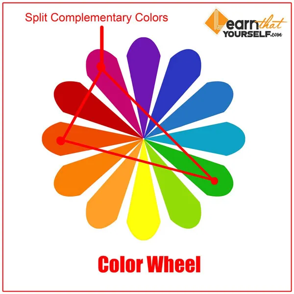
This color scheme is a different variation of the complementary color scheme. This color scheme forms a triangle in the color wheel. In addition to the color of the base in the color wheel, the other two adjacent colors are used in its place.
Although this color scheme has strong visual colors but has very less tension to it. This scheme allows you to have more creative freedom. This scheme is used to make artworks and designs which are generally more lively and joyous.
For example: orange, green and purple will get along quite nicely.
Double Complementary or Tetradic Color Scheme
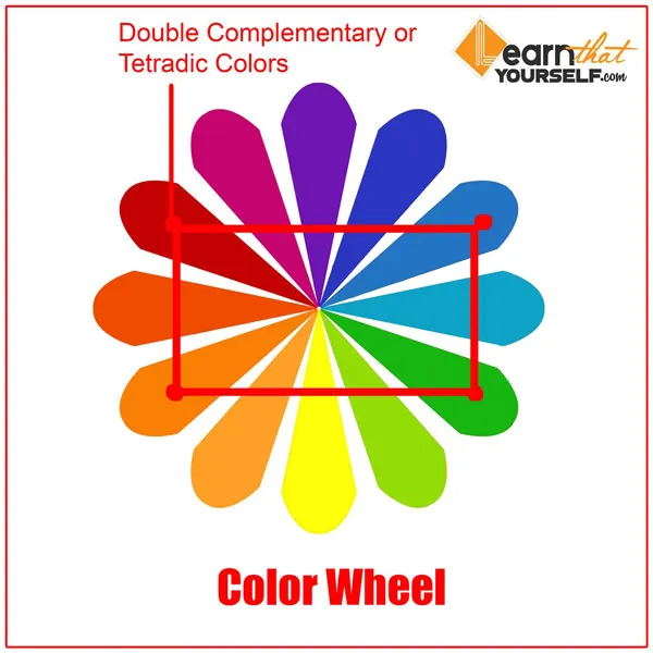
This is basically the same as the complementary color scheme only doubled, means it has two pairs of opposing colors. These colors form a perfect rectangle in the color wheel. And it is best used for foregrounds and background.
Do not ever use 25 % of each color in the scheme or else your design might look very unappealing. This will work if we let one color dominate while keeping other colors as secondary. For example, green-red and orange-blue.
The color we are using should be legible, engaging and easy on the eyes. Colors like black, white and grey can help us to balance our design. So, when we really use a bit of color in our design, it stands out a lot.
Related Topics:
Meaning of Colors
Following are some popular colors and their meanings:
Red
It is an extremely stimulating color. Around the world, red is known as the color of energy. It attracts the most attention and often represents important notices and warnings.
For example: it is generally used in ambulances, traffic signals, and breaking news flash.
Orange
It is a warm and vibrant color. It is considered as energizing as well as welcoming. And it can generate a warm and welcoming feeling for the customers.
Yellow
It is an extremely versatile color depending on which shade you choose. Bright yellow is associated with enthusiasm and optimism which often provoke thoughts and thinking. While dark shades of yellow provide antiquity and age.
Green
It gives off the feeling of growth. It signifies a sense of harmony and renewal. This color balances emotion and inspires compassion. This color is very useful if anyone is making a design related to the environment.
Blue
It is usually related to calm and relaxing emotions and is also associated with strength and reliability. Blue emits a feeling of loyalty and inner security which is why we may see IT departments and business companies using this color.
Blue is a symbol of intellect and mind ultimately making it the color of communication. Maybe that’s why social network company logos like Facebook, LinkedIn, and Twitter use the color blue.
Purple
Purple combines stability and energy both. It is associated with imagination, creativity, mystery, and magic. Although it is very rare in nature, so people consider it to be a symbol of artificial things.
Light purple is associated with romantic and nostalgic feelings while dark purple is associated with gloomy feelings.
White
It is a symbol of goodness, purity, peace, and virginity. It is considered as the color of reflection. It also depicts cleanliness and faith.
Black
It is a color of mystery, power, formality, elegance, and evilness. This color is often associated with fear and a symbol of grief. This color contrasts very well with bright colors.
If you are following our Free Graphic Design Learning Guide then next you should read about, ‘Types of Image File Formats‘.















This is the best piece of information on color theory over the internet. Thank you!
All important points and color harmonies at one place. Thank you for this blog.
This is one of the most informative and detailed page about color theory on internet. Thanks for sharing!
Color theory made easy! Thank you.
This article should be named, ‘Everything about Color Theory’. Great work!
العمل العظيم، والحفاظ على ذلك! كل شيء عن نظرية اللون.
Thank you 🙂
Thanks, it’s a nice read!
Thumbs Up!
Thanks alot for this info!
Great post! Thank you.
Thanks!
Nice!
I am regular reader. This info posted at this website is truly good.
Great info!
Color Theory one of the most important topic in designing and very well explained!
Thank you sir! Bahut helpful tha sir.
It’s nearly impossible to find well-informed people on color theory but you seem like you know what you’re talking about! Thanks
Thanks a bunch for sharing this with all of us. You actually know what you’re talking about! Bookmarked.
I don’t even know how I ended up here, but I thought this post was great. I don’t know who you are but certainly you’re going to a famous blogger if you are not already 😉 Cheers!