In this Photoshop Lesson, we’ll learn about ‘Type menu in Photoshop’. My name is Lalit Adhikari and we are at LTY. Let’s Begin.
There is a number of ways you can use text while designing in Adobe Photoshop. There is a whole menu panel dedicated to the Type in the menu bar. If you click on that option a drop-down panel will open up where you will see various options available for text.
Table of Contents
Panels in Type menu
In the type panel of Adobe Photoshop, the first option is ‘Panels’. This option is a fly-out menu which opens up a few sets of options. They are:

Character Panel
Character panel is like an extended version of the options bar after you select the type tool.
As you click on that option, a dialogue box will open up. In this box, the very first option you will see is the ‘Set the font family’ which is a drop-down menu.
There are many fonts you can choose from and apply to the text in your designs.
For example: ‘Copperplate Gothic’ and ‘Impact’
If you want to check the entire font styles one by one, then just click on the font style name and keep it selected and then start pressing up and down arrow keys to go through all of the font styles one by one.

The next option you will find is ‘font-style’ which is a different version of the individual font in a font family.
This option is also a drop-down menu which has options like regular, bold, italic and bold italic. Underneath these there are other options like the size of the font, leading, kerning and tracking.

You can make a selection of the text by double-clicking on the text layer and pressing Ctrl + T to open ‘Show Transform‘. You can drag and scale the text non-destructively.
Notice the font size of the text while scaling down the text. And when you press Enter you can see the font size of the text is also changed.
You can change up and down the text as you would with an image.
But, still not lose any quality after scaling as you do with an image. Because when we scale the text it is not re-sampling the text. In fact, it is resizing the text so that it can be scaled non-destructively.

In typography, those last three options are very important to make the look of your design more outstanding.
Leading: Leading is an aspect that determines how text is placed vertically in lines. Leading is measured from the baseline of each text where the letters sit.
Kerning: This option adjusts the space between two letters, specifically the distance. If the letters are too close enough or too far apart then the typography may look much appealing.
Tracking: This option allows us to adjust the spacing throughout the entire word. This option is used when we need to change the spacing equally between every letter of the word at once.
Baseline Shift: This option allows the words to move above and below the baseline. Although the default is set at 0 pt, if you increase the points towards positive values the words will go above the baseline and the negative values will point towards negative baseline.
We can also scale our text ‘horizontally’ and ‘vertically’ by changing the values on the vertical scale and horizontal scale options.

There are also a few additional type options at the bottom of character panel such as ‘Faux bold’ or ‘Faux italic’ by which you can create fake italic or bold effect on that text which doesn’t have any original bold or italic options available.
Next options on the right side are ‘All caps’ and ‘Small caps’ which allows us to convert lower case letters to either full size or small size.
As we go on the right side of the character panel we can find other options like superscript, subscript, underline and strike-through which are rarely used.

Underneath all these options we have a language selection option. This option is a drop-down menu which contains various languages as its option.
This option makes sure that you are using the right spelling and hyphenation for the language you’ve selected. Usually, the default setting is USA English.
Related Topics:
Paragraph Panel

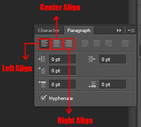
Paragraph Alignment: By default, all the text is going to show up in Photoshop in ‘left align’ because it is considered a standard alignment. This is another pallet for typography besides character panel.
- At the top here you can see the first option is left aligned and this alignment is discussed as ‘align left’ but ‘ragged right’. And here ‘ragged’ means indents in the type and in the left side it’s nice straight column.
- The next option is ‘center align’ and this type of alignment has ‘ragged left’ and ‘ragged right’. There are indents on both sides of the paragraph and it aligned only in the center.
- The third option here is ‘right align’ which is completely opposite of the ‘left alignment’. In this option, there is straight alignment on the right sight whereas indent on the left side.
Related Topics:
- History Brush Tool in Photoshop
- Color Replacement Tool & Mixer Brush Tool
- Healing, Clone & Pattern Stamp Tools in Photoshop
Anti-Alias

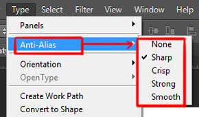
Next option, in the type panel, is ‘Anti-Alias’. This option is used to make the edges of the letters look smooth. If this option is not used, then the letters will mostly ‘look blocky’ and ‘hard edged’.
Photoshop adds a few pixels around the edges of the text to make a smoother transition between the text color and the background.
There are various anti-alias methods in Photoshop, which you can see in the fly-out menu when you click on it and these are sharp, crisp, strong and smooth.
Related Topics:
- How to use Gradient Tool in Photoshop
- Burn, Dodge & Sponge Tool in Photoshop
- Blur, Sharpen & Smudge Tool in Photoshop
Orientation

The next option is ‘Orientation’ which allows the text to align itself ‘horizontally’ and ‘vertically’.
There is a fly-out menu in this option and if you want to align your text horizontally or vertically then just check that option.
Related Topics:
Create Work Path
Sometimes the font styles can’t give you exactly what you want. And in these cases, you need to take some text and modify that as per your requirement. You can do this by converting the text to path.

For this, you need to type a word and then ‘right click’ on the text layer in the text panel and choose ‘Create Work Path’ or you can also access it from the type panel.
And it will convert your text to a path that you can easily modify. Switch off the text layer and you’ll see that a path is generated around the text. In the path’s panel, a work path is created. I advise you to ‘save’ it first.

Now, if you want to modify the path then just grab the pen tool and select some control points which you want to move and set them according to how you see the design to be.
You have to hold the CTRL key and then click and drag any control point the way you want.
Related Topics:
Warped Text Effect

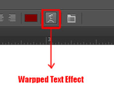
Now, with your type tool active you can see a couple of options on the top and the ‘T’ with a curved arrow underneath is the warp text tool.
If you click it, it will open up a menu that lets you select from a few different warp styles, For Example: arc, fish, rise etc. After applying these styles you can see what it does to the text and then you can do a few adjustments in the menu.

For example: you could make it effective on a horizontal plane or on a vertical plane. You can also use different distortions like ‘side to side’ distortions, vertical distortions and you could play around with different styles to see which ones might look good for your design.
You can play around with the direction that it bends forward or backward.
After editing the text hit ‘ok’ and you could see the normal text symbol turn into the warp text signal which indicates that you have a warp on it. If you want to edit it anytime you can just go back to the text menu.
If you are following our Free Photoshop Lessons and Tutorial Guide, then next you should read about, ‘Select menu in Photoshop‘.
Related Topics:
- Select menu in photoshop
- Filter menu in Photoshop
- View menu in Photoshop
- Window menu in Photoshop
- Photoshop Channels
- Dual light effect
- Feather in Photoshop
- How to create New Document in Photoshop
- Color Settings in Photoshop
- Color Profile


I learned something new.
Thank you for sharing this post. I am still learning about Adobe Photoshop. This will help, thanks.
Thanks, it’s a great help!
Nicely covered Type in Photoshop. Thank you!
Thanks
Best informative piece of writing on type.
Thanks, learnt new things about type in photoshop.
Good read!
Thank you, it’s informative and helpful!
Thanks
Great Help
Thank you
Thanks and it’s one of the most helpful piece of info on type in photoshop.
Thanks
Thank you
Thanks
Thanks, helpful for understanding of Type in photoshop.