In this Adobe Illustrator Tutorial, I will show you, ‘How to Create Metallic Effect in Illustrator’.
Table of Contents
Introduction
There are two things required in a Metallic effect:
- Metallic Color
- Brush Metal Effect (optional)
I will perform this tutorial on a Text in Illustrator but you can follow the steps to apply this effect on any Element or Design.
In case of text, you should chose your Font carefully. As we are creating a Metal look, so the Font should look Strong and Heavy. Otherwise, even after applying all steps correctly, the result may not look good.
Creating a suitable Background
Metals have lustrous or shining surface. Whenever we have to create light related effects like shining subject or glow in subject, it’s important to work on your Background.
As a rule of thumb, for such effects, we should always work with a dark background.
Create a Document
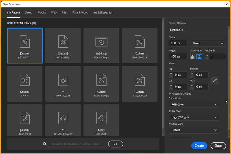
We will start by creating a New Document in Illustrator. For the purpose of this tutorial, I will chose the following values:
- Width: 850 px
- Height: 400 px
- Color Mode: RGB
- Raster Effects: High (300 ppi)
Creating Background
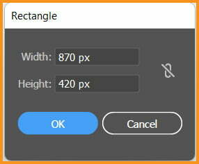
Take Rectangle Tool (M) from the Toolbar with None in Stroke and R=68, G=68 and B=88 as Fill color. Click on the Artboard with Rectangle Tool to open Rectangle dialog box and enter values as shown below.
After we click on OK, a Rectangle will be created as shown below.
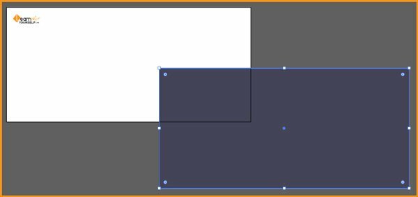
Now, we need to center our Rectangle with respect to the Artboard. We can do it using Align Panel. While the Rectangle is selected, open Align Panel and do the following:
- Align To: Align to Artboard
- Click Horizontal Align Center
- Click Vertical Align Center
Respective pics for above steps are shown below:


Our background currently looks dark but it is also dull in nature. We will add a Gradient in it to add a sense of direction.
With the Rectangle still selected, open Appearance Panel from Window menu. Click on the Add New Fill button.

A new Fill will be added to the Rectangle and could be seen in the Appearance Panel as shown below.

With the New Fill selected, we will change it’s Blending Mode to Soft Light.
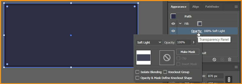
Now, we have to convert this solid Fill color to a Radial Gradient. First we will open swatches by clicking on the chevron icon along side the Fill color and chose any Gradient in it.

Open Gradient Panel from Window menu and convert the Linear Gradient to Radial Gradient in the selected Fill.
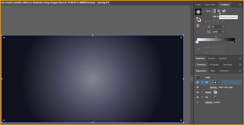
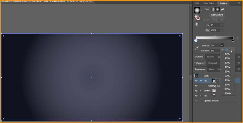
In the Gradient Slider, select the First Color Stop with white color and lower it’s Opacity to 0%.
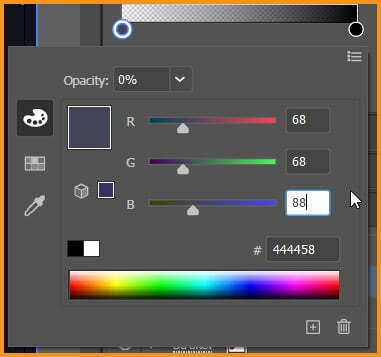
Now, double-click on the First Color Stop with White as Color and change the color values to R=68, G=68 and B=88
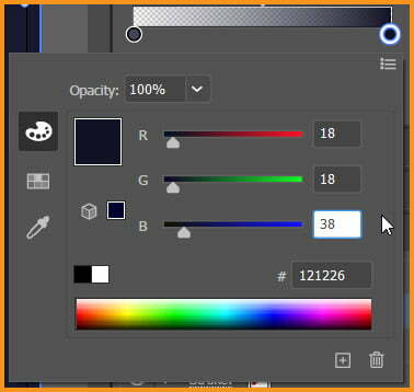
Then move to the other Color Stop and change it’s color values to R=18, G=18 and B=38
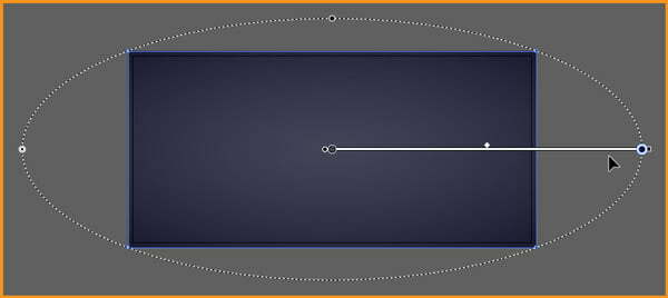
After a few minutes of experimenting with Gradient Tool, I have finalized the shape of gradient in the following way:
Now, we can easily place the subject in the center.
Related Topics:
- How to Create Flower using Gradient Mesh in Illustrator
- How to Recolor Artwork in illustrator
- How to Create Silver Metallic Effect in Illustrator
Add element for Metallic Effect
Now, we need to add the element for our Metallic Effect in Illustrator. In my case, as I already told you, I will be taking a text for the tutorial.
Remember, Typography is an important topic if you consider to use text too. I recommend to use a Bold, Strong and Headline type of Font in Sans Serif category.
Here, I will be using, LTY abbrevated for Learn That Yourself, the name of our website.
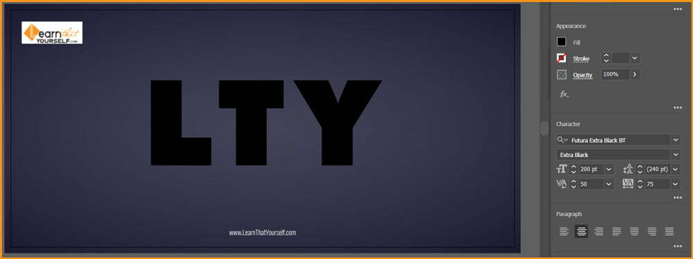
I have used Futura Extra Black BT typeface with a Font Size of 200 pt and Tracking of 75 as well as Kerning of 50 between T and Y.
If you don’t know about Tracking and Kerning then please read the Character Panel explanation in our Type menu in Photoshop blog.
Add Metal Colors
With the text selected remove the Fill color. Open Appearance Panel from Window menu with the text still selected Add New Fill from the Appearance Panel.
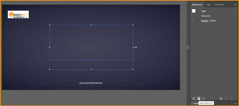
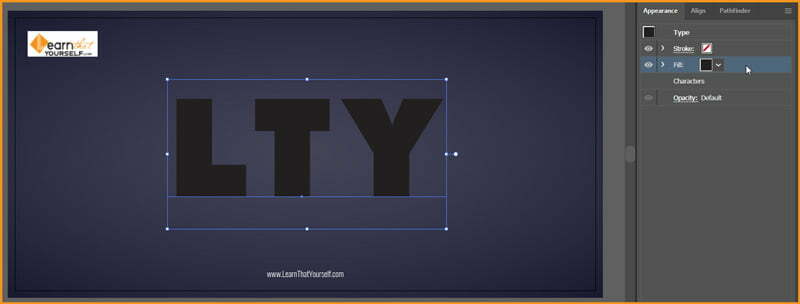
We have to change the solid fill with a Linear Gradient at 90 degrees.
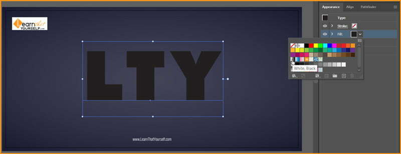
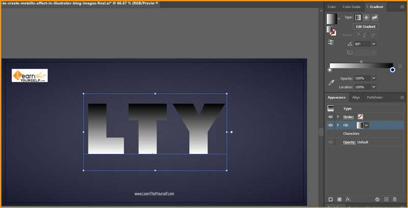
Now, we need to change color of the Color Stops as well as add some new Color Stops in the Gradient.
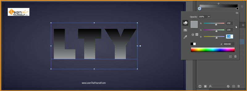
First we will change the colors in the present Color Stops. Double click on the left Color Stop (White color in pic) and change it’s values to R=152, G=154 and B=158
Double click on the right Color Stop (Black color in pic) and change it’s values to R=114, G=114 and B=114
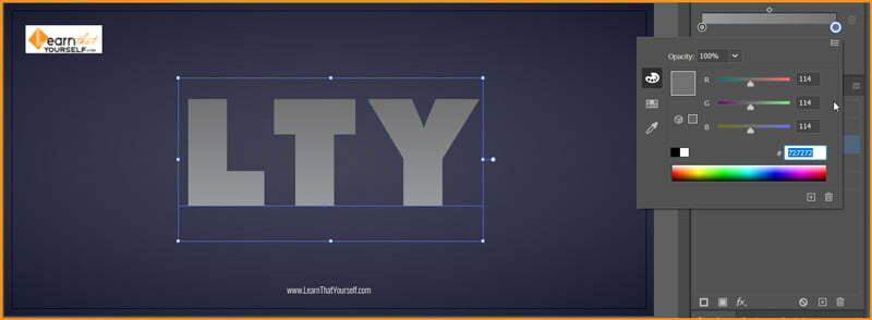
Now, we need to add the following Color Stops:
- Location: 15%; R=93, G=93 and B=93
- Location: 35%; R=152, G=154 and B=158
- Location: 50%; R=164, G=164 and B=164
- Location: 60%; R=134, G=134 and B=134
- Location: 80%; R=201, G=201 and B=201
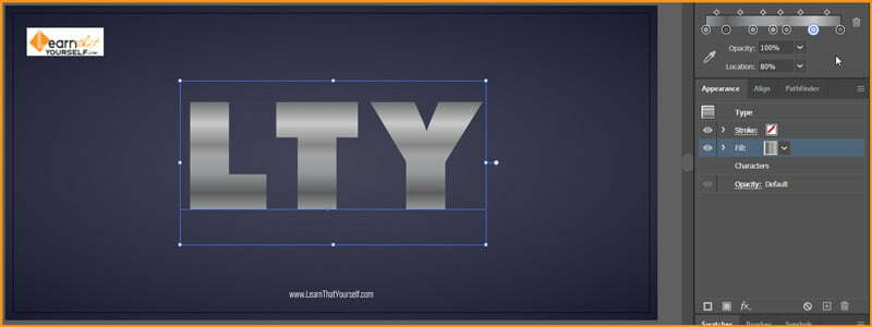
It has began to resemble colors of metal. Now we need to add some surface shine using Stroke color. Add New Stroke using Appearance Panel with Stroke Weight of 3 pt and Round Join.

We will change the solid color of Stroke to a Linear Gradient of Black to White at 90 degrees with Opacity of 50% with Soft Light as Blend Mode.
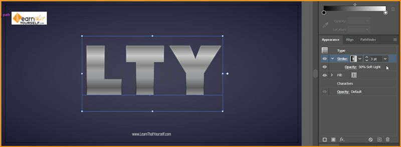
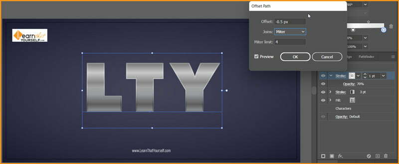
Apply effect; Effect > Path > Offset Path with values as follow:
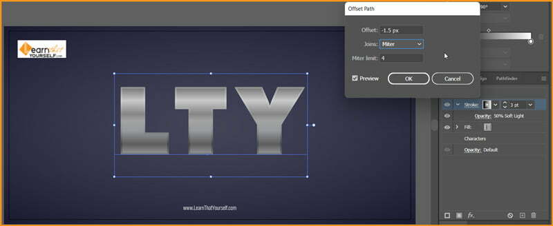
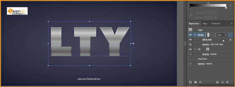
Now, Add New Stroke from Appearance Panel with Stroke Weight of 1 pt, Round Join, Opacity at 70% and Linear Gradient at 90 degrees. Linear Gradient should have following values of Color Spots:
- Location: 0%, Opacity: 0%; R=231, G=230 and B=233
- Location: 50%, Opacity: 100%; R=255, G=255 and B=255
- Location: 100%, Opacity: 0%; R=231, G=230 and B=233
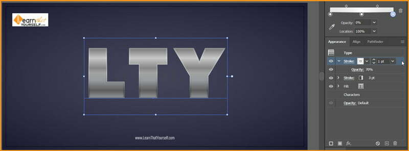
We have to apply the same Offset Path effect in this stroke layer too. Use the values below:
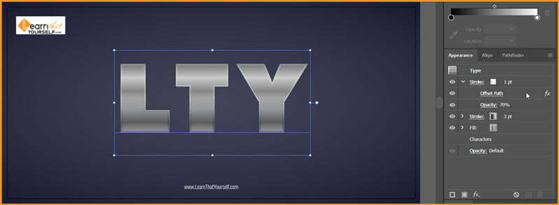
We have complete adding the metal colors to our text. The result looks as shown below.

Related Topics:
- What is Adobe Illustrator
- Line Segment, Arc, Spiral, Rectangular & Polar Grid Tool
- Rectangle, Rounded Rectangle, Ellipse, Polygon, Star & Flare Tool
Add Shadows
Let’s add some shadows to our Metal Colored Text. For this purpose, we will again Add New Fill but we will drag it down below our previous Fill.
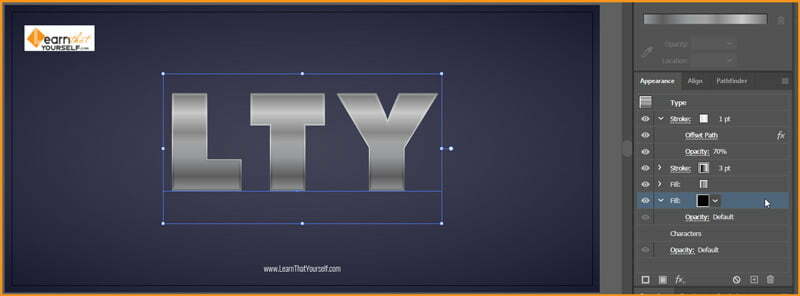
Change the Fill color to R=88, G=89 and B=91
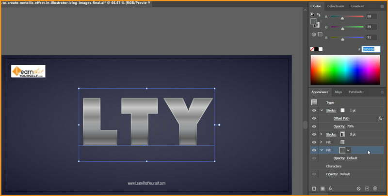
Go to Effects > Stylize > Drop Shadow with color of Shadow as R=28, G=28 and B=48 and other following values:
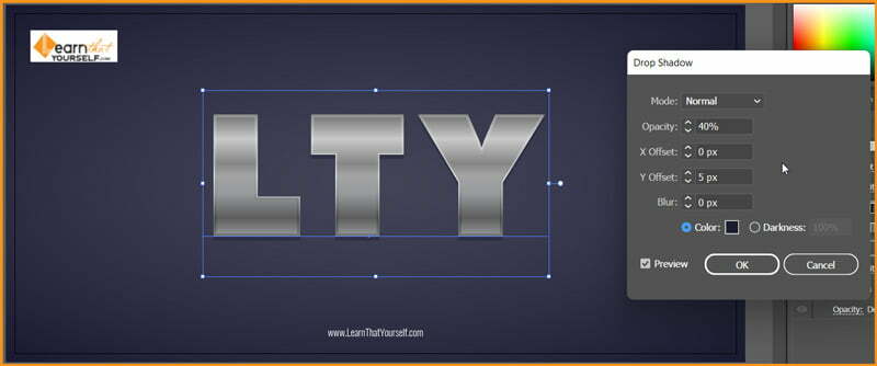
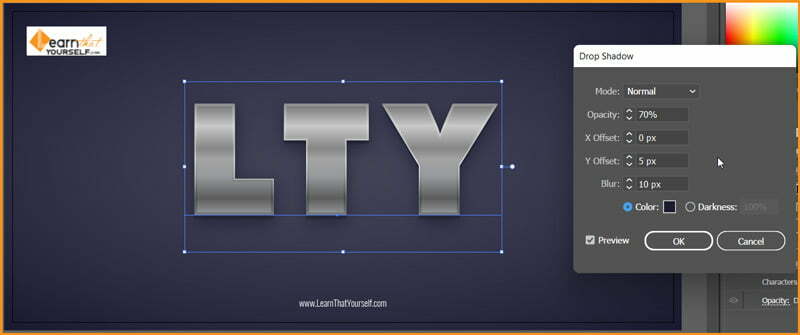
Again, add another Drop Shadow to the same Fill with same Shadow color and other values below.
Related Topics:
- Type Tool in illustrator
- Paintbrush & Blob brush Tool in illustrator
- How to use Eraser tool in illustrator
Add Metallic Effects
We have already added Metal colors and in few cases that could be all you need. But if more detail is required than we can add few effects to make it Metallic in look.
We will Add New Fill in the Appearance Panel with the Text selected. This will be our third Fill layer in Appearance Panel. It should be on the top of all other Fill layers.
It’s color will be Black, Opacity of 50% with Color Burn as Blend Mode.
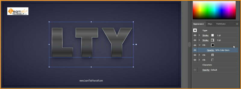
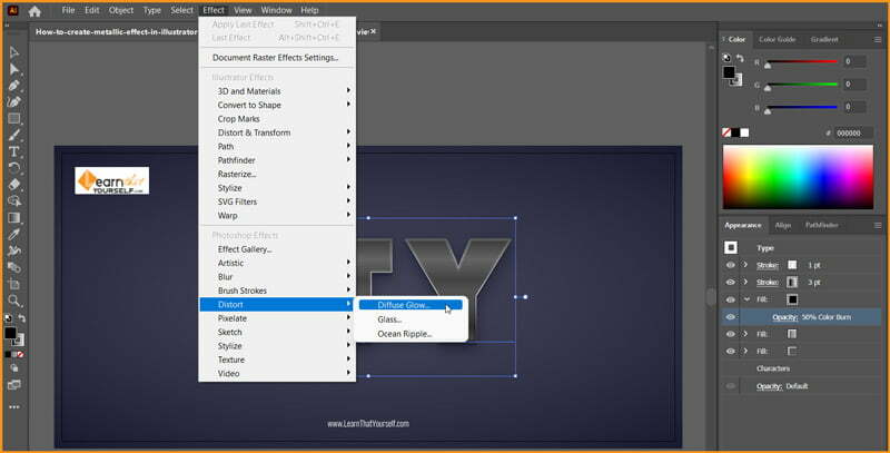
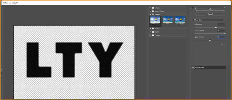
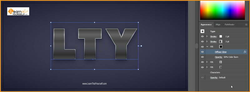
Go to Effect > Distort > Diffuse Glow with the values shown below.
Apply a new effect from Effect > Sketch > Note Paper with Image Balance of 25, Graininess of 15 and Relief of 8
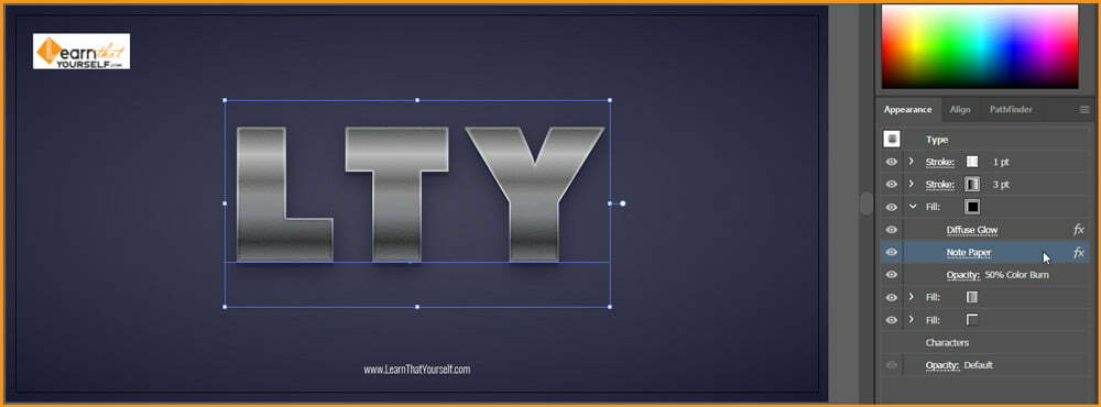
If results don’t match after the above step, please note the order of effect layer in the Appearance Panel.
Now, again, Add New Fill on top of all previous Fills in the Appearance Panel with Color as Black and Soft Light as Blend Mode.
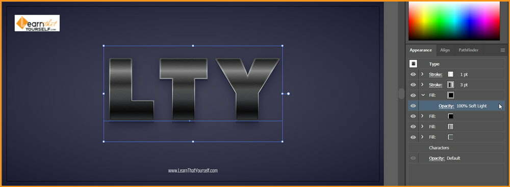
We will apply Note Paper effect again with same values as above to this fill layer.
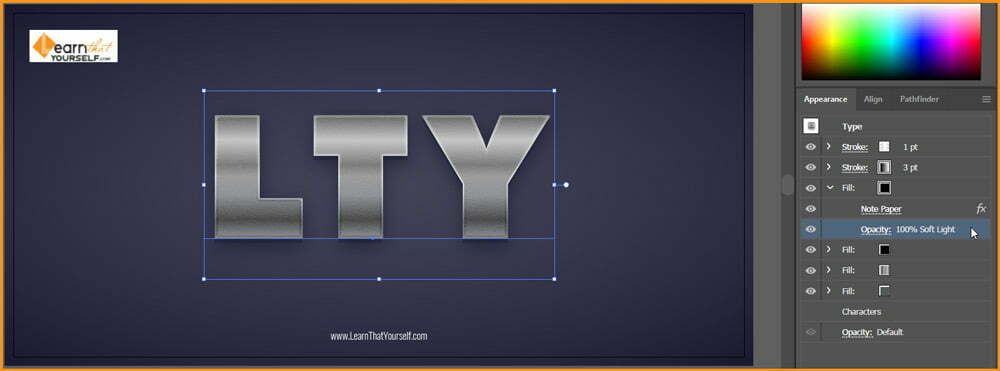
Then, we will go to Effect > Distort > Ocean Ripple with Ripple Size of 6 and Ripple magnitude to be 20
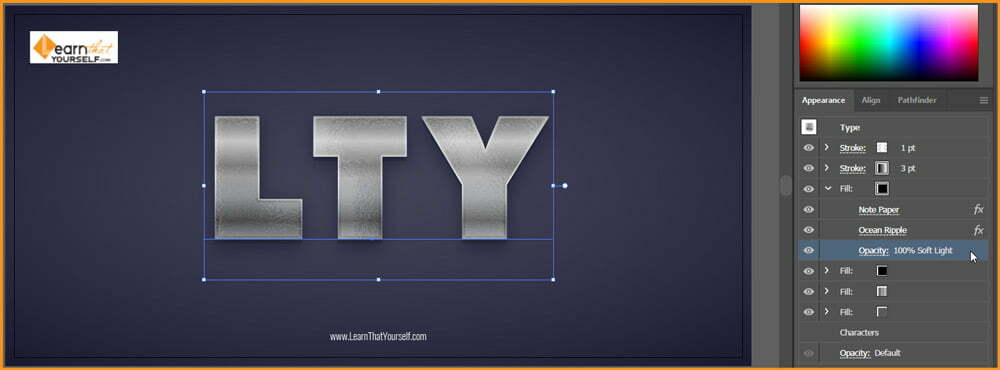
Next effect, go to Effect > Brush Strokes > Angled Strokes with Direction Balance at 100, Stroke Strength at 50 and Sharpness at 10
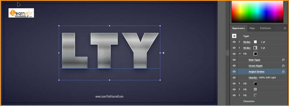
The result, till now, is shown below:

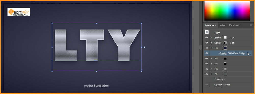
Let’s add some more shine to it and some surrounding color impact. Add New Fill layer with color values of R=20, G=20 and B=51 and Opacity at 50% with Color Dodge as Blending Mode.
Related Topics:
- How to use the Pen Tool in illustrator
- Perspective Tool in Illustrator
- Selection Tools in illustrator
Final Result

Save as Graphic Styles
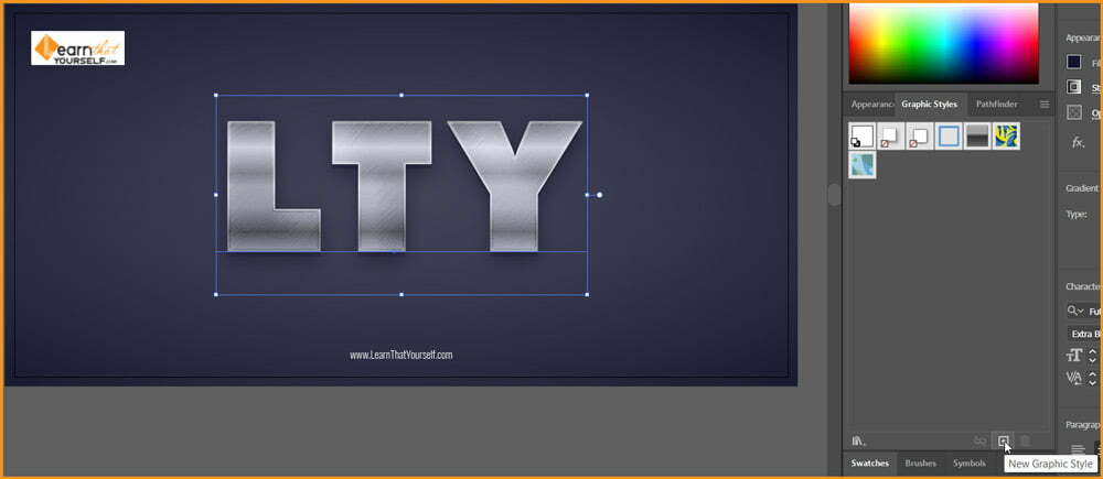
To be able to reuse this effect on different elements, we have save it as a Graphic Style. Open Graphic Styles Panel and with the text selected click on New Graphic Style button at the bottom of Graphic Styles Panel.
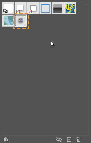
To apply this Graphic Style, we have to select our element and click on it. To download the Ai file of this tutorial, click here.
Related Topics:
- Width Tool in illustrator
- Shape Builder, Live Paint Bucket tool in illustrator
- How to use Gradient Tool in Illustrator
- How to use Mesh Tool in illustrator
- How to make a Semicircle in Illustrator
- How to design a Retro Flower Pattern
- How to set Brush Pressure in Illustrator
- How to Create A Pressure Sensitive Brush in Illustrator
- List of websites for Royalty Free images
- List of websites for Royalty Free Raw images


