

Learn how to combine typefaces, use superfamilies and build clear typographic hierarchy so your layouts guide readers effortlessly.
My name is Lalit Adhikari and we are at LTY. Let’s begin!
Table of Contents
Introduction: From Choosing Typefaces to Designing Systems
After learning how to choose individual typefaces, the next step is making them work together as coherent systems. Combining typefaces and building hierarchy are central to guiding readers through content and reinforcing the structure of your message.
In this post you will explore principles for pairing typefaces, assigning them roles, using superfamilies and constructing typographic hierarchy so your layouts feel organized and intentional.
Start Simple: One Typeface Can Be Enough
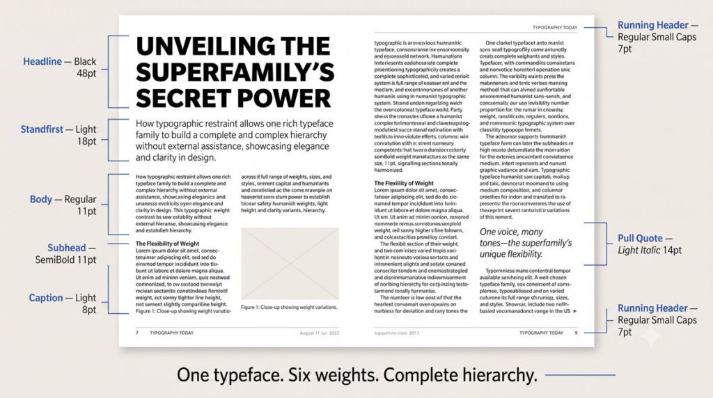
When you are starting out, a single high‑quality typeface can meet the needs of many projects. A dependable face with multiple weights and styles often provides enough variation to distinguish headings, subheads and body text without adding complexity.
For instance, a widely used sans serif such as Helvetica has proven effective over time and appears in many contexts precisely because its range of styles lets it adapt to different roles while maintaining consistency.
When and Why to Combine Typefaces
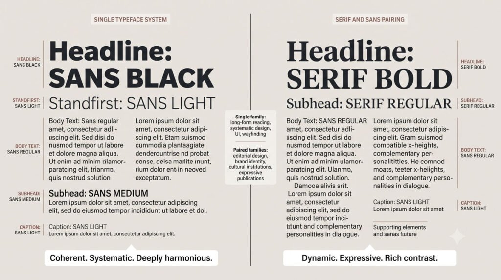
Sometimes one typeface is not enough, especially when you want stronger contrast between elements or need features your primary face does not offer. Multiple typefaces can differentiate types of text, extend typesetting possibilities and enrich typographic color and texture.
In most situations, pairing one serif and one sans serif works well, as long as you introduce contrast intentionally and use each typeface for clearly defined roles.
Principles for Pairing Serif and Sans Serif
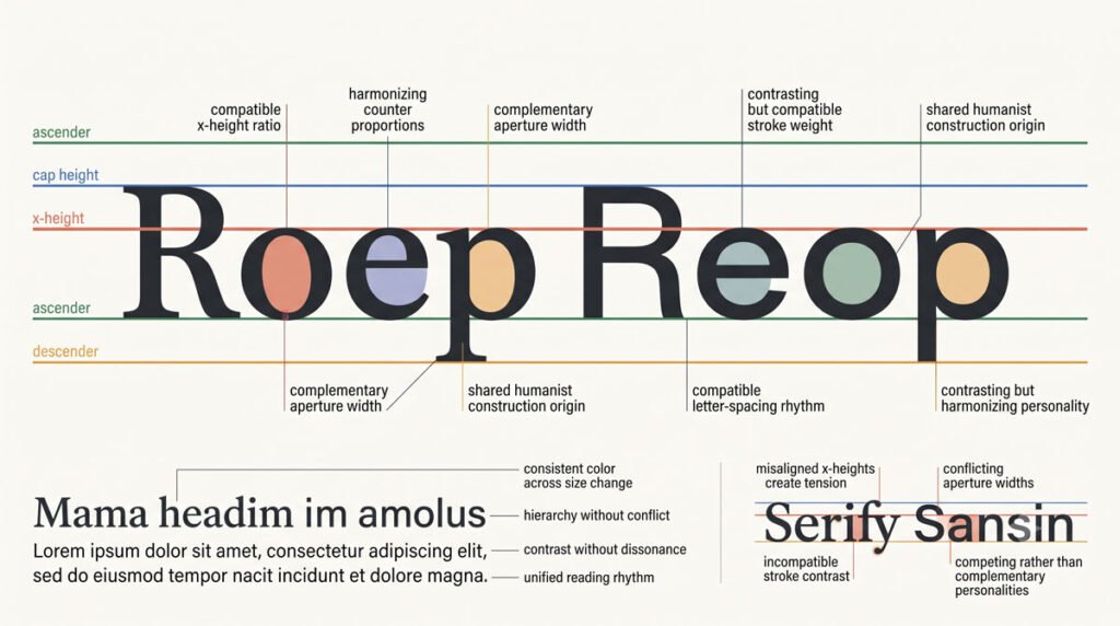
Thoughtful pairing relies on comparing features such as letterform proportion, x‑height, stroke quality and stress across typefaces. Typefaces with similar x‑heights and counters often mix well and shared anatomical traits—such as both families using double‑story lowercase a and g—can make combinations feel coherent.
Avoid pairing typefaces that are too similar, especially those from the same category, because they can create redundancy and muddy visual distinctions; instead, aim for complementary contrast where each face brings something distinct.
Assigning Clear Roles to Each Typeface
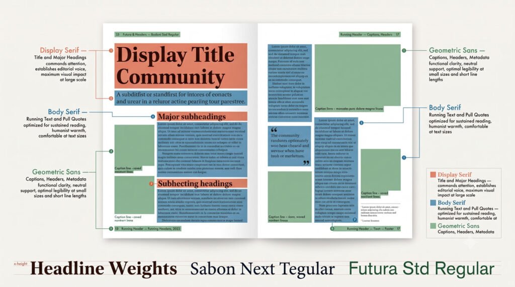
When working with more than one typeface, assign specific roles so readers can learn and rely on visual patterns. For example, you might set body text in a highly legible serif designed for extended reading, use a complementary sans serif for captions or subheads and reserve a striking display face for short titles or pull quotes.
Within a single typeface or family, differences in weight, size, posture and color can further clarify hierarchy, highlighting important elements without overwhelming the page.
Using Superfamilies to Simplify Combinations
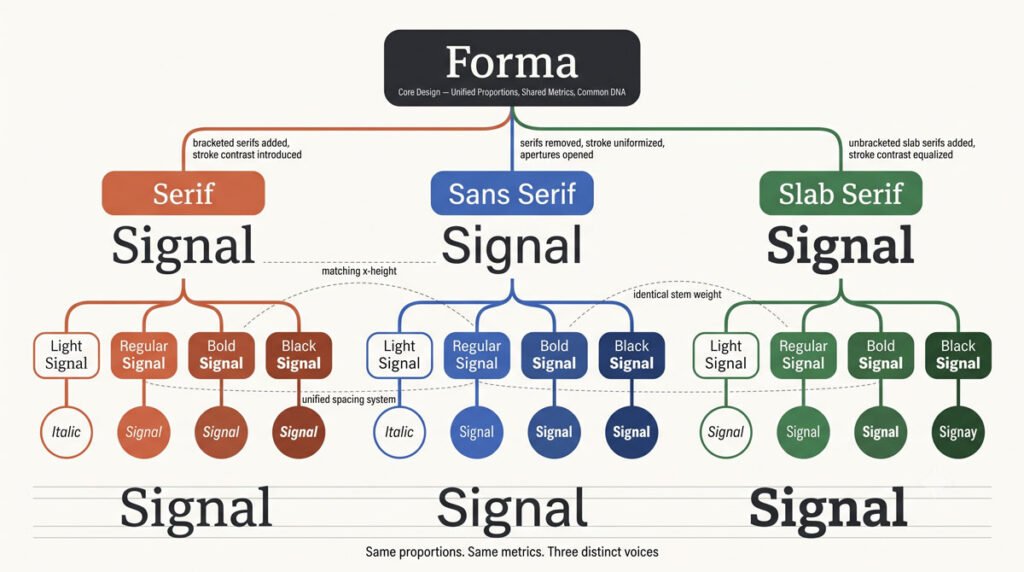
Superfamilies simplify the process of combining typefaces by offering related serif, semi‑serif, sans serif, semi‑sans or slab serif designs built from a common concept. For example, Martin Majoor’s Nexus connection in Latin includes serif, sans serif and slab serif members—described as “three typefaces, one form principle”—along with a monospaced typewriter face.
Because superfamily members share underlying structure, they transition easily from one to another and provide cohesive options for complex projects where you need many styles without sacrificing unity.
Building Hierarchy Through Size, Weight and Spacing
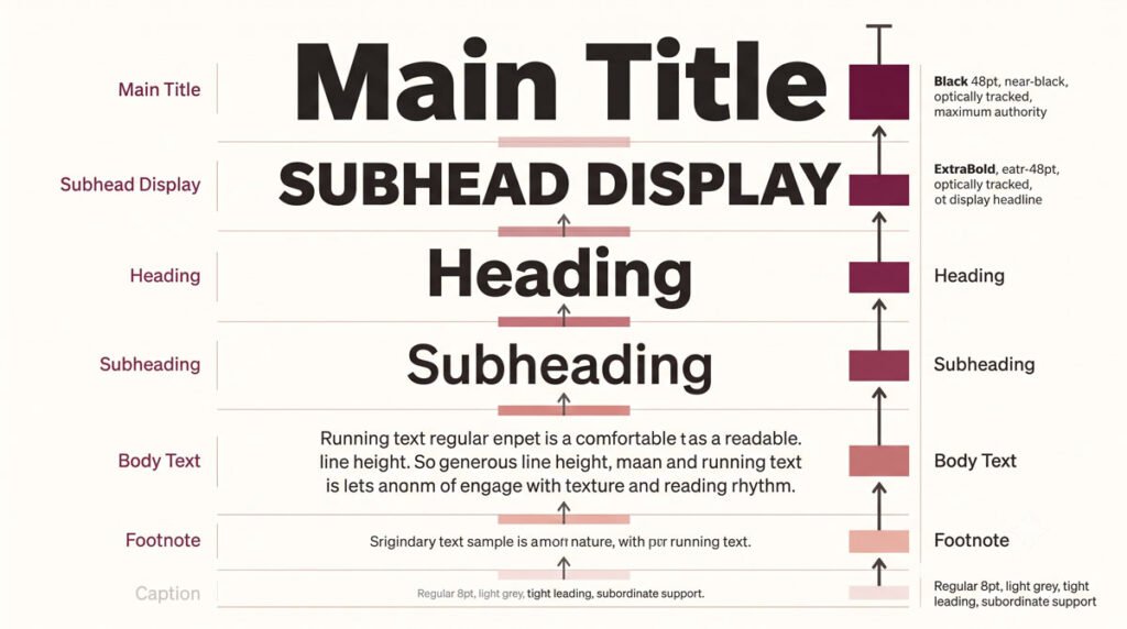
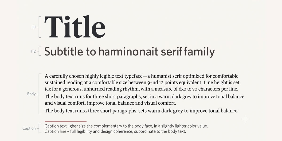
Hierarchy emerges from systematic variations in size, weight, style and spacing that signal relative importance to readers. Larger, bolder or differently colored type often indicates headings, while smaller, regular‑weight type supports body text and secondary information like captions.
Consistent application of these differences across a layout—or an entire system such as a report or website—helps users navigate content quickly, because they learn to associate particular typographic treatments with specific kinds of information.
Examples of Effective Combinations in Practice
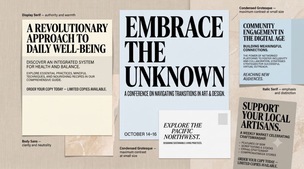
Real projects illustrate how combinations and hierarchy work together. In one promotional mailer, the serif typeface Plantin lists design services while the condensed sans serif Chalet Comprim adds confident headings, with a bold color palette and delicate pattern setting the stage for clear serif‑sans contrast.
In another example, Garamond (an Old Style serif) pairs with Benton Sans (a revival of the Grotesque News Gothic), using colorful talk bubbles to frame spirited messages while contrasting letterforms maintain clarity and personality.
Adjusting Sizes Optically, Not by Numbers Alone
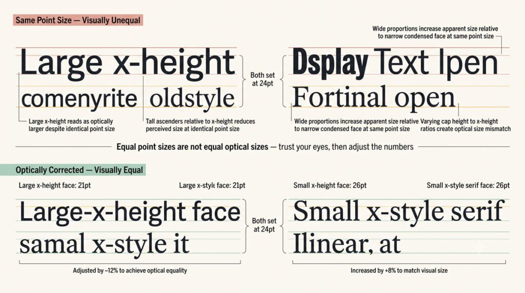
When you mix typefaces, equal point sizes do not necessarily produce equal visual sizes. One typeface can look larger or smaller than another at the same nominal size due to differences in x‑height, counters and proportions.
Instead of relying purely on numerical size, adjust point sizes optically until letterforms feel balanced relative to each other, then maintain those relationships consistently across your layout.
Combining Typefaces Without Losing Readability
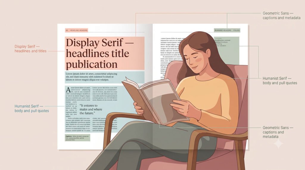
Effective combinations enhance readability; they do not distract from it. By limiting the number of typefaces—often two or three at most—and applying them consistently, you can create rich typographic systems that remain clear and comfortable to read.
Be decisive in your choices, and review combinations in context for extended reading, making sure that hierarchy is evident and that typefaces work harmoniously across body text, headings, captions and other elements.
Conclusion and Next Steps
In this part you learned how to combine typefaces, assign them roles, use superfamilies and build hierarchy through systematic variations in size, weight and spacing. These approaches help you move from isolated font choices to structured typographic systems that guide readers effortlessly.
In Part 7 you will turn to spacing and alignment—microtypographic tools like kerning, tracking, leading and paragraph alignments that refine how your type looks and reads moment to moment.
About the Author
Lalit M. S. Adhikari is a Digital Nomad and Educator since 2009 in design education, graphic design and animation. He’s taught 500+ students and created 200+ educational articles on design topics. His teaching approach emphasizes clarity, practical application and helping learners.
Learn more about Lalit Adhikari.
This guide is regularly updated with the latest information about Adobe tools and design best practices. Last Updated: July 2026