

Learn flexible principles for choosing typefaces based on text, medium, mood and features like optical sizes and character sets, grounded in typography fundamentals.
Table of Contents
Introduction: From Categories to Smart Choices
As per previous parts 1, 2, 3, 4, by now you can recognize basic typeface categories and understand their traits. The next challenge is choosing specific typefaces for real projects, where there are few absolutes and context matters more than rigid rules.
In this post you will learn flexible principles for selecting typefaces based on the text itself, the medium and users, typeface quality and features and the mood or atmosphere you want to create.
Related Topics:
- Combining Typefaces and Building Hierarchy
- Spacing, Alignment and the Color of Type
- Baselines, Grids and Advanced Typographic Layouts
Start with the Text, Not the Typeface
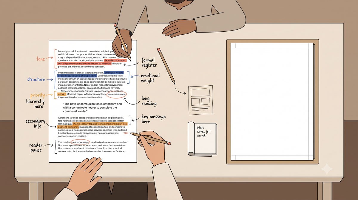
Good typeface selection begins with the text, not with browsing your font menu. Take time to read and grasp the content so you can sense its mood, energy and main message, whether it is reflective, technical, playful or urgent.
Next, carefully map the text, noting its quantity and the different types of text it contains—such as body copy, headings, captions, footnotes, and folios—and ordering them by importance before you think about specific typefaces.
Related Topics:
- Typography Fundamentals: What Typography Really Is
- Typography in Practice: Type Across Media
- Type Anatomy: Learn the Language of Letterforms
Match Typeface Range to Text Complexity
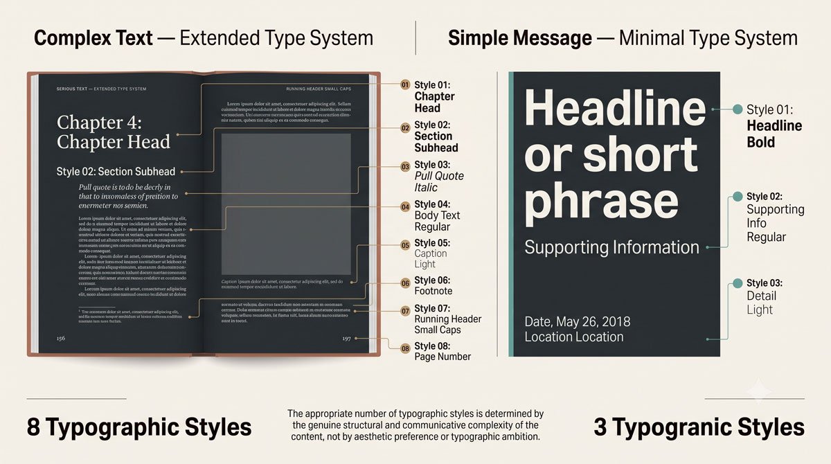
The quantity and variety of text determine how much typeface range you need. A project with limited text types might require only a few styles, while a textually rich book benefits from a typeface or family that offers multiple weights, widths and special features for body text, headings, captions and more.
When thinking about typefaces, begin with the text that appears most often—usually body text—and look for a face designed for extended reading at small sizes in either serif or sans serif, then add supporting faces or styles as needed.
Related Topics:
- Typeface Categories: Serifs, Slabs and Sans Serifs
- Typography
- The Psychology of Typography: Font Influence
Consider Medium, Users and Viewing Conditions
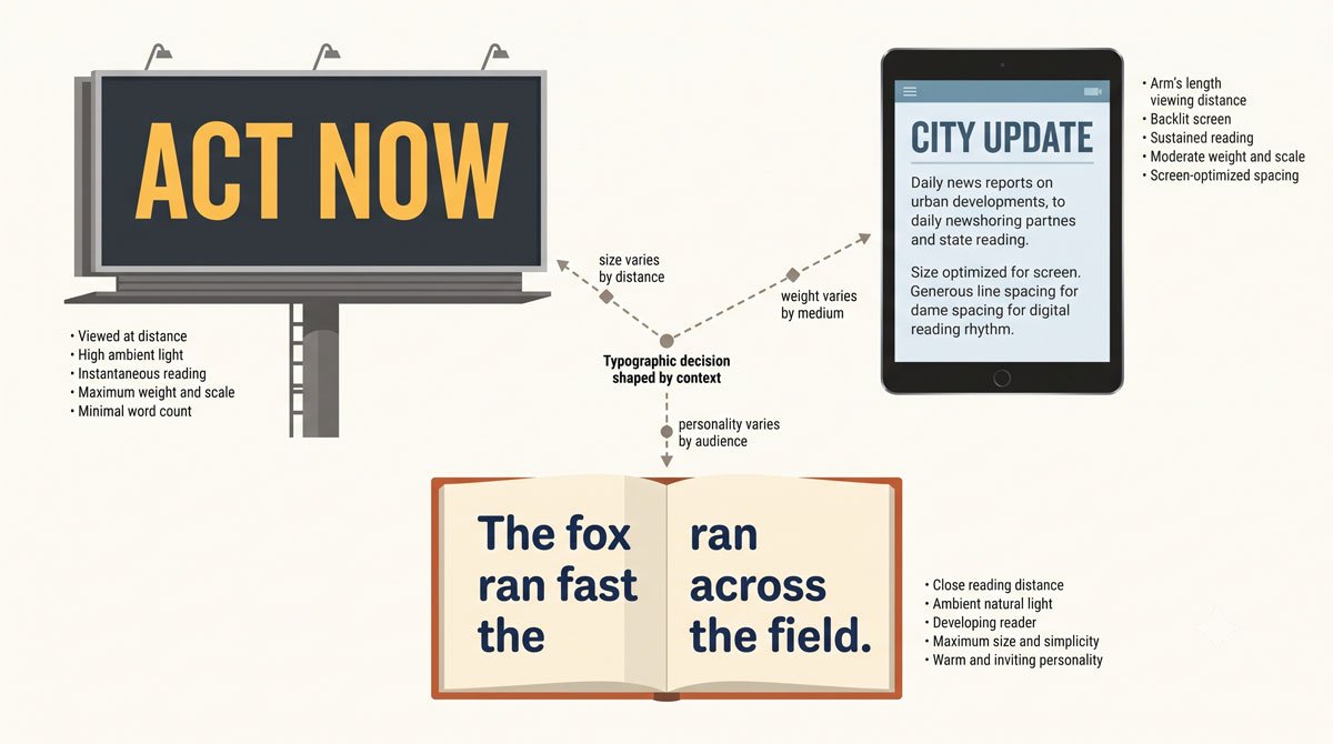
Different media and audiences call for different typographic solutions. Typefaces used in environments, where they may be viewed from a distance, will differ from those on tablets held close or in corporate reports contrasted with children’s books.
Short‑term assignments may benefit from contemporary faces that speak to current conditions, while long‑term ventures might rely on trustworthy, classic typefaces; in some cases innovative concepts can be supported by custom typefaces designed specifically for the project.
Related Topics:
- Helvetica Effect: One Font Conquered Global Design
- Comic Sans: True Story Behind the World’s Most Hated Font
- Gotham: Font That Won an Election And Changed Design Forever
Special Considerations for Digital and Web Type
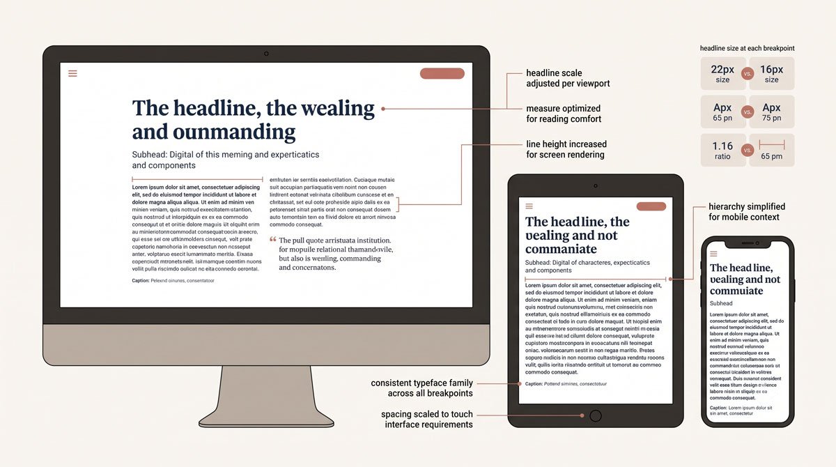
Type for the web and digital devices presents particular challenges because conditions vary across browsers, platforms and screen sizes. A typeface that works well in one digital context may not suit another, so you need to be flexible and responsive rather than assuming print choices will translate directly.
As webfont technology advances, more high‑quality typefaces are available that perform well on screen, making it possible to bring print‑level typographic care into digital environments while reducing technical barriers across platforms and devices.
Related Topics:
- Futura: The Geometric Vision of Paul Renner
- Gill Sans: Eric Gill’s Humanist Masterpiece
- Baskerville: Elegant Serif That Shaped Print Typography
Use Typeface Personality to Support the Message
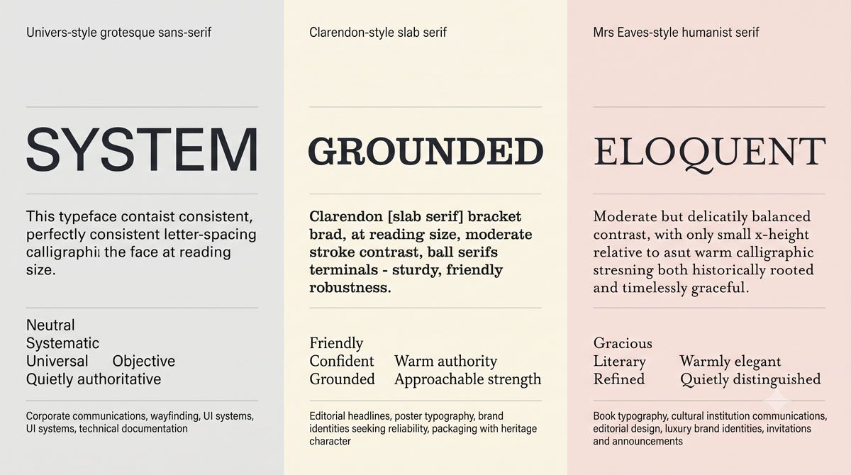
Typefaces create atmosphere before the text is fully read. Subtle messaging through physical characteristics—such as stroke contrast, proportions and details—invites viewers into the content and supports particular associations.
Some faces feel casual or dignified, others mechanical or playful: Univers, for example, has a neutral, no‑nonsense tone and “wears many hats,” Clarendon sits firmly yet feels friendly and Mrs Eaves, a Baskerville revival, is stylish and gracious with open counters and extensive ligatures.
Related Topics:
- Bodoni Font: Serif That Defined Luxury Typography
- Garamond: Timeless Serif That Defined Classical Typography
- The Worst Fonts in the World: A Typographic Hall of Shame
Evaluate Typeface Quality and Family Structure
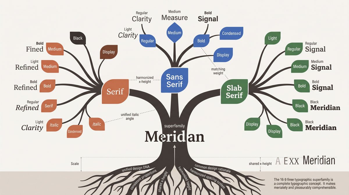
Typeface quality depends on the design of individual characters and how well they work together in words and lines. Well‑designed text faces read fluidly, have consistent styles of posture, weight and width and offer enough variation for emphasis and hierarchy.
Features such as ligatures, swash characters, alternate glyphs, multiple numeral styles and small caps increase versatility and superfamilies that include serif, sans serif and slab serif members—like Martin Majoor’s Nexus connection—simplify combining related faces in complex projects.
Related Topics:
- Gill Sans and Tube: How Johnston and Gill Defined London
- Baskerville and Eaves: A Tale of Perfection, Passion and Revival
- Futura vs. The World: The Geometric Vision of Paul Renner
Optical Sizes and Why They Matter
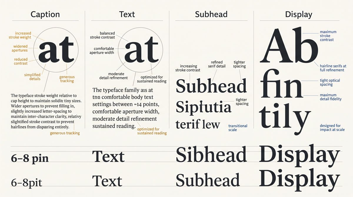
Some typefaces include optical sizes such as caption, body, subhead and display, each optimized for specific point size ranges. Caption and body styles are designed for small sizes and would appear too dense if enlarged, while display styles shine at large sizes but lose stroke quality when reduced.
Optical styles involve subtle adjustments in letterform contrast, proportion and weight so that, for example, text set at 6–8 points uses a caption style and text above 24 points uses a display style, maintaining legibility and elegance across sizes when used as intended.
Related Topics:
- Legibility vs. Readability: What Every Designer Needs to Know
- Secret Life of Symbols: History of Ampersand and Interrobang
- Helvetica – Swiss Modernism’s Ubiquity Crisis
Practical Examples of Selection in Context
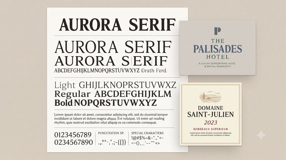
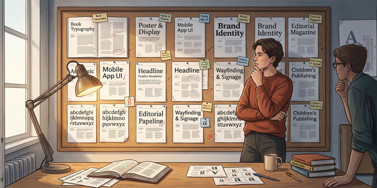
Real projects demonstrate how these principles work. A poster promoting the typeface Skolar highlights its strong serifs, tall x‑height and suitability as a hearty text face for small sizes, while large‑scale settings of uppercase Helvetica in solid leading create impactful catalog covers.
A logotype for a hotel may rely on a Humanist sans serif like Topaz redrawn for elegance, while wine labels might use custom typefaces that shift from roman to oblique to mark wine type, with color reinforcing the typographic nuance.
Related Topics:
- Comic Sans – Accessibility & Gatekeeping Critique
- Gotham – Political Design & Elections Power
- Futura – Geometric Modernism Revolution
Always Review Typefaces in Context
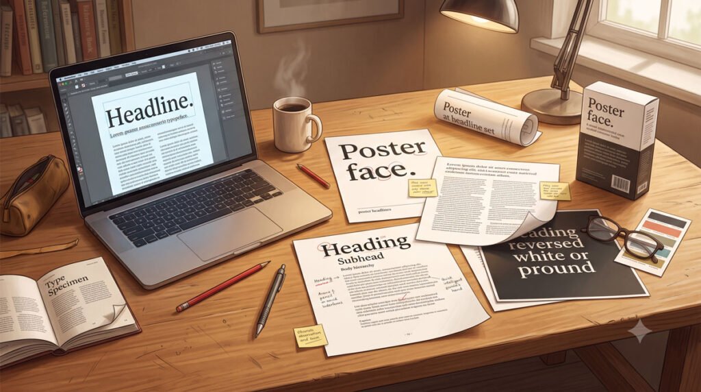
No matter how appealing a typeface looks in a specimen, you should always review it in context. Print samples if you are designing for paper, test across browsers and screen resolutions for digital projects and mock up three‑dimensional applications such as packages or environmental graphics.
Knowing how a typeface behaves in real conditions—and being willing to adjust or replace it—ensures that your selection supports both reading and the intended user experience.
Related Topics:
- Gill Sans – Humanist Alternative Modernism
- Baskerville – Print Excellence & Love Story
- Bodoni – Theatrical Prestige Aesthetics
Conclusion and Next Steps
In this part you learned to start with the text, consider medium and users, weigh personality and quality and pay attention to features like optical sizes when choosing typefaces. These principles are flexible rather than prescriptive, and they help you select faces that are appropriate, legible and expressive for each project.
In Part 6 you will build on this by exploring how to combine typefaces and create hierarchy, so your selections work together as coherent systems rather than isolated choices.
Related Topics:
- Garamond – Classical Foundation Principles
- Worst Fonts – Criticism & Gatekeeping Analysis
- Gill Sans & The Tube – Urban Identity Infrastructure
About the Author
Lalit M. S. Adhikari is a Digital Nomad and Educator since 2009 in design education, graphic design and animation. He’s taught 500+ students and created 200+ educational articles on design topics. His teaching approach emphasizes clarity, practical application and helping learners.
Learn more about Lalit Adhikari.
We try to keep the guide updated with the latest information about Adobe Tools and Design Best Practices. Lasted Updated: 15th Aug 2026.
Related Topics:
- Baskerville & Mrs. Eaves – Love, Partnership & Revival
- Futura & Paul Renner – Geometric Vision & Revolution
- Legibility vs. Readability – Typography Fundamentals
- Ampersand & Interrobang – Symbol Histories