

Learn essential type anatomy and typography terminology so you can see and talk about letterforms precisely in your design work.
My name is Lalit Adhikari and we are at LTY. Let’s begin!
Table of Contents
Introduction: Why Type Anatomy Matters
In Parts 1 and 2 you learned what typography is and how it appears across different media. To work confidently with type, you now need a precise vocabulary for what you see so you can choose, critique, and refine letterforms intentionally.
In this post you will learn the core anatomy and terminology of type—covering glyphs, characters, structural measures, and key parts of letterforms—so you can speak the language of typography and use it to your advantage.
Related Topics:
- Typeface Categories: Serifs, Slabs and Sans Serifs
- How to Choose Typefaces: Selection Principles That Work
- Combining Typefaces and Building Hierarchy
Essential Concepts: Glyphs, Characters and Alternates
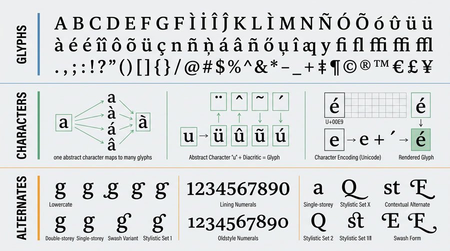
Glyphs are all the marks in a typeface, from letterforms and numerals to punctuation and symbols.
A diacritic such as an accent mark is itself a glyph, and when it combines with a base letterform it creates a character.
A character is a typographic element like a letter, numeral, or punctuation mark, and a typeface might offer multiple glyphs for the same character—for example, a lowercase g may have single‑story, double‑story, and small‑cap variants, often called alternates or alternate characters.
Related Topics:
- Spacing, Alignment and the Color of Type
- Baselines, Grids and Advanced Typographic Layouts
- Typography Fundamentals: What Typography Really Is
Type Architecture: From Metal to Digital
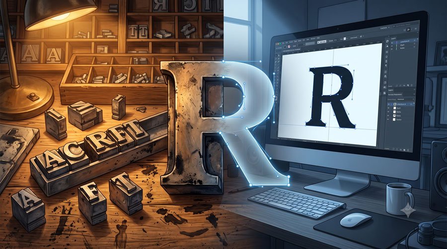
Many typographic terms originate from metal typesetting, when printers set lead type slugs by hand to form words, lines and paragraphs.
These terms describe parts such as the body size, shank, shoulder, and type height, which together defined how physical pieces of type related to paper and ink.
Even though you may work digitally today, this earlier architecture still shapes terminology for type anatomy and measurement, influencing how designers think about point size, set width and alignment.
Related Topics:
Key Vertical and Horizontal Measures
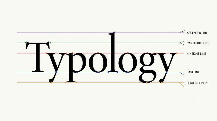
Several core measures describe how letterforms sit and relate to each other. The baseline is the imaginary line on which most letters sit, while the x‑height is the height of lowercase letters such as x, excluding ascenders and descenders.
Ascenders are the parts of lowercase letters like b, d, f, h, k, and l that rise above the x‑height, and descenders are the parts of letters like g, j, p, q, and y that fall below the baseline, both of which influence spacing and leading choices.
Related Topics:
- Helvetica Effect: One Font Conquered Global Design
- Comic Sans: True Story Behind the World’s Most Hated Font
- Gotham: Font That Won an Election And Changed Design Forever
Inside and Outside Spaces: Counters and Apertures
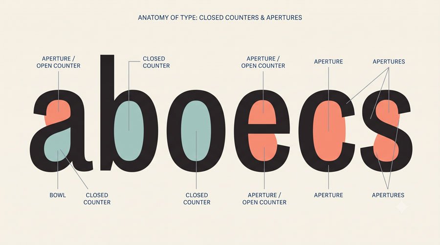
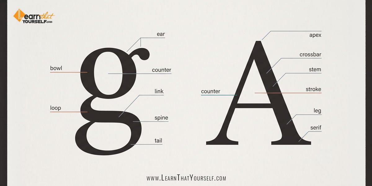
A counter (or counterform) is the enclosed white space inside characters such as b, d, and o, and these shapes strongly influence perceived weight and legibility.
An aperture, or open counter, is the partially enclosed white space in forms such as C and S, as well as in letters like n and e.
Designers distinguish between closed and open bowls—the curved strokes that enclose counters in letters such as a, b, d, and p—and how these bowls connect to stems affects how open or condensed a typeface feels.
Related Topics:
- Futura: The Geometric Vision of Paul Renner
- Gill Sans: Eric Gill’s Humanist Masterpiece
- Baskerville: Elegant Serif That Shaped Print Typography
Strokes, Serifs and Terminals
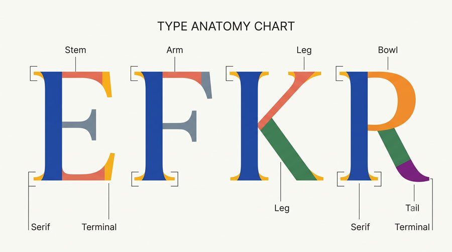
A stroke is any curved, straight, or diagonal line that constructs a character, including more specific forms like arms, legs, and stems.
A stem is the primary vertical stroke of many letters, while arms and legs are shorter horizontal or diagonal strokes attached at one end in letters such as E, F, K, and R.
A serif is a small finishing detail at the start or end of a stroke, and designers recognize many related details such as spurs, which are small, one‑sided extensions, terminals that finish strokes and swashes, which are embellished strokes that replace a serif or terminal in decorative characters.
Related Topics:
- Bodoni Font: Serif That Defined Luxury Typography
- Garamond: Timeless Serif That Defined Classical Typography
- The Worst Fonts in the World: A Typographic Hall of Shame
Letterform Details That Shape Personality
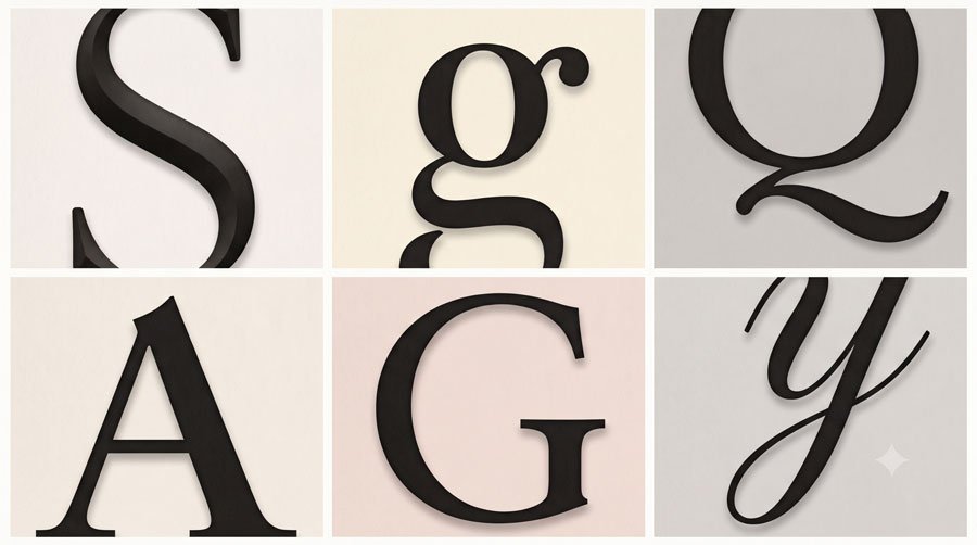
Many specific anatomy terms describe subtleties that give typefaces their character. Examples include the aperture, apex (where two strokes meet at the top in letters such as A and W), the arc of stem, chin on an uppercase G and the spine of an S.
Other details such as the ear on a double‑story g, links and loops in its lower part, overshoots where curved forms extend slightly beyond baselines or cap heights, and tails that finish letters like Q all contribute to how a typeface looks and reads.
Related Topics:
- Gill Sans and Tube: How Johnston and Gill Defined London
- Baskerville and Eaves: A Tale of Perfection, Passion and Revival
- Futura vs. The World: The Geometric Vision of Paul Renner
Uppercase, Lowercase and Small Caps
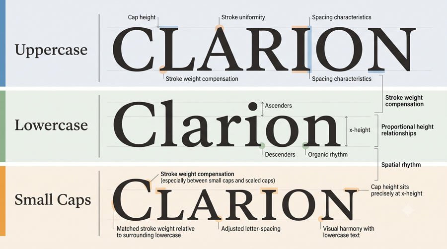
Uppercase and lowercase letters differ not only in size but in structure and proportion and both are essential in the contemporary twenty‑six‑letter Latin alphabet.
Small caps are specially drawn, smaller capital letters designed to harmonize with lowercase text, rather than simply scaled‑down uppercase forms.
Because small caps maintain stroke weight and proportion appropriate for text, they are useful for acronyms, emphasis and other special settings where full‑size capitals would appear too strong.
Related Topics:
- Legibility vs. Readability: What Every Designer Needs to Know
- Secret Life of Symbols: History of Ampersand and Interrobang
- Helvetica – Swiss Modernism’s Ubiquity Crisis
Numerals, Symbols and Special Characters
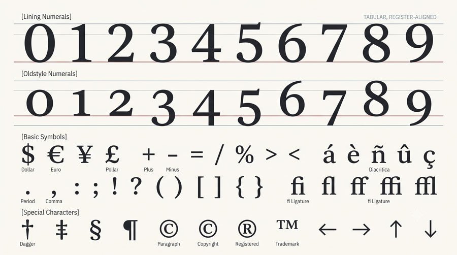
Type anatomy and terminology extend beyond letters to numerals and symbols. Lining figures are numerals drawn with the same height as uppercase letters, often used in tables and settings where vertical alignment is important.
Non‑lining or old‑style figures have varying heights and alignments that echo lowercase forms, making them useful in running text where they blend more comfortably with surrounding letters, alongside symbols, punctuation, ligatures and other glyphs that complete a typeface’s character set.
Related Topics:
- Comic Sans – Accessibility & Gatekeeping Critique
- Gotham – Political Design & Elections Power
- Futura – Geometric Modernism Revolution
Why Knowing Type Anatomy Improves Your Design
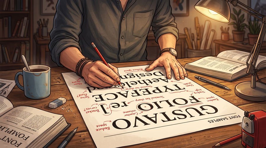
When you know the anatomy of type, you can evaluate typefaces based on their proportions, counters, stroke qualities and details rather than relying on vague impressions.
This helps you match typefaces to text needs, media and moods and gives you language to describe what you want when discussing typography with collaborators or clients.
It also allows you to be more precise in microtypographic refinements—such as adjusting spacing around particular letter combinations or choosing typefaces with features like small caps and alternate numerals that fit your hierarchy and content.
Related Topics:
- Gill Sans – Humanist Alternative Modernism
- Baskerville – Print Excellence & Love Story
- Bodoni – Theatrical Prestige Aesthetics
Conclusion and Next Steps
In this part you learned essential vocabulary for glyphs, characters, measures and letterform parts, grounding your visual decisions in clear terminology.
As you practice, keep naming what you see—stems, counters, apertures, ascenders and more—until the language becomes second nature.
In Part 4 you will build on this foundation by studying how typefaces are classified into major categories like serif, slab serif and sans serif, so you can recognize patterns and choose families more confidently.
Related Topics:
- Garamond – Classical Foundation Principles
- Worst Fonts – Criticism & Gatekeeping Analysis
- Gill Sans & The Tube – Urban Identity Infrastructure
About the Author
Lalit M. S. Adhikari is a Digital Nomad and Educator since 2009 in design education, graphic design and animation. He’s taught 500+ students and created 200+ educational articles on design topics. His teaching approach emphasizes clarity, practical application and helping learners.
Learn more about Lalit Adhikari.
We try to keep the guide updated with the latest information about Adobe Tools and Design Best Practices. Lasted Updated: 15th Aug 2026.
Related Topics:
- Baskerville & Mrs. Eaves – Love, Partnership & Revival
- Futura & Paul Renner – Geometric Vision & Revolution
- Legibility vs. Readability – Typography Fundamentals
- Ampersand & Interrobang – Symbol Histories