

Understand major typeface categories—serifs, slab serifs, and sans serifs—so you can recognize Humanist, Old Style, Modern and more when choosing type.
Table of Contents
Introduction: Why Typeface Categories Matter
After reading our previous parts: 1, 2, 3. Once you can name letterform parts, the next step is understanding how typefaces are grouped into categories so you can navigate the immense variety available.
Classifying typefaces helps you recognize patterns, understand historical roots and make more informed choices based on form and function.
In this post you will learn a practical, beginner‑friendly scheme that focuses on serif and sans serif typefaces—Humanist, Old Style, Transitional, Modern, Egyptian and Clarendon slabs and key sans serif families like Grotesque, Geometric, Humanist and Transitional.
Related Topics:
- How to Choose Typefaces: Selection Principles That Work
- Combining Typefaces and Building Hierarchy
- Spacing, Alignment and the Color of Type
Why Classifying Typefaces Is Useful
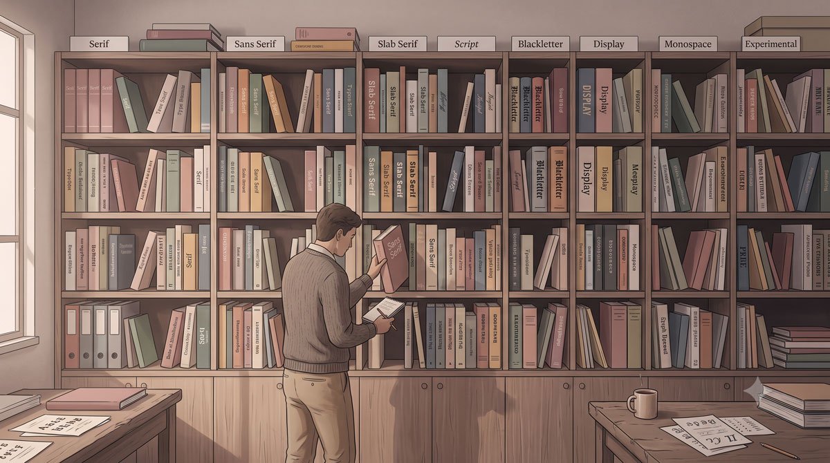
Identifying and organizing more than five hundred years of typography and myriad typefaces is challenging and has been debated by typophiles for decades.
Printers began classification in the nineteenth century to note lineage and style during a time of rapid typeface development and various systems have been proposed based on historical development, formal traits and intended use.
Although no system is perfect and many typefaces overlap categories or escape classification entirely, basic schemes still provide valuable context and descriptive terms that help with general identification and type selection.
Related Topics:
- Baselines, Grids and Advanced Typographic Layouts
- Typography Fundamentals: What Typography Really Is
- Typography in Practice: Type Across Media
Serif Categories: Humanist and Old Style
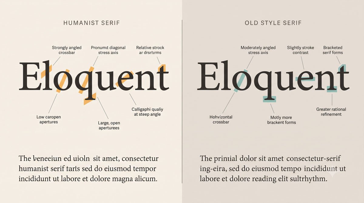
Humanist serifs are considered the original roman typefaces, influenced by Italian handwriting known as lettera antica. They have low thick‑to‑thin stroke contrast, oblique stress in round forms, angled crossbars on lowercase e and bracketed serifs, with early archetypes such as Jenson.
Old Style serifs are more refined, with smoother and rounder forms than Humanist serifs, medium stroke contrast, a horizontal crossbar on the lowercase e, and stress that shifts closer to vertical, as seen in archetypes like Bembo and later examples such as Aldus Nova, Berling, Galliard, Granjon, and Sabon.
Related Topics:
- Type Anatomy: Learn the Language of Letterforms
- Typography
- The Psychology of Typography: Font Influence
Serif Categories: Transitional and Modern
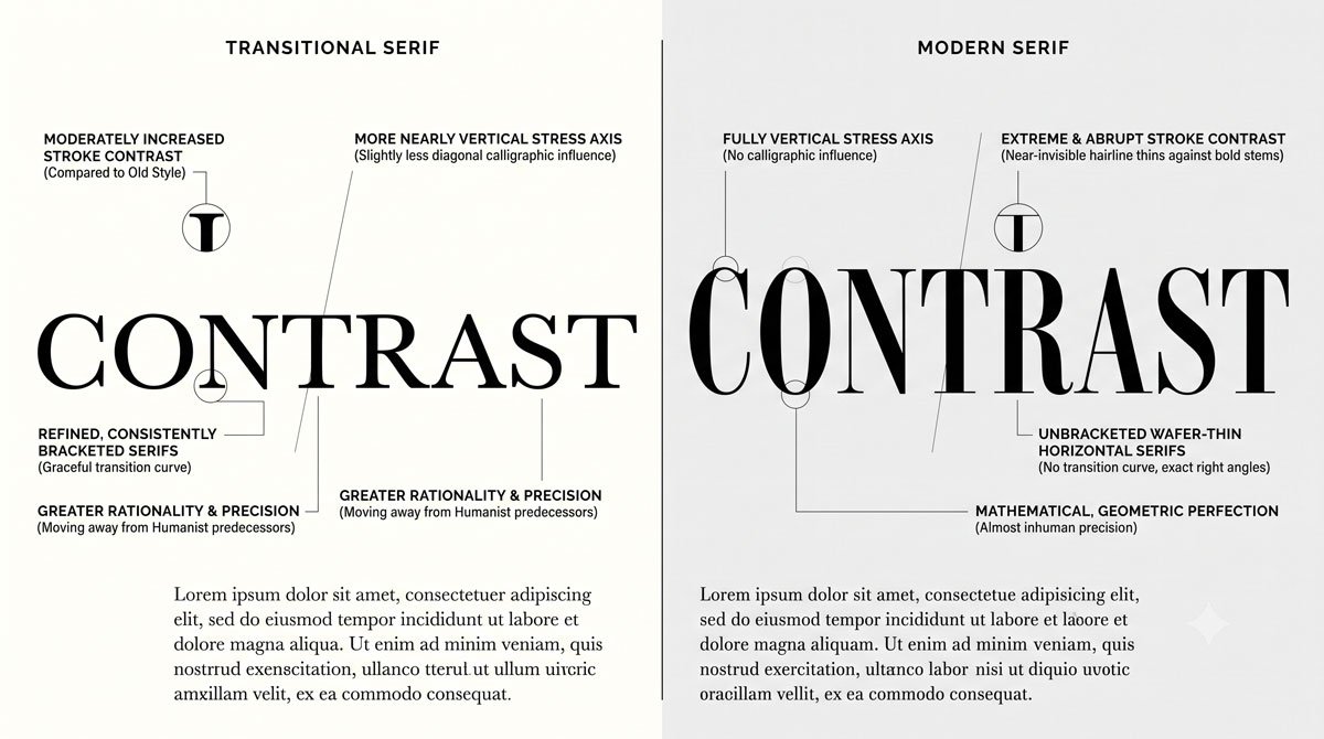
Transitional serifs emerged in the eighteenth century and are inspired partly by engraving, with medium to high thick‑to‑thin stroke contrast and more mechanical construction.
They feature slightly oblique to vertical stress, moderately thin bracketed serifs, round open characters and tall x‑heights, with archetypes like Baskerville and examples such as Arnhem, Bonesana, Fournier, Photina and Whitman.
Modern serifs also appeared in the eighteenth century but push contrast further, with very high thick‑to‑thin stroke contrast, vertical stress, horizontal crossbars on lowercase e, and hairline unbracketed serifs, seen in faces like Didot, Ambroise, Carmen, Eloquent, Moderno and Walbaum.
Related Topics:
- Helvetica Effect: One Font Conquered Global Design
- Comic Sans: True Story Behind the World’s Most Hated Font
- Gotham: Font That Won an Election And Changed Design Forever
Slab Serif Categories: Egyptian and Clarendon
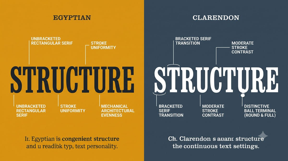
Egyptian slab serif typefaces, which first appeared in the nineteenth century, have very low or uniform stroke contrast and heavy, square unbracketed serifs that make them highly recognizable.
Historically, their weight made them effective as display faces in advertising and contemporary examples like Archer, Caecilia, Calvert, Dispatch and Memphis often include multiple weights and italics that work from body to display sizes.
Clarendon slab serifs also emerged in the nineteenth century and feature bracketed serifs, low stroke contrast, and distinctive round ball terminals on characters such as lowercase c, f and y, as seen in examples like Egizio, Oxtail, Stag, Trilby and Volta.
Related Topics:
- Futura: The Geometric Vision of Paul Renner
- Gill Sans: Eric Gill’s Humanist Masterpiece
- Baskerville: Elegant Serif That Shaped Print Typography
Sans Serif Categories: Grotesque and Geometric
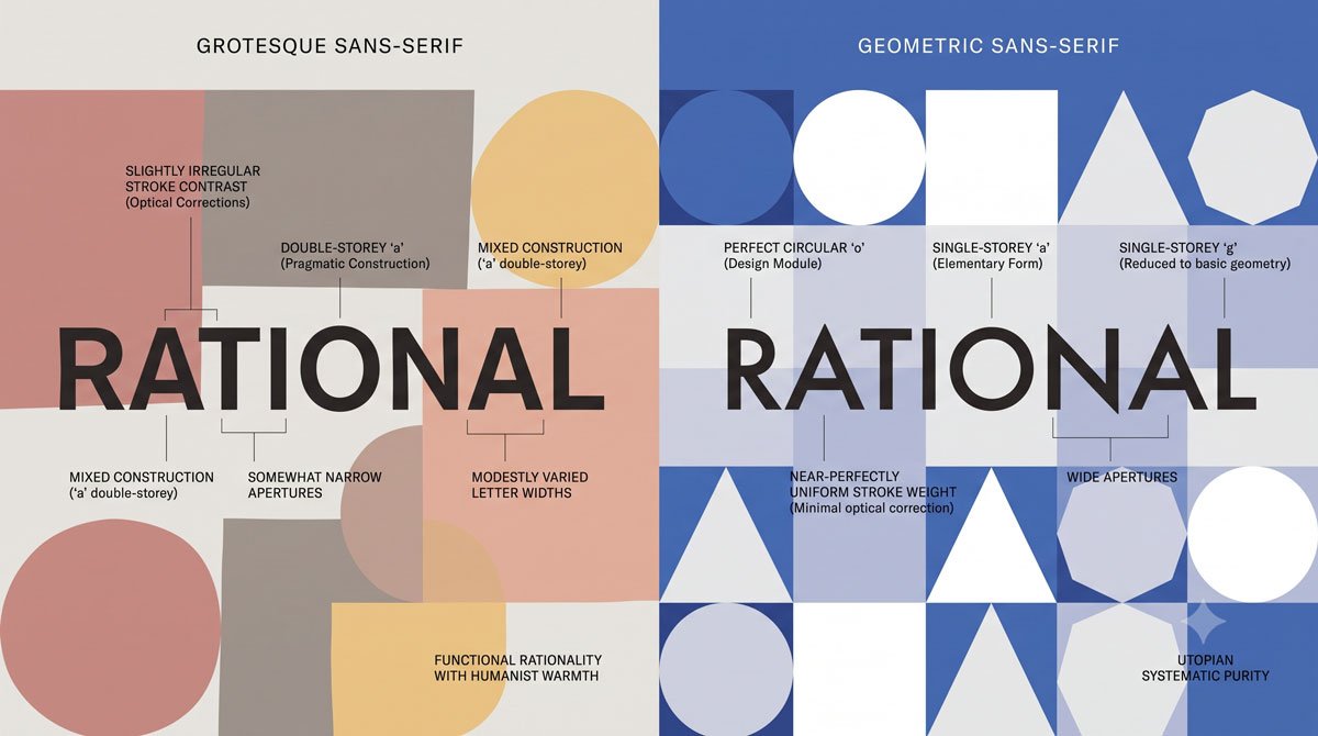
Grotesque sans serifs were the first commercially widespread sans serif typefaces in the late nineteenth and early twentieth centuries.
They show slight to uniform stroke contrast, vertical stress, and curved strokes that often end at an angle in letters like C, with early archetypes such as Akzidenz‑Grotesk and later examples like Basic Commercial, Bell Gothic, Franklin Gothic, Monotype Grotesque and Scheltersche Grotesk.
Geometric sans serifs, which emerged in the twentieth century, are inspired by circles, squares, and triangles, with uniform stroke contrast, vertical stress and forms that feel rational and modular, as seen in Futura and examples such as Avant Garde, Brandon Grotesque, Bryant, Mostra Nuova and Neutraface.
Related Topics:
- Bodoni Font: Serif That Defined Luxury Typography
- Garamond: Timeless Serif That Defined Classical Typography
- The Worst Fonts in the World: A Typographic Hall of Shame
Sans Serif Categories: Humanist and Transitional
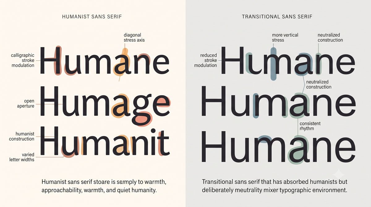
Humanist sans serifs also appeared in the twentieth century and take inspiration from Humanist serifs, showing very low or uniform stroke contrast with a subtle calligraphic influence.
They often feature slight oblique stress and true italics that differ structurally from their romans, with examples such as Agenda, Elido, Leska, Mr Eaves and Neue Sans.
Transitional sans serifs, including archetypes like Univers and Helvetica, began as refreshed Grotesques from the mid‑twentieth century onward, featuring uniform stroke contrast, vertical stress, neutral personality and curved strokes that end horizontally rather than at an angle, with many families offering multiple weights and widths.
Related Topics:
- Gill Sans and Tube: How Johnston and Gill Defined London
- Baskerville and Eaves: A Tale of Perfection, Passion and Revival
- Futura vs. The World: The Geometric Vision of Paul Renner
Seeing Personality Through Categories
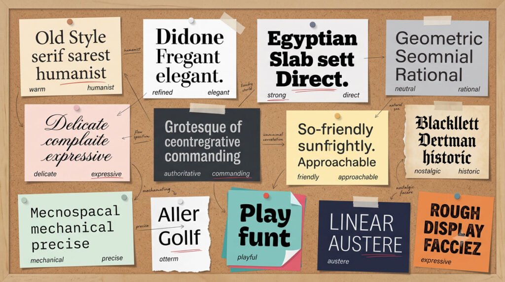
Each category suggests not only structural traits but a particular personality. Humanist and Old Style serifs often feel warm and bookish, Transitional and Modern serifs can appear more formal or refined and slabs may convey strength or friendliness depending on details like bracketed versus unbracketed serifs.
Grotesque and Geometric sans serifs lean toward industrial or rational moods, while Humanist and Transitional sans serifs may read as more neutral, adaptable or subtly humanistic, which is why they are popular choices for contemporary branding and interfaces.
Related Topics:
- Legibility vs. Readability: What Every Designer Needs to Know
- Secret Life of Symbols: History of Ampersand and Interrobang
- Helvetica – Swiss Modernism’s Ubiquity Crisis
Using Categories When Choosing Type
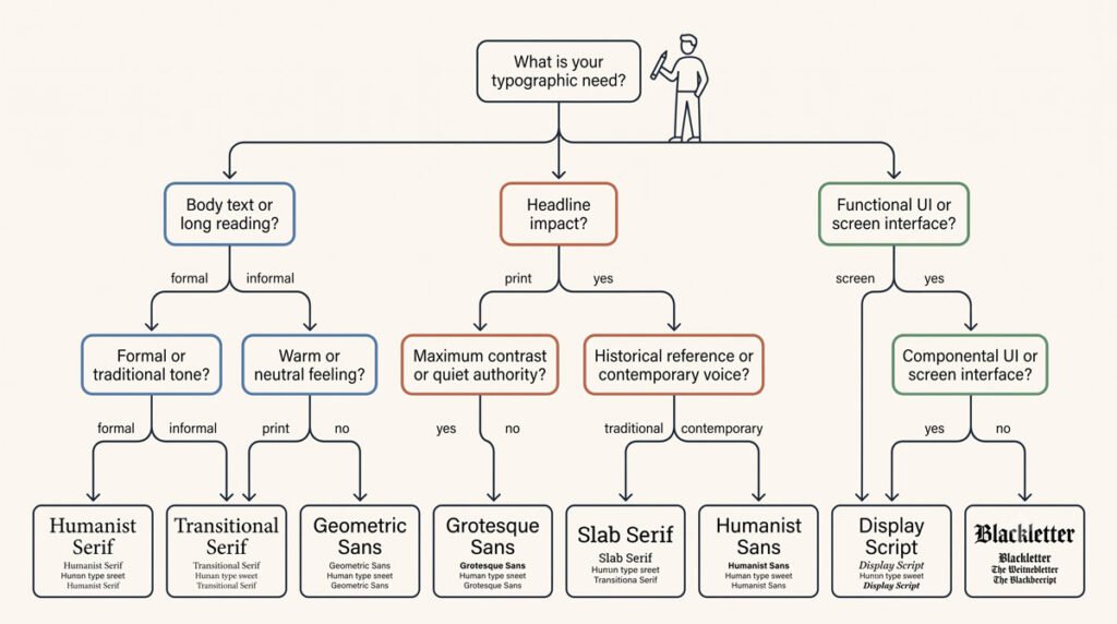
When you choose typefaces, categories help you narrow options and anticipate how a typeface will behave in text. You might look to a robust Transitional or Humanist serif for extended reading, a strong slab serif for headlines that need impact or a neutral Transitional sans serif when you want versatility across many applications.
Knowing which category a typeface belongs to also helps you pair faces more intelligently, which you will explore further when we turn to selection and combinations in later posts.
Related Topics:
- Comic Sans – Accessibility & Gatekeeping Critique
- Gotham – Political Design & Elections Power
- Futura – Geometric Modernism Revolution
Conclusion and Next Steps
In this part you learned a practical classification scheme focusing on serif, slab serif and sans serif categories and how their structures and histories feed into distinctive personalities.
As you review typefaces, try to identify their category based on stroke contrast, stress, serifs and overall construction.
In Part 5 you will move from recognizing categories to actually selecting typefaces for specific texts, media and moods, using flexible principles that help you make appropriate typographic choices.
Related Topics:
- Gill Sans – Humanist Alternative Modernism
- Baskerville – Print Excellence & Love Story
- Bodoni – Theatrical Prestige Aesthetics
About the Author
Lalit M. S. Adhikari is a Digital Nomad and Educator since 2009 in design education, graphic design and animation. He’s taught 500+ students and created 200+ educational articles on design topics. His teaching approach emphasizes clarity, practical application and helping learners.
Learn more about Lalit Adhikari.
We try to keep the guide updated with the latest information about Adobe Tools and Design Best Practices. Lasted Updated: 15th Aug 2026.
Related Topics:
- Garamond – Classical Foundation Principles
- Worst Fonts – Criticism & Gatekeeping Analysis
- Gill Sans & The Tube – Urban Identity Infrastructure
- Baskerville & Mrs. Eaves – Love, Partnership & Revival
- Futura & Paul Renner – Geometric Vision & Revolution
- Legibility vs. Readability – Typography Fundamentals
- Ampersand & Interrobang – Symbol Histories