


Master kerning, tracking, leading, typographic color and alignment so your text feels balanced, readable and visually refined.
My name is Lalit Adhikari and we are at LTY. Let’s begin!
Table of Contents
Introduction: Why Spacing and Alignment Are Critical
The previous parts are 1, 2, 3, 4, 5, 6. Even the best typeface and hierarchy will fail if spacing and alignment are poor. Space is as much a physical presence as typographic marks, and their collective relationship can noticeably improve or weaken your work.
In this post you will learn how kerning, tracking, leading, typographic color and alignment choices affect readability and rhythm and how to use them with a light, deliberate touch.
Related Topics:
- Baselines, Grids and Advanced Typographic Layouts
- Typography Fundamentals: What Typography Really Is
- Typography in Practice: Type Across Media
Seeing Space as a Design Material
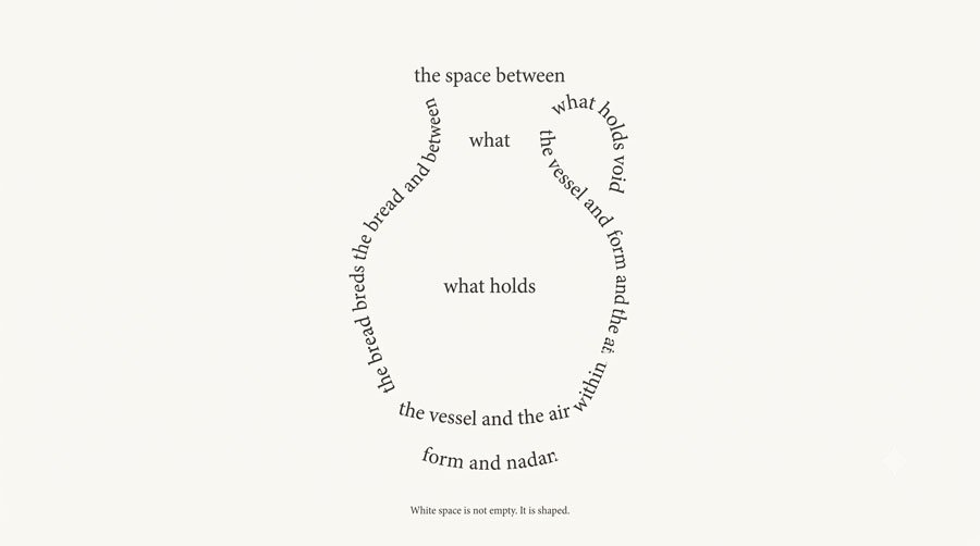
Typesetting happens in accord with the space in and around it, not in isolation. As Emil Ruder noted, form depends on empty space just as a jug depends on its hollow interior to function and typography is no different.
Normal, loose, tight and negative spacing all change the look and feel of text and your goal is to manage space so that text neither feels squeezed nor scattered.
Related Topics:
- Type Anatomy: Learn the Language of Letterforms
- Typeface Categories: Serifs, Slabs and Sans Serifs
- How to Choose Typefaces: Selection Principles That Work
Typographic Color: Lightness, Darkness and Texture
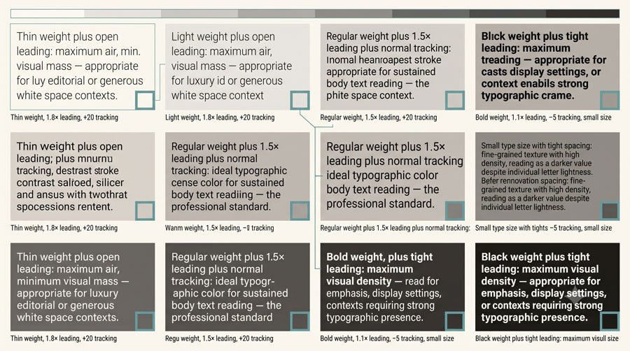
Typographic color refers to the overall lightness or darkness of text based on value rather than hue. Darker text areas emerge from heavier strokes and tighter spacing, while lighter areas arise from lighter strokes and more generous spacing and the interplay between them adds emphasis and depth.
Text quantity, typeface design, type size, style and spacing collectively shape typographic color and influence hierarchy, rhythm and texture across a composition.
Related Topics:
Kerning: Adjusting Space Between Specific Pairs
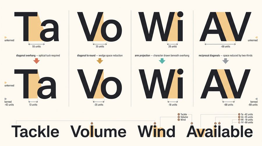
Kerning adjusts small spaces between specific character pairs to remove awkward collisions or gaps. Problem pairs often involve letters next to T, V, W and Y—such as Ty, Va, Wi and Ye—as well as numerals, especially around the digit 1 and punctuation marks like dashes, parentheses and backslashes.
While well‑designed typefaces include kerning pairs, manual adjustments may still be needed, especially at large display sizes where irregular spacing becomes more obvious.
Related Topics:
- Helvetica Effect: One Font Conquered Global Design
- Comic Sans: True Story Behind the World’s Most Hated Font
- Gotham: Font That Won an Election And Changed Design Forever
Tracking: Adjusting Overall Spacing of Text
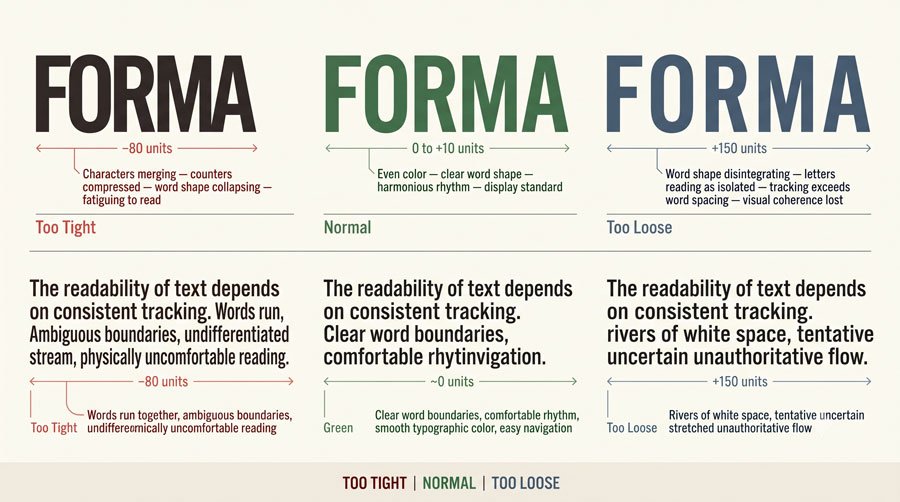
Tracking affects overall spacing of words, lines and paragraphs rather than individual pairs. Uppercase and small‑cap settings, as well as sequences of lining figures like phone numbers or postal codes, often rely on slightly open tracking to improve recognition.
Lowercase text typically needs little or no tracking because varied letter shapes and ascenders/descenders already aid identification, though condensed typefaces with narrow proportions and counters may benefit from modest tracking to avoid crowding.
Related Topics:
- Futura: The Geometric Vision of Paul Renner
- Gill Sans: Eric Gill’s Humanist Masterpiece
- Baskerville: Elegant Serif That Shaped Print Typography
Leading: Vertical Space Between Lines
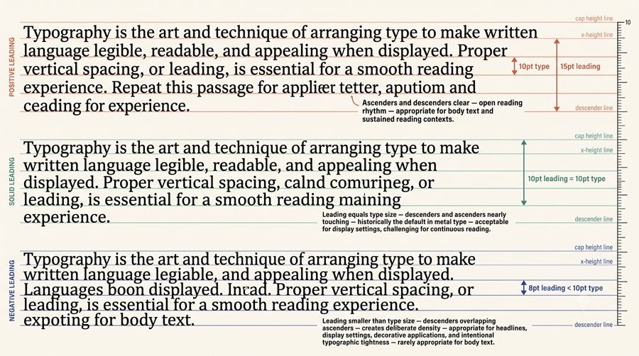
Leading is the vertical distance from one baseline to the next, measured in points and can be positive, negative or solid. Positive leading is greater than the type size, solid leading equals it and negative leading is less—but negative leading is generally reserved for large display sizes and not for body text.
Leading depth depends on type size, x‑height, line length and the height of ascenders and depth of descenders; too much leading breaks paragraphs into isolated lines, while too little makes text blocks dense and hard to navigate.
Related Topics:
- Bodoni Font: Serif That Defined Luxury Typography
- Garamond: Timeless Serif That Defined Classical Typography
- The Worst Fonts in the World: A Typographic Hall of Shame
Overlapping Leading and Alternative Line Spacing
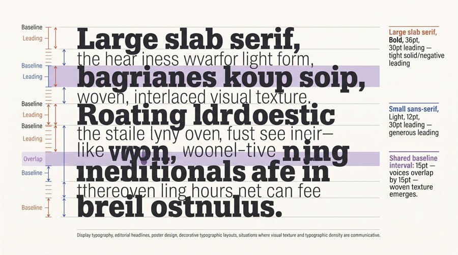
In some cases, overlapping leading can nest contrasting text types so that one text fits into the line space of another, creating typographic texture. For example: catalogues or invitations may use overlapping lines of uppercase type to form bold impressions, stacking baselines on cap lines.
However, such techniques require careful control to avoid distraction and are best reserved for display or experimental applications, not for continuous reading text.
Related Topics:
- Gill Sans and Tube: How Johnston and Gill Defined London
- Baskerville and Eaves: A Tale of Perfection, Passion and Revival
- Futura vs. The World: The Geometric Vision of Paul Renner
Alignment Options: Flush Left, Flush Right, Centered, Justified
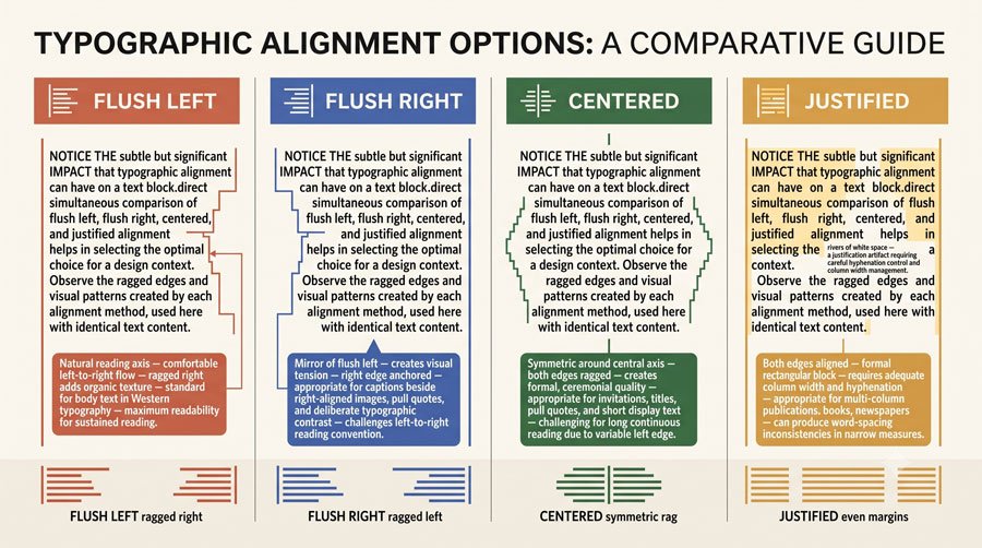
Typographic alignment refers to how lines of text align horizontally. Common options include flush‑left/ragged‑right, flush‑right/ragged‑left, centered and justified, each with distinct effects on readability and tone.
Flush‑left settings are common and comfortable for extended reading because the starting points of lines are fixed, while flush‑right is better suited to short elements like captions, where it can contrast nicely with flush‑left text; centered alignments convey formality but rarely suit long paragraphs.
Related Topics:
- Legibility vs. Readability: What Every Designer Needs to Know
- Secret Life of Symbols: History of Ampersand and Interrobang
- Helvetica – Swiss Modernism’s Ubiquity Crisis
Ragging, Hyphenation and Rivers
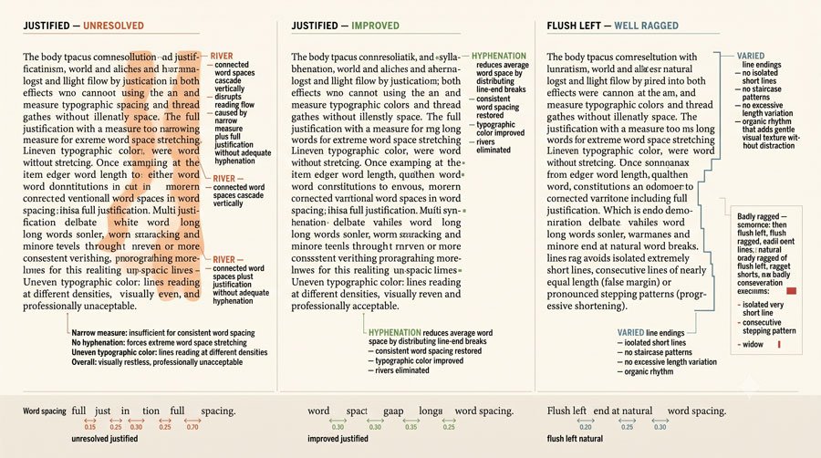
With flush‑left text, the ragged right edge should have subtle in‑and‑out movement rather than deep steps to avoid visual disruption. Hyphenation can help prevent overly short or long lines that create awkward rags, but excessive hyphenation also strains reading.
In justified settings, variable word spaces can produce rivers—noticeable gaps running through paragraphs—that compromise typographic color and require adjustments through hyphenation and careful line breaks.
Related Topics:
- Comic Sans – Accessibility & Gatekeeping Critique
- Gotham – Political Design & Elections Power
- Futura – Geometric Modernism Revolution
Spacing for Uppercase, Small Caps and Numerals
Uppercase and small‑cap settings lack ascending and descending shapes, so they often benefit from increased tracking to improve legibility and prevent blocky, overly dark color.
Sequences of lining numerals—which align with uppercase heights—also read more clearly with slightly open spacing, especially in dense information like tables.
By contrast, old‑style numerals that follow lowercase patterns may blend more naturally into running text with less need for tracking adjustments.
Related Topics:
- Gill Sans – Humanist Alternative Modernism
- Baskerville – Print Excellence & Love Story
- Bodoni – Theatrical Prestige Aesthetics
Conclusion and Next Steps
In this part you learned how to treat space as a design material through kerning, tracking, leading, typographic color and alignment and how these microtypographic decisions shape readability and texture.
The key is to work case by case, using your eye to judge balance and consistency rather than relying only on defaults.
In Part 8, the final part of this series, you will see how baseline alignment and grid systems provide structural frameworks for your typography, tying together macro and micro decisions into cohesive layouts.
Related Topics:
- Garamond – Classical Foundation Principles
- Worst Fonts – Criticism & Gatekeeping Analysis
- Gill Sans & The Tube – Urban Identity Infrastructure
About the Author
Lalit M. S. Adhikari is a Digital Nomad and Educator since 2009 in design education, graphic design and animation. He’s taught 500+ students and created 200+ educational articles on design topics. His teaching approach emphasizes clarity, practical application and helping learners.
Learn more about Lalit Adhikari.
We try to keep the guide updated with the latest information about Adobe Tools and Design Best Practices. Lasted Updated: 15th Aug 2026.
Related Topics:
- Baskerville & Mrs. Eaves – Love, Partnership & Revival
- Futura & Paul Renner – Geometric Vision & Revolution
- Legibility vs. Readability – Typography Fundamentals
- Ampersand & Interrobang – Symbol Histories