


Discover how baseline alignment, single and multi‑column grids and modular systems bring order, consistency and flexibility to your typographic layouts.
My name is Lalit Adhikari and we are at LTY. Let’s begin!
Table of Contents
Introduction: Structure for Confident Typography
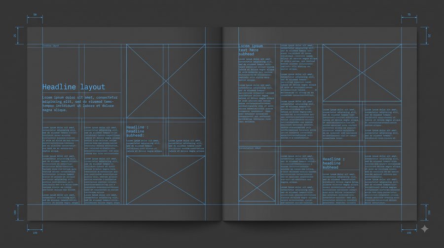
The previous parts are 1, 2, 3, 4, 5, 6, 7. Up to this point, you have focused on letterforms, typefaces, combinations and microtypography. To tie everything together, you need robust structural systems that organize content and support consistent typographic decisions.
In this final part you will explore baseline alignment and grid systems—single‑column, multi‑column and modular grids—along with alternate structures, so you can design layouts that feel ordered yet flexible.
Related Topics:
- Typography Fundamentals: What Typography Really Is
- Typography in Practice: Type Across Media
- Type Anatomy: Learn the Language of Letterforms
Baseline Alignment: Creating Vertical Rhythm
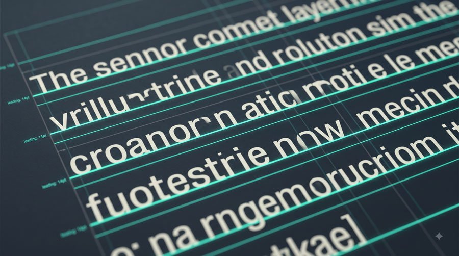
Baselines are imaginary lines on which letterforms, words, lines and paragraphs sit. A baseline alignment system is a set of horizontal guides at equally spaced vertical intervals that underlies typographic layouts and designates related positions for all text regardless of point size.
When body text leading sets the interval—for example, using a 12‑point baseline grid for 12‑point leading—all type aligns to these guides, creating vertical rhythm and typographic unity across pages.
Related Topics:
- Typeface Categories: Serifs, Slabs and Sans Serifs
- How to Choose Typefaces: Selection Principles That Work
- Combining Typefaces and Building Hierarchy
How Baseline Grids Support Layout Decisions
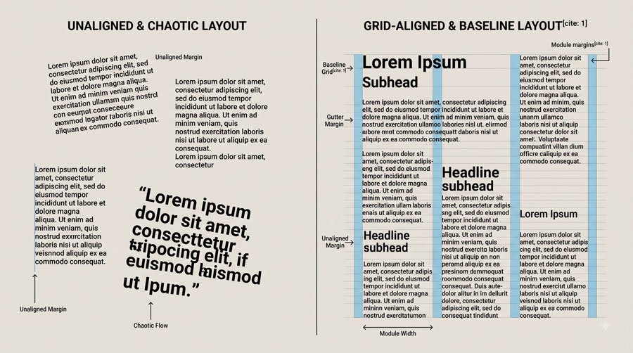
Baseline alignment systems make it easier to control positions and refine alignments because lines of type back up from page to page when viewed one atop another.
They influence not only text placement but also margin sizes, module heights in grids and positions of accompanying elements like images and illustrations.
By tying leading choices for headings, subheads and other text to multiples of the baseline interval, you create predictable, harmonious relationships that improve both structure and reading comfort.
Related Topics:
- Spacing, Alignment and the Color of Type
- The Psychology of Typography: Font Influence
- Helvetica Effect: One Font Conquered Global Design
Single‑Column Grids: Framing Continuous Text
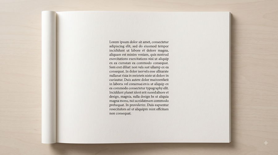
Single‑column grids are simple structures suited to works with continuous text, such as journals, novels and text‑rich blogs. They focus on framing a central text block with margins—left and right, top and bottom, inner and outer—that define the active area and provide white space.
Wide margins help maintain reader focus and create open environments with breathing room, while smaller margins extend active layout space and can introduce tension by placing text closer to edges, which may suit certain projects.
Related Topics:
- Comic Sans: True Story Behind the World’s Most Hated Font
- Gotham: Font That Won an Election And Changed Design Forever
- Futura: The Geometric Vision of Paul Renner
Multi‑Column Grids: Flexibility for Complex Content
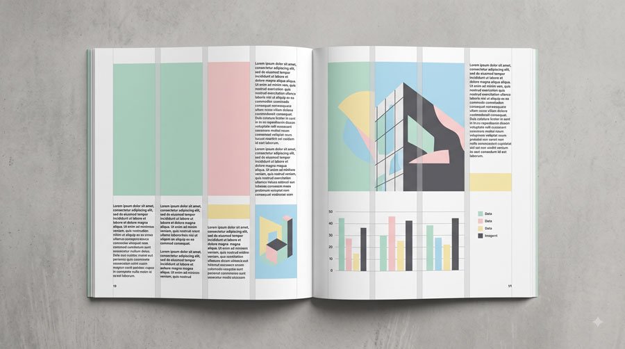
Multi‑column grids, which may range from two to eight or more columns, are suited to projects with diverse text and visual elements like images, charts and tables.
Columns are vertical guides that split space into segments framed by margins and separated by gutters, which are thin channels of white space that prevent collisions between adjacent elements.
A typical gutter measure equals body‑text leading or the baseline interval, and too many columns can hinder decisiveness while too few restrict versatility, so the number and width of columns should match content needs.
Related Topics:
- Gill Sans: Eric Gill’s Humanist Masterpiece
- Baskerville: Elegant Serif That Shaped Print Typography
- Bodoni Font: Serif That Defined Luxury Typography
Modular Grids: Rows, Columns and Modules

Modular grids extend multi‑column systems by adding horizontal divisions, creating equally distributed modules both vertically and horizontally. Modules are active spaces where type and other elements reside and can be combined to form larger zones that span multiple rows and columns.
Module proportions may be informed by average line length, leading, key image dimensions or baseline intervals and the right balance between number of modules and design freedom helps avoid both rigidity and indecision.
Related Topics:
- Garamond: Timeless Serif That Defined Classical Typography
- The Worst Fonts in the World: A Typographic Hall of Shame
- Gill Sans and Tube: How Johnston and Gill Defined London
Grids in Practice: Consistency Across Pages and Media
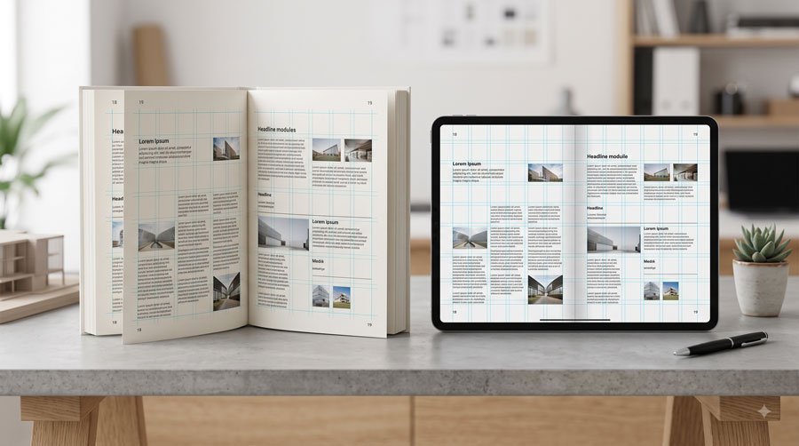
Grids guide typographic layouts by promoting clarity, connection and balance. For example, a simple three‑column grid can support a content‑rich website, allowing elements to rest in one column or span multiple columns, while a baseline alignment system ensures that text shares common vertical positions.
Books and other multi‑page works benefit from consistent grid structures that align text and images from spread to spread, as seen in interiors built on eight‑column grids accommodating both type and photographs in faces such as Memphis and a complementary sans serif.
Related Topics:
- Baskerville and Eaves: A Tale of Perfection, Passion and Revival
- Futura vs. The World: The Geometric Vision of Paul Renner
- Legibility vs. Readability: What Every Designer Needs to Know
Alternate Structures: Radial, Rotational and Geometric Layouts
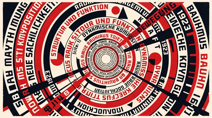
Not all typographic layouts follow rectilinear grids; some employ alternate structures inspired by geometric shapes such as circles, rectangles or squares. Radial structures allow lines of type to extend from and revolve around a central core, while rotational layouts use concentric circles where all type shares a common centre.
These complex structures can create dynamic first impressions and are well suited to projects where artistry or expression is the primary function, but they require typographic expertise to avoid sacrificing legibility or typeface integrity.
Related Topics:
- Secret Life of Symbols: History of Ampersand and Interrobang
- Helvetica – Swiss Modernism’s Ubiquity Crisis
- Comic Sans – Accessibility & Gatekeeping Critique
Balancing Structure and Freedom
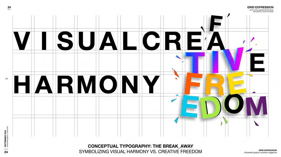
In discussing grid systems, Paul Rand emphasized that grids do not automatically ensure exciting solutions and must be interpreted as freely as necessary. Grids are tools to achieve harmony and order, but designers must be willing to bend or break them when doing so better serves the text and communication goals.
Flexible grids accommodate diverse typographic elements across media and intelligent use of structure adds richness and surprise rather than rigidity.
Related Topics:
- Gotham – Political Design & Elections Power
- Futura – Geometric Modernism Revolution
- Gill Sans – Humanist Alternative Modernism
Putting It All Together: From Fundamentals to Practice

When you combine baseline alignment, grid systems, thoughtful type choices, careful spacing and clear hierarchy, you create typographic layouts that feel both structured and alive.
Baselines and grids provide invisible scaffolding; type categories, selection principles, combinations and microtypography refine the experience within that structure.
As you continue to design, revisit these fundamentals from the whole series, test them in your projects and refine them through practice and observation across print, digital and environmental typography.
Related Topics:
- Baskerville – Print Excellence & Love Story
- Bodoni – Theatrical Prestige Aesthetics
- Garamond – Classical Foundation Principles
Conclusion and Soft Call‑to‑Action
This final part introduced baseline alignment, single‑column, multi‑column and modular grids, as well as alternate methods that expand your typographic possibilities.
Together with the previous posts, you now have a foundation spanning definition, practice, anatomy, classification, selection, combinations, spacing and structure.
Use this series as a field guide when planning your next typography‑driven project: analyse your content, set up a grid and baseline system, choose appropriate typefaces, refine spacing and hierarchy and keep exploring typography as a lifelong craft.
Related Topics:
- Worst Fonts – Criticism & Gatekeeping Analysis
- Gill Sans & The Tube – Urban Identity Infrastructure
- Baskerville & Mrs. Eaves – Love, Partnership & Revival
About the Author
Lalit M. S. Adhikari is a Digital Nomad and Educator since 2009 in design education, graphic design and animation. He’s taught 500+ students and created 200+ educational articles on design topics. His teaching approach emphasizes clarity, practical application and helping learners.
Learn more about Lalit Adhikari.
Related Topics:
- Futura & Paul Renner – Geometric Vision & Revolution
- Legibility vs. Readability – Typography Fundamentals
- Ampersand & Interrobang – Symbol Histories
- Typography