

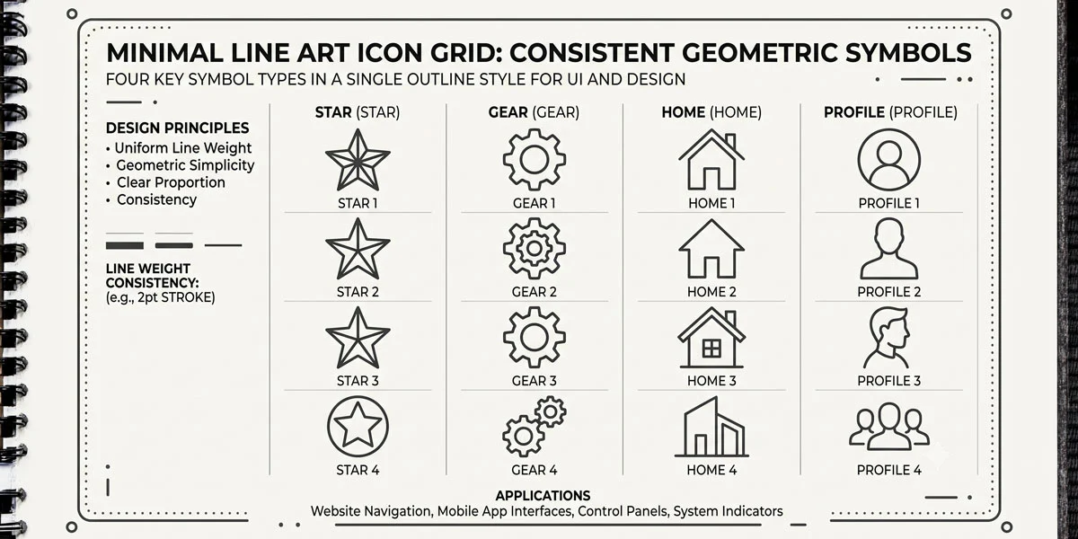
In Parts 1 and 2, we covered colors and fonts — now Part 3 of this series tackles icons, an element that seems simple but quietly ruins many junior UI projects when handled inconsistently. Icons feel like small details but they’re one of the fastest ways to make (or break) a polished interface.
My name is Lalit Adhikari and we are at LTY. Let’s begin!
Table of Contents
The One Icon Set Rule
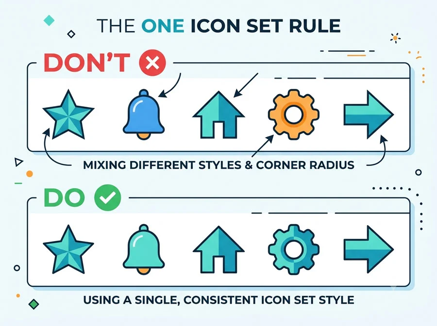
Only use one icon set per project. Mixing and matching icons between different sets creates ugly inconsistencies that are immediately noticeable, even if viewers can’t articulate why. You can choose either outline icons or filled icons as your base style.
Outline vs. Filled: When Mixing Is Allowed
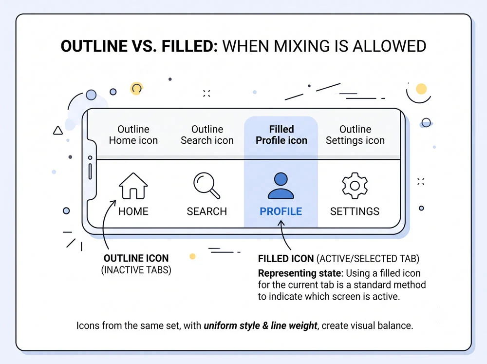
The only acceptable exception to mixing outline and filled icons is using a filled version of an icon to signify a selected or active menu item within an otherwise outlined set. Never mix outlined and filled icons for elements of equal status, such as two unselected tabs sitting side by side.
Consistency in Practice

In the book’s example screen, only filled icons are used at one consistent size — with a single intentional exception where hotel star icons are 120% larger to signal importance. This uniformity is what makes the interface feel polished rather than random.
Recommended Icon Sets
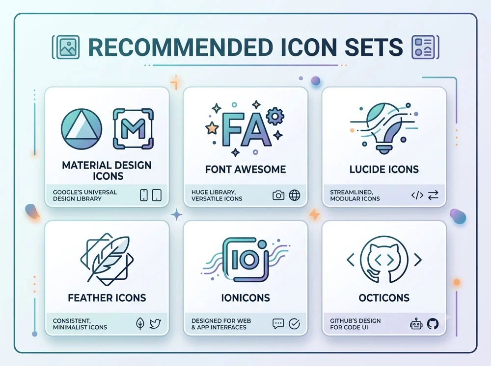
A go-to recommendation is Tabler Icons, a free set offering both filled and outlined styles. Other safe alternatives include:
- Iconoir
- Remix Icon
- Phosphor Icons
- Untitled UI Icons
- Unicons (via IconScout)
Picking one set and sticking with it across all your projects for your first year or two removes one more variable to worry about.
How to Check If an Icon Set Is Actually Consistent
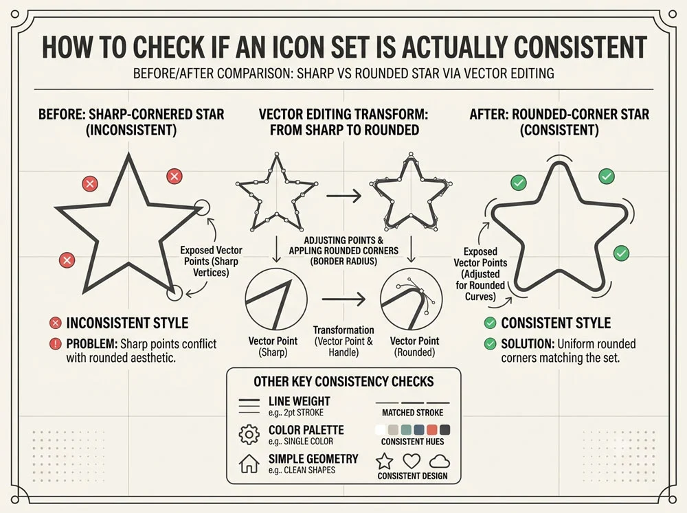
If you use a set that’s not on the recommended list, check whether icons within it visually match each other. For example, a sharp-cornered star icon paired with a rounded cog icon creates a mismatch, since one feels sharp and the other feels friendly and rounded. You can fix this manually by entering vector editing mode, selecting the icon’s edges and rounding the corners to match the rest of your set.
Icons might seem minor, but consistency here is what separates amateur-looking screens from polished ones. In Part 4, we’ll tackle spacing — the element most junior designers get wrong by cramming too much onto one screen. Try auditing your current project’s icons for consistency before moving on.
About the Author
Lalit M. S. Adhikari is a Digital Nomad and Educator since 2009 in design education, graphic design and animation. He’s taught 500+ students and created 200+ educational articles on design topics. His teaching approach emphasizes clarity, practical application and helping learners.
Learn more about Lalit Adhikari.