

We’ve covered colors, fonts, icons and spacing across this series — now in this final Part 5, we tie everything together with hierarchy, the concept that determines how people actually process your screen, plus a practical roadmap for improving your skills.
My name is Lalit Adhikari and we are at LTY. Let’s begin!
Table of Contents
What Is UI Hierarchy?
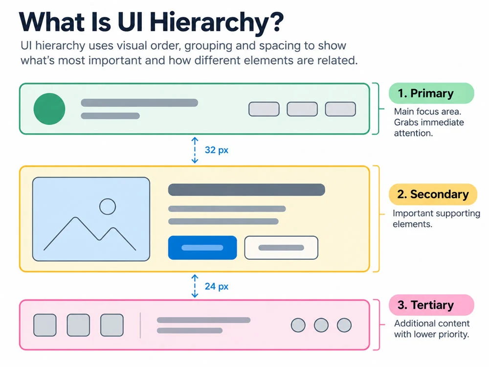
Hierarchy is the guiding force behind how we process layouts — in simpler terms, how we make sense of everything on a screen. Experienced designers apply correct hierarchy almost instinctively, but as a beginner, you benefit from a structured exercise.
Related Topics:
- UI Color Rules Every Junior Designer Needs (Part 1)
- Choosing UI Fonts as a Beginner: Sizes & Typefaces (Part 2)
- UI Icon Rules: Consistency Matters Most (Part 3)
The Gestalt Law of Proximity
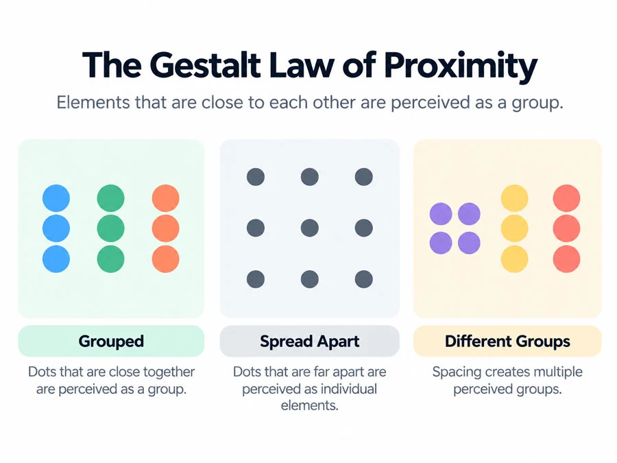
Hierarchy is grounded in the first Gestalt Law designers should focus on: proximity. This law states that objects placed close together are automatically perceived as one group, while objects placed farther apart appear unrelated. This is the same underlying principle behind the spacing rules covered in Part 4 of this series.
Related Topics:
- UI Spacing Rules: Master the 8-Point Grid (Part 4)
- UI UX Glossary Part 1: 20 Essential UI Terms Every Designer Must Know
- UI UX Glossary Part 2: 25 Core UX Terms, Laws and Principles Explained
The Hierarchy Strips Method
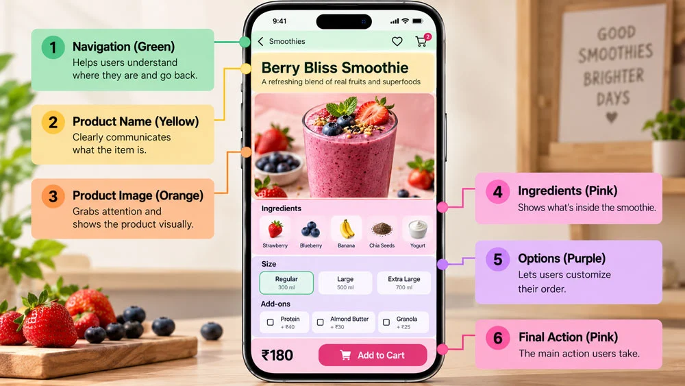
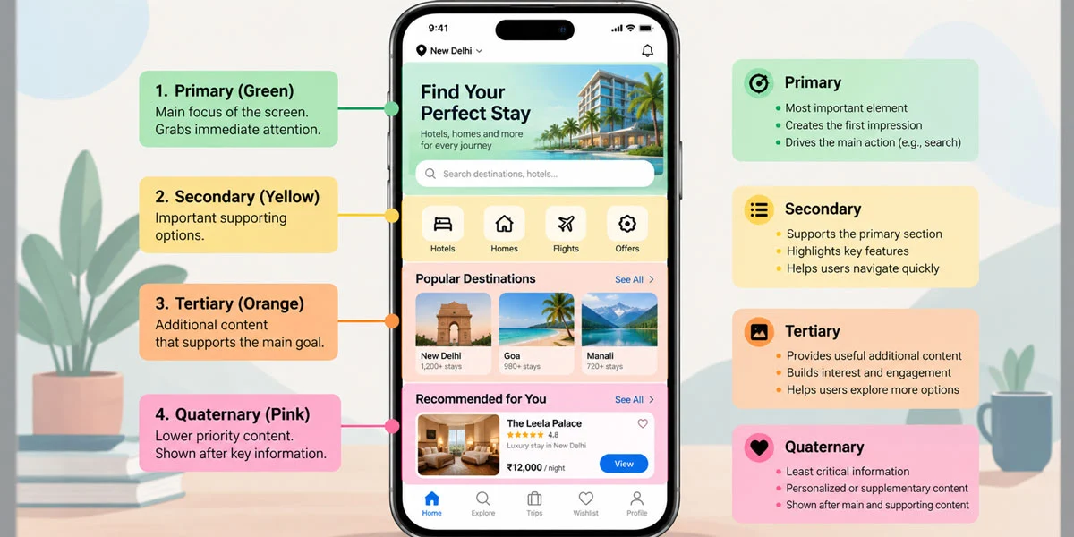
To apply hierarchy strips, you assign colored bars to each major content group on a screen, starting from the top (green) and moving progressively toward red at the bottom. If we consider a hotel app example, groups can be annotated in this order: Navigation, “Where are we?”, Categories, Product info and Decision-making info.
In a smoothie app example, the annotated groups include:
- Main navigation — so the user is never lost
- The “what” — product name displayed big and clear
- The “juicy visual” — an image that convinces users they need the product
- Extra info — a scrollable ingredients list
- Provide options — letting users personalize their choice
- Final action — the specific behavior you want the user to take
This division can happen at the sketching stage, even before drawing actual UI rectangles — think through your groups and their spacing first, then assemble the design. Lack of hierarchy, caused by visually or functionally different groups sitting too close together, is one of the most common issues designers face.
Related Topics:
What to Skip as a Beginner
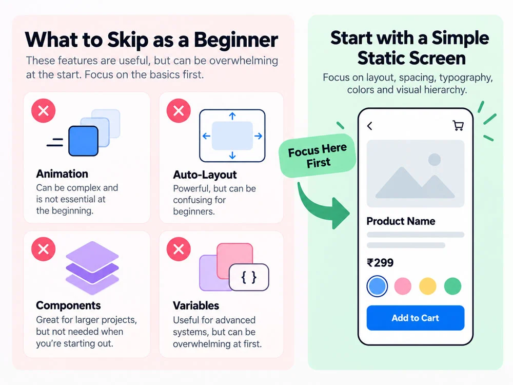
Several trendy Figma features are worth delaying until your fundamentals are solid:
- Smart Animate animations — flashy in demos, but rarely how production animation actually works; master static design first
- Auto-Layout — learn manual layout first so you develop an “eye” for spotting when layouts fail, since auto-layout doesn’t automatically guarantee good alignment
- Components — valuable once your UI already looks good, but slower to use while you’re still learning how elements work together
- Variables — unnecessary before you’re working on full design systems; your priority is making one solid mobile screen first
How to Actually Practice UI Design
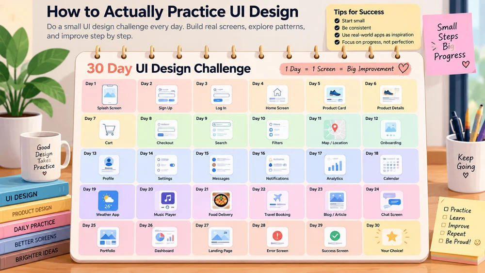
The most effective practice method is recreating common UI patterns, starting simple and gradually increasing difficulty. One specific, proven approach is completing one UI design challenge every day for 2–3 months, which is enough sustained time to see real progress. Treating design as a daily habit rewires how your brain approaches problems, making new knowledge easier to absorb over time.
Think in Terms of “Why,” Not Just “Looks Nice”
Beyond daily practice, constantly ask why each UI element exists on the screen. Beginners tend to add elements simply because they look nice — but that’s art, not design and it’s not the mindset this series is meant to build.
This wraps up our five-part series: colors, fonts, icons, spacing and now hierarchy with a practice roadmap. If you go back through Parts 1 through 4 and apply each constraint consistently on your next project, you’ll notice a real jump in how polished and professional your UI work feels.
About the Author
Lalit M. S. Adhikari is a Digital Nomad and Educator since 2009 in design education, graphic design and animation. He’s taught 500+ students and created 200+ educational articles on design topics. His teaching approach emphasizes clarity, practical application and helping learners.
Learn more about Lalit Adhikari.
Last Updated: Oct 2026