

So far in this series we’ve covered colors, fonts and icons — now Part 4 addresses spacing, an area where even visually “nice” screens with good fonts and matching icons can still fail badly. If your layout feels cramped or hard to scan despite looking polished, spacing is almost always the culprit.
My name is Lalit Adhikari and we are at LTY. Let’s begin!
Table of Contents
Why Cramming Content Fails

A screen can have great fonts, proper icons and matching photos, yet still feel wrong if everything is packed too close together. When elements sit too near each other, your brain processes the entire screen as one complex, undifferentiated group instead of clear sections.
Related Topics:
- UI Hierarchy & How to Practice Design (Part 5)
- UI Color Rules Every Junior Designer Needs (Part 1)
- Choosing UI Fonts as a Beginner: Sizes & Typefaces (Part 2)
Whitespace Isn’t Wasted Space
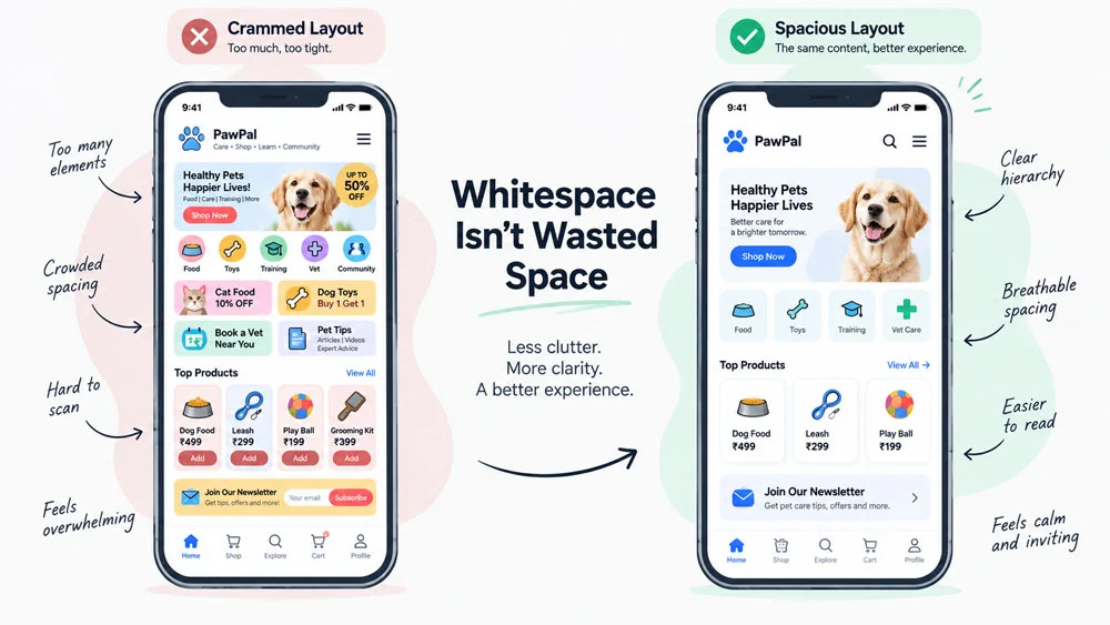
Whitespace — the empty space between elements — is essential for a readable interface, yet most junior designers avoid it because they feel pressured to fit as much content as possible onto one screen. This instinct is wrong.
People are accustomed to scrolling, often for hours daily on social media, so scrolling is not a problem to avoid. Condensed layouts may fit more content, but they’re much harder to read and process; always leave enough space for natural groups to form.
Related Topics:
- UI Icon Rules: Consistency Matters Most (Part 3)
- UI UX Glossary Part 1: 20 Essential UI Terms Every Designer Must Know
- UI UX Glossary Part 2: 25 Core UX Terms, Laws and Principles Explained
The 8-Point Grid System
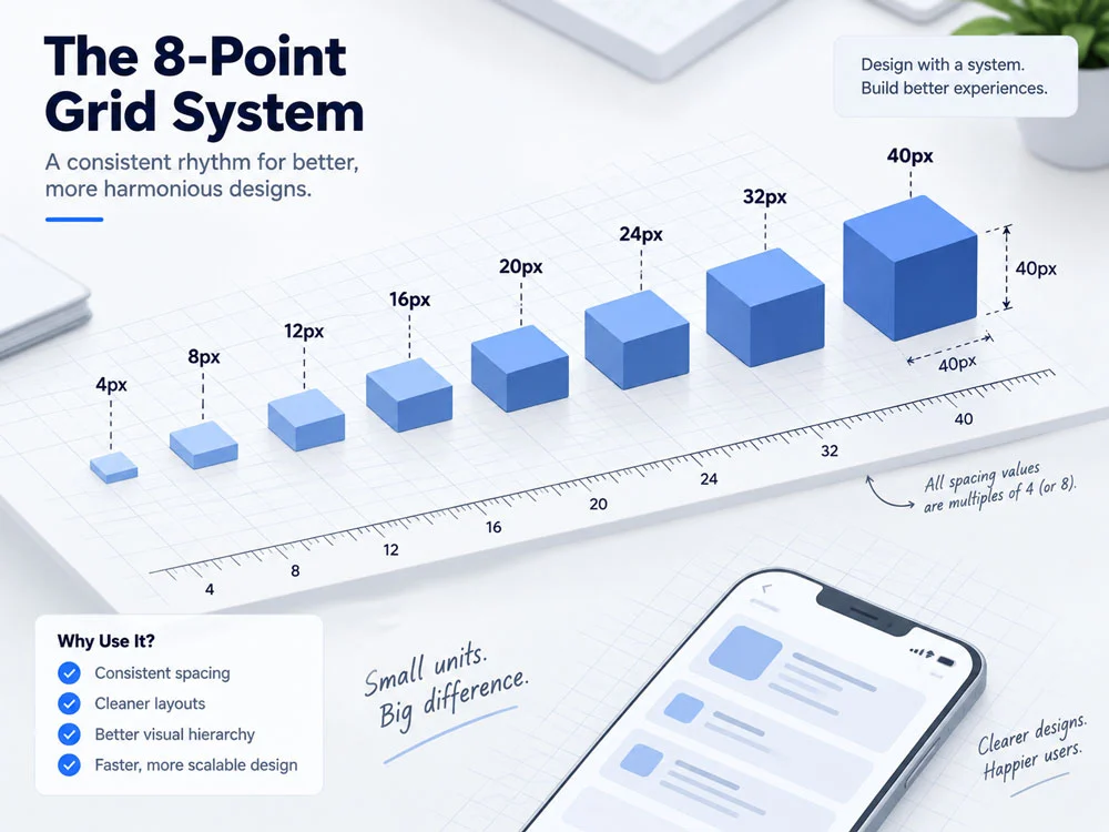
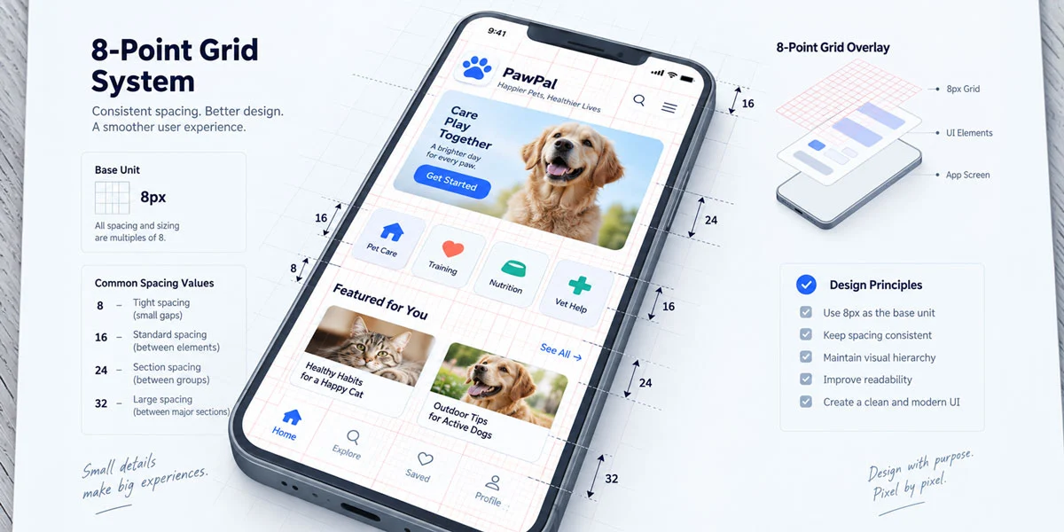
Start with an 8-point grid before exploring more complex systems like 10-point or golden-ratio-based spacing later in your career. Within the 8-point grid, your full range of spacing options includes:
4, 8, 12, 16, 20, 24, 32, 40
For simple, early designs, you can narrow this down to just five core values: 8, 12, 16, 24, 32.
Where to Use Each Spacing Value
| Spacing Range | Use Case |
| 4, 8, 12 | Inside groups (tight relationships) |
| 16 | Can work for both inside or between groups |
| 20, 24, 32, 40 | Between groups (clear separation) |
Related Topics:
Applying Spacing to a Real Screen
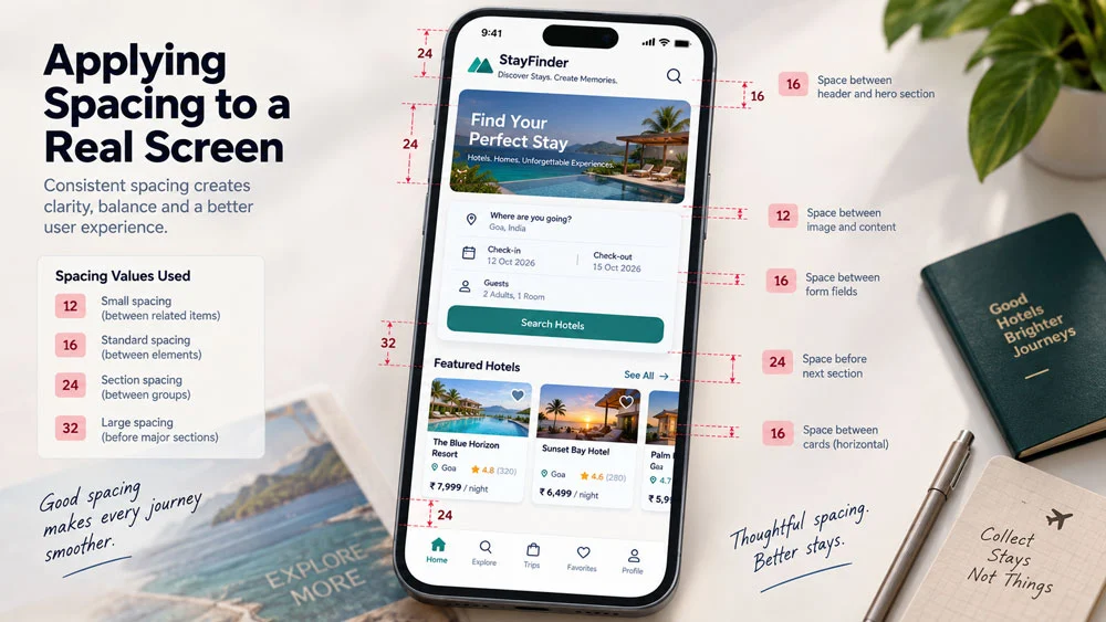
In the book’s example hotel booking screen, spacing values like 12, 16, 24 and 32 are applied almost without exception across the layout. These specific gaps are what allow your brain to jump cleanly from one content group to the next, rather than getting lost in a wall of information.
Getting spacing right transforms an already-decent design into one that’s genuinely easy to use. In Part 5, the final post in this series, we’ll bring everything together with hierarchy principles and a practical daily practice routine to build real UI skills. Start applying 8-point grid spacing to your current project today.
About the Author
Lalit M. S. Adhikari is a Digital Nomad and Educator since 2009 in design education, graphic design and animation. He’s taught 500+ students and created 200+ educational articles on design topics. His teaching approach emphasizes clarity, practical application and helping learners.
Learn more about Lalit Adhikari.
Last Updated: Oct 2026