

In Part 1 of this series, we locked down UI color rules; now it’s time to tackle typography — one of the areas where junior designers get stuck in endless decision paralysis chasing “cool” fonts. This post covers exactly which typefaces to use and how to size them so your text always looks intentional.
My name is Lalit Adhikari and we are at LTY. Let’s begin!
Table of Contents
Why Fewer Font Choices Make You Faster
Social media constantly pushes lists of “10 amazing fonts,” but if you’re doing UI design rather than general graphic design, you need to ignore those posts. Typography is difficult and the more typefaces you juggle, the higher the chance you’ll pick something that doesn’t function well in an interface.
The 4-Font Method
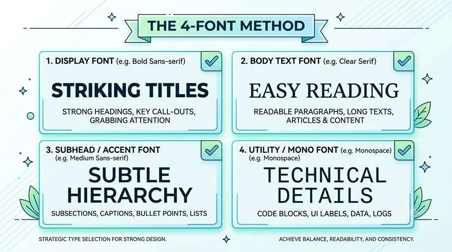
Pick just four typefaces total, and use only one per individual project — never mix multiple typefaces within the same design. Four is enough variety across different projects while keeping each project internally consistent and safe.
Recommended Safe Typeface List:
- Plus Jakarta Sans
- Inter
- Satoshi
- Poppins
- Ubuntu
- Fira Sans
- Figtree
- Lato
- Muli (Mulish)
- Open Sans
- PT Sans
- Source Sans Pro
Native Platform Fonts
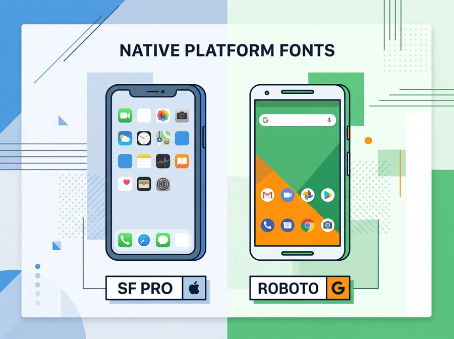
If you’re designing apps that rely on standardized system components, you can also add the native operating system fonts to your rotation: SF Pro for iOS and Roboto for Android. If you want to play it extremely safe, just use these two fonts exclusively, depending on the platform for which you’re designing.
Setting Font Sizes Using the 8-Point Grid
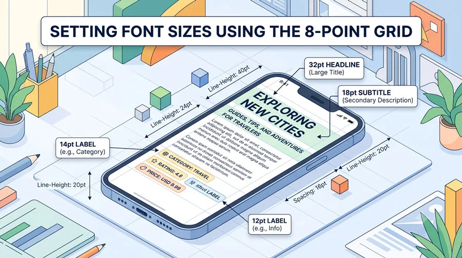
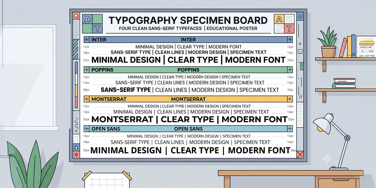
For mobile app design, four sizes are typically enough: 12, 14, 18 and 32. If you prefer more numerical precision, an alternative scale is 12, 16, 20, 24.
| Font Size Table | Element Size (px) |
| Large heading | 32 |
| Section title | 18 |
| Navigation/body label | 14 |
| Small detail text | 12 |
Avoid using anything smaller than 12px, with one exception — a bottom navigation menu’s tab labels can go down to 10px. On the large end, going bigger than 32px (or even 24px) on a mobile app is usually unnecessary. For web projects you can generally keep the same scale, but landing pages can add 4 points to smaller sizes and up to 8 points to the largest size.
Now that your fonts and sizes are locked in, Part 3 shifts to icons — another area where inconsistency quietly wrecks otherwise solid UI work. Try picking your four typefaces today and sticking to them across your next few projects.About the Author
Lalit M. S. Adhikari is a Digital Nomad and Educator since 2009 in design education, graphic design and animation. He’s taught 500+ students and created 200+ educational articles on design topics. His teaching approach emphasizes clarity, practical application and helping learners.
Learn more about Lalit Adhikari.
Last Updated: Sept 2026