



If you’ve ever opened a color picker and felt tempted to use all 16 million shades available, you’re not alone — and it’s exactly the trap this series is here to help you avoid. This is Post 1 in our five-part series on UI design constraints for junior designers and we’re starting with the single biggest visual decision you’ll make: Color.
My name is Lalit Adhikari and we are at LTY. Let’s begin!
Table of Contents
Why “More Colors” Is a Beginner Trap
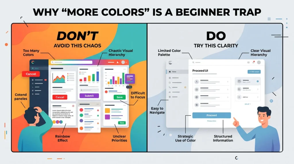
It’s tempting to make a background salmon-pink, throw in red, purple and green buttons and call it “lively.” In reality, mismatched colors create sensory overload and make a design feel chaotic rather than lively.
There are advanced techniques to make bold color combinations work, but they’re not something you should attempt in your first one or two years of learning UI design.
Related Topics:
- Choosing UI Fonts as a Beginner: Sizes & Typefaces (Part 2)
- UI Icon Rules: Consistency Matters Most (Part 3)
- UI Spacing Rules: Master the 8-Point Grid (Part 4)
Rule 1: Do not Keep Your Background Black or White
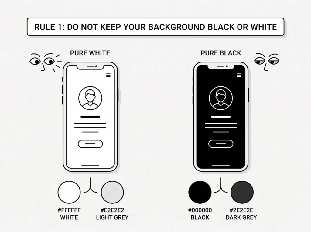
Your background should not be BLACK or WHITE. If you want to layer lighter cards on top, you can also use two “off” alternatives: #E2E2E2 and #2E2E2E.
Backgrounds that shouldn’t be used: #FFFFFF or #000000
Extra alternatives for cards: #E2E2E2 (light) or #2E2E2E (dark)
Stick to only these until you’re comfortable matching colors well.
Related Topics:
- UI Hierarchy & How to Practice Design (Part 5)
- UI UX Glossary Part 1: 20 Essential UI Terms Every Designer Must Know
- UI UX Glossary Part 2: 25 Core UX Terms, Laws and Principles Explained
Rule 2: Text Color Contrast Without Overdoing It
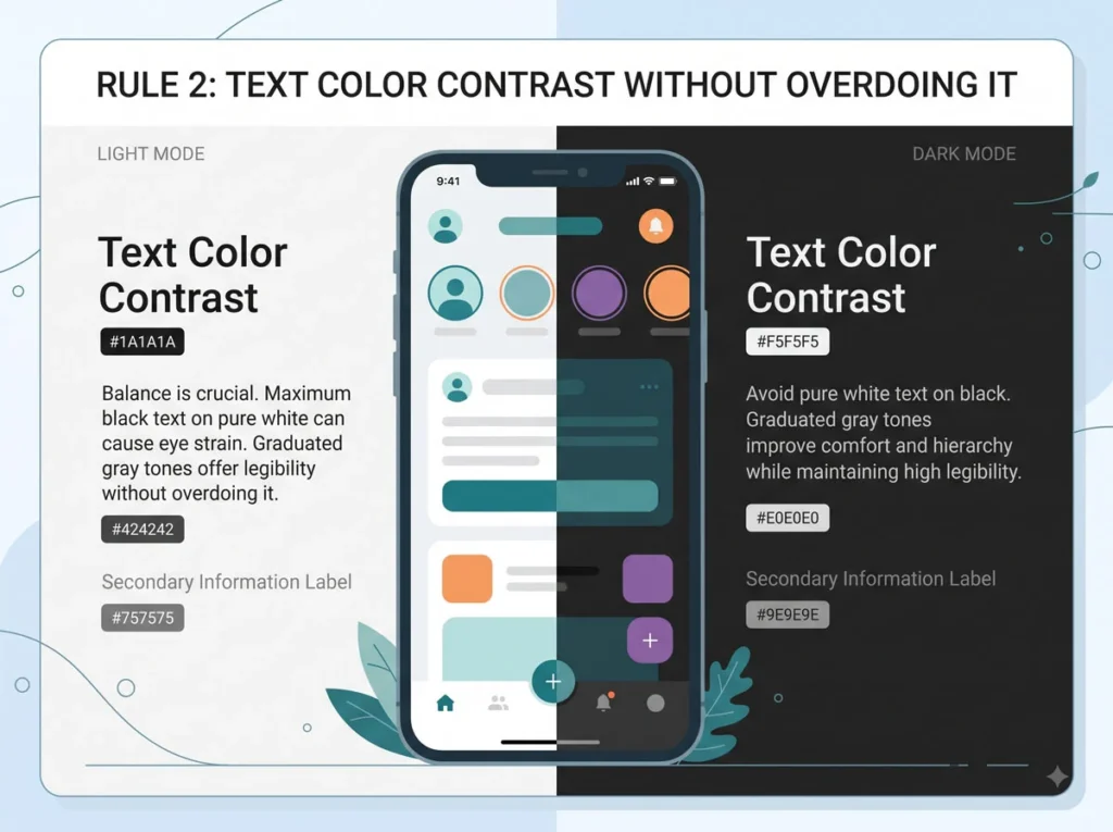
On a white background, avoid full black text since it creates too much contrast. Instead use a graduated scale: #2E2E2E for headings, #4E4E4E for body copy, and #6E6E6E for labels.
On a dark background, the logic flips but stays proportional — full white on full black is also too much contrast. Use #E2E2E2, #C2C2C2 and #A2A2A2 for headings, body text and labels respectively.
Related Topics:
Rule 3: Adding an Accent Color Correctly
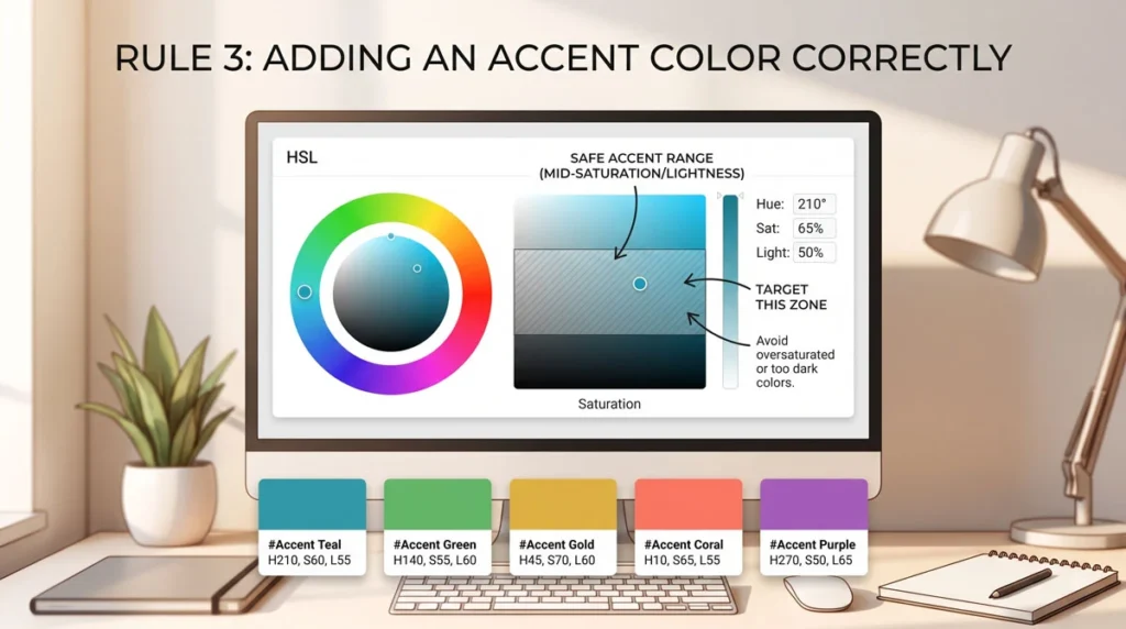
Once your monochrome base is set, add one accent color for liveliness. As a junior, restrict your accent color to a narrow HSL range: Saturation between 60 and 90, Lightness between 40 and 50.
To make this even easier, a curated list of pre-tested accent hex codes is available, including #CF1717, #F27C0D, #33CC34, #0B6FF4 and #6019E6, among others — all falling within the recommended saturation and lightness box. Notice how sparingly the accent color should be used — typically just on the primary call-to-action, not spread across the whole screen.
Rule 4: Never Give Two Buttons the Same Accent Color
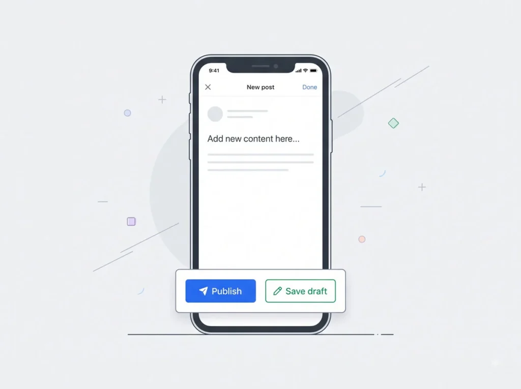
If a screen has two buttons, never make them both the same accent color. Instead:
- Identify which button is more important
- Use an outline button or text link for the secondary action
- If both buttons truly carry equal weight, use a darker fill color for one of them instead of duplicating the accent
Getting color discipline right sets the foundation for everything else in your UI. In Part 2, we’ll move from color to typography — picking fonts and sizes that won’t sabotage your otherwise clean color system. Start applying these color rules to your next project today.
About the Author
Lalit M. S. Adhikari is a Digital Nomad and Educator since 2009 in design education, graphic design and animation. He’s taught 500+ students and created 200+ educational articles on design topics. His teaching approach emphasizes clarity, practical application and helping learners.
Learn more about Lalit Adhikari.
Last Updated: Oct 2026