Creating a magazine cover is one of the most exciting—and most challenging—design projects you can undertake. A magazine cover isn’t just “pretty artwork.” It’s a strategic marketing tool that must stop scrolls, sell stories and establish brand recognition all at once.
You have roughly 2-3 seconds to grab attention on a newsstand or digital platform. After that, the reader moves on.
I’ve been teaching editorial design for more than a decade now and I’ve learned that the difference between a cover that sells and one that flops isn’t talent—it’s understanding the system.
Magazine covers follow a very specific anatomy. Typography has a precise hierarchy. Images are composed with intention, not accident.
This comprehensive guide walks you through the complete magazine cover design process, from understanding every element of a cover’s anatomy, to planning your concept, to executing it step-by-step in your design software, to testing and exporting.
By the end, you’ll have designed a professional magazine cover and understood the principles behind every design decision. Let’s begin by understanding what makes a magazine cover work.
My name is Lalit Adhikari and we are at LTY. Let’s begin!
Table of Contents
What Makes a Great Magazine Cover: The Psychology of Cover Design
Before you open design software, you need to understand the job a magazine cover must do.
The Purpose of a Magazine Cover
A magazine cover serves multiple functions simultaneously:
Immediate Attention
A newsstand is visually noisy. Thousands of magazines compete for attention. Your cover has 2-3 seconds to stop the scan. After that, the reader’s eyes move to the next title. This requires a strong focal point, clear visual contrast and strategic use of whitespace.
Communication
The cover must communicate what’s inside without requiring words.
- The masthead says “who we are.”
- The main image says “what this issue is about.”
- The cover lines say “what benefits you’ll get if you read this.”
Together, they tell a complete story.
Brand Reinforcement
Consistency across issues builds recognition. When someone sees your masthead and color palette, they should instantly know which magazine it is. This is why established magazines keep similar masthead design and layout structure across decades.
Emotional Connection
Magazine covers trigger emotions.
- A fashion magazine should feel aspirational.
- A financial magazine should feel trustworthy.
- A news magazine should feel urgent and important.
Every design choice—from image selection to color palette to typography—communicates tone and emotion.
Story Selling
The cover must entice the reader to open the magazine or click the link. It’s the first page of a sales conversation. The main cover line should promise value:
- “Learn how to…”
- “Discover why…”
- “Meet the person who…”
Related Topics:
Why Covers Succeed or Fail
I’ve analyzed hundreds of magazine covers over my teaching career. The ones that succeed share common traits:
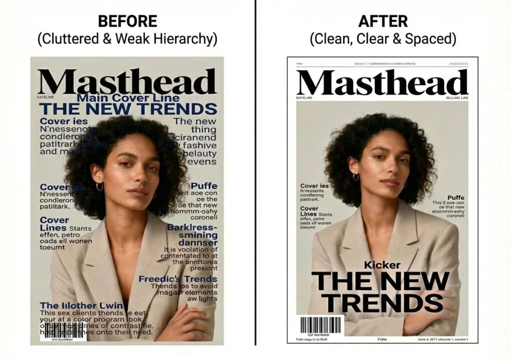
- Clear hierarchy: You know what to read first, second and third without thinking.
- Simplicity: Not necessarily minimal but focused. Every element earns its space.
- Strong imagery: The main image is compelling enough to stop a scan.
- Legible typography: You can read the main cover line from 10 feet away.
- On-brand consistency: The cover instantly reads as belonging to that magazine.
The ones that fail typically have:
- Everything competing for attention (no clear focal point)
- Weak imagery that doesn’t match the story promise
- Typography so decorative it sacrifices readability
- Cluttered layouts with too many overlapping elements
- Branding that’s inconsistent or unclear
Related Topics:
Key Principles Every Magazine Cover Designer Should Know
Principle 1: The Cover is a Sales Tool
Unlike fine art, magazine covers aren’t about pure creativity. They’re about selling. Every design choice should support that goal.
Ask: “Does this element help sell the magazine or does it distract?”
Principle 2: Hierarchy Rules Everything
Visual hierarchy determines what readers see first, second and third. Without clear hierarchy, all elements scream equally loudly and nothing stands out. We’ll discuss this extensively when we cover typography.
Principle 3: Consistency Builds Brand
A magazine’s cover design should be recognizable across issues. Vogue looks like Vogue. The Economist looks like The Economist. This doesn’t mean no variation—it means variation within a defined system.
Principle 4: Composition Matters More Than Decoration
A great cover relies on strong composition and restraint, not excessive effects. Many beginner designers rely on gradients, glows and textures to create impact. Professional designers create impact through smart composition and type arrangement.
Principle 5: The Audience Determines Everything
A magazine for 18-year-olds looks completely different from a magazine for 50-year-olds. A tech magazine looks different from a luxury magazine. Before you design, you must understand exactly who you’re speaking to.
Related Topics:
Anatomy of a Magazine Cover: Every Element Explained
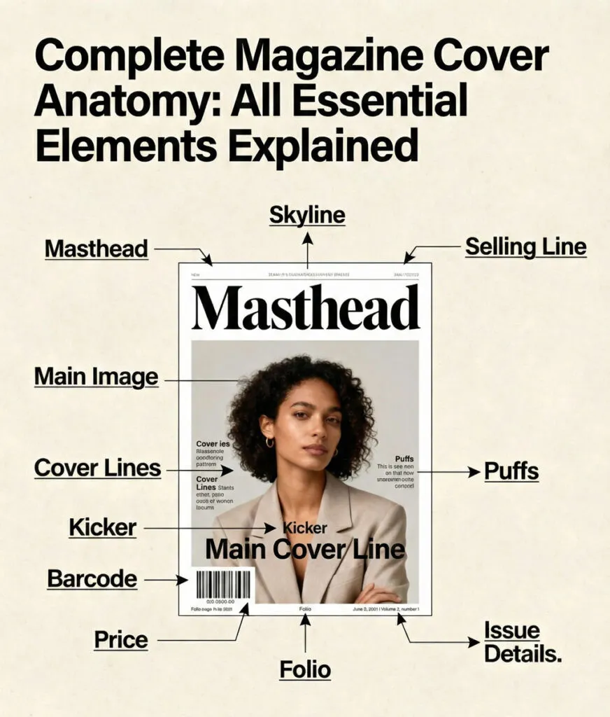
Every professional magazine cover contains a specific set of structural elements. Understanding this anatomy is the foundation of good cover design.
The Complete Elements of a Magazine Cover
Masthead (Logo/ Nameplate)
The magazine’s name, usually the largest typographic element on the cover. The masthead is the brand anchor—it must be consistent across all issues and immediately recognizable.
Most mastheads are positioned at the top but premium magazines sometimes place them off-centre or partially obscured by the subject for more sophisticated visual impact.
Tagline
A short phrase below or near the masthead that clarifies the magazine’s promise.
Examples: “The Curation Guide to Modern Design” or “Your Guide to Financial Freedom.”
Not all magazines use taglines on every cover, but many do.
Skyline (Banner/ Header)
An optional strip at the very top of the cover containing extra promotions or category labels. The skyline is outside the main cover space and typically uses smaller type. You might see “SPECIAL REPORT” or “FREE GUIDE INSIDE” or issue category information.
Main Image (Hero Image)
The dominant visual—usually a photograph, illustration or combination. This image carries the emotional weight of the cover and must immediately communicate the issue’s theme. The main image typically occupies 50-70% of the cover.
Main Cover Line (Lead Story)
The biggest cover line—second only to the masthead in visual hierarchy. This line communicates the primary story in punchy, benefit-driven language. It must be readable from a distance and positioned to complement the main image, not compete with it.
Supporting Cover Lines
Secondary headlines teasing other stories in the magazine. A typical cover has 3-7 supporting lines. These are smaller than the main cover line but larger than body copy. They’re usually grouped in columns or around the main image.
Kickers and Explainers
Small text elements that provide context. A kicker is a short word or phrase before a cover line (e.g., “EXCLUSIVE:” or “INSIDE:”). An explainer is a smaller line beneath a main headline providing additional context or benefit promise.
Puffs, Bursts or Flashes
Small visual badges or stickers calling out special content.
Examples: “FREE GUIDE INSIDE,” “COLLECTOR’S EDITION,” or “SUBSCRIBE NOW.”
These are optional but commonly used for promotions.
Issue Information
Date, issue number and volume number. This is typically small type positioned at the bottom or near the barcode area. Many digital covers omit this.
Price and Barcode
Mandatory for print magazines. Usually positioned in bottom corner, this element is non-negotiable for retail distribution. The barcode should be visible and unobstructed.
Footer/ Website Information
For digital or web covers, you might include website, social media handles or URL. Print covers sometimes include this as well.
Visual Diagram of Cover Anatomy
Imagine a standard magazine cover divided into zones:
- Top zone: Skyline (optional), masthead, tagline
- Center zone: Main image (often extends edge-to-edge)
- Text areas: Main cover line (usually overlapping or near main image), supporting cover lines (left and/ or right columns)
- Bottom zone: Issue info, website, price
- Throughout: Color overlays, design elements, graphic shapes
The key is that each zone has a specific function and hierarchy level.
Related Topics:
Understanding Your Audience and Genre
Before you design, you must understand exactly who you’re designing for.
Audience Analysis
Ask yourself these questions:
Demographics
- Age range and generation (Gen Z, Millennial, Gen X, Boomer, Silent)?
- Income level and social class?
- Geographic location and culture?
- Education level?
- Gender identity?
Psychographics
- What are their values and beliefs?
- What problems do they have?
- What aspirations do they have?
- What magazines do they already read?
- Where do they consume content (print, digital, both)?
Behavioural Patterns
- When do they read magazines (commute, leisure, specific purpose)?
- How much time do they spend reading?
- Do they scan quickly or read deeply?
- What calls to action work for them?
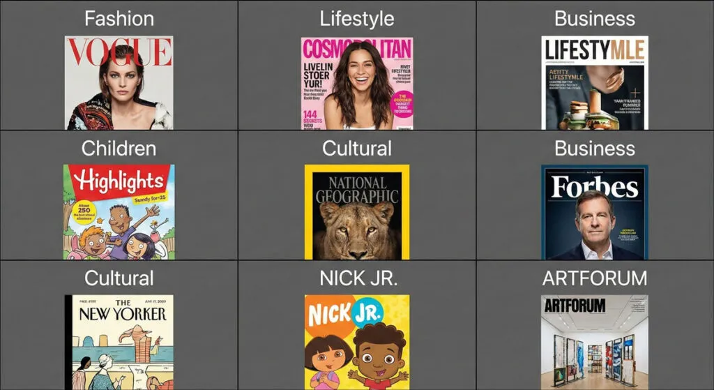
Different audiences respond to completely different cover designs. A fashion magazine for Gen Z looks radically different from a business magazine for executives. A children’s magazine uses different colors, type styles, and imagery than a luxury magazine.
Related Topics:
- Eraser tool in Photoshop
- 10 reasons Why you are not becoming a good artist
- Foreground Color, Background Color, Stroke & Fill
Genre Conventions (And When to Break Them)
Different magazine genres have established visual conventions:
Fashion and Lifestyle Magazines
- Often feature a single subject’s face, eyes directly at camera
- Bold, statement color palettes
- Minimalist type that doesn’t fight the imagery
- High-end photography
- Examples: Vogue, Harper’s Bazaar, Elle
News and Current Affairs
- Strong, urgent imagery
- Type-heavy with multiple cover lines
- Restraint in color palette (blues, blacks, grays often dominant)
- Clear hierarchy guiding readers through stories
- Examples: TIME, The Economist, Newsweek
Business and Finance
- Professional, trustworthy aesthetic
- Clear typography prioritizing readability
- Strategic use of color
- Often features portraits of newsmakers
- Examples: Harvard Business Review, The Economist, Fortune
Design and Architecture
- Experimental with type and layout
- Often feature full-bleed imagery
- Sometimes minimal text
- Push design boundaries while maintaining clarity
- Examples: Design Observer, Wallpaper, Dwell
Cultural and Entertainment
- Playful with typography and imagery
- Often feature stylized or conceptual visuals
- Mix of bold and subtle design choices
- Genre-specific color associations
- Examples: The New Yorker, Wired, Rolling Stone
Scientific and Academic
- Clarity and credibility paramount
- Minimal visual distraction
- Sophisticated typography
- Often feature data visualization or scientific imagery
- Examples: Nature, Scientific American, National Geographic
Understanding these conventions doesn’t mean copying them. It means understanding what audiences expect and consciously choosing where to follow tradition and where to innovate.
Related Topics:
Planning Your Cover: From Brief to Concept
The best magazine covers are planned before any design work begins.
Step 1: Understand the Brief
Every magazine cover project starts with information:
What is the main story?
- What is the headline or theme?
- Who is it about (if applicable)?
- Why is it important?
- What does the reader need to know?
What are the supporting stories?
- What 3-5 additional stories will you tease on the cover?
- Which are most important to highlight?
What is the tone?
- Serious and urgent? Playful and aspirational? Trustworthy and professional?
- Should the cover feel energetic or calm?
- Bold and experimental, or safe and classic?
Are there constraints?
- Specific image already available?
- Required messaging?
- Brand color restrictions?
- Specific person/subject required?
Related Topics:
- Blur, Sharpen & Smudge Tool in Photoshop
- Burn, Dodge & Sponge Tool in Photoshop
- How to use Gradient Tool in Photoshop
Step 2: Research and Create a Moodboard
Before sketching, research visually:
- Look at 10-15 covers in the same genre
- Notice what works: color use, imagery, typography, layout approaches
- Identify what’s currently oversaturated
- Find opportunities to differentiate while staying true to genre
Create a digital moodboard with images, type treatments, color palettes, and compositional approaches you find compelling.
Step 3: Develop the Main Cover Line
The headline is critical. It must:
- Be short and punchy (5-10 words maximum)
- Promise a clear benefit or create curiosity
- Reflect the main story accurately
- Use powerful verbs or emotional language
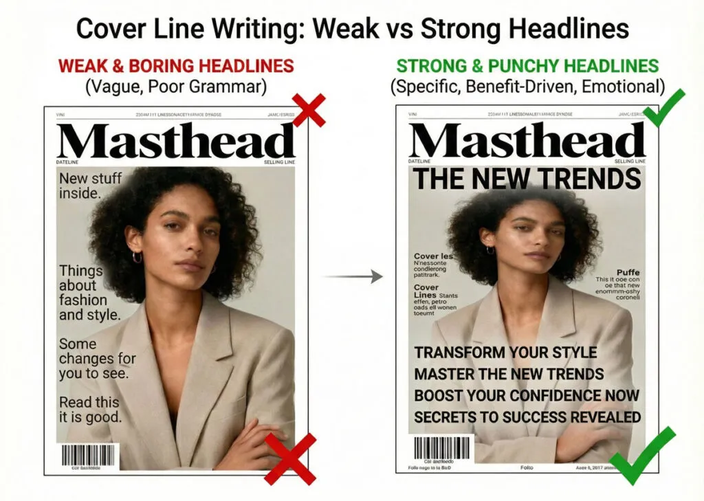
Bad cover line: “Article About Climate”
Good cover line: “How to Save Your Home From Rising Temperatures”
Work on the headline until it’s perfect. This is your main message.
Step 4: Sketch the Layout
Before opening design software, sketch 3-5 different layout approaches:
- Where could the masthead be positioned?
- Where would the main image work best?
- How would you arrange cover lines?
- Where would the main cover line sit relative to the image?
These sketches don’t need to be perfect. They’re exploring options quickly.
Step 5: Choose One Direction and Refine
Pick the layout that best serves the story and audience. Stick with it. Resist the temptation to try “one more” direction—you’ll go in circles. Instead, commit to the direction and refine it.
Related Topics:
Setting Up Your Design File Correctly
Proper file setup prevents problems later.
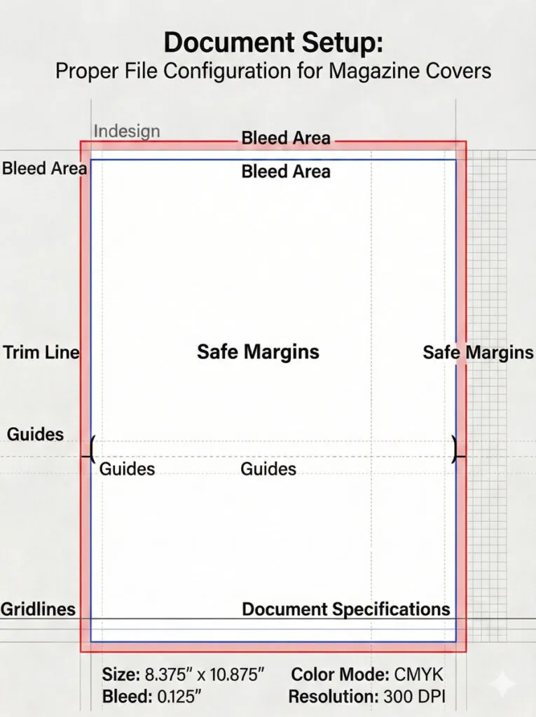
Document Specifications
For Print Magazines
- Trim size: 210 × 297 mm (A4), 203 × 254 mm (8″ × 10″), or custom size
- Bleed: 3 mm on all sides (important—images should extend to bleed to avoid white borders)
- Safe area: 5 mm margin from trim edge where critical elements should remain
- Color mode: CMYK for accurate print color
- Resolution: 300 ppi for any raster images
For Digital/ Web Covers
- Size: 1200 × 1600 px (for web blog post covers) or 2560 × 3200 px (for digital magazine platforms)
- Color mode: RGB
- Resolution: 72-150 ppi (standard for screen)
Related Topics:
- Healing, Clone & Pattern Stamp Tools in Photoshop
- Color Replacement Tool & Mixer Brush Tool
- History Brush Tool in Photoshop
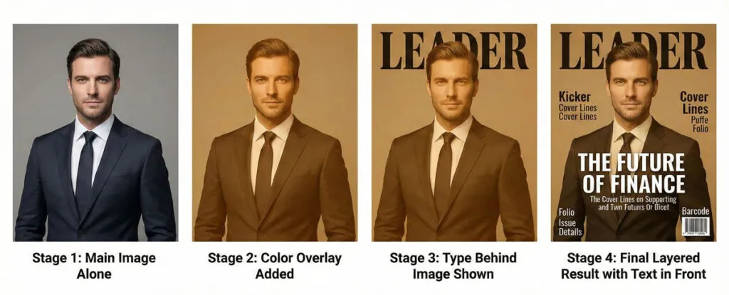
Layering Structure
Create a logical layer structure that makes editing intuitive:
Layer Stack (from bottom to top)
- Background – Solid colors, gradients, or texture elements
- Main Image – The hero photograph or illustration
- Type Behind – Any type that sits behind other elements (sometimes used for dramatic effect)
- Color Overlays & Effects – Semi-transparent overlays, gradients, or texture overlays
- Type Front – All typography (masthead, cover lines, supporting text)
- Puffs & Badges – Promotional elements and visual stickers
- Technical – Guides, gridlines, barcode area (hide before export)
Name each layer clearly. Use layer groups to organize related elements.
Setting Up Guides and Grids
Grid System
- Create a 3 or 4-column vertical grid to align elements
- Use a baseline grid for type (helps maintain consistent spacing)
Key Guides
- Top margin (for masthead safe area)
- Center vertical line
- Horizontal guides for major sections
- Safe area boundaries (inset 5 mm from edges)
Typography Styles
Before you start placing type, define your typographic styles:
- Masthead – Style/size/color
- Main Cover Line – Font family, size, weight, tracking
- Supporting Cover Lines – Font family, size, weight, color
- Kickers – All-caps, letter-spaced, specific size
- Body/ Small Text – For issue info and fine print
Setting these up prevents inconsistency and speeds up the design process.
Related Topics:
The Masthead: Building Your Brand Identity
The masthead is the most important typographic element on your cover.
Masthead Design Principles
It Must Be Instantly Recognizable
Across issues, readers should recognize your masthead immediately. This means:
- Consistent letterforms and proportions
- Consistent color (usually)
- Consistent placement (usually top-centre or top-left)
It Should Reflect Brand Personality
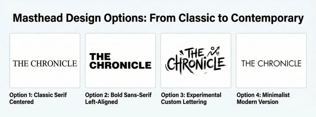
Does your magazine feel premium? Playful? Authoritative? Technical? Modern? Classic? The masthead is where you communicate this:
- Serif fonts feel traditional and prestigious
- Sans-serif fonts feel modern and clean
- Display fonts feel playful or unique
- Custom lettering feels premium and ownable
It Must Be Legible at Thumbnail Size
Your cover appears as thumbnails on websites and social media. The masthead must remain legible at small sizes. This means:
- Not overly thin or decorative
- Clear letter distinction
- Appropriate letter spacing
Related Topics:
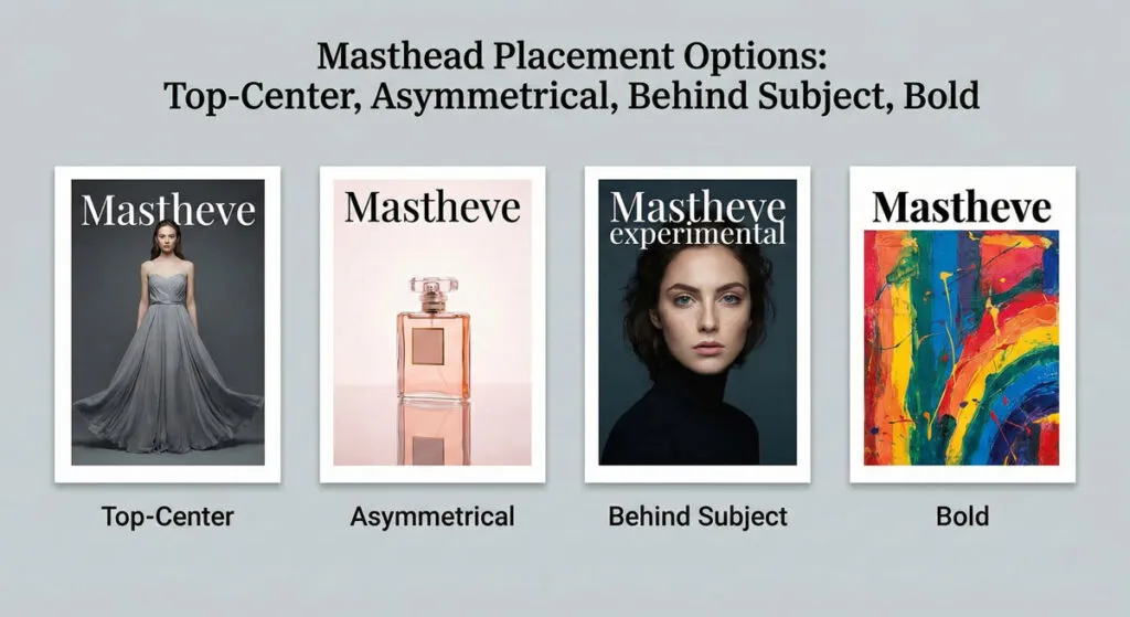
Masthead Placement Options
Option 1: Top-Center (Classic)
Positioned centered at the top, above or integrated with the main image. This is the most recognizable placement and works for most genres.
Option 2: Top-Left or Top-Right
Off-center placement creates a more dynamic layout. Asymmetrical balance feels more contemporary.
Option 3: Partially Behind Subject
For premium or fashion magazines, partially obscuring the masthead behind the subject’s head creates sophistication. Only works if the brand is already well-established.
Option 4: Full-Bleed or Large
Some bold magazines make the masthead HUGE, using it as part of the main visual. This requires a strong, distinctive letterform.
Related Topics:
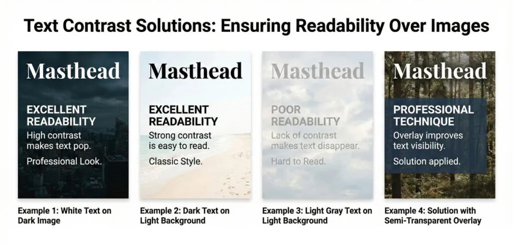
Masthead Colour and Contrast
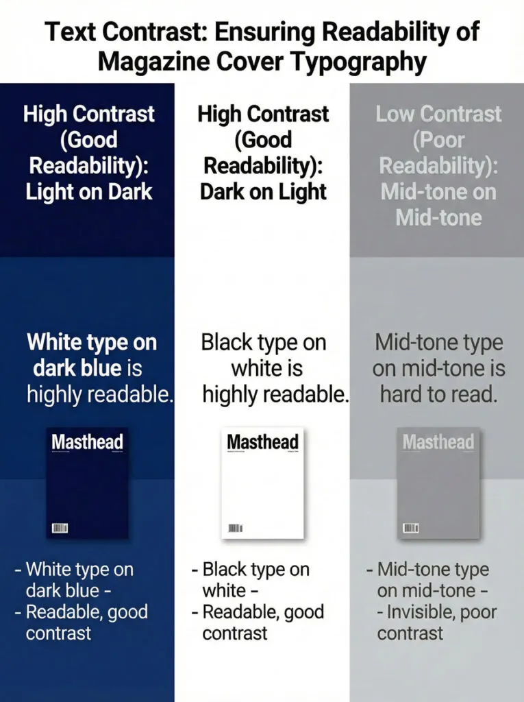
Contrast Requirements
- If the background is dark, the masthead must be light (white, light gray, or accent color)
- If the background is light, the masthead must be dark (black, dark gray, or bold color)
- Avoid mid-tone text on mid-tone backgrounds
Techniques for Maintaining Contrast
- Use outline stroke in contrasting color
- Add a subtle drop shadow or glow
- Place a semi-transparent solid block behind the text
- Crop the main image so masthead sits on neutral background
- Use the subject’s negative space (area behind the subject)
Creating a Custom Masthead
Many professional magazines use custom lettering for their masthead. If you’re creating a new magazine or redesigning one:
- Consider custom type design or heavily modified existing font
- Ensure the letterforms feel timeless, not trendy
- Test the letterforms across different sizes and colors
- Make sure letters are distinct and recognizable
Related Topics:
Choosing and Composing the Main Image
The main image is the emotional centre-piece of your cover.
Image Types and Genre Fit
Portrait Photography
- Subject’s face looking directly at camera
- Most engaging type of imagery (eye contact draws viewers)
- Works for: fashion, lifestyle, personality-driven stories
- Challenge: avoiding boredom with similar layouts
Three-Quarter or Profile
- Subject looks slightly away or in profile
- Creates space for type overlays
- Works for: lifestyle, business, cultural magazines
Conceptual Photography
- Objects, scenes, or metaphorical imagery
- Works for: business, tech, science, abstract topics
- Challenge: must clearly communicate the story theme
Illustration or 3D Rendering
- Provides complete stylistic control
- Can be simpler and more iconic than photography
- Works for: design, children’s, experimental magazines
Full-Figure or Environmental
- Subject in context or full-body visible
- Tells a richer story
- Takes up more space, leaving less room for text
Related Topics:
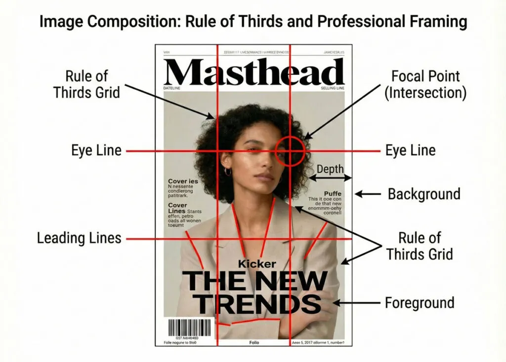
Composition Principles
The Rule of Thirds
Divide the frame into 9 equal sections (3×3 grid). Key elements should fall on intersection points or lines.
Leading Lines
Use elements in the image that guide the viewer’s eye toward the subject or focal point.
Depth
Create visual depth through foreground/background relationship. Blur background, sharpen subject.
Negative Space
Leave space around the subject for typography and visual breathing room.
Eye Line
If a person is looking a direction, leave space in that direction for type.
Practical Composition Considerations for Magazine Covers
Head Room
Leave space above the subject’s head for masthead placement. Don’t crop so tightly that there’s nowhere to put type.
Body Space
Leave vertical space along the sides of the subject for cover lines. A tight close-up doesn’t allow for supporting text.
Tangent Avoidance
Avoid awkward intersections where text meets hard edges of the subject. Either leave clear space or have the subject clearly overlap/obscure the text.
Color Balance
Consider the main image color palette. Will it support your masthead color? Will text be readable over it?
Image Quality Standards
For Print
- Minimum 300 ppi resolution
- No visible pixelation or artifacts
- Color corrected and balanced
- Properly sharpened (not over-sharpened)
For Digital
- 150-200 ppi sufficient
- Optimized for file size without visible quality loss
Related Topics:
Cover Lines: Selling Stories Through Typography
Cover lines are miniature sales pitches. Each one must promise value or create curiosity.
The Main Cover Line (Lead Story)
This is the big announcement. It’s the story the magazine is most excited about.
Structure:
- Short, punchy main line (hook)
- Optional subtitling line with more detail
- Sometimes a kicker before it
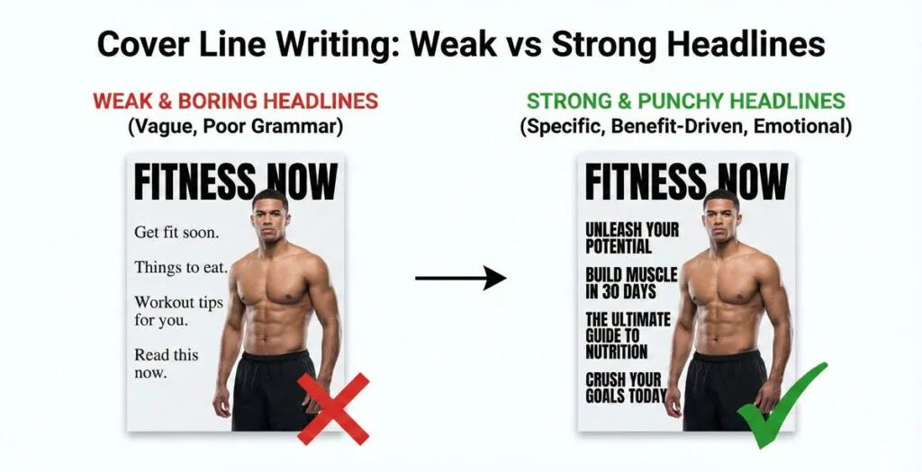
Writing Effective Cover Lines:
- Start with power words: “Discover,” “Learn,” “Meet,” “Uncover,” “Escape,” “Transform”
- Be specific: “5 Steps to Build Confidence” (better than “Confidence Building”)
- Create curiosity or promise benefit: “Why Millionaires Skip Breakfast” (better than “Breakfast Habits”)
- Keep it short: 5-10 words ideal
- Use numerics when possible: “7 Ways to” performs better than “How to”
Placement:
- Usually positioned near or overlapping the main image
- Positioned where it has clear hierarchy
- Often placed in lower 1/3 of cover so it reads as conclusion to the visual
Related Topics:
Supporting Cover Lines
3-7 additional stories teased on the cover. These create a sense of abundance and give browsers reasons to open the magazine or scroll further.
Structure:
- One primary line (the story headline)
- Optional subtitling (benefit or additional detail)
- Optional kicker (category or context)
Positioning Strategy:
- Left column, right column, or balanced around the subject
- Roughly equal size to each other (but smaller than main cover line)
- Aligned and grouped logically
Variety of Approach:
- Mix long-form stories with short service pieces
- Mix personality stories with practical how-to content
- Ensure they cover different interests/sections
The Kicker
Small text before the main headline providing context. Common kickers:
- “EXCLUSIVE:”
- “SPECIAL REPORT:”
- “THE GUIDE TO:”
- “INTERVIEW:”
- “INSIDE:”
A kicker is set much smaller than the headline it precedes and typically in all caps, often a different weight or color for distinction.
Related Topics:
Building a Typographic Hierarchy That Works
Hierarchy is everything in cover design. Without it, everything competes equally and nothing stands out.
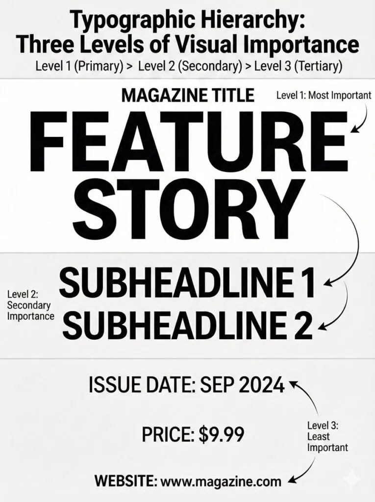
The Three Levels of Hierarchy
Level 1: Brand & Main Story
- Masthead (magazine name)
- Main cover line
- These should be largest and most prominent
- Viewers should see these first
Level 2: Important Supporting Stories
- Key cover lines
- Tagline
- Puffs or special callouts
- Secondary size, visually distinct from Level 1
Level 3: Fine Details
- Issue date and number
- Website/social handles
- Price
- Small explainer text
- Should be readable but not prominent
Related Topics:
Creating Contrast Through Variables
You control hierarchy through multiple variables:
Size:
The most obvious: larger = more important. But don’t make Level 1 four times larger than Level 2—exaggerated size looks amateurish. Aim for 1.3-1.5x size increases between levels.
Weight:
- Heavy/Bold for key headlines
- Regular or light for supporting text
- Ultra-light for fine print
Color:
- Brand color or accent color for Level 1
- Neutral (black/gray) for Level 2-3
- Or use color to highlight specific words
Case:
- ALL CAPS for short, impactful words (feels bold, commanding)
- Title Case for longer headlines (easier to read)
- Sentence case for body copy
Spacing/ Tracking:
- Tighter tracking for large, heavy text (feels more solid)
- Looser tracking for small caps or fine print (feels more refined)
- Generous line spacing between different story groups
Position:
- Top-to-bottom natural reading order supports hierarchy
- Large elements draw eye first
- Clustered related elements appear as units
Hierarchy in Practice: A Real Example
Imagine a fashion magazine cover:
LEVEL 1 (Largest, Most Prominent)
VOGUE (masthead)
The New Minimalism (main cover line)

LEVEL 2 (Secondary)
Spring Fashion Guide
The Capsule Wardrobe Decoded
50 Must-Have Items

LEVEL 3 (Fine Details)
March 2025 | $6.99 | vogue.com
Each level has distinct size, weight, and position. The viewer’s eye naturally moves through the levels in order.
Related Topics:
Choosing Typefaces: Serif, Sans-Serif and Display Fonts
Typography sets the tone for the entire cover.
Font Categories and Their Associations
Serif Fonts
- Traditional, established, sophisticated, authoritative
- Use for: luxury magazines, financial/business, classical publications
- Examples: Garamond, Bodoni, Georgia, Minion
- Best for: masthead, headlines, body copy in print
- Caution: thin serifs may not show at small digital sizes
Sans-Serif Fonts
- Modern, clean, universal, friendly
- Use for: tech, lifestyle, contemporary publications
- Examples: Helvetica, Futura, Open Sans, Montserrat, Proxima Nova
- Best for: digital covers, contemporary publications
- Versatile across sizes and contexts
Display Fonts
- Unique, decorative, experimental, expressive
- Use sparingly (usually just masthead or single headline)
- Examples: Playfair Display, DM Serif Display, Prata
- Caution: can date quickly; use classic display fonts
Script Fonts
- Elegant, personal, artisanal, playful
- Use very carefully (sparingly, short text only)
- Examples: Allura, Pacifico, Great Vibes
- Best for: taglines, specific moments
- Caution: many people dislike script; avoid for body copy
Related Topics:
- Selection Tools in illustrator
- Perspective Tool in Illustrator
- How to use the Pen Tool in illustrator
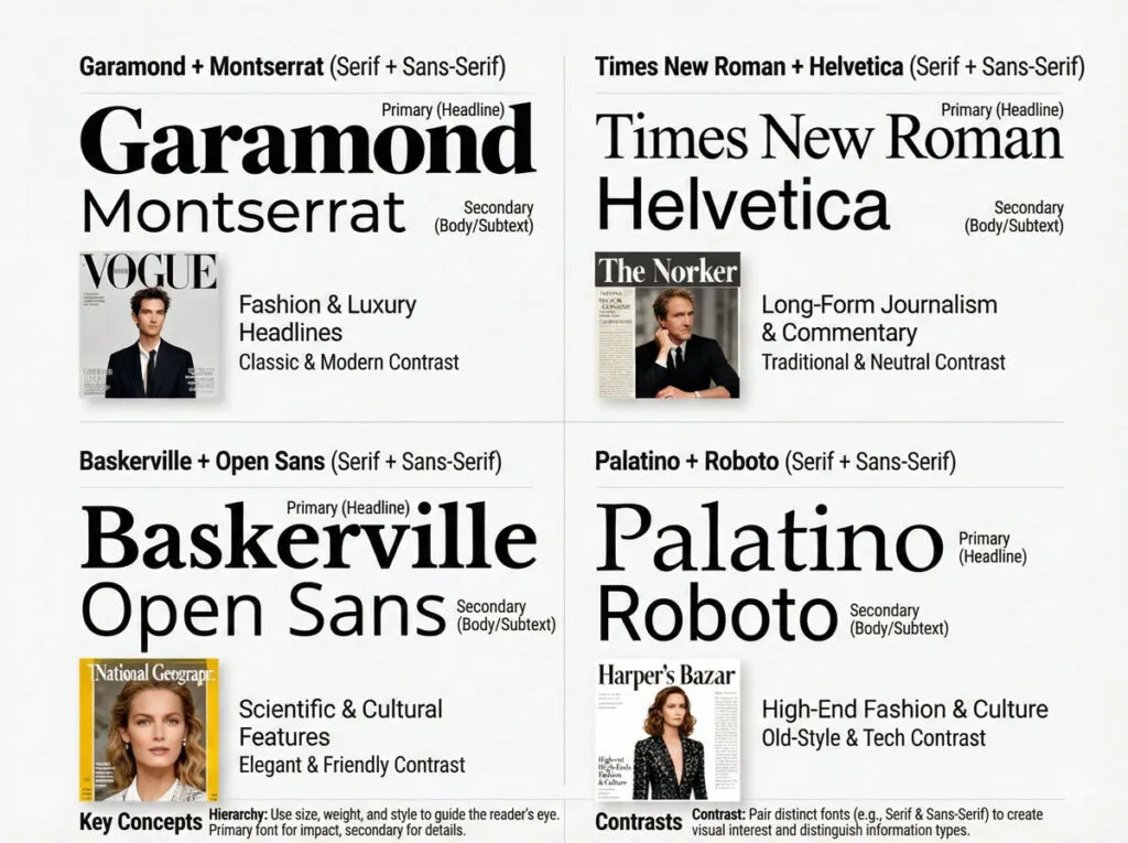
Font Pairing Strategy
Most professional covers use 2-3 typefaces maximum:
Common Pairing Approaches
- Serif + Sans-Serif
- Serif for masthead/headlines (authority)
- Sans-serif for body/supporting lines (clarity)
- Example: Bodoni (serif) + Open Sans (sans-serif)
- Same Family, Different Weights
- Use one font family but vary weights dramatically
- Example: Montserrat Ultra-Bold (masthead) + Montserrat Regular (supporting)
- Creates unity while maintaining distinction
- Display + Workhorse
- Bold display font for masthead (personality)
- Simple sans-serif for all other type (clarity)
- Example: Playfair Display (masthead) + Lato (supporting)
Guidelines for Magazine Cover Fonts
Legibility First
- Avoid fonts that sacrifice legibility for style
- Test all type at the actual size it will appear
- Avoid thin weights that disappear at small sizes
Consistency Across Issues
- Keep the same typefaces for masthead and primary headlines across all issues
- This builds recognition and brand consistency
Limit the Palette
- Using more than 3 typeface families looks scattered
- Instead, vary weights and sizes within families
Consider the Medium
- Print and digital rendering differ slightly
- Test fonts in both contexts
- Some fonts look better in print (serifs), others on screen (sans-serifs)
Related Topics:
- Photoshop Gold Text Effect
- 5 Types of Masking in Photoshop
- Step by Step guide for Retro 3D Movie Effect in Photoshop
Color Strategy: Psychology, Palette and Contrast
Color is one of the most powerful design tools on a magazine cover.
Color Psychology in Magazine Design
Different colors trigger emotional responses:
Blue: Trust, calm, stability, wisdom
- Use for: financial, tech, professional publications
- Overdone in: business magazines
- Avoid for: food, creative, playful publications
Red: Energy, passion, urgency, excitement
- Use for: entertainment, food, fashion, sports
- Overdone in: budget/sale-focused publications
- Caution: can feel aggressive in large doses
Green: Growth, health, nature, renewal
- Use for: wellness, environmental, organic/natural products
- Overdone in: eco/green publications
- Works well with: earth tones
Yellow/ Orange: Optimism, warmth, friendliness, creativity
- Use for: youth-oriented, playful, creative publications
- Overdone in: casual/budget publications
- Caution: yellow can be hard to read against light backgrounds
Purple: Luxury, creativity, spirituality, uniqueness
- Use for: premium, design-focused, creative publications
- Can feel: artificial if overused
- Pairs well with: gold accents
Pink: Playfulness, femininity, youth, energy
- Use for: fashion, lifestyle, young-audience publications
- Avoid: if trying to reach mixed-gender audiences
- Caution: can feel superficial if overused
Black: Sophistication, power, elegance, authority
- Use for: luxury, premium, professional publications
- Pairs well with: white or accent colors
- Works for: mastheads, creating contrast
White: Cleanliness, simplicity, purity, emptiness
- Often used for: background and breathing room
- Use for: creating space and contrast
- Be careful: too much white can feel empty
Related Topics:
- How to use Eraser tool in illustrator
- Paintbrush & Blob brush Tool in illustrator
- Type Tool in illustrator
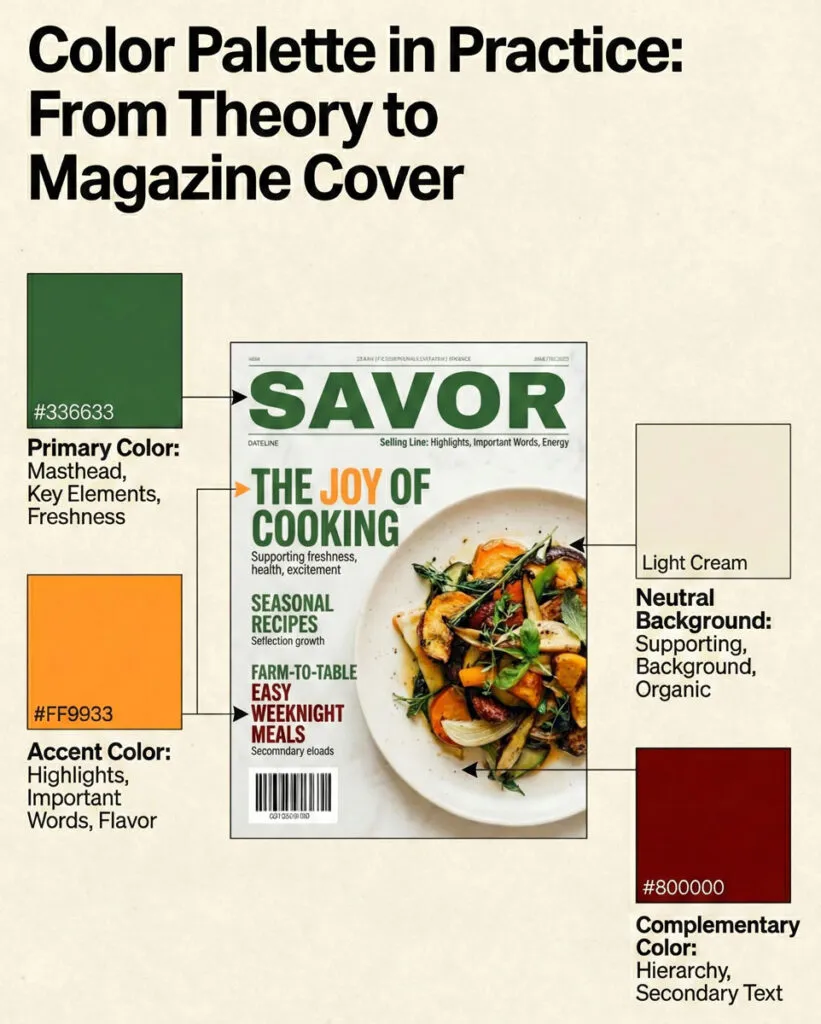
Building a Cohesive Color Palette
A strong cover uses a limited palette:
Approach 1: Monochromatic
- One base color in multiple shades and tints
- Simple, sophisticated, cohesive
- Good for: fashion, luxury, minimalist publications
Approach 2: Complementary
- Two colors opposite on the color wheel (e.g., blue + orange)
- Creates vibrant, energetic contrast
- Good for: entertainment, youth, fashion
Approach 3: Analogous
- 2-3 colors next to each other on the color wheel (e.g., blue, blue-green, green)
- Creates harmonious, cohesive feel
- Good for: lifestyle, wellness, nature
Approach 4: Triadic
- Three colors equally spaced on the color wheel
- Creates balanced, vibrant palette
- Good for: creative, design, playful publications
Color in Practice: Contrast and Readability
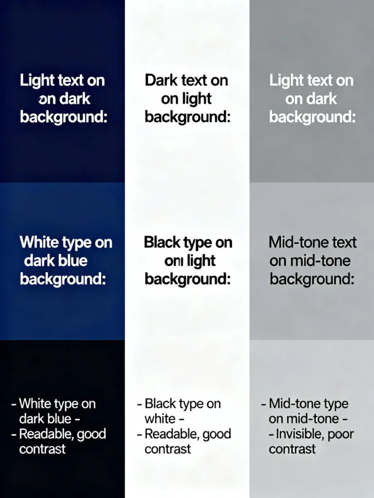
Critical Principle: Text Must Contrast Strongly with Background
Measure contrast using WCAG standards or simple rules:
Light Text on Dark Background:
- White on dark blue, dark gray, or black: excellent contrast
Dark Text on Light Background:
- Black, dark gray, or dark blue on white, light gray: excellent contrast
What to Avoid:
- Mid-tone text on mid-tone background (unreadable)
- Light gray on white (insufficient contrast)
- Dark blue on black (looks invisible)
Techniques for Maintaining Contrast:
- Use Solid Color Blocks Behind Type
- Semi-transparent overlay
- Solid color strip
- Ensures text remains readable over busy images
- Use Outline/Stroke
- Add black or white outline to text
- Helps text show against varied backgrounds
- Add Shadow or Glow
- Subtle drop shadow behind text
- Can help readability but shouldn’t be primary solution
- Choose Simpler Background Images
- Images with areas of neutral color
- Avoid extremely busy backgrounds
Related Topics:
- Starting CorelDRAW
- How to Add Falling Snow in Photoshop
- How to Create Silver Metallic Effect in Illustrator
Step-by-Step: Creating a Complete Magazine Cover
Let’s build an actual magazine cover from start to finish. I’ll use a fictional fashion/lifestyle magazine called “Stride” as our example.
Concept Overview
Magazine: Stride (lifestyle magazine for active women)
Issue: Summer 2025
Main Story: “Redefine What Strong Means” (interview with an athlete/fitness innovator)
Tone: Empowering, contemporary, energetic
Target Audience: Women 25-45, active lifestyle, motivated by personal growth
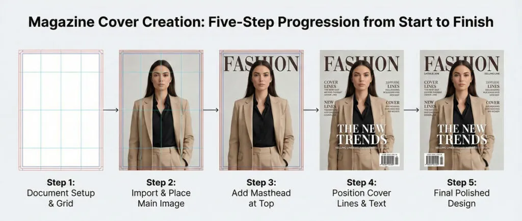
Step 1: Create Document and Set Up Structure
File Setup:
- Size: 210 × 297 mm (A4)
- Bleed: 3 mm all sides
- Color mode: CMYK
- Resolution: 300 ppi for images
Layer Structure:
- Background (gradient or solid color)
- Main Image (hero photo)
- Type Behind (optional)
- Color Overlays
- Type Front (all headlines and text)
- Puffs/Badges
- Technical elements
Create Guides:
- Vertical guides at 3mm bleed, 5mm safe area
- Horizontal guides for masthead area, main story area, supporting lines area
- Center vertical guide
Step 2: Choose and Place Main Image
The Image:
Dynamic portrait of a woman in athletic wear, side-lit, looking powerful and confident. Shot from waist-up to leave room for masthead above and cover lines around.
Placement:
- Extends nearly edge-to-edge (honoring the bleed)
- Subject positioned in upper-center area
- Eyes in upper third (rule of thirds)
- Space around subject for typography
Step 3: Add Masthead
Masthead Design:
- Font: Montserrat Ultra-Bold
- All caps: STRIDE
- Size: 120 pt
- Color: White with 2 pt black stroke for contrast
- Positioning: Top-center, 12 mm from top edge
The stroke ensures readability over the varied background of the subject’s body.
Step 4: Add Main Cover Line
Headline:
“Redefine What Strong Means”
Typography:
- Font: Montserrat Bold
- Size: 54 pt
- Tracking: 50
- All caps: REDEFINE WHAT STRONG MEANS
- Color: White text with semi-transparent dark overlay behind it
- Positioning: Lower 1/3 of cover, left-aligned
The overlay ensures readability over the background image.
Step 5: Add Supporting Cover Lines
Supporting Stories:
- “The New Fitness Frontiers”
- “Nutrition That Powers Performance”
- “Gear Guide for Summer Training”
Typography:
- Font: Montserrat Medium
- Size: 16 pt
- Color: White or accent color (teal)
- Positioning: Right side, vertically aligned, roughly centered height
Each line has a kicker in all-caps:
- “TREND:”
- “SCIENCE:”
- “SHOP:”
Step 6: Add Secondary Elements
Tagline:
“Inspire. Achieve. Elevate.” positioned beneath masthead
Skyline (optional):
“SUMMER 2025 | SUMMER ATHLETE GUIDE” in thin, light typeface at top
Issue Information:
- Date: July 2025
- Price: $6.99
- Positioned bottom right near barcode area
Related Topics:
Advanced Techniques: Depth, Layering and Visual Flow
Once you master basic cover design, advanced techniques add sophistication.
Creating Depth Through Layering
Technique 1: Type Behind Subject
- Place certain type elements behind the subject’s body
- Creates depth illusion: subject appears in front of text
- Requires careful placement so it doesn’t hurt readability
- Works best with: large subjects with clear silhouettes
Technique 2: Graduated Transparency
- Main image is fully opaque at center
- Gradually becomes transparent at edges
- Reveals background or supporting design beneath
- Creates smooth transition into supporting text areas
Technique 3: Multiple Image Layers
- Combine two images: one in focus, one blurred
- Create composite where subject from one photo sits in front of scene from another
- Adds visual richness and storytelling potential
Color Overlays and Effects
Overlay Strategy:
- Place semi-transparent color layer over main image
- Creates color consistency and mood
- Helps text visibility
- Watch opacity: 15-40% usually ideal
Gradient Overlays:
- Fade from opaque at bottom (for text) to transparent at top (showing image)
- Creates visual hierarchy
- Improves readability of type over image
Visual Flow and Eye Path
Design the cover so the viewer’s eye follows a natural path:
- Masthead (top, obvious first)
- Main cover line (large, eye-catching)
- Main image (natural focal point)
- Supporting cover lines (secondary importance)
- Issue details (if viewer is still interested)
Use size, color and position to guide this path. Avoid scattered elements that make the eye jump randomly.
Related Topics:
Common Beginner Mistakes and How to Fix Them
Mistake 1: Everything Competes Equally
Problem: Masthead, main cover line and supporting text all similar in size and weight. Nothing stands out.
Fix: Enforce a clear size hierarchy. Make masthead 2-3x larger than supporting lines. Make main cover line 1.5-2x larger than secondary lines.
Example:
- Masthead: 120 pt
- Main cover line: 54 pt
- Secondary cover lines: 16 pt
This creates obvious hierarchy.
Mistake 2: Too Much Text Everywhere
Problem: Every inch of cover is covered with text. No breathing room. Looks cluttered and overwhelming.
Fix: Limit to 3-5 main cover lines plus masthead. Leave whitespace. Not every story needs to appear on the cover.
Mistake 3: Text Over Busy Images Without Contrast Management
Problem: Cover line is invisible over the complex background of the image.
Fix: Add a semi-transparent overlay behind the text, use contrasting outline/stroke, or choose a simpler image with areas of neutral tone.
Mistake 4: Inconsistent Typography Across Issues
Problem: Every month, the masthead is different size/style, supporting text follows different rules, layout is completely different.
Fix: Create a style guide that defines:
- Masthead: size, font, color, placement
- Primary cover line: size, font, color, positioning rules
- Secondary cover lines: size, font, color, column placement
- Colors and gradients
Allow variation within these parameters.
Mistake 5: Weak Main Image
Problem: The hero image doesn’t communicate the story or isn’t visually compelling enough to stop scrolling.
Fix: Brief your photographer/illustrator clearly on what you need. Choose images with:
- Clear focal point
- Strong composition
- Colors that support your palette
- Emotional resonance matching the story
Mistake 6: Illegible Type at Small Sizes
Problem: Cover looks great on screen but when printed small or shown as thumbnail, type becomes unreadable.
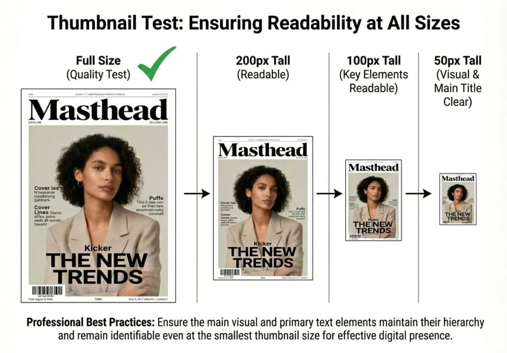
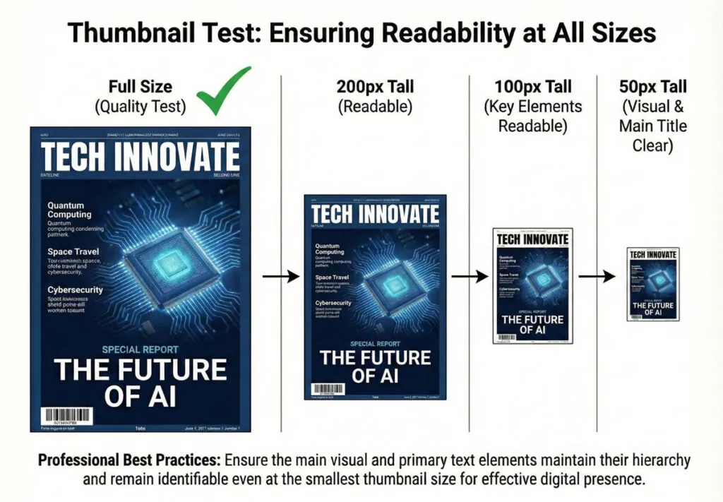
Fix: Test your cover at multiple sizes. Zoom out to 50% or smaller. Can you still read masthead and main cover line? If not, simplify or enlarge.
Mistake 7: Poor Color Contrast
Problem: Main text blends into background. Insufficient contrast ratio.
Fix: Use tools like WebAIM Contrast Checker. Aim for WCAG AA standard (4.5:1 contrast for normal text, 3:1 for large text). If you’re close, add outline/stroke or semi-transparent overlay.
Mistake 8: Overreliance on Effects
Problem: Gradients, glows, shadows, textures everywhere. Looks dated and unprofessional.
Fix: Design primarily with solid shapes and type. Add effects sparingly if they serve a purpose. Most professional covers use minimal effects.
Related Topics:
Testing Your Cover Before Final Export
Never release a cover without thorough testing.
The Thumbnail Test
- Shrink your cover to approximately 200 px tall
- Can you instantly recognize the masthead?
- Can you read the main cover line?
- Does it still feel balanced and composed?
If you answer “no” to any question, your cover isn’t working at all sizes.
The Distance Test
- Print your cover at full size (or view on screen)
- Stand 10 feet away
- What’s the first element you see?
- Can you read the main cover line from this distance?
- Does the hierarchy still work?
This simulates how someone sees a cover on a newsstand.
The Color Proof Test
- Print a color proof or export PDF
- Check color accuracy
- Verify type contrast and legibility
- Look for any color shifts or printing issues
The Peer Review
- Show the cover to 5-10 people who represent your audience
- Ask:
- What’s the main story?
- What’s interesting to you?
- What would make you click/buy?
- What’s confusing?
- If multiple people miss the main message, your hierarchy isn’t working.
The Consistency Check (For Ongoing Publications)
- Place your new cover next to previous covers
- Does the masthead look consistent?
- Is the typographic style similar?
- Does the color approach feel aligned with the brand?
This ensures your cover builds brand recognition rather than confusing readers.
Related Topics:
Exporting for Print and Digital Distribution
Proper export is critical. A beautiful cover ruined by improper export format is a tragedy.
Export for Print
PDF/X Format (Recommended):
- File → Export as PDF
- Choose Adobe PDF preset
- Select “PDF/X-1a” or “PDF/X-4” (check printer preference)
- Verify:
- Bleed is included
- All fonts are embedded (or outlined)
- Color mode is CMYK
- Crop marks are included (optional but helpful)
Settings to Check:
- Include Bleed Area: YES
- Compression: ZIP (lossless)
- Color Conversion: NO (you want colors to arrive at printer without conversion)
- Font Subset: Ensure all fonts embedded
Preparing for Professional Printing
Before Sending to Printer:
- Create Bleeds Properly
- All edge-extending images must extend 3 mm beyond trim line
- Don’t leave margins inside the bleed area
- Convert Fonts
- Option A: Outline all type (Convert to Outlines in design software)
- Option B: Embed fonts in PDF
- Never send files with missing fonts
- Verify Color Mode
- Confirm CMYK for print
- Don’t send RGB to printer (colors will shift)
- Soft Proof
- Review a PDF preview
- Check that colors, fonts, and elements look correct
- Look for any text cutoff at edges
- Communication with Printer
- Provide specs: trim size, bleed, any special requirements
- Ask about their preferred file format and specs
Related Topics:
Creating a Reusable Cover System for Consistency
For publications releasing multiple issues, create a system.
Building a Cover Template
- Set Up Master File
- Create a base document with masthead, grid, guides
- Include color swatches for brand colors
- Set type styles for all recurring elements
- Create Flexible Layout Structure
- Define zones for main image, masthead, cover lines
- Show flexible positioning (not locked into one arrangement)
- Allow variation while maintaining brand consistency
- Document the System
- Create a style guide showing:
- Masthead rules (never smaller than X, never positioned other than…)
- Color palette and application
- Typeface rules
- Minimum sizes for type
- Examples of acceptable variations
- Create a style guide showing:
Example Cover Template Structure
STRIDE MAGAZINE COVER SYSTEM

Masthead Rules:
- Font: Montserrat Ultra-Bold
- Size: 120 pt minimum
- Color: White with black stroke
- Position: Top-center, 12mm from edge
- Never change: this is the brand anchor

Primary Headline Rules:
- Font: Montserrat Bold
- Size: 48-54 pt
- Color: White with shadow or overlay
- Position: Lower 2/3 of cover
- Variation allowed: left, center, or right alignment

Secondary Headlines:
- Font: Montserrat Medium
- Size: 16 pt
- Color: White or accent color (teal)
- Position: Right or left columns
- Variation allowed: vertical arrangement

Color Palette:
- Primary: Teal #00897B
- Accent: Coral #FF6F42
- Neutral: Black #1A1A1A, White #FFFFFF
Year-Round Variation Ideas
Even with a strict system, you can vary covers:
- Different main images each month
- Different main headlines
- Different supporting story selections
- Different color overlays (different tint of primary color)
- Different accent color emphasis
- Seasonal variations (winter palette vs. summer palette)
This creates consistency while preventing monotony.
Related Topics:
- How to Recolor Artwork in illustrator
- How to Create Flower using Gradient Mesh in Illustrator
- How to Create Metallic effect in Illustrator
Conclusion: From Understanding to Mastery
You’ve now learned the complete anatomy of magazine cover design, from understanding the psychology behind cover effectiveness to executing professional covers, to building reusable systems.
Magazine cover design combines strategy, art and craft. It’s not just about making something look pretty—it’s about understanding your audience, communicating clearly and guiding viewers’ eyes to the information you want them to see.
The best magazine covers feel inevitable. They look like they could be no other way. But that inevitability comes from thoughtful planning, understanding the anatomy and rules and then executing with precision and restraint.
Your Next Steps:
- Analyze existing covers in your target genre. Notice the hierarchy, color choices, type decisions. What works and why?
- Create a practice cover using a fictional magazine. Go through the complete process from brief to final export.
- Build your own cover template if you’re working on an ongoing publication.
- Study type and hierarchy extensively. These are the core skills that separate amateur from professional covers.
- Test your covers with real audiences before finalizing.
The path to mastery is practice. Your first cover won’t be perfect. Your tenth will be better. Your fiftieth will be professional. Keep pushing, studying and refining.
The magazine covers you see in the world aren’t products of magic or innate talent. They’re products of understanding a system, respecting the rules and executing with skill.
Now go create something that stops scrolls and sells stories.
Related Topics:
- How to Create A Pressure Sensitive Brush in Illustrator
- How to set Brush Pressure in Illustrator
- How to design a Retro Flower Pattern
About the Author
Lalit M. S. Adhikari is a Digital Nomad and Educator since 2009 in design education, graphic design and animation. He’s taught 500+ students and created 200+ educational articles on design topics. His teaching approach emphasizes clarity, practical application and helping learners.
Learn more about Lalit Adhikari.
Last Updated: December 2025
This guide is regularly updated with the latest information about Adobe tools and design best practices. Last Updated: Mar 2026
Related Topics:
- How to make a Semicircle in Illustrator
- How to use Mesh Tool in illustrator
- How to use Gradient Tool in Illustrator
- Create a Document in InDesign
- What is InDesign
- Photoshop Channels
- Adobe Illustrator vs Photoshop for Beginners: Which Should You Learn First?
- Window menu in Photoshop
- View menu in Photoshop
- Filter menu in Photoshop


