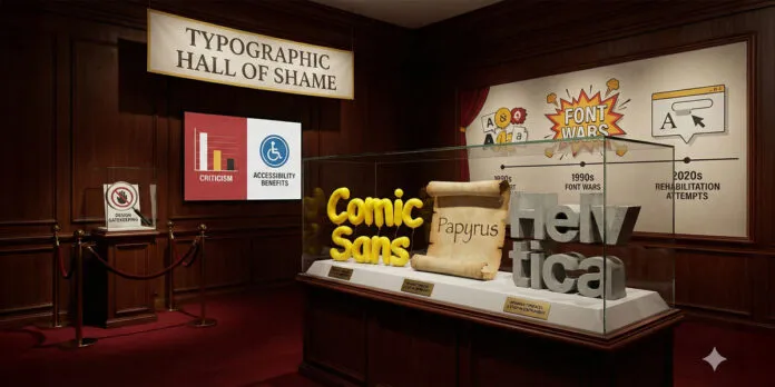
Explore the most controversial and despised fonts in design history. Discover why fonts like Comic Sans, Papyrus, and Helvetica are criticized, and what makes a typeface “bad.
My name is Lalit Adhikari and we are at LTY. Let’s begin!
Table of Contents
Introduction: When Typography Goes Wrong
In the world of graphic design and typography, certain fonts have achieved a peculiar kind of fame: they are universally despised, mocked, and avoided by serious designers.
These fonts represent everything that many designers believe is wrong with typography—poor design decisions, overuse, inappropriate contexts, or fundamental design flaws.
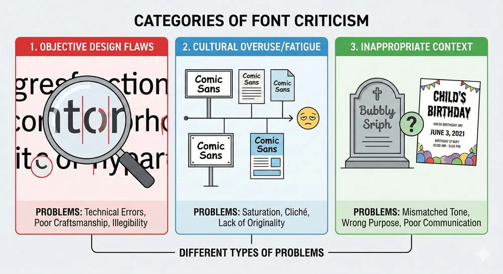
Yet the question of what makes a font “bad” is more complex than it might initially appear. Some fonts are considered “bad” because they are poorly designed.
Others are considered “bad” not because of inherent design flaws but because they have been so extensively overused that encountering them produces groans of frustration.
Still others are considered “bad” because they are used inappropriately—deployed in contexts where they communicate the wrong message or undermine professional credibility.
This complex landscape of font criticism raises important questions:
- What makes a typeface objectively “bad”?
- Is a typeface bad because of its design characteristics, or because of how it has been used and abused?
- Can a “bad” font be rehabilitated through appropriate use?
- Do we dismiss fonts too quickly based on fashion and trend rather than objective evaluation?
The fonts that have earned reputations as “the worst” include infamous names like Comic Sans, Papyrus, and Helvetica (yes, even the celebrated Helvetica is criticisms by some). These fonts represent different categories of typographic failure:
- Comic Sans as a casualty of overuse and inappropriate deployment
- Papyrus as a typeface with fundamental design problems
- Helvetica as a once-revolutionary font that has become ubiquitous to the point of invisibility and contempt.
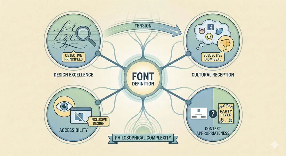
Understanding why certain fonts are despised reveals important lessons about typography, design history, design philosophy, and the complex relationship between design excellence and cultural reception.
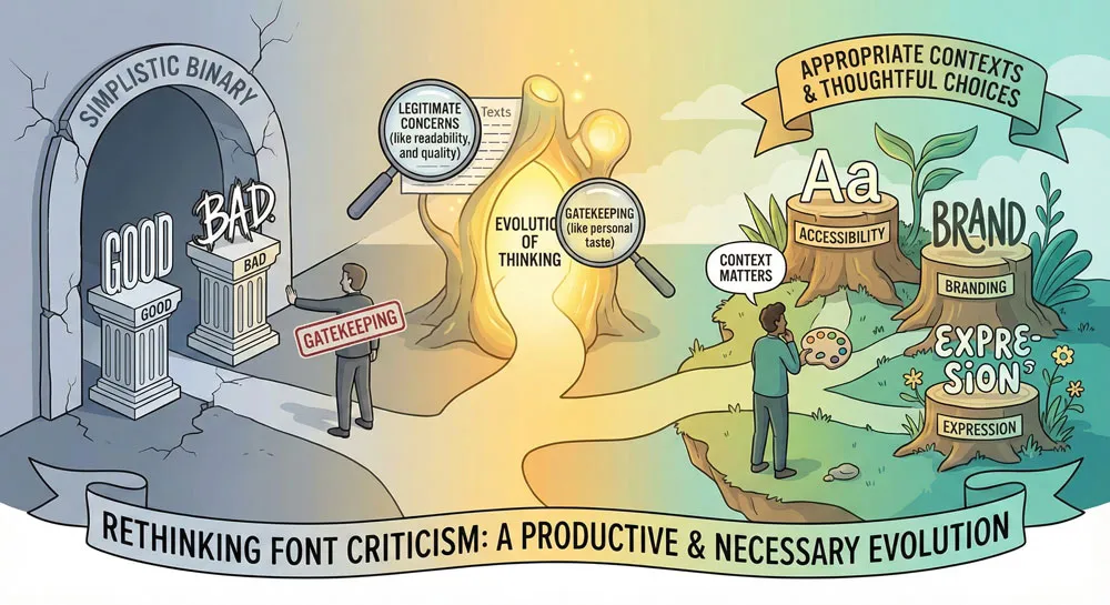
It also reveals important critiques of design gatekeeping—the tendency of design professionals to dismiss fonts based on snobbery rather than legitimate design principles.
This comprehensive exploration examines the most widely-criticized and despised fonts, analyzes why these fonts earn such contempt, explores the distinction between objectively bad design and culturally despised fonts, considers questions of font rehabilitation and appropriate use, and ultimately asks:
- what does the contempt directed at certain fonts reveal about design values, about design gatekeeping, about the relationship between design excellence and accessibility?
Related Topics:
- Gill Sans and Tube: How Johnston and Gill Defined London
- Baskerville and Eaves: A Tale of Perfection, Passion and Revival
- Futura vs. The World: The Geometric Vision of Paul Renner
What Makes a Font “Bad”? Defining Typographic Failure
Design Flaws and Objective Problems
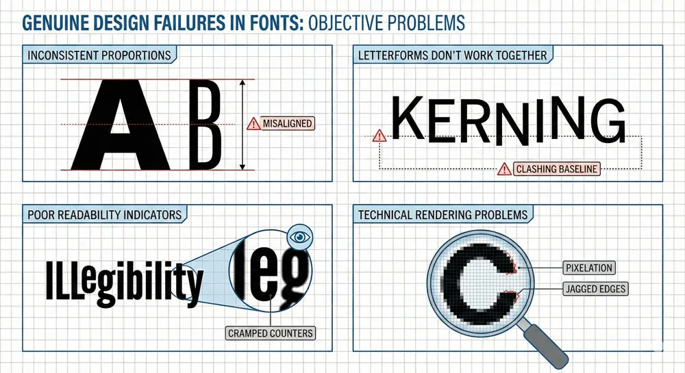
Some fonts are genuinely poorly designed. They may have fundamental structural problems: letterforms that don’t work well together, inconsistent proportions, poor readability, or technical issues that make them function poorly.
True design flaws might include:
- Letterforms that are difficult to distinguish from each other
- Inconsistent proportions and rhythm
- Poor spacing and kerning
- Lack of thought about how the typeface functions in actual use
- Technical problems that cause rendering issues
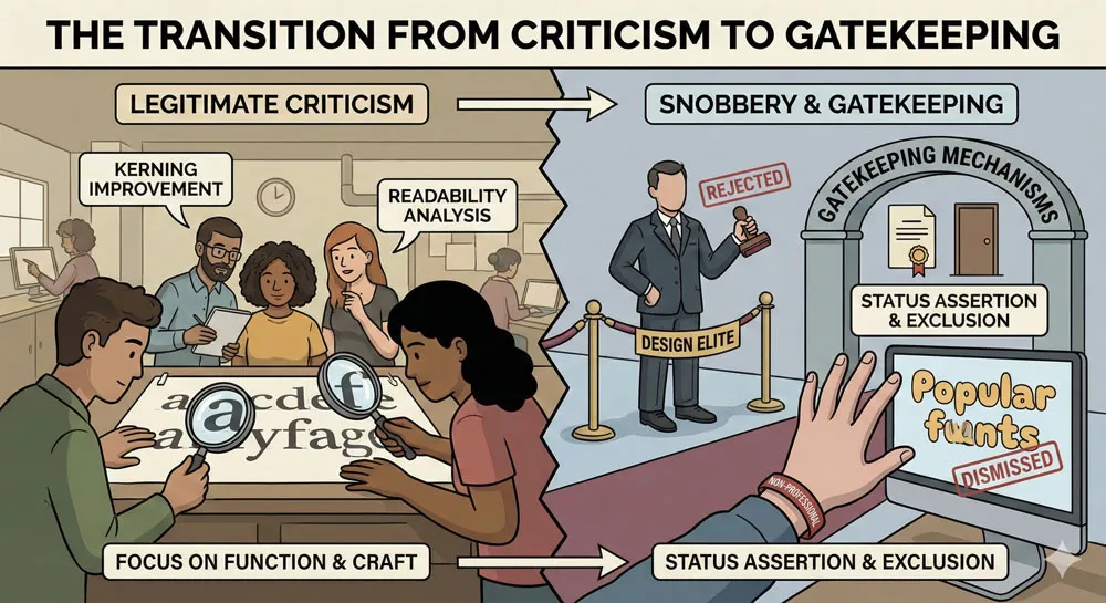
When a typeface has genuine design flaws, criticism is often legitimate and based on objective design principles.
Overuse and Cultural Fatigue
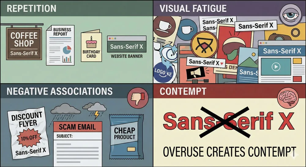
Some fonts are not inherently “bad” but have become despised through cultural overuse. When a typeface is deployed so extensively and so inappropriately that it becomes visually exhausting, designers and viewers develop negative associations with the typeface regardless of its design qualities.
Comic Sans is perhaps the primary example of a font damaged by overuse. The typeface itself is not fundamentally poorly designed, but it has been used so extensively and in so many inappropriate contexts (official business communications, corporate branding, serious institutions) that it has become a symbol of design failure and poor judgment.
Context and Appropriate Use
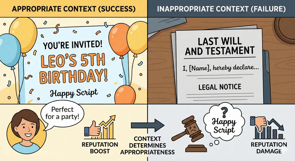
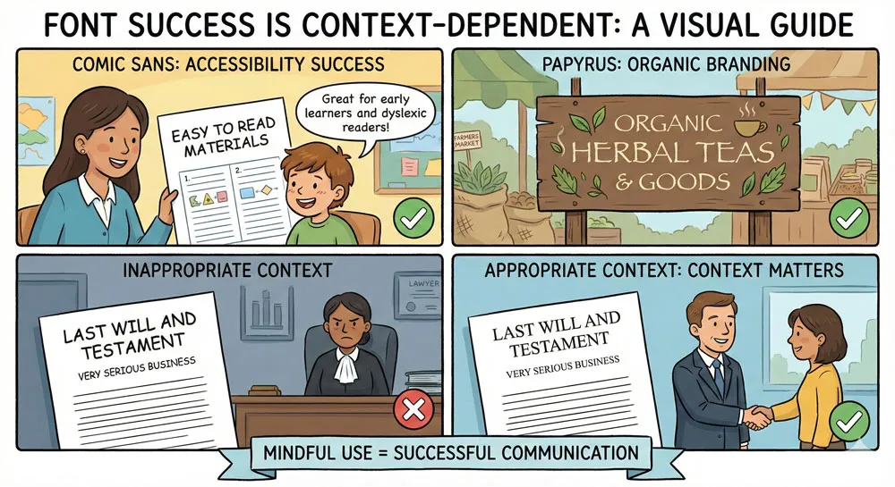
Some fonts are considered “bad” because they are chronically used in inappropriate contexts. A typeface that functions well in one context might be disastrous in another.
When a typeface is consistently used inappropriately, it develops a negative reputation even if the typeface itself is adequately designed.
Papyrus, for example, has gained a reputation as a “bad” font partly because it has been extensively used in inappropriate contexts—on professional business communications, government documents, formal branding—where its casual, decorative character is entirely inappropriate.
Snobbery and Design Gatekeeping
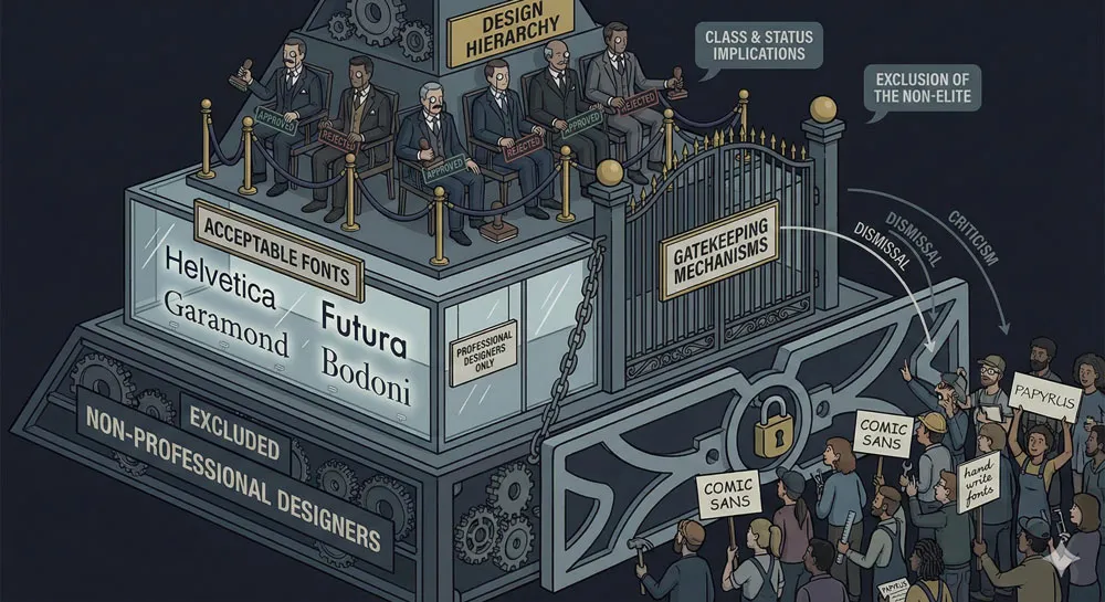
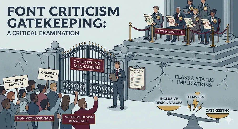
Some criticism of fonts is not based on objective design principles but on snobbery, gatekeeping, and design fashion.
Design elites may dismiss fonts as “bad” because they are popular with non-designers, because they are used in contexts associated with low status, or because dismissing certain fonts has become fashionable within design communities.
This gatekeeping dimension of font criticism raises important questions about whether design criticism is based on legitimate principles or on hierarchies of taste and professional status.
Related Topics:
- Legibility vs. Readability: What Every Designer Needs to Know
- Secret Life of Symbols: History of Ampersand and Interrobang
- Helvetica – Swiss Modernism’s Ubiquity Crisis
Comic Sans: The World’s Most Despised Typeface
The Rise and Fall of Comic Sans
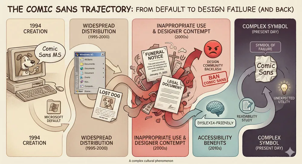
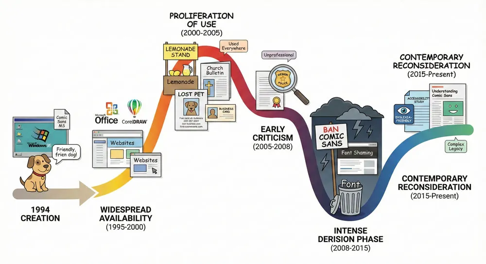
Comic Sans was designed in 1994 by Vincent Connare for Microsoft. The typeface was created as an informal, friendly sans-serif based on comic book lettering.
When it was released, Comic Sans was not particularly noted as exceptional—it was simply one of many typefaces included with Microsoft software.
However, Comic Sans achieved unexpected prominence through widespread availability and use.
Because Comic Sans came preinstalled on millions of computers, it became accessible to anyone creating documents.
Because the typeface was informal and friendly, it was deployed in countless contexts.
By the early 2000s, Comic Sans had become the subject of intense derision from design professionals. The typeface became symbolic of poor design choices, amateur design decisions, and the problem of non-designers having access to design tools.
Why Is Comic Sans So Hated?
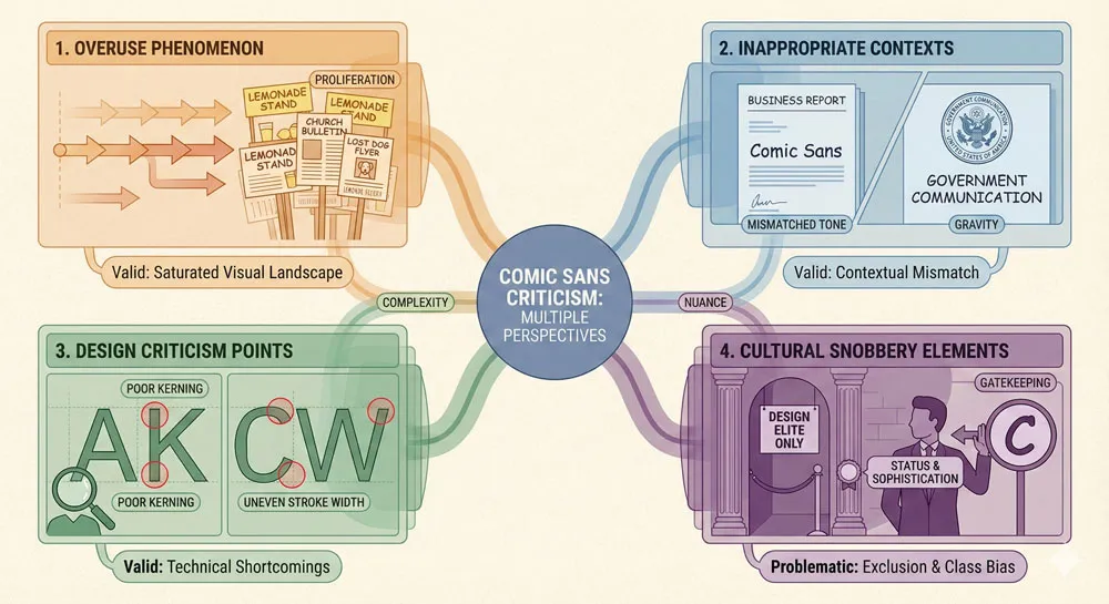
Comic Sans criticism comes from multiple sources:
- Overuse: Comic Sans has been deployed so extensively and in so many inappropriate contexts that it has become nearly impossible to encounter the typeface without negative associations. Formal business documents, government communications, medical documents, and serious branding have all suffered from Comic Sans deployment.
- Inappropriate contexts: The casual, friendly character of Comic Sans makes it appropriate for certain contexts (children’s materials, casual communication) but entirely inappropriate for others (legal documents, professional communications, serious institutional branding). The extensive inappropriate use has damaged the typeface’s reputation.
- Design criticism: Some designers criticize Comic Sans for design characteristics—the letterforms, the weight inconsistencies, the informal character that can appear unprofessional or childish.
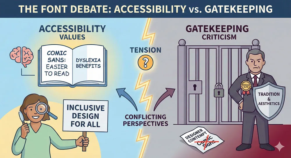
- Accessibility paradox: Interestingly, Comic Sans is often considered one of the most readable typefaces for people with dyslexia. Yet despite this significant functional benefit, many designers continue to despise the typeface.
The Comic Sans Defense
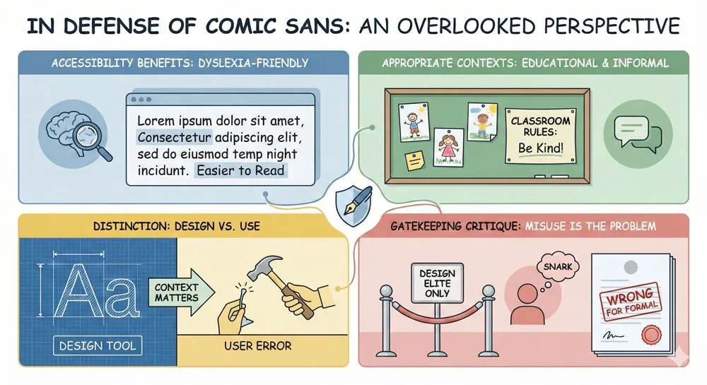
In recent years, some designers and accessibility advocates have mounted defenses of Comic Sans:
- Comic Sans is highly readable for people with dyslexia and other reading difficulties
- The typeface is not inherently poorly designed
- The problem is not Comic Sans but inappropriate use
- Design snobbery against Comic Sans reflects classism and gatekeeping
- Comic Sans has been unfairly scapegoated for broader problems in design
These defenses raise important points about the distinction between legitimate design criticism and gatekeeping.
Related Topics:
- Comic Sans – Accessibility & Gatekeeping Critique
- Gotham – Political Design & Elections Power
- Futura – Geometric Modernism Revolution
Papyrus: The Typeface That Won’t Go Away
Papyrus History and Design
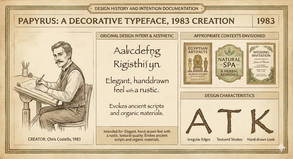
Papyrus was designed in 1983 by Chris Costello. The typeface was intended to evoke the appearance of Egyptian papyrus—informal, organic, with visible texture suggesting handwritten letterforms on papyrus paper.
When designed, Papyrus was positioned as a decorative typeface appropriate for specific contexts. However, like Comic Sans, Papyrus became widely available through widespread software distribution.
Why Is Papyrus Despised?
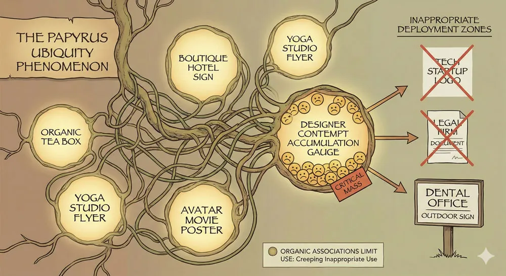
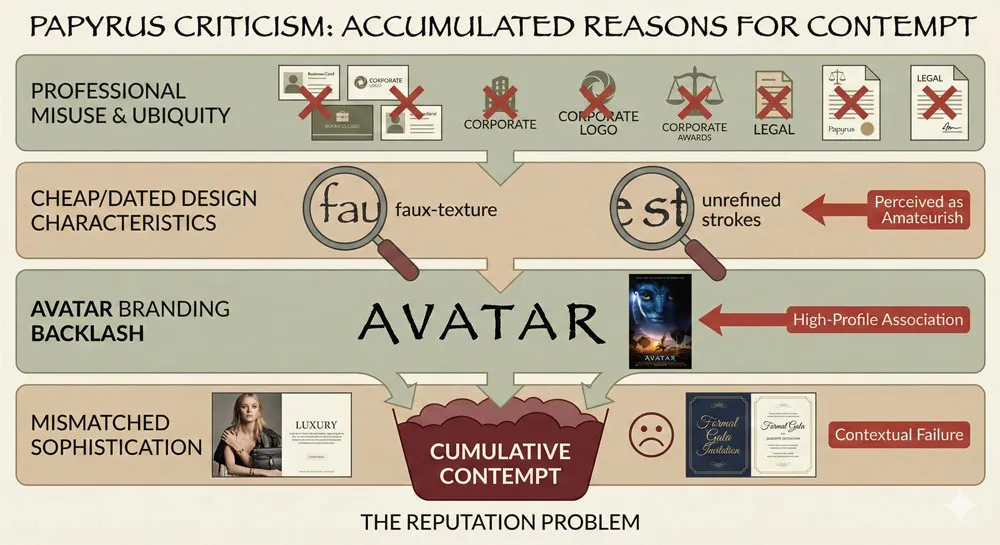
Ubiquity and inappropriate use: Papyrus has become a default choice for anything related to natural, organic, or “earthy” concepts. Hotels, spas, environmental organizations, and countless other institutions deployed Papyrus without considering alternatives or appropriateness.
Design characteristics: Designers criticize Papyrus for appearing cheap, for looking dated, for lacking sophistication. The decorative character that makes Papyrus appropriate for certain contexts makes it inappropriate for professional or serious contexts.
The Avatar effect: The 2009 film Avatar used Papyrus extensively for its marketing and branding. This high-profile use of Papyrus by a major film franchise seemed to validate Papyrus as an acceptable mainstream font, triggering intense backlash from design professionals.
Overuse in appropriate contexts: More than Comic Sans, Papyrus has been deployed extensively in contexts where professional sophistication is required, leading to visible design failure and professional embarrassment.
The Problem with Papyrus Criticism
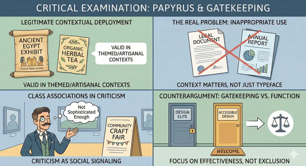
Criticism of Papyrus also reveals design gatekeeping:
- Papyrus works well for specific contexts
- The problem is not Papyrus itself but its inappropriate deployment
- Design professionals may dismiss Papyrus due to its association with non-professional use
- Criticism of Papyrus often reflects classism and gatekeeping
Related Topics:
- Gill Sans – Humanist Alternative Modernism
- Baskerville – Print Excellence & Love Story
- Bodoni – Theatrical Prestige Aesthetics
Helvetica: The Typeface Everyone Hates to Love
Helvetica’s Cultural Position
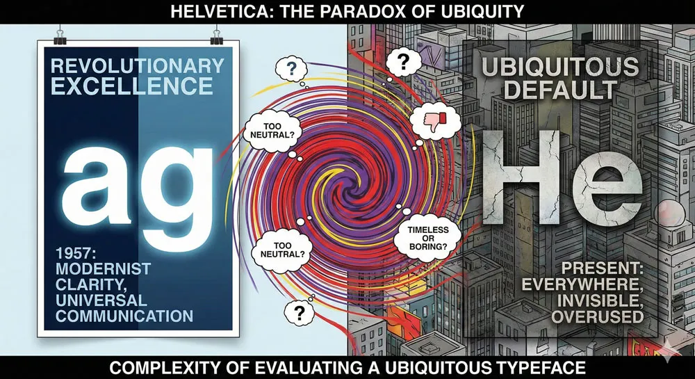
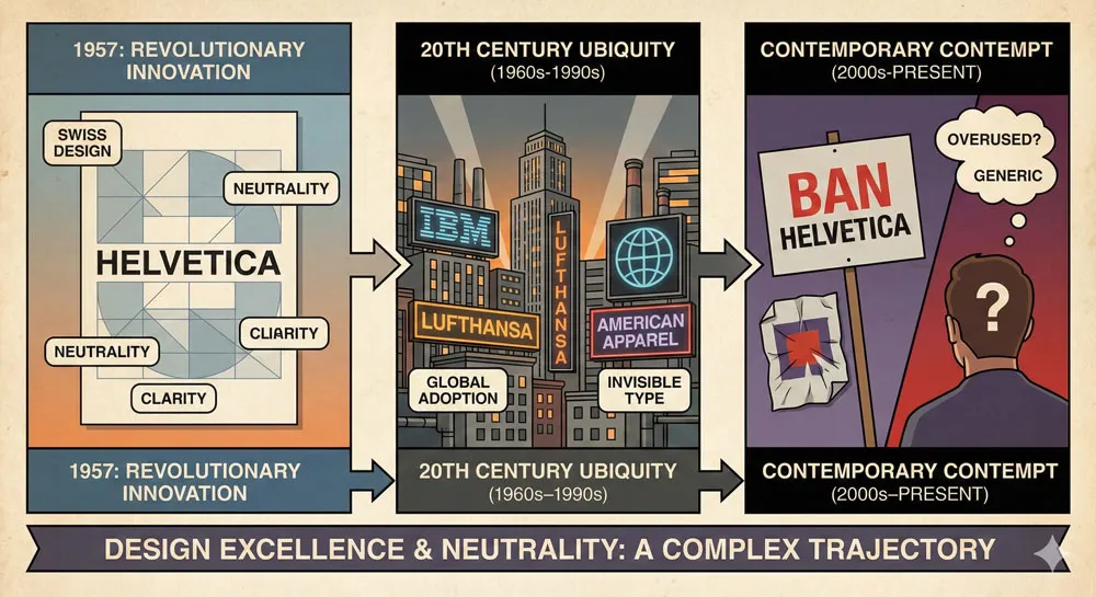
Helvetica is perhaps the most complex font in the “bad fonts” discussion. Helvetica was a revolutionary typeface when designed—a clean, modern, versatile sans-serif that could be deployed in countless contexts.
Throughout the twentieth century, Helvetica became ubiquitous. The typeface appeared on corporate branding, government documents, signage, and countless design applications. Helvetica was selected by design professionals as the best choice for neutral, professional communication.
However, by the early twenty-first century, Helvetica had become so ubiquitous that it began attracting criticism—not for being poorly designed but for being everywhere, for being invisible through overuse, for becoming the default choice when designers had no other ideas.
Helvetica Criticism
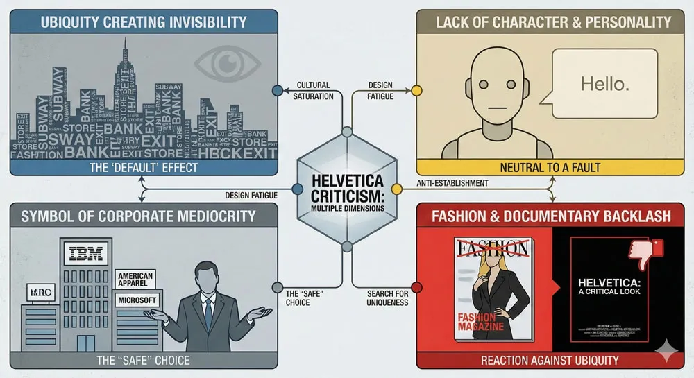
Ubiquity and invisibility: Helvetica has become so ubiquitous that it is nearly invisible. The typeface appears everywhere but is noticed nowhere. Encountering Helvetica has become an experience of design mediocrity—the typeface communicates nothing except that the designer had no distinctive vision.
Lack of character: Helvetica’s very virtue—its neutral versatility—becomes a vice when the result is design with no distinctive character, no personality, no memorable quality.
Symbol of corporate design failure: For many critics, Helvetica has become symbolic of corporate design mediocrity, of designers choosing the safe, familiar option instead of making distinctive design choices.
The Helvetica documentary effect: A 2007 documentary celebrating Helvetica’s influence triggered significant backlash, with designers and critics arguing that Helvetica’s dominance was precisely the problem in contemporary design.
The Helvetica Defense
Other designers argue:
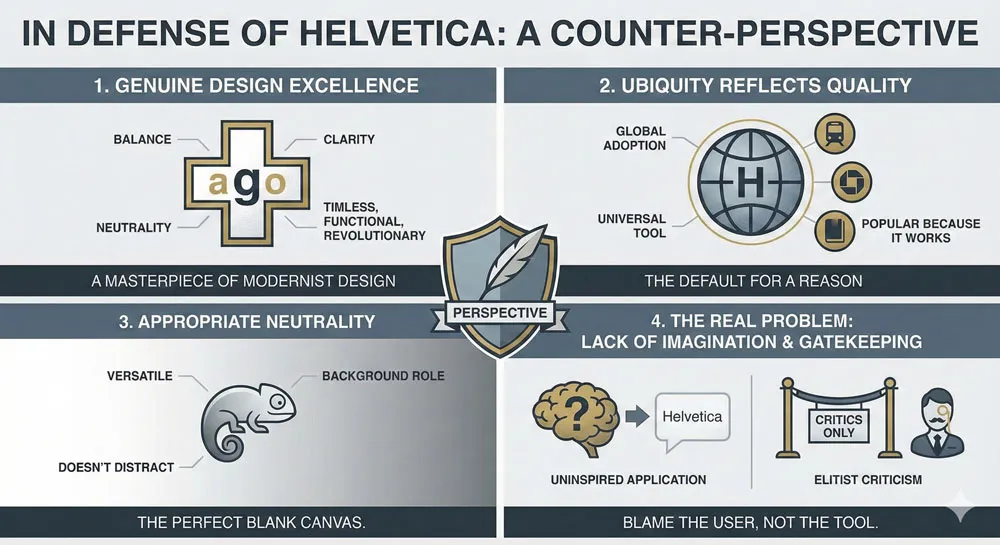
- Helvetica remains an excellent typeface
- Criticism reflects fashion rather than legitimate design principles
- Helvetica’s ubiquity reflects its genuine quality and appropriateness
- The problem is not Helvetica but lack of imagination in how designers deploy it
- Helvetica criticism represents ageism and dismissal of design achievements
Related Topics:
- Garamond – Classical Foundation Principles
- Worst Fonts – Criticism & Gatekeeping Analysis
- Gill Sans & The Tube – Urban Identity Infrastructure
Other Widely-Criticized Fonts
Times New Roman: The Typewriter Legacy
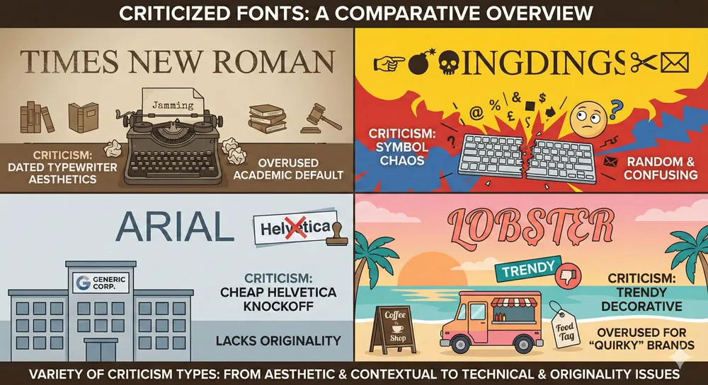
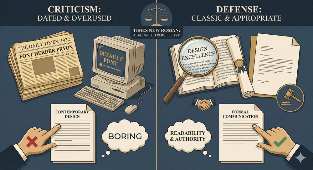
Times New Roman was designed for newspaper printing and became the default for business documents. Contemporary designers criticize Times New Roman for looking dated, for evoking typewriter aesthetics, for being boring.
However, Times New Roman criticism often misses the point: the typeface was excellently designed for its specific purpose. The criticism often reflects fashion rather than legitimate design evaluation.
Wingdings: The Symbol Chaos
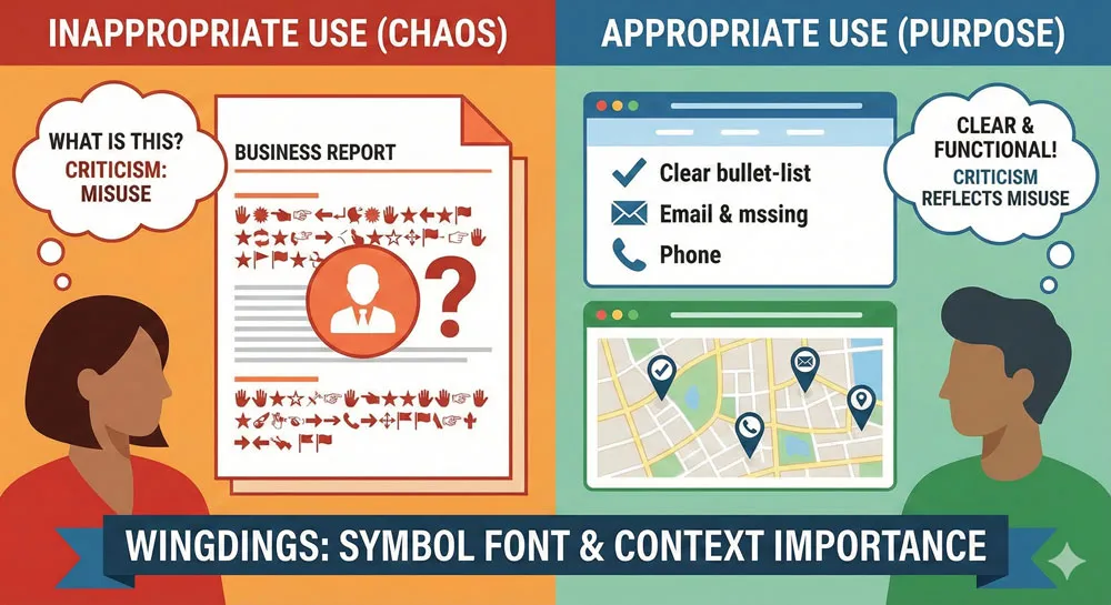
Wingdings is a symbol font that replaces letterforms with decorative symbols. Designers criticize Wingdings for its overuse in casual contexts, for appearing unprofessional, for being impossible to read when viewed as text.
However, Wingdings criticism sometimes reflects lack of understanding about the typeface’s intended purpose and appropriate use.
Arial: The Helvetica Knockoff
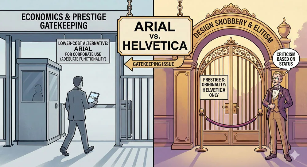
Arial, designed as a low-cost alternative to Helvetica, is criticized for being derivative, for being inferior to Helvetica, for being ubiquitous in corporate contexts.
Arial criticism often reflects snobbery—the idea that Arial is “cheap” Helvetica and therefore inferior. However, Arial functions adequately for most corporate contexts.
Lobster: The Trendy Decorative Font
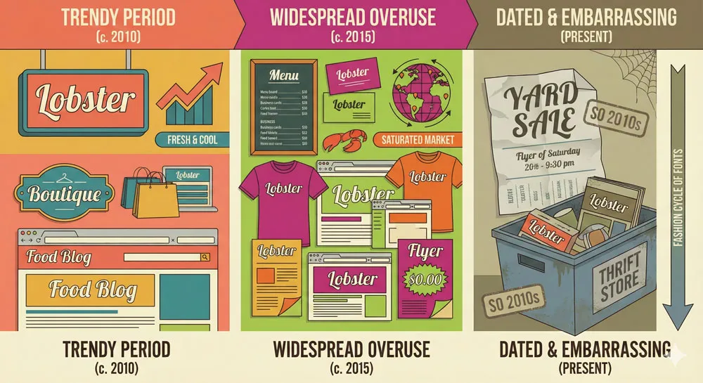
Contemporary criticism focuses on typefaces like Lobster—trendy decorative fonts that designers overuse until they become associated with poor design fashion.
Lobster criticism reflects the reality that trendy fonts quickly become dated and embarrassing when fashion moves on.
Related Topics:
- Baskerville & Mrs. Eaves – Love, Partnership & Revival
- Futura & Paul Renner – Geometric Vision & Revolution
- Legibility vs. Readability – Typography Fundamentals
The Problem of Design Gatekeeping
When Criticism Becomes Snobbery
Much criticism of “bad” fonts reflects design gatekeeping rather than legitimate design principles:
- Dismissing fonts because they are popular with non-designers
- Criticizing fonts based on cultural and class associations
- Using font criticism to establish professional status and hierarchy
- Dismissing fonts because they are unfashionable within design communities
This gatekeeping dimension is particularly evident in Comic Sans criticism—a font despised by design professionals but actually quite functional and used appropriately in certain contexts.
Accessibility and Inclusive Design
Comic Sans criticism particularly problematizes gatekeeping because Comic Sans is one of the most readable typefaces for people with dyslexia. The design community’s dismissal of Comic Sans creates tension with accessibility and inclusive design values.
The Economics of Font Choice
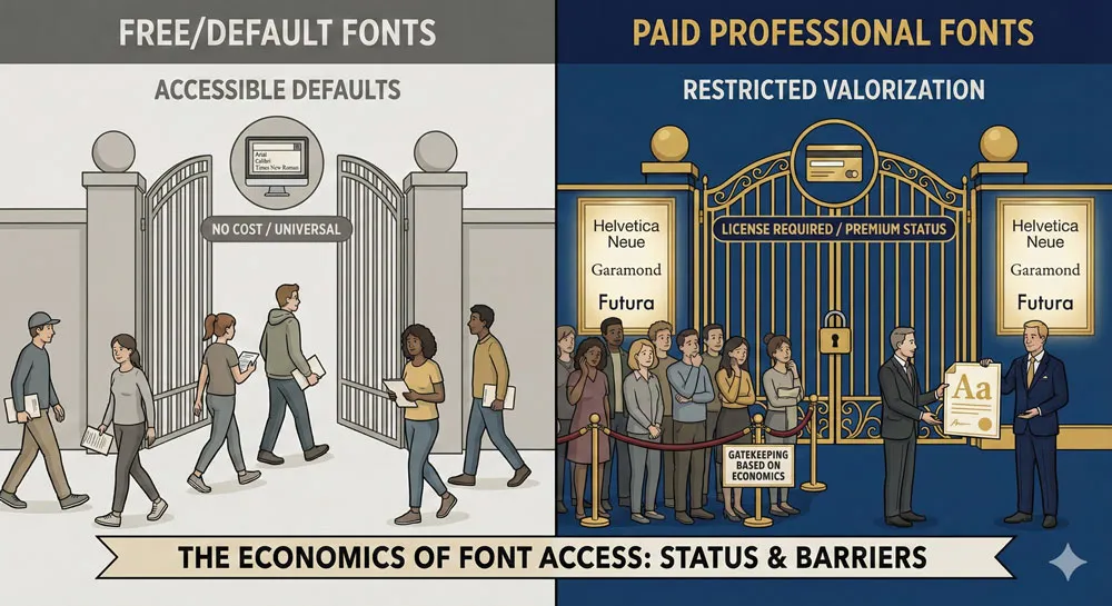
“Bad” fonts are often those available without cost or through default software distributions. Dismissing these fonts may reflect gatekeeping based on economics: professional fonts are those you must purchase, while “bad” fonts are those freely available to everyone.
Related Topics:
Can Bad Fonts Be Rehabilitated?
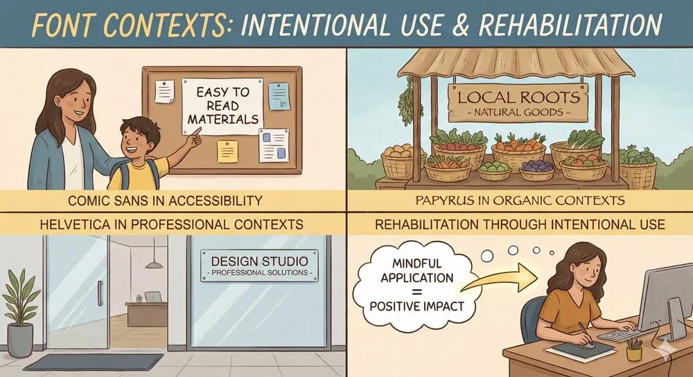
Context and Appropriate Use
One of the most important insights about “bad” fonts is that context determines appropriateness. A font that is disastrous in one context might be perfectly appropriate in another.
Comic Sans, despite widespread derision, functions appropriately for:
- Children’s materials
- Casual, friendly communication
- Documents for readers with dyslexia
- Creative contexts where informality is desired
Papyrus might be appropriate for:
- Organic, natural product branding
- Casual, creative contexts
- Contexts where informality and texture are desired
Helvetica and Times New Roman, despite criticism, remain appropriate for:
- Corporate professional communication
- Contexts requiring neutrality and clarity
- Design where the typeface should be invisible
Designer Education and Intentional Choices
Rehabilitation of “bad” fonts often requires designer education—helping designers understand when fonts are appropriate, how to deploy typefaces intentionally rather than by default, how to make distinctive design choices.
When designers deploy Comic Sans, Papyrus, or Helvetica intentionally and appropriately, these fonts can function adequately or even excellently. The problem is often not the typeface but the thoughtlessness of the deployment.
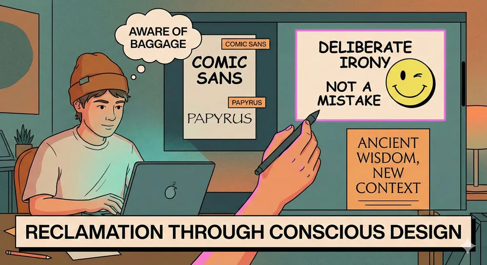
Reclamation and Ironic Use
Some contemporary designers have begun reclaiming “bad” fonts through ironic or intentional use. Using Comic Sans or Papyrus intentionally, knowing the cultural baggage these fonts carry, can be a design choice rather than an error.
This reclamation suggests that fonts can be rehabilitated when used with intentionality and awareness.
Related Topics:
- Helvetica Effect: One Font Conquered Global Design
- Comic Sans: True Story Behind the World’s Most Hated Font
- Gotham: Font That Won an Election And Changed Design Forever
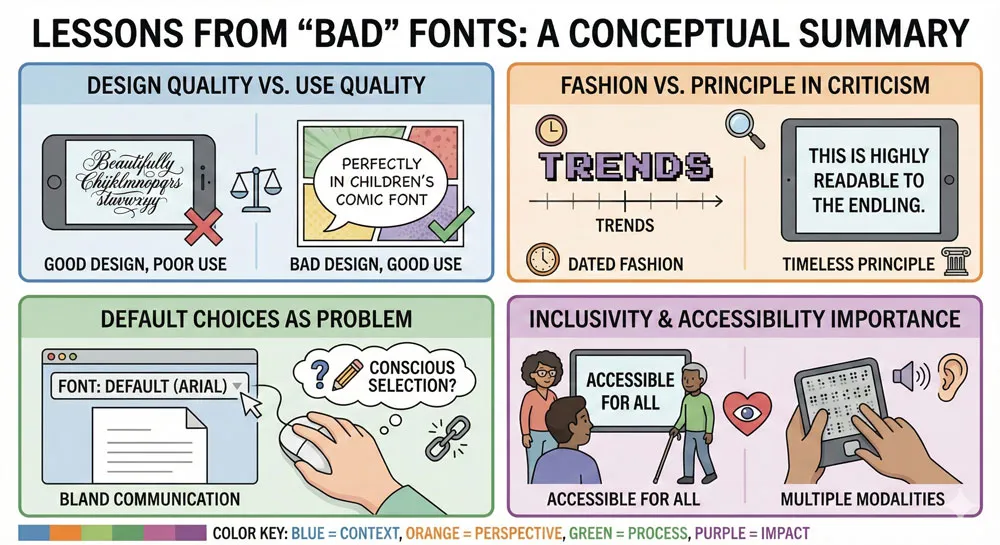
Lessons from Font Criticism
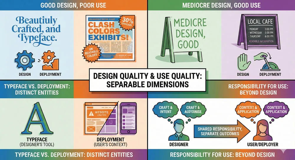
The Distinction Between Design and Use
One of the most important lessons from examining “bad” fonts is the distinction between the quality of the typeface design and the quality of how the typeface is deployed.
A well-designed typeface can be ruined through inappropriate use. A mediocre typeface might be redeemed through thoughtful, appropriate deployment.
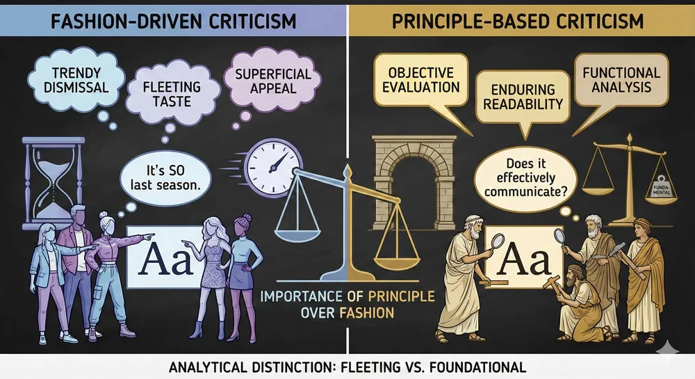
Fashion vs. Principle in Design Criticism
Much font criticism reflects fashion rather than design principle. Fonts become despised not because they are objectively poorly designed but because fashion has moved on, or because certain designers have established that the font is “bad.”
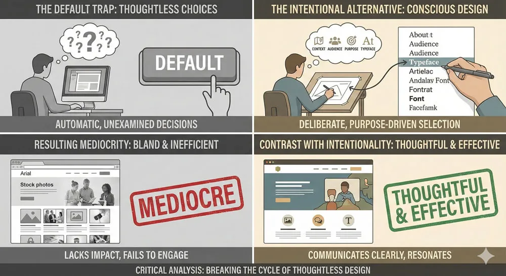
The Problem of Default Choices
Much of the criticism of “bad” fonts reflects the problem of default choices. When designers deploy fonts by default—simply accepting what is available, easy, or familiar—the result is often mediocre design.
Criticism should perhaps focus on thoughtless default choices rather than on specific fonts.
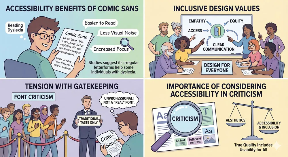
Inclusivity and Accessibility
Dismissing fonts can exclude people with accessibility needs. Comic Sans criticism, for example, creates tension with the reality that Comic Sans serves important accessibility functions.
Font criticism should consider inclusivity and accessibility implications rather than simply reflecting design fashion.
Related Topics:
- Futura: The Geometric Vision of Paul Renner
- Gill Sans: Eric Gill’s Humanist Masterpiece
- Baskerville: Elegant Serif That Shaped Print Typography
FAQ: Common Questions About “Bad” Fonts
Q: Is Comic Sans objectively a bad typeface?
A: Comic Sans is not objectively poorly designed. However, it has been deployed so extensively and inappropriately that it has developed negative cultural associations. The problem is often use rather than design.
Q: Why do designers hate Comic Sans?
A: Designers criticize Comic Sans for overuse, inappropriate deployment, and association with poor design decisions. However, some of this criticism reflects gatekeeping rather than legitimate design principles.
Q: Can Comic Sans be used appropriately?
A: Yes. Comic Sans is highly readable for people with dyslexia, appropriate for children’s materials, and can work in casual contexts. The problem is inappropriate deployment, not the typeface itself.
Q: Is Papyrus a badly designed font?
A: Papyrus has design characteristics that make it appropriate for certain contexts and inappropriate for others. It is not objectively poorly designed, but it has been extensively used inappropriately.
Q: Why is Helvetica criticized if it’s considered excellent?
A: Helvetica criticism reflects its ubiquity and the resulting design mediocrity from default Helvetica choices. The criticism is often directed at how Helvetica is deployed rather than the typeface itself.
Q: Can bad fonts be rehabilitated?
A: Yes. Fonts can be rehabilitated through intentional, appropriate use. The key is understanding when a typeface is appropriate and deploying it thoughtfully.
Q: Is font criticism elitist?
A: Much font criticism does reflect design gatekeeping and elitism. Criticism should be based on legitimate design principles rather than fashion or cultural associations.
Q: Should Comic Sans be avoided completely?
A: No. Comic Sans should be used where appropriate—in contexts where its friendly, informal character is desired, and particularly in accessibility contexts where its readability benefits are valuable.
Q: Are there truly “bad” fonts?
A: It’s difficult to identify truly objectively “bad” fonts. Most criticism reflects inappropriateness of use, cultural associations, or gatekeeping rather than objective design failure.
Q: What makes a font good?
A: Good fonts function well for their intended purpose, communicate appropriately, are readable, and are deployed thoughtfully in contexts where they serve the communication goals.
Related Topics:
- Bodoni Font: Serif That Defined Luxury Typography
- Garamond: Timeless Serif That Defined Classical Typography
Conclusion: Rethinking Font Criticism
The examination of fonts dismissed as “bad” reveals important lessons about typography, design philosophy, and design culture. It reveals that much criticism of fonts reflects gatekeeping, fashion, and cultural snobbery rather than legitimate design principles.
Yet legitimate criticism also exists. Some fonts have genuine design problems. Some uses of typefaces are genuinely inappropriate. Some deployment of fonts reflects thoughtlessness rather than intentional design choice.
The productive approach to font criticism requires distinguishing between:
- Legitimate design flaws – real problems with typeface structure and function
- Inappropriate use – deploying typefaces in contexts where they don’t belong
- Cultural gatekeeping – dismissing fonts based on snobbery rather than design principles
- Fashion and trend – criticizing fonts because fashion has moved on
This distinction allows us to appreciate fonts for what they are while also holding designers accountable for thoughtful, appropriate deployment.
It also allows us to recognize that fonts dismissed as “bad” might have legitimate uses and might serve important functions—including crucial accessibility functions—even if they are despised by design elites.
The ultimate lesson is that there are few truly “bad” fonts, but there is such a thing as bad design choices—the thoughtless deployment of typefaces without consideration of appropriateness, context, or communication goals.
The solution is not to dismiss fonts but to encourage thoughtful, intentional design choices.
About the Author
Lalit M. S. Adhikari is a Digital Nomad and Educator since 2009 in design education, graphic design and animation. He’s taught 500+ students and created 200+ educational articles on design topics. His teaching approach emphasizes clarity, practical application and helping learners.
Learn more about Lalit Adhikari.


