Discover typography fundamentals: the craft of making language visible. Learn macro/micro typography, design objectives, and principles for effective visual communication.
Table of Contents
What is Typography? A Designer’s Essential Craft
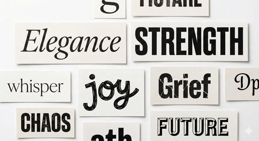
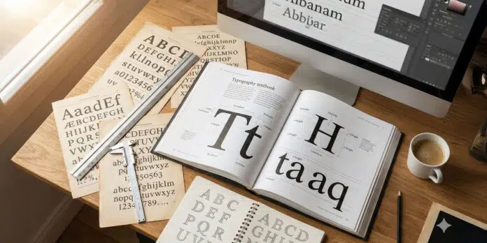
Typography is far more than simply selecting a typeface and placing text on a page. It is a refined craft—a deliberate, thoughtful process that makes language visible and gives words life and power.
Designers who understand typography engage with words purposefully and with poise, shaping language to speak fluently through letterforms and their supporting characters.
Typography conveys information while simultaneously evoking emotion, sharing stories, and influencing behaviour across all mediums.
At its core, typography is communication. Type can whisper delicately or shout loudly. It can be commanding and beautiful one moment, then analytical and instructive the next.
The remarkable aspect is that type is simultaneously dramatic, whimsical, modest, and extravagant—a versatile tool that demands both discipline and creativity from designers who dedicate themselves to the craft.
The Essential Difference: Typography vs. Handwriting, Calligraphy and Lettering
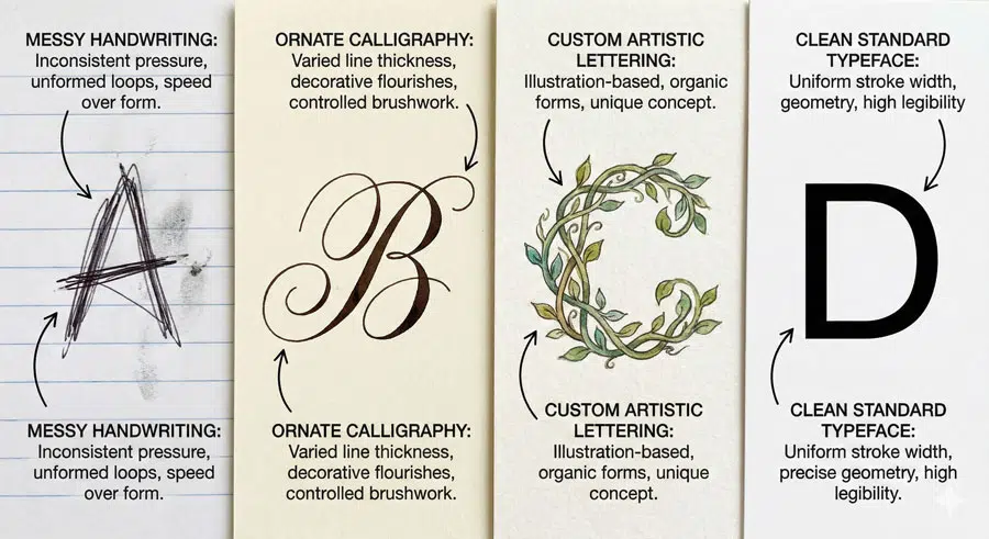
Many people confuse typography with related but distinct disciplines. Understanding these differences is crucial for any designer seeking to master the craft.
Typography is unique because it uses standardized forms that rearrange and reproduce in exact fashion without end. Typefaces consist of systematized character sets designed for repeated use across ranges of text.
Handwriting, by contrast, is personal and unique—each writer’s hand creates distinct, unrepeatable marks. Calligraphy, which means “beautiful writing,” encompasses diverse styles from ornate and sinuous to rough and painterly, with appearance heavily influenced by the tools used (typically a brush or pen).
Lettering involves custom letterforms designed by hand or digital tools that are unique in appearance, reserved for customization in limited-edition and special work.
The key distinction is this: typography provides the foundation for consistent, repeatable communication across all mediums—from print to digital to environmental design.
The Five Core Objectives of Designing with Type for Communication
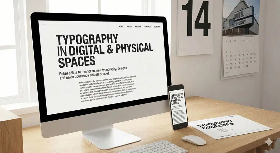
When you approach any project—whether it’s a website, poster, packaging, or environmental signage—remember these five fundamental objectives:
- Convey Information with Type – Communicate with Clarity The primary function of typography is to ensure your message is understood. Legibility isn’t optional; it’s essential. Every design choice should prioritize clarity while maintaining aesthetic appeal.
- Assist the Reading Process – Make It Accessible (and Delightful) Typography should guide the reader’s eye smoothly through content. Hierarchy, spacing, and alignment all play crucial roles in creating a reading experience that is both accessible and enjoyable.
- Uphold Typeface Integrity – Value It and Its Makers Type designers pour years of expertise into creating typefaces. Respect their work by using typefaces as intended, never artificially stretching, squashing, or otherwise distorting them.
- Express Text Beautifully – Create Visually Inviting Work Beyond function lies artistry. Well-executed typography creates visual interest and emotional resonance. This balance between form and function is what elevates good design to great design.
- Design with Appropriateness – Do What Best Serves Each Project Not every typeface works for every purpose. Environmental signage requires directness and clarity; a luxury brand identity might call for elegance and refinement. Choose with intention.
Macro and Micro typography: Two Complementary Approaches
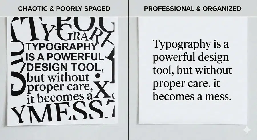
Understanding the distinction between macro and micro typography is essential for creating successful designs. These aren’t separate disciplines but rather complementary approaches that must work together.
Macro typography addresses composition and layout—the plan and organization of typographic elements on a page or screen. It considers spatial positioning, relationships between elements, and white space (negative space).
The macro view is the compositional body where designers order, connect, and balance type to create the first impression that engages viewers. Without immediate visual interest at this macro level, communication fails. Viewers simply won’t engage with your message.
Micro typography refers to typesetting essentials and details. It’s where designers transform plain text into a typographic system with hierarchy, optical emphasis, and strategic variation.
Microtypography encompasses letterform, word, line, and paragraph dynamics. Principal micro factors include spacing (kerning and tracking), and aesthetic tailoring (refinement of punctuation and ragging).
What makes microtypography so elegant is that it’s often undetected by viewers—a sign of its success. Refined compositions feel effortless.
The relationship between macro and micro is interdependent: the success of the whole depends on its parts. A beautifully composed layout falls apart if the micro-details are neglected, and perfect micro-details won’t save a poorly conceived macro layout.
Typography Across All Mediums
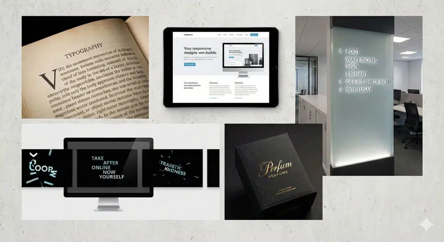
Typography is everywhere—crossing mediums that include environments, interfaces, packaging, print, and digital works.
Whether you’re designing environmental signage systems that require practical directness, motion sequences that appeal through lively type treatments, or conceptual interpretive work, the fundamental principles remain constant.
Designers work with type objectively and subjectively, with both economy and extravagance. Environmental signage is practical and direct; clarity is imperative.
Typography in motion sequences is conceptual and interpretive, with letterforms personifying or emoting strongly. Regardless of the medium, the balance between function and aesthetics reigns supreme.
The versatility of typography is one of its greatest strengths. The same principles that guide a book designer inform a web designer, a packaging designer, and a wayfinding system designer.
Once you understand the fundamentals, you can apply them across infinite contexts.
Conclusion: The Journey Ahead
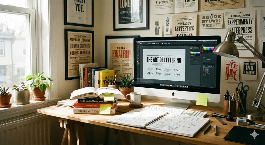
Typography fundamentals provide the foundation for all visual communication. It’s a field that rewards both disciplined learning and creative experimentation.
The designers who excel at typography understand that it’s not just about selecting pretty fonts—it’s about making thoughtful, purposeful decisions that serve the content and engage the viewer.
As you continue your typography journey, remember that it’s a craft that evolves with practice and observation. Pay attention to typography in the world around you. Notice what works and what doesn’t.
Ask yourself why certain typographic choices are effective. This critical eye, combined with solid foundational knowledge, will develop your expertise.
About the Author
Lalit M. S. Adhikari is a Digital Nomad and Educator since 2009 in design education, graphic design and animation. He’s taught 500+ students and created 200+ educational articles on design topics. His teaching approach emphasizes clarity, practical application and helping learners.
Learn more about Lalit Adhikari.
This guide is regularly updated with the latest information about Adobe tools and design best practices. Last Updated: Mar 2026


