Discover the fascinating histories of the ampersand and interrobang—two of typography’s most interesting symbols. Learn how they evolved, why they matter, and how to use them effectively in design.
My name is Lalit Adhikari and we are at LTY. Let’s begin!
Table of Contents
Introduction: The Drama Hidden in Symbols
Typography is typically understood as the art and technique of arranging type:
- selecting typefaces, determining sizing, managing spacing, and creating visual hierarchy with letterforms.
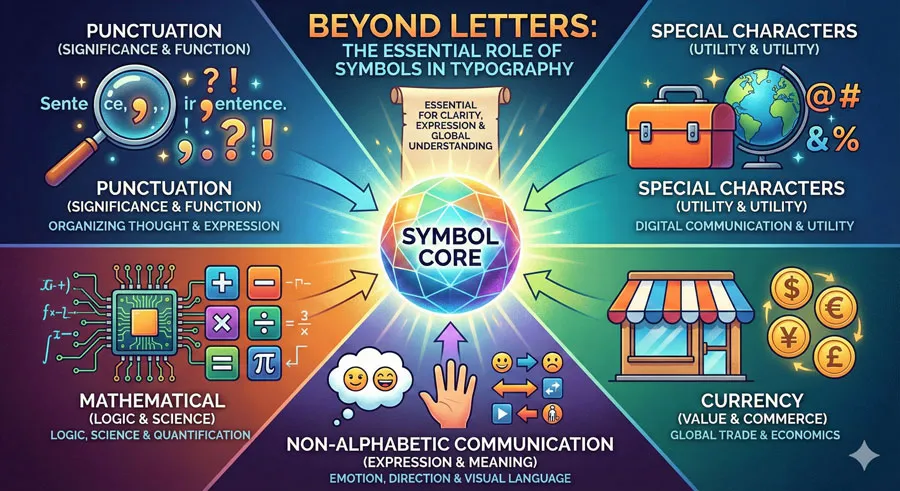
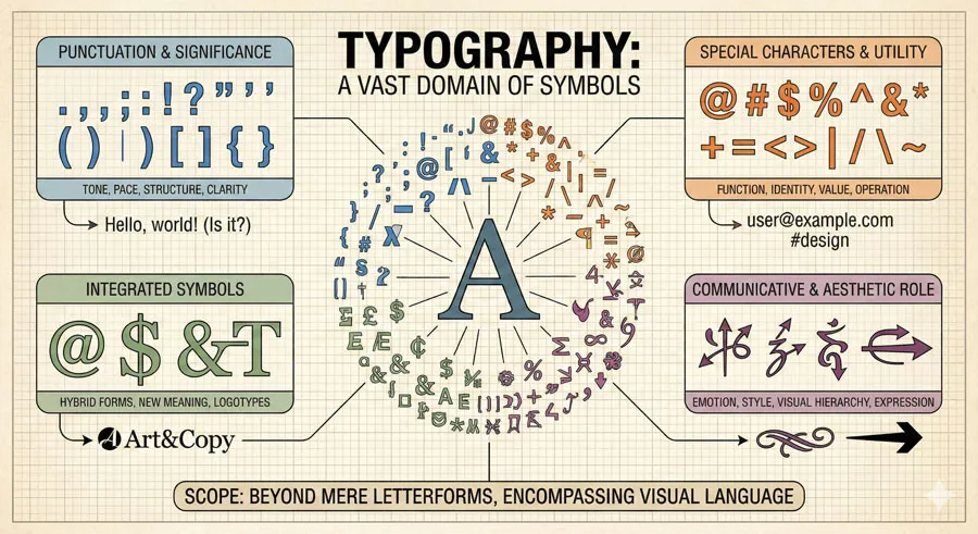
However, typography encompasses far more than letters. Typography includes the symbols, punctuation marks, and special characters that are integral to written communication.
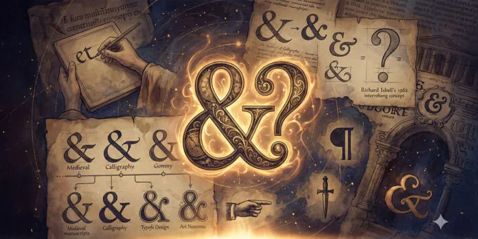
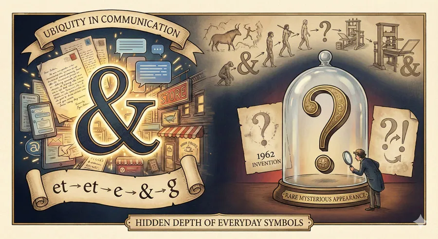
Among typography’s most fascinating elements are symbols with unexpected histories. The ampersand (&) is a ubiquitous symbol that appears constantly in design and communication, yet most designers and writers know little about its origins or evolution.
The interrobang (‽) is a rare symbol that few people encounter, yet it represents a creative attempt to solve a fundamental punctuation problem.
These symbols are not merely decorative or utilitarian. They carry histories reflecting how written communication has evolved, how designers and writers have attempted to solve communication challenges, how typography responds to cultural and linguistic needs.
The symbols embody decisions made centuries ago that continue to influence how we write and design today.
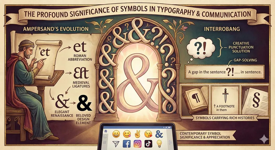
The ampersand originated as a ligature—a combination of two letters:
- “a” and “et” (the Latin word for “and”)
Over centuries, the ampersand evolved from a practical abbreviation into a distinctive symbol with character and personality. Different typefaces interpret the ampersand differently, giving the symbol remarkable variety and visual interest.
The interrobang is more recent. Invented in 1962 by typographer Richard Isbell, the interrobang represents an attempt to address a gap in English punctuation. The symbol combines the question mark and exclamation point, expressing statements that are simultaneously questioning and emphatic.
The stories of the ampersand and interrobang reveal something profound about typography:
- symbols emerge to serve communication needs, symbols evolve over time reflecting cultural and technological changes, symbols can become so familiar we forget their origins and meaning, and symbols continue to matter in contemporary design and communication.
This comprehensive exploration examines the ampersand’s origins and evolution through design history, explores the ampersand’s visual variety across typefaces, traces the interrobang’s invention and attempt at adoption, analyses why the interrobang failed to achieve widespread adoption, considers the role of symbols in contemporary typography and design, and ultimately asks:
- what do these symbol histories reveal about typography, design, and written communication?
Related Topics:
- Helvetica – Swiss Modernism’s Ubiquity Crisis
- Comic Sans – Accessibility & Gatekeeping Critique
- Gotham – Political Design & Elections Power
The Ampersand: From Ligature to Icon
Origins in Roman Abbreviation
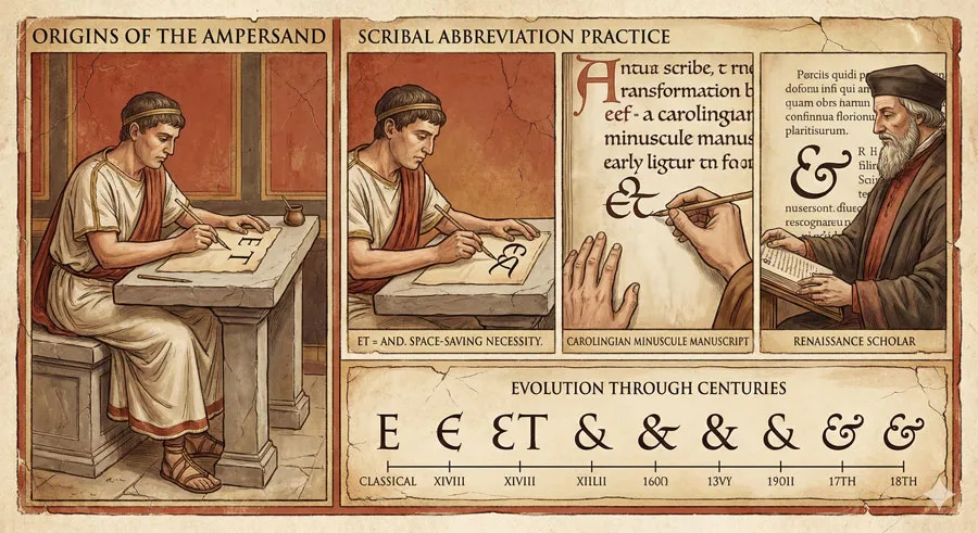
The ampersand has a surprising origin story rooted in Roman writing practice. The ampersand originated as a ligature combining the Latin letters “a” and “e” and the abbreviation “t” representing “et” (meaning “and” in Latin).
Roman scribes frequently combined “et” into a single symbol as a space-saving abbreviation. This combination of letters gradually transformed into a unified symbol as scribal practice evolved. The symbol became so standard that it evolved into a distinctive visual form.
When printing was invented in the fifteenth century, the ampersand was already an established symbol in handwritten script. Early printers included ampersands in their typefaces, preserving the symbol that had developed through centuries of manuscript practice.
Evolution Through Typeface Design
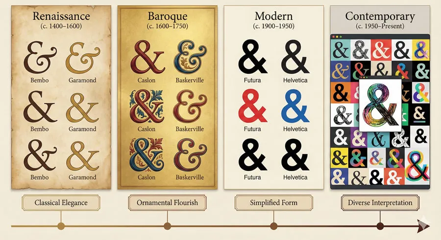
The ampersand has an extraordinary history of visual evolution. Because the symbol began as a ligature combining multiple letterforms, the ampersand has always had visual complexity. Different typefaces interpret this complexity differently, resulting in remarkable variety.
Renaissance typefaces created elegant ampersands reflecting classical proportions. Baroque typefaces elaborated ampersands with decorative flourishes. Modern typefaces simplified ampersands into cleaner forms. Contemporary typefaces continue to offer diverse interpretations.
This diversity means ampersands are often the most visually interesting characters in typefaces. Many designers choose typefaces specifically based on how the ampersand is rendered. The ampersand becomes a window into the designer’s visual philosophy and interpretation of the typeface.
The Ampersand as Design Element
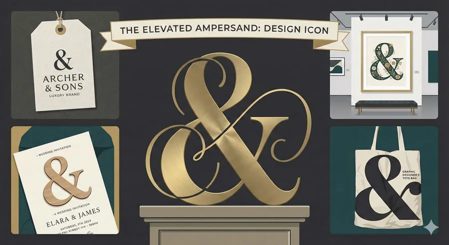
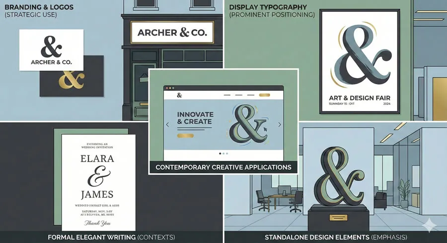
Contemporary designers have elevated the ampersand from utilitarian symbol to design element. Many designers use ampersands prominently in branding, logos, and graphic design. The distinctive visual character of ampersands makes them attractive design elements.
Ampersands appear in decorative contexts, often rendered at large size to emphasize their visual interest. Wedding invitations, luxury branding, artistic design, and sophisticated typography frequently feature prominent ampersands.
This elevation reflects recognition that ampersands carry aesthetic interest beyond mere utility. The ampersand has become a design element appreciated for its visual character and historical resonance.
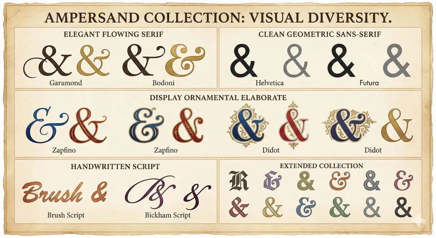
Ampersand Varieties Across Typefaces
Different typefaces render ampersands remarkably differently:
- Elegant serif ampersands feature flowing curves and classical proportions, often with flourishes suggesting handwriting origins.
- Clean geometric ampersands reflect modernist design principles with simplified forms and rational proportions.
- Display ampersands are often elaborate and decorative, designed to draw attention.
- Handwritten ampersands vary from typeface to typeface, reflecting different interpretations of cursive forms.
This variety has made the ampersand a design study element. Typography enthusiasts collect ampersands from different typefaces, appreciating the diverse visual interpretations.
Related Topics:
- Futura – Geometric Modernism Revolution
- Gill Sans – Humanist Alternative Modernism
- Baskerville – Print Excellence & Love Story
Understanding the Ampersand’s Visual Complexity
Why Ampersands Vary So Much
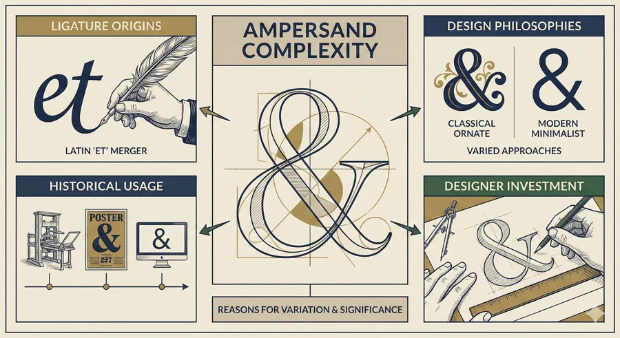
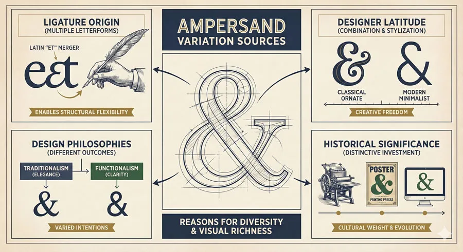
The ampersand’s visual variation stems from its origin as a ligature. Because the symbol combines multiple letterforms, designers have latitude in how they combine and stylize those forms. Different design philosophies result in dramatically different ampersands.
Additionally, the ampersand historically appeared frequently in written language, appearing in formal documents, manuscripts, and printed works. This frequent appearance meant the symbol developed significant cultural and aesthetic weight. Designers invested significant effort in crafting distinctive ampersands.
Ampersand Usage in Contemporary Design
Contemporary usage of ampersands has evolved significantly. Historically, ampersands were used whenever the word “and” appeared.
However, contemporary usage typically reserves ampersands for specific contexts:
- Branding and logos – Ampersands are frequently used in brand names and logos
- Display typography – Ampersands appear prominently in display and decorative contexts
- Formal or elegant writing – Ampersands suggest sophistication and refinement
- Design elements – Ampersands are used as standalone design elements
- Abbreviations and shorthand – Ampersands continue to appear in abbreviations and codes
This selective usage reflects recognition that ampersands carry aesthetic and cultural weight. The symbol is no longer a neutral abbreviation but a design choice with communicative implications.
Related Topics:
- Bodoni – Theatrical Prestige Aesthetics
- Garamond – Classical Foundation Principles
- Worst Fonts – Criticism & Gatekeeping Analysis
The Interrobang: An Invention Born from Punctuation Problem
The Problem the Interrobang Solves
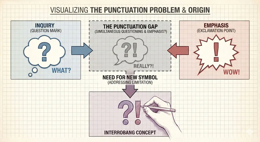
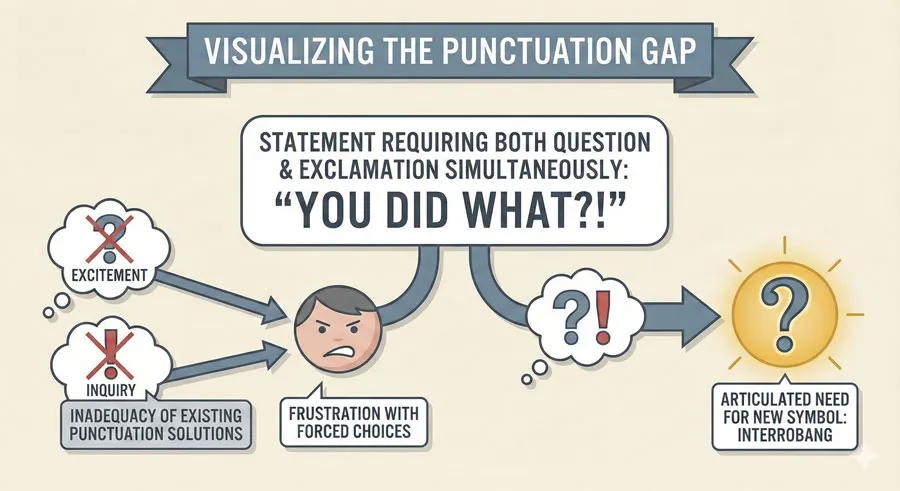
English punctuation has a gap. The question mark expresses inquiry. The exclamation point expresses excitement or emphasis. However, certain statements are simultaneously questioning and emphatic—they express statements that are both curious and excited.
Before the interrobang, writers expressing such statements faced a choice: end with a question mark (suggesting the excitement is secondary) or an exclamation point (suggesting the question is secondary). Neither solution was satisfactory for statements that are genuinely both questioning and emphatic.
This punctuation gap motivated the invention of the interrobang.
Richard Isbell and the Interrobang’s Invention
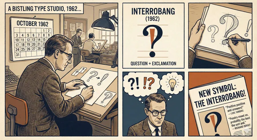
In 1962, typographer Richard Isbell created the interrobang (‽) as a solution to this punctuation problem. The symbol combines the question mark and exclamation point, expressing statements that are simultaneously questioning and emphatic.
The name “interrobang” combines “interrogation” (questioning) and “bang” (typographer’s slang for exclamation point). The symbol immediately caught attention from designers and typographers who recognized it addressed a genuine communication gap.
Several typeface manufacturers incorporated the interrobang into their typefaces. The symbol appeared in design publications and generated interest among design professionals who appreciated the creative solution.
Why the Interrobang Didn’t Achieve Widespread Adoption
Despite initial enthusiasm, the interrobang failed to achieve widespread adoption. Several factors contributed:
- Lack of keyboard access – Most keyboards lacked the interrobang, making it difficult to type
- No standardization – The symbol appeared inconsistently across typefaces
- Cultural resistance – Many writers and editors viewed the symbol as unnecessary or affected
- Institutional barriers – Publishers, newspapers, and style guides did not officially adopt the symbol
- Technological limitations – Early digital systems did not support the interrobang
Without keyboard accessibility and institutional adoption, the interrobang remained a curiosity rather than achieving everyday usage.
Contemporary Interrobang Interest
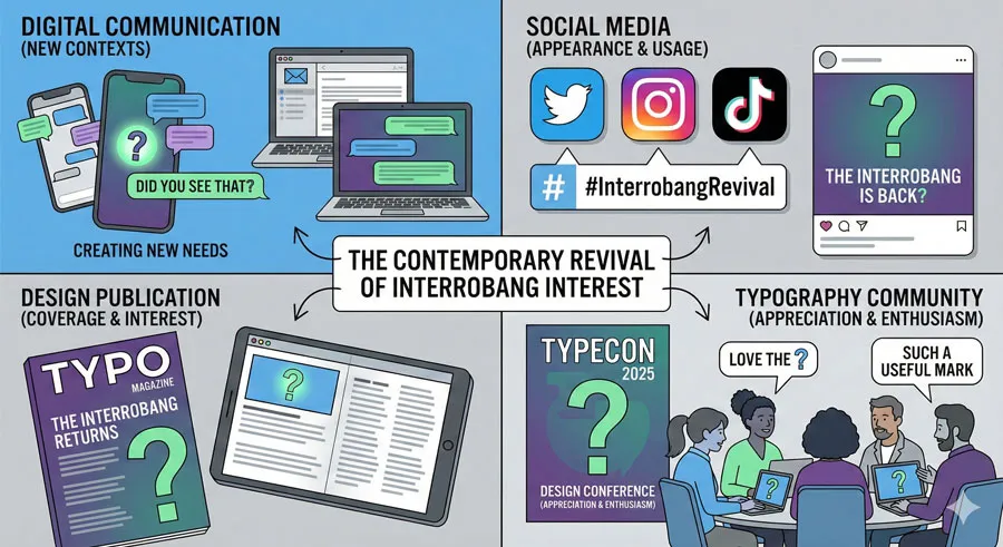
Despite historical failure to achieve adoption, the interrobang has experienced contemporary interest. Digital communication (texting, social media) has created new contexts where the interrobang would be useful. Young people often encounter the interrobang on social media and appreciate what it expresses.
Contemporary typography and design have renewed interest in the interrobang. It appears in design publications, on websites, and in creative typography. The symbol has achieved cultural recognition as a creative, clever, but underutilized punctuation mark.
Unicode standardization has also enabled the interrobang. The symbol is included in Unicode, making it available in digital systems. However, the interrobang remains unusual in everyday usage, appearing primarily in design-aware contexts.
Related Topics:
- Gill Sans & The Tube – Urban Identity Infrastructure
- Baskerville & Mrs. Eaves – Love, Partnership & Revival
- Futura & Paul Renner – Geometric Vision & Revolution
The Role of Symbols in Typography and Design
Symbols Beyond Letters
Typography traditionally focuses on letterforms, but symbols play crucial communicative roles. Punctuation marks, special characters, mathematical symbols, and other non-alphabetic elements are integral to written communication.
These symbols are often overlooked in typography education and discussion, yet they carry significant communicative and aesthetic weight. The design of symbols affects how documents read, how information is conveyed, and how designs function.
Symbol Design Consistency
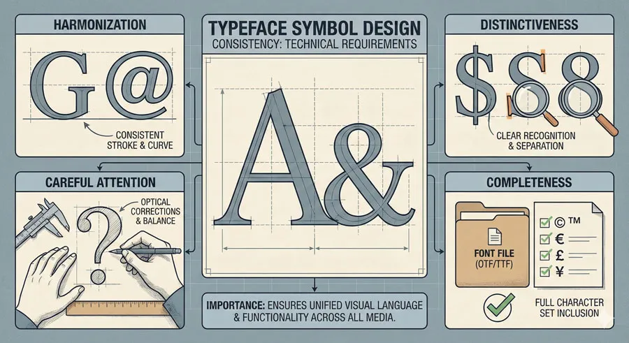
Symbol design across a typeface requires as much attention as letter design. Symbols must harmonize with the typeface character while remaining visually distinctive. Poor symbol design can undermine otherwise excellent typeface design.
Contemporary typeface design includes careful attention to symbol design. Font files include hundreds of characters, including letters, numbers, punctuation marks, mathematical symbols, currency symbols, and numerous other elements. Each requires thoughtful design.
Cultural Significance of Symbols
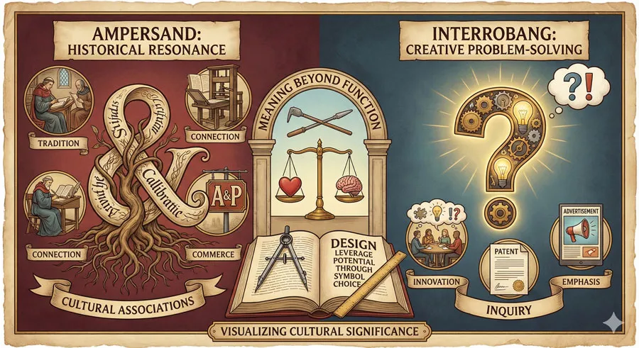
Symbols carry cultural meaning beyond their functional role. The ampersand carries historical resonance and aesthetic associations. The interrobang carries meaning as a clever solution to a communication problem, a symbol of creative problem-solving.
Designers can leverage this symbolic meaning. Using an ampersand in a design choice signals sophistication, elegance, or historical awareness. Creative symbol usage can enhance design communication.
Related Topics:
- Legibility vs. Readability – Typography Fundamentals
- Ampersand & Interrobang – Symbol Histories
- Typography
Other Fascinating Symbols in Typography
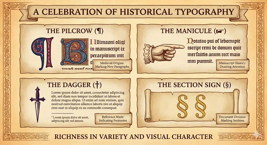
The Pilcrow (¶)
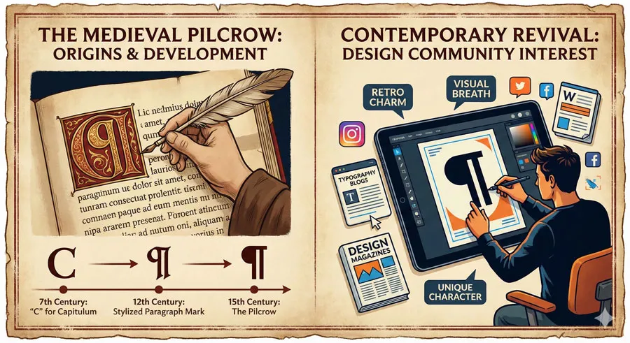
The pilcrow is an ancient symbol marking paragraph breaks. Originating as a mark in medieval manuscripts, the pilcrow appears in contemporary typography, particularly in editorial design and publishing.
The pilcrow has regained contemporary interest through design and typography enthusiasts. The symbol appears in design contexts and has become a recognizable design element.
The Manicule (☞)
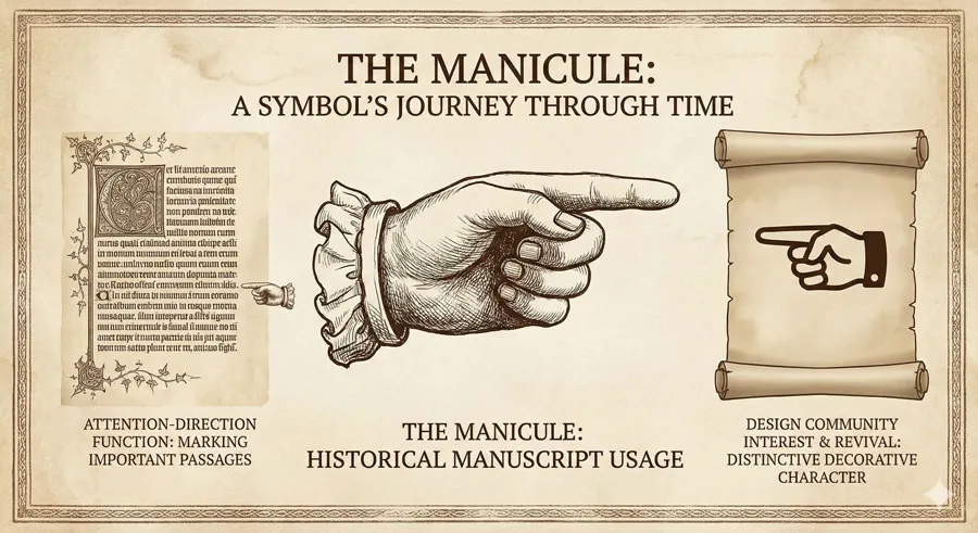
The manicule is a pointing hand symbol used historically in manuscripts and printed texts to direct reader attention. While less common in contemporary design, the manicule has experienced revival through design interest.
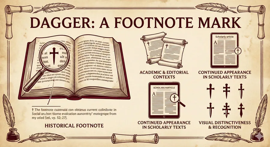
The Dagger (†) and Double Dagger (‡)
These symbols historically marked footnotes or references. While less commonly used than in historical documents, daggers continue to appear in academic and editorial contexts.
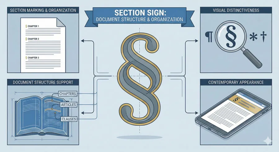
The Section Sign (§)
The section sign marks document sections. While primarily functional, the section sign has distinctive visual character and occasional appearance in design.
Related Topics:
- The Psychology of Typography: Font Influence
- Helvetica Effect: One Font Conquered Global Design
- Comic Sans: True Story Behind the World’s Most Hated Font
Symbols in Contemporary Digital Design
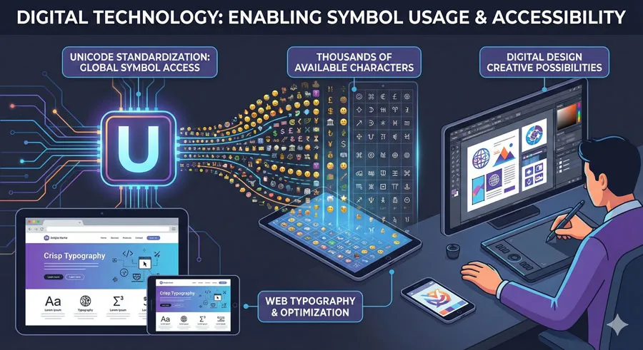
Unicode and Symbol Availability
Unicode standardization has made thousands of symbols available in digital systems. Characters that were difficult to access are now readily available. This has enabled designers to use symbols creatively.
The ampersand and interrobang are both available in Unicode, ensuring their availability across digital platforms. However, symbol rendering varies depending on the font used.
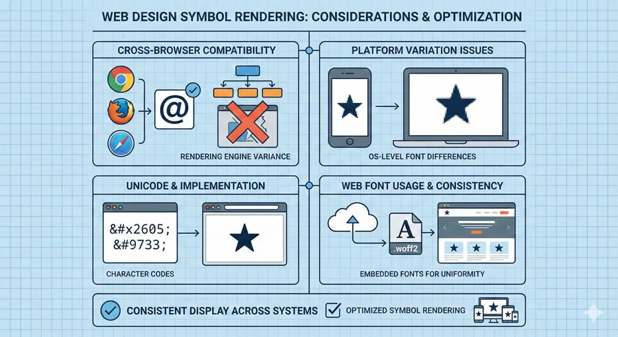
Web Typography and Symbol Rendering
Web typography must account for symbol rendering across browsers and platforms. Symbols should display correctly regardless of the user’s system or selected font.
Web designers often use Unicode character codes or web fonts to ensure symbol rendering. This careful attention ensures symbols display as intended.
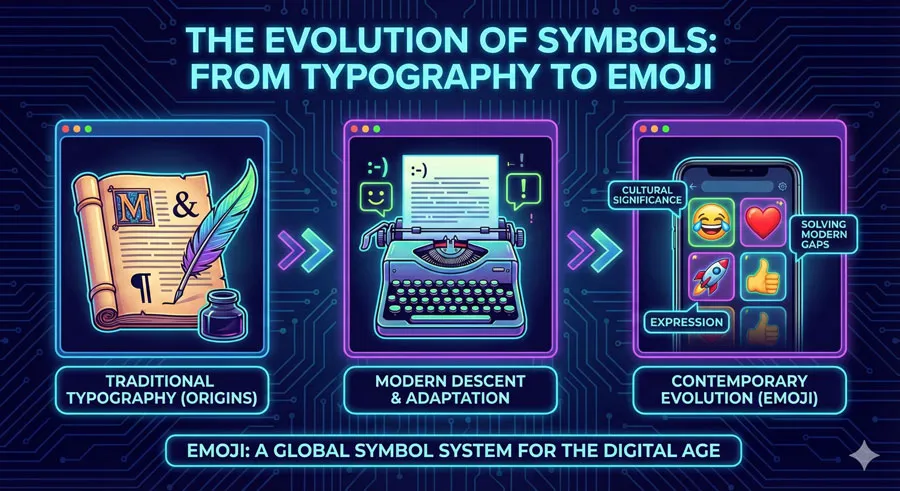
Emoji and Symbol Evolution
Contemporary digital communication introduces emoji as a new symbol system. Emoji are modern descendants of the symbol tradition, evolving to meet contemporary communication needs.
The history of emoji parallels the history of traditional typographic symbols: they emerged to solve communication problems, they have cultural significance, and they continue to evolve.
Related Topics:
- Gotham: Font That Won an Election And Changed Design Forever
- Futura: The Geometric Vision of Paul Renner
- Gill Sans: Eric Gill’s Humanist Masterpiece
FAQ: Common Questions About Typography Symbols
Q: Can I use ampersands freely in design?
A: Ampersands are most appropriate in specific contexts: branding, display typography, formal or elegant writing. In body text, “and” typically appears spelled out.
Q: What does the interrobang actually mean?
A: The interrobang expresses statements that are simultaneously questioning and emphatic—statements expressing curiosity combined with excitement or emphasis.
Q: Why doesn’t everyone use the interrobang?
A: The interrobang lacks keyboard accessibility and institutional adoption. Most digital systems require special methods to input the symbol.
Q: Are there other invented punctuation marks?
A: Yes. The irony mark and the question mark have proposed variations. However, most invented punctuation marks fail to achieve adoption.
Q: How do different typefaces render ampersands?
A: Ampersand design varies dramatically across typefaces. Some are elegant and flowing, others are geometric and simple, still others are elaborate and decorative.
Q: Should I choose a typeface based on the ampersand?
A: Many designers do prioritize ampersand design when selecting typefaces. If ampersands appear prominently in your design, ampersand design becomes important.
Q: Can I use special symbols in web design?
A: Yes, using Unicode character codes or web fonts ensures symbols display correctly across browsers and platforms.
Q: What is the history of the @ symbol?
A: The @ symbol originated as an abbreviation in business and accounting, representing “at the rate of.” It was repurposed as the email separator in email addresses.
Q: Are punctuation marks copyrightable?
A: No. Punctuation marks themselves are not copyrightable. However, specific font renderings of punctuation marks are protected by copyright.
Q: Why should designers care about punctuation marks?
A: Punctuation marks are integral to typography. Their design affects how text reads and how designs function. Thoughtful punctuation design enhances overall design quality.
Related Topics:
- Baskerville: Elegant Serif That Shaped Print Typography
- Bodoni Font: Serif That Defined Luxury Typography
- Garamond: Timeless Serif That Defined Classical Typography
Conclusion: The Significance of Symbols
The histories of the ampersand and interrobang reveal something essential about typography: symbols matter. They carry histories, they evolve over time, they solve communication problems, and they continue to influence written communication.
The ampersand’s evolution from a Roman abbreviation to a beloved design element demonstrates how symbols develop cultural and aesthetic significance over centuries. The ampersand is no longer merely a space-saving abbreviation but a visual element valued for its distinctive character and historical resonance.
The interrobang’s story—an invention born from recognition of a punctuation gap, initial enthusiasm, failure to achieve adoption, and contemporary revival—illustrates the challenges symbols face achieving acceptance.
The interrobang’s relative failure to achieve adoption contrasts with the ampersand’s enormous success, raising questions about what factors enable symbols to achieve cultural acceptance.
These symbol histories also reveal the role typography plays in written communication. Symbols are not merely decorative or utilitarian. They represent creative responses to communication challenges. They carry aesthetic and cultural weight. They influence how documents read and how information is conveyed.
Contemporary designers and typographers should recognize the significance of symbols. Thoughtful attention to symbol design and symbol usage can enhance design quality. Understanding symbol histories and significance can deepen appreciation for typography.
The ampersand and interrobang represent typography’s hidden depths. While many designers focus on letterforms, these symbols demonstrate that typography encompasses far more. The full richness of typography appears when we attend to symbols, punctuation marks, and special characters.
Related Topics:
- The Worst Fonts in the World: A Typographic Hall of Shame
- Gill Sans and Tube: How Johnston and Gill Defined London
- Baskerville and Eaves: A Tale of Perfection, Passion and Revival
About the Author
Lalit M. S. Adhikari is a Digital Nomad and Educator since 2009 in design education, graphic design and animation. He’s taught 500+ students and created 200+ educational articles on design topics. His teaching approach emphasizes clarity, practical application and helping learners.
Learn more about Lalit Adhikari.
This guide is regularly updated with the latest information about Adobe tools and design best practices. Last Updated: Mar 2026
Related Topics:
- Futura vs. The World: The Geometric Vision of Paul Renner
- Legibility vs. Readability: What Every Designer Needs to Know


