Explore the critical difference between legibility and readability in typography, how they impact design, and why understanding both is essential for design excellence.
My name is Lalit Adhikari and we are at LTY. Let’s begin!
Table of Contents
Introduction: Distinguishing Fundamental Concepts
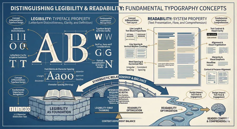
Legibility and readability are distinct concepts frequently confused within typography practice. Understanding distinction between legibility and readability proves essential for design excellence and effective communication.
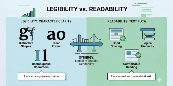
Legibility refers to typeface characteristics enabling individual letterforms to be distinguished. Legibility concerns typeface design—how clearly letterforms are differentiated and recognizable. Legible typeface features distinctive letterforms, clear character differentiation, and optical clarity.
Readability refers to ease and comfort of reading extended text. Readability concerns text presentation—layout, spacing, line length, contrast, and overall composition. Readable text is comfortable to read for extended duration.
Legibility is typeface property. Readability is broader system property encompassing typeface, layout, spacing, hierarchy, and contextual factors. A legible typeface can be rendered unreadable through poor layout. Illegible typeface cannot be rendered readable regardless of layout excellence.
These distinctions profoundly matter for design practice. Designers must optimize both legibility and readability for design excellence. Focusing solely on typeface legibility while ignoring readability factors creates design failure. Equally, excellent layout cannot compensate for illegible typeface.
Understanding legibility and readability enables designers to make informed decisions about typeface selection, text presentation, and overall design composition. Designers benefit from clear conceptual framework distinguishing these factors.
Many design problems emerge from confusion between legibility and readability. Understanding distinction clarifies design decisions and improves outcomes.
This comprehensive exploration examines legibility as typeface property, analyzes readability as system property, explores legibility factors and characteristics, analyzes readability factors and considerations, examines relationship between legibility and readability, considers practical design implications, and ultimately asks:
- What makes typography legible and readable? How can designers optimize both for design excellence?
Related Topics:
Legibility: Typeface Properties and Characteristics
Letterform Distinctiveness and Character Differentiation
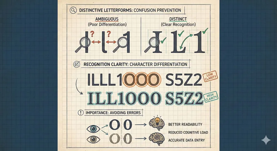
Legibility begins with distinctive letterforms clearly differentiated from similar characters. Legible typefaces feature letterforms avoiding confusion—clear differentiation between ‘l’ and ‘I’, ‘0’ and ‘O’, ‘S’ and ‘5’.
Character differentiation enables rapid letterform recognition essential for reading.
Letterform Clarity and Optical Definition
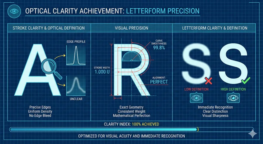
Legible typefaces feature clear letterform definition and optical clarity. Distinctive character shapes, clear strokes, and well-defined forms enhance legibility.
Optical clarity enables quick letterform recognition.
Font Metrics and Character Spacing
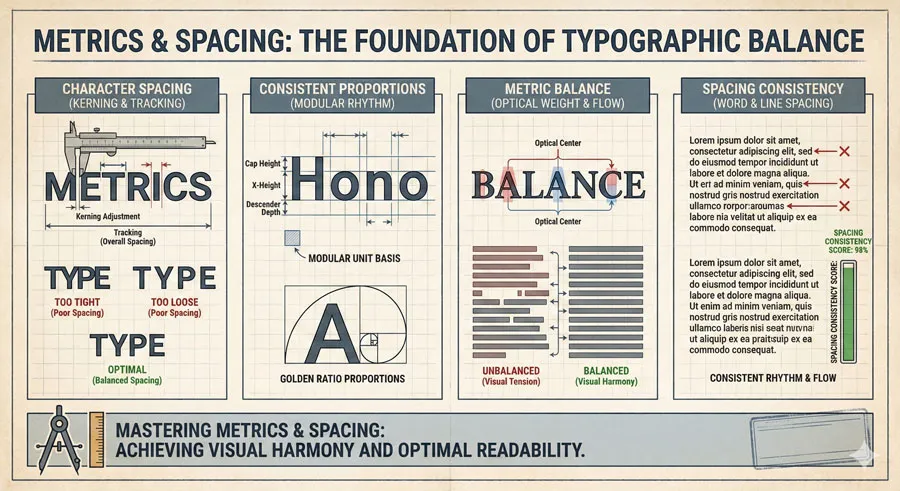
Legibility concerns character spacing and metrics. Even spacing and consistent letterform proportions enhance legibility.
Consistent metrics improve character recognition.
Typeface Weight and Stroke Clarity
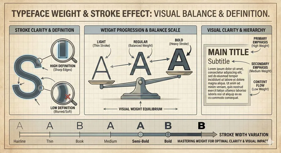
Legible typefaces feature clear strokes and appropriate weight. Too-light typefaces lack clarity; too-heavy typefaces obscure letterform distinction.
Appropriate weight supports legibility.
Serif versus Sans-Serif Considerations
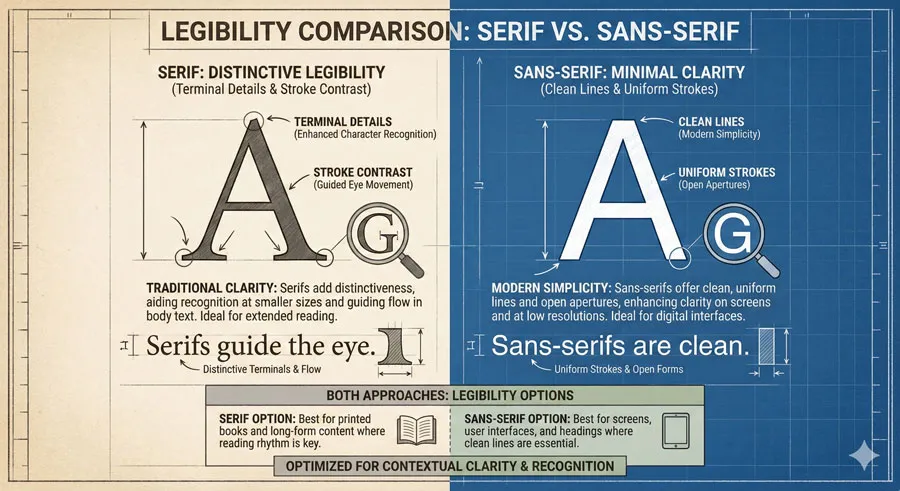
Both serif and sans-serif typefaces can be legible. Serif typefaces feature distinctive serifs aiding character recognition. Sans-serif typefaces achieve legibility through clear geometric forms.
Both approaches can create legible typefaces.
Optical Compensation and Design Details
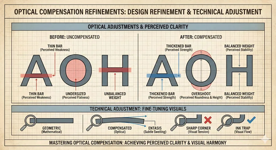
Legible typefaces employ optical compensation—subtle adjustments ensuring visual balance and clarity. Optical adjustments enhance perceived clarity.
Design refinement improves legibility.
Related Topics:
Readability: Text Presentation and System Properties
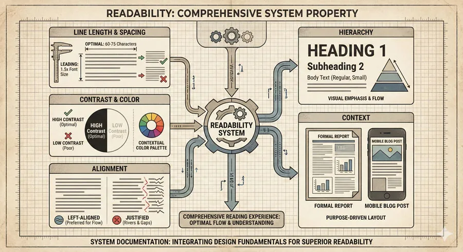
Line Length and Text Block Proportions
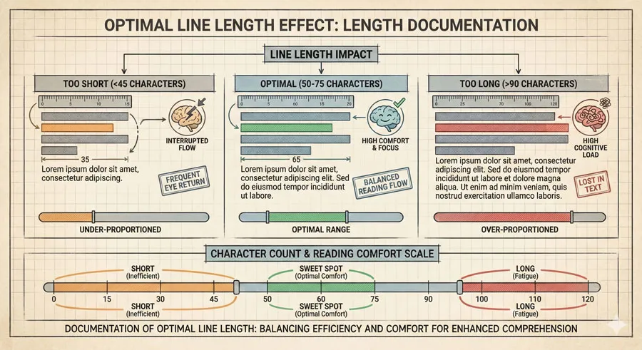
Readability depends significantly on line length. Optimal line length typically ranges 50-75 characters, enabling comfortable eye movement and line return without excessive cognitive load.
Line length profoundly affects reading comfort.
Line Spacing and Vertical Text Rhythm
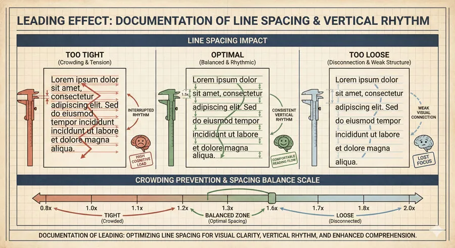
Line spacing (leading) affects readability significantly. Adequate spacing prevents visual crowding and enables comfortable line scanning. Excessive spacing creates disconnection.
Line spacing creates vertical reading rhythm.
Word Spacing and Horizontal Text Flow
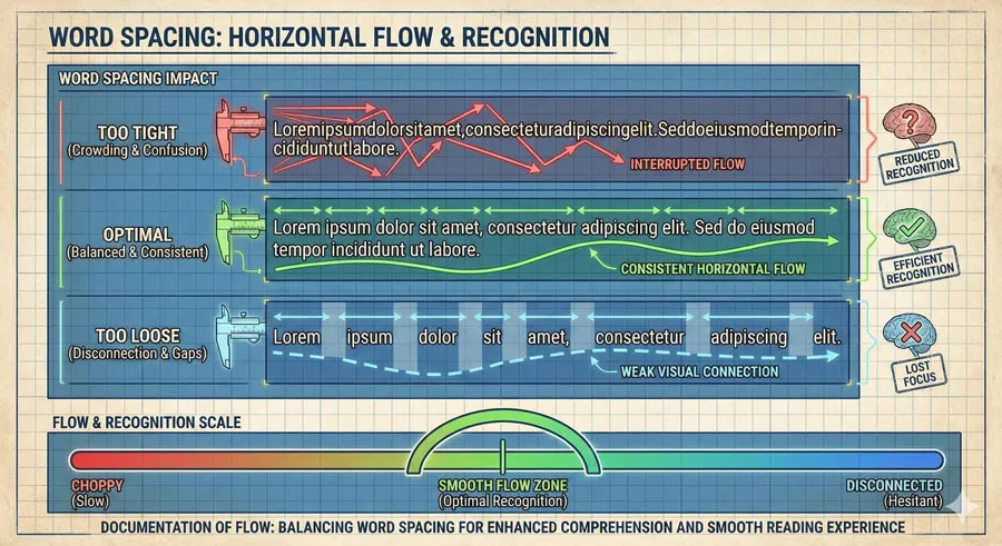
Word spacing affects horizontal reading flow. Consistent, adequate spacing enables comfortable word recognition and eye movement.
Word spacing supports horizontal flow.
Text Contrast and Visual Clarity
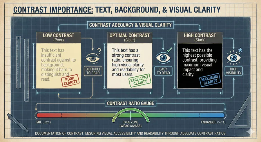
Contrast between text and background affects readability. Adequate contrast enables comfortable reading; insufficient contrast impairs readability regardless of typeface legibility.
Contrast enables visual clarity.
Alignment and Visual Organization
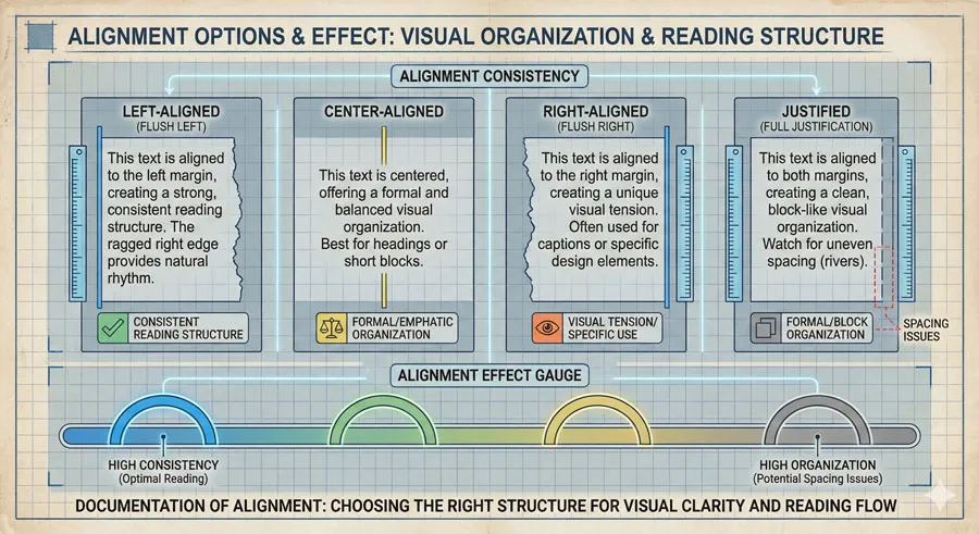
Text alignment affects readability. Left-aligned text typically reads more easily than justified or right-aligned text. Consistent alignment creates visual organization supporting reading.
Alignment creates reading structure.
Color and Visual Intensity
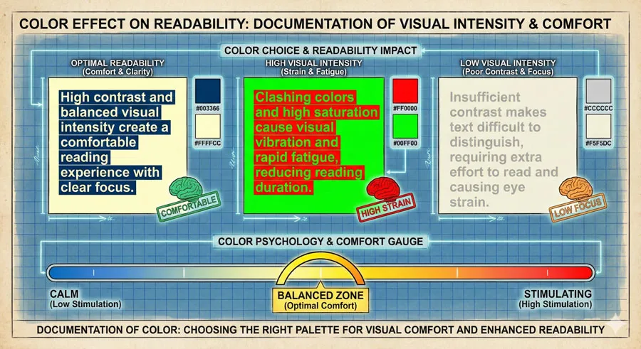
Color choice affects readability. Colors with sufficient contrast improve readability. Color psychology affects reading comfort—warm colors may feel different than cool colors.
Color choice affects reading experience.
Hierarchy and Visual Emphasis
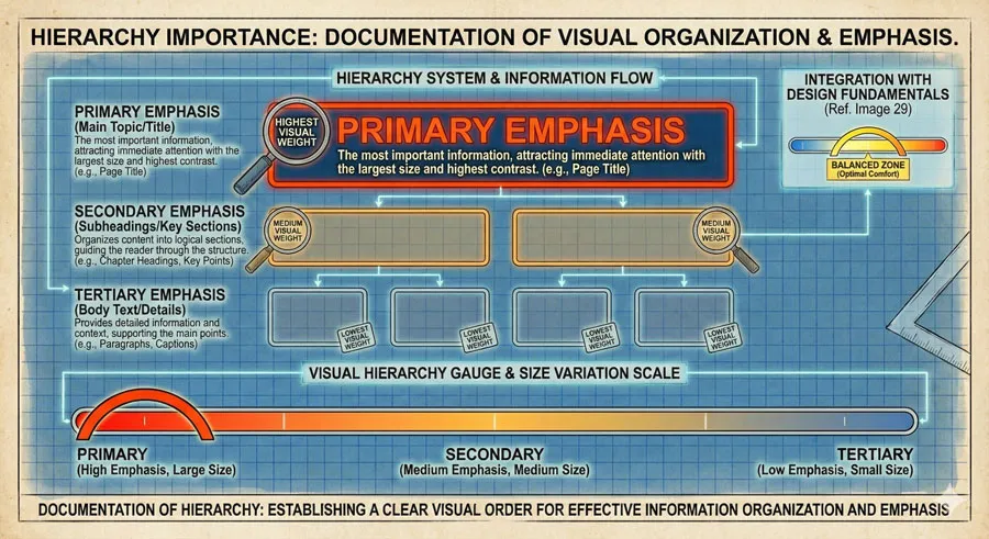
Clear hierarchy with distinct size, weight, or color differentiation improves readability. Hierarchy guides reader attention and organizes information.
Hierarchy enables visual comprehension.
Context and Purpose Alignment
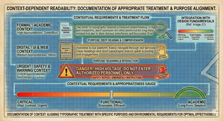
Readability depends on appropriateness to context. Body text requires different treatment than headlines. Display text has different readability requirements than reading text.
Context determines readability requirements.
Related Topics:
Legibility Factors: Detailed Analysis
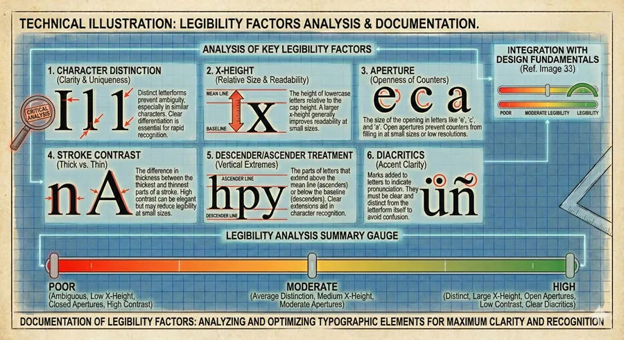
1-2 Test: Character Distinction
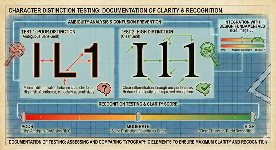
Legibility test involves examining whether similar characters are clearly distinguished. Can reader distinguish ‘l’ from ‘I’? ‘0’ from ‘O’? ‘S’ from ‘5’?
Character distinction reveals legibility.
X-Height and Character Recognition
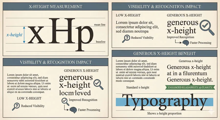
X-height (lowercase letter height) significantly affects legibility. Generous x-height improves character recognition. Minimal x-height reduces legibility.
X-height affects character visibility.
Aperture and Letterform Opening
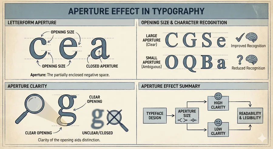
Aperture (letterform opening) affects legibility. Generous apertures in letters like ‘a’, ‘e’, ‘c’ improve character recognition. Tight apertures reduce legibility.
Aperture clarity affects recognition.
Stroke Contrast and Visual Definition
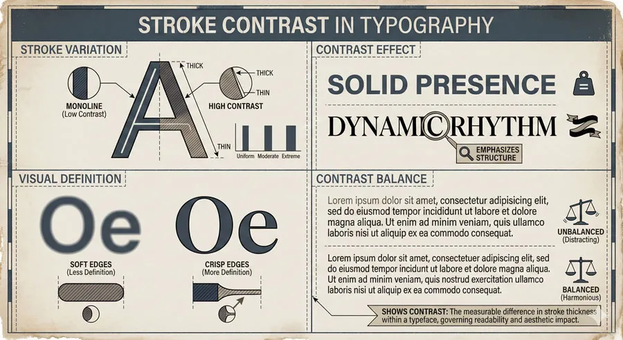
Stroke contrast (variation between thick and thin strokes) affects legibility. Moderate contrast creates definition; extreme contrast can impair recognition.
Stroke contrast creates visual rhythm.
Descender and Ascender Treatment
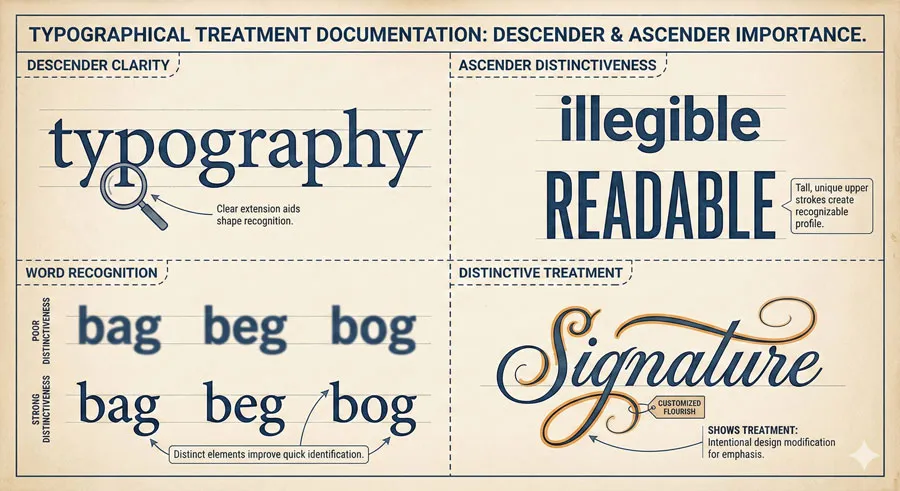
Distinctive descenders and ascenders aid word recognition. Clear descender and ascender treatment improves legibility.
Distinctive features aid recognition.
Diacritic Clarity and Accent Marks
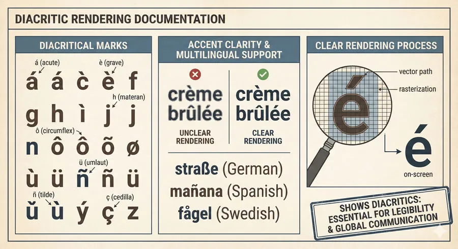
Legible typefaces clearly render diacritical marks and accents. Clarity of diacritics especially important for international text.
Diacritic clarity supports multilingual legibility.
Related Topics:
Readability Factors: Detailed Analysis
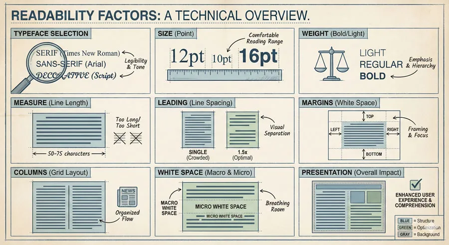
Typeface Selection and Body Text Optimization
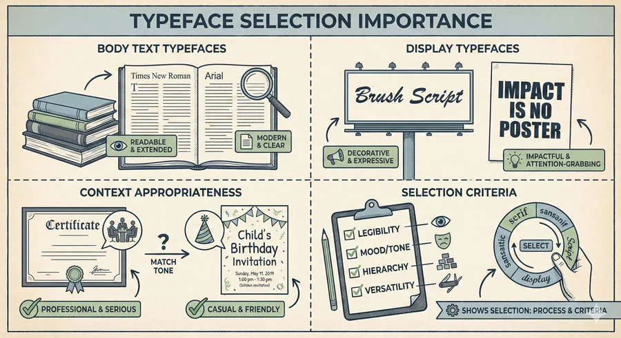
Readable text begins with typeface designed for body text use. Display typefaces often sacrifice readability for distinctive character. Body text typefaces prioritize readability.
Typeface selection affects readability.
Size and Visual Accessibility
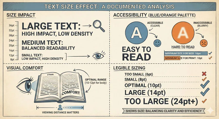
Text size significantly affects readability. Optimal body text size typically ranges 12-16 points for print, 16-18 pixels for screen. Size affects comfort and accessibility.
Size enables visual accessibility.
Weight and Visual Prominence
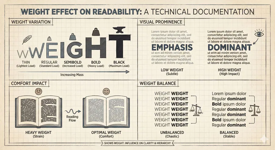
Text weight affects readability. Regular weight typically reads most easily. Bold text tires eyes during extended reading. Light weight may reduce readability.
Weight selection affects comfort.
Measure (Line Length) and Cognitive Load
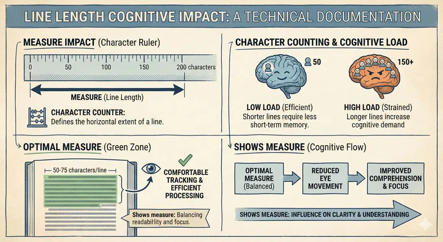
Line length affects reading comprehension and comfort. Optimal measure (50-75 characters) prevents excessive eye movement and cognitive overload.
Measure affects comprehension.
Leading (Line Spacing) and Vertical Flow
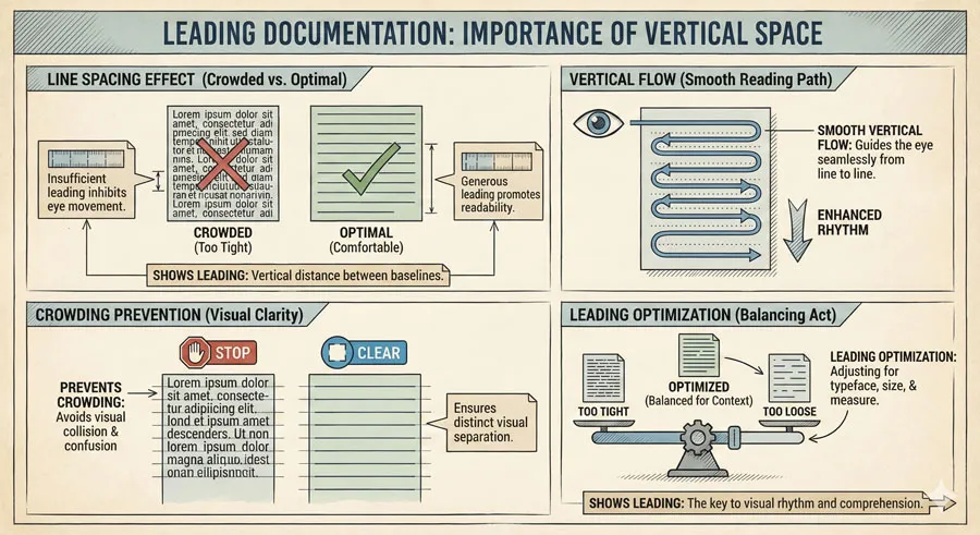
Leading affects comfortable line scanning and return. Generous leading prevents crowding; excessive leading creates disconnection.
Leading creates reading rhythm.
Margin and Visual Breathing Room
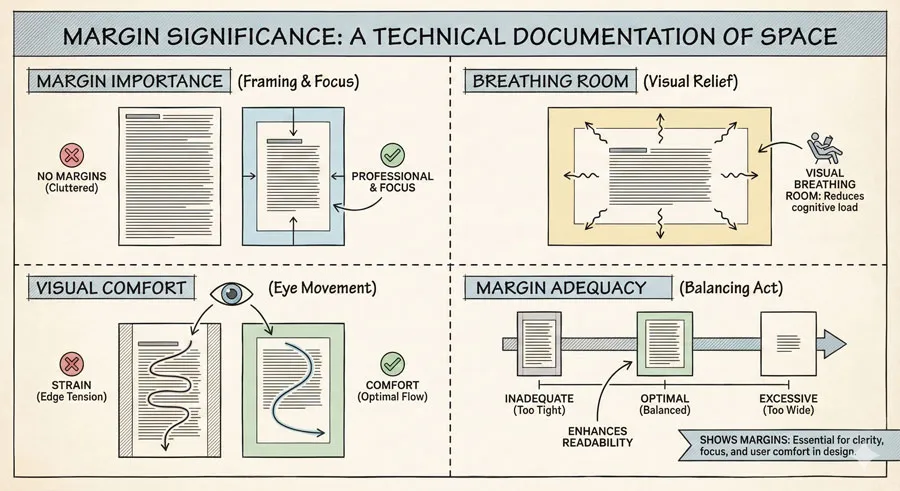
Adequate margins provide visual breathing room and prevent crowding. Margins affect perceived page open and reading comfort.
Margins create visual space.
Column Configuration and Page Architecture
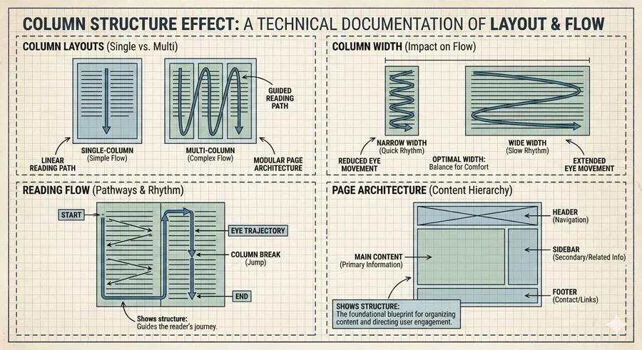
Single column typically reads more easily than multiple columns. Column width affects line length and reading comfort.
Column structure affects flow.
White Space and Visual Rest
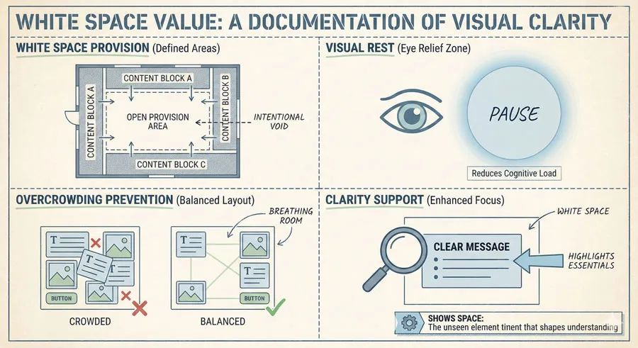
Adequate white space provides visual rest and prevents overcrowding. White space supports visual clarity.
White space improves comprehension.
Related Topics:
Relationship Between Legibility and Readability
Legibility as Foundation
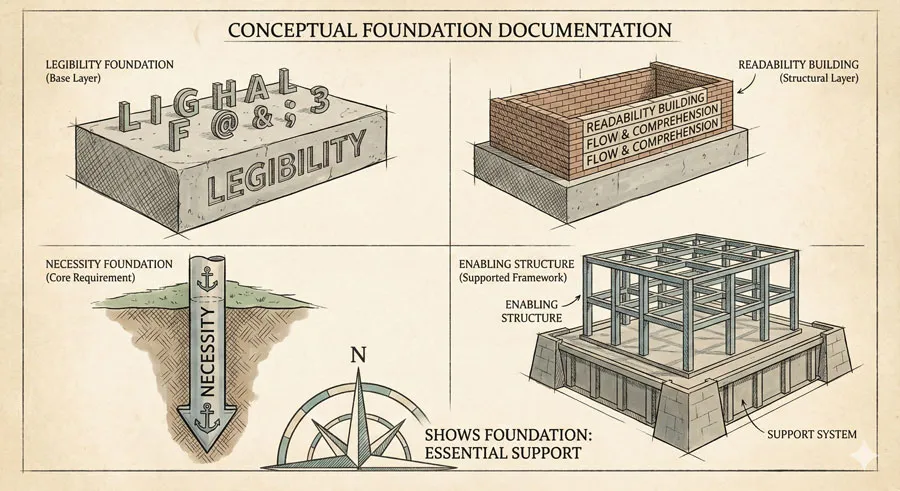
Legibility is necessary but insufficient condition for readability. Legible typeface must be presented readably. Legibility provides foundation.
Foundation enables readability.
Readability Requires Legibility
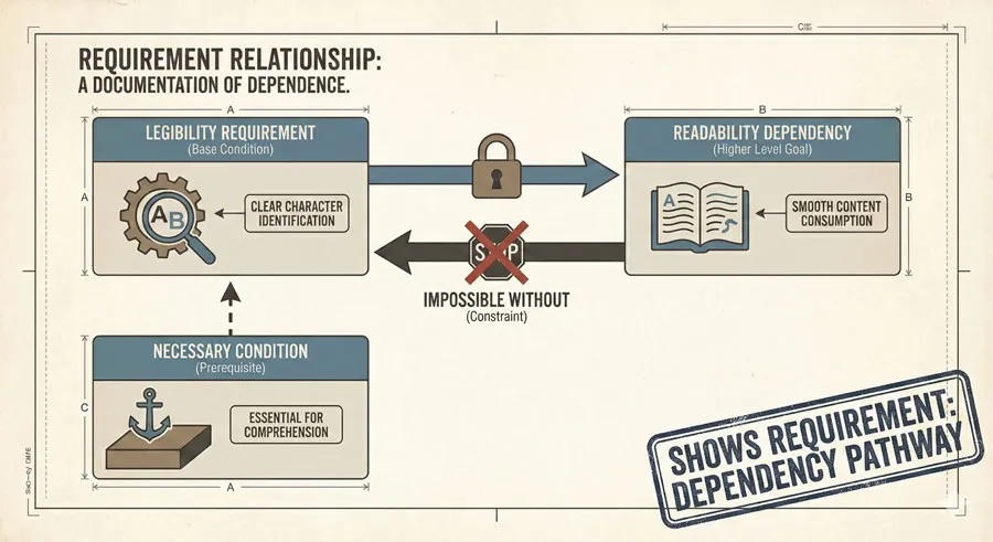
Readable text requires legible typeface. Illegible typeface cannot be rendered readable regardless of layout excellence.
Legibility enables readability.
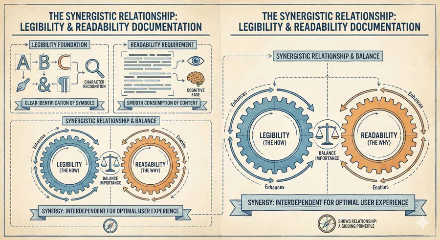
Synergistic Relationship

Legibility and readability work synergistically. Legible typeface presented well achieves superior readability. Legible typeface presented poorly reduces readability below potential.
Synergy creates excellence.
Context-Dependent Balance
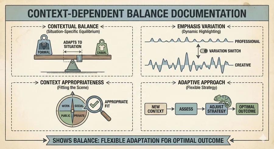
Different contexts require different legibility and readability emphases. Headlines may sacrifice some readability for distinctive character. Body text prioritizes readability over distinctiveness.
Context determines balance.
Design Excellence Requires Both

Design excellence requires optimizing both legibility and readability. Neither factor can be neglected without compromising design quality.
Both factors matter equally.
Related Topics:
Practical Design Implications and Guidance
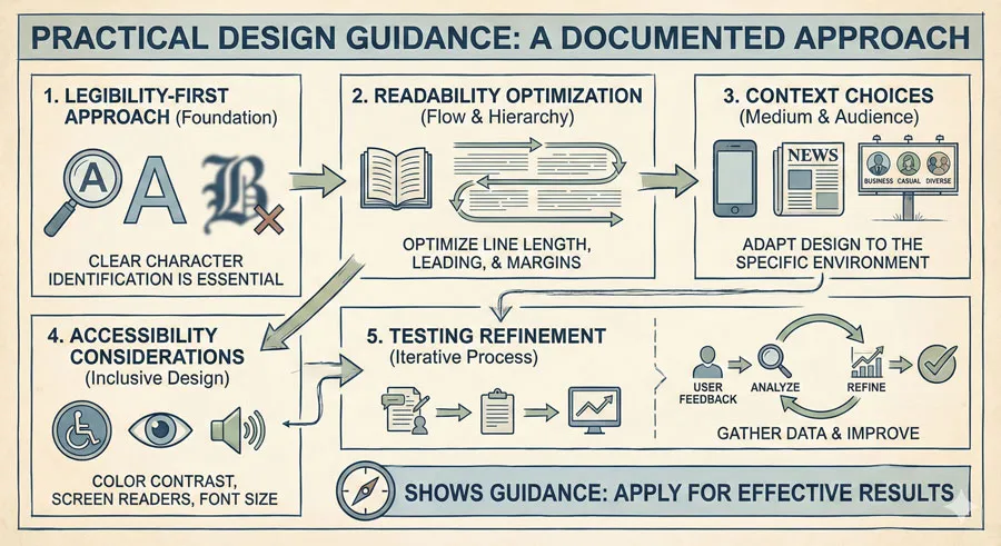
Legibility-First Thinking
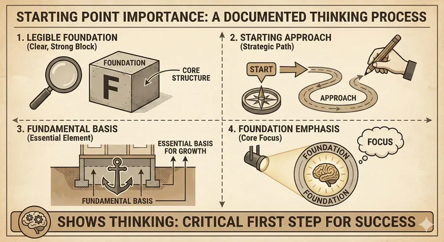
Designers should begin with legible typeface. Legible foundation enables strong readability. Illegible typeface creates fundamental limitation.
Start with legible base.
Readability Optimization Through Presentation
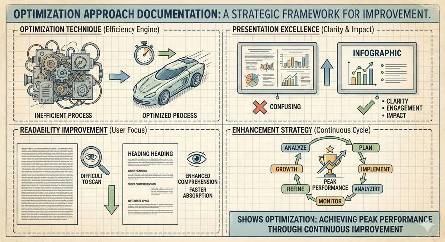
Design excellence emerges through presenting text readably. Optimize line length, spacing, hierarchy, and contrast.
Presentation improves readability.
Context-Appropriate Choices
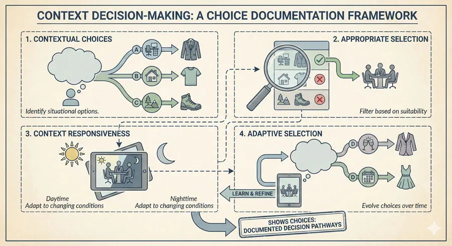
Body text requires different treatment than headlines. Adapt legibility and readability emphases to context.
Context determines approach.
Accessibility Considerations
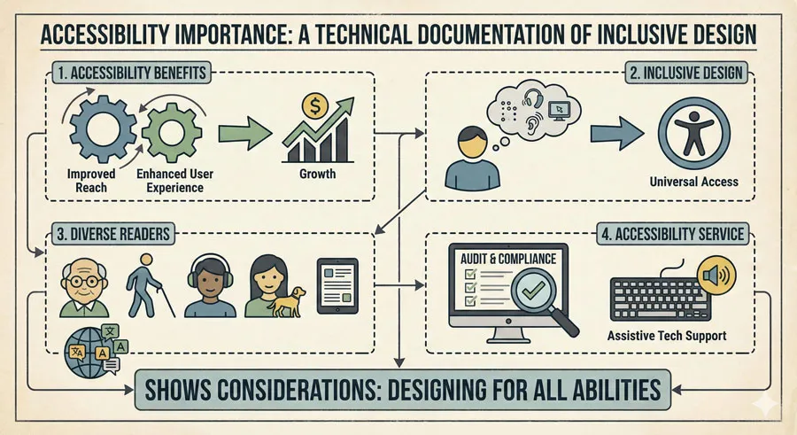
Legibility and readability directly affect accessibility. Legible, readable text serves diverse readers better.
Accessibility requires both factors.
Testing and Refinement
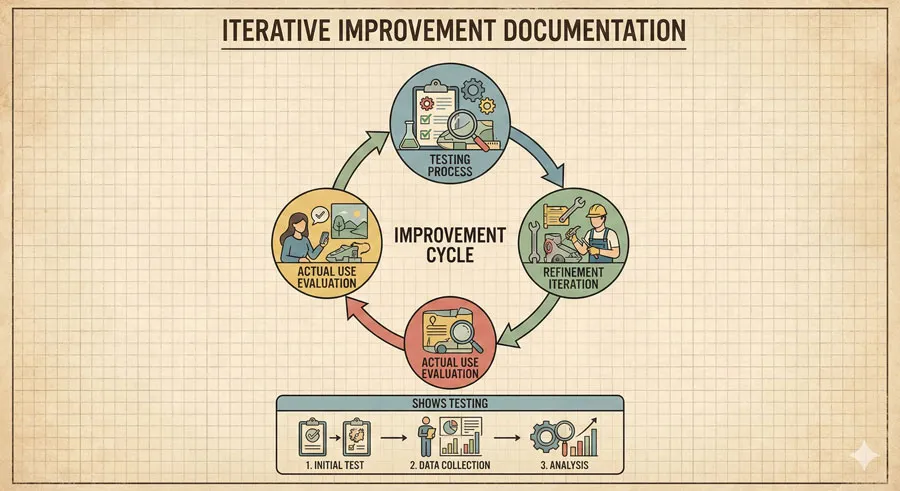
Designers should test legibility and readability in actual use. Refinement improves both factors.
Testing improves outcomes.
Typeface Appropriateness
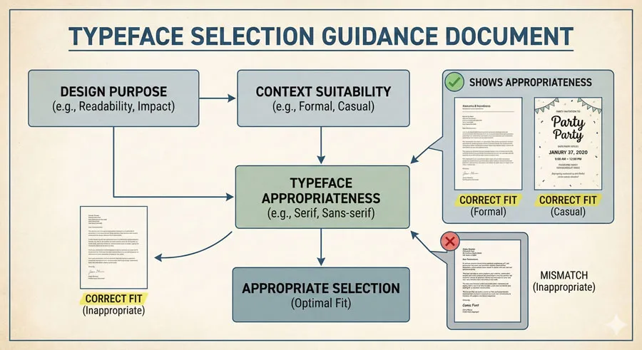
Select typefaces designed for intended context. Display typefaces work poorly for body text. Specialized typefaces serve specific needs.
Choose context-appropriate typefaces.
Balance and Restraint
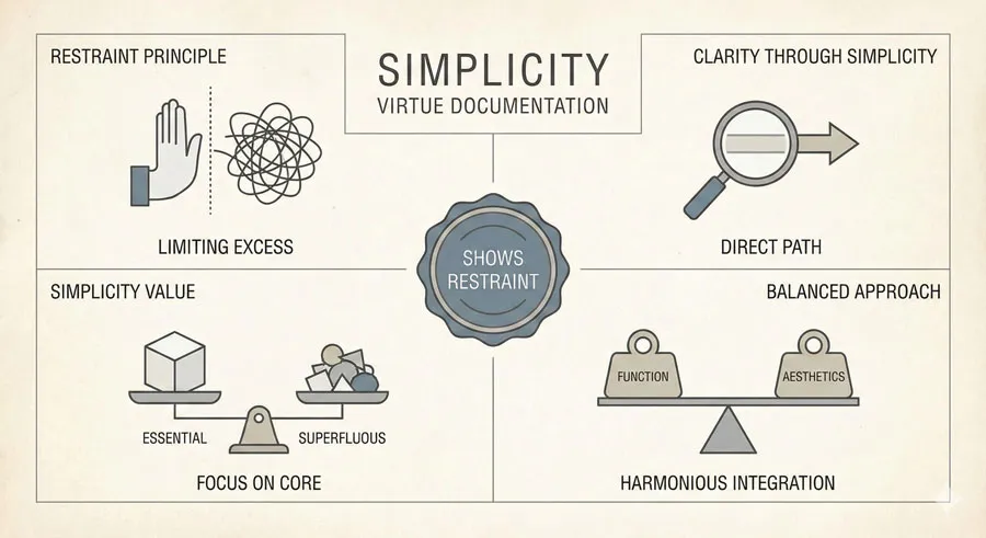
Excellent typography often involves restraint. Excessive variation and ornamentation impair both legibility and readability.
Simplicity serves clarity.
Related Topics:
FAQ: Common Questions About Legibility and Readability
Q: Aren’t legibility and readability the same thing?
A: No. Legibility refers to typeface character differentiation. Readability refers to text presentation comfort. Both matter.
Q: Can an illegible typeface be made readable?
A: No. Illegible typeface creates fundamental limitation. Poor presentation cannot create readability without legible foundation.
Q: What’s the most legible typeface?
A: Several typefaces are highly legible. Context matters. Different contexts may require different legible typefaces.
Q: Is sans-serif more legible than serif?
A: No universal answer. Both serif and sans-serif typefaces can be legible. Context and design matter.
Q: How long is optimal line length?
A: Research suggests 50-75 characters for print, slightly longer for screen. Context affects optimal length.
Q: Does line spacing affect legibility?
A: No. Line spacing (leading) affects readability, not legibility. Legibility is typeface property.
Q: Can color affect legibility?
A: No. Color affects readability through contrast and visual intensity, not letterform distinction.
Q: Why do some typefaces feel harder to read?
A: Multiple factors contribute—typeface characteristics, size, spacing, contrast, layout, and context.
Q: Is bigger always more readable?
A: No. Excessively large text can reduce readability. Optimal size balances visibility and comfort.
Q: How do accessibility needs affect legibility and readability?
A: Accessible design requires legible typefaces and readable presentation. Both factors support accessibility.
Related Topics:
Conclusion: Mastering Typography Fundamentals

Understanding distinction between legibility and readability is essential for typography excellence. Legibility concerns typeface properties; readability concerns text presentation. Both require attention.
Legible typeface serves as foundation enabling readable text. Illegible typeface creates insurmountable limitation. Designers must begin with legible typeface.
Readability emerges through thoughtful text presentation. Line length, spacing, contrast, hierarchy, and alignment all affect readability. Excellent presentation transforms legible typeface into readable text.
Design excellence requires optimizing both legibility and readability. Neither factor can be neglected. Superior typography emerges from attending both.
Context determines specific legibility and readability requirements. Headlines may emphasize distinctiveness. Body text prioritizes comfort. Designers must adapt emphasis to context.
Accessibility benefits from legible typefaces and readable presentation. Inclusive design serves diverse readers through optimizing both factors.
Testing and refinement improve legibility and readability. Designers benefit from evaluating typography in actual use.
Understanding legibility and readability enables designers to evaluate typography critically and make informed decisions. Clear conceptual framework improves design practice.
Typography fundamentals—legibility and readability—remain constant despite technological change. Digital and print typography both benefit from understanding these principles.
Mastery of legibility and readability distinguishes design excellence. Designers who understand and apply these principles create superior typography.
The distinction between legibility and readability ultimately matters because typography profoundly affects reader experience. Legible, readable typography enables comfortable communication. Poor typography impairs comprehension.
Related Topics:
About the Author
Lalit M. S. Adhikari is a Digital Nomad and Educator since 2009 in design education, graphic design and animation. He’s taught 500+ students and created 200+ educational articles on design topics. His teaching approach emphasizes clarity, practical application and helping learners.
Learn more about Lalit Adhikari.
This guide is regularly updated with the latest information about Adobe tools and design best practices. Last Updated: Mar 2026
Related Topics:


