Learn the critical difference between legibility and readability in typography. Discover how to design with both principles for effective communication and excellent user experience.
My name is Lalit Adhikari and we are at LTY. Let’s begin!
Table of Contents
Introduction: Two Concepts, One Goal
Typography education often emphasizes the importance of legibility and readability, often treating them as interchangeable concepts. However, legibility and readability are distinct but interconnected principles that serve different functions in typography and design.
Understanding the difference between legibility and readability is crucial for designers at all levels. The distinction affects typeface selection, font sizing, line length, spacing, color choices, and countless other design decisions. Confusing these concepts can result in typography that looks beautiful but communicates poorly, or typography that is functional but uninviting.
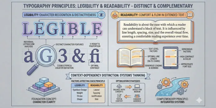
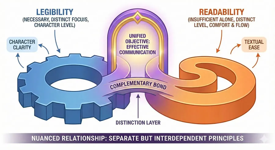
Legibility refers to how easily individual letterforms can be distinguished from one another. Readability refers to how easily extended text can be read and understood.
A typeface can be highly legible (distinctive letterforms that are easy to differentiate) while still being difficult to read (poor in extended text contexts). Conversely, a typeface might be readable in context but feature letterforms that are difficult to distinguish at first glance.
The relationship between legibility and readability is complementary but distinct. Legibility is the foundation—if individual letterforms cannot be distinguished, readability will suffer. However, high legibility alone does not guarantee readability.
Extended text contexts introduce additional factors: line length, line spacing, letter spacing, word spacing, color contrast, and countless other variables that affect how readable text is.
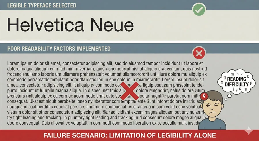
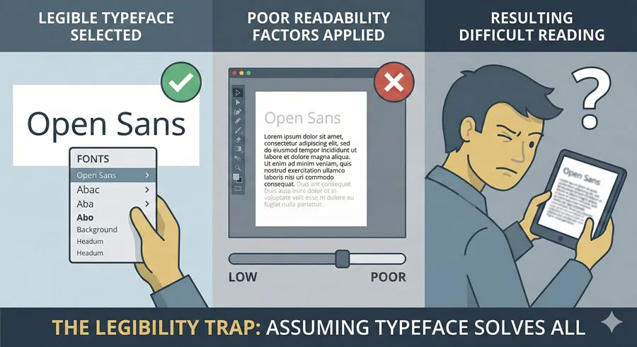
This distinction matters because designers often approach typography problems assuming that choosing a “legible” typeface solves typography challenges. However, even the most legible typeface will be difficult to read if deployed in contexts with poor line length, insufficient contrast, or inappropriate spacing.
This comprehensive exploration examines legibility fundamentals and characteristics, explores readability principles and factors, analyses the relationship between legibility and readability, considers how to optimize for both, explores common mistakes in approach, and ultimately asks:
- how can designers apply both legibility and readability principles to create typography that is beautiful, functional, and genuinely serves communication goals?
Related Topics:
- Secret Life of Symbols: History of Ampersand and Interrobang
- Helvetica – Swiss Modernism’s Ubiquity Crisis
- Comic Sans – Accessibility & Gatekeeping Critique
Legibility: The Foundation of Typography
Defining Legibility
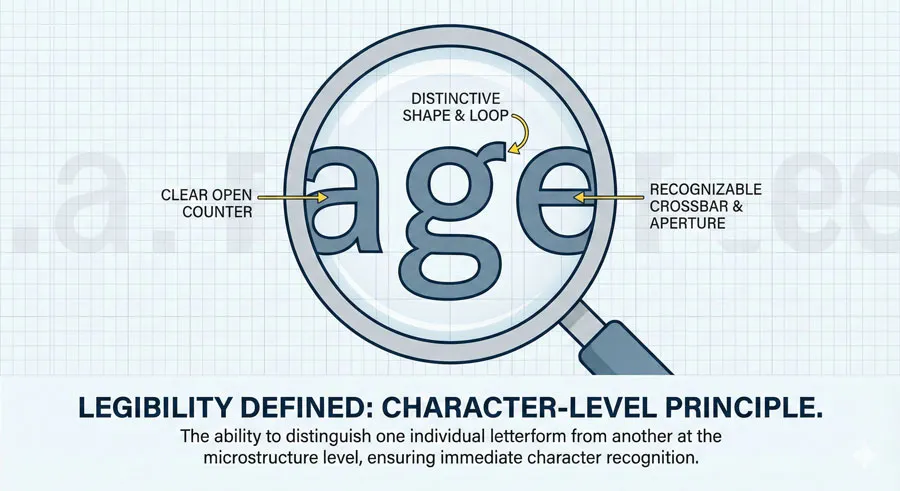
Legibility is the degree to which individual letterforms can be distinguished from one another and recognized quickly. A highly legible typeface features letterforms that are distinctive and unmistakable. The letterforms are structured so that similar letters are clearly differentiated.
Legibility operates at the character level. A legible typeface is one where the letter “l” cannot be confused with the letter “I”, where “O” is distinctly different from “0”, where “a” is clearly distinguishable from “d”, where similar letterforms are nonetheless unmistakable.
Characteristics of Legible Typefaces
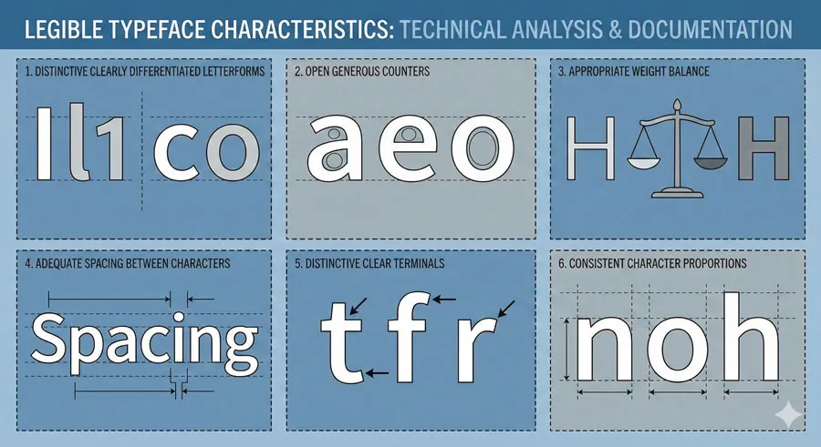
Highly legible typefaces typically feature:
- Distinctive letterforms – characters that are unmistakably different
- Clear differentiation – similar letters that are nonetheless clearly distinct
- Open counters – the spaces inside letterforms are open and clear
- Appropriate weight – not too thin (difficult to distinguish) or too heavy (letterforms merge)
- Good spacing – adequate space between letterforms so they are not confused
- Distinctive terminals – ends of strokes are shaped clearly
- Consistent character width – letterforms maintain consistent proportions
Conversely, legibility is reduced by:
- Similarity between characters – letters that look too similar
- Closed or cramped counters – interior spaces that are too small
- Excessive weight – strokes so heavy letterforms merge
- Poor spacing – letterforms too close together
- Decorative elements – flourishes that obscure letterforms
- Inconsistent proportions – letterforms that vary widely in width
Legibility and Typeface Categories
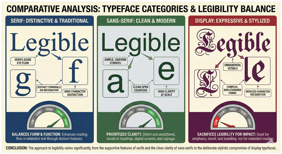
Different typeface categories approach legibility differently:
- Serif typefaces traditionally achieve legibility through distinctive serifs that help differentiate letterforms. The serifs themselves serve a legibility function by making letterforms more distinctive.
- Sans-serif typefaces achieve legibility through clear, open letterforms without serif appendages. The simplicity of sans-serif forms requires that the basic letterform structures be highly distinctive.
- Display typefaces may sacrifice legibility for distinctive character, making them inappropriate for extended text.
Related Topics:
- Gotham – Political Design & Elections Power
- Futura – Geometric Modernism Revolution
- Gill Sans – Humanist Alternative Modernism
Readability: The Context-Dependent Principle
Defining Readability
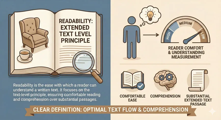
Readability is the ease with which extended text can be read and understood. A readable design is one where a reader can comfortably read substantial amounts of text without fatigue or confusion.
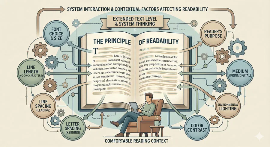
Readability operates at the text level rather than the character level. Readability depends not just on the typeface but on how the typeface is deployed: line length, line spacing, letter spacing, word spacing, color contrast, text alignment, and countless other factors.
Factors Affecting Readability
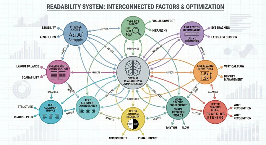
Readability depends on multiple interrelated factors:
- Typeface choice – The typeface contributes to readability, but is only one factor
- Type size – Text that is too small is difficult to read; text that is too large appears broken up
- Line length – Text lines that are too long or too short reduce readability
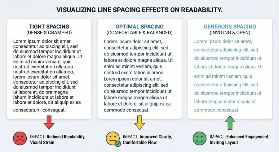
- Line spacing – Inadequate line spacing makes reading text difficult; excessive line spacing appears disjointed
- Letter spacing – Poor letter spacing affects reading speed and comprehension
- Word spacing – Incorrect word spacing disrupts reading flow
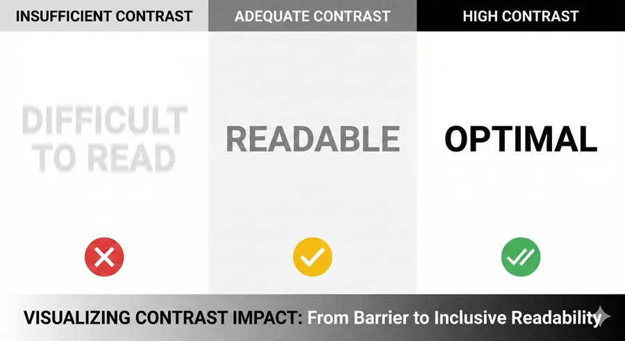
- Color contrast – Inadequate contrast between text and background reduces readability
- Text alignment – Justified text may reduce readability due to irregular word spacing
- Column width – Multiple narrow columns affect how readers scan text
- Background – Patterned or textured backgrounds reduce readability
- Environment – Reading context (screen, printed page, directional signage) affects readability
How Readability Differs from Legibility
The critical distinction is that readability depends on context and deployment while legibility depends primarily on typeface structure.
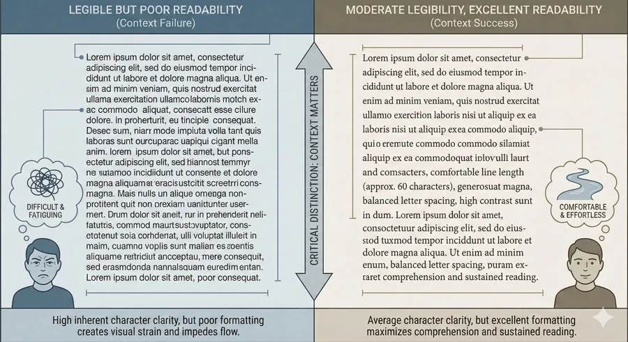
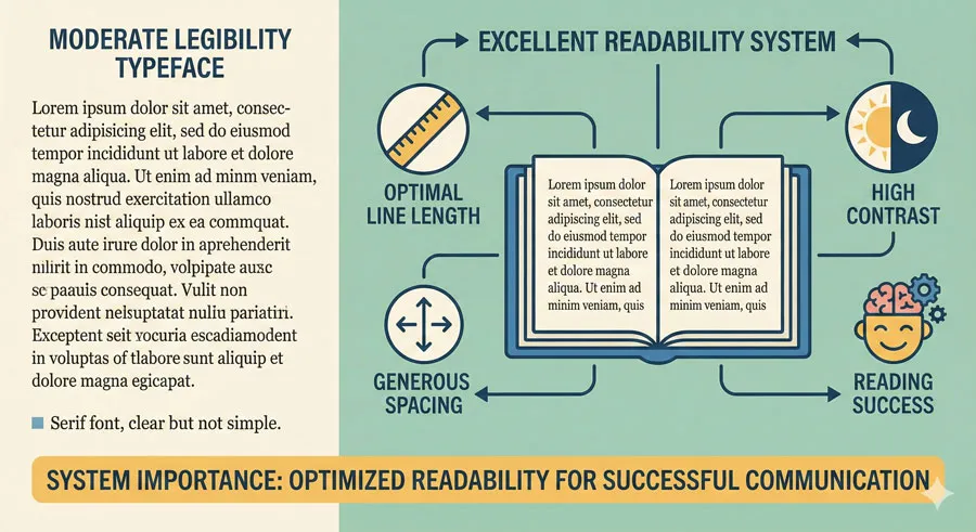
A highly legible typeface deployed with poor line length, inadequate contrast, and inappropriate spacing will be difficult to read despite its legibility. Conversely, a typeface with moderate legibility can be highly readable if deployed thoughtfully with appropriate size, spacing, contrast, and line length.
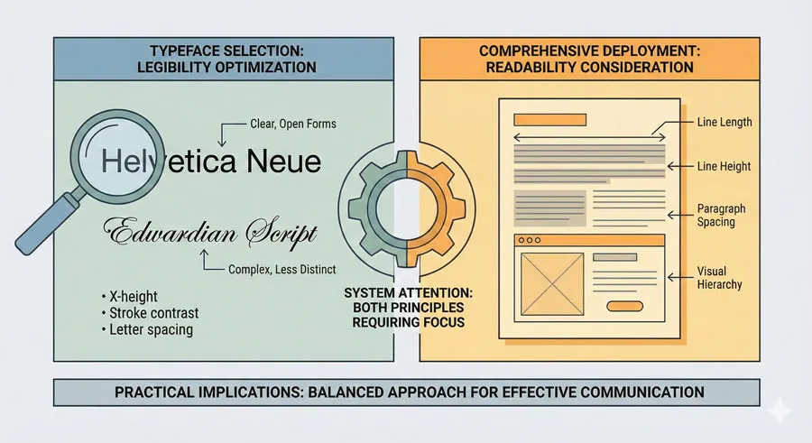
This distinction suggests different design approaches. Legibility is achieved through typeface selection. Readability requires considering how the typeface is deployed and how the entire typographic system works together.
Related Topics:
- Baskerville – Print Excellence & Love Story
- Bodoni – Theatrical Prestige Aesthetics
- Garamond – Classical Foundation Principles
The Relationship Between Legibility and Readability
Complementary but Distinct
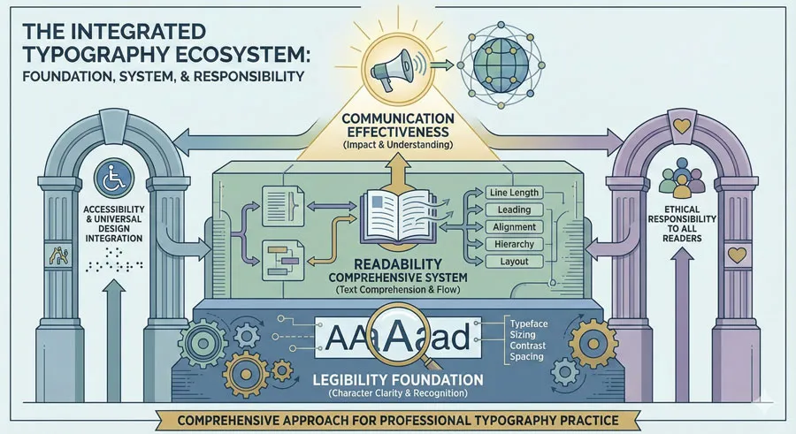
Legibility and readability are complementary but distinct principles. Legibility is necessary but not sufficient for readability. A typeface must be reasonably legible to be readable in extended text. However, high legibility alone does not guarantee readability.
The relationship might be visualized as hierarchical: legibility is the foundation. If a typeface cannot be read at the character level, readability will suffer. However, achieving readability requires attention to additional factors beyond legibility.
When Legibility Alone Fails
Consider a scenario where a designer selects an extremely legible typeface (perhaps a geometric sans-serif with highly distinctive letterforms) but deploys it with very long lines, minimal line spacing, and light gray color on a white background. Despite the typeface’s excellent legibility, the extended text will be difficult to read.
This scenario demonstrates that legibility alone is insufficient. The designer optimized the most visible component (typeface choice) while neglecting equally important factors affecting readability (line length, line spacing, color contrast).
When Readability Requires Adequate Legibility
Conversely, consider deploying a moderately legible serif typeface with excellent line length, generous line spacing, adequate color contrast, and appropriate sizing. The moderate legibility of the typeface is adequate because the overall system supports readability.
However, there are limits. A typeface must achieve minimum legibility standards. A display typeface with intentionally decorative or obscured letterforms will ultimately be difficult to read regardless of how thoughtfully other factors are addressed.
Practical Implications
For designers, the practical implication is that both principles require attention:
- Legibility is achieved through thoughtful typeface selection
- Readability is achieved through considering how the typeface is deployed in context
Excellent typography addresses both principles simultaneously.
Related Topics:
- Worst Fonts – Criticism & Gatekeeping Analysis
- Gill Sans & The Tube – Urban Identity Infrastructure
- Baskerville & Mrs. Eaves – Love, Partnership & Revival
Optimizing for Legibility
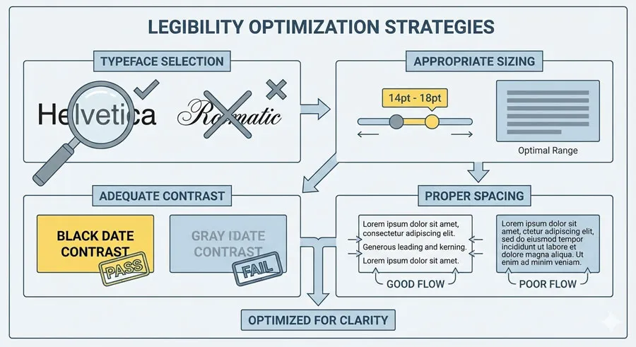
Typeface Selection
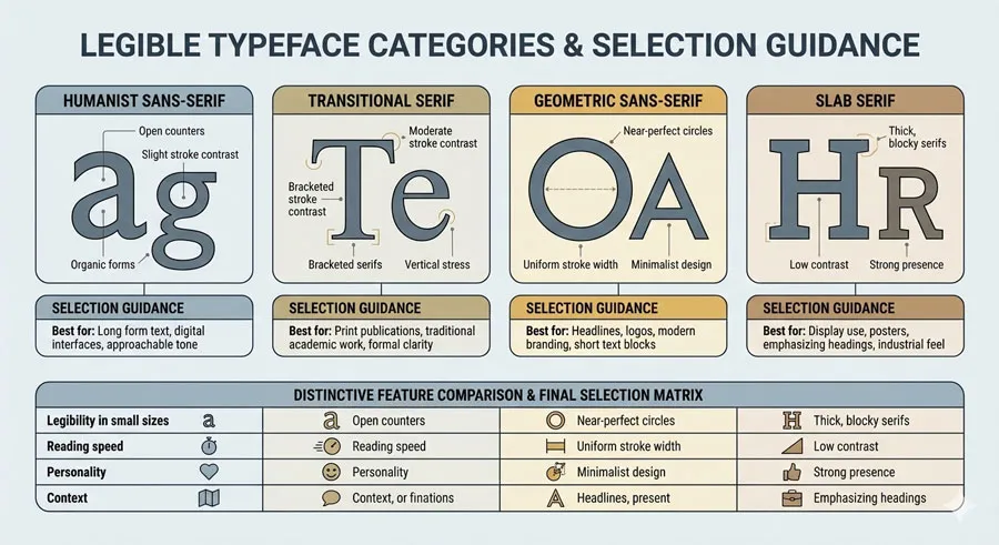
Selecting legible typefaces is the primary tool for optimizing legibility. Typefaces designed specifically for legibility (often called “text faces” or “body faces”) prioritize legibility through distinctive letterforms.
Categories of legible typefaces:
- Humanist sans-serifs – readable and legible
- Transitional serifs – balance tradition with legibility
- Geometric sans-serifs – provide clarity through simplicity
- Slab serifs – legible through clear structural forms
Font Size and Weight
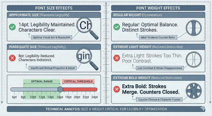
Even legible typefaces can become illegible if deployed at inappropriate sizes or weights:
- Size – Text that is too small sacrifices legibility
- Weight – Typeface weight affects legibility; too thin or too heavy can reduce distinctiveness
- Regular weight – Standard weights typically optimize legibility
- Extreme weights – Very light or very heavy weights may reduce legibility
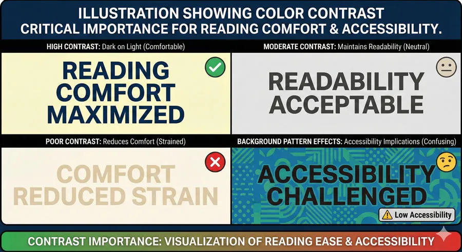
Colour and Contrast
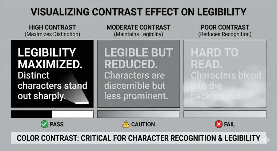
Legibility requires adequate contrast between letterforms and background:
- High contrast – Black text on white background maximizes legibility
- Sufficient contrast – Even colors with moderate contrast can maintain legibility
- Poor contrast – Gray text on white background reduces legibility
- Background patterns – Patterned backgrounds obscure letterforms and reduce legibility
Spacing
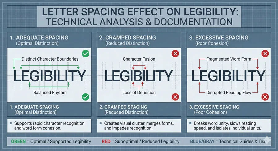
Spacing affects legibility by affecting how distinctly letterforms appear:
- Letter spacing – Adequate spacing helps distinguish individual letters
- Cramped spacing – Reduces legibility by making letterforms merge visually
- Excessive spacing – Can also reduce legibility by separating components
Related Topics:
- Futura & Paul Renner – Geometric Vision & Revolution
- Legibility vs. Readability – Typography Fundamentals
- Ampersand & Interrobang – Symbol Histories
Optimizing for Readability
Type Size for Readability
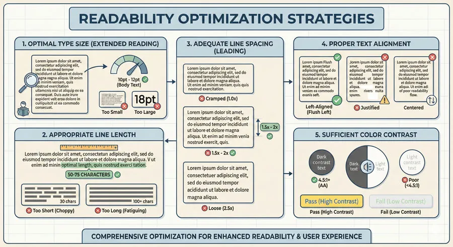
Type size affects readability significantly:
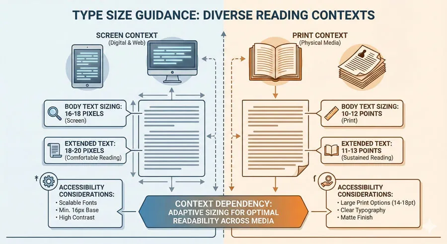
- Body text – Typically 16-18 pixels for screen reading; 10-12 points for print
- Extended text – Slightly larger sizes improve readability
- Context-dependent – Size requirements depend on reading distance and context
- Younger readers – May require larger sizes
- Older readers – Typically benefit from larger sizes
- Screen vs. print – Screen reading typically requires larger sizes than print
Line Length and Line Spacing
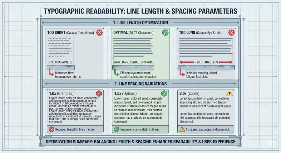
Line length and line spacing are among the most important readability factors:
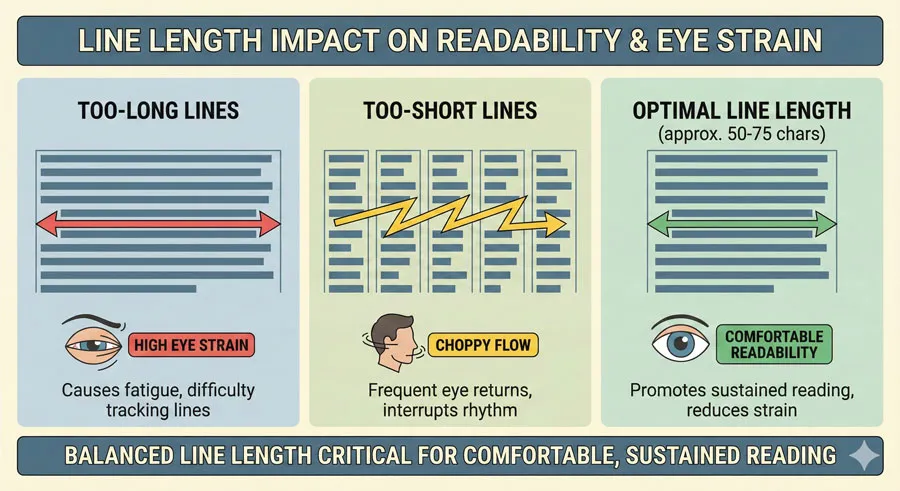
- Optimal line length – 50-75 characters or 8-10 words per line
- Too-long lines – Reader eye travels excessively; loses place returning to start of next line
- Too-short lines – Reading becomes choppy and fatiguing
- Line spacing – Typically 1.5 to 2 times the line height improves readability
- Generous spacing – Makes text less dense and more readable
- Cramped spacing – Makes text appear dense and reduces readability
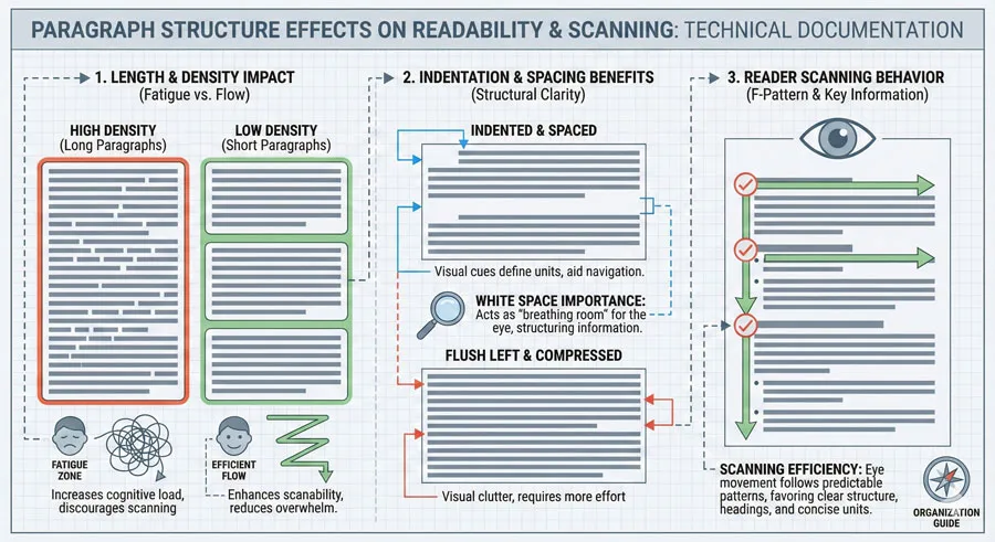
Paragraph Structure
Paragraph structure affects readability:
- Paragraph length – Long paragraphs appear dense; short paragraphs aid scanning
- Indentation – Indentation or space between paragraphs improves readability
- First-line indent – Helps readers identify paragraph breaks
- White space – Generous white space improves readability
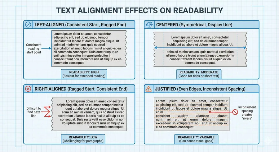
Alignment and Justification
Text alignment affects readability:
- Left-aligned – Provides consistent left edge for eye tracking; generally most readable
- Centered – Reduces readability for extended text; appropriate for display
- Right-aligned – Difficult for extended reading
- Justified – Can reduce readability due to inconsistent word spacing; may be appropriate for narrow columns
Colour and Contrast for Readability
Colour and contrast significantly affect readability:
- High contrast – Maximum readability (dark text on light background, or vice versa)
- Color combinations – Certain color combinations are more readable than others
- Accessibility – Color blind users may have difficulty with some color combinations
- Background patterns – Patterns reduce readability and should be avoided
Related Topics:
- Typography
- The Psychology of Typography: Font Influence
- Helvetica Effect: One Font Conquered Global Design
Common Mistakes in Legibility and Readability
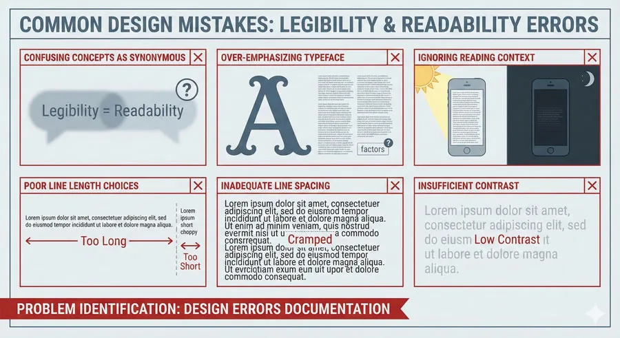
Confusing Legibility with Readability
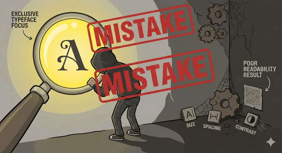
The most common mistake is assuming that selecting a “legible” typeface solves typography problems. Designers often focus exclusively on typeface selection while neglecting other readability factors.
A legible typeface deployed with poor line length, inadequate spacing, and insufficient contrast will still be difficult to read.
Over-Emphasizing Typeface Choice
Related to the above, designers often over-emphasize typeface selection while neglecting equally important factors. The typeface is important, but it is only one component of a comprehensive typographic system.
Legibility can be optimized through typeface selection, but readability requires considering the entire system: size, spacing, contrast, line length, and numerous other factors.
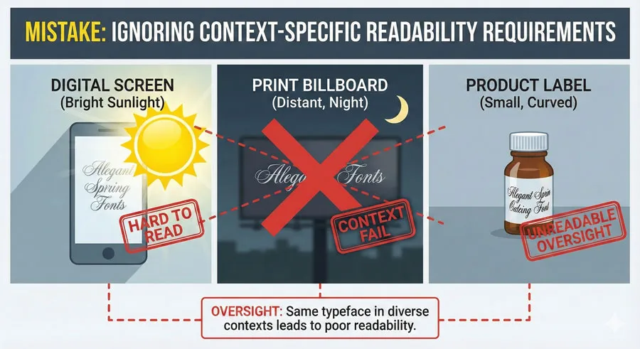
Neglecting Reading Context
Different reading contexts have different requirements. A typeface appropriate for body text in a printed book may be inappropriate for directional signage, which may be read quickly from a distance under poor lighting conditions.
Designers should consider reading context: Is text being read carefully in comfortable conditions, or scanned quickly in challenging environments?
Poor Line Length Choices
Line length is one of the most impactful readability factors, yet designers often neglect it. Lines that are too long or too short reduce readability.
This mistake is particularly common in web design, where designers sometimes create very wide text columns that sacrifice readability.
Inadequate Line Spacing
Line spacing significantly affects readability. Designers often use default line spacing values without considering whether adequate spacing exists.
Tight line spacing makes extended text difficult to read and appear visually dense.
Insufficient Colour Contrast
Colour contrast affects both legibility and readability. Designers sometimes sacrifice contrast for aesthetic reasons, creating text that is difficult to read.
Light gray text on white backgrounds is a common example of this mistake.
Ignoring Accessibility Requirements
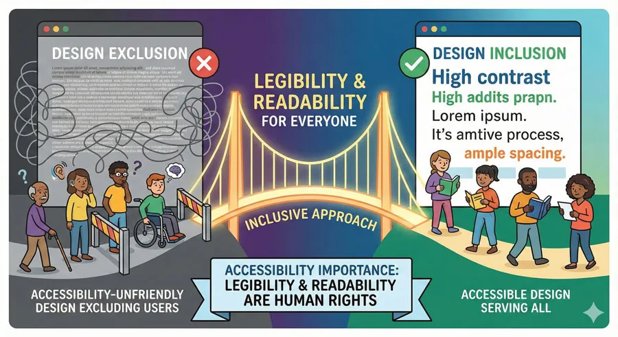
Accessibility affects both legibility and readability. Certain design decisions (color combinations, font sizes, line spacing) affect readers with different visual abilities.
Accessibility should not be treated as an afterthought but as integral to legibility and readability optimization.
Related Topics:
- Comic Sans: True Story Behind the World’s Most Hated Font
- Gotham: Font That Won an Election And Changed Design Forever
- Futura: The Geometric Vision of Paul Renner
Accessibility and Universal Design
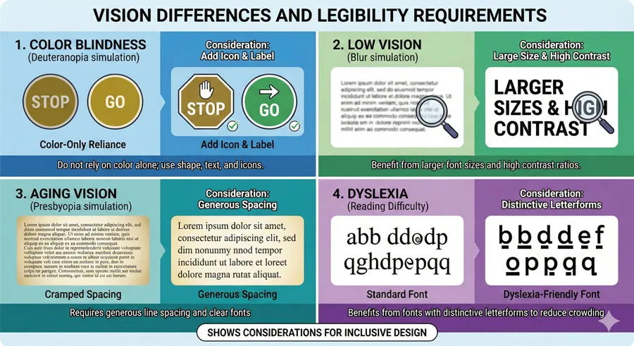
Vision and Legibility
Different readers have different vision capabilities. Legibility considerations must account for:
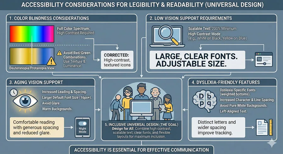
- Color blindness – Color should not be the only distinguishing feature
- Low vision – Larger sizes, higher contrast, and clearer typefaces are important
- Aging eyes – Older readers typically benefit from larger sizes and higher contrast
- Dyslexia – Certain typeface characteristics (distinctive letterforms, adequate spacing) support readers with dyslexia
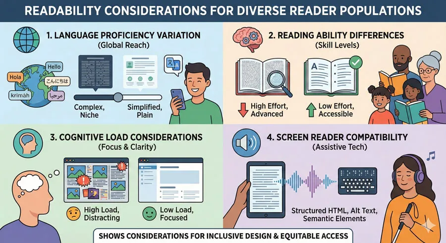
Readability for Diverse Readers
Readability considerations must account for diverse readers:
- Language proficiency – Non-native speakers may benefit from clearer typography
- Reading ability – Readers with lower literacy may require clearer, simpler typography
- Cognitive load – Complex visual hierarchies and typography reduce readability for some readers
- Screen readers – Digital readability must account for screen reader compatibility
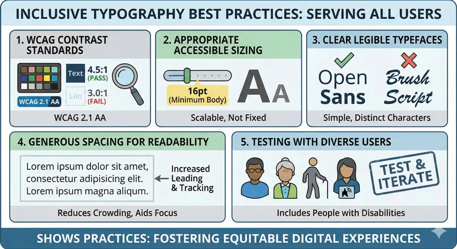
Inclusive Typography Design
Creating legible and readable typography for all users requires:
- Adequate contrast – Meeting WCAG accessibility standards
- Appropriate sizing – Large enough for comfortable reading
- Clear typefaces – Using typefaces designed for legibility and readability
- Generous spacing – Line spacing and letter spacing that support reading
- Testing with diverse users – Including users with different vision and reading abilities
Related Topics:
- Gill Sans: Eric Gill’s Humanist Masterpiece
- Baskerville: Elegant Serif That Shaped Print Typography
- Bodoni Font: Serif That Defined Luxury Typography
FAQ: Common Questions About Legibility and Readability
Q: Is legibility more important than readability?
A: Neither is more important; they serve different functions. Legibility is necessary for readability, but readability requires attention to additional factors beyond legibility.
Q: Can a typeface be highly readable but not legible?
A: Not really. If a typeface is not legible (individual letterforms are difficult to distinguish), it will ultimately be difficult to read in extended text contexts. However, moderate legibility is often adequate if readability factors are optimized.
Q: Which typefaces are most legible?
A: Typefaces designed specifically for text (body faces) typically optimize legibility. Humanist sans-serifs, transitional serifs, and typefaces designed for accessibility are generally highly legible.
Q: What is the ideal line length for readability?
A: 50-75 characters or approximately 8-10 words per line is generally considered optimal for readability in most contexts.
Q: How does line spacing affect readability?
A: Line spacing significantly affects readability. Adequate line spacing (typically 1.5 to 2 times the line height) improves readability, while cramped line spacing reduces readability and increases visual fatigue.
Q: Does justified text reduce readability?
A: Justified text can reduce readability because it requires uneven word spacing to maintain right margin alignment. Left-aligned text typically provides better readability.
Q: How important is color contrast for legibility?
A: Color contrast is critically important. Inadequate contrast significantly reduces both legibility and readability. High contrast (dark text on light background) maximizes legibility.
Q: Can I use decorative fonts for body text?
A: Generally not. Decorative fonts prioritize distinctive character over legibility and readability. They are typically appropriate for display contexts only.
Q: What type size is best for screen reading?
A: 16-18 pixels is often considered optimal for screen reading. Print reading typically uses smaller sizes (10-12 points) due to different reading distances.
Q: How do I know if my typography is readable?
A: Read the text yourself. Does it feel comfortable to read? Do your eyes easily track from line to line? Can you read extended text without fatigue? Test with diverse users, including those with different visual abilities.
Related Topics:
- Garamond: Timeless Serif That Defined Classical Typography
- The Worst Fonts in the World: A Typographic Hall of Shame
- Gill Sans and Tube: How Johnston and Gill Defined London
Conclusion: Legibility and Readability as Design Practice
Understanding the distinction between legibility and readability is essential for designers. Legibility is the foundation—selecting typefaces with clear, distinctive letterforms that can be easily recognized.
Readability is the larger context—considering how the typeface is deployed and ensuring that all factors (size, spacing, contrast, line length) work together to create typography that is comfortable and easy to read.
The most common mistake is treating these as synonymous or assuming that selecting a legible typeface solves all typography problems. In reality, optimizing typography requires attention to both principles and consideration of the entire typographic system.
Contemporary design increasingly emphasizes accessibility and inclusive design. Legibility and readability are not only aesthetic concerns but ethical ones. Typography that is difficult to read excludes readers with different visual abilities. Typography that is poorly designed creates unnecessary cognitive burden.
Designers have power in creating typography. That power carries responsibility to use legibility and readability principles to create typography that serves all readers, that communicates effectively, and that respects the reader’s time and attention.
The distinction between legibility and readability is not merely academic. It has practical implications for every typography decision:
- typeface selection, sizing, spacing, color choices, and countless other variables.
By understanding how these principles work separately and together, designers can create typography that is not just beautiful but genuinely functional and accessible.
Related Topics:
- Baskerville and Eaves: A Tale of Perfection, Passion and Revival
- Futura vs. The World: The Geometric Vision of Paul Renner
About the Author
Lalit M. S. Adhikari is a Digital Nomad and Educator since 2009 in design education, graphic design and animation. He’s taught 500+ students and created 200+ educational articles on design topics. His teaching approach emphasizes clarity, practical application and helping learners.
Learn more about Lalit Adhikari.
This guide is regularly updated with the latest information about Adobe tools and design best practices. Last Updated: Mar 2026


