Discover how Gotham became the font of the Obama campaign and shaped contemporary design. Explore Tobias Frere-Jones’ masterpiece, its history, psychology, and lasting cultural impact on branding and politics.
My name is Lalit Adhikari and we are at LTY. Let’s begin!
Table of Contents
Introduction: A Font That Changed How We See Power and Hope
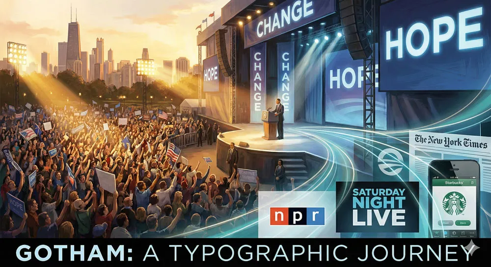
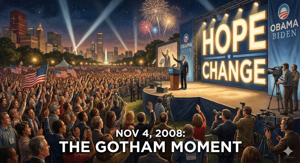
On November 4, 2008, Barack Obama stood before an enormous crowd in Chicago’s Grant Park to deliver his election victory speech. Behind him, the stage was dominated by massive letterforms spelling out his name.
The typography was clean, modern, distinctly American, and powerfully optimistic. The typeface was Gotham, and in that moment, a font designed by a New Jersey typographer named Tobias Frere-Jones became inextricably linked with one of the most significant political moments in recent American history.
Gotham did not win the election. But it played a role in shaping how voters perceived the campaign, how the media represented it, and how the historical moment has been remembered.
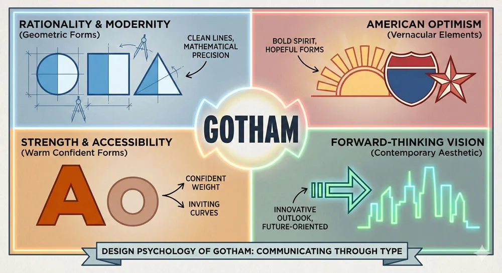
Gotham communicated optimism, forward-thinking progress, American strength, and contemporary vision. It was, in many ways, the perfect visual embodiment of the “Hope and Change” message that defined the 2008 Obama campaign.
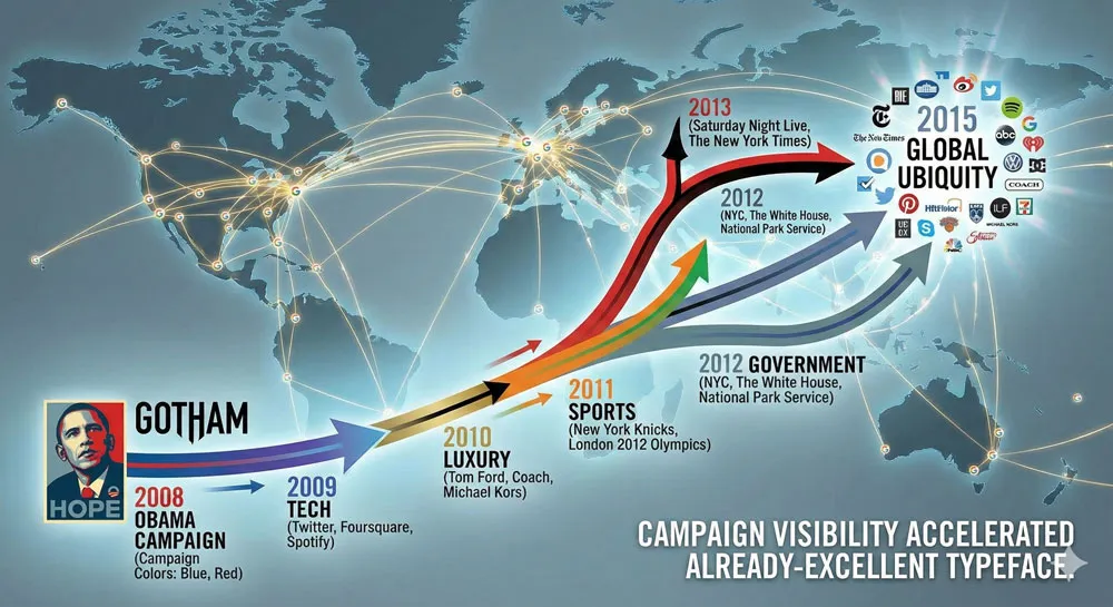
What is remarkable about Gotham’s role in the 2008 election is not just the typeface’s cultural visibility at that moment, but the typeface’s subsequent trajectory. After becoming associated with the Obama campaign, Gotham went on to become one of the most widely adopted typefaces in contemporary design.
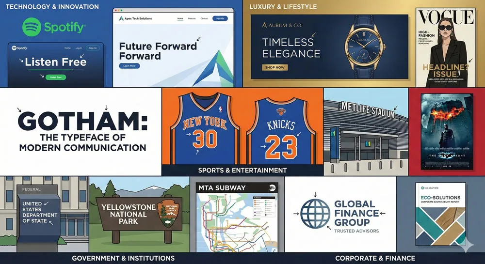
It has been used by tech companies, luxury brands, government institutions, sports franchises, and countless other organizations seeking to communicate that they are modern, optimistic, forward-thinking, and American.
Gotham represents a crucial moment in the history of typography and political communication. It demonstrates the profound psychological power of typeface choice in shaping how we perceive political messages.
It reveals how design choices made by relatively few people (the designer, the campaign’s design team) can influence the perceptions of millions. And it shows how a typeface can transcend its original context to become a broader cultural force shaping how we think about modernity, Americanism, and hope itself.
This comprehensive exploration of Gotham traces the typeface’s origins in American vernacular design and geometric sans-serif traditions, examines Tobias Frere-Jones’s design philosophy and process, analyses the 2008 Obama campaign’s strategic use of Gotham, explores Gotham’s subsequent adoption across industries and cultures, and ultimately asks:
- What does Gotham tell us about design, politics, typography, and the relationship between visual communication and power?
Related Topics:
- Futura: The Geometric Vision of Paul Renner
- Gill Sans: Eric Gill’s Humanist Masterpiece
- Baskerville: Elegant Serif That Shaped Print Typography
The Roots of Gotham: American Vernacular Design and Geometric Sans-Serifs
Understanding American Sans-Serif Traditions
To understand Gotham, you must first understand the American typographic and design traditions that produced it.
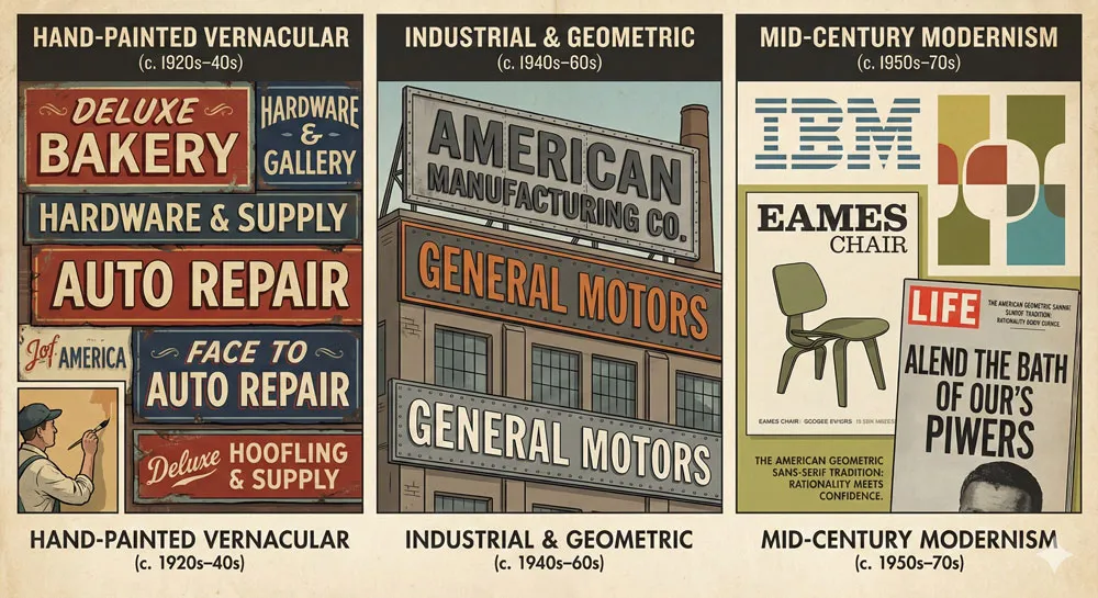
While Swiss design modernism gave the world Helvetica and Univers, American design developed its own distinct sans-serif tradition—one grounded in American vernacular, industrial lettering, and geometric rationality combined with distinctly American character.
American sans-serif design drew inspiration from early 20th-century industrial signage, hand-painted letterforms on storefronts, and the practical needs of American commerce and advertising.
Unlike Swiss design, which emphasized absolute neutrality and universalism, American design allowed for personality, character, and distinctiveness within a modernist framework.
Typefaces like Alternate Gothic, a condensed geometric sans-serif used extensively in American signage and headlines, represented this American design sensibility.
These typefaces were functional and modern, yet they had personality. They communicated strength and confidence without sacrificing approachability. They felt distinctly American—bold, confident, forward-thinking.
Gotham emerges from this tradition of American sans-serif design. It is simultaneously a geometric sans-serif (connecting it to European modernism and design rationality) and a distinctly American typeface (incorporating American vernacular character and confidence).
This hybrid nature—combining Swiss modernist rationality with American optimism and personality—is crucial to understanding Gotham’s power and appeal.
The Geometric Sans-Serif Tradition: From Futura to Contemporary Design
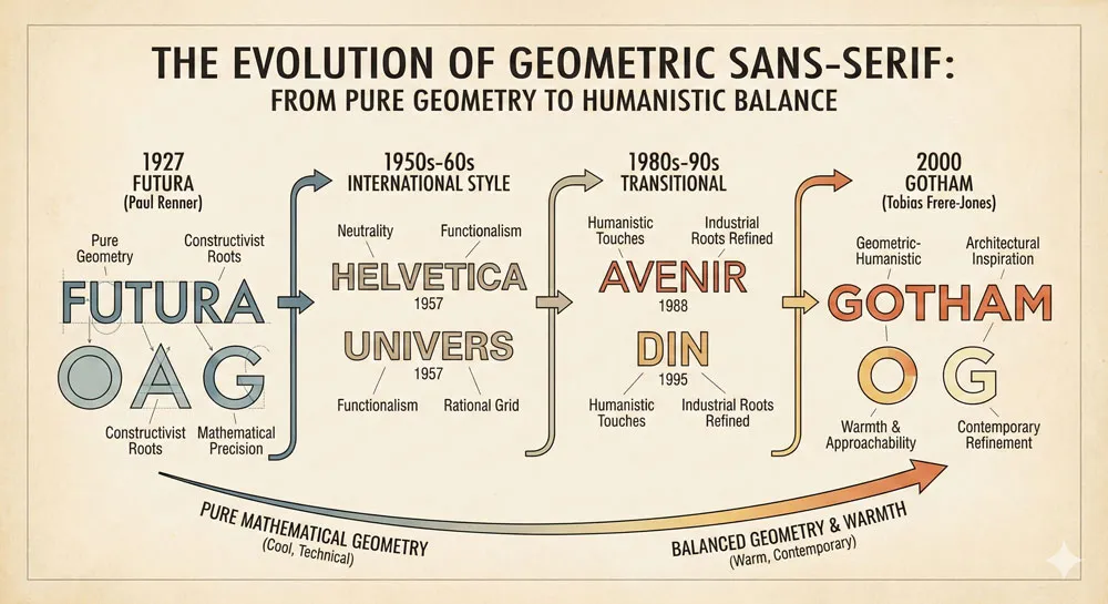
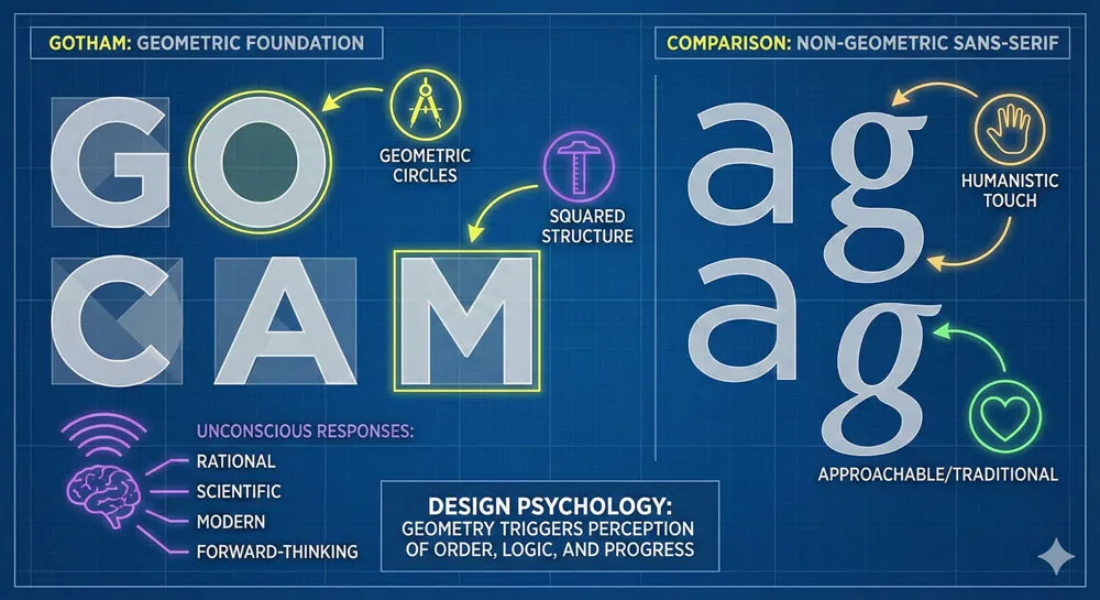
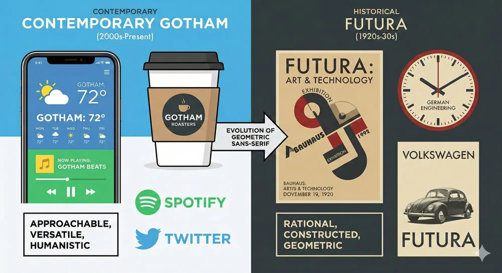
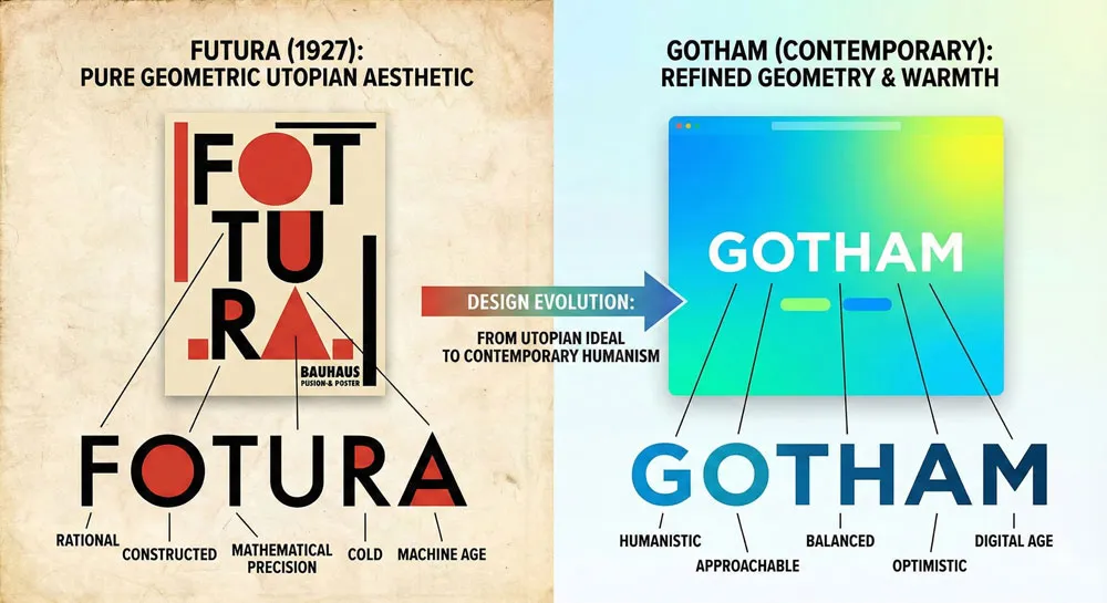
Geometric sans-serifs occupy a specific place in typographic history. Typefaces like Futura (Paul Renner, 1927) were designed based on pure geometric principles—circles, squares, and triangles serving as the foundation for letterforms.
This geometric approach communicated rationality, mathematical precision, and technological optimism. Futura became associated with modernity, progress, and forward-thinking vision.
However, pure geometric sans-serifs, while beautiful and powerful, can sometimes feel cold or detached. The perfectly geometric forms, while mathematically pure, lack the warmth and approachability that humanist sans-serifs provide.
Designers throughout the late 20th and early 21st centuries sought to create geometric sans-serifs that maintained the strength and modernity of geometric design while incorporating more warmth and character.
Gotham represents an evolution of geometric sans-serif design. It maintains geometric principles—the letterforms are based on geometric relationships and mathematical proportions—yet incorporates subtle refinements and character that make the typeface warmer and more approachable than pure geometric fonts.
The result is a typeface that feels simultaneously scientific and human, modern and accessible, powerful and optimistic.
The Rise of Contemporary Sans-Serifs: Design Context for Gotham
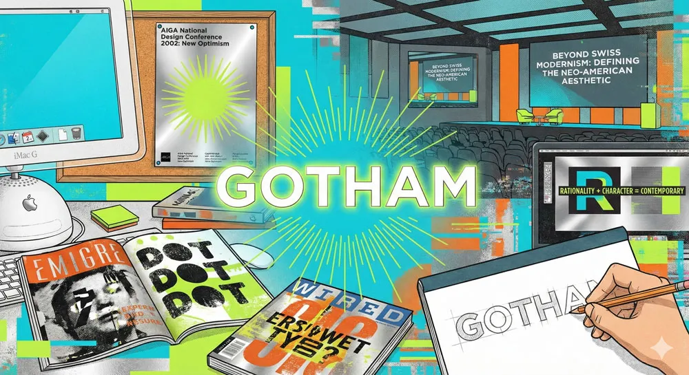
The early 2000s saw a proliferation of geometric sans-serif designs attempting to create typefaces that felt contemporary, confident, and distinctly American.
These typefaces moved away from the Swiss modernism that had dominated late 20th-century design and toward a new aesthetic that could be called “neo-American modernism.”
Designers recognized that Helvetica, while still powerful and widely used, felt somewhat dated—too associated with 1970s corporate America and institutional conformity.
A new generation of designers wanted typefaces that felt contemporary without losing modernism’s rationality and clarity. They wanted typefaces that communicated forward-thinking vision without sacrificing accessibility.
This was the design context in which Tobias Frere-Jones created Gotham in the early 2000s. The typeface was designed at precisely the moment when American design culture was ready to embrace a new geometric sans-serif that could communicate contemporary optimism and forward-thinking vision.
When the Obama campaign selected Gotham for their visual identity, they were making a choice aligned with broader cultural and design movements toward contemporary geometric sans-serifs that communicated American confidence and progress.
Related Topics:
- Bodoni Font: Serif That Defined Luxury Typography
- Garamond: Timeless Serif That Defined Classical Typography
- The Worst Fonts in the World: A Typographic Hall of Shame
Tobias Frere-Jones: The Designer Behind Gotham
Background and Design Philosophy
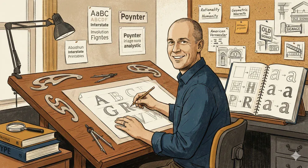
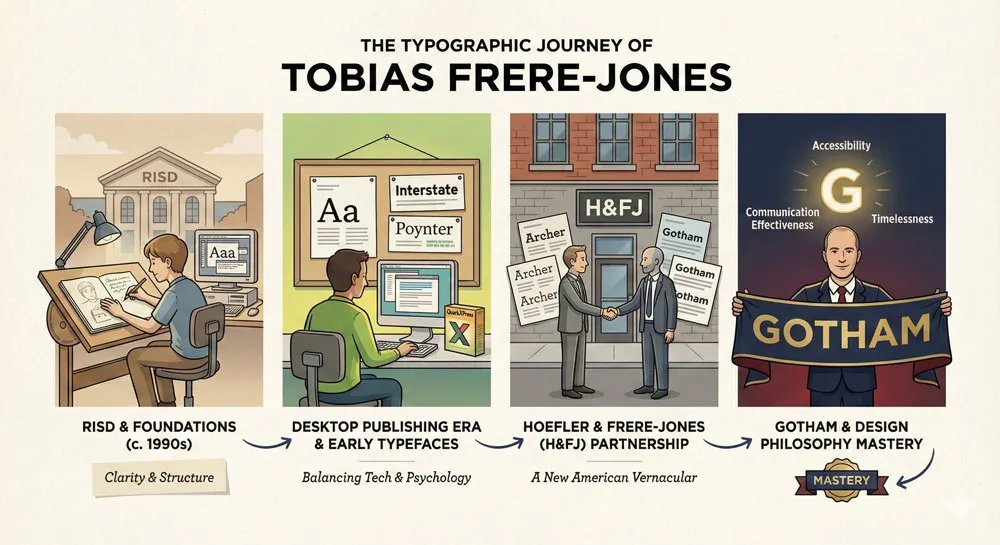
Tobias Frere-Jones is one of the most significant type designers working in contemporary design. Born in 1970, Frere-Jones studied graphic design at Risd (Rhode Island School of Design) and came of age during the desktop publishing revolution that democratized typography and type design.
Frere-Jones’s approach to type design emphasizes clarity, accessibility, and the relationship between typography and communication.
He is interested not just in creating beautiful letterforms but in creating typefaces that serve specific communication purposes. His design philosophy balances geometric rationality with humanistic concern for readability and warmth.
Before creating Gotham, Frere-Jones had established himself as a significant type designer. He had worked on various typeface projects and had developed a sophisticated understanding of how typefaces communicate.
He understood that typeface choice involves both technical considerations (legibility, compatibility with design systems) and psychological considerations (personality, emotional effect, cultural associations).
The Creation of Gotham: Design Process and Inspiration
Gotham was created at the Hoefler & Frere-Jones type foundry (now known as The Hoefler Type Foundry), which Frere-Jones co-founded with Jonathan Hoefler.
The foundry has become known for designing typefaces that combine historical awareness with contemporary relevance. Hoefler and Frere-Jones believe that the best contemporary typefaces build on historical traditions while addressing contemporary needs.
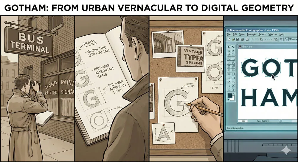
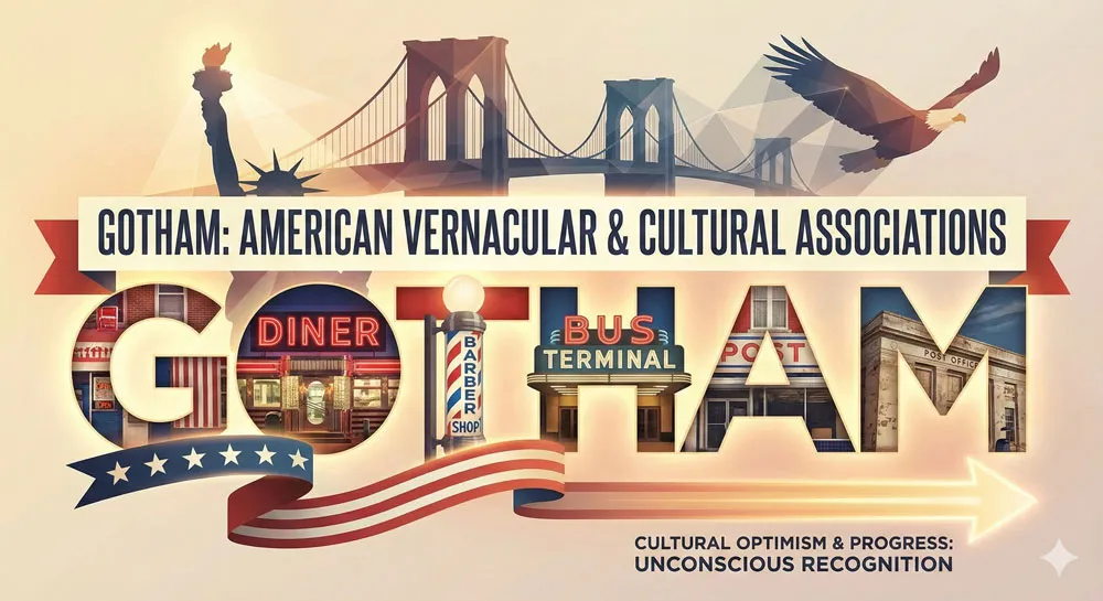
Frere-Jones has explained that Gotham was inspired by the architectural letterforms and signage he observed in New York City. The typeface emerged from studying the hand-painted lettering on buildings, the geometric simplicity of utilitarian signage, and the distinctive American aesthetic of mid-century architecture.
Gotham is, in many ways, a typographic documentation of American vernacular design—the geometric, confident letterforms visible on buildings and signage throughout American cities.
The design process involved extensive research into American typography, geometric design principles, and the history of sans-serif typefaces. Frere-Jones studied typefaces like Alternate Gothic and other American geometric sans-serifs.
He examined historical signage and architectural lettering. He researched how geometric forms communicate confidence and modernity.
However, Gotham is not merely a historical recreation. It is a contemporary interpretation of American geometric sans-serif traditions. Frere-Jones took historical inspiration and refined it through the lens of contemporary design sensibilities.
The result is a typeface that feels both familiar (drawing on American design traditions) and contemporary (executed with contemporary design precision and sophistication).
Gotham’s Design Characteristics: What Makes It Distinctive
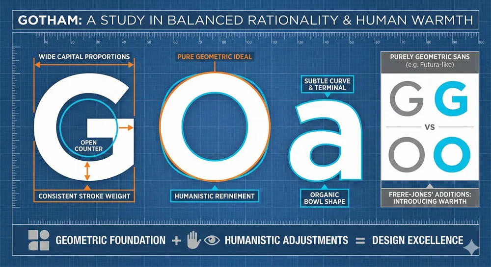
Gotham’s visual characteristics are key to understanding its power and psychological effect. The typeface is based on geometric principles—the letterforms derive from simple geometric shapes.
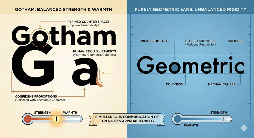
However, unlike purely mathematical geometric fonts, Gotham incorporates subtle optical adjustments and refinements that make the typeface more readable and more human.
The letterforms of Gotham are distinctive. The capital letters are notably wide, communicating strength and confidence. The lowercase letterforms are clear and legible, with open counters (the internal white space within letters) that improve readability.
The stroke weight is consistent, reflecting the geometric sans-serif tradition. Overall, the typeface communicates clarity, confidence, and forward-thinking rationality.
However, Gotham also incorporates warmth. The geometric forms are not absolutely pure; they are refined to feel more approachable. The typeface has personality without sacrificing functionality.
This balance between geometric rationality and human warmth is precisely what makes Gotham so successful in communication contexts.
The typeface also functions extremely well at various sizes and in various media. Gotham is legible at small sizes in body text, powerful at large sizes in headlines, and works excellently for signage and display uses.
This versatility has contributed to its widespread adoption—it is a typeface that functions beautifully in numerous contexts.
Related Topics:
- Gill Sans and Tube: How Johnston and Gill Defined London
- Baskerville and Eaves: A Tale of Perfection, Passion and Revival
- Futura vs. The World: The Geometric Vision of Paul Renner
Gotham and the 2008 Obama Campaign: Political Design Strategy
The Campaign Design Challenge
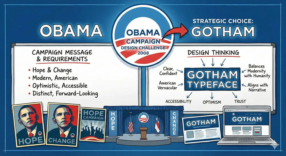
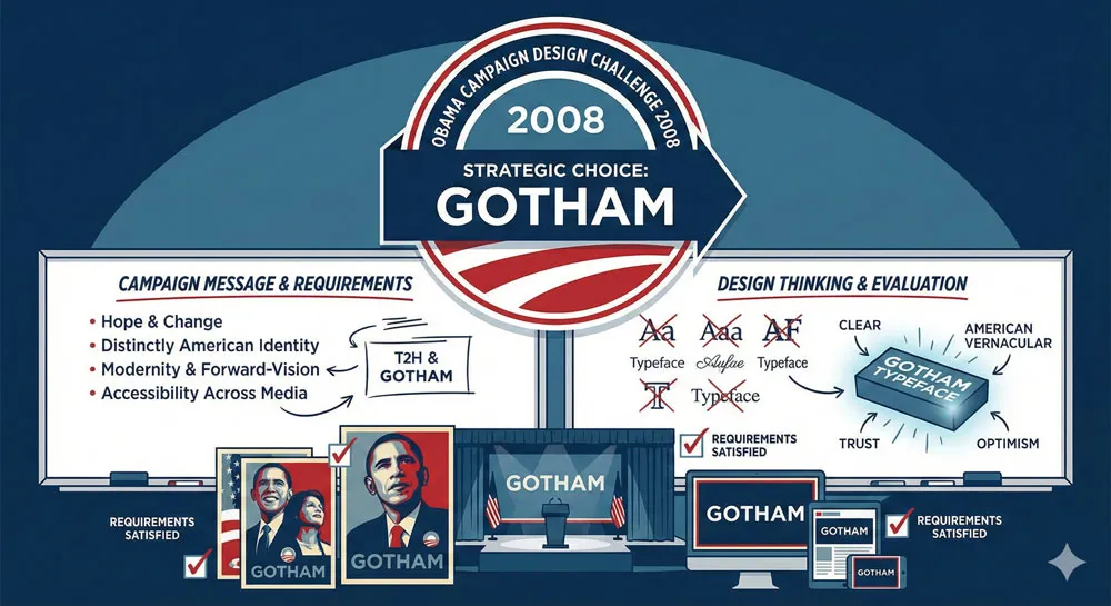
When Barack Obama’s 2008 presidential campaign faced the challenge of creating a visual identity, they needed typography that would communicate specific messages about Obama and his campaign.
The campaign’s theme was “Hope and Change”—a message about transformation, forward-thinking vision, and optimistic progress. The visual identity needed to communicate these ideas.
The campaign designers faced interesting constraints. They needed a typeface that was distinctly American (Obama is an American candidate running in American elections). They needed a typeface that communicated modernity and forward-thinking vision (aligning with the message of change).
They needed a typeface that felt optimistic and inspirational without being clichéd or overly sentimental. They needed a typeface that worked across numerous media—from campaign posters to websites to television advertising to signage.
Gotham perfectly satisfied these requirements. The typeface is distinctly American, emerging from American vernacular design traditions. It communicates modernity and forward-thinking vision through its geometric contemporary aesthetic.
It feels optimistic and inspirational through its confident, powerful forms and warm, approachable character. It functions beautifully across media.
Gotham in Campaign Context
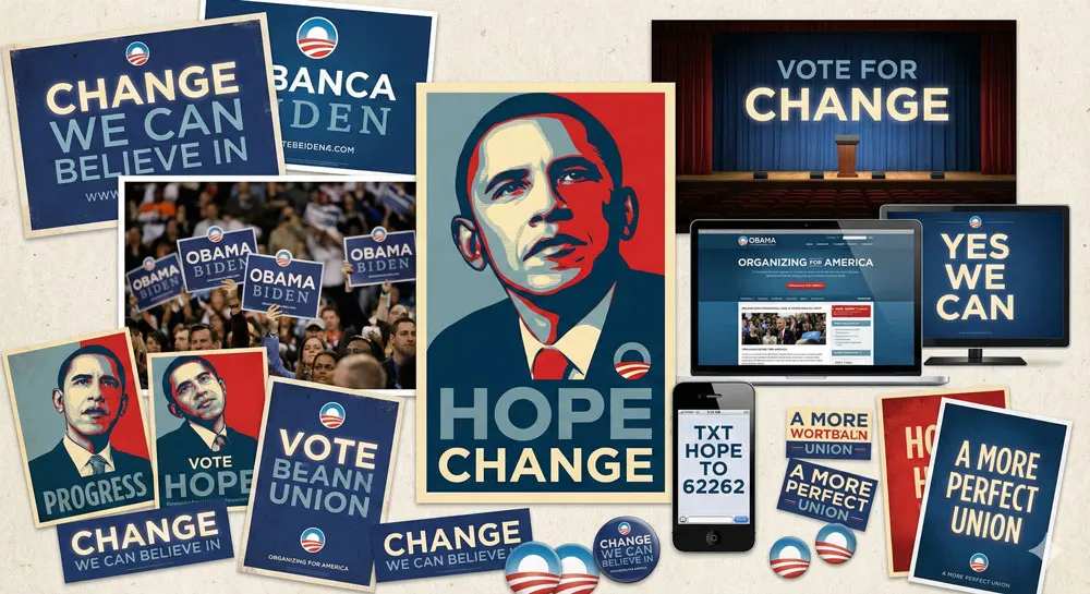
The Obama campaign used Gotham prominently in their visual identity. The typeface appeared on campaign posters, often featuring Obama’s name or slogans like “CHANGE” and “HOPE” rendered in large Gotham letterforms.
The most iconic campaign image—Shepard Fairey’s “Hope” poster—while not using Gotham specifically, existed within a visual aesthetic that aligned perfectly with Gotham’s characteristics.
Gotham appeared throughout the campaign: on signage, in digital media, in print advertising, and in television broadcasting. The typeface became visually associated with the entire campaign.
Every time voters encountered Gotham in campaign context, they unconsciously absorbed psychological messages that the typeface communicated: modernity, optimism, forward-thinking vision, American strength, and hope.
The psychological effect was powerful. Gotham’s geometric confidence communicated that Obama was a candidate of vision and forward-thinking progress.
The typeface’s warmth and approachability communicated that Obama was accessible and concerned with ordinary people. The typeface’s American character communicated that Obama was authentically American and understood American values.
Campaign Success and Typeface Impact
The 2008 Obama campaign was enormously successful. Obama won the election with a significant margin.
Multiple factors contributed to this success—the candidate’s message, the political context (economic crisis, unpopular incumbent), the campaign’s organizational effectiveness, and the campaign’s savvy use of digital media.
However, the campaign’s visual design, including the strategic use of Gotham, played a role in shaping voter perception and media representation of the campaign.
Design professionals and media commentators repeatedly noted that the campaign’s visual identity was sophisticated, coordinated, and psychologically effective. Gotham became permanently associated with the campaign’s visual aesthetic.
What is important to emphasize is that Gotham did not “win” the election. Design choices do not determine electoral outcomes.
However, design choices shape perception, influence emotional responses, and contribute to the overall communication strategy.
The Obama campaign’s strategic use of Gotham was effective design strategy—the typeface was chosen specifically because it communicated the psychological messages the campaign wanted to communicate.
The Moment That Changed Everything
The moment when Gotham achieved iconic status and permanent cultural association with the Obama campaign came on election night, November 4, 2008.
As Obama stood before the massive crowd in Grant Park, the backdrop featured his name in enormous Gotham letterforms. In that moment, Gotham became visually associated with one of the most significant political moments in recent American history.
For type designers and design professionals, this moment was extraordinary. A typeface they had designed or worked with had become part of a historic political moment. For Tobias Frere-Jones, the experience must have been surreal—watching a typeface he designed become part of how an election is remembered.
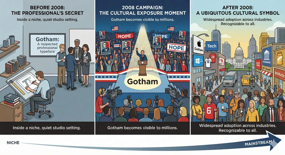
This moment also permanently changed Gotham’s cultural status. Before the 2008 campaign, Gotham was a respected typeface known among design professionals but not widely recognized by the general public.
After the campaign, Gotham became recognizable to millions of people. The typeface became associated with political hope, forward-thinking vision, and American optimism.
Related Topics:
- Legibility vs. Readability: What Every Designer Needs to Know
- Secret Life of Symbols: History of Ampersand and Interrobang
- Helvetica – Swiss Modernism’s Ubiquity Crisis
Gotham After 2008: Cultural Ubiquity and Design Dominance
From Political Campaign to Universal Symbol
Following the 2008 campaign’s prominence, Gotham’s adoption accelerated dramatically. The typeface, which had been successful before the campaign, became one of the most widely adopted typefaces in contemporary design.
Design professionals and organizations recognized that Gotham effectively communicated specific psychological messages—modernity, confidence, forward-thinking vision, approachability—and began selecting Gotham for their own projects.
The interesting question is whether Gotham became widely adopted because of its design excellence (which would have happened eventually) or because of its association with the Obama campaign (which may have accelerated adoption but was not the sole cause). Most likely, the answer is both.
Gotham was an excellent typeface that likely would have become widely adopted eventually. However, the 2008 campaign gave Gotham enormous visibility and cultural prominence, which accelerated its adoption and made it more culturally recognizable.
This acceleration of adoption transformed Gotham from a respected professional typeface into a ubiquitous cultural force. Within a few years of the 2008 campaign, Gotham had become one of the most recognizable typefaces to the general public.
This is a remarkable achievement—most typefaces never achieve this level of public recognition.
Gotham Across Industries and Contexts
Following the 2008 campaign, Gotham began appearing across diverse industries and contexts. Technology companies adopted Gotham because it communicated modernity and forward-thinking vision.
Gotham appeared in tech company logos, websites, and branding materials. Companies like Spotify and other tech-forward organizations used Gotham to communicate that they were contemporary, innovative, and forward-thinking.
Luxury and fashion brands adopted Gotham because it communicated confidence and strength without sacrificing approachability. Gotham appeared in luxury branding contexts, though luxury brands often modified or customized Gotham rather than using it directly, to maintain distinctiveness.
Sports teams and franchises adopted Gotham because it communicated strength, confidence, and American power. Gotham appeared in sports branding across professional and collegiate athletics.
The typeface’s geometric confidence aligned perfectly with sports brands’ desires to communicate athletic power and competitive victory.
Government and institutional organizations adopted Gotham because it communicated official authority and contemporary modernity without the coldness of Helvetica or the formality of serif typefaces.
Gotham allowed institutions to present themselves as contemporary and forward-thinking while maintaining authority and professionalism.
Gotham’s Role in Contemporary Design
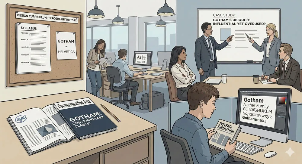
By the 2010s, Gotham had become one of the most influential typefaces in contemporary design. It was widely taught in design schools. It appeared in design publications and case studies.
Design professionals recognized Gotham as a significant contemporary typeface that had meaningfully influenced how contemporary design communicated.
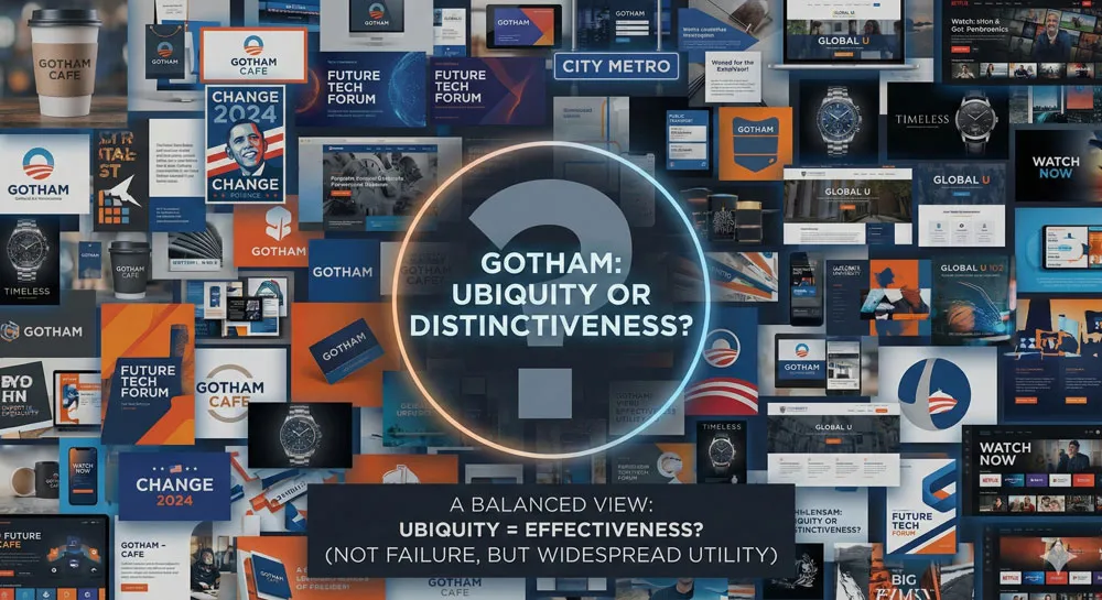
However, Gotham’s ubiquity also led some design professionals to view the typeface as overused or clichéd.
Critics argued that Gotham had become too common, that it had lost its distinctiveness through widespread adoption, and that seeing Gotham in numerous contexts had made the typeface feel generic rather than distinctive.
This criticism mirrors the critique of Helvetica—the more successful a typeface becomes, the more it risks being perceived as ubiquitous and generic.
However, this critique misses an important point. Gotham’s ubiquity is not evidence of failure; it is evidence of success. Gotham became widely adopted because it effectively communicates specific psychological messages that numerous organizations want to communicate.
The typeface is not generic—it has distinct personality and character. Rather, Gotham is widely adopted precisely because it has such distinctive and powerful personality.
Related Topics:
- Comic Sans – Accessibility & Gatekeeping Critique
- Gotham – Political Design & Elections Power
- Futura – Geometric Modernism Revolution
The Psychology of Gotham: Why It Communicates Hope and Progress
Geometric Forms and Psychological Associations
Gotham’s psychological power emerges from its geometric forms and their psychological associations. Geometric sans-serifs communicate rationality, mathematical precision, and modernity.
These psychological associations are rooted in the history of geometric design—the geometric sans-serif tradition emerged alongside modernism, design movements that valued rationality and systematic thinking.
When viewers encounter Gotham, they unconsciously respond to its geometric character by perceiving the communicator as rational, systematic, and forward-thinking. This is not a conscious response; it is an automatic psychological reaction based on accumulated cultural associations with geometric design.
Additionally, Gotham’s forms are notably wide and confident. The letterforms are not constrained or compressed; they are expansive and assertive. This visual confidence communicates psychological confidence.
Viewers perceive organizations using Gotham as confident in their vision, their products, and their direction.
American Character and Cultural Associations
Gotham’s American vernacular roots contribute to its psychological power. The typeface is distinctly American—it emerges from American design traditions and carries cultural associations with American optimism, American confidence, and American forward-thinking vision.
When viewers encounter Gotham, they unconsciously recognize (even if they cannot articulate the recognition) that this typeface draws on American design traditions.
This recognition creates psychological associations between the communicator and American values of optimism, progress, and confidence in the future.
This American character was particularly powerful in the context of the Obama campaign. The campaign was explicitly American—a presidential campaign in the United States.
Using a distinctly American typeface reinforced that this was an American campaign grounded in American values and American vision. The typeface’s character aligned perfectly with the campaign’s message.
Warmth and Approachability
Unlike purely mathematical geometric sans-serifs, Gotham incorporates warmth and approachability. The geometric forms are refined through humanistic considerations. The typeface is friendly without sacrificing strength.
This combination of geometric rationality and humanistic warmth makes Gotham psychologically powerful for communication that needs to feel both confident and approachable.
When viewers encounter Gotham, they respond to both the typeface’s strength (geometric forms, confident proportions) and its warmth (refined letterforms, approachable character).
This dual response creates psychological perception that the communicator is both confident and concerned with people’s wellbeing. The communicator is strong and visionary, yet also accessible and humanistic.
This psychological dual message was crucial to the Obama campaign’s effectiveness. The campaign needed to communicate that Obama was a visionary leader (strong, confident) who was also accessible and concerned with ordinary people’s lives (warm, approachable).
Gotham communicated both messages simultaneously.
Contemporary Modernity
Gotham communicates contemporary modernity. The typeface does not feel historical or retro; it feels current and contemporary.
This is because Gotham was designed relatively recently (early 2000s) with contemporary design sensibilities, and because the typeface’s visual language (geometric rationality merged with contemporary refinement) feels contemporary rather than nostalgic.
When viewers encounter Gotham, they unconsciously perceive the communicator as contemporary, current, and forward-thinking. Organizations using Gotham are perceived as modern rather than traditional, innovative rather than conservative, forward-looking rather than backward-looking.
This communication of modernity is particularly powerful in contexts where organizations want to present themselves as contemporary and innovative.
Technology companies use Gotham to signal that they are at the forefront of contemporary innovation. Political campaigns use Gotham to signal that they represent contemporary vision and forward-thinking change.
Related Topics:
- Gill Sans – Humanist Alternative Modernism
- Baskerville – Print Excellence & Love Story
- Bodoni – Theatrical Prestige Aesthetics
Gotham as Political Design: Design and Power in Election Communication
The Relationship Between Typography and Political Power
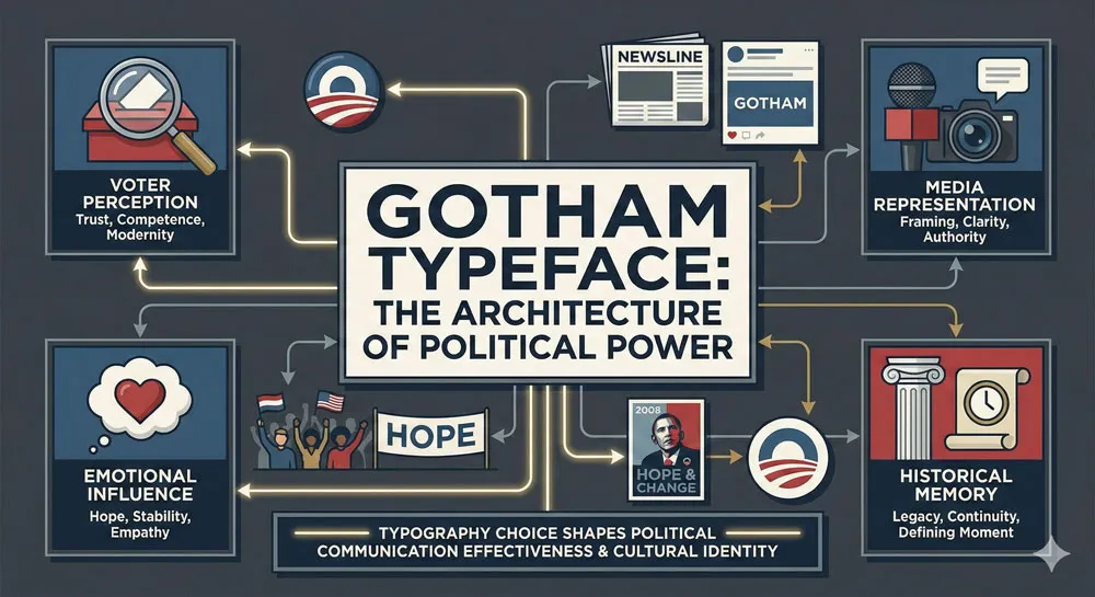
The Obama campaign’s strategic use of Gotham reveals something important about the relationship between typography and political power.
Typeface choices shape how voters perceive political messages. They shape how the media represents political campaigns. They shape how political moments are historically remembered.
This is not to say that typography determines electoral outcomes or that typeface choice determines how voters vote.
Rather, typography is one element among many that shapes perception, influences emotion, and contributes to overall communication strategy.
A sophisticated campaign uses typography strategically to reinforce its message and to shape how that message is perceived.
The Obama campaign understood this. They hired sophisticated designers and strategists who understood that typography matters. The campaign did not select Gotham randomly or casually.
The selection was strategic—the typeface was chosen because it communicated specific psychological messages aligned with the campaign’s overall strategy.
Gotham vs. Helvetica: Political Typography Choices
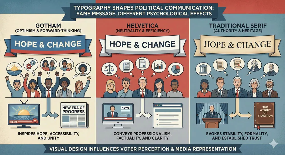
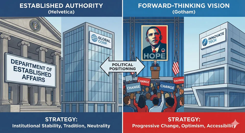
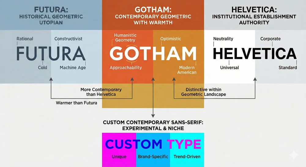
Interestingly, Gotham and Helvetica represent different approaches to political communication through typography. Helvetica communicates institutional authority and bureaucratic efficiency—the typeface feels official and established.
Gotham communicates contemporary optimism and forward-thinking vision—the typeface feels innovative and hopeful.
The Obama campaign could have selected Helvetica for their visual identity. Helvetica would have communicated authority and institutional power. However, this would not have aligned with the campaign’s message of change and forward-thinking vision.
Helvetica is the typeface of the establishment; Gotham is the typeface of change.
This distinction reveals that political campaigns are aware, at least implicitly, of the psychological associations between typefaces and political messages. Campaigns select typefaces strategically to communicate messages aligned with their campaign narrative.
Subsequent Political Use of Gotham
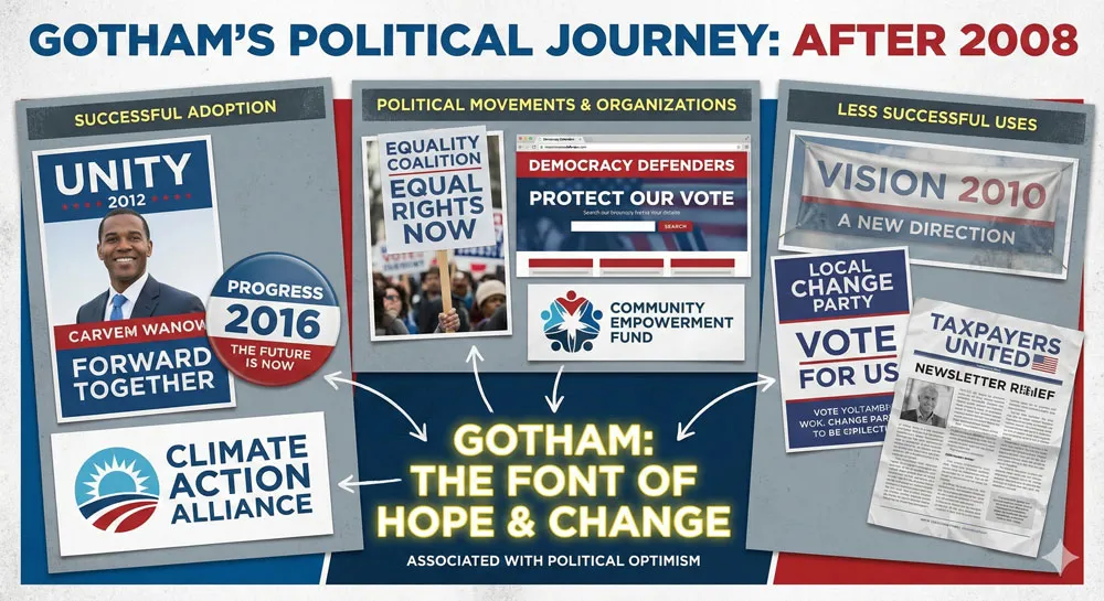
Following the 2008 Obama campaign’s success, Gotham became attractive to political campaigns attempting to communicate similar messages of contemporary optimism and forward-thinking vision.
Gotham appeared in subsequent political campaigns and political organizations seeking to associate themselves with the optimism and forward-thinking vision that Gotham had become associated with through the Obama campaign.
However, Gotham’s association with the specific Obama campaign creates an interesting challenge for other political campaigns attempting to use the typeface.
The typeface carries psychological baggage from its association with Obama. Using Gotham potentially creates unconscious psychological associations between a campaign and the Obama campaign’s message of hope and change.
This illustrates how typefaces acquire cultural meanings and associations over time. A typeface that was originally “neutral” or “generic” becomes associated with specific political messages, organizations, or historical moments.
These associations shape how the typeface is perceived and how it functions in communication contexts.
Related Topics:
- Garamond – Classical Foundation Principles
- Worst Fonts – Criticism & Gatekeeping Analysis
- Gill Sans & The Tube – Urban Identity Infrastructure
Gotham vs. Other Contemporary Typefaces: Design Comparison and Context
Gotham vs. Futura: American Geometric Innovation
Comparing Gotham to Futura, the quintessential geometric sans-serif from which Gotham draws inspiration, reveals how contemporary typeface design builds on but also differs from historical traditions.
Futura communicates technological optimism and utopian modernism—it feels aspirational and visionary, but also somewhat cold and detached from human concerns.
Gotham, by contrast, maintains geometric confidence while incorporating humanistic warmth. Gotham communicates optimism and modernity, but feels more accessible and approachable than Futura.
Where Futura says “we are building a utopian future through rational principles,” Gotham says “we are optimistic about the future and concerned with your wellbeing.”
This evolution from Futura to Gotham reflects broader design changes—contemporary design values not just rationality and geometric clarity, but also accessibility, warmth, and humanistic concern.
Contemporary geometric sans-serifs like Gotham maintain modernist principles while incorporating humanistic refinement.
Gotham vs. Helvetica: The Typeface Transition
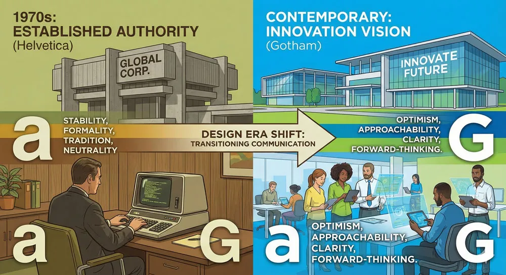
The relationship between Gotham and Helvetica is complex. Helvetica dominated late 20th-century design, particularly corporate and institutional design. Helvetica communicates institutional authority and corporate efficiency.
However, Helvetica can feel dated, cold, and associated with 1970s corporate culture.
Gotham emerged as a contemporary alternative to Helvetica. Organizations that wanted to communicate modernity while maintaining confidence and clarity could select Gotham rather than defaulting to Helvetica.
Gotham communicates similar messages to Helvetica (authority, clarity, confidence) but with a contemporary aesthetic rather than a dated one.
However, Helvetica and Gotham serve different psychological functions. Helvetica communicates institutional establishment authority; Gotham communicates contemporary forward-thinking vision.
Organizations using Helvetica communicate that they are established and reliable; organizations using Gotham communicate that they are contemporary and innovative.
Gotham vs. Custom Typefaces
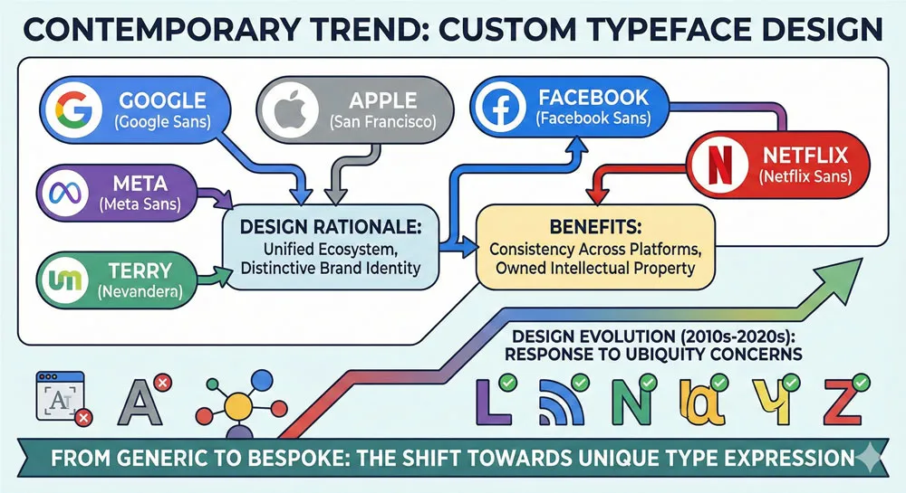
An interesting contemporary development is the creation of custom typefaces by major organizations.
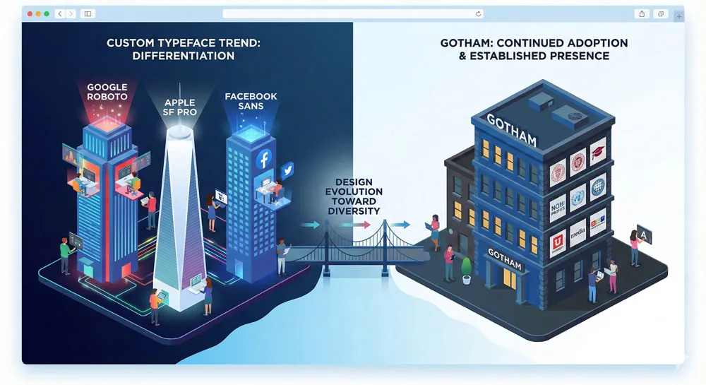
Rather than adopting existing typefaces like Gotham, major companies commission custom typefaces designed specifically for their brands. Google (Roboto), Facebook (various custom typefaces), Apple (San Francisco), and others have created custom typefaces rather than defaulting to existing options.
This trend represents both recognition of Gotham’s success and desire to differentiate from Gotham’s ubiquity. Organizations recognize that typeface choice shapes brand perception, so they invest in custom typefaces that uniquely communicate their brand personality rather than using existing typefaces that might be used by competitors.
However, many organizations continue to use Gotham or similar typefaces. Gotham’s ubiquity is remarkable—the typeface has achieved the status of a nearly universal contemporary geometric sans-serif, similar to Helvetica’s status as the default sans-serif of the late 20th century.
Related Topics:
- Baskerville & Mrs. Eaves – Love, Partnership & Revival
- Futura & Paul Renner – Geometric Vision & Revolution
- Legibility vs. Readability – Typography Fundamentals
Gotham’s Global Impact: Cultural Variations and International Adoption
Gotham in International Contexts
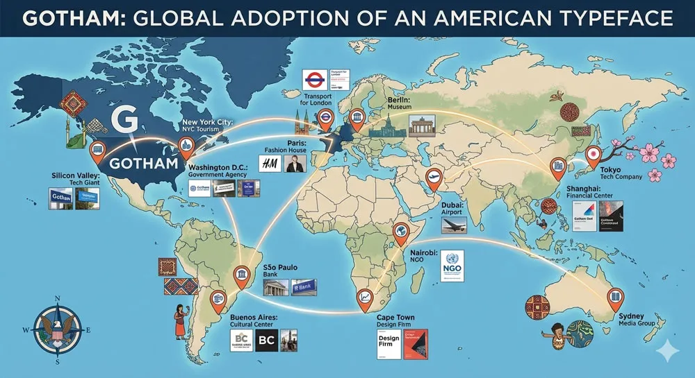
While Gotham emerged from American design traditions and was popularized through an American political campaign, the typeface has been adopted globally.
Design professionals worldwide have selected Gotham for branding, communication, and design purposes. The typeface’s psychological messages of contemporary modernity and forward-thinking vision transcend national boundaries.
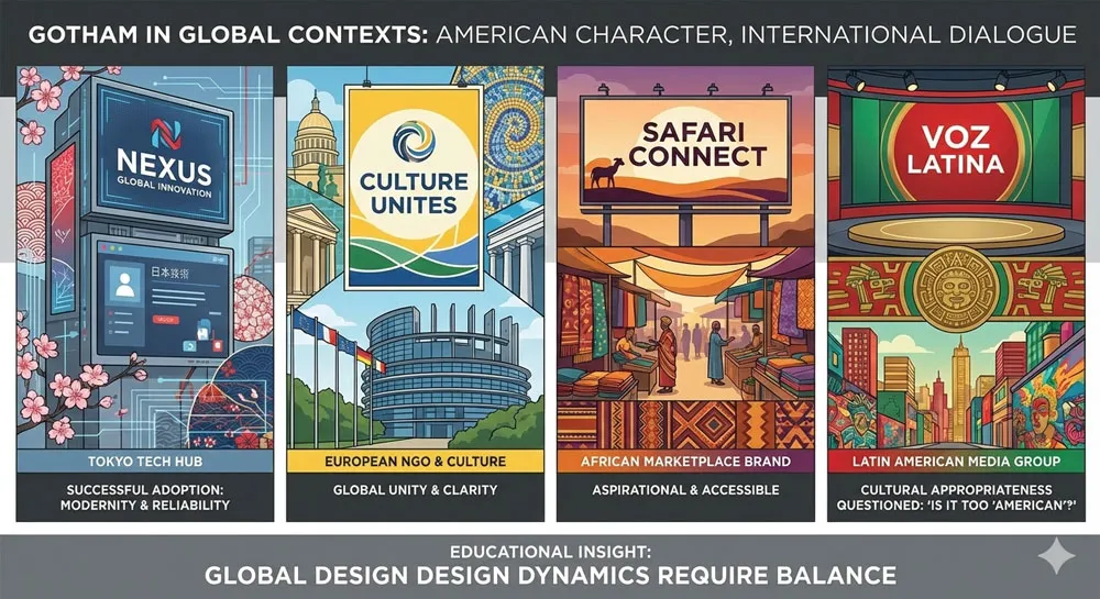
However, Gotham’s American character remains. International organizations using Gotham unconsciously communicate associations with American design, American optimism, and American forward-thinking vision.
This can be powerful in contexts where American associations are positive and desirable. However, it can also be limiting or problematic in contexts where American associations are not desired.
Different cultures may respond to Gotham’s psychological messages differently. In cultures that value geometric rationality and modernist design principles, Gotham’s aesthetic feels natural and appropriate.
In cultures with different design traditions, Gotham might feel foreign or culturally inappropriate.
Gotham and Language Adaptations
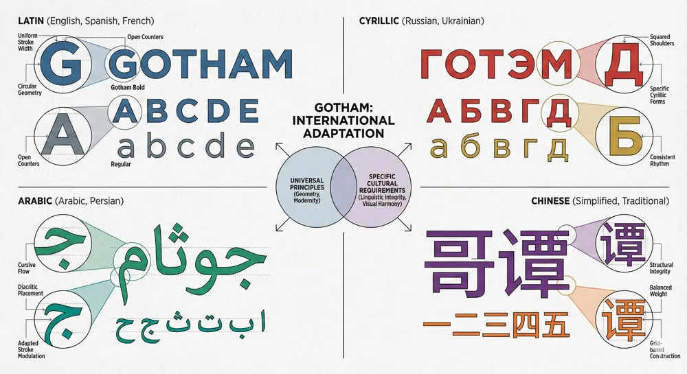
An interesting aspect of Gotham’s international adoption is how the typeface functions across different languages and writing systems. Gotham was designed for Latin characters used in English. When adapted for other languages and writing systems, the typeface must be modified or adapted to function appropriately.
Some organizations have commissioned adaptations of Gotham for non-Latin writing systems (Cyrillic, Arabic, Chinese characters). These adaptations attempt to maintain Gotham’s distinctive character while functioning appropriately for specific writing systems.
This process reveals both the universality of geometric design principles and the specific requirements of different writing systems.
The Question of Cultural Appropriation
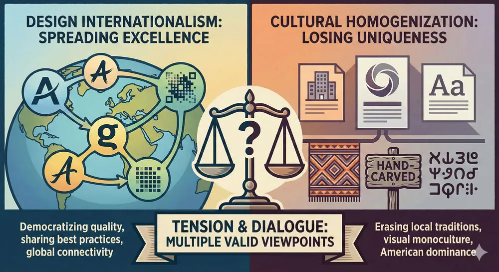
Gotham’s global adoption raises interesting questions about cultural appropriateness and design imperialism. A typeface grounded in American vernacular design and popularized through an American political campaign is now used globally by organizations in diverse cultural contexts.
Does this represent desirable design internationalism or problematic cultural homogenization?
Most likely, the answer is both. Gotham’s adoption reflects broader design globalization where successful contemporary designs spread internationally.
This can be understood as positive (excellent design is recognized and adopted globally) or negative (local design traditions and visual diversity are erased in favor of American design exports). Both perspectives contain truth.
Related Topics:
- Ampersand & Interrobang – Symbol Histories
- The Psychology of Typography: Font Influence
- Helvetica Effect: One Font Conquered Global Design
The Contemporary Moment: Gotham’s Legacy and Challenges
Gotham’s Ubiquity and the Question of Distinctiveness
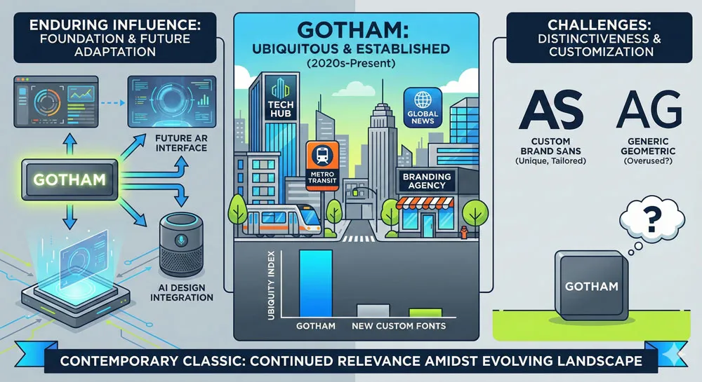
By the 2020s, Gotham has become nearly ubiquitous in contemporary design. The typeface appears on corporate logos, tech company websites, sports branding, government institutions, and countless other contexts.
This ubiquity raises the question: has Gotham become so common that it no longer communicates distinctiveness?
This question mirrors the critique of Helvetica. As Helvetica became ubiquitous in late 20th-century design, critics argued that the typeface had become generic and that seeing Helvetica everywhere meant the typeface no longer communicated distinctiveness.
Similarly, some critics argue that Gotham’s ubiquity has made the typeface feel generic rather than distinctive.
However, this critique misses an important point. Gotham’s ubiquity reflects the typeface’s effectiveness at communicating specific psychological messages that many organizations want to communicate.
The typeface is not generic—it has distinct personality and powerful psychological character. The ubiquity reflects the fact that many organizations value what Gotham communicates.
Custom Typefaces and Designer Response
In response to typeface ubiquity, many organizations now commission custom typefaces designed specifically for their brands.
This trend suggests that while Gotham remains powerful and widely used, some organizations prefer to differentiate through custom typefaces rather than adopting existing typefaces used by competitors.
This development is healthy for the design profession and for design diversity. Custom typefaces allow organizations to establish distinctive visual identities while also supporting type designers and recognizing that typeface design is specialized work requiring investment and expertise.
However, Gotham’s continued adoption by numerous organizations suggests that the typeface’s effectiveness remains undimmed.
Gotham continues to be selected not because it is the only option or the default choice, but because it effectively communicates what organizations want to communicate.
Gotham’s Future
Looking forward, Gotham will likely remain a significant typeface in contemporary design. The typeface has achieved the status of a contemporary classic—a typeface that will be studied, used, and respected for decades to come.
Gotham will likely never achieve the historical ubiquity of Helvetica (which dominated for over 60 years), but Gotham has already become one of the most significant typefaces of the early 21st century.
Future generations of designers will learn about Gotham and its role in the 2008 Obama campaign. The typeface will be studied as an example of effective design strategy in political communication. Gotham will continue to appear in design contexts and will likely be used for decades to come.
Related Topics:
FAQ: Common Questions About Gotham
Q: Did Gotham really “win” the election for Obama?
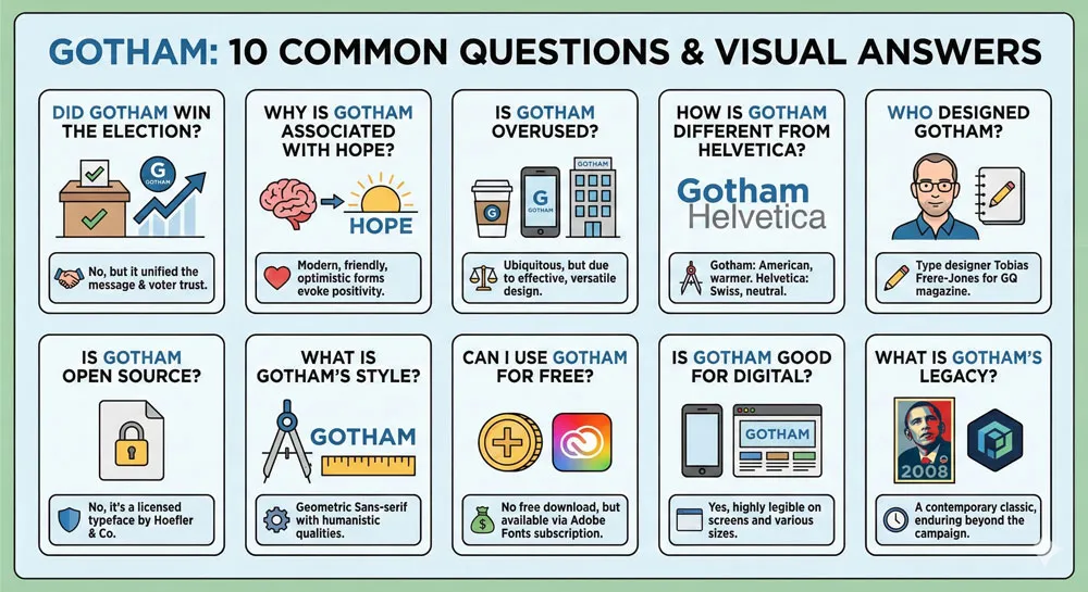
A: No. Typography does not determine electoral outcomes. However, Gotham was part of the campaign’s overall communication strategy, and the typeface effectively communicated the psychological messages the campaign wanted to communicate (modernity, optimism, forward-thinking vision). Design choices shape perception and contribute to communication effectiveness, but they do not determine electoral outcomes.
Q: Why is Gotham associated with hope and progress?
A: Gotham’s psychological associations emerge from multiple factors: its geometric character (communicating rationality and modernity), its American vernacular roots (communicating American optimism), its warm yet confident forms (communicating both strength and approachability), and its association with the successful Obama “Hope and Change” campaign (creating direct psychological link between the typeface and that message).
Q: Is Gotham used in other political campaigns?
A: Yes. Following the 2008 Obama campaign’s success, other political campaigns and political organizations have used Gotham, presumably seeking to communicate similar messages of contemporary optimism and forward-thinking vision. However, Gotham’s association with Obama and the specific “Hope and Change” message creates interesting challenges for other campaigns.
Q: Why do so many tech companies use Gotham?
A: Technology companies use Gotham because the typeface effectively communicates modernity, innovation, and forward-thinking vision—messages that tech companies want to communicate. Gotham’s contemporary aesthetic and psychological associations with progress make it attractive to tech-focused organizations.
Q: Is Gotham better than Helvetica?
A: This is subjective and context-dependent. Helvetica and Gotham communicate different psychological messages and are appropriate in different contexts. Helvetica communicates institutional authority and established professionalism; Gotham communicates contemporary modernity and forward-thinking vision. Neither is universally “better”—both are excellent typefaces appropriate in different contexts.
Q: Can I use Gotham for my business?
A: It depends on your context and brand identity. If your organization wants to communicate contemporary modernity and forward-thinking vision, Gotham is an excellent choice. If your organization wants to communicate established authority and institutional professionalism, other typefaces might be more appropriate. Consider what psychological messages you want to communicate and whether Gotham aligns with those messages.
Q: Where can I get Gotham?
A: Gotham is available through the Hoefler Type Foundry (www.typography.com). The typeface is available for various uses—web, desktop, print, etc. The foundry offers licensing for different applications and budgets.
Q: Is Gotham overused?
A: Gotham is widely used in contemporary design. Some design professionals argue that the typeface has become overused and that seeing Gotham in numerous contexts diminishes its distinctiveness. However, Gotham’s widespread adoption reflects the typeface’s effectiveness at communicating messages that many organizations want to communicate.
Q: How did Tobias Frere-Jones feel about Gotham’s use in the Obama campaign?
A: Frere-Jones has spoken positively about Gotham’s role in political communication. He has noted that seeing his typeface become part of a significant historical and political moment was an extraordinary experience. Frere-Jones seems to appreciate that Gotham was selected because it effectively communicated the campaign’s message.
Q: Will Gotham become as ubiquitous as Helvetica?
A: It’s impossible to predict, but Gotham has already become one of the most widely used contemporary typefaces. However, contemporary design culture is more diverse than late 20th-century design, and many organizations now commission custom typefaces rather than adopting existing typefaces. Gotham will likely remain significant and widely used, but may not achieve Helvetica’s era-defining ubiquity.
Related Topics:
Conclusion: A Typeface That Captured a Moment and Defined an Era
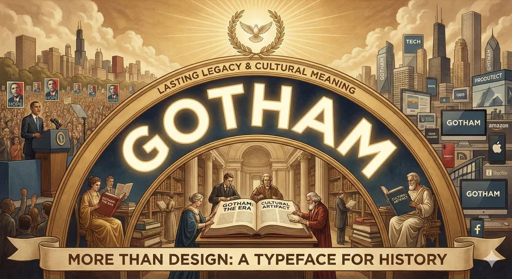
Gotham is a remarkable typeface—not just for its design excellence, but for its cultural significance and historical impact. Few typefaces ever achieve the level of cultural recognition and impact that Gotham has achieved.
Most typefaces remain known primarily to design professionals. Gotham has become known to millions of people worldwide through its association with a significant political campaign and its subsequent adoption across industries and contexts.
Gotham’s story is ultimately a story about design power. It is a story about how the seemingly minor choice of which typeface to use in political communication can become part of how a historical moment is perceived and remembered.
It is a story about how geometric forms and letterforms communicate psychological messages that shape perception and influence emotion.
The 2008 Obama campaign’s strategic use of Gotham demonstrates that sophisticated campaigns recognize the power of design. They understand that typography matters. They invest in design strategy because they recognize that design choices shape communication effectiveness and voter perception.
Gotham’s subsequent adoption across industries and contexts demonstrates that the typeface’s psychological power extends far beyond the specific political context in which it was popularized.
The typeface communicates messages about contemporary modernity, forward-thinking vision, and American optimism that numerous organizations want to communicate.
Looking forward, Gotham will likely remain a significant typeface in contemporary design. The typeface has achieved the status of a contemporary classic.
Future generations of designers will study Gotham as an example of effective design strategy and as a typeface that captured a historical moment and influenced design for decades to come.
The ultimate lesson of Gotham is that typography matters. The seemingly small choice of which typeface to use in communication can have profound effects on how messages are perceived, how organizations are perceived, and how historical moments are remembered.
Gotham is a testament to the power of design and the careful thought that goes into selecting typefaces for important communication purposes.
Related Topics:
About the Author
Lalit M. S. Adhikari is a Digital Nomad and Educator since 2009 in design education, graphic design and animation. He’s taught 500+ students and created 200+ educational articles on design topics. His teaching approach emphasizes clarity, practical application and helping learners.
Learn more about Lalit Adhikari.
This guide is regularly updated with the latest information about Adobe tools and design best practices. Last Updated: Mar 2026
Related Topics:


