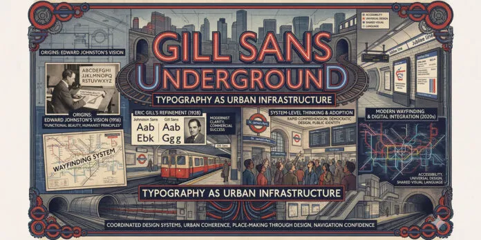
Explore how Gill Sans became the visual identity of London Underground, shaped urban design thinking, and demonstrates typography’s power in creating urban infrastructure identity.
My name is Lalit Adhikari and we are at LTY. Let’s begin!
Table of Contents
Introduction: Typography as Urban Infrastructure
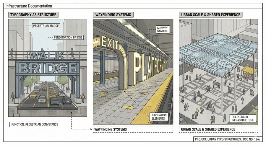
Few typefaces possess such profound influence on urban life as Gill Sans does on London. The typeface became the visual identity of London Underground, shaping how millions of Londoners navigate their city daily. Gill Sans demonstrates typography’s power to become infrastructure—essential systems shaping daily urban experience.
The London Underground story reveals something crucial about design:
- that typography transcends aesthetic concern to become functional infrastructure.
The Tube’s visual identity guides millions of people through complex transportation network. Typography became navigation system, wayfinding infrastructure, identity marker.
Edward Johnston originally designed typeface for the Underground in 1913, creating typeface specifically serving transportation needs. His design established principles that Eric Gill later refined, creating Gill Sans.
The relationship between Gill Sans and the Underground demonstrates design systems thinking decades before digital design made systems explicit. The Underground design coordinated typography, signage systems, color coding, and layout creating comprehensive visual language.
This comprehensive design system made London Underground navigable, identifiable, and visually coherent. The system served functional transportation needs while creating distinctive urban aesthetic.
Gill Sans and the Underground story also reveals typography’s role in creating social infrastructure. The typeface connected all Londoners—across classes, neighborhoods, backgrounds—through unified visual language. Typography created shared urban experience.
The story further demonstrates design’s democratic potential. The Underground was public infrastructure serving all citizens. Its typography was public design—shared visual language belonging to entire population rather than design elite.
This comprehensive exploration examines the London Underground design system and typography’s role, traces Edward Johnston’s original design and Eric Gill’s refinement, analyzes Gill Sans’ functional role in urban navigation, explores the typeface’s influence on urban design thinking, considers contemporary implications, and ultimately asks:
- how can typography function as infrastructure? What does the Tube’s design reveal about design’s social and functional potential?
Related Topics:
Edward Johnston and the Original Underground Design
Revolutionary Transportation Design Brief
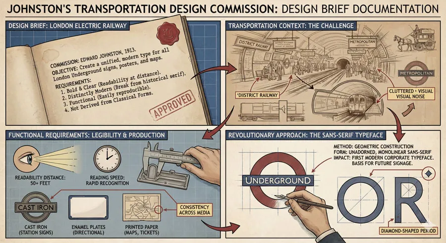
Edward Johnston received unprecedented design commission: create typeface specifically designed for London Underground transportation system. The brief required typeface optimized for transportation signage, legibility, and wayfinding.
This transportation-specific brief was revolutionary. Rather than adapting existing typeface, Johnston designed from first principles optimizing for transportation context.
Humanist Principles Applied to Infrastructure

Johnston approached the commission with humanist design philosophy. The typeface should serve user needs, prioritize legibility, and communicate clearly across diverse contexts.
Johnston’s humanist approach to infrastructure design established principles influential to contemporary design thinking.
System-Level Design Thinking
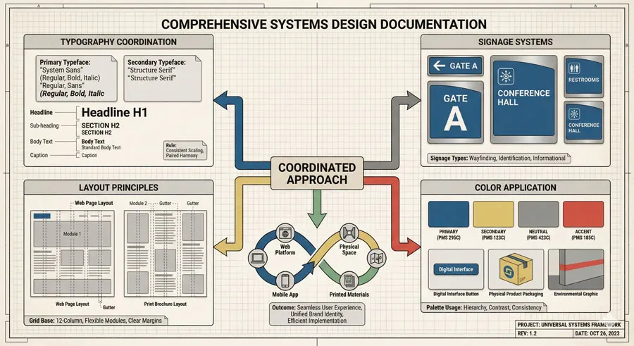
Johnston designed not merely typeface but complete design system. Typography coordinated with signage systems, layout principles, color application, and wayfinding logic.
This systems thinking demonstrated that comprehensive design coordination creates superior user experience.
Modernist Clarity and Functional Beauty
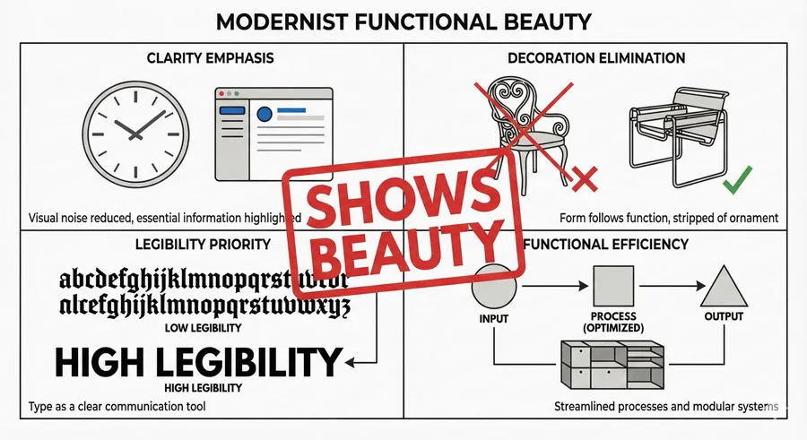
Johnston’s design embraced modernist clarity and functional beauty. The typeface eliminated decoration in favor of legibility and functional efficiency.
Yet the design achieved beauty through functional clarity rather than superficial aesthetics.
Related Topics:
Gill Sans and the Underground: System Refinement
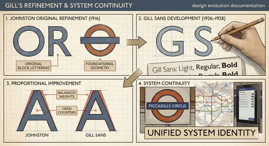
Eric Gill’s Refinement of Johnston’s Vision
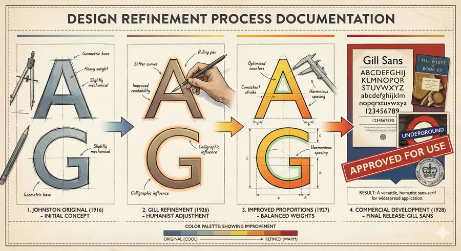
Eric Gill refined Johnston’s original typeface, creating Gill Sans as commercial version of Underground typeface. Gill’s refinement maintained Johnston’s functional principles while improving proportions and legibility.
Gill Sans became typeface embodying both Johnston’s functional vision and Gill’s humanist design philosophy.
Commercial Success and Public Adoption
Gill Sans achieved commercial success, becoming standard typeface for diverse applications. Yet the typeface retained connection to its Underground origins.
The typeface’s public infrastructure heritage gave it distinctive character and authority.
Design System Continuity
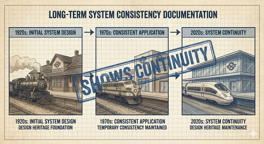
The Underground continued using Gill Sans (and related typefaces) maintaining design system continuity. The system demonstrated long-term design consistency and commitment to coordinated design thinking.
This continuity contrasted with frequent design fashion changes in other contexts.
Wayfinding and Navigation Infrastructure
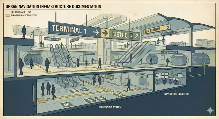
Gill Sans became integral to Underground wayfinding system. Typography worked with signage systems, color coding, and layout logic creating navigation infrastructure.
Typography functioned as practical infrastructure enabling users to navigate complex system.
Related Topics:
Functional Excellence: Gill Sans in Urban Navigation
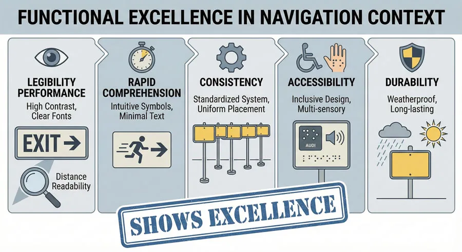
Legibility at Multiple Scales
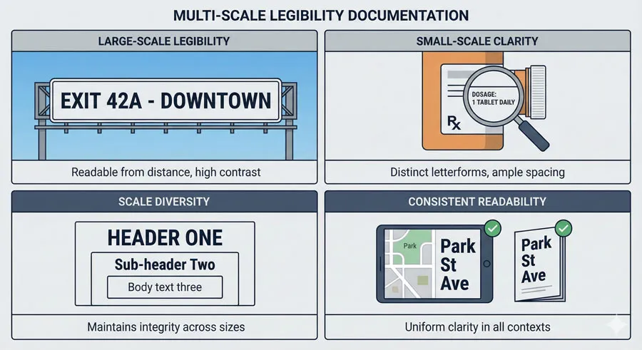
Gill Sans maintains legibility across diverse scales—from large signage to small ticket print. The typeface’s clarity and proportion ensure legibility regardless of viewing distance.
This multi-scale legibility is essential for transportation infrastructure.
Rapid Comprehension and Wayfinding
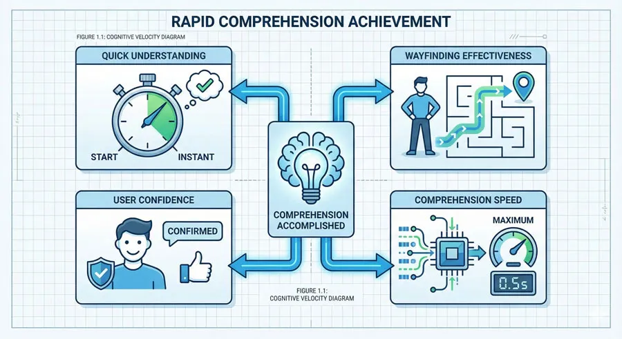
Clear typography enables rapid comprehension essential for wayfinding. Users quickly identify stations, lines, connections through clear typographic communication.
Transportation typography prioritizes rapid comprehension over aesthetic subtlety.
Consistency and Unified Experience
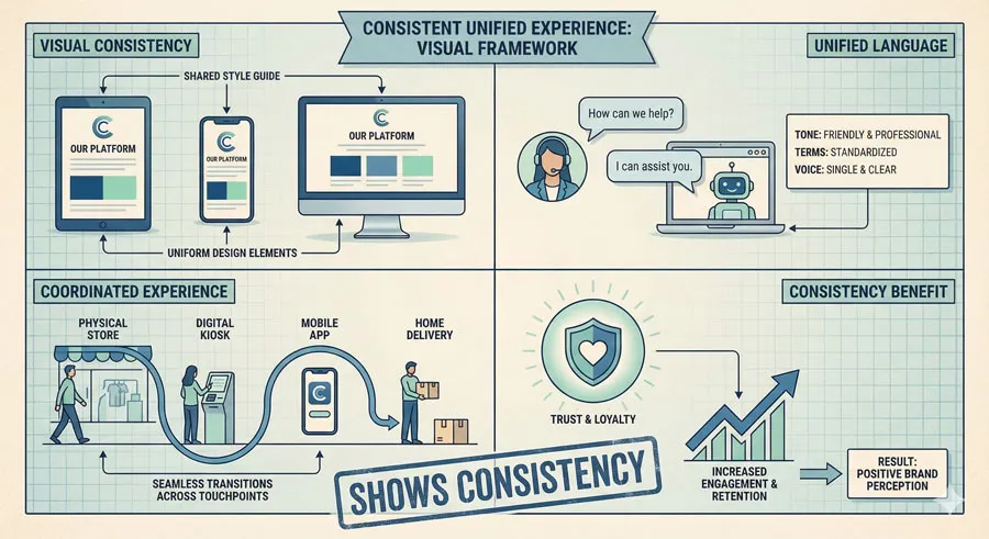
Gill Sans creates visual consistency across Underground system. Users experience unified visual language whether on platforms, in trains, or reading maps.
Consistency creates navigation confidence and coherent user experience.
Accessibility and Universal Design
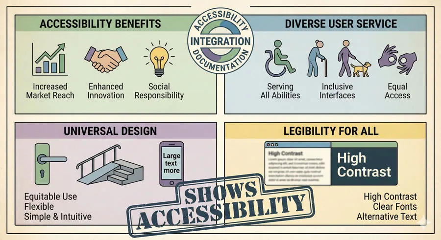
Gill Sans’ clear, distinctive letterforms serve accessibility needs. The typeface’s legibility benefits diverse users including those with vision difficulties.
Transportation infrastructure must serve all users.
Durability and Practical Performance

Gill Sans performs well in printed forms enduring repeated public exposure. The typeface maintains legibility despite wear, aging, and environmental conditions.
Practical durability matters for public infrastructure.
Related Topics:
Urban Design and Infrastructure Thinking
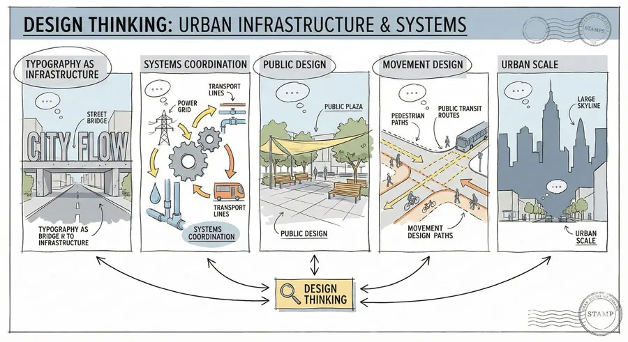
Typography as Infrastructure System
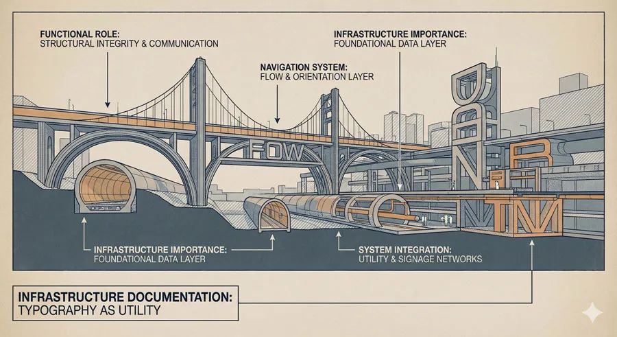
The Underground demonstrates typography functioning as infrastructure. Rather than decorative concern, typography serves essential navigation and wayfinding functions.
This infrastructure thinking changed how designers conceptualize typography.
Coordinated Design Systems
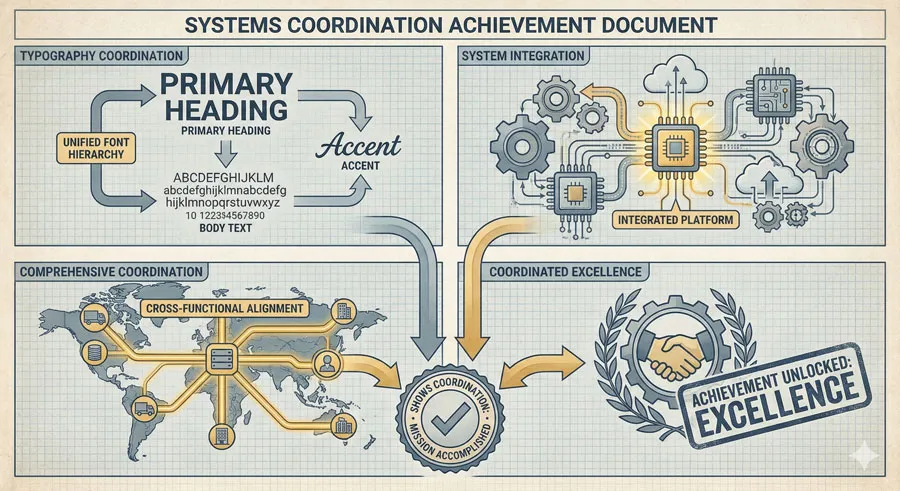
The Underground design coordinated typography with signage, layout, color, and wayfinding. This comprehensive systems thinking influenced later design thinking about integrated systems.
Systems design emerged partly from transportation design precedents like the Underground.
Public Design and Democratic Principles
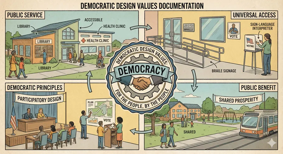
The Underground design served all citizens regardless of design taste or education. This democratic design approach contrasted with elite design culture.
The Tube demonstrated design’s democratic potential.
Design for Movement and Navigation
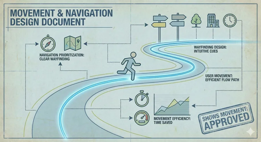
Transportation design prioritized movement and navigation—physical and informational. This functional focus influenced how designers think about user experience and functionality.
Transportation design established user-centered design principles.
Design at Urban Scale
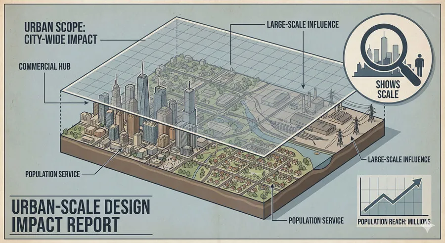
The Underground operated at urban infrastructure scale—shaping daily experience of millions. This scale influenced thinking about design’s social impact and responsibility.
Urban infrastructure design demonstrated design’s potential social power.
Related Topics:
Contemporary Relevance and Legacy
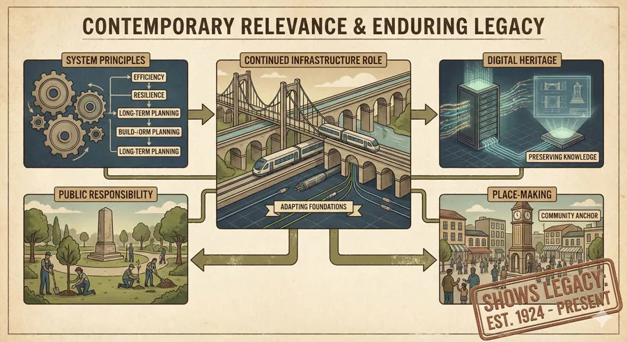
Continued Infrastructure Role
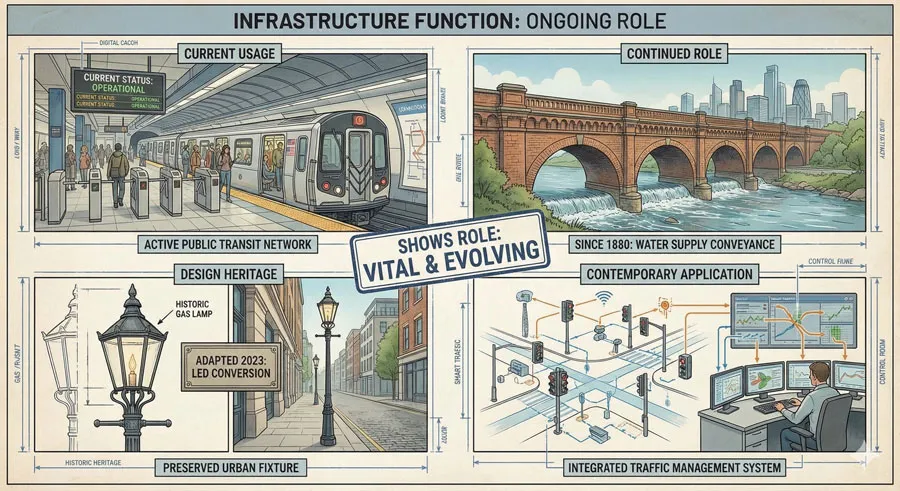
Gill Sans remains essential to London Underground visual identity. The typeface continues serving navigation and wayfinding functions decades after original design.
The typeface’s enduring relevance demonstrates functional excellence.
Design System Principles
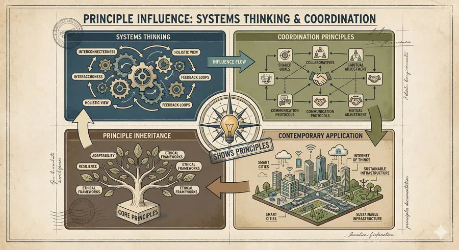
The Underground design system established principles applicable to contemporary design contexts. Systems thinking, coordination, consistency—these principles remain relevant.
Historical precedents inform contemporary design thinking.
Public Infrastructure and Social Responsibility

The Underground design demonstrates design’s social responsibility. Public infrastructure design serves entire populations.
Contemporary design should prioritize public benefit and social responsibility.
Typography in Digital Wayfinding
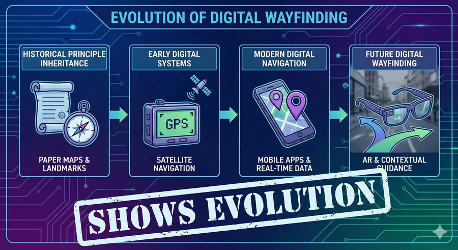
Digital wayfinding systems build on principles established by physical transportation typography. Digital design inherits lessons from print infrastructure design.
Historical typography principles inform digital design.
Identity and Place-Making
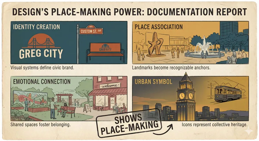
The Underground demonstrates how design creates identity and sense of place. The typeface became symbol of London itself.
Design creates emotional connections to places and communities.
Related Topics:
FAQ: Common Questions About Gill Sans and Urban Design
Q: Is Gill Sans still used for London Underground?
A: Yes, though the system has evolved. New Johnston typeface designed for digital contexts maintains the design heritage.
Q: How did typography become transportation infrastructure?
A: Functional necessity drove the design. Clear typography was essential for navigation. Excellence emerged from functional requirements.
Q: Does transportation design influence other design fields?
A: Yes. Transportation design established principles—systems thinking, user-centered design, accessibility—influential across design disciplines.
Q: What makes infrastructure typography different?
A: Infrastructure typography prioritizes functionality over fashion. Users must comprehend rapidly. Legibility matters more than aesthetic subtlety.
Q: Should contemporary design follow Underground principles?
A: Yes, many principles remain relevant. Systems thinking, user-centeredness, clarity, consistency—these principles serve contemporary design.
Q: How does typography create sense of place?
A: Consistent typography creates visual identity. Over time, typography becomes symbol of place, creating emotional connections.
Q: What is the relationship between Johnston and Gill Sans?
A: Johnston designed original Underground typeface. Gill refined Johnston’s design commercially. Gill Sans maintains Johnston’s functional principles.
Q: Does digital design need physical design heritage?
A: Yes. Historical design principles remain applicable. Digital design inherits lessons from print and transportation design.
Q: How important is design consistency for user experience?
A: Extremely important. Consistency creates navigation confidence and coherent experience. Users learn visual language more readily.
Q: Can design serve both beauty and functionality?
A: Yes, as demonstrated by Gill Sans. Beauty can emerge from functional excellence rather than decorative addition.
Related Topics:
Conclusion: Typography as Shared Urban Infrastructure
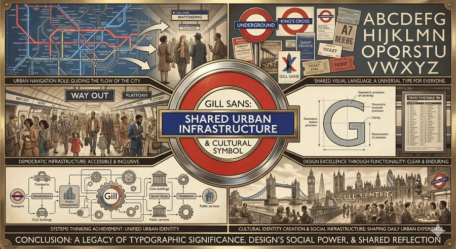
Gill Sans and the London Underground demonstrate typography’s potential to function as essential infrastructure. The typeface shaped how millions navigate their city, creating shared visual language and coordinated urban experience.
The story reveals something profound about design: that excellent design often emerges from functional requirements rather than aesthetic indulgence. The Underground brief required typography serving navigation needs. Excellence emerged from this functional focus.
The design system thinking demonstrated by the Underground influenced how designers conceptualize coordinated, comprehensive design. Systems thinking became essential design approach.
The Underground also demonstrated design’s democratic potential. Public infrastructure design serves all citizens. The typography belongs to entire population rather than design elite.
Edward Johnston and Eric Gill created something transcending individual authorship. Their design became shared cultural infrastructure—part of London’s identity, essential to daily urban experience.
Contemporary designers can learn important lessons from Gill Sans and the Underground. Functionality, systems thinking, consistency, accessibility, democratic values—these principles remain relevant to contemporary design challenges.
The typeface also reminds us that typography possesses profound social power. Clear communication and visual coherence can facilitate navigation, create social bonds, and establish identity.
Urban design continues relying on similar principles established by the Underground. Effective public infrastructure requires coordinated design systems, consistent visual language, and functional clarity.
Gill Sans demonstrates that typeface design encompasses more than aesthetic concern. Typography shapes how people move through physical spaces, navigate information systems, and experience shared urban environments.
The Tube story is ultimately story about design’s potential to improve daily life through thoughtful, functional, democratic design. Gill Sans proves that typography matters profoundly—not as decoration but as infrastructure essential to urban life.
Related Topics:
About the Author
Lalit M. S. Adhikari is a Digital Nomad and Educator since 2009 in design education, graphic design and animation. He’s taught 500+ students and created 200+ educational articles on design topics. His teaching approach emphasizes clarity, practical application and helping learners.
Learn more about Lalit Adhikari.
This guide is regularly updated with the latest information about Adobe tools and design best practices. Last Updated: Mar 2026
Related Topics:


