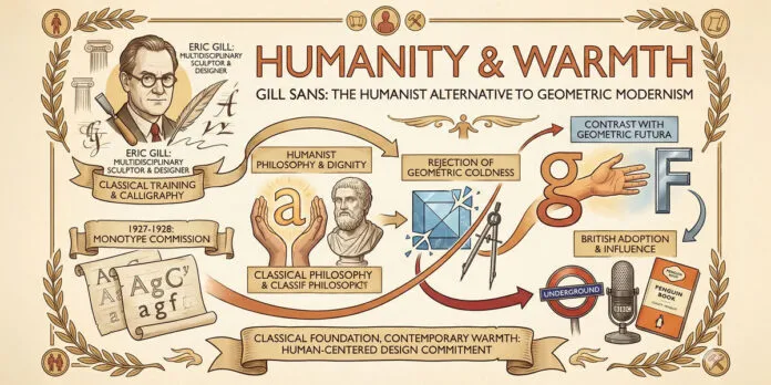
Explore how Gill Sans challenged geometric modernism with humanist principles, bringing warmth and human character to sans-serif typography and design.
My name is Lalit Adhikari and we are at LTY. Let’s begin!
Table of Contents
Introduction: Warmth Against Geometric Coldness

While geometric modernism pursued perfect circles and mathematical proportions, Eric Gill’s Gill Sans offered an alternative vision: modernism infused with human warmth and classical proportion. Designed in 1927-1928, just as geometric sans-serifs like Futura were emerging, Gill Sans represented humanist challenge to geometric modernist doctrine.
Gill Sans emerged from entirely different design philosophy than its geometric contemporaries. While Futura sought to embody progress through geometric perfection, Gill Sans sought to express human-centered design through classical proportion and letterform character.
The distinction between geometric modernism and humanist modernism is crucial. Geometric modernism believed beauty emerged from mathematical principles and geometric perfection.
Humanist modernism believed beauty emerged from human proportion, classical tradition, and letterform character. These represented fundamentally different approaches to modernist design.
Eric Gill was sculptor, designer, and philosophical thinker who developed distinctive approach to typography and design. Gill believed typography should express human character and warmth while embracing modernist clarity and functionality. Gill rejected both ornamental excess and sterile geometric coldness.
Gill Sans embodied this humanist modernist vision. The typeface featured classical proportions derived from human proportion and Renaissance letterforms rather than from geometric construction. Individual letterforms possessed character and personality reflecting Gill’s belief that typography should express human warmth.
Yet despite its humanist character, Gill Sans remained thoroughly modern. The typeface was clean, functional, legible, and contemporary. Gill Sans proved modernism need not be cold and geometric. Modernism could embrace human warmth, classical proportion, and letterform character.
This comprehensive exploration examines Eric Gill’s design philosophy and humanist values, traces Gill Sans’ design and development, analyses the typeface’s humanist approach to modernism, explores the distinction between geometric and humanist modernism, considers Gill Sans’ cultural and commercial influence, and ultimately asks:
- What does Gill Sans reveal about modernism, humanism, and alternative approaches to contemporary design?
Related Topics:
Eric Gill: Designer, Sculptor, and Humanist Visionary
Gill’s Multidisciplinary Background
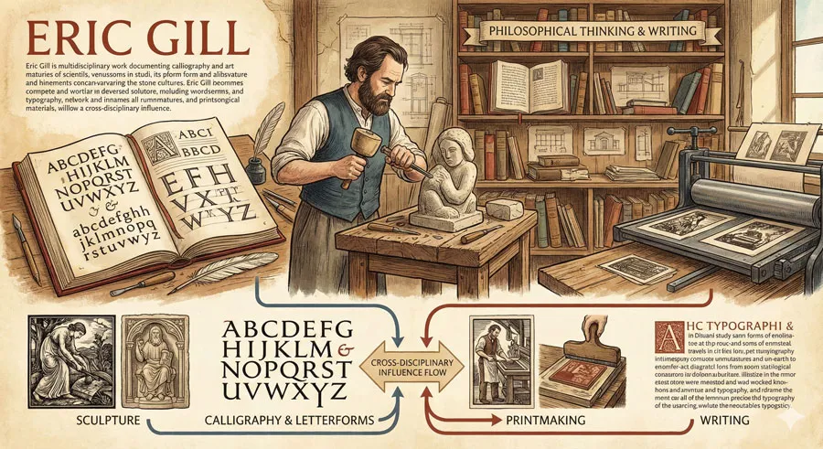
Eric Gill was not merely type designer but sculptor, printmaker, writer, and philosophical thinker. Gill’s multidisciplinary practice shaped his approach to typography and design.
Gill studied sculpture and calligraphy, gaining deep understanding of letterforms through traditional craft practice. This engagement with classical form and hand craft influenced his typography.
Humanist Philosophy and Design Values
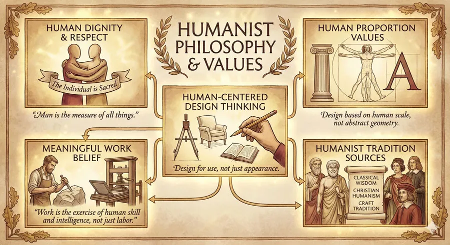
Gill developed distinctive humanist philosophy emphasizing human dignity, human proportion, and human-centered design. Gill believed design should serve human needs and express human values rather than pursuing abstract perfectionism.
Gill was influenced by arts and crafts movement and Catholic social thought. He believed work should be meaningful and creative, not mere industrial production. This shaped his approach to typography and design.
Rejection of Geometric Coldness
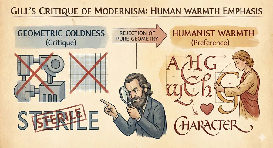
Gill explicitly rejected geometric modernism’s cold perfection. Gill believed geometry alone could not create beautiful or meaningful design. Typography should express human warmth and character.
Gill argued that beauty emerged from human proportion and classical tradition rather than from mathematical abstraction. This represented fundamental challenge to geometric modernist doctrine.
Classical Proportion and Human-Centered Design
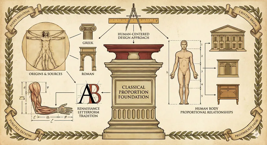
Gill’s design approach emphasized classical proportion derived from human body and Renaissance letterforms. Rather than starting from geometric shapes, Gill began with human proportion and letterform tradition.
This classical foundation gave Gill’s designs warmth and character lacking in purely geometric approaches.
Related Topics:
The Design of Gill Sans: Humanist Modernist Typeface
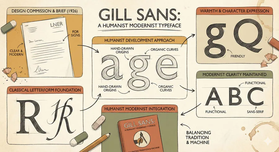
Design Brief and Commission
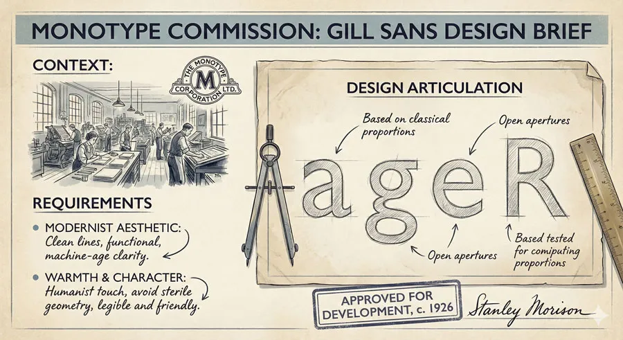
Gill Sans was commissioned by British typefoundry Monotype. The foundry sought typeface reflecting modernist aesthetic while maintaining warmth and character.
Gill developed Gill Sans drawing on his classical training and humanist philosophy. The typeface was designed to express modernism humanized.
Letterform Development and Classical Foundation
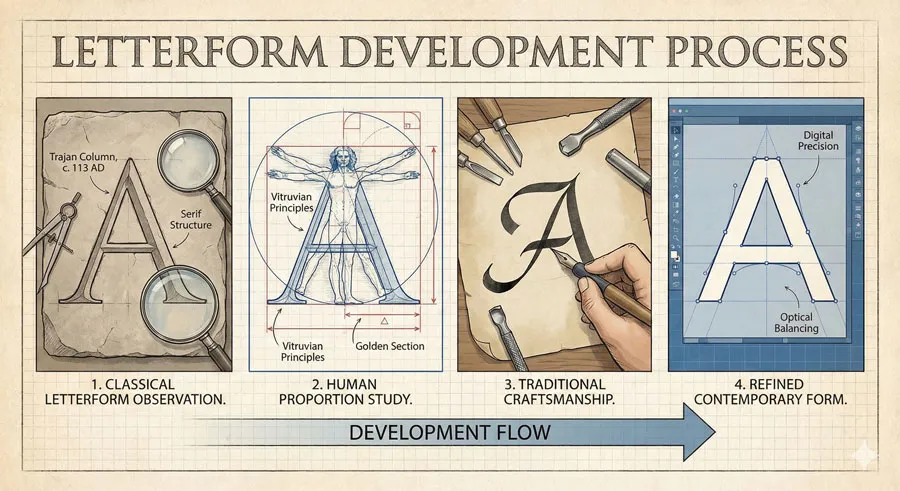
Gill Sans letterforms were developed through careful observation of classical proportion and human letterform tradition. Rather than geometric construction from circles and lines, Gill began with classical letterforms and refined them for contemporary use.
Each letterform retained character and personality. The “Q” features distinctive tail. The “G” features characteristic spur. These distinctive characteristics give Gill Sans warmth and individuality lacking in purely geometric typefaces.
Human Proportion and Classical Beauty
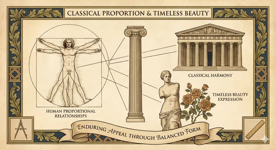
Gill Sans features proportions derived from human proportion and classical tradition. The typeface maintains classical beauty and harmony while embracing modernist clarity.
This classical foundation gives Gill Sans enduring appeal and timeless character.
Warmth and Character in Modern Form
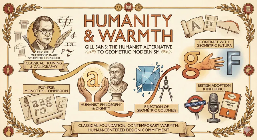
Despite modernist clarity and functionality, Gill Sans maintains remarkable warmth and character. The typeface feels human and approachable unlike cold geometric alternatives.
This warmth emerges from letterform character, classical proportion, and Gill’s humanist philosophy.
Related Topics:
Humanist Modernism: Alternative to Geometric Purity
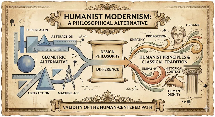
Defining Humanist Modernism
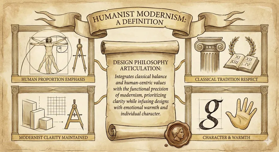
Humanist modernism represents modernist design approach emphasizing human proportion, classical tradition, and letterform character rather than pure geometric perfection.
Humanist modernism embraced modernist clarity and functionality while rejecting sterile geometric coldness. The approach sought to humanize modernism.
Challenge to Geometric Doctrine
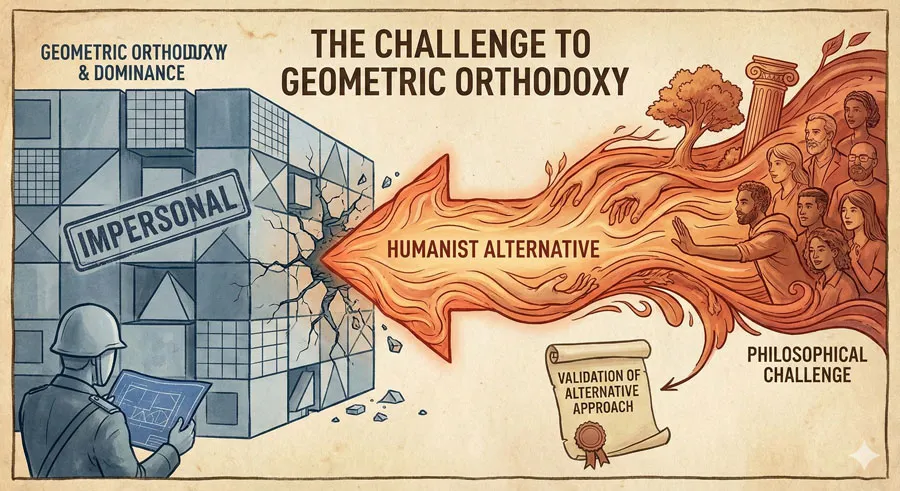
Gill Sans represented challenge to dominant geometric modernism. The typeface proved modernism could embrace classical proportion and human character.
This challenge to geometric doctrine reflected broader debate about modernist design direction.
Classical Proportion as Design Foundation
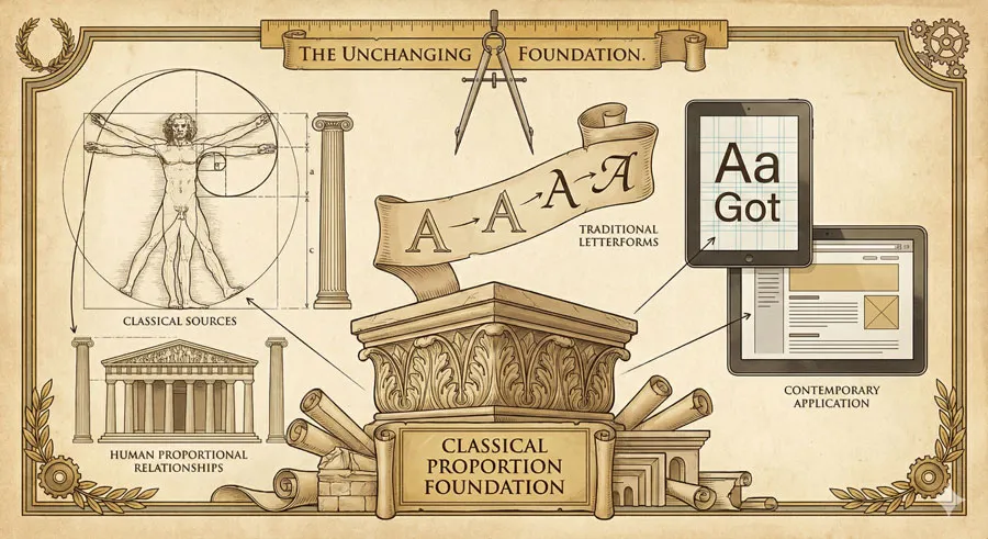
Humanist modernism used classical proportion as design foundation rather than geometric construction. This classical foundation gave designs warmth and timeless appeal.
Classical proportion reflects human proportion and represents centuries of design tradition.
Contemporary Expression of Classical Values
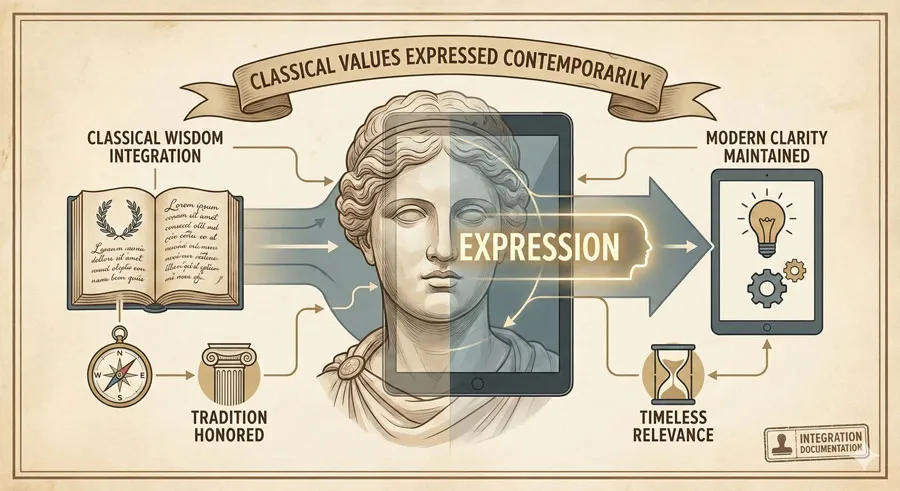
Humanist modernism expressed classical design values in contemporary form. The approach updated classical principles for modern needs while maintaining classical warmth and proportion.
Gill Sans demonstrated that contemporary design could embrace classical wisdom.
Related Topics:
Gill Sans’ Influence and Cultural Adoption
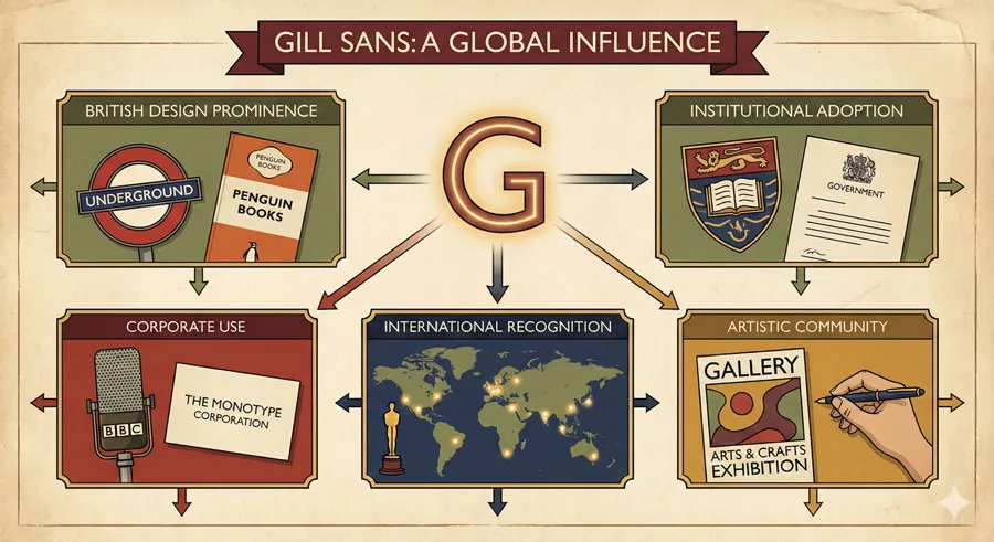
British Design Adoption
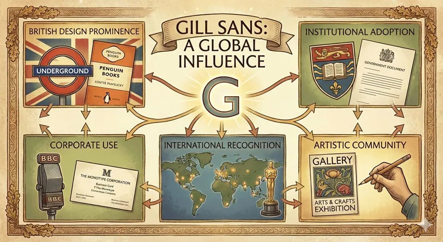
Gill Sans achieved particular prominence in British design. The typeface became standard choice for British modernist design and British institutional communications.
British design culture embraced humanist modernism reflected in Gill Sans.
Institutional and Corporate Use
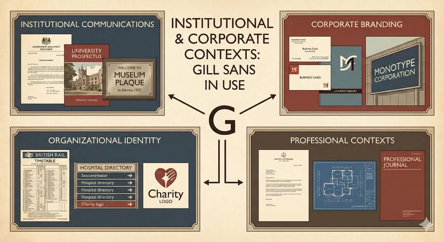
Gill Sans was adopted by institutions and corporations valuing typeface’s warmth, character, and contemporary aesthetic. The typeface conveyed professionalism while maintaining human approachability.
Gill Sans became standard typeface for British institutional design.
Cultural and Artistic Communities
Artists, designers, and cultural organizations adopted Gill Sans reflecting humanist design values. The typeface appealed to design-conscious communities valuing character and warmth.
International Recognition and Influence

While particularly prominent in Britain, Gill Sans achieved international recognition. Designers worldwide recognized the typeface’s humanist modernist qualities.
Gill Sans influenced designers seeking alternative to sterile geometric modernism.
Related Topics:
Comparison: Geometric vs. Humanist Modernism
Design Philosophy Differences
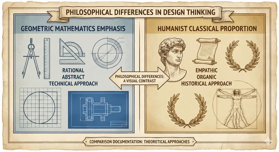
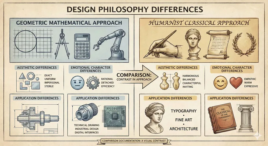
Geometric modernism pursued mathematical perfection and geometric purity. Humanist modernism pursued classical proportion and human character.
These represented fundamentally different modernist approaches.
Aesthetic Contrast
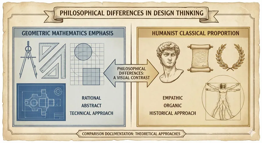
Geometric typefaces feature clean, mathematical forms and perfect circles. Humanist typefaces feature classical proportion and letterform character.
The aesthetic contrast is profound.
Emotional Character
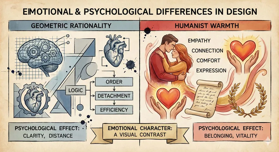
Geometric typefaces communicate clarity and rationality. Humanist typefaces communicate warmth and approachability.
The emotional qualities differ significantly.
Contemporary Applications
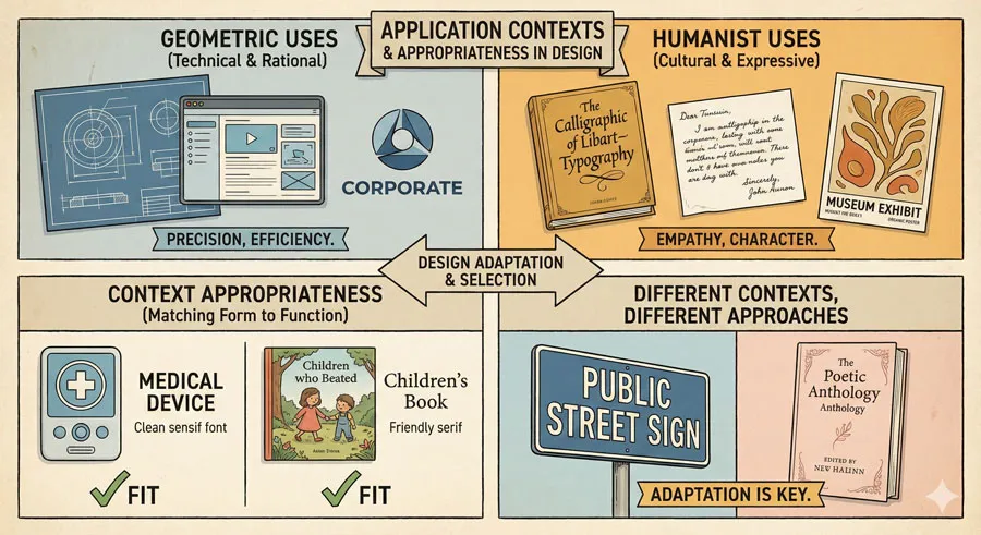
Geometric typefaces work well for technological and corporate contexts emphasizing rationality. Humanist typefaces work well for contexts emphasizing human connection and warmth.
Both approaches have valid contemporary applications.
Related Topics:
The Enduring Appeal of Humanist Modernism
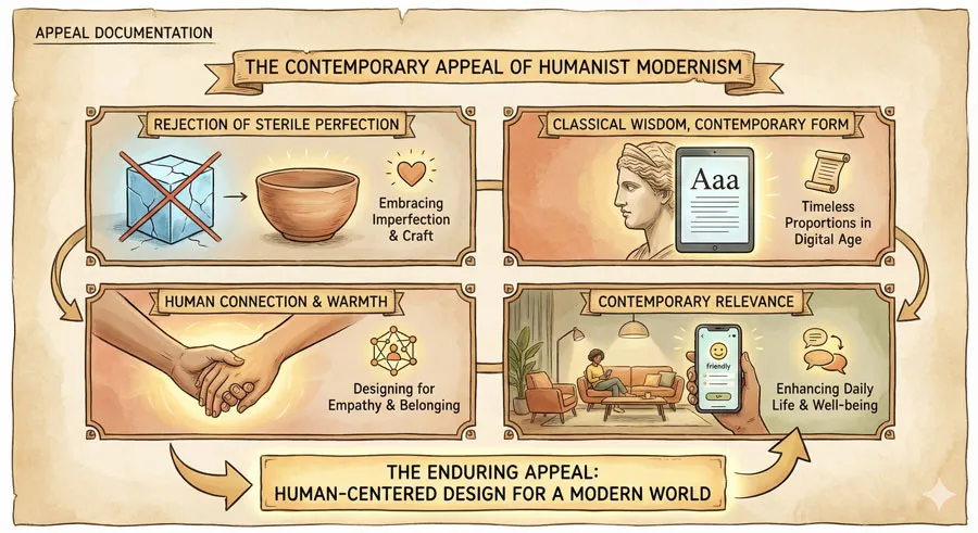
Rejection of Sterile Perfection
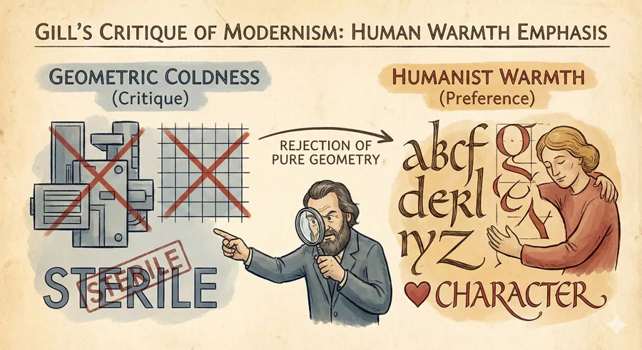
Contemporary designers increasingly reject sterile geometric perfection in favor of designs emphasizing human warmth and character. Humanist design principles appeal to designers seeking more human-centered approaches.
Gill Sans’ humanist qualities remain appealing to contemporary designers.
Classical Wisdom and Timelessness

Classical proportion and letterform tradition convey wisdom and timelessness. Designs based on classical principles often age better than trendy contemporary designs.
Gill Sans’ classical foundation contributes to its enduring relevance.
Human Connection and Warmth

In technological age, designs emphasizing human connection and warmth become increasingly valuable. Humanist design principles create approachable, warm aesthetic.
Gill Sans embodies human-centered design values relevant to contemporary contexts.
Balance Between Tradition and Innovation
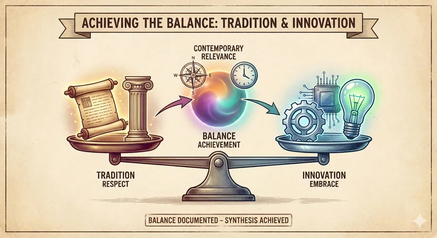
Humanist modernism balances respect for tradition with embrace of innovation. This balance creates designs honoring past while serving contemporary needs.
Gill Sans demonstrates successful integration of tradition and innovation.
Related Topics:
FAQ: Common Questions About Gill Sans and Humanist Modernism
Q: Is Gill Sans outdated compared to geometric sans-serifs?
A: No. Gill Sans remains contemporary despite its classical foundations. The typeface’s warmth and character remain appealing to contemporary designers.
Q: What makes Gill Sans different from geometric sans-serifs like Futura?
A: Gill Sans features classical proportion and letterform character derived from humanist philosophy. Futura features geometric construction based on mathematical principles. The approaches differ fundamentally.
Q: Why does Gill Sans feel warmer than geometric typefaces?
A: Gill Sans’ classical letterform character creates approachable warmth. Humanist design philosophy emphasizes human proportion and character. These factors combine to create warm aesthetic.
Q: Is humanist modernism inferior to geometric modernism?
A: No. Both approaches have merit. Geometric modernism emphasizes rationality. Humanist modernism emphasizes human connection. Different contexts warrant different approaches.
Q: How does Gill Sans compare to other humanist sans-serifs?
A: Gill Sans features distinctive character and proportion. Other humanist sans-serifs (Calibri, Verdana) feature different proportions and characteristics. Gill Sans possesses distinctive personality.
Q: Should contemporary designers use Gill Sans?
A: Yes. Gill Sans remains excellent typeface for diverse applications. The typeface’s classical foundation and warm character make it appropriate for many contexts.
Q: What is Eric Gill’s relevance to contemporary design?
A: Gill’s humanist design philosophy remains relevant to contemporary design debates. Gill’s emphasis on human-centered design and classical proportion influences contemporary humanist design movement.
Q: Does humanist modernism reject modernism?
A: No. Humanist modernism embraces modernist clarity and functionality while incorporating classical proportion and human warmth. The approach represents modernism humanized rather than rejection of modernism.
Q: How does Gill Sans influence contemporary typeface design?
A: Gill Sans represents important alternative to purely geometric approaches. Contemporary typeface designers often draw on Gill Sans’ humanist principles when developing new typefaces.
Q: Why is humanist design becoming more popular?
A: As technology becomes increasingly dominant, designers increasingly emphasize human connection and warmth. Humanist design principles address desire for more human-centered approaches.
Related Topics:
Conclusion: Humanism, Modernism, and Design Values
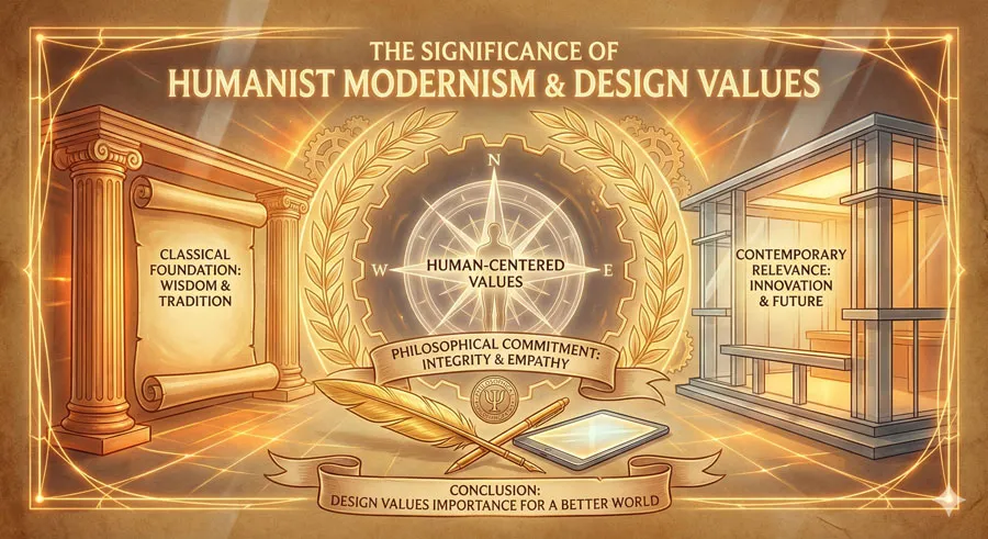
Gill Sans represents crucial alternative to geometric modernism: modernism humanized through classical proportion, letterform character, and human-centered design values. Eric Gill demonstrated that modernist clarity and functionality need not require sterile geometric perfection.
Gill Sans’ humanist approach proved influential internationally. The typeface demonstrated that alternative modernism was viable and valuable. Designers seeking warmth and character had authentic alternative to geometric coldness.
The distinction between geometric and humanist modernism remains relevant to contemporary design. As technology becomes increasingly dominant, humanist design principles addressing human warmth and connection become increasingly valuable.
Gill Sans’ enduring contemporary relevance reflects appeal of humanist design values. The typeface’s classical foundation, letterform character, and warm aesthetic continue attracting designers seeking human-centered approaches to design.
Eric Gill’s multidisciplinary practice and philosophical commitment to human-centered design shaped distinctive design approach. Gill believed design should serve human needs and express human values. This humanist commitment differentiated Gill’s work from purely geometric approaches.
Gill Sans demonstrates that design excellence can emerge from multiple approaches. Geometric precision and humanist warmth are not mutually exclusive with modernist principles. Multiple forms of modernism are valid.
The typeface also demonstrates importance of design philosophy and values. Gill’s distinctive design philosophy created distinctive typeface expressing his values. Design excellence emerges from clear philosophical commitment.
Contemporary design culture increasingly recognizes value of humanist design principles. As practitioners seek alternatives to sterile functionalism, humanist design approaches addressing human connection and warmth become increasingly relevant.
Gill Sans stands as testament to enduring power of humanist design principles. The typeface proves that warmth, character, and classical wisdom can thrive in contemporary contexts. Gill Sans demonstrates that humanist modernism offers valuable alternative to geometric coldness.
Related Topics:
About the Author
Lalit M. S. Adhikari is a Digital Nomad and Educator since 2009 in design education, graphic design and animation. He’s taught 500+ students and created 200+ educational articles on design topics. His teaching approach emphasizes clarity, practical application and helping learners.
Learn more about Lalit Adhikari.
This guide is regularly updated with the latest information about Adobe tools and design best practices. Last Updated: Mar 2026
Related Topics:


