Explore Garamond’s legendary history, Claude Garamond’s printing innovations, and how this classical serif typeface became the foundation of typography, influencing typeface design for over 500 years.
My name is Lalit Adhikari and we are at LTY. Let’s begin!
Table of Contents
Introduction: The Typeface That Shaped Five Centuries of Typography
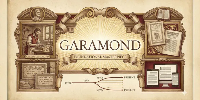
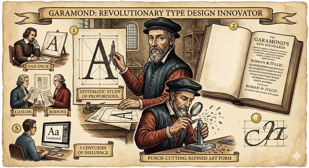
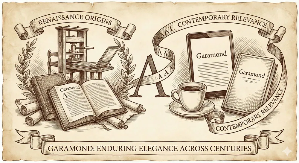
In the sixteenth century, during the Renaissance, a Parisian typefounder and punch-cutter named Claude Garamond revolutionized typography by creating typefaces based on classical Roman proportions and refined through careful observation of historical letterforms.
While many typefaces have come and gone, Garamond has endured for over five hundred years, influencing virtually every subsequent serif typeface and remaining one of the most widely-used and respected typefaces in the world.
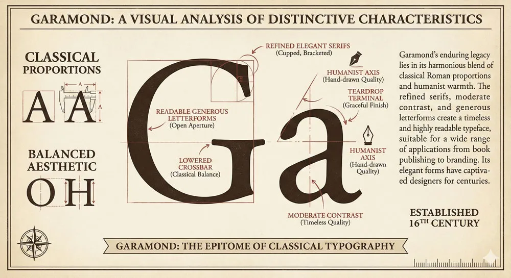
Garamond is not a single typeface but a family of typefaces designed and refined by Claude Garamond and his successors. The typefaces are characterized by elegant proportions, refined serifs, readable letterforms, and a timeless quality that transcends design fashion.
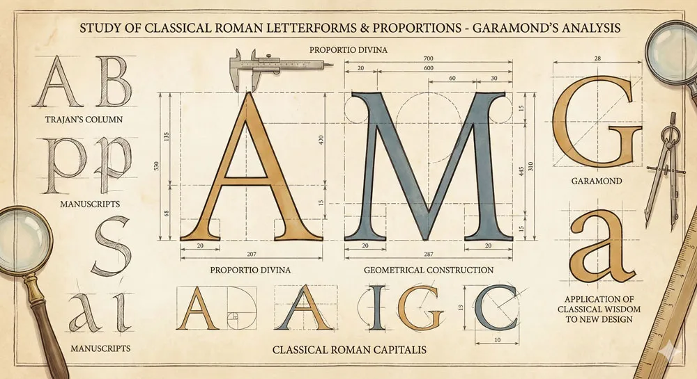
Garamond typefaces are based on classical Roman letter proportions—proportions that were proven to be readable and beautiful through centuries of use in printed books.
What distinguishes Garamond from other classical typefaces is its perfect balance. Garamond is neither too heavy nor too light, neither too dramatic nor too restrained. The typeface is readable in both large display settings and small body text.
The typeface communicates elegance and sophistication without sacrificing functionality. The typeface is timeless—it looks equally appropriate in books published in the sixteenth century and in contemporary design.
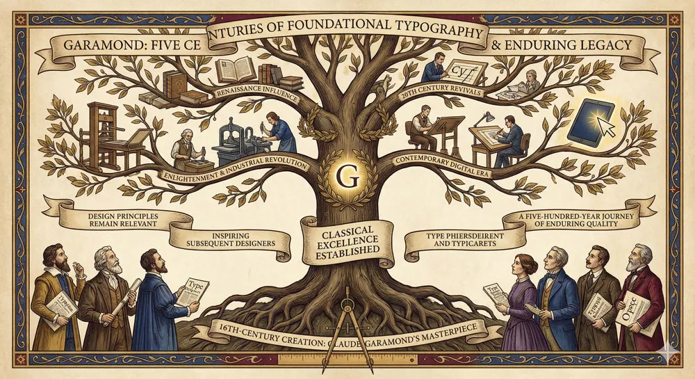
Over five centuries, Garamond has influenced typeface design more profoundly than perhaps any other typeface. Most serif typefaces trace their design lineage through Garamond.
Designers study Garamond as the foundational model of classical serif design. The typeface appears in countless contemporary design contexts—from classic literature to contemporary branding.
Yet Garamond’s story is also a story about the relationship between classical principles and timeless design.
Garamond has endured because it is based on fundamental principles of proportion, readability, and elegance that transcend specific historical moments or fashion trends. The typeface proves that design rooted in classical principles and careful observation can achieve enduring relevance.
This comprehensive exploration traces Claude Garamond’s life and revolutionary approach to typeface design, examines Garamond typeface characteristics and classical proportions, explores the typeface’s adoption and influence across five centuries, analyses Garamond’s role in book design and literary culture, compares Garamond to other serif typefaces, and ultimately asks:
- what does Garamond reveal about the foundations of excellent typography, about the timeless power of classical proportions, and about design principles that endure across centuries?
Related Topics:
- The Worst Fonts in the World: A Typographic Hall of Shame
- Gill Sans and Tube: How Johnston and Gill Defined London
- Baskerville and Eaves: A Tale of Perfection, Passion and Revival
Claude Garamond: The Pioneer Punch-Cutter and Type Designer
A Life in Type and Printing
Claude Garamond was born around 1480 in Paris. He came of age during the Renaissance, a period of extraordinary cultural and intellectual ferment.
The printing press, invented by Johannes Gutenberg in the mid-fifteenth century, had recently arrived in Paris and was transforming how information was disseminated and how texts were produced.
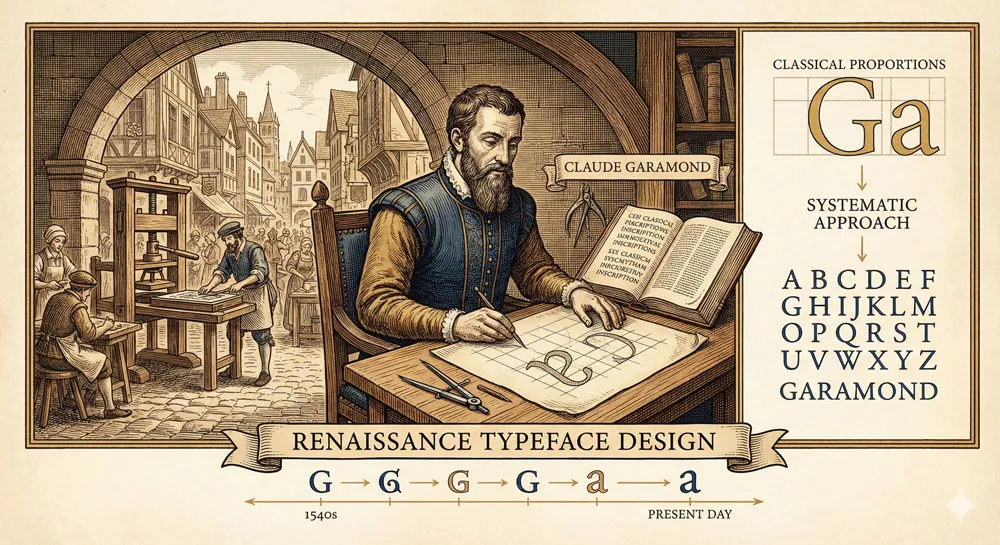
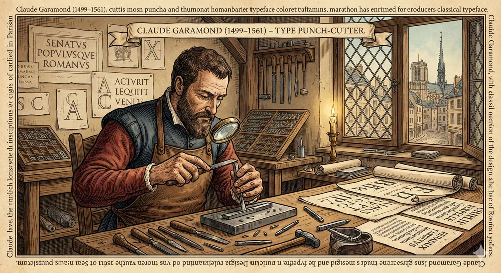
Garamond was trained as a punch-cutter—a craftsperson who carved letterforms into metal punches that could be used to create printing type. This was highly skilled work requiring exceptional craftsmanship, artistic sensibility, and deep understanding of letterforms.
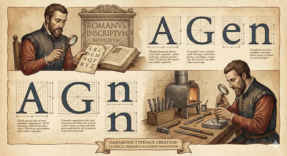
What distinguished Garamond from other punch-cutters was his systematic study of classical Roman letterforms and proportions. Garamond studied Roman inscriptions, examined historical letterforms, and sought to understand the underlying proportional relationships that made classical letters beautiful and readable.
Rather than simply copying existing typefaces, Garamond sought to understand and apply classical principles to create new typefaces.
Garamond established himself as the leading type designer of his era. His typefaces were adopted by prestigious printers and became the standard for fine book printing throughout Europe.
Garamond’s reputation was so significant that even after his death in 1561, his typefaces remained in use and continued to be copied and refined by subsequent type designers.
Garamond’s Design Philosophy: Classical Proportions and Functional Beauty
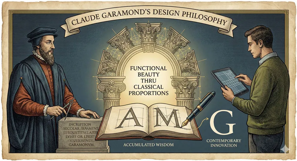
Central to Claude Garamond’s design philosophy was the belief that excellent typography was based on classical proportions and careful observation of how letters functioned in practice.
Garamond believed that designers should study Roman proportions not to copy them directly but to understand the underlying principles that made them work.
This approach represented something revolutionary at the time. Rather than simply perpetuating existing practices, Garamond systematically studied the foundations of typography and created new typefaces based on classical principles.
This combination of classical study and contemporary innovation became Garamond’s distinctive approach.
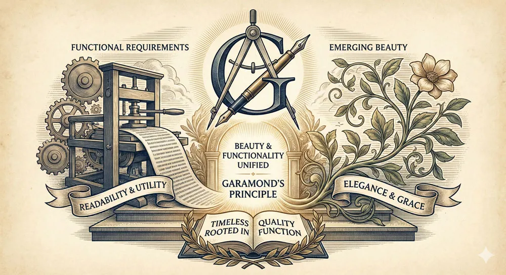
Garamond also believed deeply in functional beauty—the principle that beauty emerged from perfect attention to functional requirements.
Garamond’s typefaces were designed to be readable in body text, to work in various sizes, to maintain elegant proportions while serving the practical requirements of printing. This commitment to functional beauty gave Garamond’s typefaces exceptional longevity.
The Significance of Garamond’s Innovations
Garamond’s innovations in typeface design were significant for the entire history of typography. Garamond proved that systematic study of classical proportions could yield superior typefaces.
Garamond demonstrated that punch-cutting and type design could be elevated to an art form based on principles and understanding rather than mere copying.
Garamond’s success established him as the most influential type designer of the Renaissance. His typefaces became the standard for fine printing. Subsequent type designers studied Garamond and sought to learn from his approach.
Garamond’s principles of classical proportion and functional beauty became foundational to subsequent typography.
Related Topics:
- Futura vs. The World: The Geometric Vision of Paul Renner
- Legibility vs. Readability: What Every Designer Needs to Know
- Secret Life of Symbols: History of Ampersand and Interrobang
Creating Garamond Typeface: Classical Study and Proportional Refinement
The Study of Classical Proportions
Garamond’s approach to typeface design began with systematic study of classical Roman letterforms.
Garamond examined Roman inscriptions, studied historical letterforms, and sought to understand the proportional relationships that made Roman letters beautiful and functionally effective.
This classical study was not mere copying or revivalism. Rather, Garamond sought to understand the principles underlying classical letterforms so that he could apply those principles to create new, contemporary typefaces.
Garamond believed that classical proportions represented accumulated wisdom about what made letters beautiful and readable.
The Innovation of Refined Proportions
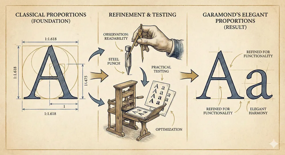
Garamond’s innovation was to refine classical proportions through careful observation and practical testing. Garamond created typefaces based on classical principles but refined through understanding of how letters actually functioned in printed text.
The resulting typefaces were elegant, readable, and appropriately proportioned for various uses. The serifs were refined and suggested classical elegance.
The letterforms had generous proportions that were comfortable to read. The overall aesthetic was one of classical refinement combined with practical functionality.
Functional Beauty and Timeless Design
A crucial principle underlying Garamond’s design was the belief that beauty and functionality were unified. Beautiful typefaces emerged from perfect attention to functional requirements.
Garamond designed typefaces that were beautiful precisely because they were so well-suited to their function—printing readable, elegant books.
This principle of functional beauty gave Garamond’s typefaces remarkable durability. Because the beauty was rooted in functional excellence rather than fashionable ornamentation, the typefaces remained appropriate and beautiful even as fashions changed.
Related Topics:
- Helvetica – Swiss Modernism’s Ubiquity Crisis
- Comic Sans – Accessibility & Gatekeeping Critique
- Gotham – Political Design & Elections Power
Garamond’s Design Characteristics: Classical Elegance and Timeless Proportion
Classical Proportions and Refined Detail
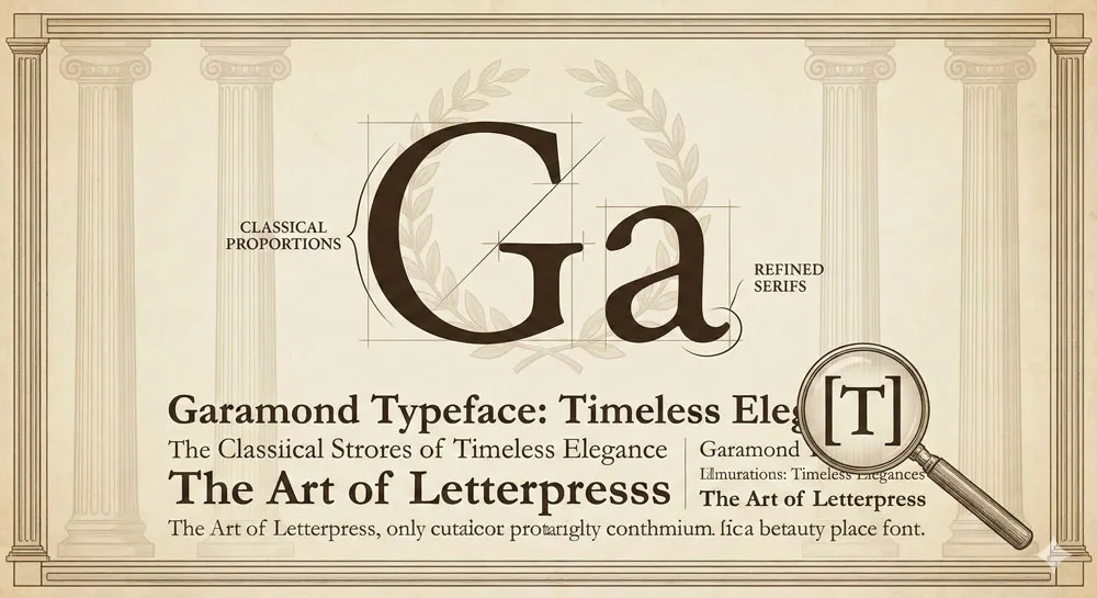
Garamond typefaces are characterized by classical proportions and refined detail throughout. The letterforms are based on Roman proportions—proportions that have proven their value through centuries of use.
The serifs are refined and elegant. The overall aesthetic is one of classical refinement.
These classical proportions work together to create typefaces that are immediately recognizable as timeless and classical. When viewers encounter Garamond, they unconsciously perceive classical elegance and refined proportionality.
Readability and Legibility
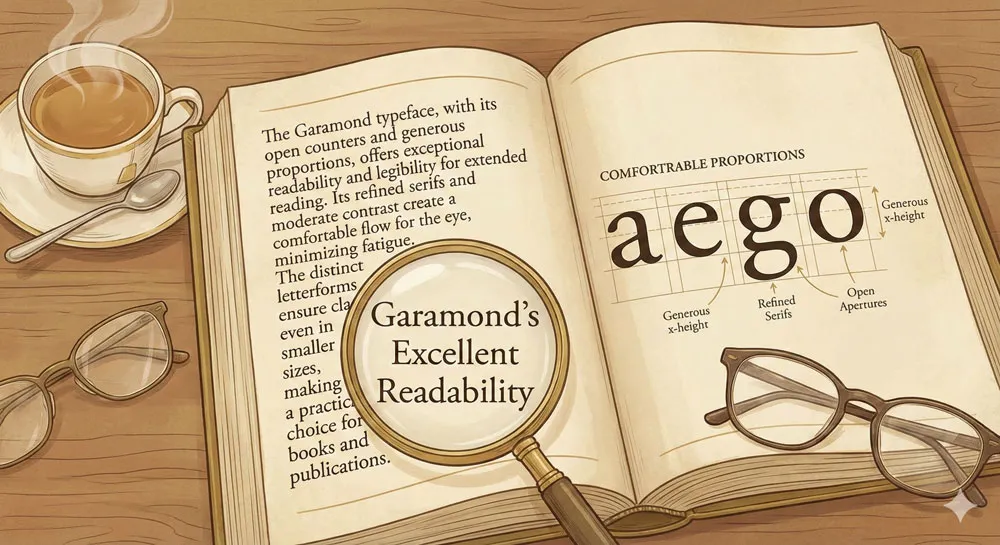
Despite—or perhaps because of—its classical character, Garamond is exceptionally readable. The letterforms are clear and easily distinguishable. The proportions are generous and comfortable. The typeface reads beautifully in extended text settings.
This combination of classical elegance and exceptional readability is one of Garamond’s most distinctive characteristics. The typeface proves that classical refinement and practical functionality are entirely compatible.
Timeless Quality and Historical Association
Garamond possesses a distinctive timeless quality. The typeface does not feel old-fashioned or dated. Rather, the typeface feels eternally contemporary. Garamond appears equally appropriate in a sixteenth-century book and in contemporary design.
This timeless quality emerges from Garamond’s foundation in classical principles. Because the typeface is based on enduring principles rather than transient fashions, it transcends historical moments.
The typeface has proven that classical proportions remain beautiful and appropriate across five centuries of design history.
Related Topics:
- Futura – Geometric Modernism Revolution
- Gill Sans – Humanist Alternative Modernism
- Baskerville – Print Excellence & Love Story
Garamond’s Adoption and 500-Year Influence
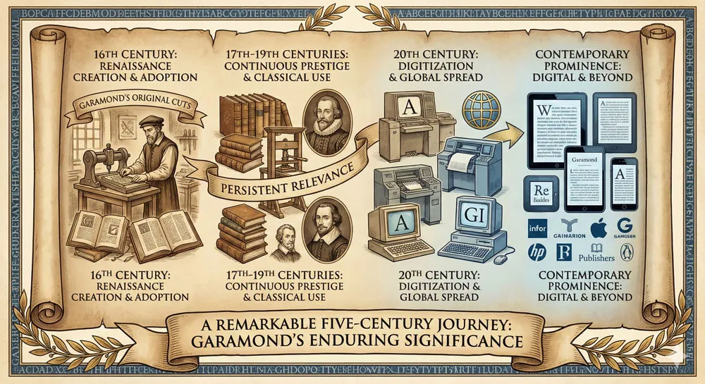
Renaissance and Early Adoption
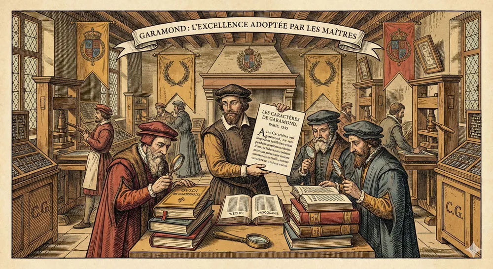
Garamond typefaces achieved rapid adoption among prestigious printers during the Renaissance. The typefaces became the standard for fine book printing. Important texts, prestigious publications, and beautiful books were printed in Garamond.
This early adoption established Garamond as the leading typeface of the Renaissance printing world. The typeface became associated with quality, prestige, and printing excellence.
Copying and Continuation of the Garamond Tradition
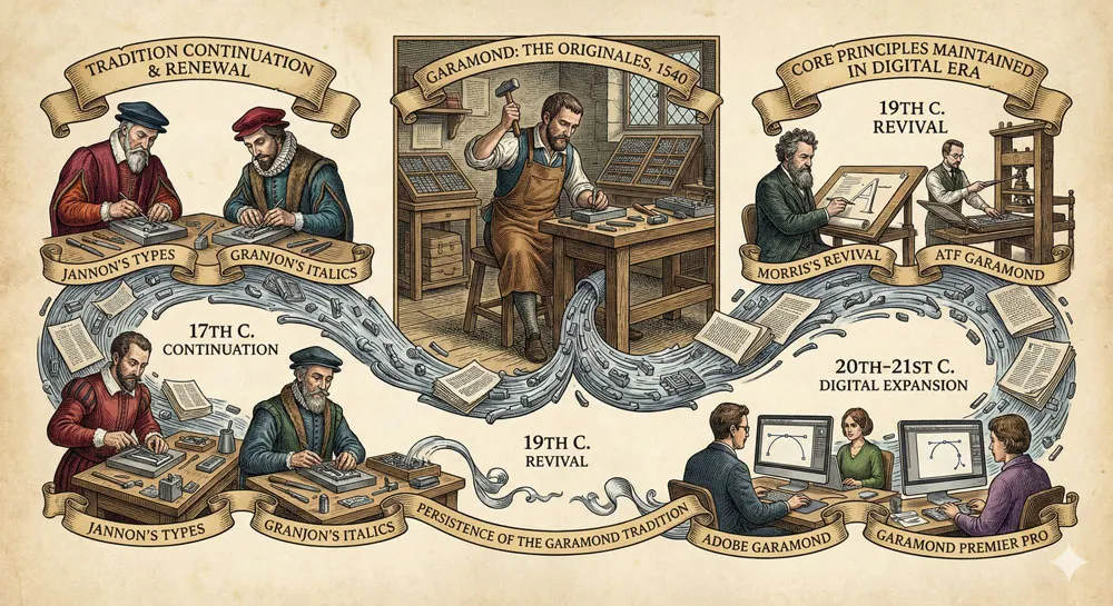
After Garamond’s death, subsequent type designers continued the Garamond tradition by cutting additional Garamond typefaces and refining existing designs.
The Garamond family grew to include numerous related typefaces. The tradition of Garamond-inspired design continued and expanded.
This continuation of the Garamond tradition meant that Garamond never simply faded from use. Rather, the typeface tradition was continuously renewed and updated by subsequent designers while maintaining the core principles and aesthetic.
Garamond in Modern and Contemporary Design
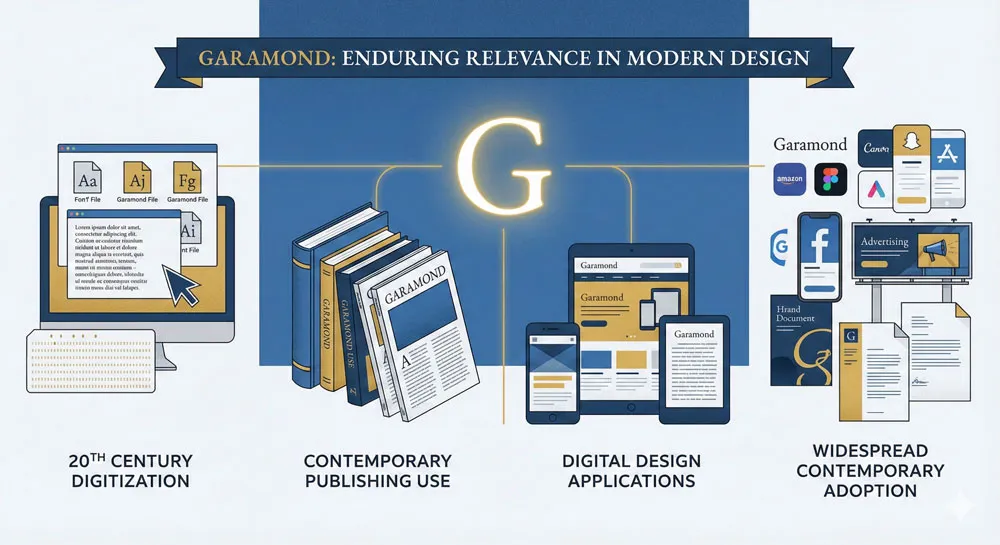
Throughout the twentieth and twenty-first centuries, Garamond has remained one of the most widely-used serif typefaces.
The typeface was digitized and adapted for contemporary use. Garamond appears in publishing, in academic contexts, in design contexts where classical elegance is valued.
Contemporary designers often select Garamond specifically because of its classical heritage and timeless quality. Using Garamond communicates that a designer understands typography history and values classical principles.
Related Topics:
- Bodoni – Theatrical Prestige Aesthetics
- Garamond – Classical Foundation Principles
- Worst Fonts – Criticism & Gatekeeping Analysis
Typography’s Foundation: Garamond and Design Principles
Garamond as Foundational Model
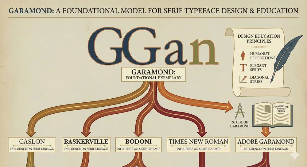
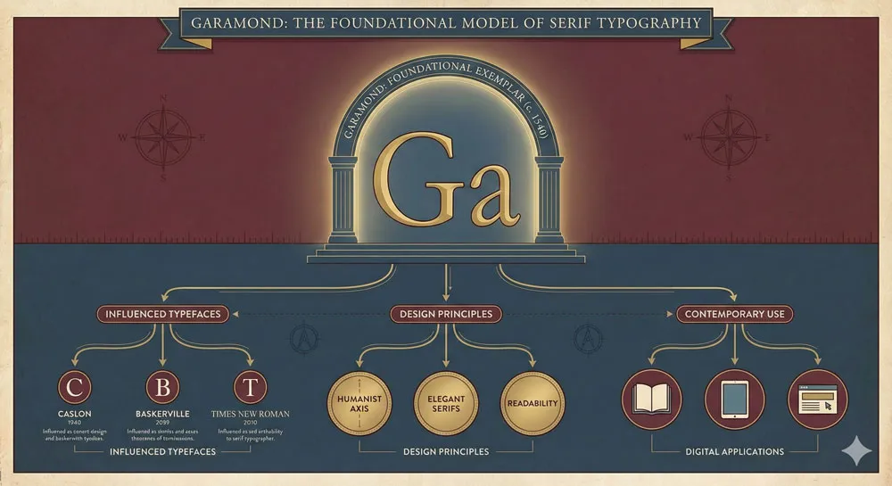
Garamond is often cited as the foundational model of classical serif typeface design. Most serif typefaces trace their design lineage through Garamond.
Designers studying typeface design learn Garamond as the essential model of how classical principles should be expressed in typography.
This foundational role reflects Garamond’s superior design. The typeface is based on classical principles, carefully refined through practical use, and perfectly balanced. The typeface serves as an exemplar of excellent serif typeface design.
Classical Proportions as Enduring Principle
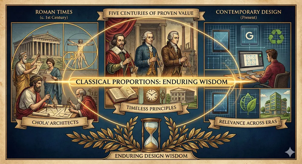
Garamond demonstrates that classical proportions represent accumulated wisdom about beautiful and readable letterforms. The proportions that Garamond studied in Roman inscriptions have proven their value through five centuries of use.
This endurance of classical proportions suggests that some design principles transcend historical fashion. The proportions that were beautiful in Roman times remain beautiful in contemporary design. This suggests that excellent design is based on fundamental principles rather than transient fashions.
Design Education and Garamond
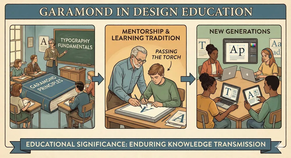
Garamond plays an important role in design education. Design students study Garamond to understand serif typeface design principles. Design schools teach Garamond as a foundational model of excellence in typeface design.
This educational role ensures that Garamond’s principles continue to influence subsequent generations of designers. Young designers learning from Garamond’s example are learning principles that have proven their value across five centuries.
Related Topics:
- Gill Sans & The Tube – Urban Identity Infrastructure
- Baskerville & Mrs. Eaves – Love, Partnership & Revival
- Futura & Paul Renner – Geometric Vision & Revolution
Comparing Garamond to Other Serif Typefaces
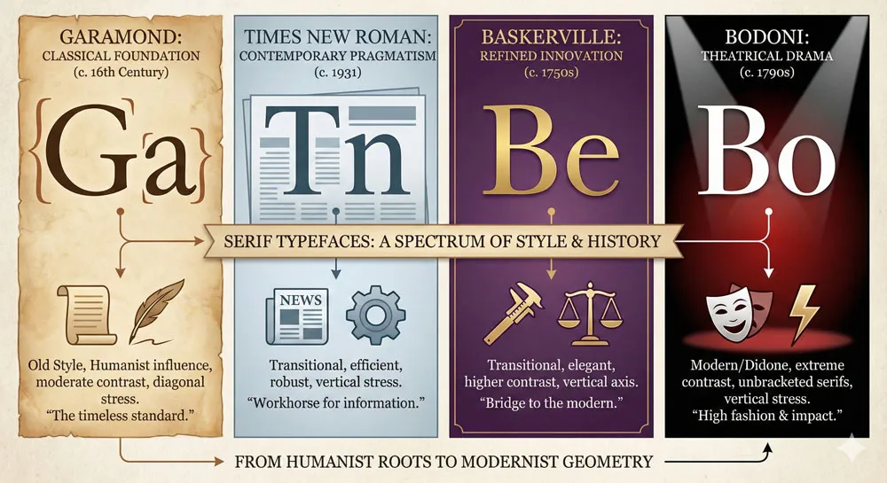
Garamond vs. Times New Roman: Classical vs. Contemporary Pragmatism
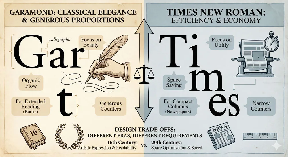
Times New Roman was designed in the twentieth century for newspaper printing. While Times New Roman is influenced by classical serif principles, it emphasizes efficiency and economy of space rather than classical elegance.
Garamond, by contrast, prioritizes classical elegance and generous proportions.
Both typefaces are excellent for their intended purposes, but they represent different design priorities and different eras of typography.
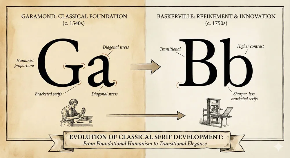
Garamond vs. Baskerville: Classical Restraint vs. Refined Innovation
Baskerville, designed in the eighteenth century, refined and innovated upon classical principles while maintaining restraint and elegance. Garamond, the earlier Renaissance typeface, established the classical foundation that Baskerville subsequently refined.
These represent different eras of classical typography development—Garamond establishing the foundation, Baskerville refining and innovating within that tradition.
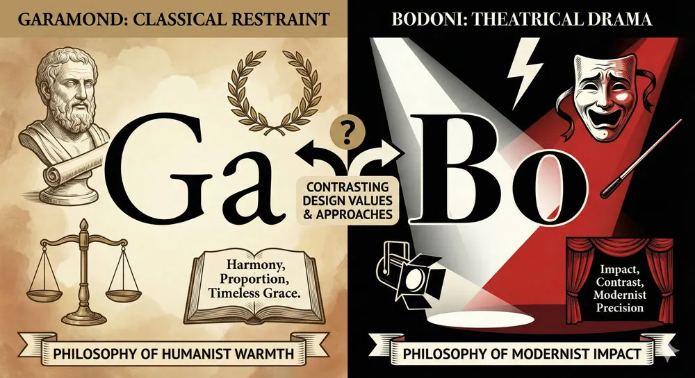
Garamond vs. Bodoni: Classical Restraint vs. Theatrical Drama
Bodoni, designed contemporaneously with the development of modern Garamond interpretations, pursued theatrical elegance and extreme contrast. Garamond maintains classical restraint and balanced proportions.
These represent different philosophical approaches to serif typeface design—Garamond emphasizing restrained classical elegance, Bodoni emphasizing theatrical drama.
Garamond vs. Modern Interpretations
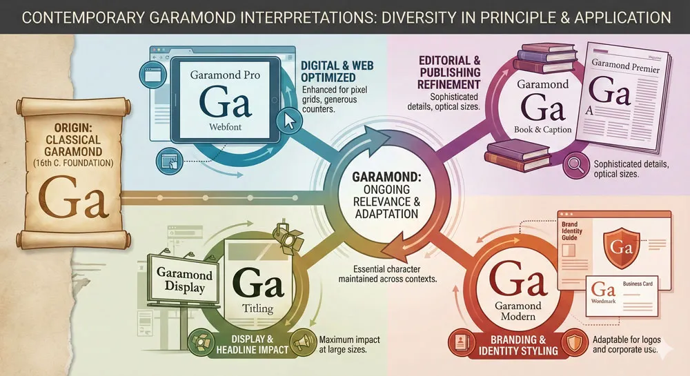
Contemporary Garamond interpretations—such as those by Adobe, Monotype, and other foundries—represent different interpretations of Garamond’s principles.
These contemporary versions have adapted Garamond for digital use while attempting to preserve the essential character and proportions of the original design.
The variety of Garamond interpretations reflects the typeface’s enduring influence and the ongoing relevance of Garamond’s principles.
Related Topics:
- Legibility vs. Readability – Typography Fundamentals
- Ampersand & Interrobang – Symbol Histories
- Typography
Garamond in Contemporary Design: Timeless Relevance and Classical Authority
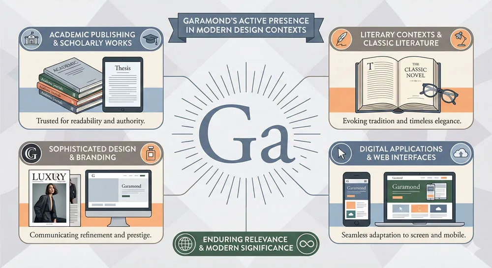
Academic and Literary Publishing
Garamond remains extensively used in academic publishing and literary contexts. The typeface appears in important scholarly works, in prestigious publications, in literary books.
Using Garamond in these contexts communicates respect for classical traditions and commitment to typographic excellence.
Design Contexts Valuing Classical Principles
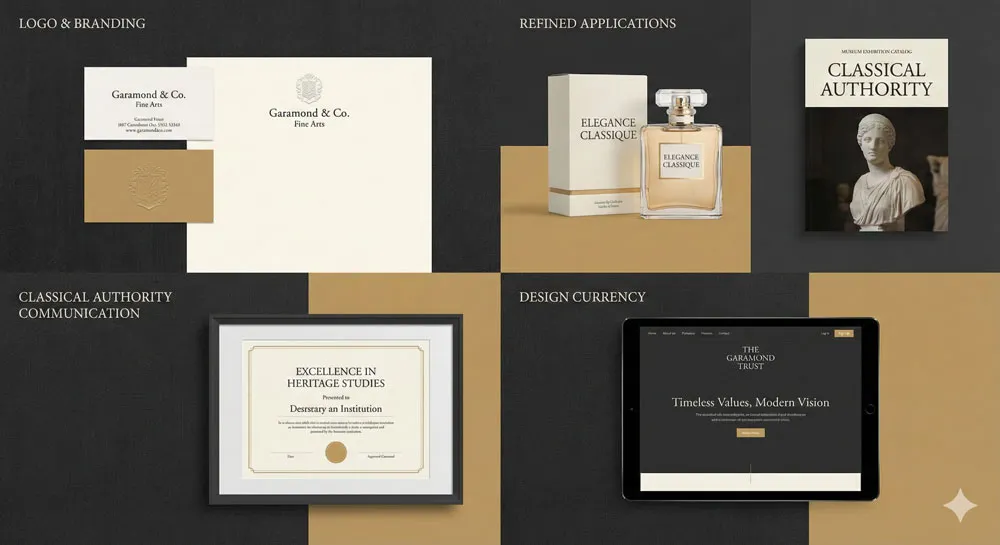
Contemporary designers select Garamond when they want to communicate classical elegance, design understanding, and typographic refinement. Garamond appears in logo design, in branding, in sophisticated design contexts where classical authority is desired.
Digital Adaptation and Screen Usage
Garamond has been successfully adapted for digital and screen contexts. The typeface appears in digital publishing, in web design, in contemporary digital media. The transition to digital has been relatively successful because Garamond’s design is based on enduring principles rather than specific technological requirements.
Related Topics:
- The Psychology of Typography: Font Influence
- Helvetica Effect: One Font Conquered Global Design
- Comic Sans: True Story Behind the World’s Most Hated Font
The Philosophy of Classical Design and Enduring Principles
Classical Principles as Foundation
Garamond’s endurance across five centuries suggests that classical principles represent fundamental truths about beautiful and functional design. The proportions that were studied and refined during the Renaissance remain relevant and beautiful in contemporary design.
This raises important questions about design philosophy: Are there fundamental principles that transcend fashion and historical moments? Can classical study yield design wisdom that remains relevant across centuries?
The Balance Between Tradition and Innovation
Garamond represents a productive balance between respecting classical traditions and pursuing contemporary innovation. Garamond studied classical principles while creating new, contemporary typefaces. This combination of classical learning and contemporary innovation created something enduring.
Design Excellence and Timeless Relevance
Garamond demonstrates that design excellence based on fundamental principles achieves enduring relevance. The typeface remains beautiful and appropriate not because it is fashionable, but because it is based on sound design principles.
This suggests that excellent design requires understanding fundamental principles rather than chasing fashion.
Related Topics:
- Gotham: Font That Won an Election And Changed Design Forever
- Futura: The Geometric Vision of Paul Renner
- Gill Sans: Eric Gill’s Humanist Masterpiece
FAQ: Common Questions About Garamond
Q: Who designed Garamond and when?
A: Claude Garamond, a French punch-cutter and type designer, created Garamond typefaces beginning in the early sixteenth century. Garamond died in 1561, but his typefaces continued to be used and refined by subsequent designers.
Q: What makes Garamond distinctive?
A: Garamond is distinctive for its classical proportions based on Roman letterforms, refined elegant serifs, readable generous letterforms, and timeless quality. The typeface represents a perfect balance of classical elegance and practical functionality.
Q: How long has Garamond been in use?
A: Garamond has been in continuous use for over five hundred years—from its creation in the sixteenth century to contemporary design. This extraordinary longevity demonstrates the enduring value of Garamond’s design.
Q: Is Garamond still used in contemporary design?
A: Yes. Garamond remains one of the most widely-used serif typefaces. The typeface appears in academic publishing, literary contexts, sophisticated design applications, and anywhere classical elegance is valued.
Q: What does Garamond communicate psychologically?
A: Garamond communicates classical elegance, timeless quality, design understanding, respect for typography traditions, and refined sophistication. The typeface is associated with literary culture and design excellence.
Q: Can I use Garamond in my design project?
A: Garamond is available in numerous digital forms from multiple foundries. Whether to use Garamond depends on your design context. Garamond is particularly appropriate for academic publishing, literary contexts, and sophisticated design applications where classical authority is desired.
Q: Are there different versions of Garamond?
A: Yes. Multiple foundries have created their own interpretations of Garamond. Different versions emphasize different aspects of Garamond’s original design. Popular versions include Adobe Garamond, Monotype Garamond, and many others.
Q: What influenced Claude Garamond’s design?
A: Garamond was influenced by classical Roman letterforms, Renaissance humanism, careful observation of historical letterforms, and commitment to functional beauty. Garamond studied classical proportions and applied them to contemporary typeface design.
Q: Why has Garamond endured for five hundred years?
A: Garamond has endured because it is based on classical principles that transcend fashion, because it is exceptionally readable and functional, and because it possesses timeless elegance. The typeface’s excellence ensures its continued relevance.
Q: Is Garamond better than other serif typefaces?
A: This is subjective and context-dependent. Garamond, Baskerville, Bodoni, and other serif typefaces are each excellent in their own ways. Garamond’s particular combination of classical elegance, readability, and timeless quality makes it appropriate for many contexts, particularly academic and literary applications.
Related Topics:
- Baskerville: Elegant Serif That Shaped Print Typography
- Bodoni Font: Serif That Defined Luxury Typography
Conclusion: The Enduring Legacy of Classical Excellence and Timeless Design
Claude Garamond and his typefaces represent something profound about design: the power of classical principles to achieve enduring relevance. Five hundred years after their creation, Garamond typefaces remain beautiful, readable, and appropriate.
The typeface has influenced virtually every subsequent serif typeface and remains a model for excellent typography.
Garamond’s five-century journey demonstrates that excellent design based on fundamental principles transcends fashion and historical moments.
The classical proportions that Garamond studied in Roman inscriptions have proven their value through centuries of use. The typeface continues to be appropriate because it is based on enduring principles rather than transient fashions.
Garamond also represents a particular approach to design: systematic study of principles, careful refinement through practical use, and commitment to functional beauty.
This approach—studying foundational principles and applying them with care—remains relevant to contemporary design practice.
In an era when design fashion changes rapidly and new typefaces are constantly created, Garamond stands as a testament to the enduring power of excellence.
Garamond proves that design based on fundamental principles, refined through careful observation, and committed to functional beauty achieves something lasting. The typeface remains relevant not because it is fashionable but because it is fundamentally excellent.
About the Author
Lalit M. S. Adhikari is a Digital Nomad and Educator since 2009 in design education, graphic design and animation. He’s taught 500+ students and created 200+ educational articles on design topics. His teaching approach emphasizes clarity, practical application and helping learners.
Learn more about Lalit Adhikari.
This guide is regularly updated with the latest information about Adobe tools and design best practices. Last Updated: Mar 2026


