Discover Garamond’s revolutionary approach to classical serif typography, its enduring influence on Western design, and the timeless principles that make it a foundational typeface.
My name is Lalit Adhikari and we are at LTY. Let’s begin!
Table of Contents
Introduction: The Typeface of Civilizational Foundation
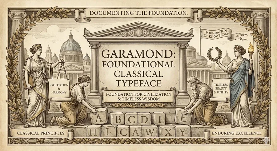
Few typefaces possess foundational significance comparable to Garamond. Designed by Claude Garamond in sixteenth century, Garamond represents culmination of classical typographic principles and foundation of Western serif typography.
The typeface embodies wisdom accumulated through centuries of typographic evolution and establishes principles governing serif design into contemporary era.
Garamond emerged during transformative period in typography and printing. The fifteenth and sixteenth centuries saw typography evolving from mechanical reproduction of manuscript forms to distinctive artistic medium. Garamond synthesized centuries of typographic evolution into coherent, elegant typeface.
The typeface is “classical” in most profound sense: embodying principles of enduring validity applicable across centuries and contexts. Garamond’s proportions reflect classical architectural principles. The typeface’s forms reference classical letterforms yet express contemporary sensibility.
Claude Garamond was master printer and type designer who elevated typography to art form. Garamond developed reputation for typographic excellence and meticulous craftsmanship. His typefaces were sought by printers throughout Europe.
Garamond represents something profoundly important: that typeface design need not chase novelty or pursue contemporaneity to achieve excellence. Garamond’s enduring influence emerges precisely because the typeface embodies timeless principles rather than temporal fashion.
The typeface’s classical foundation makes it ideal for contexts valuing tradition, authority, and established wisdom. Legal documents, academic publishing, classical literature—all gravitate toward Garamond’s classical sensibility.
Yet Garamond also demonstrates that classical principles remain contemporary. The typeface appears in contemporary design contexts alongside modern typefaces. Garamond’s timelessness emerges from fundamental excellence rather than fashionable trends.
This comprehensive exploration examines Claude Garamond’s design philosophy and historical significance, traces Garamond typeface’s classical characteristics, analyses the typeface’s foundational influence on serif design, explores classical principles embodied in Garamond, considers the typeface’s contemporary relevance, and ultimately asks:
- What does Garamond reveal about classical principles, typographic foundation, and enduring design excellence?
Related Topics:
Claude Garamond: Master Printer and Classical Scholar
Renaissance Learning and Classical Training
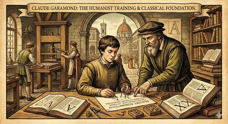
Claude Garamond was born during Renaissance, era emphasizing classical learning and humanist principles. Garamond’s design philosophy reflected Renaissance emphasis on classical wisdom and proportion.
Garamond’s training in classical forms shaped his typographic approach. The typeface reflects classical letterform traditions and Renaissance humanist values.
Typographic Excellence and Craftsmanship

Garamond devoted career to achieving typographic excellence and mechanical perfection. Every aspect of typeface design received meticulous attention.
Garamond’s reputation for excellence attracted wealthy patrons and discerning printers throughout Europe. His typefaces were prized possessions indicating printer’s commitment to quality.
Synthesis of Typographic Evolution
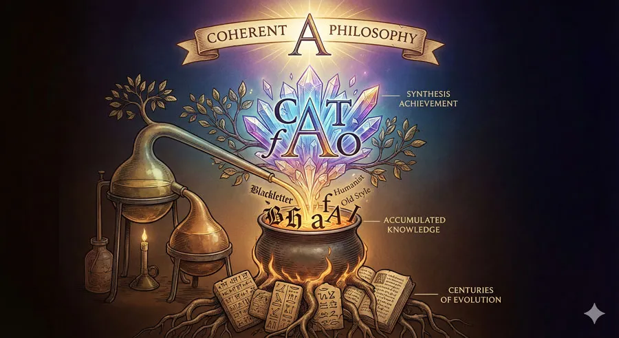
Garamond synthesized centuries of typographic evolution into coherent design philosophy. The typeface incorporated best practices from generations of type designers.
This synthesis created typeface embodying accumulated typographic wisdom.
Classical Proportion and Mathematical Foundation
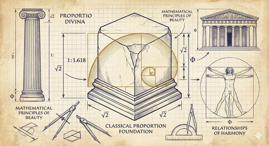
Garamond grounded typeface design in classical proportion and mathematical principles. The typeface reflects understanding of classical architecture and proportion.
This mathematical foundation gives typeface enduring harmony and proportion.
Related Topics:
Garamond Typeface: Classical Foundation and Design Principles
Classical Letterform Foundation
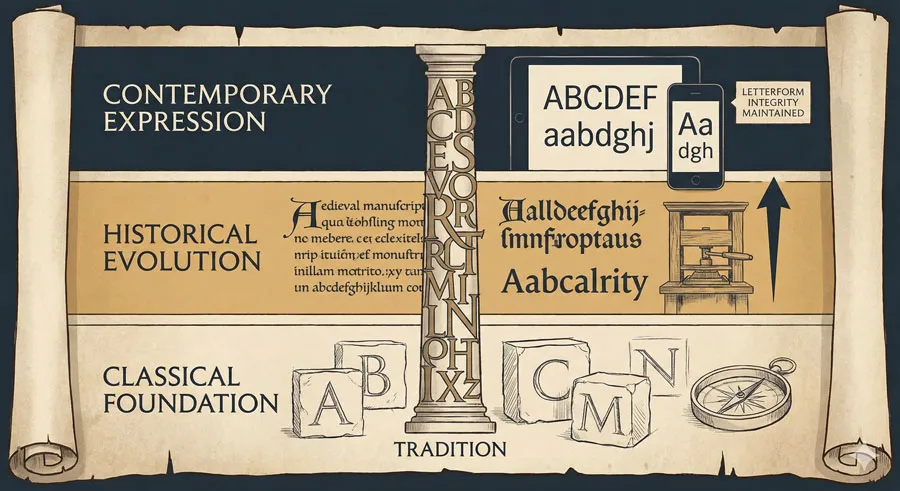
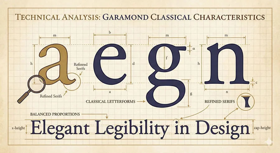
Garamond’s letterforms derive from classical letterform traditions spanning centuries. The typeface respects historical letterform evolution while expressing contemporary sensibility.
This classical foundation gives typeface legitimacy and historical grounding.
Balanced Proportion and Harmony
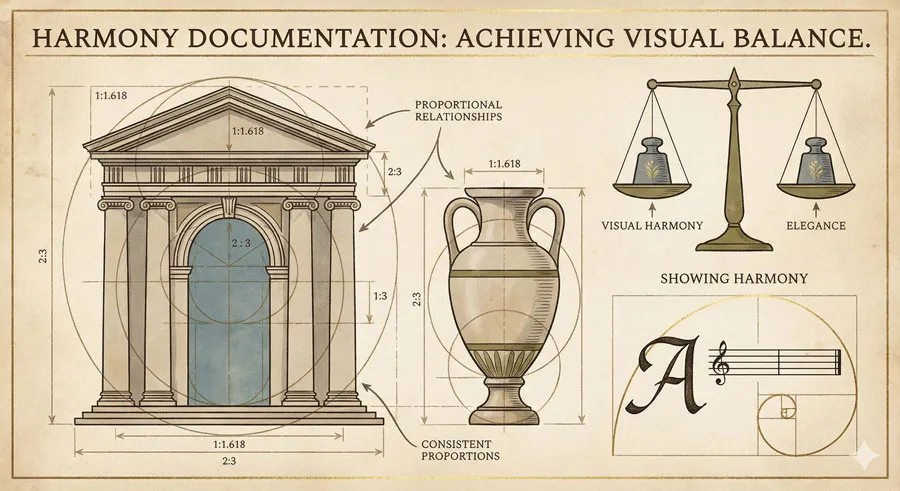
Garamond features carefully balanced proportions creating visual harmony and elegance. The typeface maintains consistent proportional relationships across letterforms.
This harmony contributes to typeface’s visual beauty and enduring appeal.
Refined Serifs and Classical Details
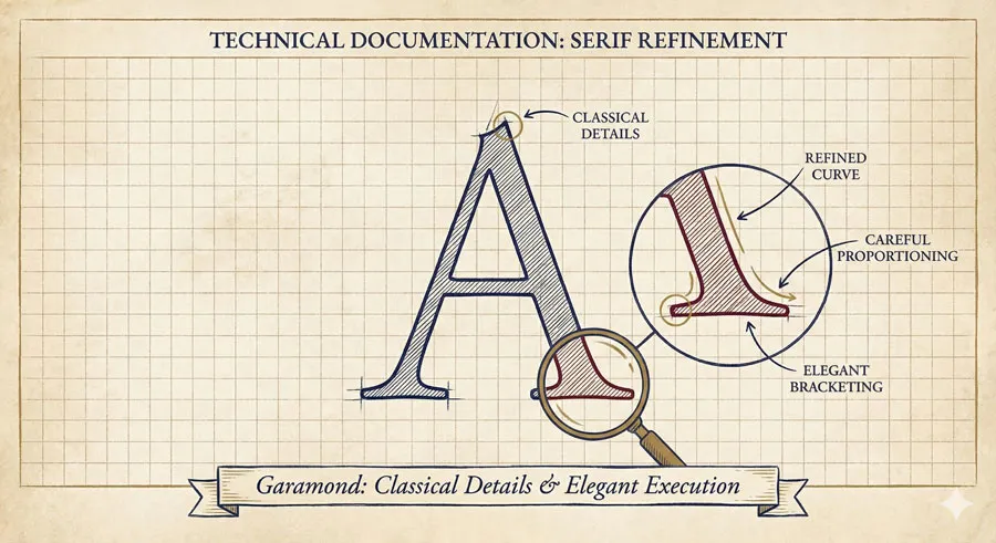
Garamond features refined serifs reflecting classical sensibility. Every serif is carefully proportioned and elegantly executed.
The refined details express commitment to excellence and classical values.
Elegant Legibility and Practical Utility
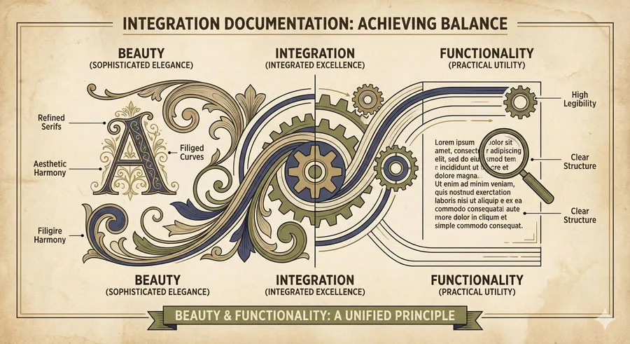
Despite sophisticated elegance, Garamond remains highly legible and practical. The typeface serves communication needs effectively while maintaining aesthetic excellence.
This integration of beauty and functionality represents Garamond’s genius.
Related Topics:
Foundational Influence on Serif Typeface Design
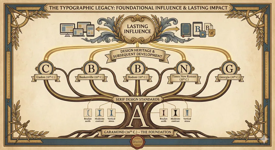
Establishment of Serif Design Standards
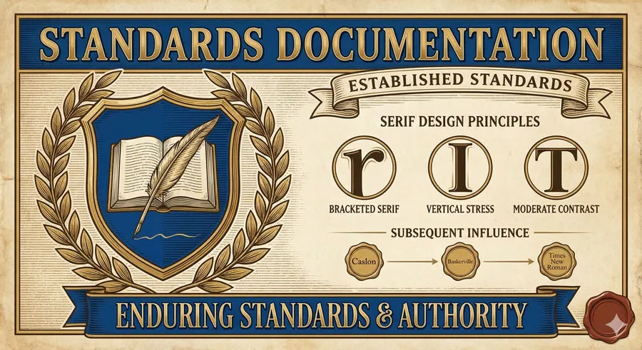
Garamond established standards for serif typeface design that remained influential for centuries. Subsequent serif designers built upon Garamond’s foundational work.
Garamond’s influence extends across multiple design eras and contexts.
Humanist Values in Typeface Design
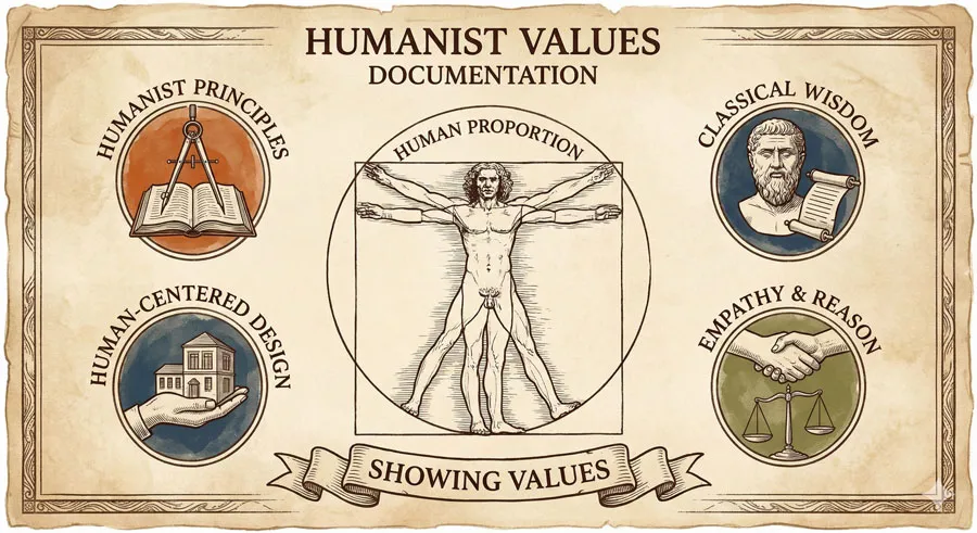
Garamond embedded humanist values into typeface design. The typeface expresses Renaissance commitment to human-centered design and classical proportion.
These humanist values remain relevant to contemporary humanist design movements.
Foundation for Subsequent Serif Evolution
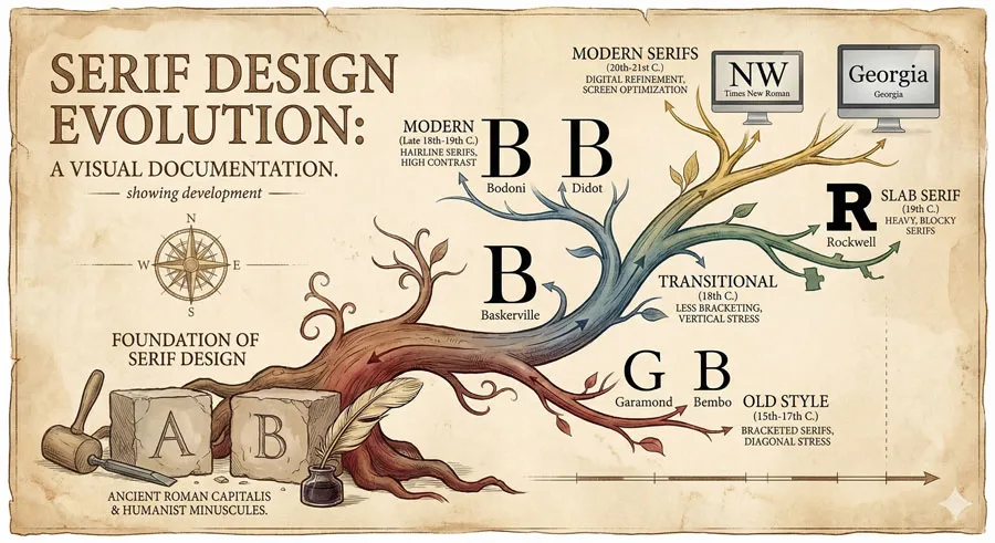
Later serif typefaces—including Baskerville, Bodoni, and modern serifs—built upon Garamond’s foundational work. Garamond established principles governing serif design.
Understanding Garamond is essential to understanding serif typeface history.
Continuous Influence and Contemporary Relevance
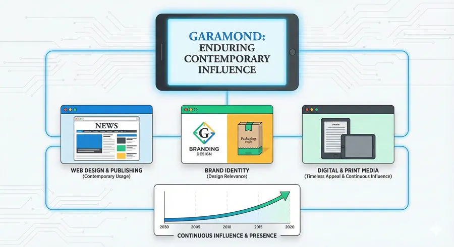
Garamond’s influence remains current despite centuries passing since original design. Contemporary designers continue valuing Garamond’s classical principles and foundational work.
The typeface remains relevant across diverse contemporary contexts.
Related Topics:
Classical Principles Embodied in Garamond
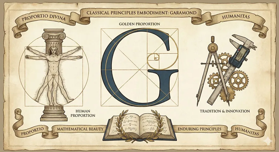
Golden Proportion and Mathematical Beauty
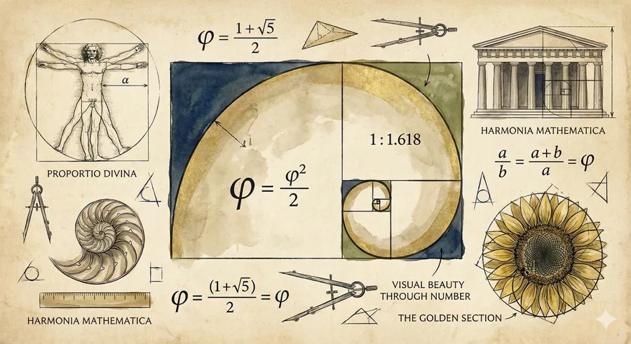
Garamond incorporates golden proportion and mathematical principles creating visual harmony. The typeface demonstrates that mathematical beauty can serve practical communication.
These principles contribute to typeface’s enduring aesthetic appeal.
Balance Between Tradition and Innovation
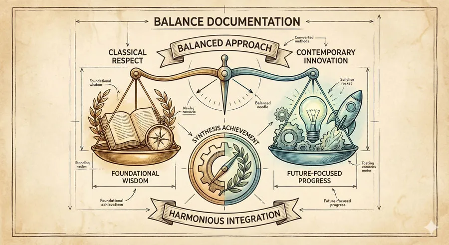
Garamond balances respect for classical tradition with contemporary innovation. The typeface is neither purely historical nor trendy.
This balance creates design possessing both classical authority and contemporary relevance.
Human Proportion and Classical Aesthetics
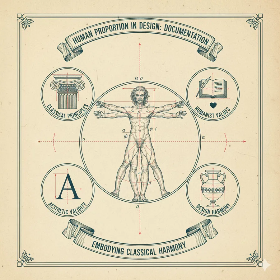
Garamond incorporates human proportion reflecting classical Greek and Roman principles. The typeface’s forms relate to human body proportions.
This classical grounding gives typeface profound aesthetic validity.
Enduring Principles Over Temporal Fashion
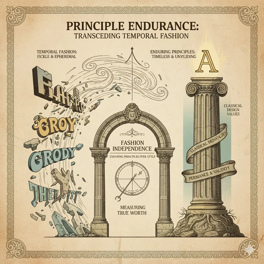
Garamond demonstrates that typeface excellence can transcend temporal fashion. The typeface remains beautiful despite centuries of design evolution and changing fashions.
Garamond proves that classical principles possess enduring validity.
Related Topics:
Contemporary Applications and Authority
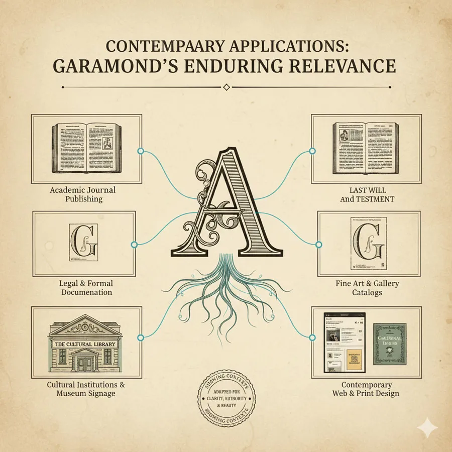
Academic and Legal Publishing
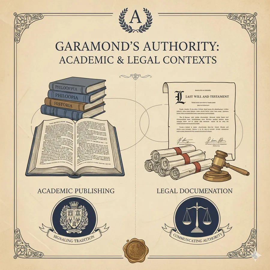
Garamond remains preferred typeface for academic publishing, legal documents, and formal contexts. The typeface’s classical authority suits these contexts.
Garamond communicates tradition, authority, and established wisdom.
Fine Art and Cultural Publishing
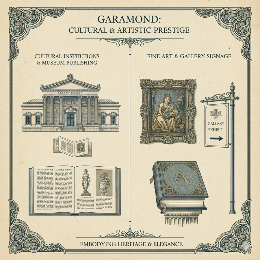
Museums, galleries, and cultural institutions adopt Garamond for publications and signage. The typeface’s refined elegance suits cultural prestige contexts.
Garamond appears in finest cultural and artistic contexts.
Classical Literature and Historical Publishing
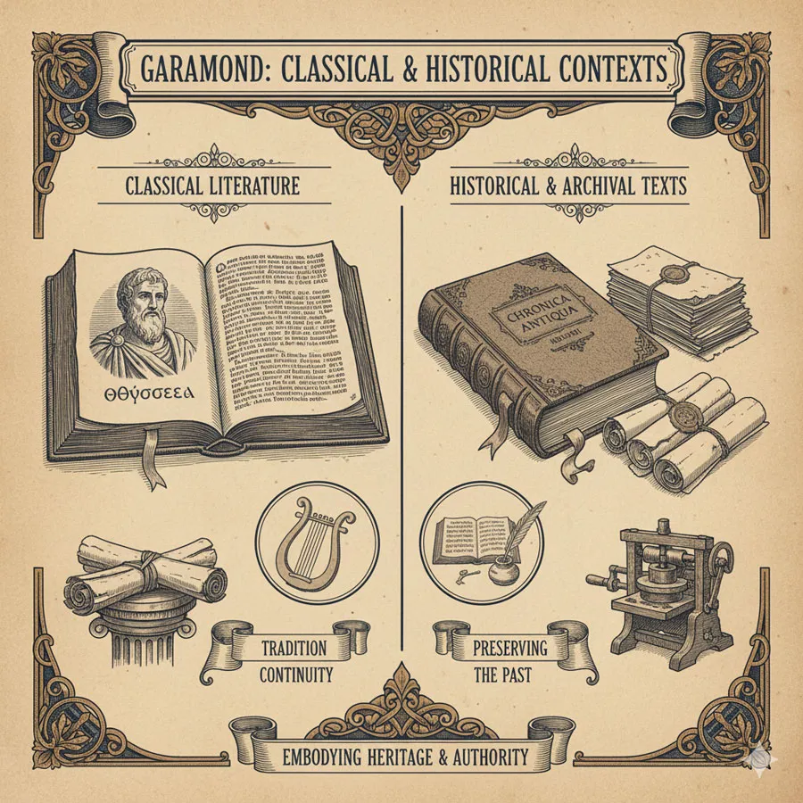
Classical literature, historical texts, and archival publishing favor Garamond. The typeface’s historical legitimacy suits these contexts.
Garamond creates visual continuity with typographic tradition.
Contemporary Design and Balanced Elegance
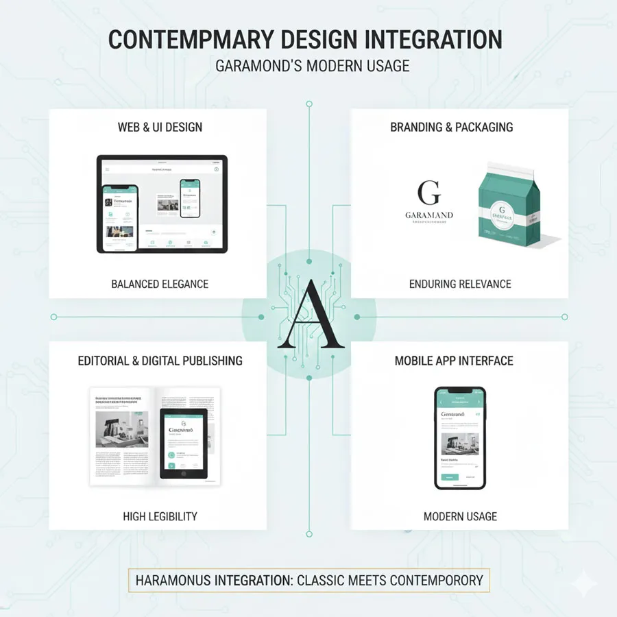
Contemporary designers adopt Garamond not for nostalgia but for enduring excellence. The typeface’s fundamental quality makes it contemporary despite classical origins.
Garamond demonstrates that classical design remains contemporary.
Related Topics:
The Enduring Appeal of Classical Principles
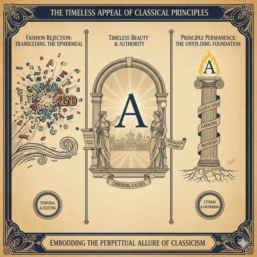
Rejection of Temporal Fashion in Design
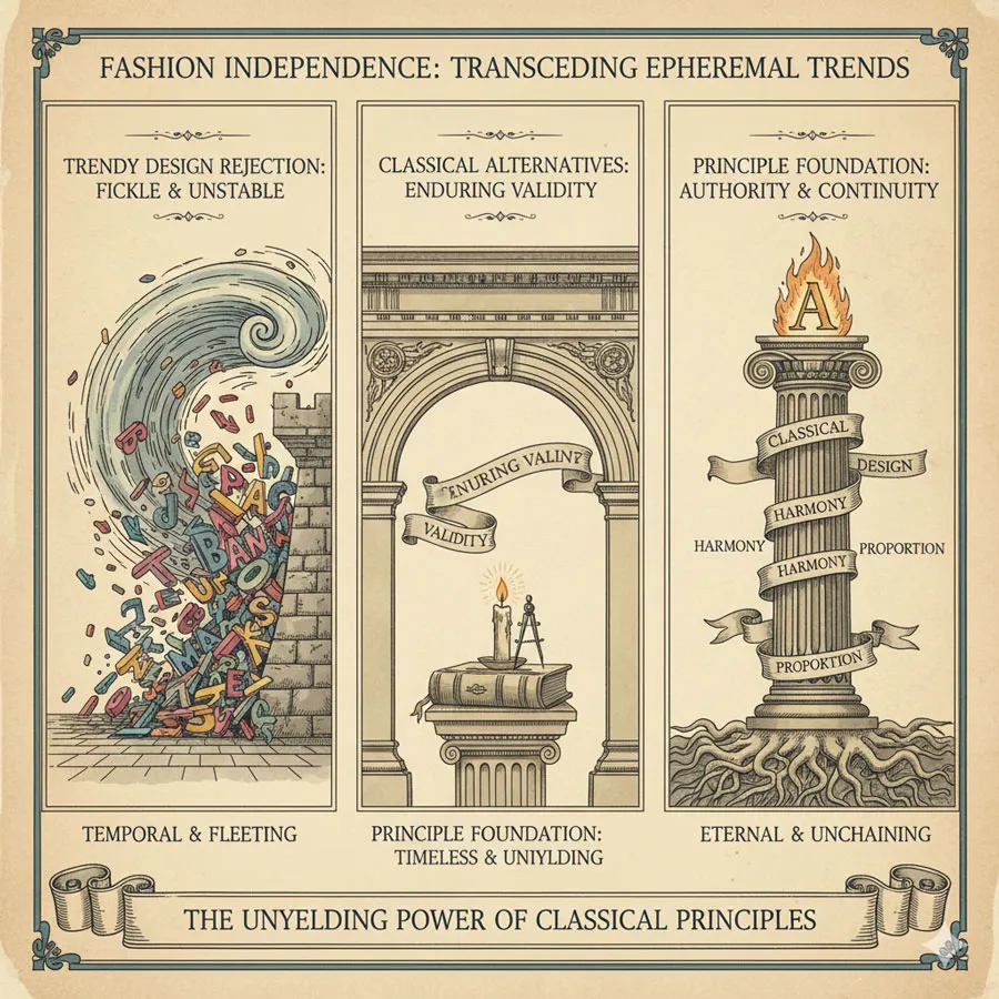
Contemporary designers increasingly reject purely trendy approaches in favor of designs possessing enduring validity. Garamond represents alternative to fashion-driven design.
Classical principles provide foundation for enduring design excellence.
Timeless Beauty and Proportion
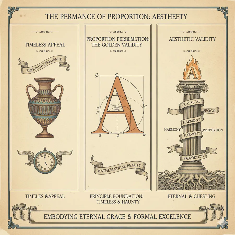
Garamond’s appeal emerges from timeless beauty and proportion rather than temporal fashion. The typeface remains beautiful across centuries and contexts.
This timelessness suggests something profound about design principles.
Authority and Tradition Communication
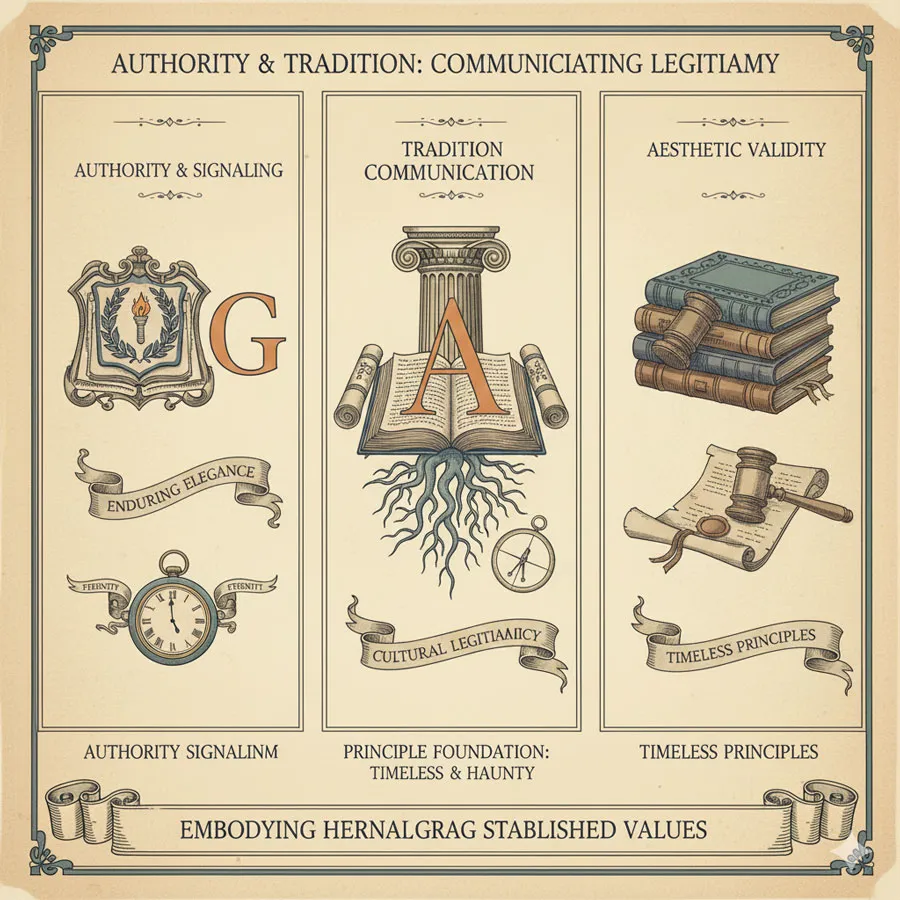
Garamond communicates authority and connection to established tradition. Contemporary audiences recognize classical design’s association with wisdom and legitimacy.
Classical design possesses cultural power beyond aesthetic appeal.
Foundation for Design Excellence
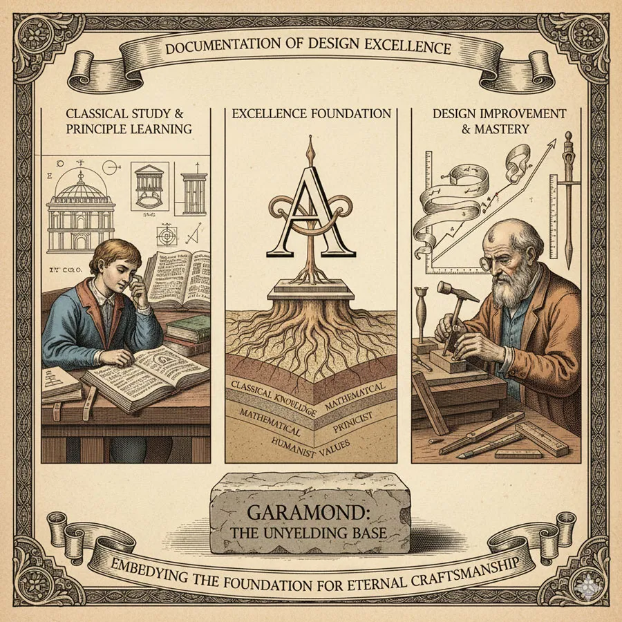
Garamond demonstrates that design excellence emerges from studying classical principles and foundational wisdom. Contemporary designers can learn from classical approaches.
Classical design study strengthens contemporary design practice.
Related Topics:
FAQ: Common Questions About Garamond
Q: Is Garamond outdated?
A: No. Garamond remains contemporary and widely used. The typeface’s classical principles transcend temporal fashion.
Q: Why does Garamond convey authority?
A: Garamond’s classical proportions, historical significance, and widespread use in authoritative contexts create associations with authority and tradition.
Q: How does Garamond differ from other classical serifs?
A: Garamond’s particular proportions, refined details, and historical significance distinguish it from other classical serifs. The typeface possesses distinctive character within classical tradition.
Q: Should contemporary designers use Garamond?
A: Yes. Garamond remains excellent choice for diverse applications. The typeface’s enduring quality makes it contemporary despite classical origins.
Q: What makes Garamond classical?
A: Garamond’s classical foundation emerges from classical letterform traditions, proportion principles, and humanist design values reflecting Renaissance thought.
Q: Is Garamond appropriate for contemporary branding?
A: Yes. Contemporary brands successfully use Garamond for contexts valuing tradition, authority, and refined quality. However, context determines appropriateness.
Q: Does Garamond work for body text?
A: Yes. Garamond excels for body text applications. The typeface combines elegance with exceptional legibility and readability.
Q: How does Garamond compare to contemporary sans-serifs?
A: Garamond offers classical serif elegance while contemporary sans-serifs offer modern geometric clarity. Different typefaces suit different contexts.
Q: What is Garamond’s legacy?
A: Garamond’s legacy includes establishing foundational serif principles, demonstrating enduring power of classical design, and inspiring centuries of subsequent typeface design.
Q: Why study Garamond?
A: Studying Garamond teaches fundamental principles of serif design, classical proportion, and integration of beauty and functionality—lessons applicable to contemporary design.
Related Topics:
Conclusion: Classical Foundation and Enduring Excellence
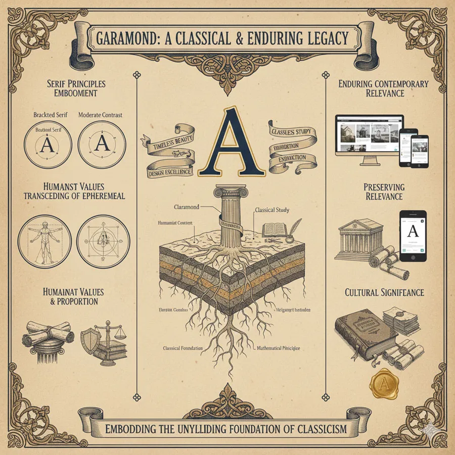
Garamond represents classical foundation of Western serif typography: typeface embodying principles of enduring validity and timeless beauty. Claude Garamond’s synthesis of classical principles and practical utility created typeface of lasting influence.
Garamond’s enduring relevance emerges not from novelty or fashionable trends but from fundamental excellence and classical principles. The typeface remains beautiful and functional across centuries precisely because it embodies principles transcending temporal fashion.
The typeface’s classical foundation makes it ideal for contexts valuing authority, tradition, and refined quality. Yet Garamond also demonstrates that classical design remains contemporary—that timeless principles possess lasting validity.
Garamond’s influence on serif typeface design remains profound. Subsequent serif designers built upon Garamond’s foundational work. Understanding Garamond is essential to understanding serif typography history.
The typeface also demonstrates importance of classical learning and humanist principles in design. Garamond’s design philosophy reflected Renaissance commitment to classical wisdom and human-centered proportion.
Contemporary design culture increasingly recognizes value of classical principles and enduring excellence. As fashion-driven design trends cycle rapidly, classical design possessing enduring validity becomes increasingly valuable.
Garamond represents design approach emphasizing substance over trend, principle over fashion, enduring validity over temporal relevance. This approach creates designs possessing lasting significance.
Understanding Garamond means understanding that design excellence can emerge from classical principles and accumulated wisdom. Great design need not pursue novelty or contemporary fashion; great design can emerge from studying classical foundations and establishing enduring principles.
Garamond’s story is ultimately story about the power of classical principles and the enduring validity of design based on proportion, harmony, and human-centered values. The typeface proves that fundamental excellence transcends temporal fashion and remains relevant across centuries.
Related Topics:
About the Author
Lalit M. S. Adhikari is a Digital Nomad and Educator since 2009 in design education, graphic design and animation. He’s taught 500+ students and created 200+ educational articles on design topics. His teaching approach emphasizes clarity, practical application and helping learners.
Learn more about Lalit Adhikari.
This guide is regularly updated with the latest information about Adobe tools and design best practices. Last Updated: Mar 2026
Related Topics:


