Master typography terminology and type anatomy. Learn letterform parts: serifs, stems, bowls, counters, ascenders, descenders, baselines and more.
Table of Contents
Why Terminology Matters: Building Your Typographic Vocabulary
Understanding typography fundamentals includes learning its terminology—the shared language that allows designers to communicate precisely about type.
Basic typographic terminology is constant across mediums, building mutual connections from one medium to another. A serif is always a serif, whether you’re working in digital, print, or environmental design.
Knowing the parts that comprise typographic practice aids both type selection and use. Best expression comes with intimate knowledge of essential elements including characters, measures, and styles.
When you can precisely name and describe typographic components, you gain control over your design choices. You move from intuitive design to intentional design.
Many typographic terms originated during metal typesetting days when typographers and printers set lead type slugs (cast-metal sorts) by hand to form words, lines, and paragraphs.
These terms shaped much of the terminology we use today to describe type anatomy and measure. Understanding this historical context helps you appreciate why certain terms exist and what they truly mean.
The Parts of Type: A Complete Anatomical Guide
Every letterform, regardless of typeface, shares common anatomical parts. Let’s explore the essential components:
- The Foundational Lines:
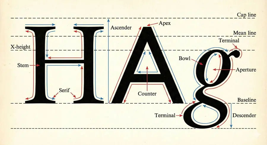
The baseline is the imaginary line on which letterforms, words, lines, and paragraphs sit. It’s your reference point for all vertical measurement. The x-height is the distance from baseline to the top of a lowercase letter like ‘x’—it measures lowercase letterform height minus ascenders and descenders.
The mean line (or mid-line) marks the height of lowercase letterforms minus ascenders and descenders. The cap line marks the height of uppercase letterforms. The ascender line marks the highest point of ascending letterforms like ‘b’, ‘d’, ‘f’, ‘h’, ‘k’, and ‘l’. The descender line marks the lowest point of descenders in letters like ‘g’, ‘j’, ‘p’, ‘q’, and ‘y’.
- Critical Letterform Components:
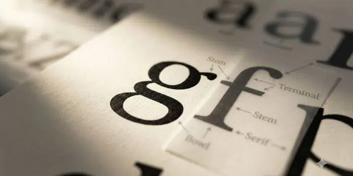
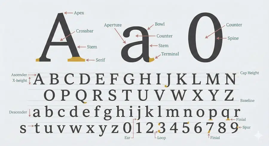
A stem is the primary vertical stroke of a letterform. Serifs are small finishing details at the start and end of strokes—they come in many varieties including reflexive, transitive, bilateral, unilateral, abrupt, and adnate.
An arm is a short horizontal or vertical stroke attached to another on one end, as seen in E, F, and L. A bowl is the curved stroke that encloses counter space, as in ‘a’, ‘b’, ‘g’, and ‘p’.
The counter (or counterform) is the enclosed white space in characters like ‘b’, ‘d’, and ‘o’. An aperture is the partially enclosed white space in letters like ‘C’, ‘S’, ‘n’, and ‘e’.
A crossbar is the horizontal bar that connects two strokes, crosses stems, or bisects stems. The terminal is the curved or straight end of finishing strokes—terminal styles include ball, beak, and teardrop (lachrymal).
Other important components include the ascender (the part of lowercase letters that rises above x-height), the descender (the part that falls below the baseline), the apex (the top point where two strokes meet), the crotch (the acute inside point where two strokes meet), the finial (a curved and tapered finishing stroke), and the swash (an embellished stroke that creates decorative letterforms).
Understanding Glyphs vs. Characters
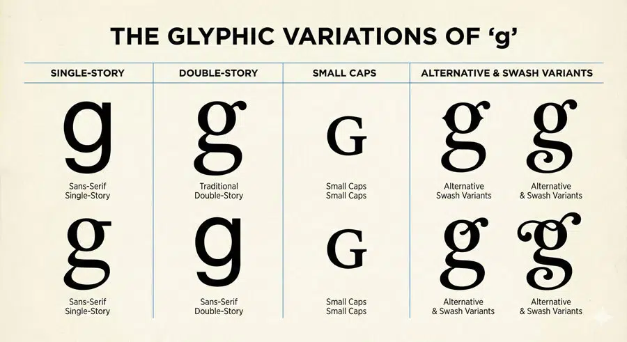
A character is a typographic element such as a letterform, numeral, or punctuation mark. A glyph is a specific visual representation of a character.
This distinction matters because many typefaces contain multiple glyphs per character—alternative versions that add flexibility and richness to typography.
For example, the lowercase ‘g’ character can have multiple glyphs: a single-story ‘g’ (with a single closed counter), a double-story ‘g’ (with a bowl plus loop), and small cap ‘G’. These variations are called “alternates” or “alternate characters.”
The term “diacritic” refers to accent marks—auxiliary marks that combine with letterforms to create new characters. The acute accent mark (´) combined with ‘e’ creates the character ‘é’. These diacritical marks are glyphs on their own but create new characters when combined with letterforms.
Point Size, x-Height and Optical Sizing
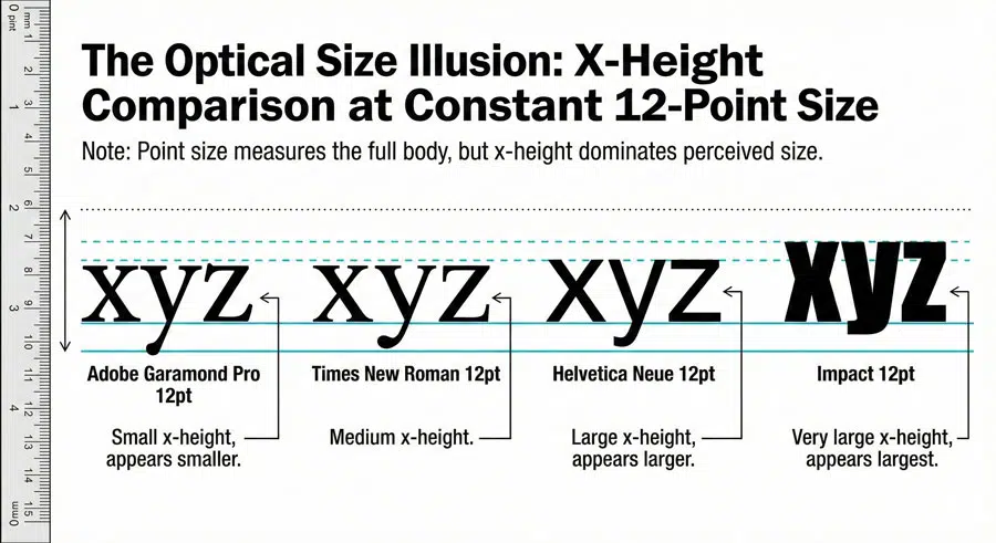
Understanding point size is crucial for consistent typography. Point size refers to the body size of a character—not its appearing size. This distinction is critical. Typefaces that share matching point sizes do not always have the same optical size.
A typeface with a tall x-height (the distance from baseline to the mean line) will look noticeably larger than a typeface with a small x-height, even at the same point size.
Body size is the area a character inhabits plus the white space surrounding it. Body height equals point size. The term originated in metal typesetting days when lead-type blocks called slugs contained characters.
Appearing size refers to optical size—the perceived character size. This is why optical sensitivity is so important in typography. What looks correct visually often stands true, while what a ruler might tell you can be misleading.
Measure, Contrast and Stress
Measure refers to line length and is typically expressed in picas. A pica equals 12 points and measures approximately 0.166 inches. Understanding measure is essential for readability—both too-short and too-long lines impair reading comprehension.
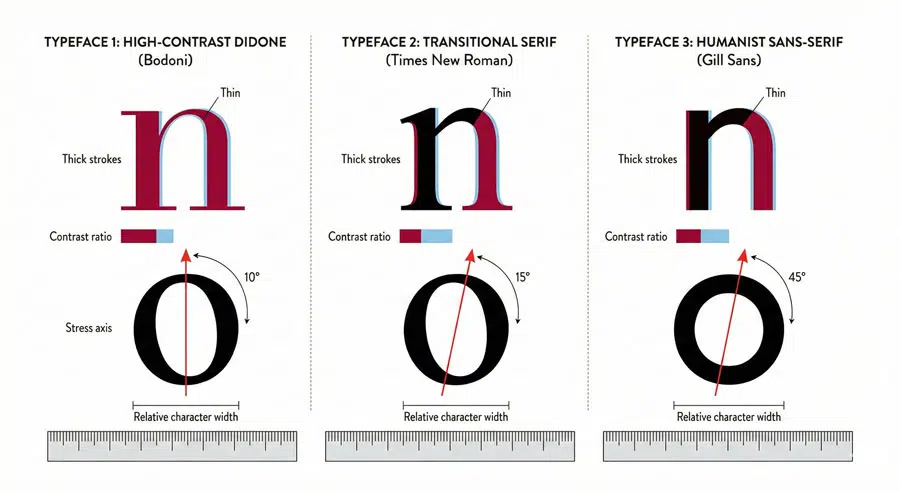
Contrast refers to the relationship between thick and thin strokes in a letterform. Serif typefaces such as Bodoni and Didot feature high thick-to-thin stroke contrast.
Sans serif typefaces such as Trade Gothic and Univers feature low to uniform thick-to-thin stroke contrast. This contrast is a key characteristic that distinguishes typeface categories and influences their personality and readability.
Stress refers to the invisible axis that bisects character tops and bottoms at the thinnest points. Orientation can be oblique or vertical, and stress is detectable using the lowercase ‘o’ as a guide.
Humanist typefaces often have oblique stress (reflecting handwriting influences), while modern typefaces typically feature vertical stress (reflecting mechanical construction).
Serifs and Sans Serifs: The Fundamental Divide
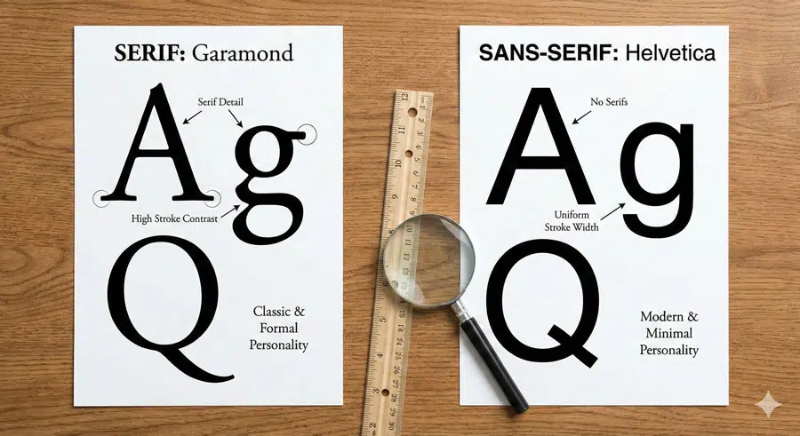
A serif is a small finishing detail at the start and end of strokes. Serif typefaces include Humanist, Old Style, Transitional, Modern, and Slab categories, each with distinct characteristics that reflect historical development and design philosophy.
Sans serif literally means “without serifs.” Sans serif typefaces feature very low to uniform thick-to-thin stroke contrast. Categories include Grotesque, Geometric, Humanist, and Transitional. The first known sans serif typeface appeared in 1816, designed by William Caslon IV. The term “sans serif” was coined roughly twenty years later by Vincent Figgins.
The choice between serif and sans serif is one of the most fundamental decisions a designer makes. For centuries, serif typefaces dominated body text; more recently, sans serifs have become equally prominent for both display and body text applications.
Conclusion: Mastery Through Understanding

Learning typography anatomy and terminology is an investment that pays dividends throughout your design career. When you can precisely name the parts of letterforms and understand their relationships, you gain the ability to make intentional, informed design choices. You move beyond trial-and-error design to strategic, purposeful design.
About the Author
Lalit M. S. Adhikari is a Digital Nomad and Educator since 2009 in design education, graphic design and animation. He’s taught 500+ students and created 200+ educational articles on design topics. His teaching approach emphasizes clarity, practical application and helping learners.
Learn more about Lalit Adhikari.
This guide is regularly updated with the latest information about Adobe tools and design best practices. Last Updated: Mar 2026


