Explore Bodoni’s revolutionary high-contrast serif design, its association with prestige and luxury branding, and its enduring theatrical appeal in contemporary design.
My name is Lalit Adhikari and we are at LTY. Let’s begin!
Table of Contents
Introduction: The Typeface of Theatrical Prestige
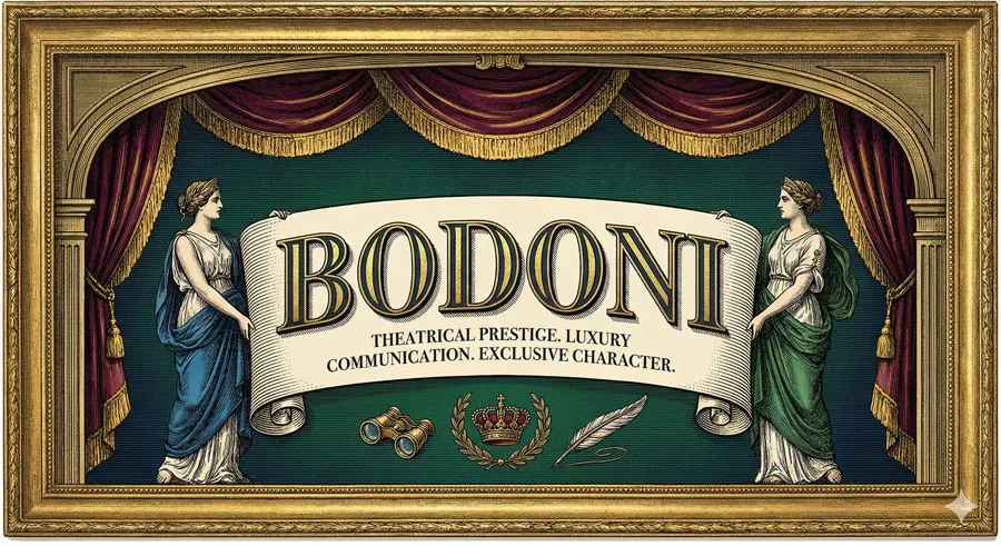
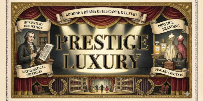
Bodoni represents theatrical elegance and prestige like no other typeface. Designed by Giambattista Bodoni in late eighteenth century, Bodoni embodies luxury, sophistication, and dramatic visual impact.
The typeface communicates prestige, exclusivity, and refined taste through its distinctive high-contrast design and theatrical character.
Bodoni is typeface of extremes: extreme contrast between thick and thin strokes, extreme elegance, extreme drama. The typeface does not whisper; it commands attention. Bodoni announces presence with theatrical flair.
This theatrical character makes Bodoni ideal for prestige branding, luxury marketing, and high-end design. Brands positioning themselves as luxurious, exclusive, and prestigious adopt Bodoni to communicate these values. The typeface’s dramatic character conveys exclusivity and refinement.
Giambattista Bodoni was visionary printer and type designer who revolutionized typography through relentless innovation. Bodoni pursued excellence with almost obsessive dedication, developing numerous typeface variations and perfecting printing techniques.
Bodoni’s approach differed significantly from typeface designers before him. While most designers refined existing letterforms, Bodoni created revolutionary new forms expressing contemporary aesthetic. Bodoni’s designs were bold, innovative, and unapologetically theatrical.
The typeface’s high-contrast design was revolutionary. Previous serifs maintained relatively moderate stroke contrast. Bodoni dramatically increased contrast, creating visual drama and sophistication.
Bodoni also possesses remarkable versatility. Despite theatrical character, the typeface works effectively for numerous applications. Bodoni appears in luxury fashion, high-end publishing, prestige branding, fine art contexts, and contemporary design.
This comprehensive exploration examines Giambattista Bodoni’s design philosophy and revolutionary approach, traces Bodoni typeface’s distinctive characteristics, analyses the typeface’s association with prestige and luxury, explores theatrical qualities and visual drama, considers Bodoni’s contemporary relevance, and ultimately asks:
- What does Bodoni reveal about luxury design, prestige communication, and theatrical typography?
Related Topics:
Giambattista Bodoni: Revolutionary Type Designer
Design Innovation and Bold Experimentation
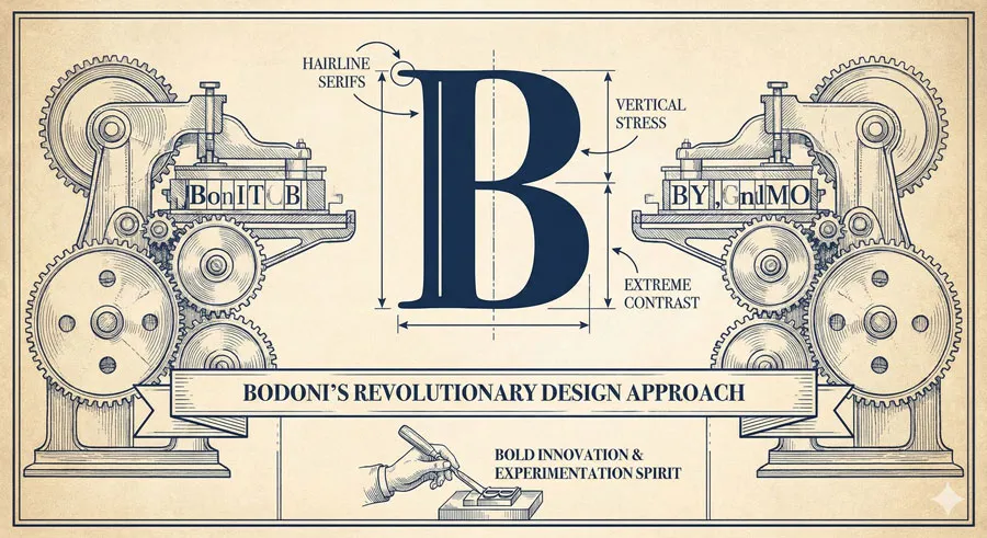
Giambattista Bodoni was born in 1740 and devoted career to typography innovation. Bodoni was not merely designer but visionary pursuing revolutionary new typographic forms.
Bodoni approached typography with revolutionary spirit. He questioned existing conventions and pursued radical new designs. Bodoni believed typography should express contemporary aesthetic rather than merely repeating historical forms.
Prestige and Excellence Pursuit
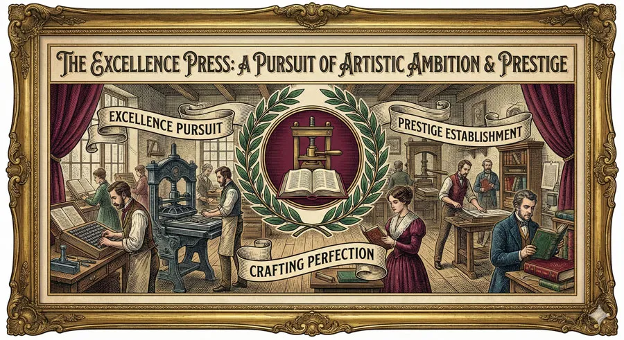
Bodoni established private printing house pursuing typographic excellence and prestige. The foundry was repository of innovation and artistic ambition.
Bodoni attracted wealthy patrons recognizing his artistic vision. His printing and typeface designs achieved status of fine art.
High-Contrast Innovation
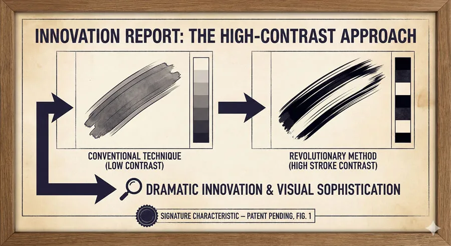
Bodoni dramatically increased stroke contrast compared to previous typefaces. This innovation created typefaces of unprecedented visual drama and sophistication.
The high-contrast approach became signature characteristic of Bodoni designs.
Mathematical Precision and Artistic Vision

Bodoni combined mathematical precision with artistic vision. The typefaces featured carefully calculated proportions and meticulous attention to detail.
This combination of precision and artistry created designs of exceptional quality.
Related Topics:
Bodoni Typeface: High-Contrast Revolutionary Design
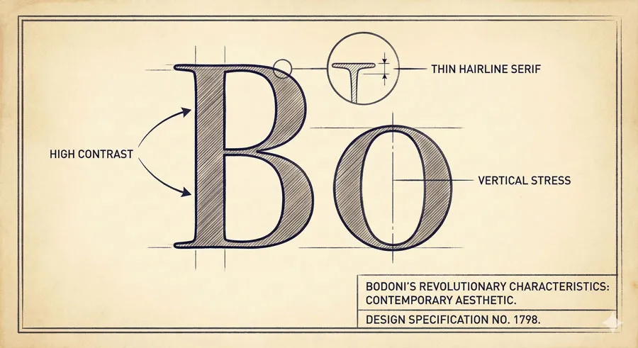
Distinctive Visual Character
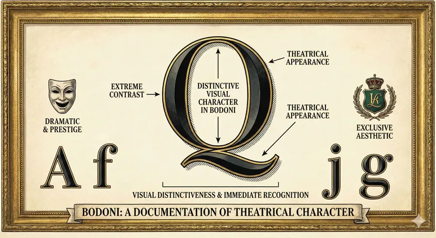
Bodoni features extremely high contrast between thick and thin strokes. This contrast creates dramatic visual appearance emphasizing elegance and sophistication.
The high contrast makes Bodoni visually distinctive and immediately recognizable.
Thin Serifs and Refined Details
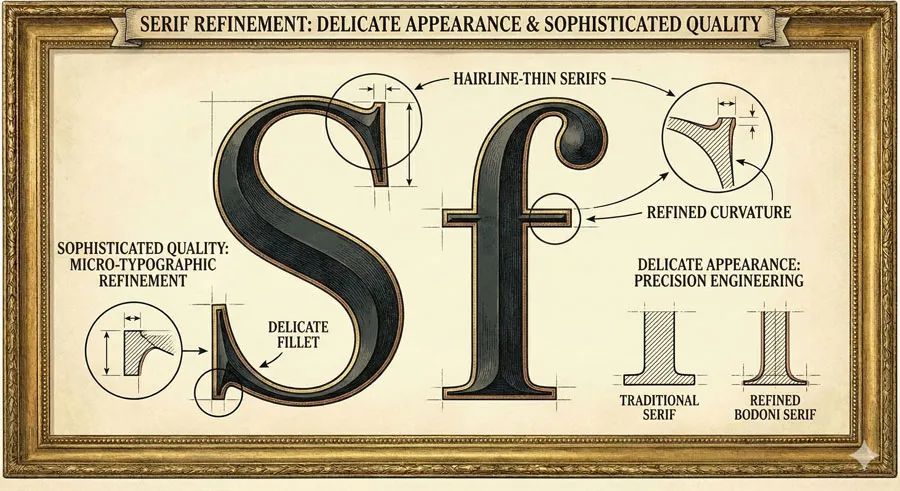
Bodoni features thin, refined serifs creating delicate, sophisticated appearance. The serifs are almost hairline-thin compared to previous serif typefaces.
This refinement creates impression of sophistication and luxury.
Vertical Stress and Contemporary Aesthetic
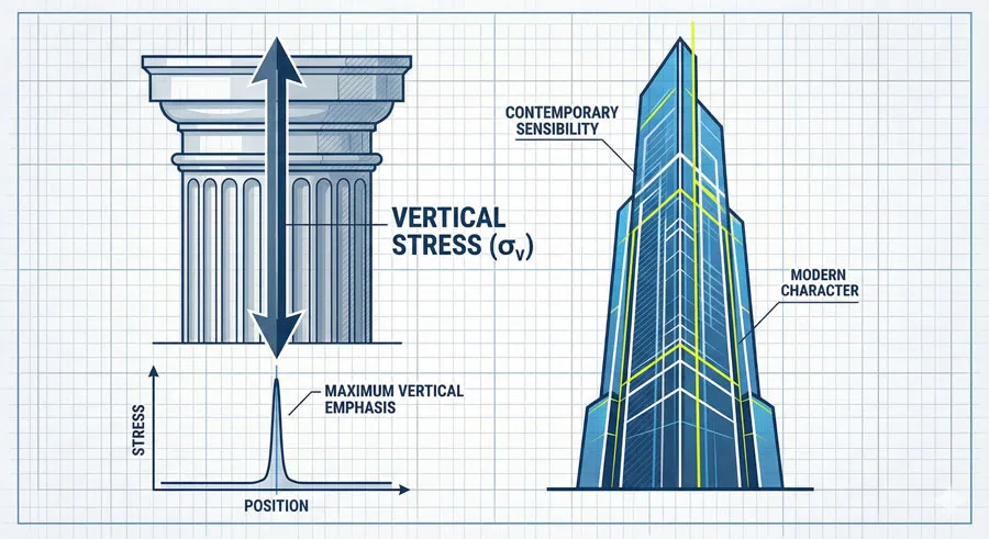
Bodoni features strong vertical stress giving typeface contemporary, almost modern aesthetic. The vertical emphasis creates impression of strength and modernity within classical serif framework.
This modern sensibility differentiates Bodoni from purely classical serifs.
Drama Through Extreme Contrast
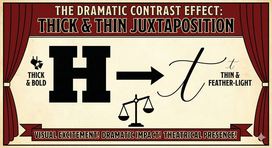
Bodoni achieves theatrical drama through extreme contrast. The juxtaposition of thick and thin strokes creates visual excitement and visual impact.
This dramatic quality makes Bodoni ideal for prestige and luxury applications.
Related Topics:
The Association with Prestige and Luxury
Prestige Branding Communication
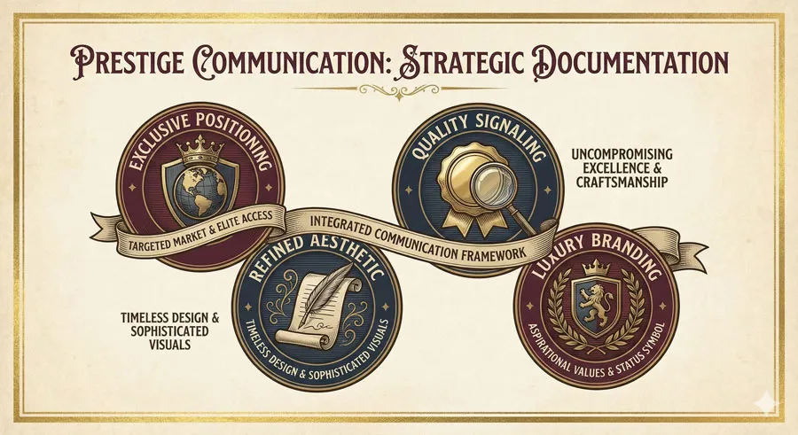
Bodoni is adopted by brands positioning themselves as prestigious and luxurious. The typeface communicates exclusivity and refined taste.
High-end fashion, luxury goods, and prestige services adopt Bodoni to signal quality and exclusivity.
Luxury Fashion and High-End Design
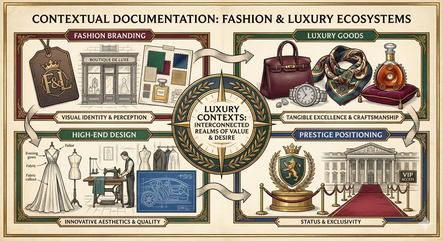
Bodoni appears prominently in luxury fashion branding and high-end design. Fashion houses, jewelry brands, and luxury retailers use Bodoni for its prestige associations.
The typeface’s elegant character aligns with luxury aesthetic values.
Fine Art and Cultural Prestige
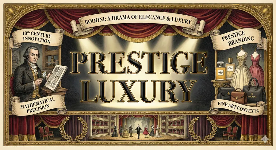
Museums, galleries, and cultural institutions adopt Bodoni for publications and signage. The typeface’s refined elegance suits fine art contexts.
Bodoni communicates cultural sophistication and artistic prestige.
Exclusivity and Refined Taste

Bodoni’s use signals exclusivity and refined taste. The typeface’s distinctive character and theatrical presence announce that design is intentional, sophisticated, and elevated.
Bodoni communicates that brand or design has elevated pretensions and refined sensibilities.
Related Topics:
Theatrical Qualities and Visual Drama
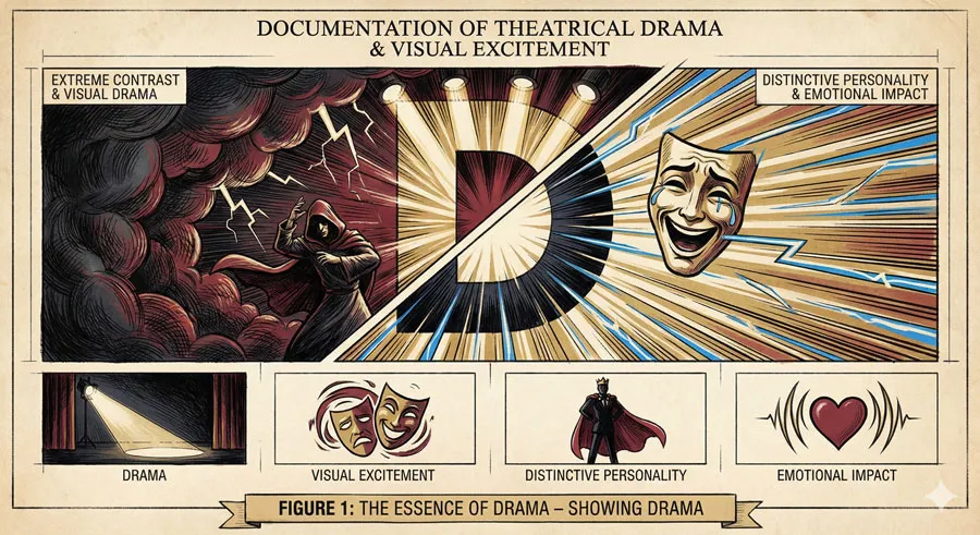
Extreme Contrast and Visual Excitement
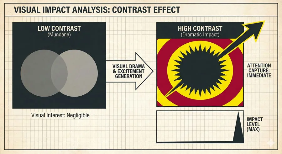
Bodoni’s extreme contrast creates visual drama and excitement. The juxtaposition of thick and thin strokes demands viewer attention and creates visual interest.
The dramatic quality makes Bodoni ideal for capturing attention and creating impact.
Distinctive Personality and Character
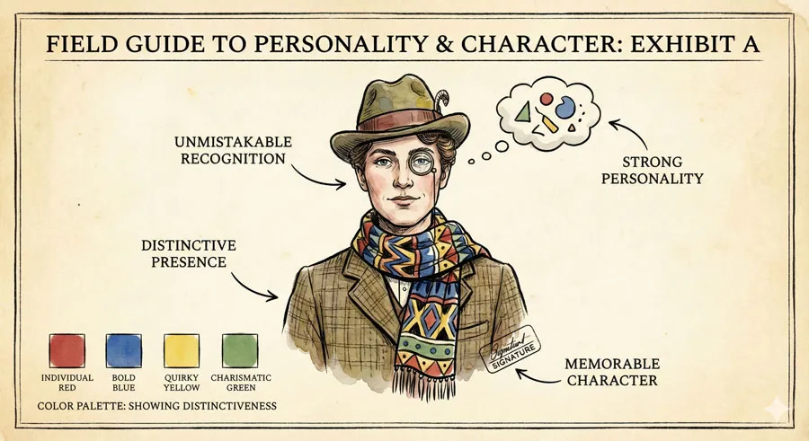
Despite refined elegance, Bodoni possesses strong personality and character. The typeface is unmistakably Bodoni—instantly recognizable despite its classical serif roots.
The distinctive character makes Bodoni memorable and impactful.
Emotional Impact and Sophistication
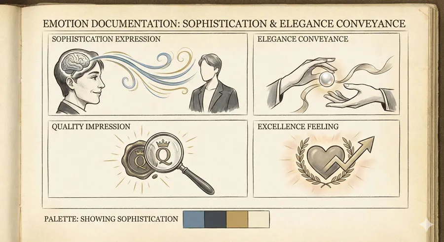
Bodoni conveys sophistication, elegance, and refined sensibility. The typeface creates emotional impression of quality and excellence.
The emotional impact contributes to prestige associations.
Visual Performance in Display Contexts

Bodoni achieves exceptional visual performance in display contexts. The typeface commands attention and creates visual impact at large sizes.
This performance makes Bodoni ideal for headlines, posters, and prominent contexts.
Related Topics:
Bodoni in Contemporary Design
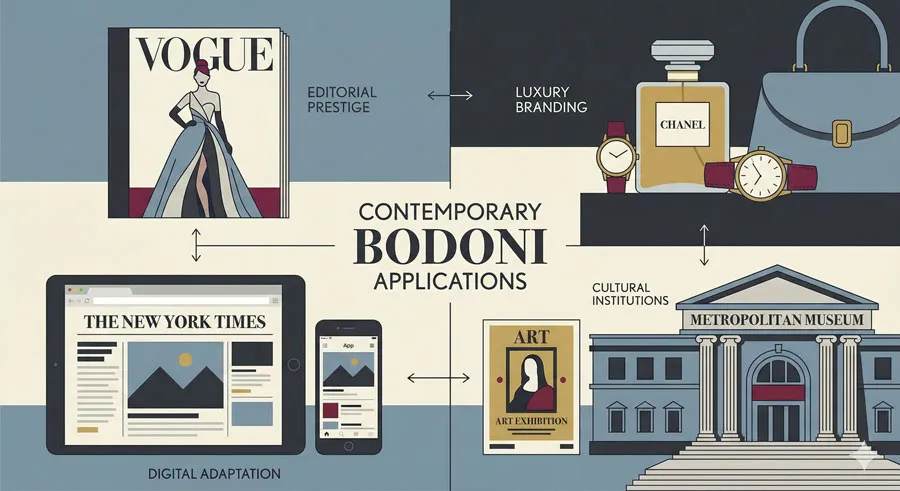
High-End Editorial and Publishing
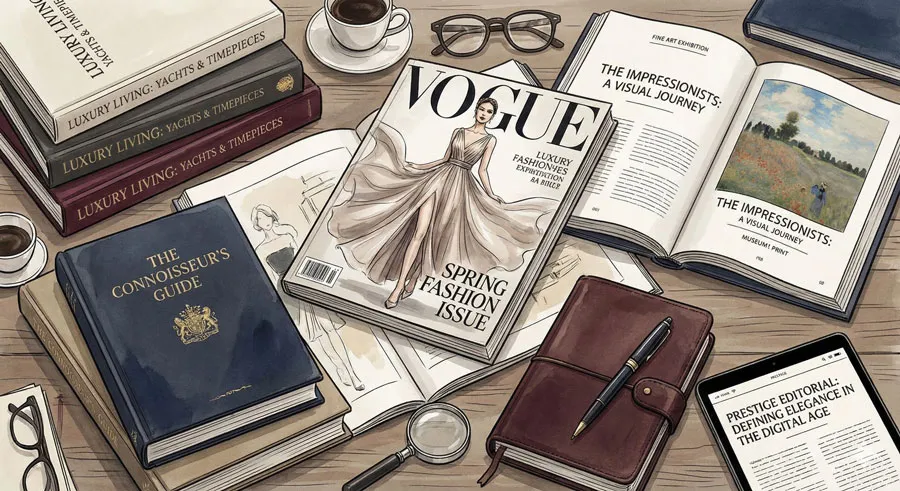
Bodoni remains preferred typeface for luxury magazines, high-end publishing, and prestige editorial contexts. The typeface’s elegance and dramatic presence enhance editorial credibility and prestige.
Fashion magazines, luxury publications, and fine art catalogs adopt Bodoni.
Contemporary Luxury Branding
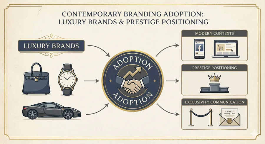
Contemporary luxury brands continue adopting Bodoni recognizing prestige associations. The typeface’s distinctive character communicates quality and exclusivity.
Bodoni remains typeface of choice for prestige positioning.
Digital Adaptation and Web Use

Digital versions of Bodoni enable contemporary applications. Web designers adapt Bodoni for digital contexts seeking prestige aesthetic.
However, Bodoni’s greatest strength remains print and display applications.
Cultural and Artistic Prestige
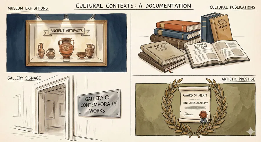
Cultural institutions, museums, and galleries continue using Bodoni for exhibitions, publications, and signage. The typeface’s refined elegance suits fine art and cultural prestige contexts.
Bodoni remains typeface of cultural sophistication.
Related Topics:
The Contemporary Debate: Prestige vs. Pretension
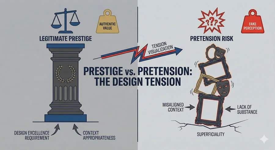
Valid Prestige Communication

Bodoni genuinely communicates prestige and quality. The typeface’s distinctive character and refined elegance legitimately signal elevated design and refined sensibility.
Appropriate Bodoni use genuinely enhances prestige communication.
Risk of Pretension
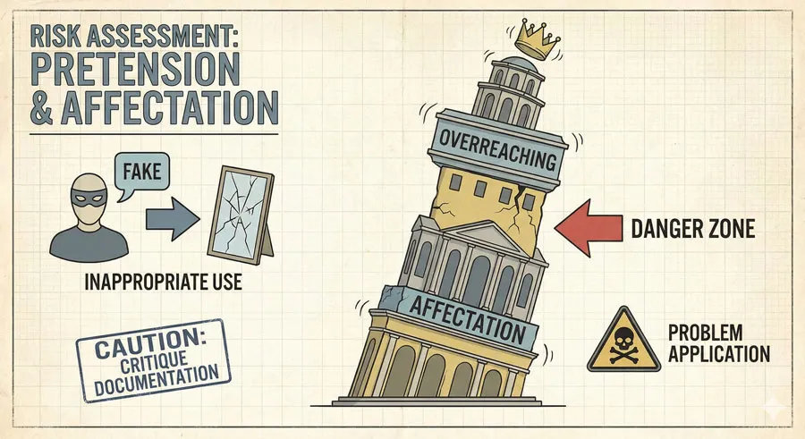
However, Bodoni risks communicating pretension when misapplied. Inappropriate Bodoni use can suggest overreaching, affectation, or attempt to elevate design without substance.
Bodoni’s prestige associations make misuse particularly obvious and damaging.
Context and Appropriateness
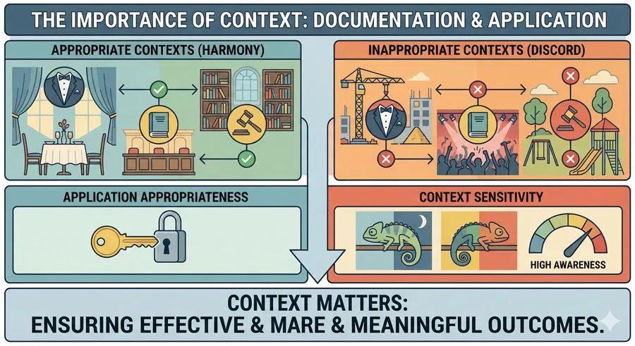
Bodoni success depends on appropriate context and application. Bodoni works beautifully for genuinely prestigious contexts but becomes problematic in inappropriate contexts.
Designers must consider appropriateness carefully when selecting Bodoni.
Design Excellence Requirement
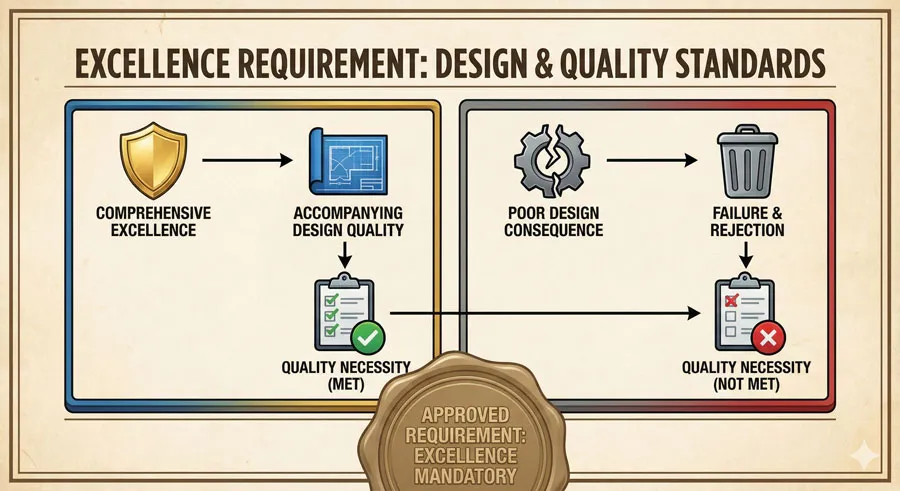
Bodoni demands accompanying design excellence. The typeface’s refined character requires comprehensive design quality and excellence.
Poor design accompanied by Bodoni becomes pretentious and awkward.
Related Topics:
FAQ: Common Questions About Bodoni
Q: Is Bodoni appropriate for body text?
A: Generally not. Bodoni’s high contrast and dramatic character make it less suitable for extended body text. Bodoni excels in display and headline contexts.
Q: Why does Bodoni convey prestige?
A: Bodoni’s high contrast, refined serifs, and distinctive character communicate sophistication and refined taste. These characteristics have become culturally associated with prestige and luxury.
Q: Is Bodoni outdated?
A: No. Bodoni remains contemporary and relevant for prestige and luxury branding. The typeface’s distinctive character remains appealing to contemporary designers.
Q: How does Bodoni compare to other elegant serifs?
A: Bodoni features higher contrast and more dramatic character than most serifs. Other elegant serifs like Garamond feature less contrast and more classical aesthetic.
Q: Can Bodoni be used inappropriately?
A: Yes. Bodoni’s prestige associations make inappropriate use particularly obvious. Poor design paired with Bodoni becomes pretentious and awkward.
Q: Is Bodoni appropriate for contemporary brands?
A: Yes. Contemporary luxury brands successfully use Bodoni recognizing prestige associations. However, application must align with genuine brand positioning.
Q: Why is Bodoni popular in fashion?
A: Fashion industry values sophistication, elegance, and visual impact. Bodoni’s theatrical character and prestige associations make it ideal for luxury fashion branding.
Q: Does Bodoni work for print or digital?
A: Bodoni excels in print and display contexts. Digital adaptation is possible but Bodoni’s greatest strength appears in print applications.
Q: Can Bodoni communicate values other than prestige?
A: Bodoni’s distinctive character can communicate drama, artistry, and contemporary aesthetics beyond prestige. Context determines message.
Q: What is Bodoni’s design legacy?
A: Bodoni’s legacy includes high-contrast serif innovation, association with prestige and luxury, and enduring influence on typeface design and luxury branding.
Related Topics:
Conclusion: Theatre, Prestige, and Timeless Drama
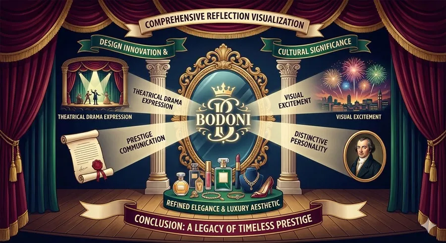
Bodoni represents theater of typography: dramatic, prestigious, visually exciting, and unmistakably theatrical. Giambattista Bodoni’s revolutionary high-contrast design created typeface of unprecedented visual drama and sophistication.
Bodoni’s design legacy extends beyond typeface to establish association between high contrast and prestige, between theatrical character and refined elegance. The typeface established visual language of luxury and exclusivity.
Contemporary luxury brands continue recognizing Bodoni’s prestige value. The typeface remains ideal for communicating exclusivity, refined taste, and elevated positioning.
However, Bodoni’s prestige associations also require appropriate context. Bodoni demands accompanying design excellence and genuine brand positioning to avoid communicating pretension.
The typeface’s theatrical character makes it memorable and impactful. Bodoni commands attention and creates lasting impression through visual drama and distinctive personality.
Bodoni also demonstrates importance of risk-taking and innovation in design. Bodoni’s revolutionary high-contrast approach challenged existing conventions and created new aesthetic possibility.
Contemporary designers continue recognizing Bodoni’s value for prestige contexts. The typeface remains relevant and sought after by brands and designers pursuing luxury positioning and theatrical visual impact.
Bodoni’s enduring appeal suggests something profound about design: that theatrical drama, refined elegance, and prestige communication remain valuable in contemporary contexts. Bodoni proves that distinctive, daring design can achieve lasting cultural significance.
Understanding Bodoni means understanding that typography communicates more than functional information—typography expresses values, identity, and positioning. Bodoni specializes in expressing prestige, exclusivity, and refined aesthetic values.
Related Topics:
About the Author
Lalit M. S. Adhikari is a Digital Nomad and Educator since 2009 in design education, graphic design and animation. He’s taught 500+ students and created 200+ educational articles on design topics. His teaching approach emphasizes clarity, practical application and helping learners.
Learn more about Lalit Adhikari.
This guide is regularly updated with the latest information about Adobe tools and design best practices. Last Updated: Mar 2026
Related Topics:


