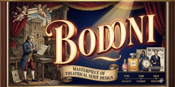
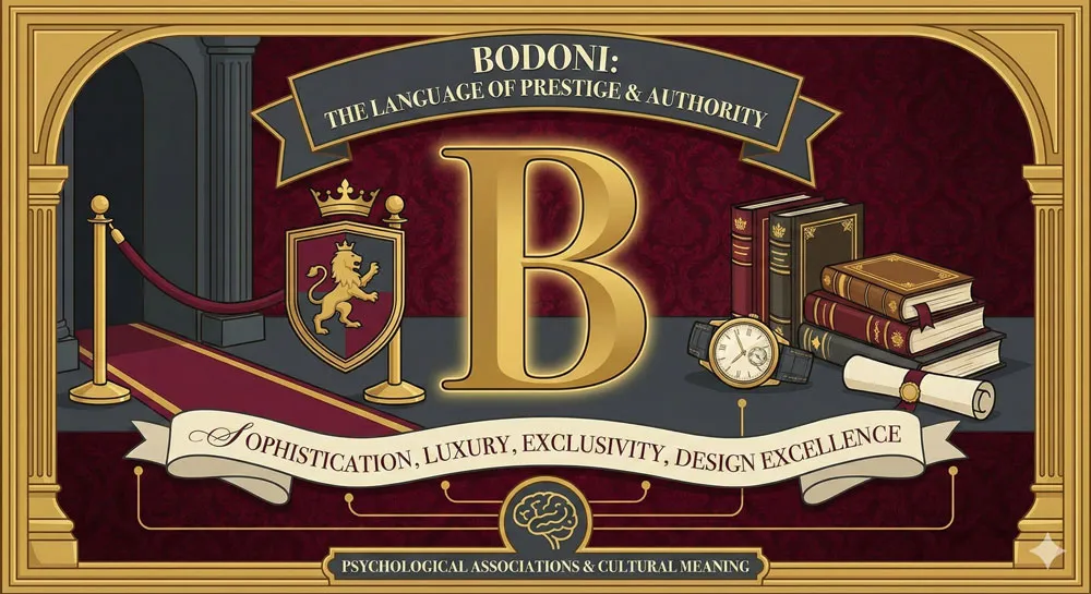
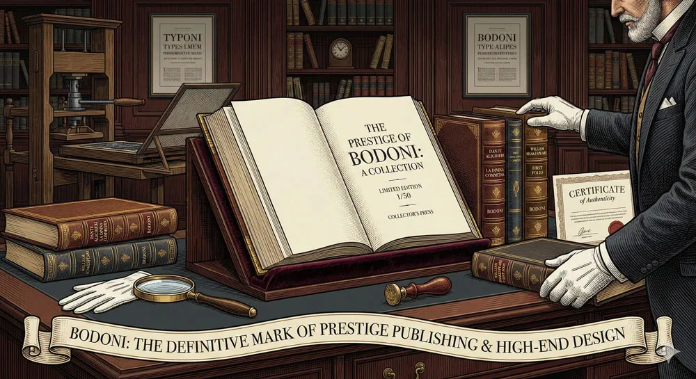
Discover Bodoni’s dramatic design history, Giambattista Bodoni’s printing innovations, and how this theatrical serif typeface became synonymous with prestige, luxury, and design excellence across centuries.
My name is Lalit Adhikari and we are at LTY. Let’s begin!
Table of Contents
Introduction: The Typeface That Became Synonymous with Luxury
In the late eighteenth century, as European printing culture was flourishing and typeface design was becoming increasingly sophisticated, an Italian printer and typographer named Giambattista Bodoni developed a vision of creating typefaces that would embody drama, elegance, and theatrical sophistication.
While other designers like John Baskerville were pursuing refined, restrained elegance, Bodoni pursued something different: a style that was more dramatic, more theatrical, more visually commanding.
The result was Bodoni, a typeface that represents the apex of theatrical serif design. Released progressively throughout Bodoni’s career (with the typeface reaching its mature form in the late eighteenth century), Bodoni represented a radical departure from more conservative serif designs.
The typeface featured extreme contrast between thick and thin strokes, creating dramatic visual impact. The serifs were refined and architectural, suggesting both elegance and authority. The overall character was one of theatrical sophistication—a typeface designed to command attention and communicate prestige.
What distinguishes Bodoni from contemporary designs like Baskerville is its theatrical character. Where Baskerville pursues elegance through refinement and restraint, Bodoni pursues elegance through drama and visual intensity. Bodoni is not shy or subtle. Bodoni announces itself. Bodoni is designed to be noticed, admired, and remembered.
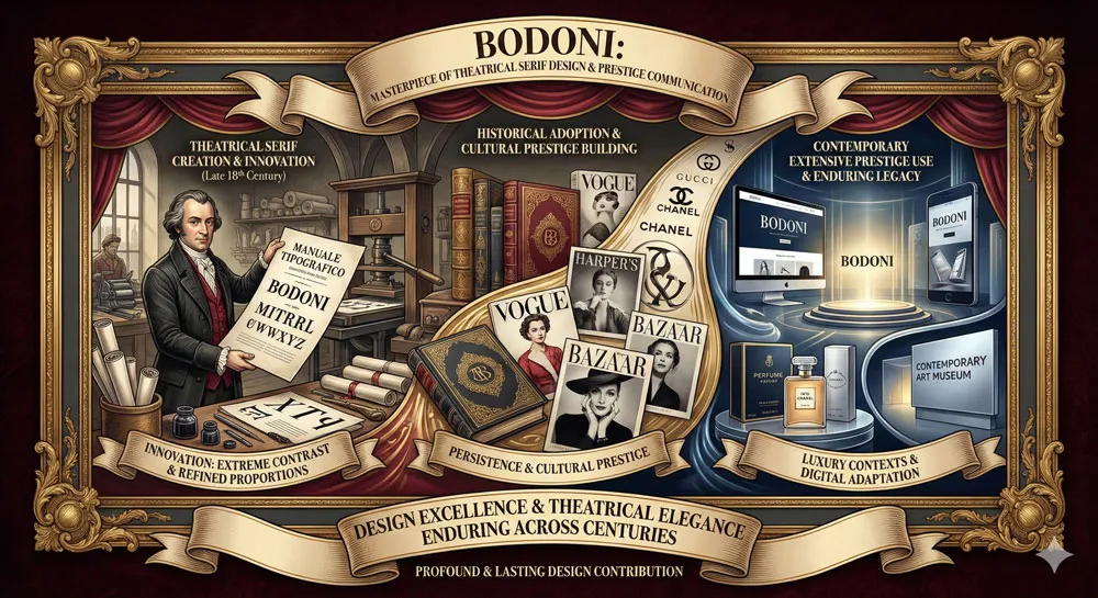
Nearly two and a half centuries after its creation, Bodoni remains one of the most recognizable and culturally significant typefaces in the world. The typeface appears in prestige publishing, in luxury branding, in high-end design contexts.
Bodoni has become synonymous with luxury, prestige, and design excellence. The typeface communicates that an organization or publication is sophisticated, discerning, and committed to excellence.
Yet Bodoni’s story is also a story about the relationship between typeface design and cultural values. Bodoni emerged during the Enlightenment, in a culture that valued artistic innovation, visual spectacle, and the celebration of human creativity.
The typeface embodies these cultural values. In its theatrical character, its extreme contrasts, its visual intensity, Bodoni celebrates the possibilities of design and the power of typography to communicate meaning and emotion.
This comprehensive exploration traces Giambattista Bodoni’s life and design philosophy, examines Bodoni typeface characteristics and theatrical innovations, explores the typeface’s adoption and association with prestige and luxury, analyzes Bodoni’s role in prestige publishing and high-end design, compares Bodoni to other serif typefaces, and ultimately asks:
- what does Bodoni reveal about the relationship between design drama and cultural prestige, between theatrical elegance and refined beauty, between visual intensity and communicative power?
Related Topics:
- Garamond: Timeless Serif That Defined Classical Typography
- The Worst Fonts in the World: A Typographic Hall of Shame
- Gill Sans and Tube: How Johnston and Gill Defined London
Giambattista Bodoni: The Visionary Printer and Type Designer
A Life Devoted to Printing Excellence
Giambattista Bodoni was born in 1740 in Piedmont, northern Italy. He came of age during the Italian Enlightenment, a period of significant cultural and intellectual ferment. Bodoni was trained in the printing tradition and quickly became recognized as an exceptionally talented printer and typographer.
Unlike many printers who were primarily business-focused, Bodoni was an artist and visionary. Bodoni believed that printing could be transformed into a true art form. He believed that typography, page design, and all elements of book production could and should be designed with extraordinary care and sophistication.
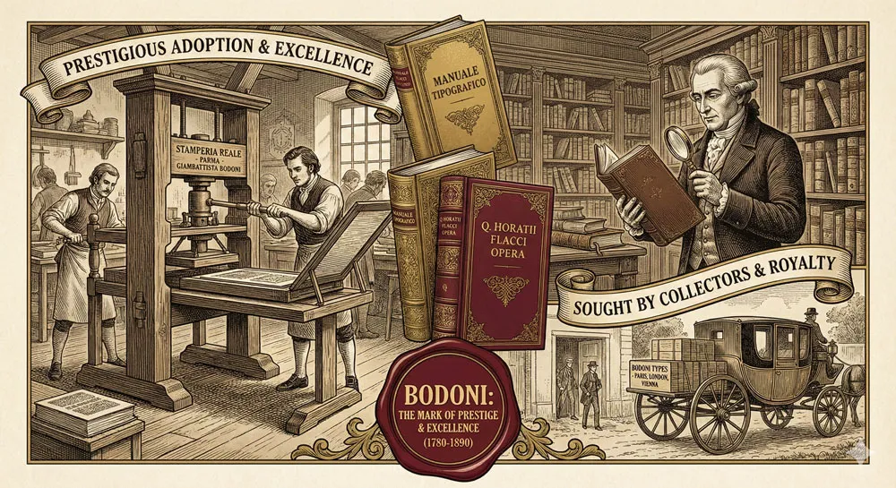
Bodoni established his own printing house and became known for producing extraordinarily beautiful and sophisticated books. His books were sought after by collectors and were recognized as masterpieces of printing and design. Bodoni printed important literary works, scholarly texts, and lavish limited editions. His reputation spread throughout Europe.
Bodoni’s Design Philosophy: Theatrical Elegance and Visual Drama
Central to Giambattista Bodoni’s design philosophy was the belief that elegance could be expressed through drama and visual intensity.
Where some designers believed that elegance required restraint and quiet refinement, Bodoni believed that elegance could be theatrical, visually commanding, and intense.
This theatrical approach distinguished Bodoni from contemporary designers. Bodoni was willing to push proportions to dramatic extremes. Bodoni created high contrast between thick and thin strokes—so extreme that some conservative critics questioned whether such high contrast could actually be legible.
Bodoni designed serifs that were architectural and commanding, suggesting both elegance and authority.
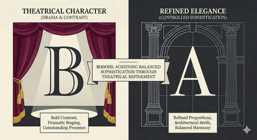
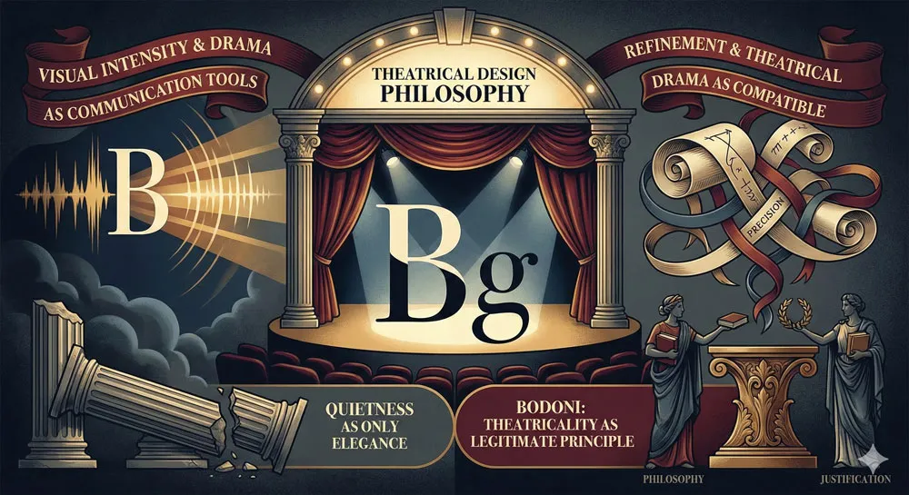
Yet Bodoni’s theatrical approach was not arbitrary or excessive. Rather, Bodoni believed that dramatic contrast and visual intensity could be refined, elegant, and entirely appropriate for communicating prestige and sophistication.
Bodoni proved that theatricality and elegance were not mutually exclusive—that a typeface could be both visually intense and refined, both commanding and beautiful.
Bodoni and Italian Printing Culture
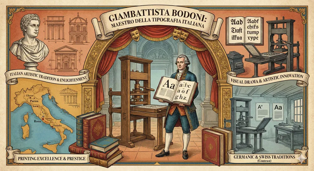
Giambattista Bodoni was a central figure in Italian printing culture. Bodoni represented a specifically Italian approach to typography and printing—one that valued drama, visual sophistication, and artistic innovation.
This Italian approach stood in contrast to the more restrained Germanic and Swiss printing traditions.
Bodoni’s success in establishing a distinctly Italian printing tradition was significant. Bodoni demonstrated that Italian design could compete with and exceed the printing traditions of northern Europe. Italian printing culture gained prestige and international recognition through Bodoni’s achievements.
This Italian influence on typography continues today. Many contemporary design movements value Bodoni’s approach—theatrical elegance, visual intensity, artistic sophistication—as specifically Italian contributions to design tradition.
Related Topics:
- Baskerville and Eaves: A Tale of Perfection, Passion and Revival
- Futura vs. The World: The Geometric Vision of Paul Renner
- Legibility vs. Readability: What Every Designer Needs to Know
Creating Bodoni Typeface: Dramatic Innovation and Theatrical Refinement
The Evolution of Bodoni’s Design
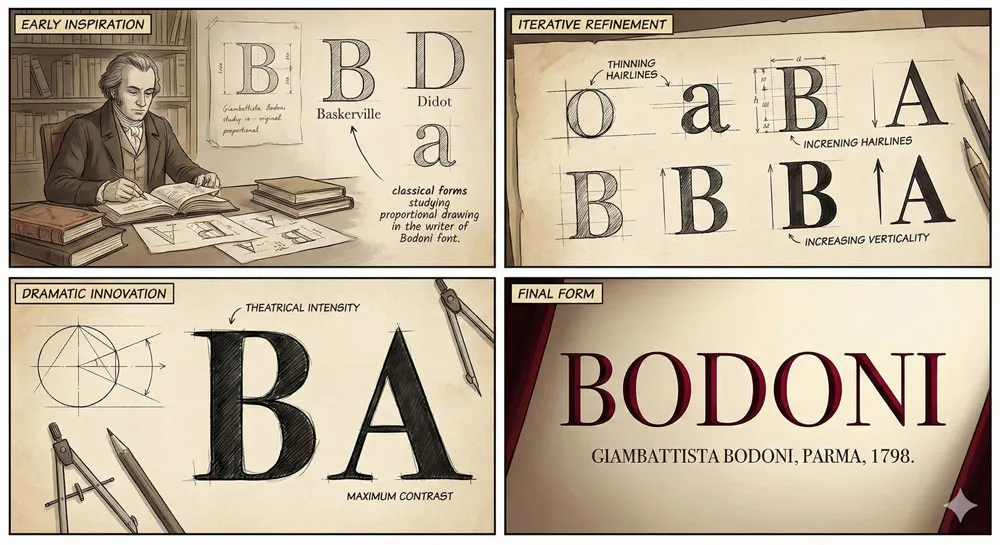
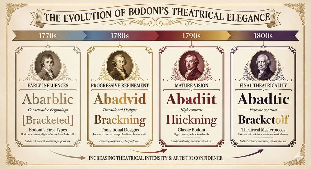
Bodoni did not create a single typeface that remained static. Rather, Bodoni continuously refined and evolved his typeface designs throughout his career. The typefaces bearing Bodoni’s name evolved significantly from early designs to mature designs.
Early Bodoni designs show influence from predecessor serif typefaces. However, as Bodoni’s career progressed, his designs became increasingly theatrical and distinctive. The contrast between thick and thin strokes increased. The serifs became more architectural and refined. The overall character became more visually intense and commanding.
This evolution reflects Bodoni’s developing artistic vision. As Bodoni became more confident and more respected, he was able to pursue increasingly radical and theatrical designs. The mature Bodoni typefaces represent the fullest expression of Bodoni’s artistic vision.
The Innovation of Extreme Contrast
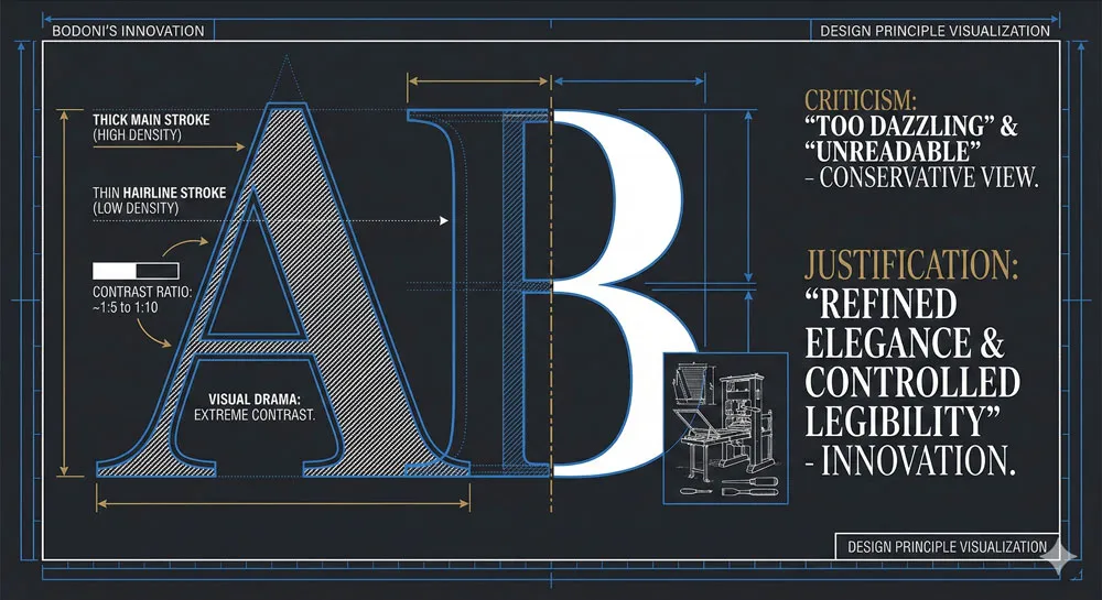
The most distinctive innovation of Bodoni typefaces is the extreme contrast between thick main strokes and thin hairline strokes. This contrast is so extreme that it creates visual drama and intensity. The thick strokes are very heavy, while the thin strokes are almost gossamer-thin.
This extreme contrast was controversial. Some critics and designers argued that such extreme contrast compromised legibility. Some argued that the thin hairlines would be fragile and would break during printing. Some argued that the design was excessive and overwrought.
However, Bodoni proved that extreme contrast could be refined, elegant, and functionally appropriate. The extreme contrast created visual drama while the careful proportion and refinement of the letterforms maintained legibility. Bodoni demonstrated that theatrical design and practical functionality were not mutually exclusive.
The Architectural Serif Design
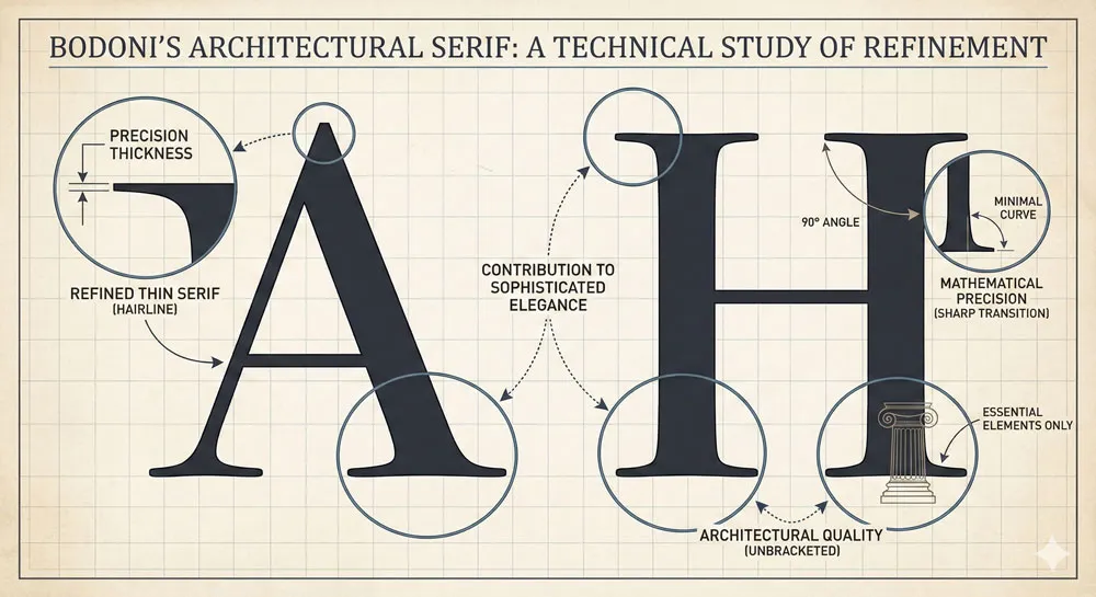
Another distinctive feature of Bodoni typefaces is the refined, architectural serif design. The serifs are thin, precise, and elegant. The serifs suggest both classical architecture and technological precision. The serifs contribute to the overall impression of sophistication and refinement.
The serif design is not ornamental or excessive. Rather, the serifs are stripped to essential elements, refined to mathematical precision. This refined serif design distinguishes Bodoni from more ornamental serif designs and contributes to the impression of controlled elegance.
Related Topics:
- Secret Life of Symbols: History of Ampersand and Interrobang
- Helvetica – Swiss Modernism’s Ubiquity Crisis
- Comic Sans – Accessibility & Gatekeeping Critique
Bodoni’s Design Characteristics: Theatrical Elegance and Visual Intensity
Extreme Contrast and Visual Drama
Bodoni is immediately recognizable because of the extreme contrast between thick and thin strokes. This contrast creates visual drama and intensity. When you encounter Bodoni, your eye is immediately drawn to the typeface. Bodoni refuses to be ignored.
This visual intensity serves a purpose: it communicates that whatever text is set in Bodoni is important, prestigious, and worthy of attention. The typeface functions as a visual announcement: “Notice me. I am important. I am worth your attention.”
Refined Elegance and Sophistication
Despite—or perhaps because of—its theatrical character, Bodoni communicates refined elegance and sophistication. The extreme contrast is refined and controlled. The proportions are carefully balanced. The overall aesthetic is one of sophisticated elegance.
This combination of theatricality and refinement is distinctive. Many theatrical typefaces are crude or excessive. Bodoni is theatrical but never crude. Bodoni is intense but always refined.
Prestige and Authority
Bodoni communicates prestige and authority. When text is set in Bodoni, there is an implicit message: this publication, this brand, this organization is prestigious and sophisticated. Bodoni has become culturally associated with luxury, with prestige publishing, with high-end design.
This association is so strong that using Bodoni in design contexts immediately communicates prestige and quality. Bodoni functions as a visual shorthand for sophistication and design excellence.
Related Topics:
- Gotham – Political Design & Elections Power
- Futura – Geometric Modernism Revolution
- Gill Sans – Humanist Alternative Modernism
Bodoni’s Adoption and Cultural Influence: From 18th Century to Contemporary
18th and 19th Century Prestige and Adoption
During Bodoni’s lifetime and immediately after, Bodoni typefaces achieved significant prestige and adoption. Prestigious printers throughout Europe adopted Bodoni. The typeface was used for important literary works, luxury editions, and prestige publications.
Bodoni became associated with the finest printing and publishing. Collectors sought books printed in Bodoni. The typeface became a mark of publishing prestige and excellence.
Bodoni and the Industrial Revolution: Tradition and Innovation
During the nineteenth century, as industrialization transformed printing, Bodoni remained relevant. However, questions arose about whether Bodoni’s theatrical approach was compatible with industrial mass production.
Some argued that simpler, less theatrical typefaces were more appropriate for industrial production. However, Bodoni persisted because it fulfilled a specific cultural function: it communicated prestige and luxury. Even as mass production increased, there remained demand for typefaces that could communicate sophistication and exclusivity.
20th Century and Contemporary Prestige Context
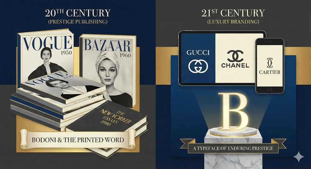
During the twentieth century, Bodoni remained strongly associated with prestige and luxury. The typeface was adopted for luxury branding, for high-end publishing, for design contexts where prestige and sophistication were valued.
In contemporary contexts, Bodoni remains one of the most recognizable and prestigious typefaces. The typeface appears in luxury branding, in fashion design, in high-end publishing.
Bodoni has successfully navigated technological change while maintaining its cultural association with prestige and excellence.
Related Topics:
- Baskerville – Print Excellence & Love Story
- Bodoni – Theatrical Prestige Aesthetics
- Garamond – Classical Foundation Principles
Prestige Publishing and Luxury Design Contexts
Bodoni and High-End Publishing
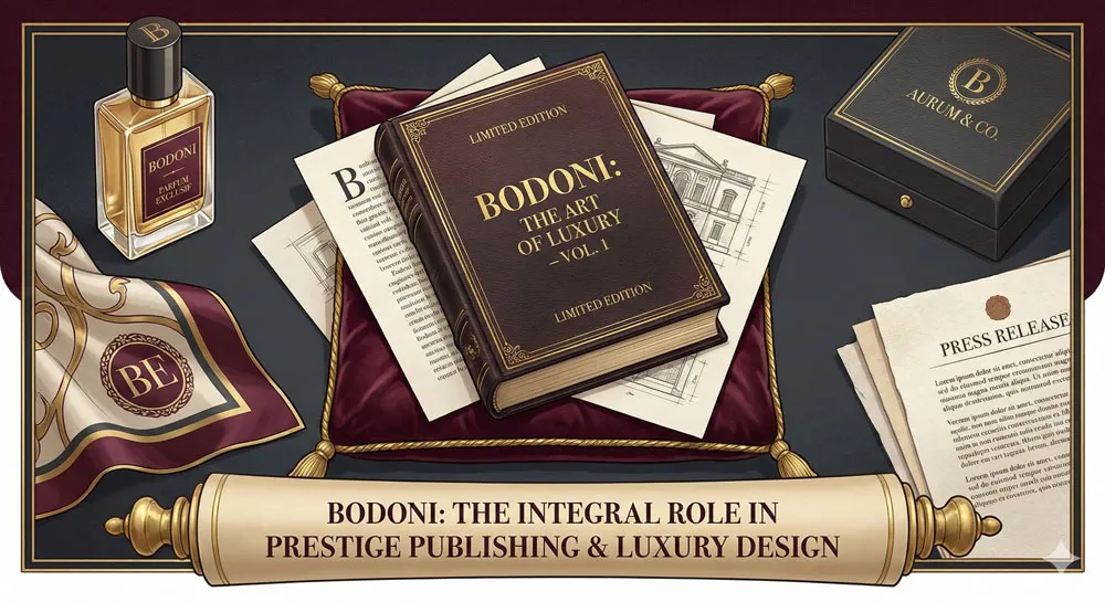
Bodoni became strongly associated with prestige publishing and high-end book design. The typeface appeared in limited editions, in important literary works, in luxury publications designed for collectors.
Using Bodoni in publishing contexts communicated that the publication was important, prestigious, and carefully designed. The typeface functioned as a visual marker of publishing excellence and prestige.
Bodoni in Luxury Branding and High-End Design
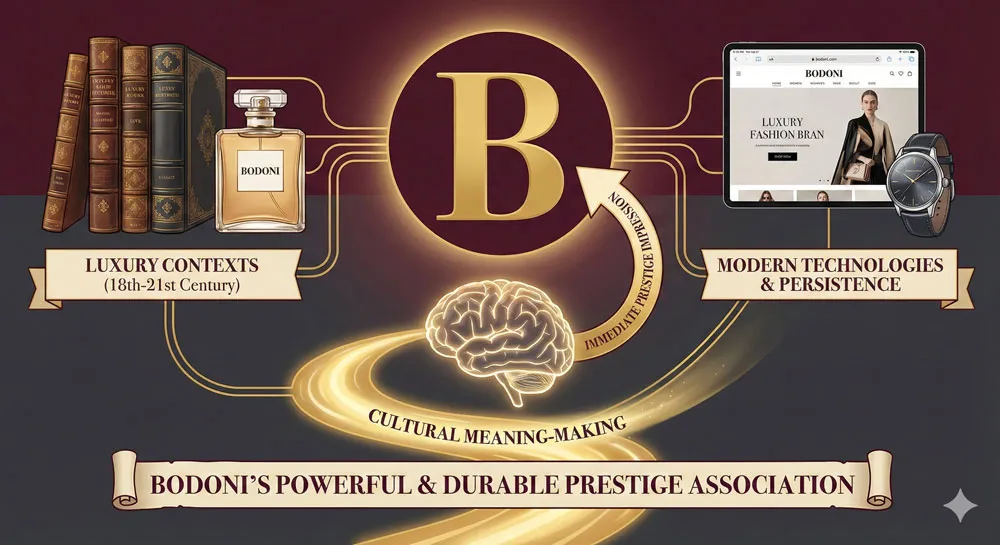
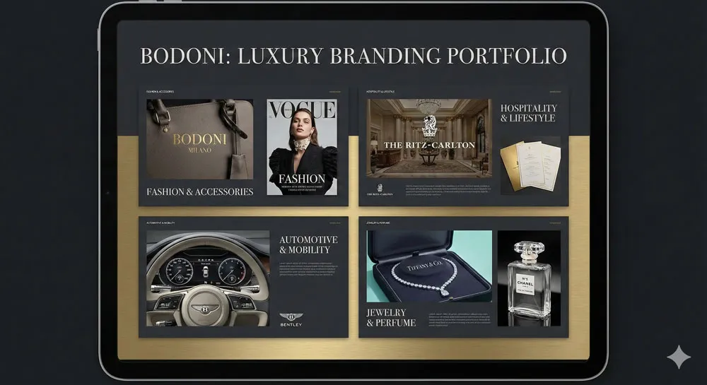
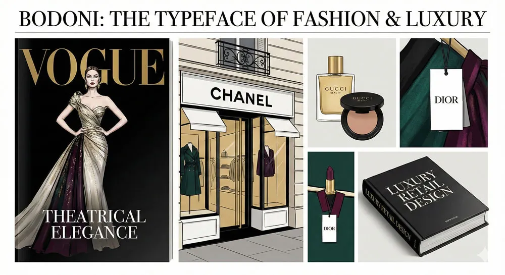
In contemporary contexts, Bodoni has become a primary typeface for luxury branding and high-end design. Luxury brands use Bodoni to communicate sophistication, exclusivity, and design excellence.
Bodoni appears on luxury product packaging, in luxury retail environments, in luxury branding contexts. The typeface communicates that a brand or product is sophisticated, discerning, and worthy of premium pricing.
The Cultural Association with Prestige
Bodoni’s cultural association with prestige is powerful and durable. Encountering Bodoni in design contexts immediately suggests prestige and quality. This association has proven remarkably stable across centuries and technological contexts.
This association reflects cultural values: prestige and luxury are associated with visual intensity, with dramatic elegance, with theatrical sophistication. Bodoni embodies these values visually.
Related Topics:
- Worst Fonts – Criticism & Gatekeeping Analysis
- Gill Sans & The Tube – Urban Identity Infrastructure
- Baskerville & Mrs. Eaves – Love, Partnership & Revival
Comparing Bodoni to Other Serif Typefaces
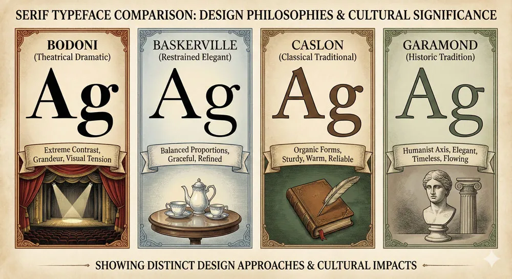
Bodoni vs. Baskerville: Theatrical Drama vs. Restrained Elegance
Bodoni and Baskerville represent two different approaches to refined serif typeface design, developed in roughly the same period by designers from different cultural traditions.
Baskerville, the English typeface, pursues restrained, refined elegance. Bodoni, the Italian typeface, pursues theatrical drama and visual intensity.
Both typefaces are excellent and appropriate for different contexts and purposes. Baskerville is appropriate when elegance and refinement are desired.
Bodoni is appropriate when prestige and visual intensity are desired. The choice between them depends on specific design goals and contexts.
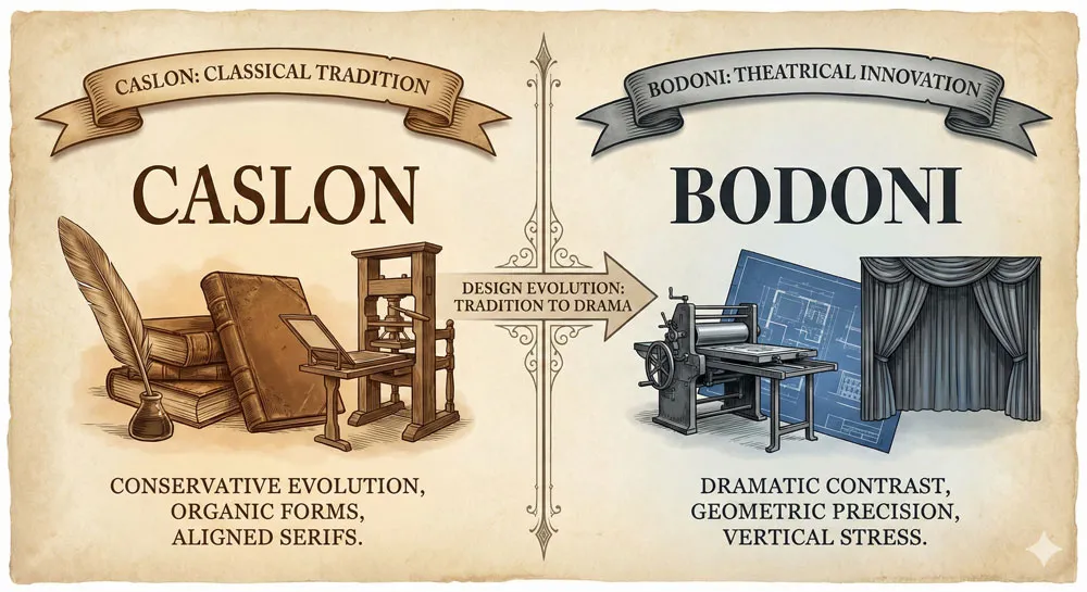
Bodoni vs. Caslon: Classical Tradition vs. Theatrical Innovation
Caslon represents classical serif tradition—more conservative, more restrained than Bodoni. Bodoni represents theatrical innovation pushing serif design toward greater drama and visual intensity.
These represent different design philosophies: Caslon valuing tradition and stability, Bodoni valuing innovation and visual intensity. Both have merit depending on design context.
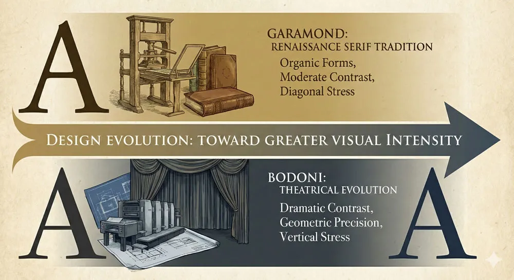
Bodoni vs. Garamond: Historic Tradition vs. Contemporary Theatricality
Garamond is an older serif typeface from the Renaissance printing tradition. Bodoni builds upon and extends that tradition while pushing toward greater visual drama. Bodoni represents an evolution of serif design toward greater theatrical intensity.
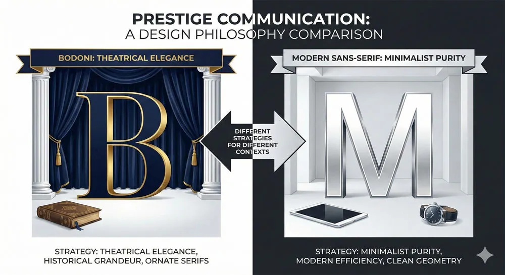
Bodoni vs. Modern Sans-Serifs: Serif Prestige vs. Contemporary Minimalism
Contemporary sans-serif typefaces like Helvetica represent a different design philosophy: minimalist, universal, stripped of historical association. Bodoni, by contrast, is rich in historical association and theatrical character.
This comparison raises interesting questions about how prestige and sophistication are communicated in contemporary design. Does prestige require theatrical serif elegance, or can contemporary minimalism communicate prestige equally effectively?
Related Topics:
- Futura & Paul Renner – Geometric Vision & Revolution
- Legibility vs. Readability – Typography Fundamentals
- Ampersand & Interrobang – Symbol Histories
Bodoni in Contemporary Design: Enduring Luxury and Prestige
Continued Presence in Luxury Branding
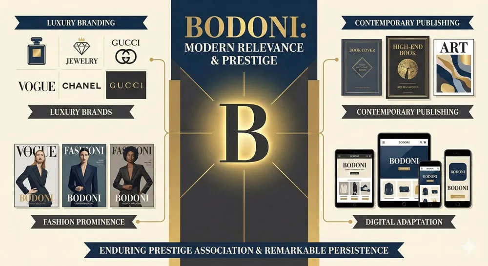
Bodoni remains one of the most frequently used typefaces in luxury branding and high-end design. Luxury brands continue to select Bodoni because it effectively communicates the values those brands want to communicate: sophistication, prestige, design excellence, luxury.
Bodoni appears in luxury fashion, luxury hospitality, luxury automotive branding, luxury cosmetics. The typeface has become almost synonymous with luxury branding.
Fashion and Luxury Industry Association
Bodoni has particular prominence in fashion and luxury industries. The typeface appears in luxury fashion publications, in high-end fashion branding, in luxury fashion retail environments.
This association reflects the nature of fashion and luxury markets: these industries value visual drama, theatrical elegance, and prestige communication. Bodoni perfectly serves these values.
Digital Adaptation and Contemporary Application
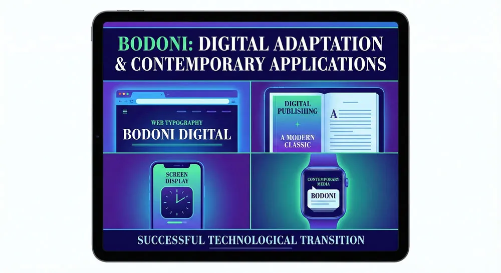
Like other classical typefaces, Bodoni has been digitized and adapted for contemporary digital contexts. Bodoni appears in digital design, in web design, in contemporary digital media.
The transition to digital contexts has been relatively successful. Bodoni’s distinctive character translates well to digital environments. The typeface remains recognizable and prestigious in digital contexts.
Related Topics:
- Typography
- The Psychology of Typography: Font Influence
- Helvetica Effect: One Font Conquered Global Design
The Philosophy of Theatrical Design and Cultural Values
Theatricality as Design Principle
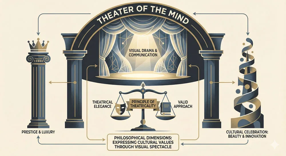
Bodoni embodies a philosophical commitment to theatricality as a legitimate and valuable design principle. Bodoni proves that design need not be subtle or restrained—that design can be theatrical, visually intense, and commanding while still being refined and elegant.
This commitment to theatrical design reflects Italian cultural values: celebration of visual beauty, appreciation for artistic innovation, comfort with dramatic expression.
The Relationship Between Visual Drama and Communication
Bodoni demonstrates that visual drama can enhance communication. The extreme contrast and visual intensity of Bodoni don’t compromise legibility—they enhance it. The visual intensity draws attention and commands engagement.
This suggests that communication is not just about functional legibility but about creating engagement, commanding attention, and communicating prestige and importance.
Prestige, Luxury, and Design Values
Bodoni’s strong association with prestige and luxury reflects cultural beliefs about what communication prestige and luxury. Visual drama, extreme contrast, theatrical elegance are culturally associated with prestige and luxury.
This association raises questions about design philosophy: what values do we want to communicate? If we want to communicate prestige and luxury, what design choices best accomplish that goal? Bodoni is one answer to that question.
Related Topics:
- Comic Sans: True Story Behind the World’s Most Hated Font
- Gotham: Font That Won an Election And Changed Design Forever
- Futura: The Geometric Vision of Paul Renner
FAQ: Common Questions About Bodoni
Q: Who designed Bodoni typeface and when?
A: Giambattista Bodoni, an Italian printer and typographer, created Bodoni beginning in the late eighteenth century. The typeface evolved throughout Bodoni’s career, reaching its mature form by the late 1700s. Bodoni died in 1813.
Q: What makes Bodoni distinctive?
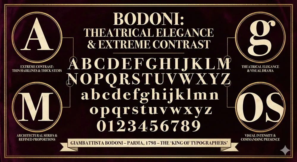
A: Bodoni is distinctive for extreme contrast between thick and thin strokes, refined and architectural serifs, theatrical elegance, and visual intensity. The typeface is immediately recognizable and commands attention.
Q: How is Bodoni different from Baskerville?
A: Baskerville is restrained and refined, pursuing elegance through proportion and restraint. Bodoni is theatrical and dramatic, pursuing elegance through visual intensity and extreme contrast. Baskerville is English and understated; Bodoni is Italian and commanding.
Q: Is Bodoni still used in contemporary design?
A: Yes. Bodoni is extensively used in contemporary luxury branding, high-end publishing, and prestige design contexts. The typeface remains one of the most prestigious and recognizable typefaces.
Q: What does Bodoni communicate psychologically?
A: Bodoni communicates prestige, luxury, sophistication, theatrical elegance, design excellence, and exclusivity. The typeface is associated with high-end, premium, and luxury contexts.
Q: Can I use Bodoni in my design project?
A: Bodoni is available in digital form from multiple sources. Whether to use Bodoni depends on your design context. Bodoni is particularly appropriate for luxury branding, prestige publishing, and contexts where you want to communicate sophistication and prestige.
Q: How does Bodoni function in digital contexts?
A: Bodoni functions well in digital contexts, though it functions somewhat differently than in print. The extreme contrast and thin hairlines are adapted for screen display. The typeface remains distinctive and recognizable in digital contexts.
Q: What influenced Giambattista Bodoni’s design philosophy?
A: Bodoni was influenced by Italian printing culture, by the Enlightenment celebration of artistic innovation, by observation of what made printing beautiful and commanding, and by belief that printing should be treated as a fine art deserving of artistic excellence and innovation.
Q: Why did Bodoni become so associated with prestige and luxury?
A: Bodoni’s theatrical elegance and visual intensity communicate prestige. The typeface appears in luxury publications, luxury branding, and high-end contexts. This repeated association in prestige contexts has made Bodoni culturally synonymous with luxury and prestige.
Q: Is Bodoni better than other serif typefaces?
A: This is subjective and context-dependent. Bodoni, Baskerville, Caslon, and other serif typefaces are each excellent in their own ways and appropriate in different contexts. Bodoni’s theatrical elegance makes it particularly appropriate for prestige and luxury contexts.
Related Topics:
Conclusion: The Enduring Legacy of Theatrical Elegance and Prestige
Giambattista Bodoni and his typeface represent something profound about design: the power of visual drama and theatrical elegance to communicate prestige and to capture human attention and admiration.
Bodoni proved that elegance did not require restraint and quiet refinement—that elegance could be theatrical, intense, and visually commanding while still being refined and sophisticated.
Bodoni also represents a particular cultural philosophy—the Italian celebration of visual beauty, artistic innovation, and theatrical expression.
In an era when German and English printing traditions valued restraint and functionality, Bodoni championed visual intensity and artistic drama. Bodoni proved that this Italian approach could achieve excellence and prestige equal to more restrained traditions.
Nearly two and a half centuries after its creation, Bodoni remains one of the most recognizable and culturally significant typefaces. The typeface has successfully navigated technological change and shifting design fashions.
The typeface remains strongly associated with prestige and luxury. The typeface continues to communicate theatrical elegance and sophisticated prestige.
Bodoni stands as a masterpiece of theatrical serif design and as a testament to the power of visual drama in communication. The typeface demonstrates that design can be both functionally effective and visually intense, both elegant and commanding, both refined and theatrical.
In doing so, Bodoni represents a distinctive and valuable contribution to design tradition and continues to influence how we think about the relationship between visual intensity and prestige, between theatrical elegance and refined beauty, between design drama and communicative power.
About the Author
Lalit M. S. Adhikari is a Digital Nomad and Educator since 2009 in design education, graphic design and animation. He’s taught 500+ students and created 200+ educational articles on design topics. His teaching approach emphasizes clarity, practical application and helping learners.
Learn more about Lalit Adhikari.
This guide is regularly updated with the latest information about Adobe tools and design best practices. Last Updated: Mar 2026


