Discover Baskerville’s transformative history, John Baskerville’s printing innovations, and how this elegant serif typeface shaped typography, book design, and literary culture for centuries.
My name is Lalit Adhikari and we are at LTY. Let’s begin!
Table of Contents
Introduction: The Typeface That Elevated Print to Art
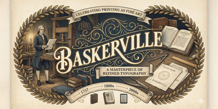
In the early eighteenth century, as printing had become established for nearly three centuries, a printer and typographer named John Baskerville developed a vision of transforming printing into an art form.
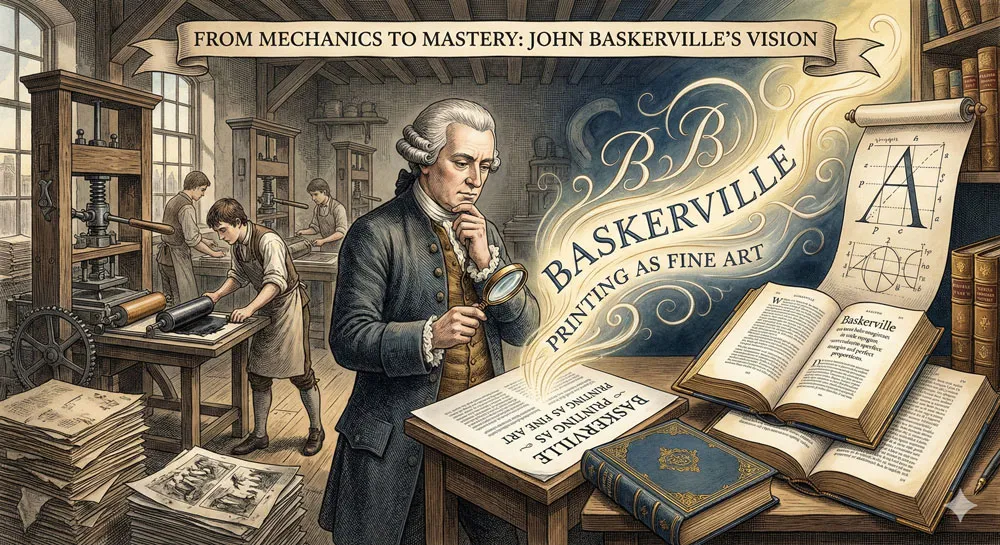
Baskerville was not content with merely reproducing text mechanically. He believed that printing, and the typefaces that formed the foundation of print communication, should be beautiful, refined, and worthy of the finest literary works.
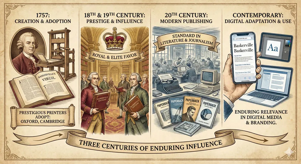
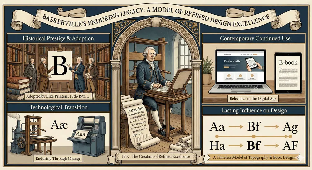
The result was a typeface that bears his name: Baskerville. Released in 1757, Baskerville represented a revolutionary approach to serif typeface design. The typeface was more elegant, more refined, and more carefully proportioned than the typefaces that had preceded it.
Baskerville incorporated subtle refinements that made the typeface exceptionally readable while maintaining extraordinary beauty. The typeface was designed specifically for book printing—for creating beautiful, readable books that would be cherished by readers and collectors.
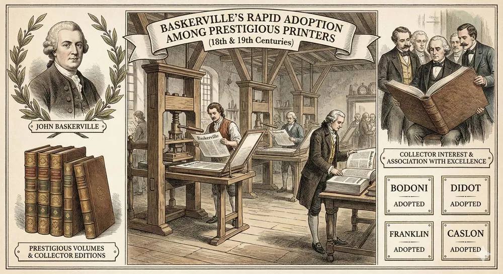
What is remarkable about Baskerville is that it achieved its ambitious goals. The typeface was adopted by prestigious printers throughout Europe and America.
Baskerville was used to print important literary works, scholarly publications, and beautiful books that are still admired centuries later. The typeface became synonymous with elegance, refinement, and print excellence.
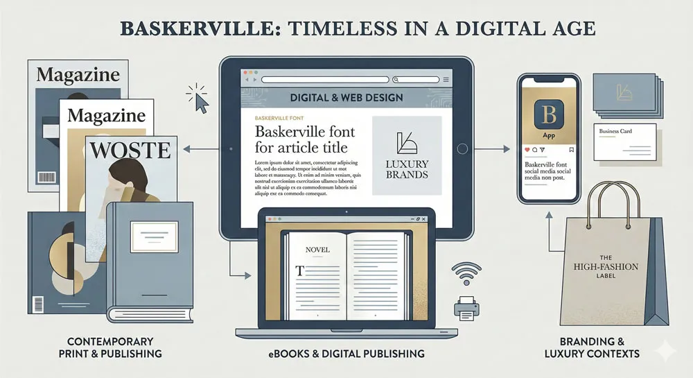
Nearly three centuries after its creation, Baskerville remains one of the most respected and widely-used serif typefaces in the world. The typeface appears in publishing, in graphic design, in digital contexts, in branding.
Baskerville has influenced virtually every subsequent serif typeface. The typeface is used to communicate sophistication, elegance, classical refinement, and literary culture.
Yet Baskerville’s story is also a story about the relationship between typeface design and the medium of print. Baskerville was designed explicitly for book printing—for creating beautiful books on paper using mechanical printing technology.
As media have changed—from print to screen, from physical books to digital documents—questions have arisen about how a typeface so intimately connected to print culture functions in contemporary digital contexts.
This comprehensive exploration traces John Baskerville’s life and revolutionary approach to printing, examines Baskerville typeface design characteristics and innovation, explores the typeface’s adoption and influence throughout the eighteenth to twentieth centuries, analyzes Baskerville’s role in print culture and book design, compares Baskerville to other serif typefaces, and ultimately asks:
- what does Baskerville reveal about the relationship between typeface design, print technology, and cultural values?
Related Topics:
- Bodoni Font: Serif That Defined Luxury Typography
- Garamond: Timeless Serif That Defined Classical Typography
- The Worst Fonts in the World: A Typographic Hall of Shame
John Baskerville: The Printer-Visionary
A Life in Print and Type Design
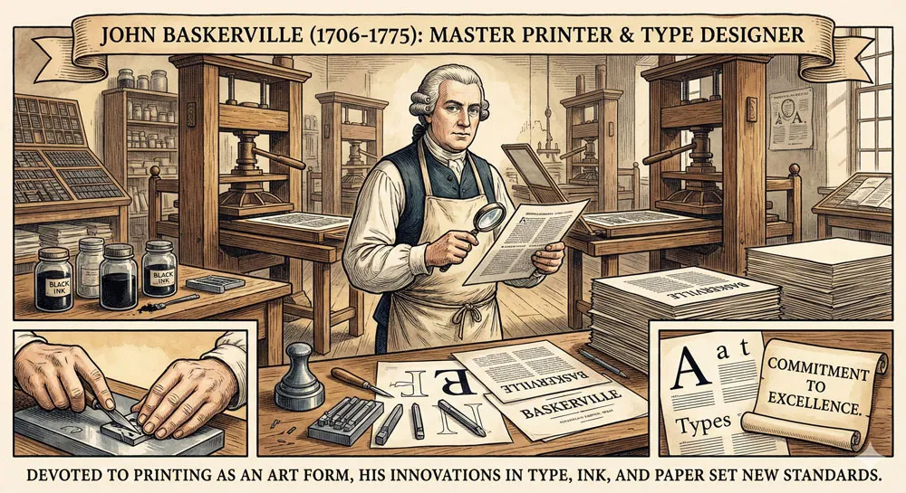
John Baskerville was born in 1706 in Worcestershire, England. He came of age during a period when printing was well-established as a technology but was still developing as an art form. Early printers had focused on making books accessible and readable.
However, by the eighteenth century, printing had matured enough that printers could focus not just on function but on beauty and elegance.
Baskerville began his career as a printer and typefounder. However, unlike many printers who simply accepted existing types and printing technologies, Baskerville was convinced that printing could be improved.
He believed that more refined typefaces could be created, that paper quality could be enhanced, that printing inks could be developed to higher standards, and that printing could become a unified craft where every element—typeface, paper, ink, layout—worked together to create beautiful books.
Baskerville was not merely a business-minded printer interested in profit. He was an artist and craftsperson convinced that printing was an art form worthy of devotion and excellence.
This artistic commitment shaped everything Baskerville did. He was willing to invest time and resources in perfecting his craft. He was willing to challenge established practices and develop new approaches.
Baskerville’s Philosophy: Print as Fine Art
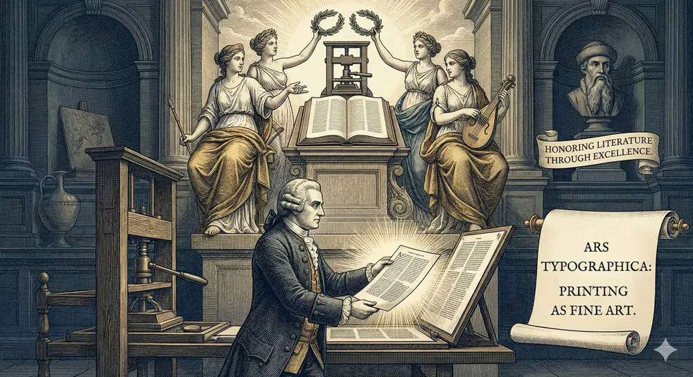
Central to John Baskerville’s philosophy was the belief that printing should be treated as a fine art rather than as mere mechanical production.
Baskerville believed that books should be beautiful—that the materials, the typeface, the layout, and the overall design should work together to create objects worthy of being treasured and admired.
This philosophy represented something radical in the eighteenth century. While printing was certainly valued and had transformed access to information and ideas, printing was not typically thought of as an art form.
Printers were valued for producing correct, legible text efficiently. Baskerville believed that printers should also be valued for creating beautiful books—for making printing an art equal to other fine arts.
This artistic commitment to printing shaped Baskerville’s entire practice. Baskerville invested in developing superior papers. He researched and developed new ink formulations. He studied typeface design extensively.
He considered every element of book production—from margins to paper quality to binding—as contributing to the overall aesthetic and functional achievement.
Baskerville’s Influence and Reputation
During his lifetime and after his death, Baskerville gained considerable reputation among printers, designers, and book collectors. His books were recognized as beautiful, elegant, and exceptionally well-printed. Collectors sought Baskerville-printed books. Other printers studied his work and sought to learn from his innovations.
However, Baskerville was not universally celebrated during his lifetime. Some conservative printers and critics believed that Baskerville’s innovations were unnecessary extravagances. There was debate about whether his refined, elegant approach to printing represented progress or merely fashionable pretension.
This debate—between those who valued Baskerville’s artistic innovations and those who saw them as unnecessary refinement—continued throughout his career and beyond.
Related Topics:
- Gill Sans and Tube: How Johnston and Gill Defined London
- Baskerville and Eaves: A Tale of Perfection, Passion and Revival
- Futura vs. The World: The Geometric Vision of Paul Renner
Creating Baskerville Typeface: Design Innovation and Refinement
The Design Process and Innovation
Baskerville typeface was created as part of Baskerville’s broader commitment to improving printing. Baskerville studied existing typefaces, analyzed their strengths and weaknesses, and designed a typeface that would improve upon what had come before.
The key innovation of Baskerville typeface was subtle but profound: the typeface was refined to an unprecedented degree. Every proportion was carefully considered. Every curve was refined. Every detail was perfected.
The result was a typeface that was not radically different from previous serif typefaces but was distinctly more elegant and more carefully executed.
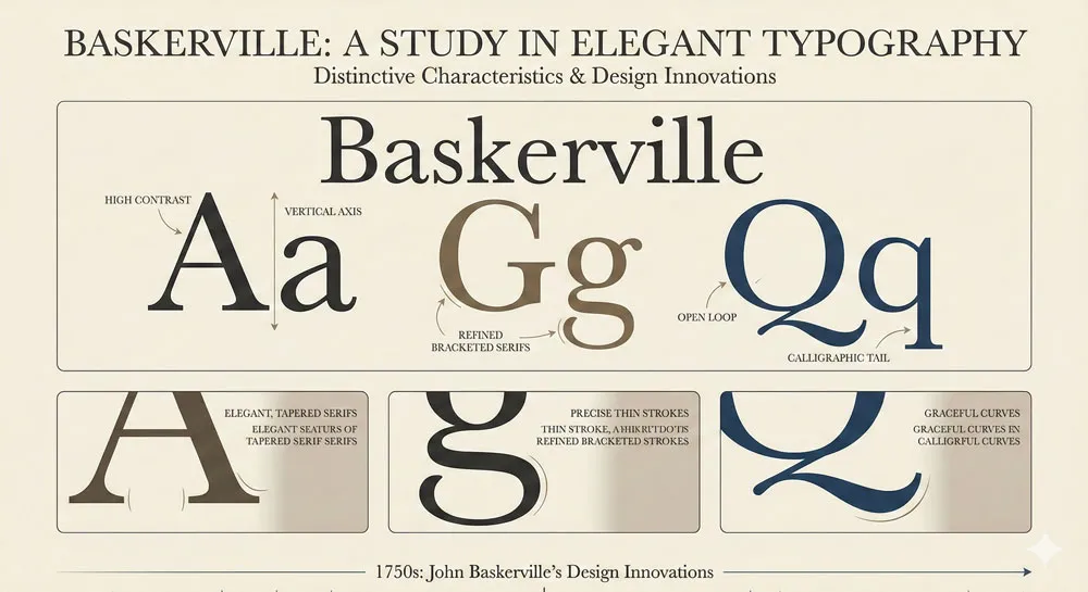
Baskerville incorporated several innovations that distinguished it from predecessor typefaces. The contrast between thick and thin strokes was increased—thinner serifs, thinner hairlines, more dramatic contrast between major and minor strokes.
This increased contrast made the typeface more elegant and refined. The proportions were refined so that letters felt more spacious and less cramped. The overall aesthetic was more refined and sophisticated.
Importantly, all these refinements were made in service of readability and functionality. Baskerville was not pursuing elegance for its own sake.
Rather, Baskerville was convinced that refined proportions and careful attention to detail improved both the beauty and the functionality of the typeface.
The Relationship Between Form and Function
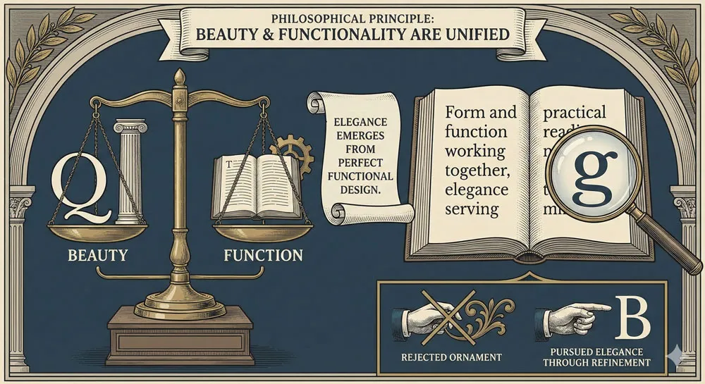
A crucial principle underlying Baskerville typeface design was the belief that beauty and functionality were not separate concerns. Rather, true beauty emerged from perfect attention to functional requirements and careful execution in service of those requirements.
This principle distinguished Baskerville from some contemporary approaches. While some designers pursued ornament or decoration as an end in itself, Baskerville pursued elegance through refinement of functional forms.
The typeface was beautiful precisely because it was so perfectly suited to its function—printing beautiful, readable books.
This principle also gave Baskerville typeface great longevity. Because the beauty of the typeface was rooted in functional excellence, the typeface continued to be functionally valuable even as tastes and fashions changed.
Baskerville remained readable and appropriate in contexts where more ornamental or fashionable typefaces might become dated.
Innovation in Paper, Ink, and Printing
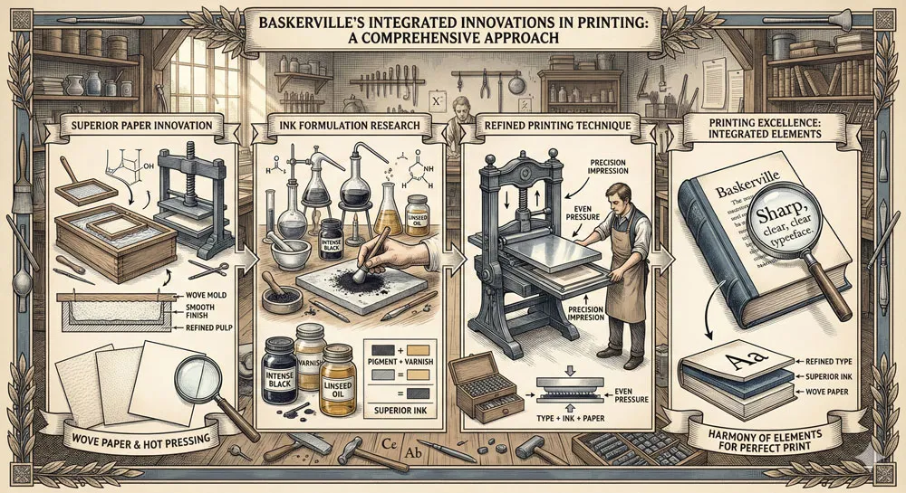
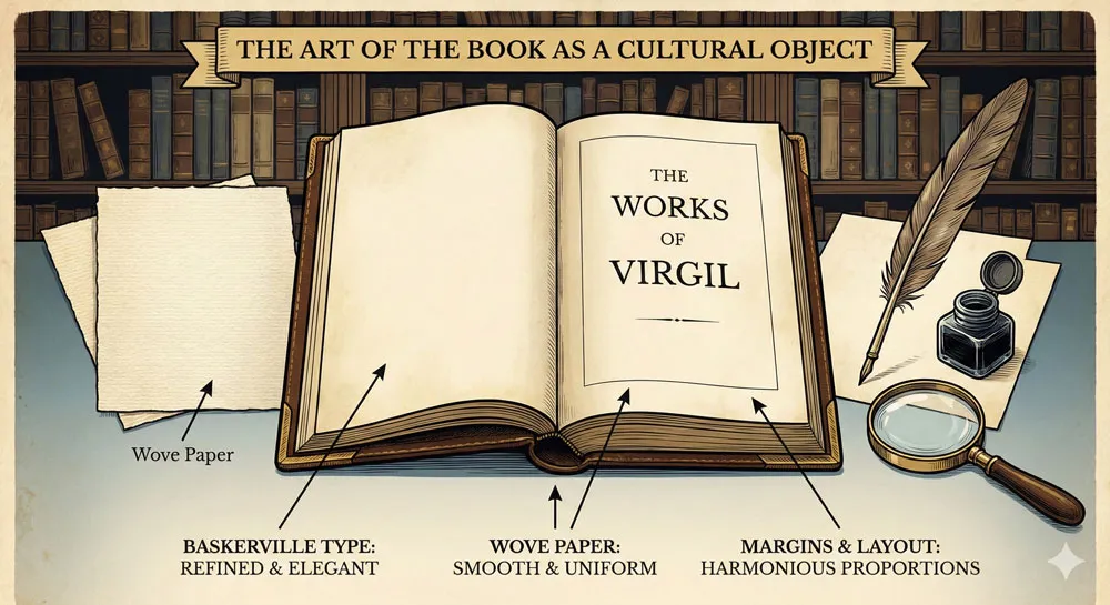
It is important to understand that Baskerville typeface cannot be fully appreciated apart from Baskerville’s broader innovations in printing. Baskerville was innovating not just in typeface design but in paper production, ink formulation, and printing technique.
Baskerville commissioned superior papers that were smoother and more evenly textured than typical printing papers. He researched and developed new inks that would print more sharply and consistently. He refined printing techniques to ensure that ink was applied evenly and that impressions were clean and precise.
All these innovations worked together. The refined typeface achieved its full potential only when printed on superior paper with carefully formulated ink using refined technique.
Baskerville understood that the typeface was one element of an integrated system of print production, and that excellence in all elements was required to achieve the ultimate goal: beautiful, readable books.
Related Topics:
- Legibility vs. Readability: What Every Designer Needs to Know
- Secret Life of Symbols: History of Ampersand and Interrobang
- Helvetica – Swiss Modernism’s Ubiquity Crisis
Baskerville’s Design Characteristics: Elegance and Refinement
Elegant Proportions and Refined Detail
Baskerville typeface is characterized by elegant proportions and refined detail throughout. The typeface has high contrast—thin hairlines and thick main strokes creating visual drama and elegance.
The serifs are refined and carefully proportioned. The letterforms have generous proportions that feel spacious and open rather than cramped.
These design characteristics work together to create a typeface that communicates elegance, refinement, sophistication, and classical taste. When viewers encounter Baskerville, they unconsciously perceive these qualities through the typeface’s visual characteristics.
Readability and Functionality
Despite—or perhaps because of—its elegance, Baskerville is exceptionally readable. The generous proportions, the high contrast between thick and thin strokes, the refined serifs all contribute to clarity and legibility.
The typeface reads beautifully in long form texts, in books, in settings where extended reading is anticipated.
This combination of elegance and readability distinguished Baskerville from typefaces that prioritized one at the expense of the other. Baskerville proved that a typeface could be both beautiful and functionally excellent for reading.
The Aesthetic of Printing Excellence
Baskerville communicates a specific aesthetic—the aesthetic of printing excellence, of refined craftsmanship, of books as beautiful objects. When you see Baskerville in a printed book, you receive an implicit message: this book was created with care, with attention to excellence, with respect for the reader’s experience.
This aesthetic has proven remarkably durable. Even in contemporary contexts, Baskerville communicates elegance and quality. The typeface remains associated with literary culture, with prestige publishing, with design excellence.
Related Topics:
- Comic Sans – Accessibility & Gatekeeping Critique
- Gotham – Political Design & Elections Power
- Futura – Geometric Modernism Revolution
Baskerville’s Adoption and Influence: From 18th Century to Contemporary
18th and 19th Century Adoption
Baskerville typeface achieved rapid adoption among prestigious printers during the eighteenth and nineteenth centuries. The typeface was used by important printers throughout Europe and America. Baskerville-printed books became sought-after by collectors and readers.
The typeface became associated with prestige and quality. Printers and publishers selecting Baskerville were making a statement about their commitment to excellence and to producing beautiful, readable books.
The Industrial Revolution and Print Production
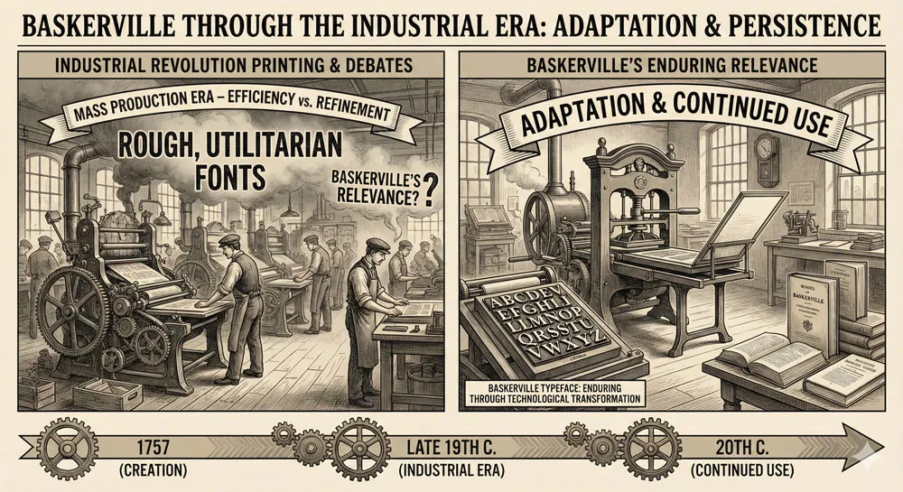
During the nineteenth century, as industrialization transformed printing, questions arose about Baskerville’s relevance in a context of mass production and industrial efficiency.
Some argued that Baskerville’s refinements were incompatible with industrial mass production and that simpler, less refined typefaces were more appropriate for rapid, efficient printing.
However, Baskerville remained in use throughout the nineteenth and twentieth centuries. The typeface proved adaptable to new technologies and contexts while maintaining its essential character and elegance.
20th and 21st Century Usage
During the twentieth century, Baskerville remained widely used in book design and publishing. The typeface was adopted for important literary works, scholarly publications, and prestige printing projects.
As printing evolved and desktop publishing emerged, Baskerville was digitized and adapted for contemporary use.
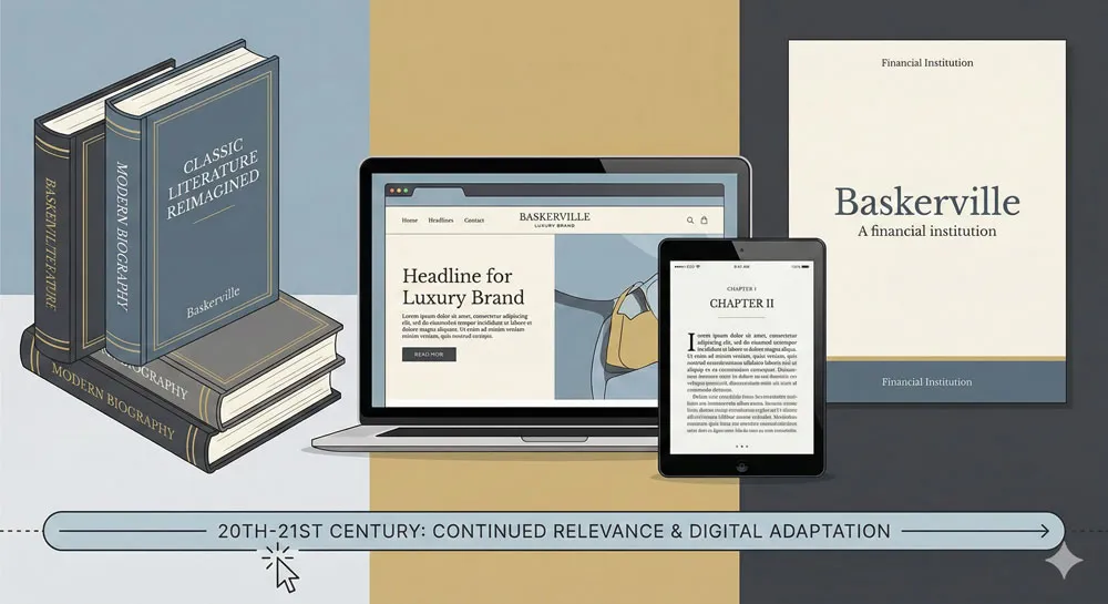
In contemporary contexts, Baskerville continues to be used in print design, in digital publishing, in branding contexts where elegance and refinement are valued. The typeface has successfully transitioned from physical print to digital contexts while maintaining its distinctive character.
Related Topics:
- Gill Sans – Humanist Alternative Modernism
- Baskerville – Print Excellence & Love Story
- Bodoni – Theatrical Prestige Aesthetics
Print Culture, Book Design, and Literary Aesthetics
Baskerville and the Creation of Beautiful Books
John Baskerville and his typeface are intimately connected with the creation of beautiful books as cultural objects. Baskerville understood that books were not merely containers for text but were physical, aesthetic objects that should be designed to enhance the reader’s experience and to honor the literary work.
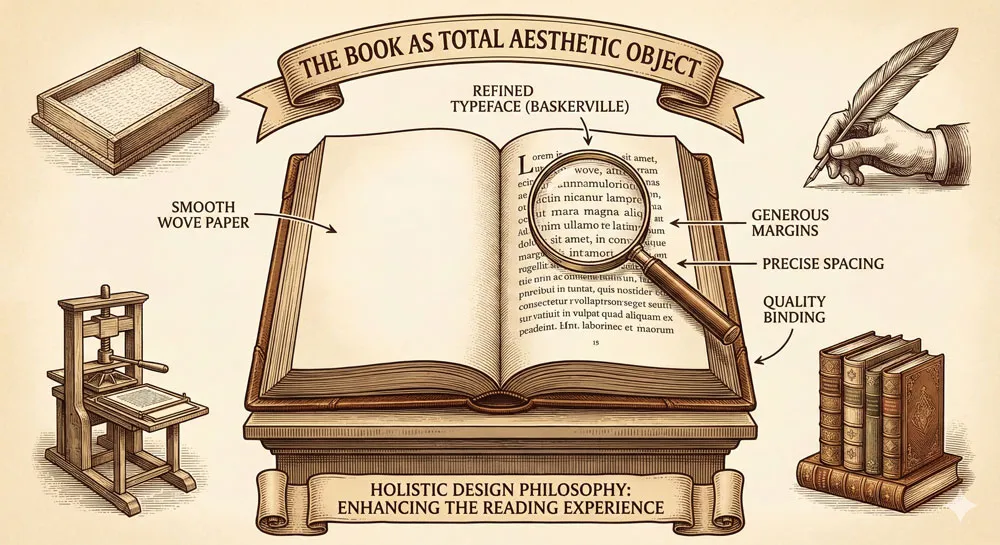
Baskerville’s approach to book design encompassed everything: paper selection, typeface choice, margin proportions, line spacing, binding design. Every element was considered as contributing to the overall aesthetic and functional achievement.
This comprehensive approach to book design—treating the book as a unified aesthetic object—was influential and continues to influence book design principles today.
Baskerville and Literary Culture
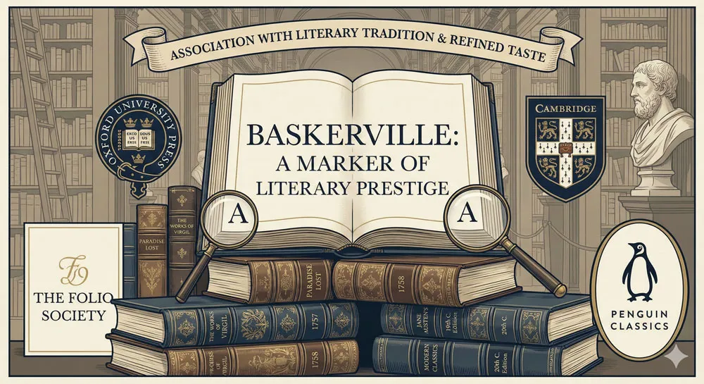
Baskerville typeface became closely associated with literary culture and with prestige publishing. The typeface appeared in important literary works and in scholarly publications. This association gave Baskerville particular cultural significance and prestige.
Using Baskerville became a way for publishers and printers to communicate respect for the literary work and commitment to excellence in production.
This association remains strong: contemporary use of Baskerville in publishing contexts continues to communicate literary prestige and design excellence.
The Influence on Subsequent Typography
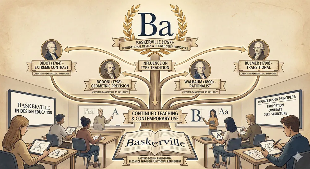
Baskerville’s influence on subsequent serif typeface design was profound. Designers studying typeface design learn from Baskerville.
The principles that Baskerville embodied—elegance through refinement of functional forms, careful proportion and detail, unity between form and function—influenced countless subsequent typefaces.
Modern serif typefaces often carry forward principles first systematically expressed in Baskerville. The typeface remains a model for how elegant, refined typeface design can serve readability and function.
Related Topics:
- Garamond – Classical Foundation Principles
- Worst Fonts – Criticism & Gatekeeping Analysis
- Gill Sans & The Tube – Urban Identity Infrastructure
Comparing Baskerville to Other Serif Typefaces
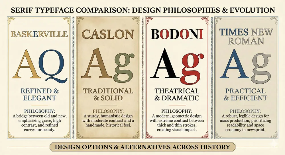
Baskerville vs. Caslon: The Contrast Between Refinement and Tradition
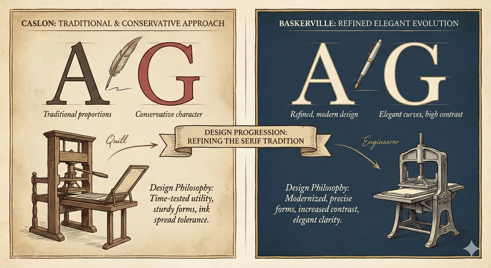
Caslon, a typeface designed by William Caslon in the early eighteenth century, preceded Baskerville and represented a different approach to serif typeface design. Caslon was more traditional, with less extreme contrast between thick and thin strokes, more conservative proportions.
Baskerville represented a refinement and modernization of Caslon’s approach. Where Caslon was traditional and somewhat sturdy, Baskerville was elegant and refined.
Both typefaces were excellent, but they represented different design philosophies—Caslon emphasizing tradition and solidity, Baskerville emphasizing refinement and elegance.
Baskerville vs. Bodoni: The Competition for Elegance
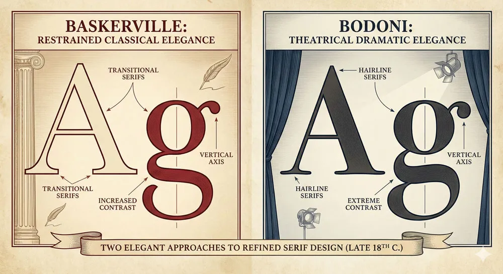
Around the same time that Baskerville was gaining prominence, Giambattista Bodoni in Italy was creating Bodoni typeface, which was similarly committed to elegance and refinement. Bodoni and Baskerville represent two different European approaches to refined serif typeface design.
Baskerville and Bodoni are often compared. Both emphasize elegance and refinement. Both incorporate high contrast between thick and thin strokes.
However, they have subtle differences in proportion and character. Baskerville is often considered more restrained and classical, while Bodoni is more dramatic and theatrical.
Baskerville vs. Times New Roman: Classical Elegance vs. Commercial Practicality
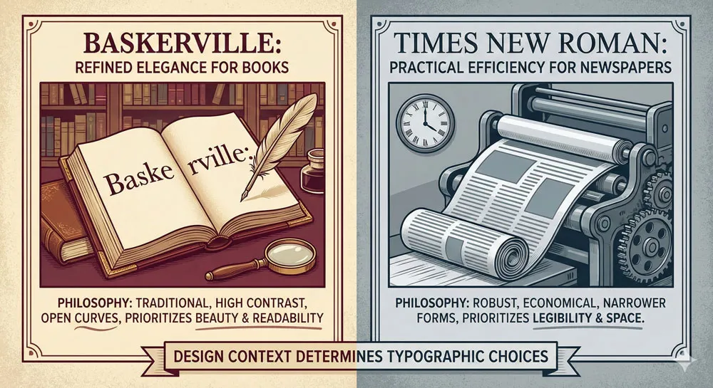
Times New Roman, designed in the twentieth century for newspaper printing, represents a different approach to serif typeface design. Times New Roman was designed for efficiency and readability in small sizes, in high-speed production contexts.
Baskerville, by contrast, was designed for elegance and refinement in book printing. These different design priorities led to very different visual results.
Baskerville is more elegant and refined; Times New Roman is more practical and efficient. Both are excellent typefaces, but for different purposes and contexts.
Related Topics:
- Baskerville & Mrs. Eaves – Love, Partnership & Revival
- Futura & Paul Renner – Geometric Vision & Revolution
- Legibility vs. Readability – Typography Fundamentals
Baskerville in Contemporary Design and Digital Contexts
Transition to Digital and Challenges
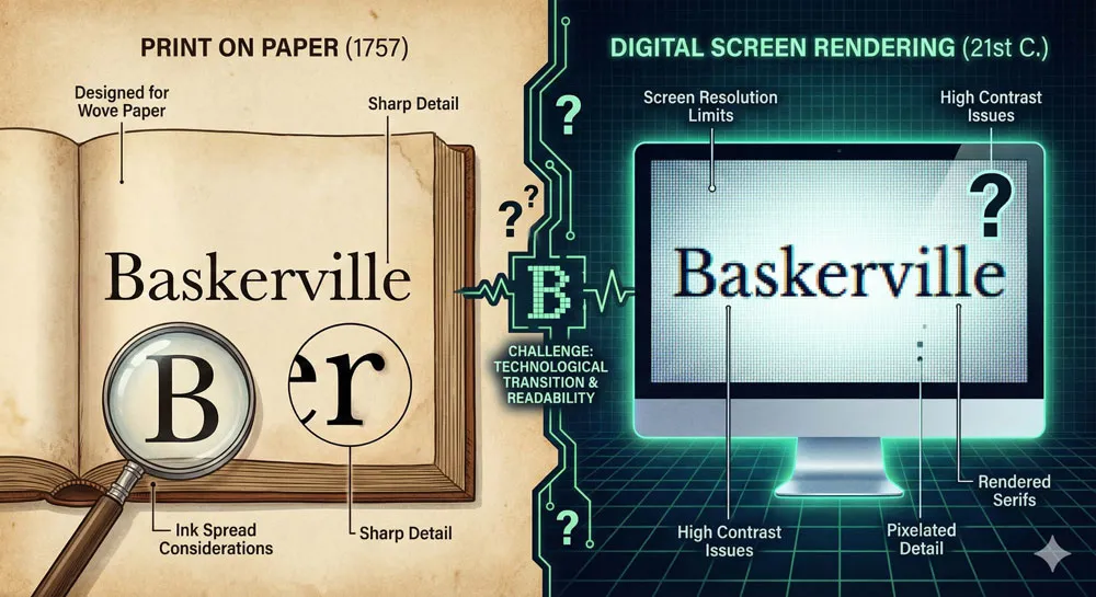
As typography has transitioned from physical print to digital screens, questions have arisen about how Baskerville functions in digital contexts. Baskerville was designed for print—for ink on paper, for the specific printing technologies of the eighteenth century.
On digital screens, with different rendering technologies and different reading contexts, Baskerville functions differently than in its original print context.
Some have argued that Baskerville’s refined details and high contrast are less suitable for screen reading than in print. Others argue that Baskerville remains excellent for digital publishing contexts.
Baskerville in Digital Publishing and eBooks
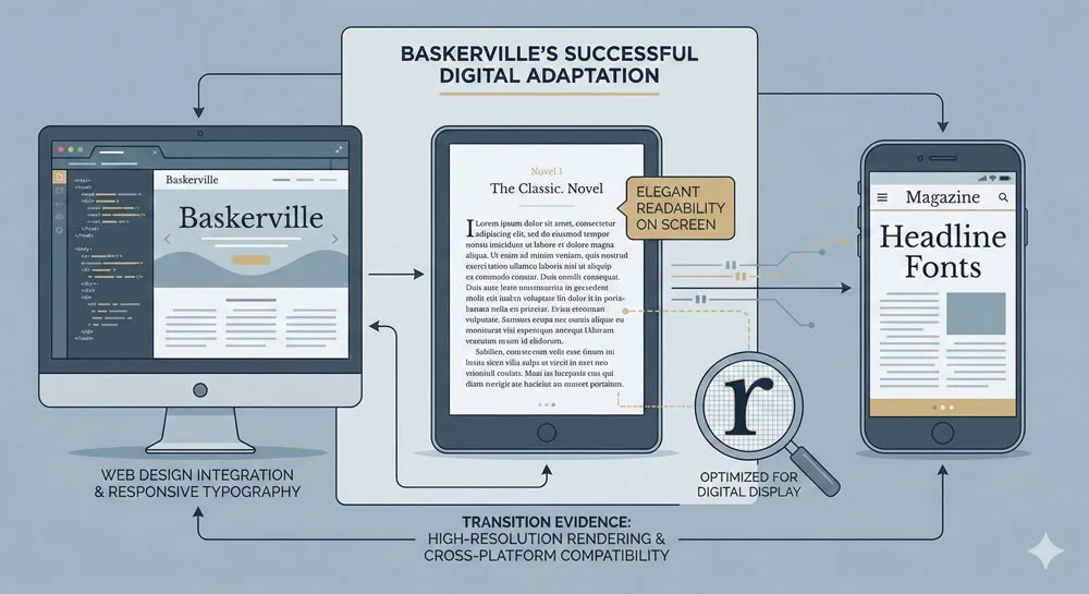
Despite initial questions about Baskerville’s appropriateness for digital contexts, the typeface has been successfully adapted for digital publishing.
Baskerville is used in eBook readers, in digital publishing platforms, and in web design. The typeface continues to communicate elegance and literary prestige even in digital contexts.
This successful transition demonstrates the enduring value of Baskerville’s design. The typeface transcends its original technological context because its excellence is rooted in fundamental design principles rather than in specific printing technologies.
Baskerville in Contemporary Branding and Design
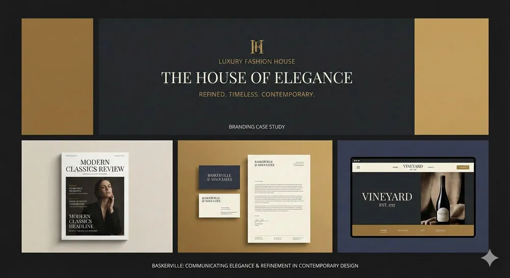
Contemporary designers continue to select Baskerville for branding, graphic design, and other contexts where elegance, refinement, and classical association are valued.
Baskerville appears in luxury branding, in publishing and literary contexts, in sophisticated design applications.
Using Baskerville in contemporary contexts communicates specific values: refinement, elegance, classical taste, literary culture, design excellence. The typeface has successfully transcended its historical context to remain relevant in contemporary design.
Related Topics:
- Ampersand & Interrobang – Symbol Histories
- Gill Sans: Eric Gill’s Humanist Masterpiece
- Futura: The Geometric Vision of Paul Renner
The Philosophy of Print and the Aesthetics of Books
Books as Beautiful Objects
John Baskerville’s philosophical commitment was to the idea that books should be beautiful—that books were not merely containers for text but were physical, aesthetic objects worthy of beauty and care. This philosophy continues to influence book design and publishing philosophy today.
Contemporary book designers often reference Baskerville’s philosophy when arguing for attention to beauty and design excellence in book production.
The idea that books should be treated as aesthetic objects, not merely as utilitarian containers for information, owes much to Baskerville’s influence.
The Relationship Between Form and Content
Baskerville’s design practice embodied the principle that the form of a book—its typography, its design, its physical properties—should serve and enhance the content. The design should not distract from the text but should enhance the reader’s engagement with the text.
This principle—that form should serve content—continues to be fundamental to good design practice. Baskerville serves as a model for how thoughtful design enhances rather than distracts from content.
The Ethics of Design Excellence
Underlying Baskerville’s practice was an ethical commitment: that designers and craftspeople have a responsibility to pursue excellence, to respect their materials, to serve their audience well. Baskerville was willing to invest time, resources, and expertise in pursuing excellence in printing.
This ethical dimension of design practice remains relevant. Designers continue to grapple with questions about responsibility, excellence, and respect for the audience—questions that Baskerville’s practice embodies.
Related Topics:
- Gotham: Font That Won an Election And Changed Design Forever
- Comic Sans: True Story Behind the World’s Most Hated Font
- Helvetica Effect: One Font Conquered Global Design
FAQ: Common Questions About Baskerville
Q: Who designed Baskerville typeface and when?
A: John Baskerville designed Baskerville typeface and released it in 1757. Baskerville was an eighteenth-century English printer and typographer committed to improving printing through refinement and innovation.
Q: What makes Baskerville distinctive?
A: Baskerville is distinctive for its elegant proportions, high contrast between thick and thin strokes, refined serifs, and exceptional readability. The typeface is characterized by refinement and elegance through careful attention to proportion and detail.
Q: How is Baskerville different from other serif typefaces?
A: Baskerville is more refined and elegant than many predecessor serif typefaces. Compared to Caslon (more traditional), Baskerville is more refined. Compared to Bodoni (more theatrical), Baskerville is more restrained. Compared to Times New Roman (more utilitarian), Baskerville is more elegant.
Q: Is Baskerville still used in contemporary design?
A: Yes. Baskerville remains widely used in contemporary design, particularly in publishing, branding, and digital publishing contexts. The typeface is valued for its elegance and its associations with literary culture and design excellence.
Q: What does Baskerville communicate psychologically?
A: Baskerville communicates elegance, refinement, sophistication, literary culture, classical taste, and design excellence. The typeface is associated with prestige, quality, and careful attention to beauty and detail.
Q: Can I use Baskerville in my design project?
A: Baskerville is available in digital form from multiple sources. Whether to use Baskerville depends on your specific design context. The typeface is particularly appropriate for publishing, literary contexts, luxury branding, and situations where elegance and refinement are desired.
Q: How does Baskerville function on digital screens?
A: Baskerville functions well in digital contexts, though it functions differently than in print. The typeface has been successfully adapted for digital publishing, eBook readers, and web design. The high contrast and refined details remain effective in digital contexts.
Q: What influenced John Baskerville’s design philosophy?
A: Baskerville was influenced by printing tradition, by commitment to craftsmanship and excellence, by observation of what made books beautiful and readable, and by belief that printing should be treated as a fine art. He was part of a broader movement toward refined printing during the eighteenth century.
Q: Why did Baskerville become so influential?
A: Baskerville became influential because it was beautiful, readable, and functionally excellent. The typeface represented a genuine improvement over predecessor designs. The typeface also benefited from being associated with prestige printing and important literary works.
Q: Is Baskerville better than other serif typefaces?
A: This is subjective and context-dependent. Baskerville, Caslon, Bodoni, and other serif typefaces are each excellent in their own ways and appropriate in different contexts. Baskerville’s particular combination of elegance and readability makes it excellent for many applications, particularly in publishing and literary contexts.
Related Topics:
Conclusion: The Enduring Legacy of Refinement and Excellence
John Baskerville and his typeface represent something profound about design: the belief that excellence in craft and attention to beauty are valuable pursuits.
Baskerville was willing to invest time, resources, and expertise in pursuing perfection in printing. The result was a typeface and printing practice that has endured and influenced design for nearly three centuries.
Baskerville typeface remains relevant not because it is fashionable or trendy, but because it is built on fundamental design principles that transcend fashion.
The refined proportions, the careful attention to detail, the unity between form and function, the commitment to serving the reader’s experience—these principles remain valuable regardless of technological changes or design fashion.
Baskerville also represents a particular philosophy about books and reading. Baskerville believed that books should be beautiful, that design and content should work together to enhance the reader’s experience, that printing was worthy of being treated as a fine art. This philosophy continues to influence book design and publishing practice.
In an era when much design prioritizes novelty or commercial efficiency, Baskerville represents a different set of values: refinement, elegance, timelessness, commitment to excellence.
The typeface stands as a model of how thoughtful design, grounded in fundamental principles, can create something that remains valuable and appropriate across centuries and technological contexts.
About the Author
Lalit M. S. Adhikari is a Digital Nomad and Educator since 2009 in design education, graphic design and animation. He’s taught 500+ students and created 200+ educational articles on design topics. His teaching approach emphasizes clarity, practical application and helping learners.
Learn more about Lalit Adhikari.
This guide is regularly updated with the latest information about Adobe tools and design best practices. Last Updated: Mar 2026


