Master professional typography standards: typeface integrity, ligatures, small caps, punctuation refinement, and aesthetic tailoring details that elevate design.
Table of Contents
Aesthetic Tailoring: The Craft of Refinement
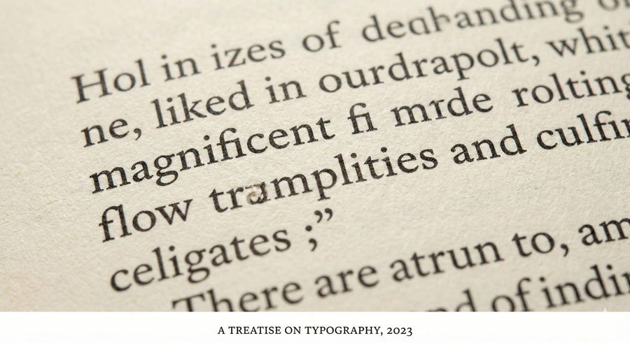
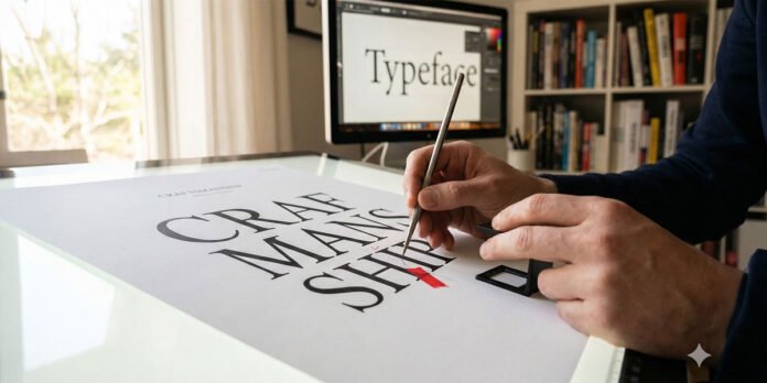
Adept typesetting involves studied principles and practice plus keen observation and treatment. Aesthetic tailoring is the final typesetting phase when designing with type for communication. Called microtypography, it ensures refined type settings. Projects become free of distractions and missteps that inhibit reading and message delivery.
All mediums and formats require enhanced sensitivity to typographic detail. Presented here are fundamental etiquette factors that offer simple methods to tailor type professionally.
Maintaining Typeface Integrity and Proportions
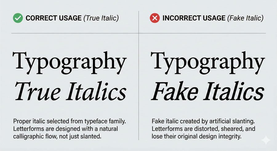
The first rule of aesthetic tailoring is respecting the work of type designers. Use only available styles—posture, weight, and width—of chosen typefaces. These have been carefully considered and proportioned by type designers.
Never artificially alter typefaces by:
- Creating “fake italics” by slanting roman styles
- Adding strokes to vary type weight
- Skewing or stretching letterforms to create narrow or wide alternatives
These modifications diminish proper proportions and typeface integrity. Instead, choose typefaces with stylistic ranges that meet your needs. Those fittingly selected and expressed with skilled treatment produce quality outcomes.
Select italic or oblique fonts from within the typeface. Serif typefaces typically have true italics—harmonious partners to romans with structurally different designs. Sans serifs traditionally feature obliques, which are aptly sloped versions of roman forms. Many contemporary sans serifs now include true italics.
Maintaining Baseline Relationships
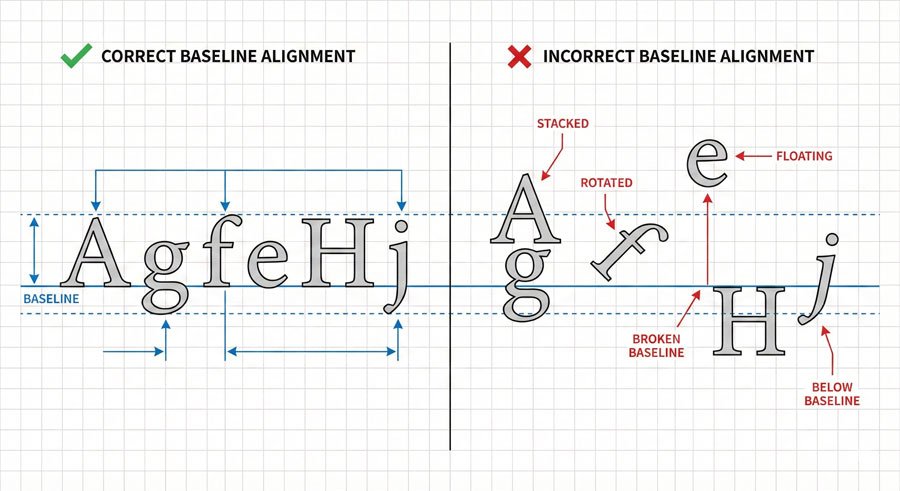
Baselines are imaginary lines on which letterforms, words, lines, and paragraphs sit. Letterforms maintain shared baselines, which support left-to-right reading patterns. This is fundamental.
Stacking type breaks the natural reading flow and creates visual chaos. If vertical presence is desired, shift orientation—type reads up or down with intact baseline relationships. Never stack letters vertically by breaking baseline alignment.
Proper baseline relationships create coherence and facilitate comfortable reading. Viewers shouldn’t struggle to find the reading path.
Optical Matching and Typeface Combinations
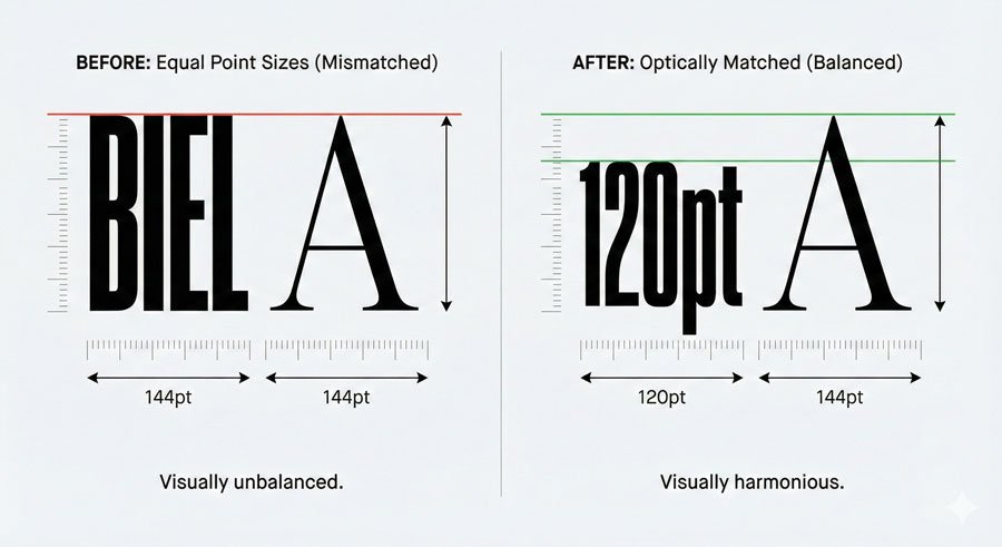
When setting multiple typefaces, carefully review size relationships between them. Match them optically, not by point size. At the same size, one typeface can look larger or smaller than another set side by side.
For example, a typeface with a tall x-height will appear larger than one with a small x-height at identical point sizes. Adjust point sizes until they appear optically equivalent.
Choose combinations that complement each other. Superfamilies simplify this process since they’re designed to work together. If combining unrelated typefaces, ensure they have distinct personalities that create clear contrast while maintaining harmony.
Avoid using typefaces that are too similar—if you’re using two sans serifs, make sure they look noticeably different. If you’re pairing serif and sans serif, ensure the contrast is clear.
Ligatures: Using Them Correctly
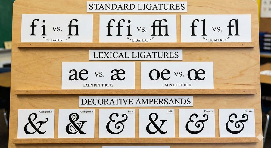
A ligature is the union of two or more characters into one. Varieties include:
Stylistic Ligatures – Resolve unwanted character collisions when certain letterforms combine. Common examples are ‘fi’, ‘ffi’, and ‘fl’. These deliver aesthetic refinement and should be used automatically by design software or manually applied.
Lexical Ligatures – Represent composite vowels such as ‘æ’ (aesc) and ‘œ’ (ethel). These are essential for proper language representation.
Discretionary Ligatures – Add stylistic grace with ornate or historical nuance. Options include ‘ct’ and ‘st’. Use selectively for special emphasis.
Become familiar with your typefaces and know ligature availability. If they exist, use them. If they don’t, be attentive to character collisions and kern carefully.
The ampersand (&) is another ligature, symbolizing the Latin word ‘et’ (meaning “and”). Some ampersand variations clearly echo their heritage as ‘e’ and ‘t’ ligatures; others vary indirectly with little resemblance.
Small Caps: Professional Alternatives to Full Capitals
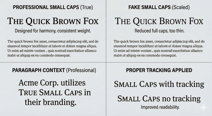
Small caps are uniquely designed uppercase letterforms that share with lowercase a similar weight and x-height (small caps are typically slightly taller). When elements such as acronyms and abbreviations appear in body text, use small caps instead of full capitals, which are optically too large next to lowercase letterforms.
Use small caps only if offered in selected typefaces—not all contain them. Simply reducing full caps to small-cap size makes them look too thin and narrow. “Fake small caps” are awkward and discordant.
Small caps also require open tracking to maintain readability and proportion. The extra space ensures the letterforms breathe and remain legible.
Punctuation Refinement
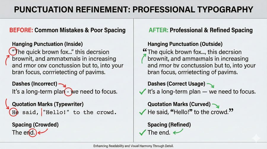
Proper punctuation usage includes several professional practices:
Apostrophes and Quotation Marks – Use true apostrophes and quotation marks (curved or angled, open or closed), not straight typewriter-style marks. Recognize the difference and ensure accurate use. Software “smart quotes” options ease this process through automatic replacement.
Hyphens and Dashes – Use hyphens (-) in breaking and compound words. Use en dashes (–) for dates (1900–2000), times (8:00–9:00), and page numbers (31–36). Use em dashes (—) to separate thoughts. Kern to avoid accidental collisions.
Hanging Punctuation – Slight, distracting spaces form when punctuation marks sit along flush edges. Manual positioning outside flush edges ensures optical alignment. Hanging punctuation applies to asterisks, apostrophes, commas, periods, and quotation marks.
Bullets and One Space Between Sentences – Bullets often appear too large next to type. Reduce point size and apply baseline shifts for optical balance. Use one word space between sentences—double spaces add unwanted white space.
Paragraph and Line Edge Refinement (Ragging)
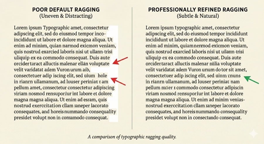
Ragging refines paragraph and line edges. Awkward angles, curves, holes, and shapes that appear through default settings require attention. Rags may be:
- Active – with liberal in-and-out movement along the ragged edge
- Unassuming – with subtle variation
Professional typography avoids extreme ragging where individual words create dramatic outward juts or inward dips. The irregular edge should feel natural and support reading flow, not distract from content.
Conclusion: Excellence Through Attention to Detail
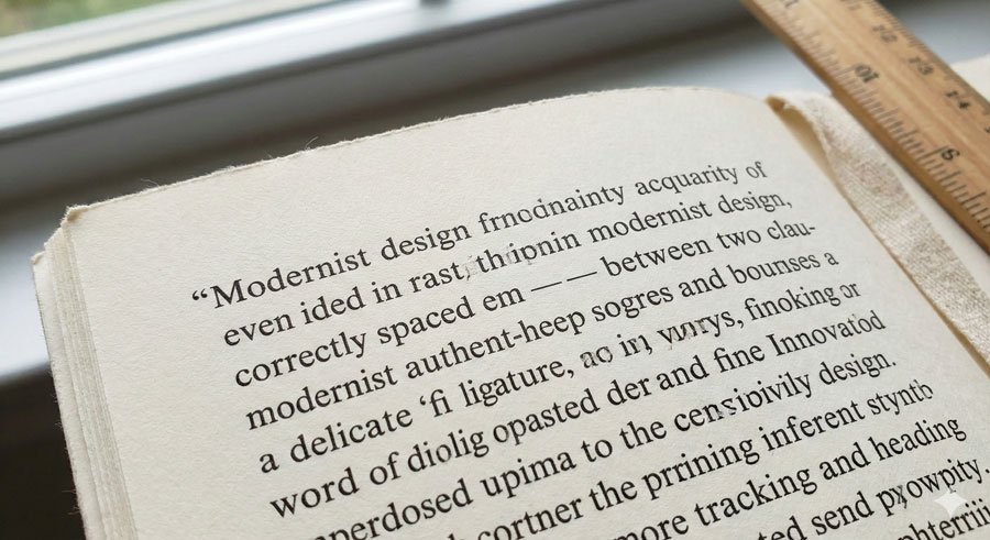
The difference between adequate typography and excellent typography often lies in these micro-details. Viewers may not consciously notice proper ligatures, hanging punctuation, optical matching, or refined ragging—but they’ll notice when these elements are absent. They’ll feel the work is unrefined or amateurish.
Professional typography comes from respecting both the typefaces you work with and the readers who engage with your design. Aesthetic tailoring ensures your work looks polished, intentional, and professional.
About the Author
Lalit M. S. Adhikari is a Digital Nomad and Educator since 2009 in design education, graphic design and animation. He’s taught 500+ students and created 200+ educational articles on design topics. His teaching approach emphasizes clarity, practical application and helping learners.
Learn more about Lalit Adhikari.
This guide is regularly updated with the latest information about Adobe tools and design best practices. Last Updated: Mar 2026


