Master typography spacing: kerning, tracking, leading. Learn alignment, hierarchy and how spacing creates visual impact and improves readability.
Table of Contents
The Power of Space in Typography
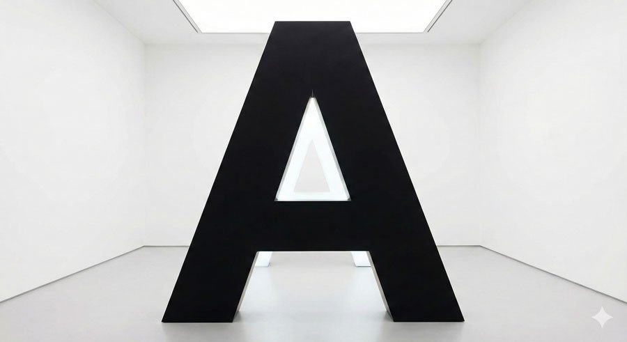
In his book Typography: A Manual of Design, Emil Ruder wrote: “The oriental philosophers hold that the essence of created form depends on empty space. Without its hollow interior a jug is merely a lump of clay, and it is only the empty space inside that makes it into a vessel.”
This insight applies perfectly to typography. Typesetting happens in accord with the space in and around letterforms. Space is as much a physical presence as typographic marks themselves. Their collective relationship enlivens works. Space can change the look and feel of type, noticeably improving or weakening it.
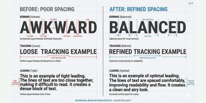
The act of spacing adjusts and refines the distances between characters, as well as the overall appearance of words, lines, and paragraphs. It includes three fundamental techniques: kerning, tracking, and leading (line spacing).
Typographic Color: How Spacing Creates Visual Impact
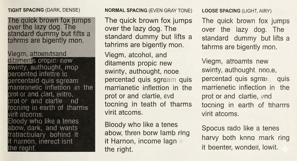
Typographic color refers to the overall lightness and darkness of type based on value, not hue. Light and dark values influence type appearance and hierarchy. Type lacking color is dull and flat; strong color enlivens works with variation and emphasis.
Text quantity, typeface selection, and space in and around letterforms—combined with well-articulated factors such as type size, style, and spacing—shape typographic color. Dark elements make strong imprints; light elements connote openness. Their interaction nurtures spatial depth, rhythm, and texture—all highly desirable typesetting attributes.
Tight spacing creates a blacker, more dramatic impression than loosely spaced type. Normal spacing typically means an even, gray field of text. Loose spacing creates an open, airy feeling. Each serves different purposes.
Kerning and Tracking: Character-Level Spacing
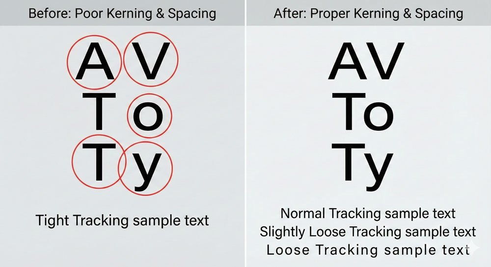
Kerning is the adjustment of space between specific character pairs. Some character combinations naturally create awkward gaps—think of ‘AV’, ‘To’, or ‘Ty’. Professional typefaces include kerning tables that automatically adjust spacing for problematic pairs. However, skilled designers often manually kern headlines and display text for optical perfection.
Kerning is optical, not mathematical. What looks correct visually determines good kerning. A kern pair that works at 72 points might not work at 48 points.
Tracking (also called letter-spacing) is uniform spacing adjustment applied across a range of characters. Unlike kerning which affects specific pairs, tracking affects all character relationships equally. Track can be:
- Normal – the default spacing designed into the typeface
- Loose – increased spacing for emphasis or open feeling
- Tight – decreased spacing for condensed impression
- Negative – tightly spaced, often used for display headlines
Small caps, for instance, require open tracking to maintain readability. Acronyms benefit from tracking adjustments. Tracking affects the overall typographic color and readability of passages.
Leading: The Vertical Dimension
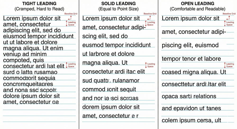
Leading (pronounced “ledding”) is the vertical distance from one baseline to the next, measured in points. The term derives from metal typesetting days when lead strips were set between lines of type to adjust vertical spacing.
Leading options are:
- Positive leading – space between lines is greater than point size (most common, creates openness)
- Solid leading – space between lines equals point size
- Negative leading – space between lines is less than point size (can cause ascenders and descenders to touch or overlap)
- Overlapping leading – an alternate method where one text fits into the line space of another
For most applications, positive leading is appropriate. Negative leading can work for display styles (24 point and up) but not body text. Body text (9 to 14 point) requires adequate leading for comfortable reading.
Leading depth is influenced by type size, x-height, and line length. Typefaces with tall ascenders and long descenders require more line spacing to avoid touching. Long lines need open leading because the eye travels farther from one line to another.
Alignment: Directing the Eye
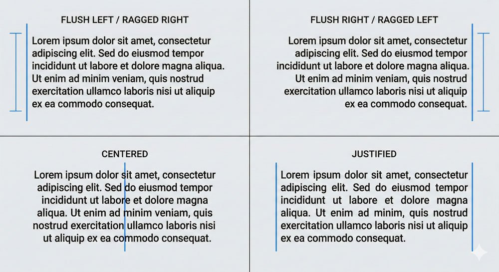
Typographic alignment refers to type configurations and dramatically affects readability and visual impression:
Flush Left / Ragged Right (FL/RR) – The most common and comfortable alignment. Starting points of lines are fixed on the left, creating a consistent reading entry point. Ragged right edges create irregular patterns but support natural left-to-right reading patterns.
Flush Right / Ragged Left (FR/RL) – Works well for words or lines, creates contrast with flush-left text when juxtaposed. Ragged left edges create irregular starting points that make reading paragraphs difficult.
Centered (C) – Connotes formality and classic typography. Useful in limited settings with minimal text (book title pages). Centering rarely applies to continuous text.
Justified (J) – Creates clean lines and strong left and right alignment edges. However, variable word spaces that flex in width can cause rivers (unsightly gaps in justified text). Justified paragraphs require careful attention to avoid readability problems.
The choice of alignment dramatically influences how readers engage with text. Always consider alignment in relationship to your content and medium.
Creating Hierarchy Through Variation

Effective typographic hierarchy emerges through variation in:
- Point size – Dramatic size changes create immediate emphasis
- Weight – Bold vs. regular creates visual distinction
- Width – Condensed vs. extended creates contrast
- Style – Roman vs. italic creates emphasis
- Case – Uppercase vs. lowercase affects prominence
- Color – Darker values create emphasis; lighter recede
- Position – Spacing and placement direct attention
- Orientation – Horizontal vs. vertical creates contrast
Spatial factors support hierarchy: spacing (tracking, kerning, leading), orientation shifts (horizontal, vertical, diagonal), and position changes. Graphic factors including line, shape, and color also support hierarchy.
The goal is creating visual interest while maintaining reading order. Viewers should understand which information is primary, secondary, and tertiary through your typographic choices.
Conclusion: Mastery Through Practice

Spacing and hierarchy require both learned principles and optical sensitivity. What looks correct visually most often stands true. Skilled typesetting comes from practice, observation, and refinement.
As you work, pay attention to how spacing choices affect readability and visual impact. Notice what works in professional design. This critical observation, combined with foundational knowledge, develops expertise.
About the Author
Lalit M. S. Adhikari is a Digital Nomad and Educator since 2009 in design education, graphic design and animation. He’s taught 500+ students and created 200+ educational articles on design topics. His teaching approach emphasizes clarity, practical application and helping learners.
Learn more about Lalit Adhikari.
This guide is regularly updated with the latest information about Adobe tools and design best practices. Last Updated: Mar 2026


