Learn typeface categories: Humanist, Old Style, Transitional, Modern serifs, plus Slab, Grotesque, Geometric and Humanist sans serifs. Master selection and pairing.
Table of Contents
The Typeface vs. Font Distinction
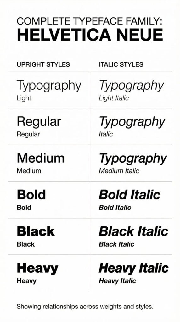
The terms “typeface” and “font” are frequently used interchangeably in modern practice, though technically they have distinct meanings. A typeface is the consistent design or distinct visual form of a type family.
It’s a cohesive system of related shapes created by a type designer, where characters including letterforms, numerals, and punctuation share formal attributes.
Historically, a font was a complete character set of a typeface in one point size and style—for example, 12-point Centaur roman.
The term can also describe family members comprising different weights and styles: light, regular, bold, italic. In digital practice, a font refers to a computer file that makes a typeface available for use and production.
Understanding this distinction helps you speak more precisely about typography and respect the work of type designers who create these systems.
Why Typeface Selection Matters
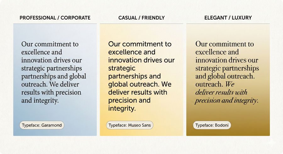
Typefaces influence communication through both appearance and legibility. Aesthetics provide first impressions and express personalities—friendly, professional, sweet and youthful, masculine, utilitarian. Connotation (implied meaning) inherent in typefaces plays a significant role in how your audience perceives your message.
Legibility refers to the recognition of single characters and their relationships when set side by side. Type designers carefully construct characters and pay special attention to space—particularly counters (enclosed white space in characters) and sidebearings (the built-in space on the left and right of characters). Character shape plus white space aid letterform recognition. Legibility relies on the invisible presence of space.
Apt typefaces directly engage viewers and send convincing messages. When you choose a typeface that aligns with your content, medium, and audience, you create work that feels intentional and compelling.
The Major Typeface Categories
Serif Typefaces
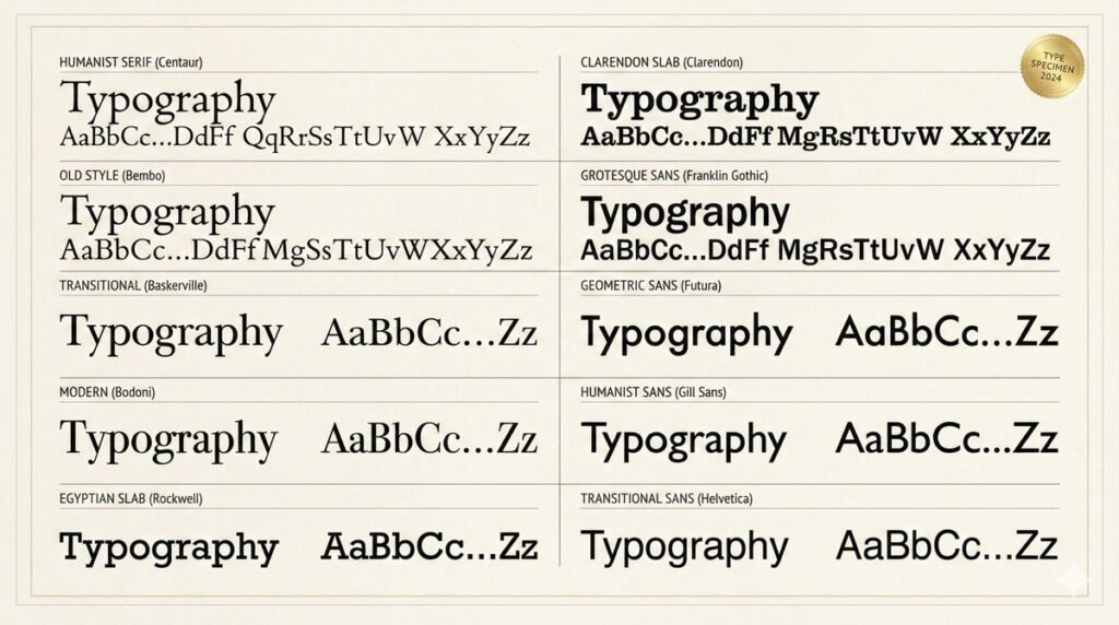
Serif typefaces are organized into four historical and formal categories:
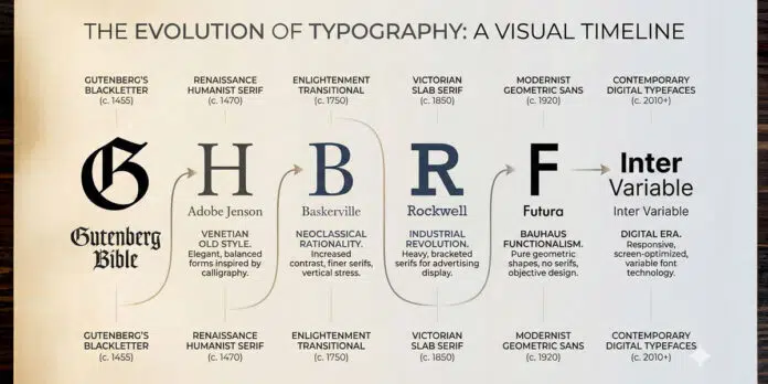
- Humanist Serif – The original roman typefaces, appearing in the fifteenth century. Inspired by Italian handwriting called “lettera antica,” they feature low thick-to-thin stroke contrast, bracketed serifs, angled crossbars on lowercase ‘e’, and oblique stress. Examples include Centaur and Vendetta. These typefaces feel elegant and historical.
- Old Style Serif – More refined than Humanist serifs with smoother, rounder forms. Appearing in the fifteenth and sixteenth centuries, they show medium thick-to-thin stroke contrast and horizontal crossbars on lowercase ‘e’. Examples include Bembo and Galliard. These typefaces balance elegance with readability.
- Transitional Serif – Appearing in the eighteenth century, inspired by engraving techniques. They feature medium to high thick-to-thin stroke contrast, sharper bracketed serifs, and taller x-heights. Baskerville is the archetypal example. These typefaces represent a bridge between historical and modern forms.
- Modern Serif – Also called Didone serifs, these appear in the eighteenth century with very high thick-to-thin stroke contrast, vertical stress, and hairline unbracketed serifs. Bodoni and Walbaum are classic examples. These typefaces feel formal and dramatic.
Slab Serif Typefaces:
- Egyptian – Appearing in the nineteenth century, featuring very low or uniform stroke contrast with heavy, square unbracketed serifs. Rockwell is the archetypal example. Originally designed for advertising, contemporary slabs are more versatile.
- Clarendon – Also appearing in the nineteenth century, featuring bracketed serifs and low thick-to-thin stroke contrast with distinctive ball terminals. Clarendons appear more refined than Egyptians.
Sans Serif Typefaces
- Grotesque – The first commercially widespread sans serifs, appearing in the nineteenth century. They show slight thick-to-thin stroke contrast with curved strokes ending at angles. Akzidenz-Grotesk is archetypal. These feel utilitarian and straightforward.
- Geometric – Appearing in the twentieth century, based on geometric shapes (circles, squares, triangles). They feature uniform stroke contrast and vertical stress. Futura is the prime example. These feel modern and rational.
- Humanist Sans – Taking inspiration from Humanist serifs with subtle thick-to-thin contrast and calligraphic influence. Gill Sans is archetypal. These feel approachable and refined.
Transitional Sans – From the mid-twentieth century onward, refreshed Grotesques with uniform stroke contrast and vertical stress. Helvetica and Univers are classic examples. These feel neutral and universal.
Legibility vs. Illegibility: When to Break the Rules
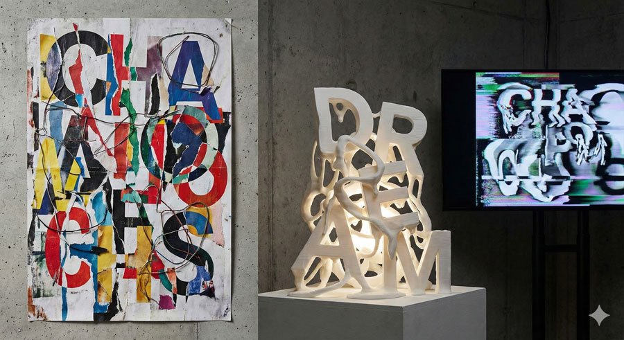
Some typefaces intentionally challenge legibility. These are typically designed for special purposes—display faces for posters, experimental faces for conceptual work, or decorative faces for specific contexts. For these typefaces, artistry and expression drive design rather than utility and communication.
This is important: understand the rules before you break them. Use legible typefaces for body text where readers need to absorb information comfortably. Reserve challenging typefaces for headlines, display use, or contexts where concept trumps comfort.
The craft of typography includes knowing when conventions serve your purpose and when breaking them creates more compelling communication.
Superfamilies: Comprehensive Typographic Systems
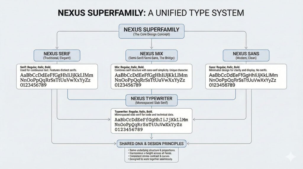
Superfamilies are full-bodied typeface families that can include serif, semi-serif, sans serif, semi-sans, and slab serif faces. They typically feature extensive weights and widths, as well as optical styles. Unified by concept and form, superfamilies provide complete typographic systems ideal for complex projects.
Type designer Martin Majoor’s Nexus (literally meaning “connection” in Latin) contains serif, sans serif, and slab serif typefaces. He describes it as “three typefaces, one form principle”—the allied threesome stems from one design concept driving its development.
Otl Aicher’s Rotis contains serif, semi-serif, sans, and semi-sans faces that transition effortlessly from one to the next. Superfamilies are comprehensive systems fit for wide-ranging, particularly complex, typographic projects.
Using a superfamily simplifies typeface selection. You know the faces work together harmoniously—that compatibility is built in.
Typeface Selection Considerations
When selecting typefaces for a project:
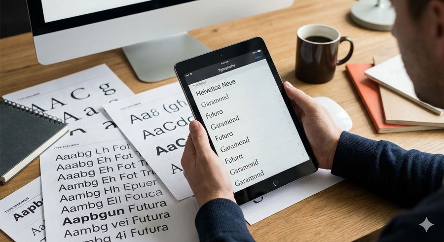
- Review in context – Print samples. View on multiple screens and resolutions. Mock up three-dimensional environments. What looks great on screen might not translate on paper.
- Match optically, not mechanically – When combining typefaces, match them visually rather than by point size. One typeface can look larger or smaller than another at identical point sizes.
- Consider the medium – Environmental signage requires legibility at a distance. Luxury packaging might demand elegance and refinement. Web typography must perform across devices.
- Respect typeface integrity – Use typefaces as designed. Don’t artificially stretch, squash, or modify them. Build a quality typeface library of faces with stylistic ranges that meet your needs.
Understand personality – Typefaces have distinct voices. Humanist serifs feel warm and historical. Geometric sans serifs feel modern and rational. Match personality to message.
Conclusion: Building Your Typographic Toolkit
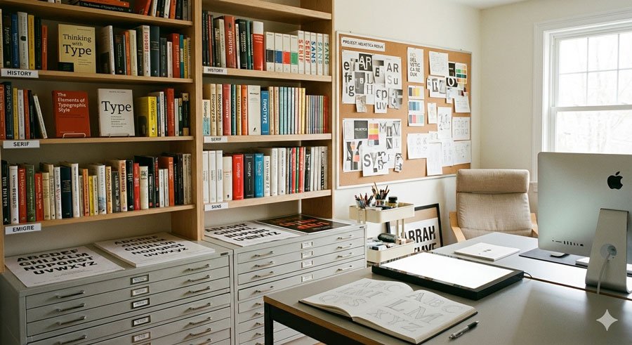
Excellence in typeface selection comes with experience. Test faces in your projects. Create specimens with ranges of settings suited to specific texts and mediums. No matter the situation, always review typefaces in context. Good typefaces fittingly selected and expressed with skilled treatment yield beautiful results.
About the Author
Lalit M. S. Adhikari is a Digital Nomad and Educator since 2009 in design education, graphic design and animation. He’s taught 500+ students and created 200+ educational articles on design topics. His teaching approach emphasizes clarity, practical application and helping learners.
Learn more about Lalit Adhikari.
This guide is regularly updated with the latest information about Adobe tools and design best practices. Last Updated: Mar 2026


