Discover how Futura typeface revolutionized geometric modernism, influenced design movements, and shaped the visual language of progress and the future.
My name is Lalit Adhikari and we are at LTY. Let’s begin!
Table of Contents
Introduction: The Typeface of the Future
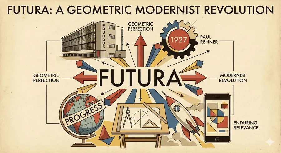
Futura represents one of typography’s most revolutionary achievements: a typeface that embodied geometric modernist principles and simultaneously captured cultural imagination about the future.
Designed by Paul Renner in 1927, Futura was not merely a typeface but a manifesto in typographic form, expressing modernist belief in progress, rationality, and geometric perfection.
Futura emerged during a crucial moment in design history. The 1920s were years of radical design experimentation and theoretical development. Modernist movements—including the Bauhaus, De Stijl, and Constructivism—were challenging traditional design approaches and developing revolutionary new design languages.
Within this context, Futura represented something remarkable: a commercial typeface that embodied modernist principles while remaining practical and readable. The typeface was not an experimental art object but a working tool suitable for printing, signage, and communication. This balance between theoretical purity and practical functionality made Futura revolutionary.
Futura’s geometric foundation was extraordinary.
The typeface was constructed from basic geometric shapes:
- Circles
- Triangles
- Straight Lines
This geometric construction reflected modernist belief that beauty emerged from rational principles and geometric perfection rather than from ornamental decoration.
The name “Futura” itself expressed the typeface’s ambition. The typeface was designed to express future vision, progress, and modernity. Futura was literally the typeface of the future.
Futura achieved enormous influence. The typeface was adopted by modernist designers, corporations, and institutions worldwide. Futura appeared in avant-garde design, commercial applications, institutional signage, and cultural contexts. The typeface became visually synonymous with modernism.
This comprehensive exploration examines Futura’s geometric foundations and design principles, traces Paul Renner’s design philosophy and role in creating the typeface, analyzes Futura’s revolutionary qualities and innovation, explores the typeface’s influence on modernist design movements, considers Futura’s cultural and commercial success, and ultimately asks:
- What does Futura reveal about modernism, design philosophy, and the relationship between geometric principles and human communication?
Modernism and Design Revolution: The 1920s Context
Modernist Design Principles and Rebellion
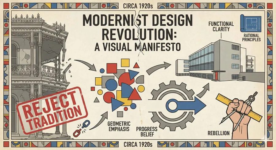
The 1920s represented pivotal moment in design history. Modernist designers rejected 19th-century ornamental traditions in favor of radical new approaches emphasizing function, clarity, and geometric form.
Modernism represented belief that design could express rational principles and progress. Designers believed that stripped-down, geometric forms represented honest truth about materials and function. Ornament represented dishonesty and tradition. Geometric clarity represented modern truth.
Bauhaus and Design Experimentation
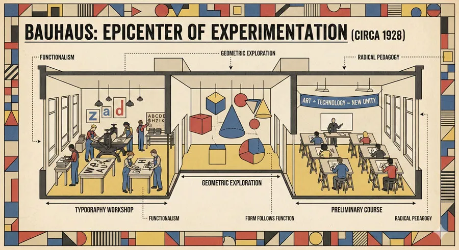
The Bauhaus school in Germany was epicenter of modernist design experimentation. Founded by Walter Gropius in 1919, the Bauhaus brought together artists, designers, and craftspeople to develop revolutionary new design approaches.
The Bauhaus emphasized integration of art and technology, geometry and function, theory and practice. Typography was central to Bauhaus thinking. The school developed radical typographic approaches emphasizing sans-serif typefaces, geometric principles, and functional clarity.
Geometric Sans-Serif Development
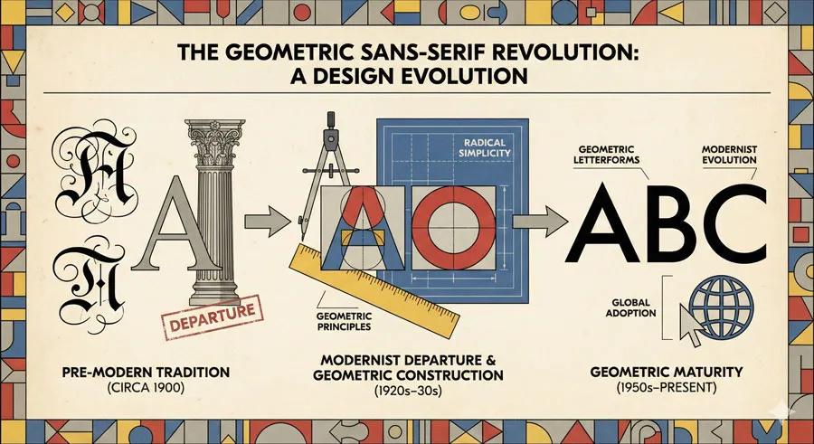
During the 1920s, designers developed geometric sans-serif typefaces expressing modernist principles. These typefaces were constructed from basic geometric shapes rather than from historical letterform traditions.
Geometric sans-serifs represented radical departure from traditional typography. The typefaces rejected centuries of typographic tradition in favor of geometric perfection and modernist principles.
Paul Renner: Designer and Modernist Visionary

Renner’s Design Background and Philosophy

Paul Renner was typography designer and design educator who developed deep commitment to modernist principles. Renner studied art and design and became involved in Munich design community.
Renner’s design philosophy emphasized clarity, functionality, and geometric principles. He believed typography should serve communication needs and express modern sensibilities. Renner rejected ornament as unnecessary and dishonest design.
Theoretical Framework and Design Thinking
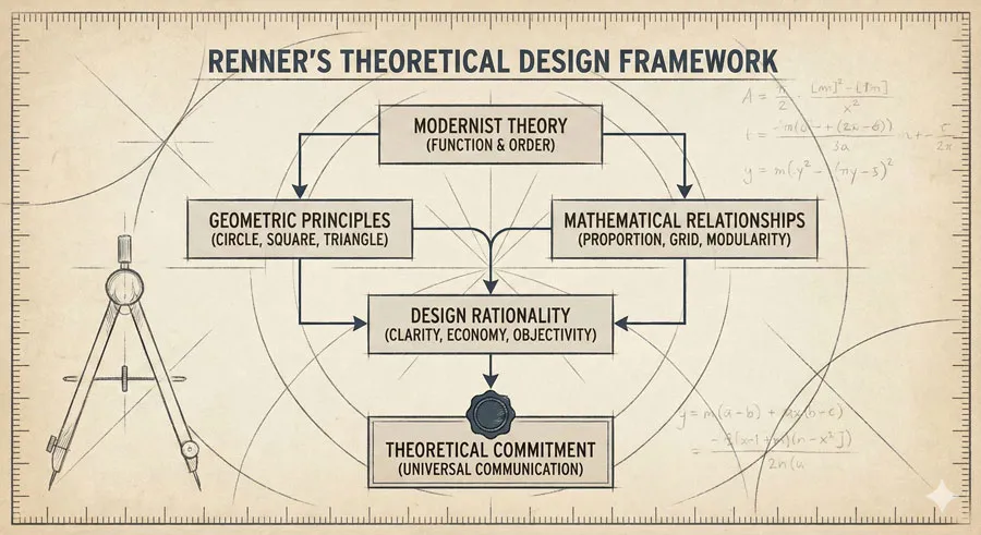
Renner developed theoretical framework for modern typography emphasizing geometric principles and functional clarity. His writing articulated modernist design philosophy explaining why geometric forms represented progress and honesty.
Renner believed that geometric forms reflected underlying mathematical principles creating beauty through rationality. This theoretical commitment drove Futura’s design.
Design Brief and Development
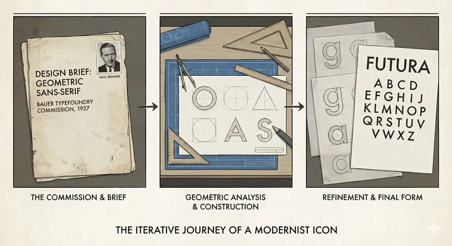
Renner was commissioned to design new typeface for Frankfurt-based Bauer Typefoundry. The foundry sought typeface expressing modernist principles while remaining practical for commercial use.
Renner developed Futura through careful geometric analysis. Every letterform was constructed from basic geometric shapes: circles for curves, straight lines for verticals and horizontals. This geometric construction created consistent, rational letterform family.
Futura’s Geometric Foundation: Revolutionary Design
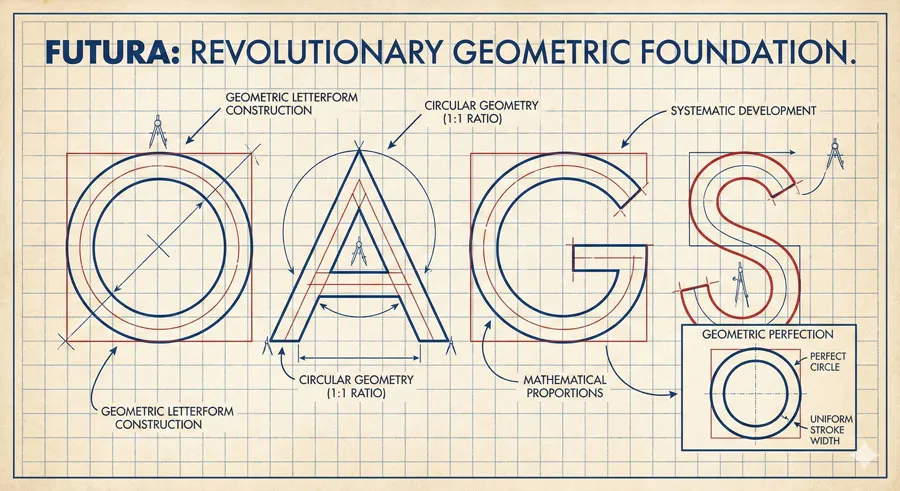
Geometric Letterform Construction
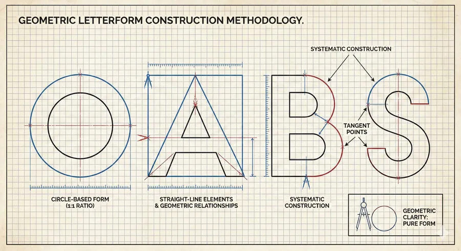
Futura’s most revolutionary characteristic was its geometric foundation. Unlike traditional typefaces developed through historical evolution and calligraphic tradition, Futura was constructed from basic geometric principles.
Each letterform was analyzed and constructed from geometric components. The letter “O” was a perfect circle. Curved strokes were based on circular geometry. This geometric construction created remarkable consistency and rational beauty.
Perfect Proportions and Mathematical Relationships
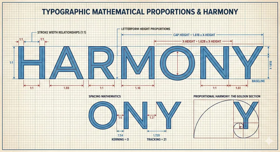
Futura’s letterforms were based on mathematical proportions. The typeface features carefully calculated relationships between stroke widths, letterform heights, and spacing.
These mathematical proportions created harmony and consistency throughout the typeface. The mathematical foundation expressed modernist belief that beauty emerged from rational principles rather than arbitrary tradition.
Elimination of Ornament and Historical Reference
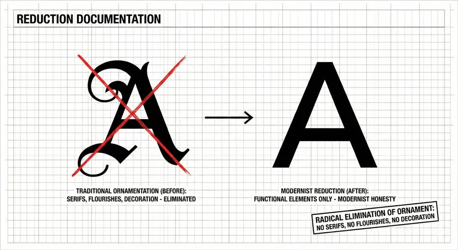
Futura eliminated all decorative elements and historical references. The typeface featured no serifs, no flourishes, no ornamental details. Every element served functional purpose.
This elimination of ornament represented radical modernist statement. Traditional typography accumulated centuries of ornamental tradition. Futura rejected this tradition completely, representing modernist belief in honest, functional form.
Geometric Perfection and Contemporary Aesthetic
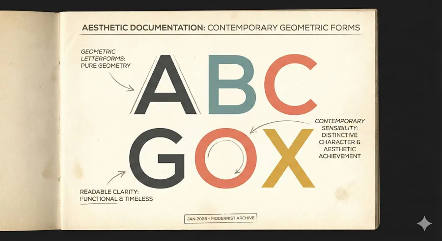
Despite geometric purity, Futura achieves remarkable contemporary aesthetic. The typeface is highly legible and readable. The geometric forms create distinctive character recognizable across diverse applications.
Futura demonstrates that geometric purity and practical functionality need not conflict. The typeface proves geometric principles can serve communication needs effectively.
Revolutionary Innovation: Modernist Principles in Commercial Typeface

Bridging Theory and Practice

Futura achieved something unprecedented: a typeface simultaneously embodying pure modernist theoretical principles while remaining practical for commercial and professional use.
Many modernist design experiments were theoretically pure but impractical. Futura proved that modernist principles could serve commercial communication without compromising theoretical integrity.
Cultural Expression of Modernist Vision
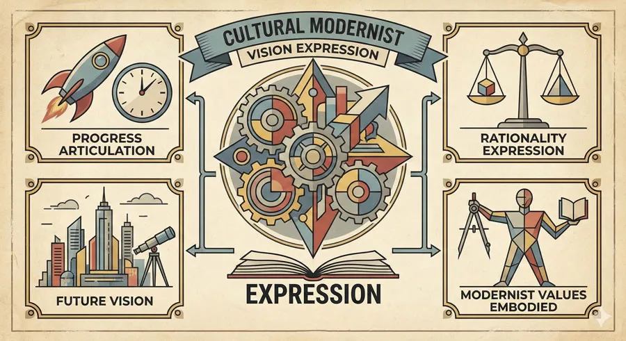
Futura expressed modernist vision that design could embody progress, rationality, and future vision. The typeface was literally designed to communicate modern aesthetic and values.
The typeface’s name—Futura—expressed ambition to create typeface expressing future orientation. The design successfully captured modernist optimism about technological progress and rational design principles.
Challenge to Typographic Tradition
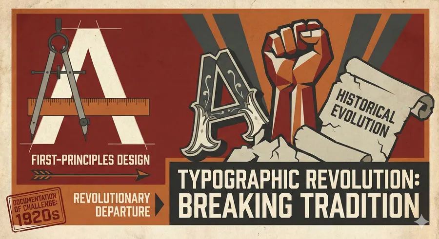
Futura challenged centuries of typographic tradition. The typeface rejected historical evolution and traditional letterform development in favor of geometric construction from first principles.
This represented radical challenge to design conservatism. Futura proved that revolutionary design approaches could achieve both theoretical purity and practical success.
Commercial Success of Radical Innovation

Futura achieved extraordinary commercial success despite—or perhaps because of—its revolutionary character. The typeface was adopted widely by corporations, designers, and institutions recognizing its modernist aesthetic and contemporary character.
This commercial success demonstrated that radical modernist design could appeal beyond avant-garde circles. Futura proved modernism could achieve popular appeal.
Influence on Modernist Design Movements

Avant-Garde Design Adoption
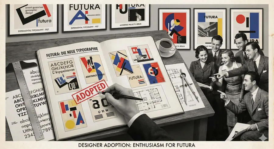
Futura was adopted enthusiastically by modernist designers and avant-garde design movements. The typeface appeared in experimental typography, artistic design, and avant-garde publications.
Modernist designers recognized Futura as embodiment of their design principles and theoretical commitments. The typeface became standard choice for designers expressing modernist aesthetic.
Bauhaus and Modernist Education

Futura was embraced by Bauhaus and modernist design education. The typeface was taught as exemplar of modernist typography expressing geometric principles and functional clarity.
Futura influenced design education by demonstrating how modernist theory could translate into practical, functional design.
Modernist Corporate and Institutional Design

Major corporations and institutions adopted Futura for branding and visual identity. The typeface expressed contemporary, progressive aesthetic attractive to organizations positioning themselves as modern and forward-thinking.
Futura became standard choice for modernist corporate design throughout 20th century.
International Modernist Design Movements

Futura influenced modernist design movements internationally. The typeface was adopted by designers in Germany, Soviet Union, United States, and other countries developing modernist design approaches.
Futura became visual language of international modernism.
Cultural and Commercial Success: From Avant-Garde to Ubiquity

Initial Adoption and Design Community Recognition

Futura achieved immediate recognition among design professionals. Designers recognized the typeface’s theoretical purity and practical quality.
The typeface quickly became standard choice for modernist designers and avant-garde design projects.
Corporate Branding and Commercial Adoption

Major corporations adopted Futura for branding and corporate identity. The typeface expressed contemporary, progressive aesthetic attractive to forward-thinking organizations.
Futura became standard typeface for modernist corporate design.
Public Signage and Institutional Design

Futura was adopted for public signage, institutional communications, and government design. The typeface’s clarity and contemporary aesthetic made it attractive for public communication.
Futura appeared throughout 20th century public environments.
Cultural Ubiquity and Historical Significance
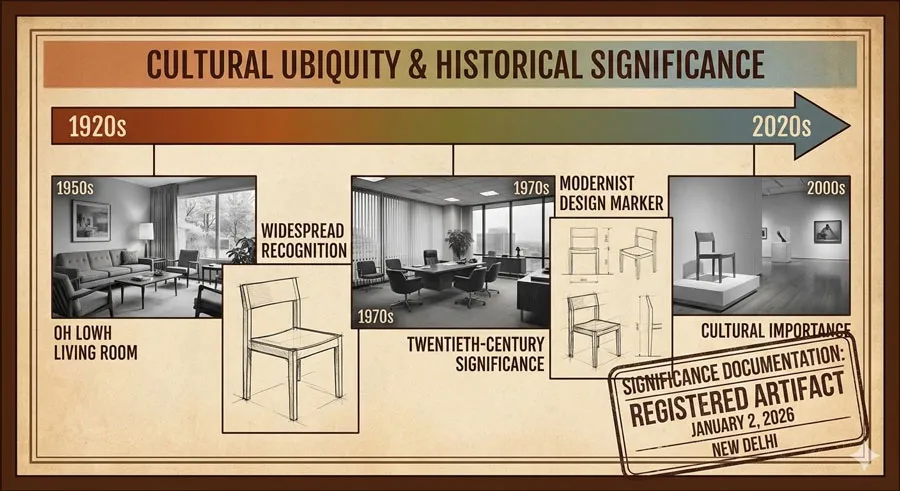
By mid-twentieth century, Futura had achieved cultural ubiquity. The typeface was recognized as defining typeface of modernist design and twentieth-century visual culture.
Futura became historically significant marker of modernist design era.
Geometric Perfection and Communication Balance

Legibility and Geometric Purity
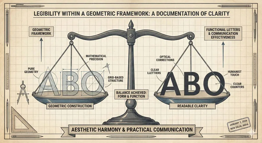
Futura successfully balances geometric purity with practical legibility and readability. Despite its geometric construction, the typeface remains highly readable.
This balance demonstrates that theoretical principles need not compromise practical functionality.
Personality Within Geometric Framework
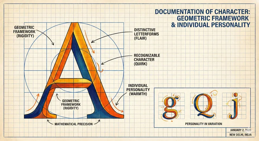
Despite geometric construction, Futura achieves distinctive personality and character. Each letterform is recognizable and distinctive while maintaining consistent geometric aesthetic.
Futura demonstrates that geometric principles can create characterful design.
Versatility Across Applications
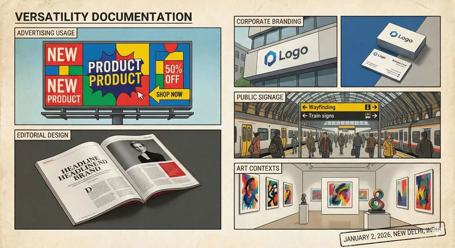
Futura works effectively across diverse applications: advertising, editorial design, corporate branding, public signage, fine art contexts.
This versatility demonstrates modernist design principles’ broad applicability.
Enduring Contemporary Relevance

Futura remains contemporary and relevant despite being designed in 1927. The typeface continues attracting designers seeking modernist aesthetic and geometric clarity.
Futura’s enduring relevance suggests modernist principles possess timeless quality.
FAQ: Common Questions About Futura and Modernism
Q: Is Futura actually based on perfect geometry?
A: Futura is constructed from geometric principles but not perfect geometry. The typeface requires adjustments for optical balance and readability.
Q: Why is Futura considered revolutionary?
A: Futura embodied modernist theoretical principles in practical, commercial typeface. The typeface proved that radical design innovation could achieve both theoretical purity and commercial success.
Q: What makes Futura different from other geometric sans-serifs?
A: Futura’s particular proportions, letter spacing, and character design distinguish it from other geometric typefaces. Futura achieves balance between geometric purity and practical functionality.
Q: Is Futura outdated?
A: No. Futura remains contemporary despite being almost 100 years old. The typeface demonstrates enduring appeal of modernist design principles.
Q: How did Futura influence contemporary design?
A: Futura established that geometric sans-serif typefaces could be commercially successful and widely adopted. The typeface influenced subsequent typeface design and established modernist aesthetic as commercially viable.
Q: Should designers still use Futura?
A: Yes. Futura remains excellent typeface for diverse applications. The typeface’s modernist aesthetic and geometric clarity remain attractive and appropriate for many contexts.
Q: What is Futura’s relationship to Bauhaus?
A: Futura embodies Bauhaus design principles but predates formal Bauhaus design movement. Futura and Bauhaus represent parallel modernist movements expressing similar design values.
Q: How does Futura compare to other sans-serifs?
A: Futura’s geometric foundation distinguishes it from humanist and grotesque sans-serifs. Futura’s particular character and proportions make it distinctive among sans-serif typefaces.
Q: Is geometric modernism still relevant?
A: Yes. Geometric modernist principles continue influencing contemporary design. Futura’s ongoing use demonstrates modernist aesthetic remains appealing.
Q: What did Futura’s design revolutionize?
A: Futura revolutionized typography by proving modernist theoretical principles could translate into practical, commercially successful typeface. The typeface demonstrated that radical design innovation could achieve broad appeal and influence.
Conclusion: Modernism, Geometry, and Design Excellence

Futura represents one of design’s greatest achievements: a typeface that simultaneously embodied pure modernist theoretical principles and achieved practical success serving diverse communication needs.
Paul Renner’s geometric construction created typeface expressing modernist vision of progress, rationality, and geometric beauty. Every design decision reflected theoretical commitment to modernist principles. Yet despite theoretical purity, Futura achieved remarkable legibility and practical utility.
Futura’s revolutionary character lay in bridging theory and practice. Many modernist design experiments were theoretically pure but impractical. Futura proved modernist principles could serve commercial communication effectively.
The typeface’s commercial success demonstrated that radical modernist design could achieve broad appeal beyond avant-garde circles. Futura proved modernism possessed popular appeal and cultural relevance.
Futura’s influence on design movements was profound. The typeface influenced Bauhaus, modernist design movements, corporate design, and design education. Futura became visual language of modernist design.
The typeface’s enduring contemporary relevance, nearly 100 years after its creation, suggests modernist principles possess timeless quality. Futura remains attractive to designers seeking geometric clarity and modernist aesthetic.
Futura’s story reveals something essential about design: that theoretical principles and practical functionality need not conflict. Design excellence emerges when theory and practice integrate successfully.
Futura also demonstrates that typefaces can express cultural and philosophical values. The typeface is not merely functional tool but expression of modernist vision and belief in progress, rationality, and geometric perfection.
Contemporary designers and design culture continue recognizing Futura as exemplar of design excellence and modernist achievement. The typeface represents period when design could express profound philosophical commitments while serving practical communication needs.
Understanding Futura means understanding modernism, geometric principles, design theory, and the relationship between form and function. Futura demonstrates that design excellence emerges from clear theoretical framework and commitment to principles expressed through every design decision.
About the Author
Lalit M. S. Adhikari is a Digital Nomad and Educator since 2009 in design education, graphic design and animation. He’s taught 500+ students and created 200+ educational articles on design topics. His teaching approach emphasizes clarity, practical application and helping learners.
Learn more about Lalit Adhikari.
This guide is regularly updated with the latest information about Adobe tools and design best practices. Last Updated: May 2026


