Explore why Comic Sans is despised by designers yet beloved by those with dyslexia. Discover how design snobbery masks accessibility benefits and perpetuates gatekeeping in typography.
My name is Lalit Adhikari and we are at LTY. Let’s begin!
Table of Contents
Introduction: When Contempt Meets Accessibility
Few typefaces inspire as much passionate contempt as Comic Sans. The typeface has become a symbol of design failure, poor taste, and amateurish design choices.
Design professionals dismiss Comic Sans as fundamentally bad. The typeface appears on countless “worst fonts” lists and worst design lists.
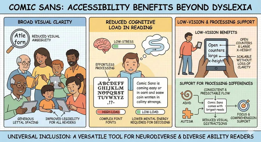
Yet this nearly universal design contempt obscures an important truth: Comic Sans serves crucial accessibility functions that design gatekeeping refuses to acknowledge. Comic Sans is one of the most readable typefaces for people with dyslexia.
The distinctive letterforms, generous spacing, and informal character that designers despise create exceptional readability for readers with specific visual and cognitive processing differences.
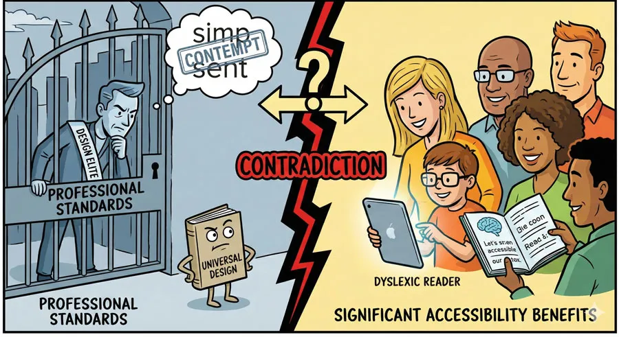
This contradiction reveals something profound about design culture:
- design criticism is often driven by gatekeeping and snobbery rather than by objective design principles or user needs.
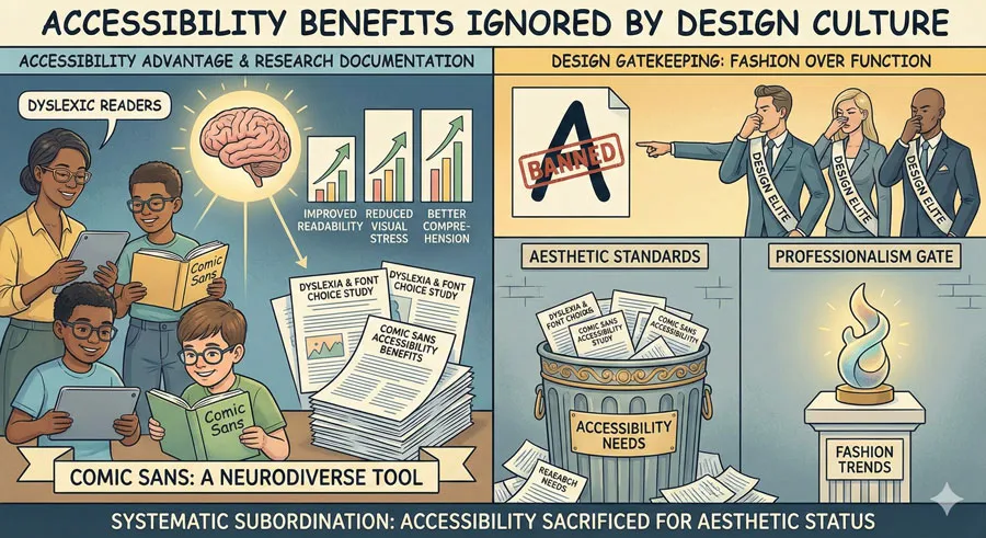
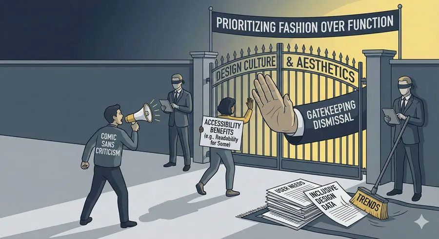
When accessibility benefits conflict with design fashion and professional status, design culture dismisses accessibility in favor of aesthetic judgment.
The Comic Sans story is not merely about a typeface. It reveals tensions between professional design culture and accessibility, between design fashion and human need, between design gatekeeping and inclusive design values.
It raises questions about whose needs design serves and who gets to decide which typefaces are acceptable.
Comic Sans deserves reconsideration—not because the criticism is entirely unfounded, but because accessibility and inclusive design must be centered in typography education and evaluation.
Dismissing Comic Sans while ignoring its accessibility benefits reflects design culture’s failure to prioritize accessibility and inclusion.
This comprehensive exploration examines Comic Sans history and design characteristics, explores the typeface’s controversial reception and contempt, analyzes the accessibility benefits that design gatekeeping ignores, critiques design snobbery and gatekeeping, considers contexts where Comic Sans is genuinely appropriate, and ultimately asks:
- What does Comic Sans reveal about design culture’s relationship with accessibility, inclusion, and gatekeeping?
Comic Sans History: From Innocent Beginning to Contempt
Original Design Intent and Purpose
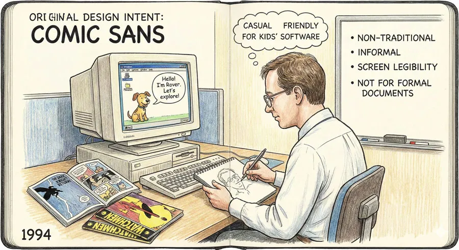
Comic Sans was designed in 1994 by Vincent Connare for Microsoft. The typeface was created for a specific purpose: casual, friendly informal communication in Microsoft applications.
Connare was inspired by comic book lettering. He wanted to create a typeface that evoked the informal, playful character of hand-drawn comic book text. The typeface was designed for contexts where informal friendliness was appropriate:
- Casual documents
- Friendly communication
- Children’s materials
When Comic Sans was released as part of Microsoft software, it was simply one of many typefaces available. There was nothing particularly remarkable about it. The typeface served its purpose: informal, casual, friendly communication.
The Rise to Prominence Through Ubiquity
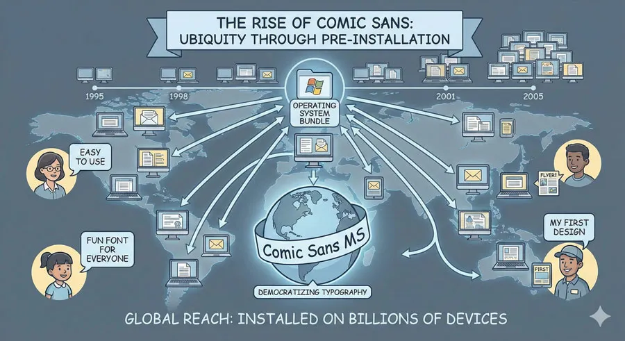
Comic Sans achieved prominence through ubiquity rather than through deliberate design adoption. Because Comic Sans came preinstalled on millions of computers, it became accessible to anyone creating documents. Because the typeface was informal and friendly, it was deployed in countless contexts.
Importantly, Comic Sans was accessible to non-professional designers and writers. People without design training could use Comic Sans. This accessibility to non-professionals was partly responsible for its widespread use.
Cultural Adoption and Misuse
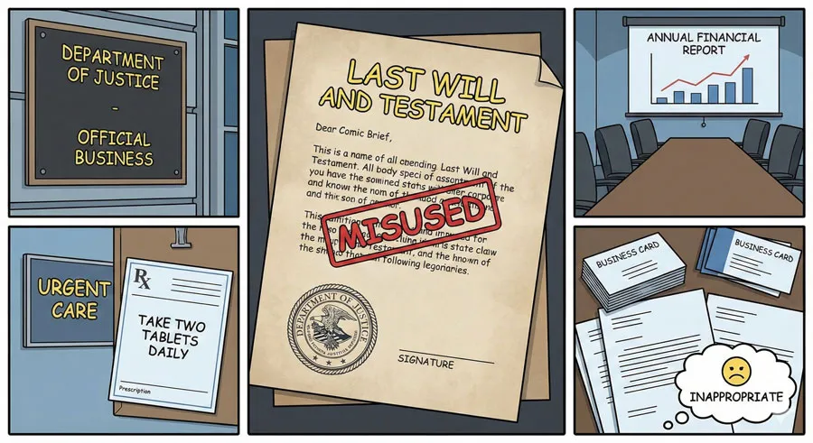
Comic Sans appeared on business documents, official communications, government forms, and serious institutional contexts where the informal character was entirely inappropriate. Wedding invitations used Comic Sans. Law firms used Comic Sans. Medical offices used Comic Sans.
This widespread use in inappropriate contexts created cultural perception that Comic Sans was unsuitable for any context requiring professionalism or seriousness. The typeface became associated with poor design judgment and amateur design choices.
The Contempt Emerges
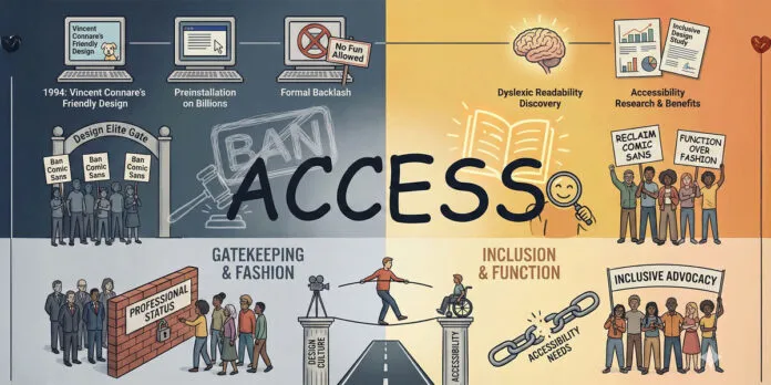
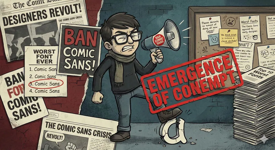
By the early 2000s, design professionals had developed near-universal contempt for Comic Sans. The typeface became a symbol of design failure. Designers created “Ban Comic Sans” movements. Comic Sans appeared constantly on worst fonts lists.
This contempt was driven partly by legitimate concerns about inappropriate use but increasingly by design snobbery and gatekeeping. Comic Sans became a symbol that separated professional designers from amateurs, design sophistication from lack of taste.
Understanding Comic Sans Design Characteristics
Distinctive Letterforms
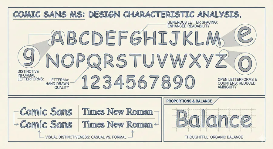
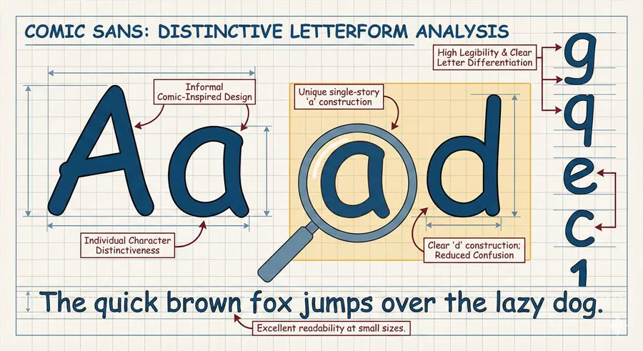
Comic Sans features distinctive letterforms inspired by comic book lettering. The letters are informal, playful, and easily recognizable. Each letterform has individual character.
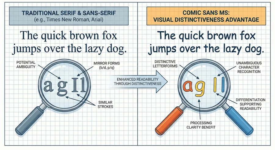
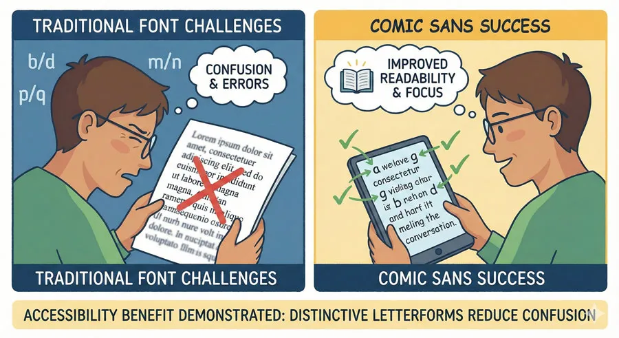
Importantly, these distinctive letterforms create high legibility at the character level. Individual letters are clearly differentiated. The letter “l” cannot be confused with “I”. The letter “O” is distinct from “0”. These distinctions create legibility benefits.
Informal Character and Personality
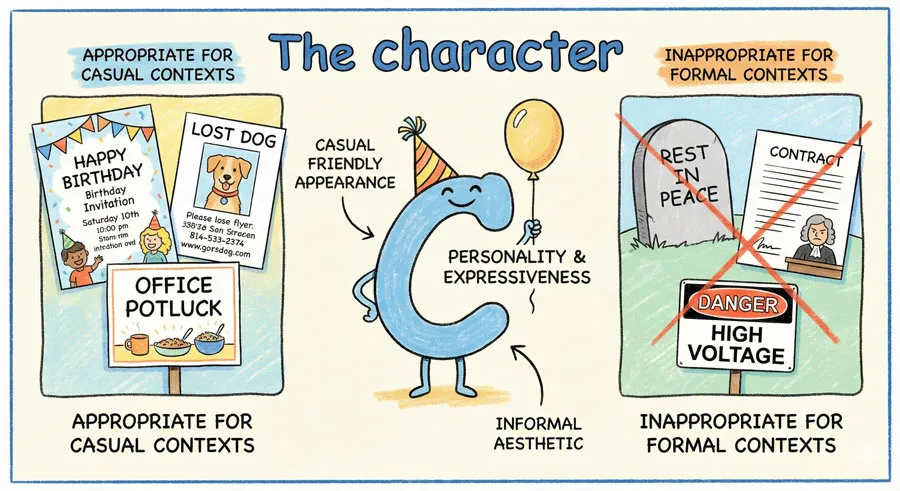
Comic Sans has obvious personality. The typeface is informal, casual, friendly. This personality is entirely intentional and appropriate for specific contexts.
However, this same personality becomes problematic in contexts requiring formality and seriousness. Comic Sans communicates the wrong message in formal contexts.
Generous Spacing and Open Letterforms
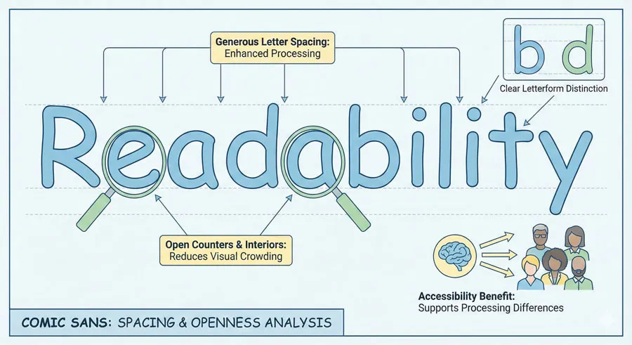
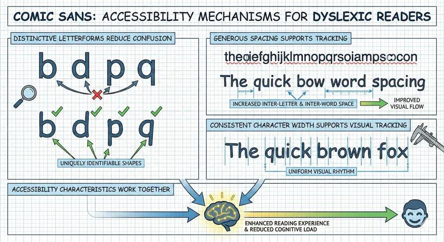
Comic Sans features relatively generous spacing between letters and open letterforms. The counters (spaces inside letterforms) are relatively open and clear. These characteristics support readability.
For many readers, generous spacing and open letterforms make text easier to read. For readers with dyslexia, these characteristics can significantly improve readability.
Visual Distinctiveness
Comic Sans letterforms are visually distinctive. They look different from other sans-serif typefaces. This distinctiveness can make the typeface easier to read for readers who benefit from distinctive, unambiguous letterforms.
Proportions and Balance
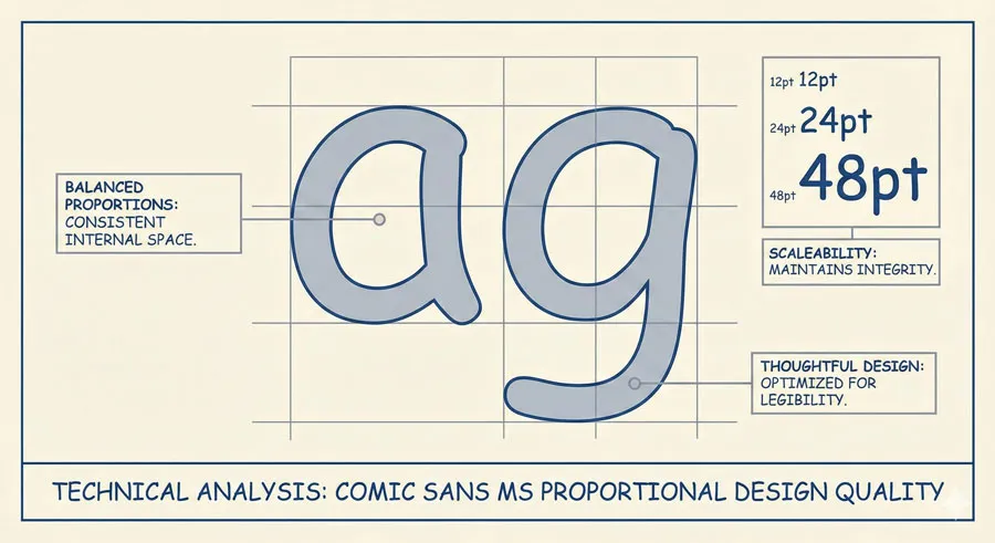
Despite its informal character, Comic Sans is reasonably well-designed. The proportions are balanced. The typeface works at various sizes. The design is thoughtful despite its casual appearance.
Design Gatekeeping: The Architecture of Contempt
Professional Status and Typeface Selection
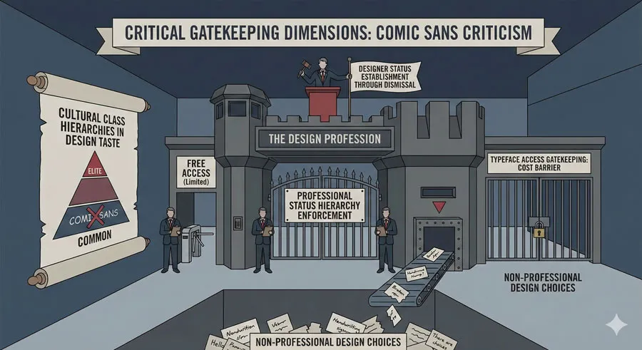
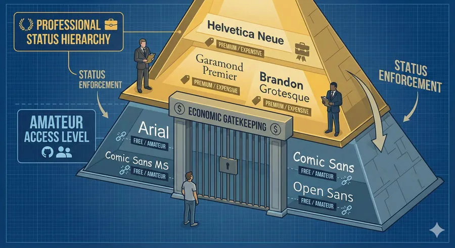
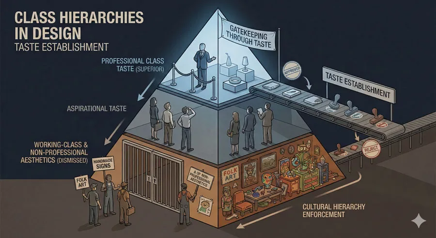
A significant dimension of Comic Sans criticism is gatekeeping based on professional status. Comic Sans is a “free” typeface, available to everyone without cost. Many “professional” typefaces require purchase.
This economic gatekeeping creates hierarchies: expensive typefaces are considered more professional, more sophisticated, more appropriate. Free typefaces are viewed with suspicion as amateur or low-status choices.
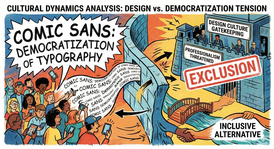
Comic Sans’ availability to everyone (it comes preinstalled on computers) democratized typeface access. However, this democratization is precisely what design professionals criticize. Comic Sans made typeface choice available to non-professionals, threatening professional gatekeeping.
Designer Status and Design Fashion
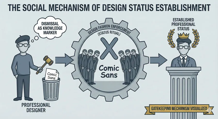
Comic Sans criticism reflects design fashion and professional status establishment. By dismissing Comic Sans, designers establish their design sophistication and professional standing. Despising Comic Sans becomes a marker of professional design knowledge.
This gatekeeping functions as status establishment:
- “Real designers” do not use Comic Sans.
- Professionals who “know better” avoid Comic Sans.
- Comic Sans becomes associated with lack of design knowledge and low professional status.
Appropriateness vs. Fashion
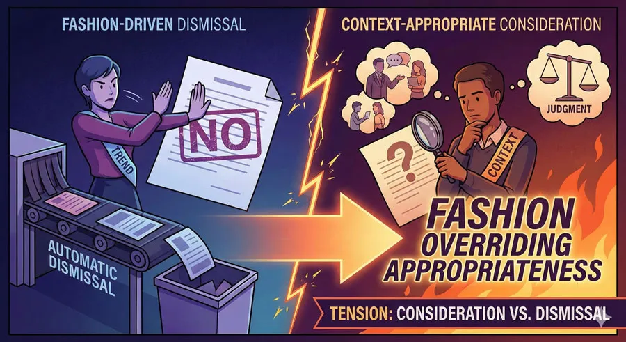
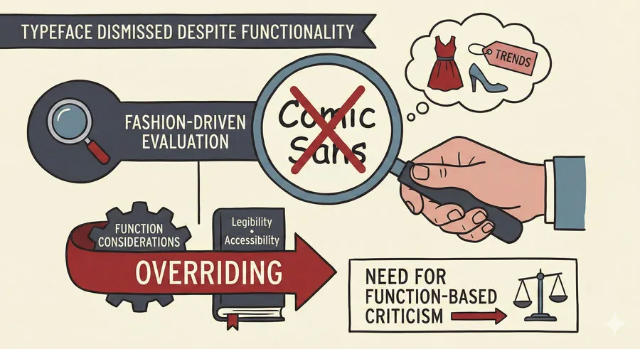
While some Comic Sans criticism reflects legitimate concerns about inappropriate use, much criticism reflects fashion rather than objective design evaluation. Comic Sans criticism has become so fashionable that designers criticize the typeface reflexively without considering appropriateness or context.
A designer might dismiss Comic Sans without considering whether it would be appropriate for a specific project. The typeface is dismissed by fashion and status rather than by reasoned evaluation.
Cultural Class and Taste Hierarchies
Comic Sans criticism often reflects class hierarchies in design culture. Comic Sans is associated with non-professional use, with contexts and users perceived as lacking design sophistication. Dismissing Comic Sans allows design professionals to establish cultural status and superiority.
This gatekeeping reflects broader cultural hierarchies where professional, educated taste is privileged over working-class aesthetics and accessibility.
The Accessibility Dimension Design Culture Ignores
Comic Sans and Dyslexia
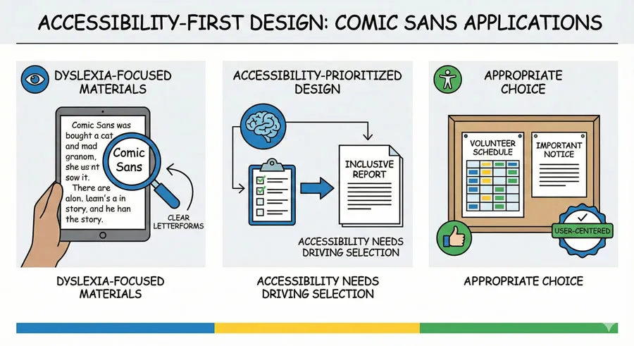
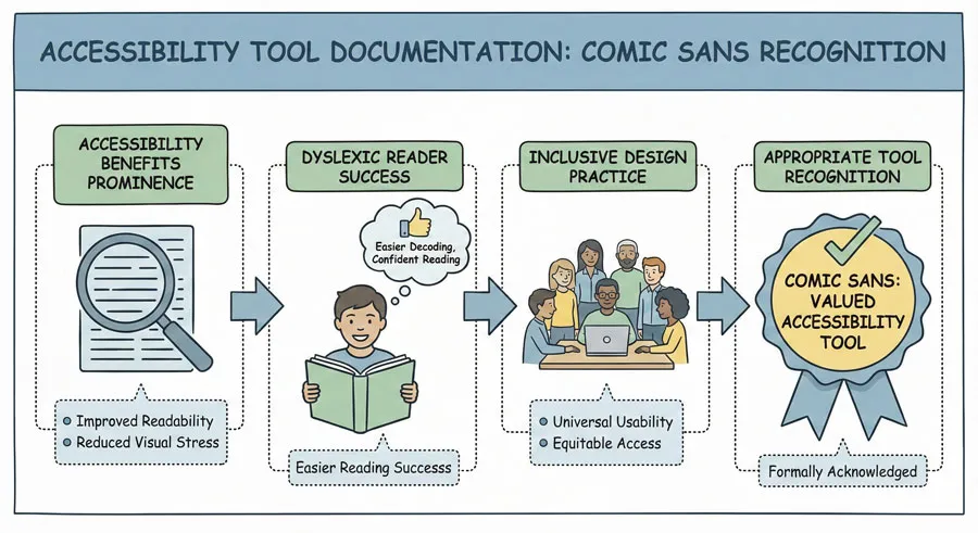
Comic Sans is one of the most readable typefaces for people with dyslexia. Research and extensive anecdotal evidence from dyslexic readers confirm that Comic Sans significantly improves readability for many people with dyslexia.
The typeface’s distinctive letterforms, generous spacing, and informal character create characteristics that support dyslexic readers. The letter “a” in Comic Sans looks distinctly different from the letter “d”. The spacing between letters is clear and generous. These characteristics reduce reading confusion and improve readability.
Why Comic Sans Works for Dyslexia
Dyslexic readers often struggle with letter confusion and visual processing. Fonts with distinctive, unambiguous letterforms reduce confusion. Fonts with generous spacing make individual letters clearer. Fonts with consistent character width support visual tracking.
Comic Sans possesses all these characteristics. The typeface’s informal, playful character is precisely what makes it effective for dyslexic readers.
Other Accessibility Benefits
Beyond dyslexia, Comic Sans serves other accessibility functions:
- Visual clarity – Distinctive letterforms and open counters improve readability for many readers
- Reduced cognitive load – Clear, unambiguous letterforms reduce the mental effort required to read
- Low-vision readers – The relatively large default sizes and open design can benefit readers with low vision
- Readers with other processing differences – Readers with various visual or cognitive processing differences often find Comic Sans more readable than other typefaces
Design Culture’s Dismissal of Accessibility
Despite clear accessibility benefits, design culture dismisses Comic Sans without acknowledging these benefits. Comic Sans criticism rarely mentions accessibility. Design professionals criticize the typeface’s appearance without considering its functionality for accessibility.
This reflects a troubling pattern in design gatekeeping: accessibility benefits are subordinated to aesthetic judgment and design fashion. When accessibility conflicts with design taste, design culture prioritizes taste.
When Comic Sans Is Genuinely Appropriate
Informal Friendly Communication
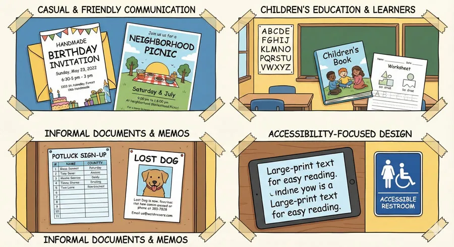
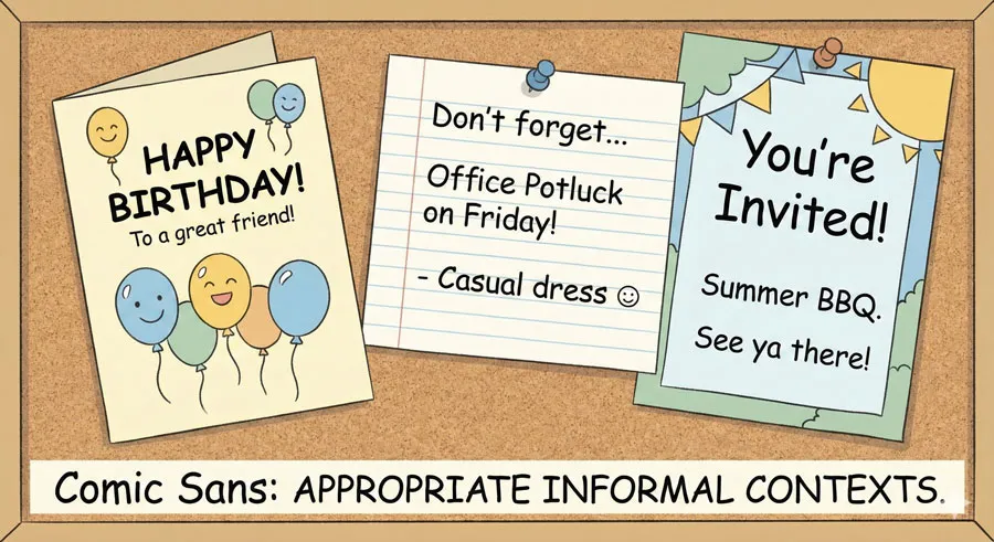
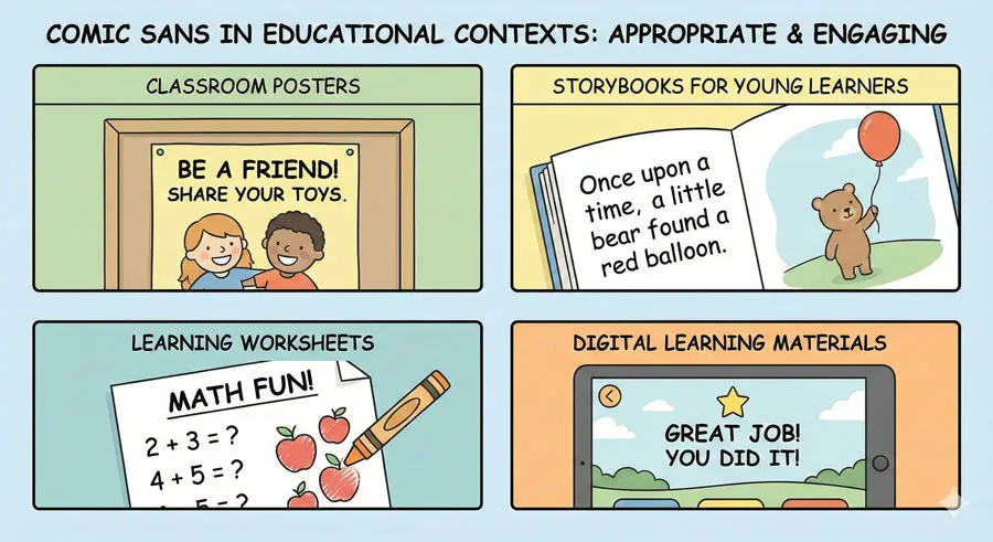
Comic Sans is genuinely appropriate for casual, informal, friendly communication. Children’s materials, greeting cards, birthday invitations, casual documents—these are contexts where Comic Sans works well.
The typeface’s informal character communicates the right message in these contexts. Comic Sans signals friendliness, casualness, and playfulness—appropriate qualities for these applications.
Accessibility-First Contexts
Comic Sans is appropriate—indeed, preferable—for accessibility-first contexts. Documents designed for readers with dyslexia should seriously consider Comic Sans. Materials for readers with processing differences should consider Comic Sans.
In these contexts, accessibility benefits override aesthetic preferences. The question is not whether Comic Sans matches design fashion but whether it serves reader needs.
Educational Materials
Comic Sans can be appropriate for educational materials, particularly materials for younger learners or readers with processing differences. The typeface’s playful character can make educational materials less intimidating.
Internal Communications
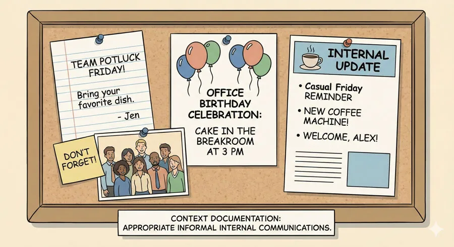
Comic Sans can be appropriate for internal, informal communications. Casual company communications, informal documents, friendly memos—these are contexts where Comic Sans’ informal character is appropriate and even desirable.
Comic Sans Criticism: Separating Legitimate from Gatekeeping
Legitimate Criticisms
Some Comic Sans criticism reflects legitimate design concerns:
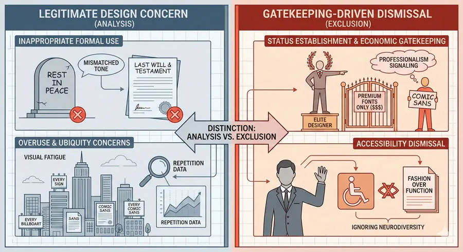
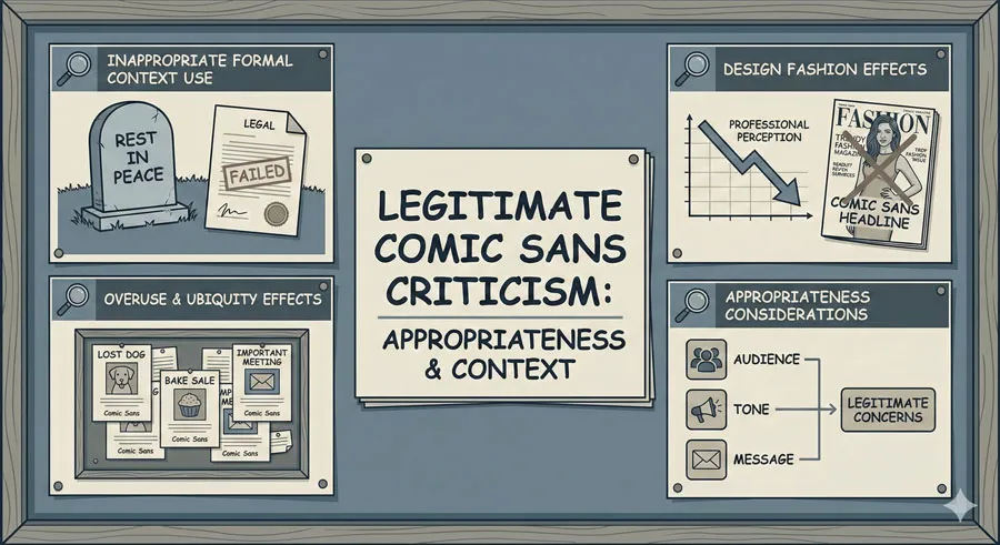
- Inappropriate use – Comic Sans deployed in formal contexts is genuinely inappropriate. Legal documents, formal business communications, institutional branding—Comic Sans communicates the wrong message.
- Overuse – Comic Sans’ ubiquity has made the typeface unsuitable for contexts requiring distinctiveness or professional appearance.
- Design fashion – Comic Sans has become so associated with poor design that using it communicates design ignorance regardless of appropriateness.
These legitimate concerns focus on appropriateness and context rather than the typeface’s inherent quality.
Problematic Criticisms
However, much Comic Sans criticism reflects gatekeeping rather than legitimate design evaluation:
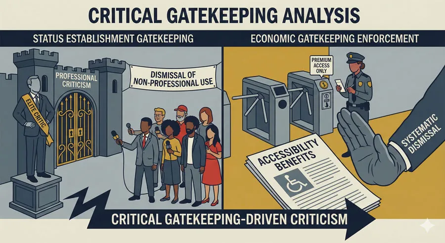
- Status establishment – Comic Sans is criticized because dismissing it establishes professional status and design sophistication.
- Economic gatekeeping – Comic Sans is criticized partly because it is free and accessible, threatening professional gatekeeping based on expensive, exclusive typefaces.
- Dismissal of non-professional use – Comic Sans is criticized because it is used by non-professionals, whose design choices are dismissed reflexively without consideration.
- Ignoring accessibility – Comic Sans is criticized without acknowledgment of accessibility benefits, reflecting design culture’s failure to prioritize inclusion.
Reframing Comic Sans: Accessibility and Inclusion
Comic Sans as Accessibility Tool
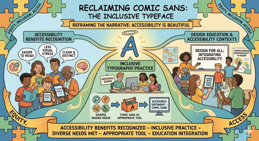
Rather than dismissing Comic Sans, design culture should recognize the typeface’s accessibility benefits. Comic Sans should be included in accessibility-focused typography discussions.
Design education should teach when Comic Sans is appropriate—particularly in accessibility contexts. Students should learn that Comic Sans, despite being unfashionable, serves important accessibility functions.
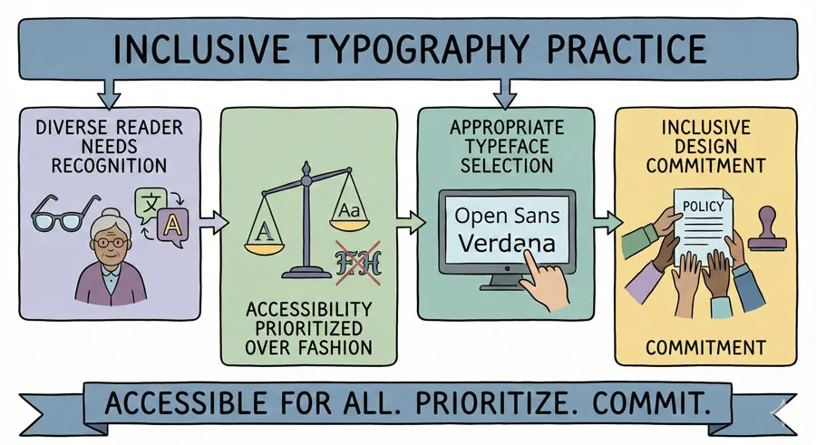
Inclusive Typography Practice
Inclusive typography practice requires recognizing that different readers have different needs. A typeface that is unfashionable among design professionals might be ideal for specific readers.
Designers should prioritize accessibility over fashion. When designing for readers with dyslexia or processing differences, designers should consider Comic Sans seriously despite fashion and professional status implications.
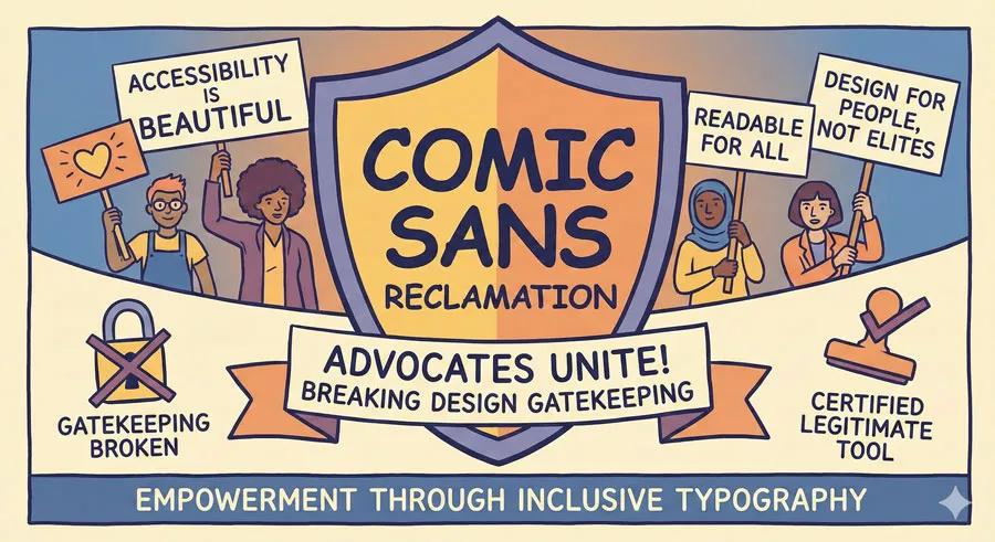
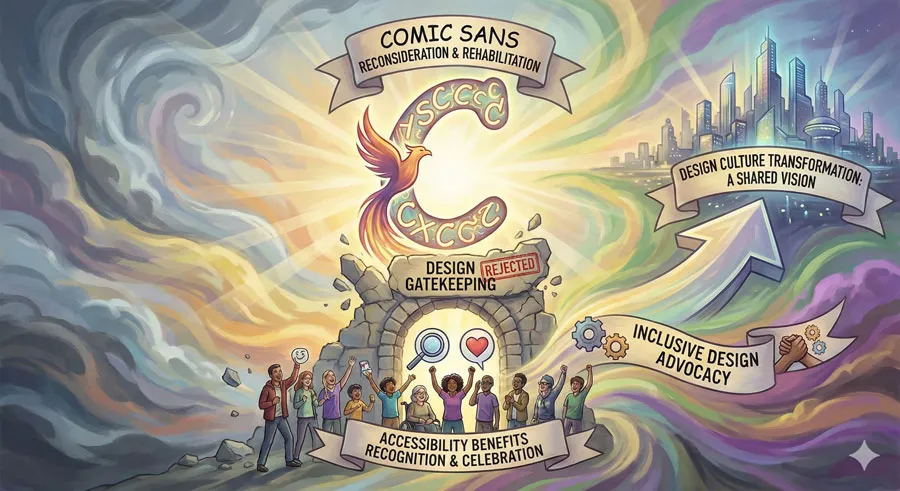
Reclaiming Comic Sans
Some designers and accessibility advocates have begun reclaiming Comic Sans. Rather than dismissing the typeface, they highlight accessibility benefits and appropriate use contexts.
This reclamation suggests that Comic Sans deserves recognition as legitimate accessibility tool rather than dismissal as design failure.
Broader Implications for Design Gatekeeping
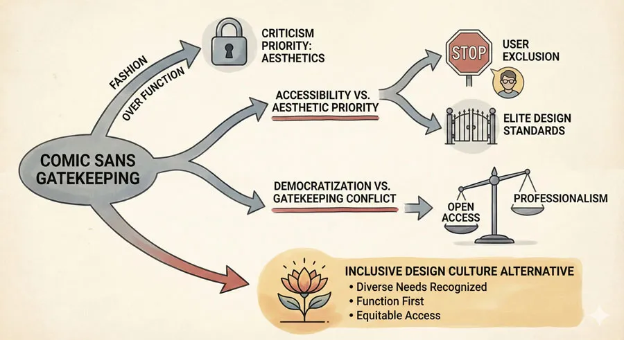
Fashion vs. Function in Design Criticism
Comic Sans reveals how design criticism often reflects fashion and status rather than objective evaluation. A typeface dismissed by design professionals might serve crucial functions for specific users.
Design criticism should prioritize function and user need over fashion and professional status.
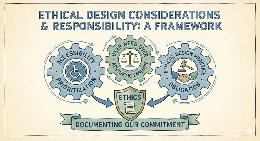
Accessibility and Design Ethics
Comic Sans raises ethical questions for designers. Should design professionals prioritize aesthetic fashion over accessibility benefits? Should designers dismiss tools that serve crucial accessibility functions because those tools are unfashionable?
Ethical design practice requires prioritizing accessibility and user need over design fashion.
Democratization and Design Culture
Comic Sans’ availability to everyone democratized typography. However, design culture’s response has been to gatekeep and dismiss non-professional design choices.
This reflects design culture’s tension with democratization. Design professionalism is partly maintained through gatekeeping of appropriate tools and choices. Democratization threatens this gatekeeping.
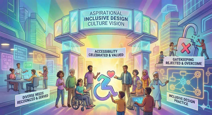
Inclusive Design Culture
An inclusive design culture would acknowledge accessibility benefits, recognize diverse user needs, and avoid dismissing tools that serve those needs based on fashion or professional status.
An inclusive design culture would celebrate Comic Sans as accessibility tool while also teaching appropriate context and use.
FAQ: Common Questions About Comic Sans and Accessibility
Q: Is Comic Sans really accessible for dyslexia?
A: Yes. Extensive research and anecdotal evidence from dyslexic readers confirm that Comic Sans significantly improves readability for many dyslexic readers.
Q: Should I use Comic Sans for accessibility?
A: Comic Sans is one option for accessibility. Other typefaces (Verdana, Open Dyslexic, Segoe, etc.) also provide accessibility benefits. Choice should depend on specific reader needs.
Q: Is all criticism of Comic Sans gatekeeping?
A: No. Some criticism reflects legitimate concerns about inappropriate use. However, much criticism reflects gatekeeping rather than legitimate design evaluation.
Q: Should Comic Sans be used in professional documents?
A: Generally not, unless accessibility benefits override aesthetic concerns. For accessibility-focused contexts, Comic Sans may be appropriate despite professional considerations.
Q: Why do designers hate Comic Sans?
A: Designers criticize Comic Sans for multiple reasons: inappropriate use, fashion, status establishment, and sometimes gatekeeping. Accessibility benefits are often ignored.
Q: Is Comic Sans poorly designed?
A: No. Comic Sans is reasonably well-designed for its intended purpose: casual, informal, friendly communication. Criticism reflects use and fashion rather than design quality.
Q: Can I use Comic Sans if I’m not concerned with accessibility?
A: Yes, in appropriate contexts. Casual communications, informal documents, children’s materials, and contexts where the informal character is appropriate.
Q: What typefaces offer similar accessibility benefits?
A: Open Dyslexic, Verdana, Segoe, and other typefaces with distinctive letterforms and generous spacing offer accessibility benefits. Choice depends on specific needs.
Q: Should I choose typefaces based on accessibility?
A: Yes, when designing for readers with accessibility needs. Accessibility should be a primary consideration in typeface selection.
Q: How can I support accessible typography?
A: Learn about accessibility-friendly typefaces, consider accessibility in design decisions, defend accessible font choices against gatekeeping, advocate for inclusive design practices.
Conclusion: Rethinking Comic Sans and Design Culture
Comic Sans deserves reconsideration. Not because all criticism is unfounded—some criticism reflects legitimate concerns about inappropriate use—but because design culture’s near-universal contempt ignores significant accessibility benefits.
Comic Sans is one of the most readable typefaces for people with dyslexia. The typeface serves crucial accessibility functions. Yet design professionals dismiss Comic Sans without acknowledging these benefits, prioritizing fashion over accessibility.
This reflects a troubling pattern in design culture:
- When fashion conflicts with accessibility, design culture prioritizes fashion.
- When professional status is threatened by democratic access to tools, design culture gatekeeps and dismisses.
An ethical, inclusive design practice requires different approach. Design professionals should:
- Acknowledge accessibility benefits – Recognize that Comic Sans serves important accessibility functions
- Prioritize accessibility – Consider accessibility in typography choices, even when this conflicts with fashion
- Challenge gatekeeping – Question dismissals of fonts based on status or fashion rather than legitimate design principles
- Educate inclusively – Teach students when Comic Sans is appropriate, including accessibility contexts
Comic Sans represents opportunity for design culture to demonstrate commitment to accessibility and inclusion. The typeface challenges design professionals to examine whether design criticism serves legitimate principles or merely gatekeeping.
Ultimately, Comic Sans matters not because the typeface is inherently excellent or inherently bad, but because the story of Comic Sans reveals design culture’s relationship with accessibility, inclusion, and gatekeeping.
Comic Sans shows what happens when fashion triumphs over user need, when professional status overrides accessibility benefit, when gatekeeping subordinates inclusion.
Reconsidering Comic Sans means reconsidering design culture itself. It means asking whose needs design serves. It means examining whether design criticism reflects legitimate principles or merely gatekeeping.
It means committing to accessibility and inclusion even when this challenges design fashion.
About the Author
Lalit M. S. Adhikari is a Digital Nomad and Educator since 2009 in design education, graphic design and animation. He’s taught 500+ students and created 200+ educational articles on design topics. His teaching approach emphasizes clarity, practical application and helping learners.
Learn more about Lalit Adhikari.


