Explore Helvetica’s revolutionary creation in 1950s Switzerland, its meteoric rise to ubiquity, and the contemporary design crisis of a typeface so omnipresent it has become invisible and despised.
My name is Lalit Adhikari and we are at LTY. Let’s begin!
Table of Contents
Introduction: The Paradox of Perfection
Helvetica is both celebrated as one of history’s greatest typeface achievements and criticized as a symbol of design mediocrity and cultural homogenization.
Few typefaces inspire such passionate and contradictory responses. This paradox reveals something essential about design excellence, cultural acceptance, and the complex relationship between achievement and ubiquity.
When Max Miedinger and Eduard Hoffmann designed Helvetica in 1956 at the Haas Typefoundry in Switzerland, they created something revolutionary. Helvetica was a clean, modern, versatile sans-serif typeface that embodied modernist design principles.
The typeface was designed for contemporary needs:
- Clarity
- Functionality
- Universal Applicability
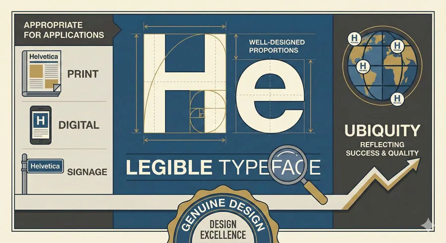
Helvetica achieved immediate success among designers and typographers who recognized its quality. The typeface was adopted by corporations, institutions, and design professionals worldwide. Helvetica became the typeface of modernism, appearing on everything from corporate branding to street signage.
However, Helvetica’s success created an unexpected problem. The typeface became so ubiquitous, so widely adopted, so omnipresent in visual environments, that it began to symbolize mediocrity rather than excellence.
The typeface appeared everywhere without distinction. Designers despaired that every project seemed to default to Helvetica. Cultural critics argued that Helvetica represented design stagnation and lack of imagination.
The Helvetica crisis—the simultaneous achievement of design excellence and symbol of design failure—raises profound questions:
- Can excellence become problematic through ubiquity?
- Does universal adoption undermine achievement?
- How do designers balance respect for historical achievement with pursuit of innovation and distinctiveness?
This comprehensive exploration examines Helvetica’s revolutionary creation in post-war Switzerland, traces the typeface’s rise to ubiquity, analyzes the design crisis that ubiquity created, considers critiques of Helvetica and responses to those critiques, explores contemporary reassessment of the typeface, and ultimately asks:
- What does Helvetica’s trajectory reveal about design excellence, cultural acceptance, and the relationship between achievement and ubiquity?
Related Topics:
- Comic Sans – Accessibility & Gatekeeping Critique
- Gotham – Political Design & Elections Power
- Futura – Geometric Modernism Revolution
Switzerland’s Design Heritage and Modernist Vision
The Swiss Design Tradition
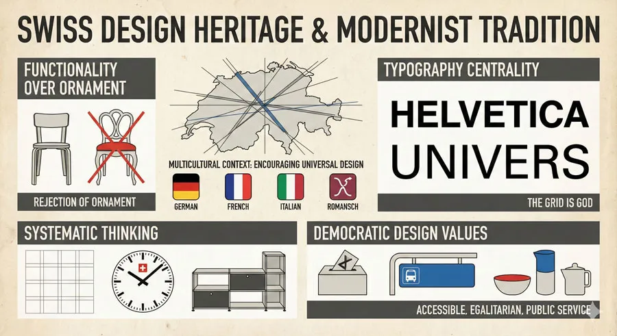
Switzerland developed a distinctive design tradition rooted in clarity, functionality, and systematic thinking. Swiss designers rejected ornamental approaches in favor of rational, systematic design. This Swiss approach emphasized typography, grid systems, and clear communication.
The Swiss design tradition emerged from specific cultural and historical context. Switzerland’s multilingual, multicultural character encouraged designers to develop communication systems that transcended language. Swiss industrial precision influenced design thinking. Democratic traditions fostered belief in accessible, clear design for all people.
By mid-twentieth century, Swiss design had achieved international recognition. Swiss typographers, graphic designers, and design educators were leading modernist design development worldwide.
Post-War Modernist Context
The 1950s were a transformative moment for design. Post-war reconstruction created demand for modern design reflecting contemporary values.
Designers embraced modernism as philosophy of progress and advancement. The clean lines and functional beauty of modernist design represented optimistic vision of future.
Within this context, Swiss designers developed distinctive interpretation of modernism. Swiss modernism emphasized grid systems, mathematical proportions, and systematic design thinking. Typography was central to Swiss modernism.
The Haas Type foundry and Type Design Innovation
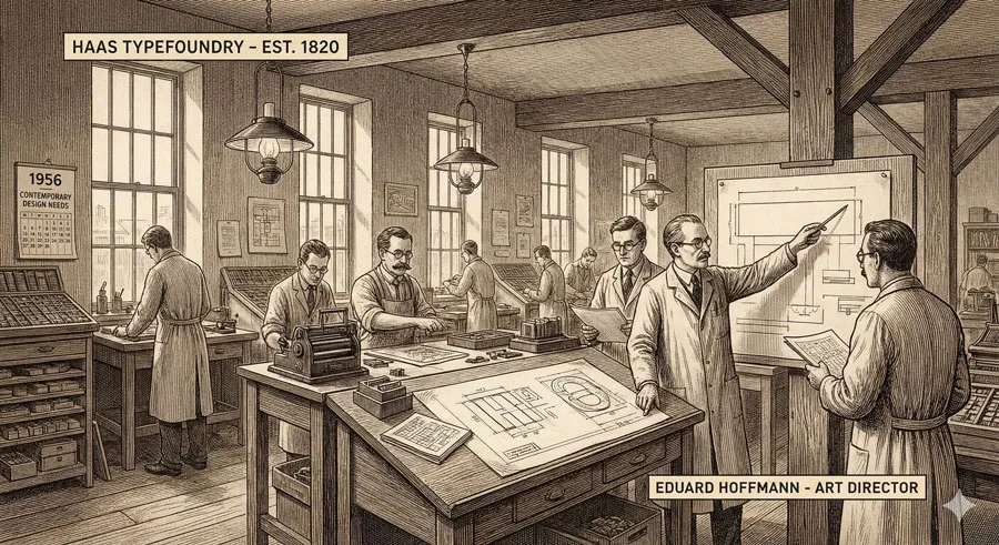
The Haas Typefoundry was located in Switzerland and was engaged in active typeface design and production. The foundry was responsive to contemporary design needs and trends.
Eduard Hoffmann, art director at Haas, recognized need for typeface suited to contemporary requirements. The foundry commissioned Max Miedinger, a talented type designer, to create a new typeface.
Related Topics:
- Gill Sans – Humanist Alternative Modernism
- Baskerville – Print Excellence & Love Story
- Bodoni – Theatrical Prestige Aesthetics
Helvetica’s Creation: Revolutionary Design Response
Design Brief and Development
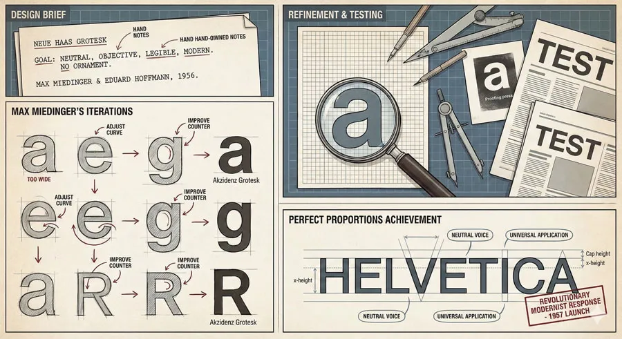
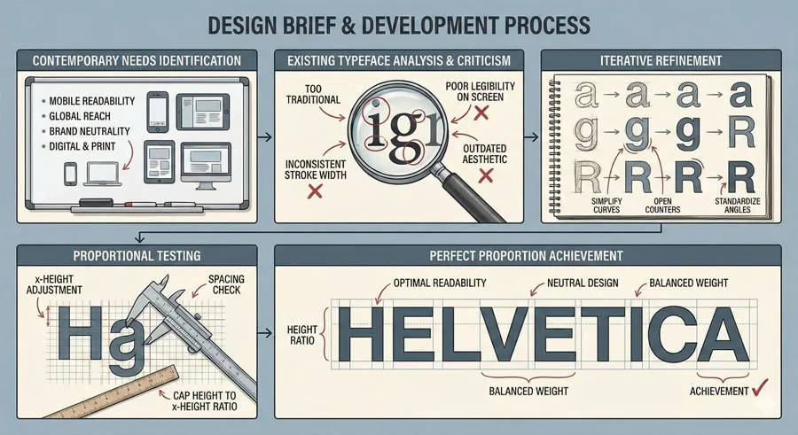
The design brief was clear: create a versatile, modern sans-serif typeface appropriate for contemporary business and communication needs. The typeface should be highly legible, neutral, and applicable across diverse contexts.
Miedinger and Hoffmann studied existing typefaces and identified what they viewed as deficiencies. Previous sans-serifs often lacked refinement or contained idiosyncratic letterforms. The new typeface needed to be perfect in proportions while remaining distinctive enough to be recognized.
The development process involved extensive refinement. Every letterform was carefully proportioned. The typeface was tested at various sizes and contexts. The goal was to achieve perfection in contemporary design interpretation.
Typeface Characteristics
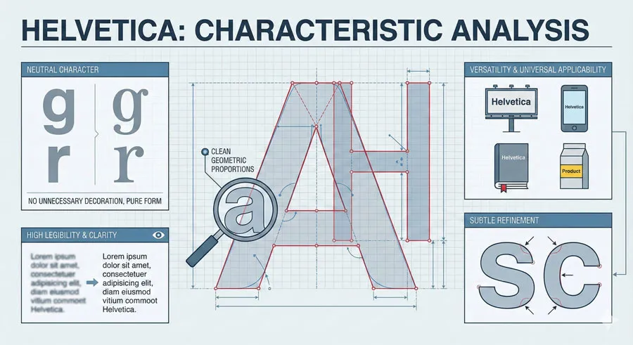
Helvetica’s distinctive characteristics emerged from modernist design philosophy:
- Neutral character – No unnecessary decorative elements; pure functional form
- Clean proportions – Carefully calculated proportions based on geometric principles
- High legibility – Clear letterforms easily distinguished at any size
- Versatility – Works effectively in diverse applications and sizes
- Subtlety – Refined details distinguishing Helvetica from other sans-serifs
- Universality – Appropriate for diverse communication contexts and audiences
These characteristics made Helvetica ideal for modernist design goals: communication clarity, functional beauty, universal application.
Naming and Launch
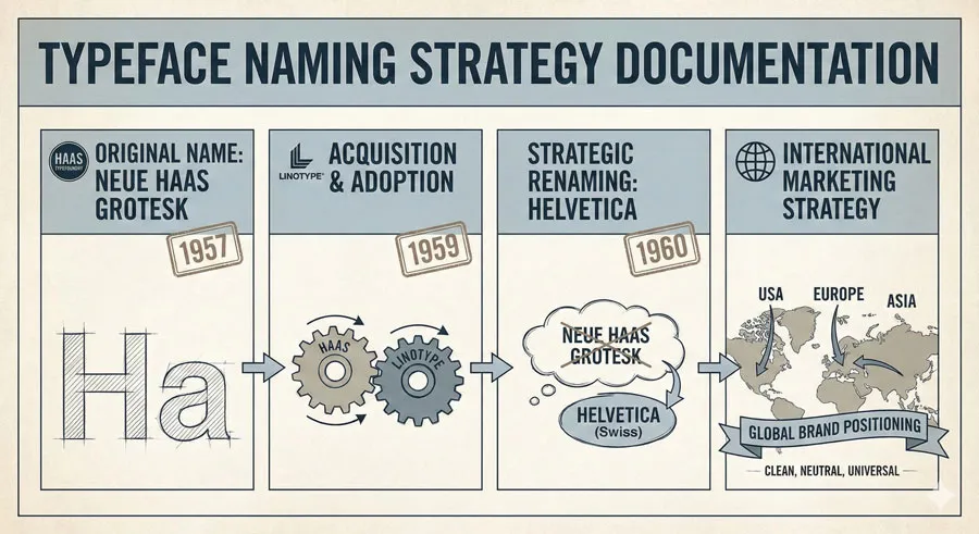
The typeface was initially called “Neue Haas Grotesk” (New Haas Grotesque). When Linotype acquired the typeface and added it to their library, they renamed it “Helvetica”—the Latin name for Switzerland.
The renaming was strategic and symbolic. “Helvetica” suggested Swiss quality and modernist values. The name aligned with international marketing and international modernist design culture.
Related Topics:
- Garamond – Classical Foundation Principles
- Worst Fonts – Criticism & Gatekeeping Analysis
- Gill Sans & The Tube – Urban Identity Infrastructure
The Rise to Ubiquity: Helvetica Conquers Design
Post-War Design Adoption
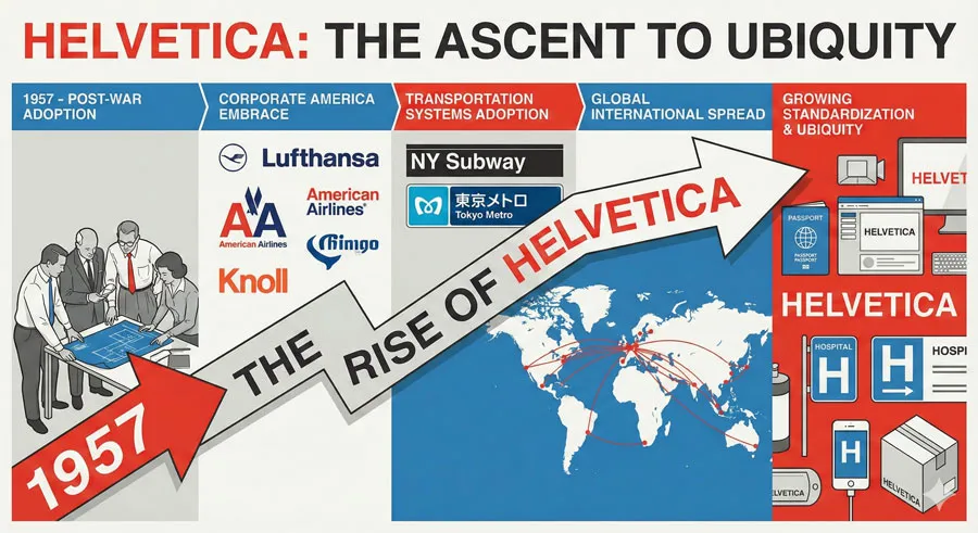
After its 1957 launch, Helvetica achieved rapid adoption. Designers immediately recognized the typeface’s quality and applicability. Helvetica became the preferred typeface for Swiss design and spread internationally as Swiss modernism gained influence.
Corporate America embraced Helvetica. The typeface’s neutral character made it ideal for corporate branding. Helvetica appeared on corporate logos, signage, and communications.
Transportation systems adopted Helvetica. The typeface’s clarity and legibility made it appropriate for directional signage and public communication.
Global Spread and Standardization
By the 1970s and 1980s, Helvetica had become ubiquitous. The typeface appeared on everything: corporate signage, street signs, product packaging, books, documents, signage worldwide.
The typeface became so standard that it seemed like the default choice. Designers used Helvetica because it was reliable and available. Clients expected Helvetica because it had become the standard for professional communication.
Helvetica’s ubiquity reflected its quality and appropriateness. The typeface genuinely was excellent for many applications. However, ubiquity created unintended consequences.
Digital Standardization
When digital typography emerged, Helvetica continued its dominance. Helvetica was typically the default typeface in early digital systems. The typeface was preinstalled on computers and available in digital font formats.
This digital standardization further entrenched Helvetica. Operating systems shipped with Helvetica. Software applications defaulted to Helvetica. Web browsers displayed Helvetica as default sans-serif.
Related Topics:
- Baskerville & Mrs. Eaves – Love, Partnership & Revival
- Futura & Paul Renner – Geometric Vision & Revolution
- Legibility vs. Readability – Typography Fundamentals
The Ubiquity Crisis: When Excellence Becomes Invisible
The Problem of Omnipresence
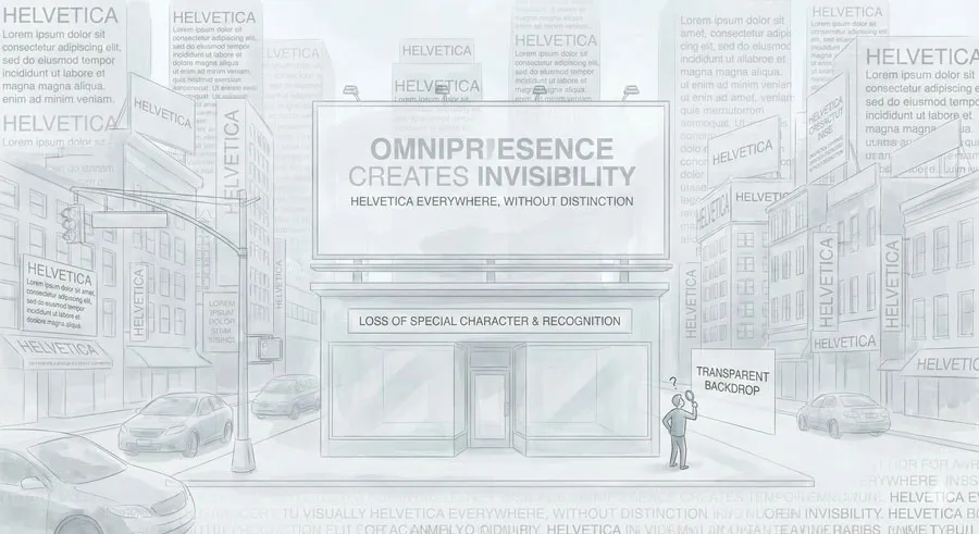
Helvetica’s ubiquity created a design problem: the typeface had become so omnipresent that it was invisible. Designers and viewers no longer consciously noticed Helvetica; it had become the neutral backdrop to communication.
This invisibility was problematic for design culture. Designers typically want their work to be noticed and appreciated. When Helvetica became invisible through ubiquity, the typeface’s qualities went unrecognized.
Additionally, ubiquity meant that Helvetica appeared in every conceivable context without distinction. A luxury brand used Helvetica. A budget airline used Helvetica. A prestigious publication used Helvetica.
The typeface’s appearance in such diverse contexts without differentiation reduced its ability to communicate brand distinction.
Designer Fatigue and Rebellion
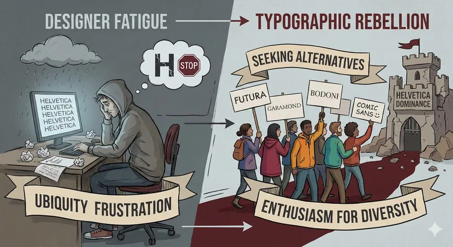
By the 1980s and 1990s, designers began experiencing fatigue with Helvetica. The typeface’s ubiquity became oppressive. Designers felt constrained by Helvetica’s dominance.
Design culture developed what might be called “Helvetica fatigue.” Seeing Helvetica everywhere, designers felt motivated to use other typefaces. Alternative typefaces were sought as rebellion against Helvetica dominance.
Designers increasingly criticized Helvetica as boring, mediocre, and unimaginative. The typeface became associated with design stagnation and lack of creativity.
Academic and Critical Response
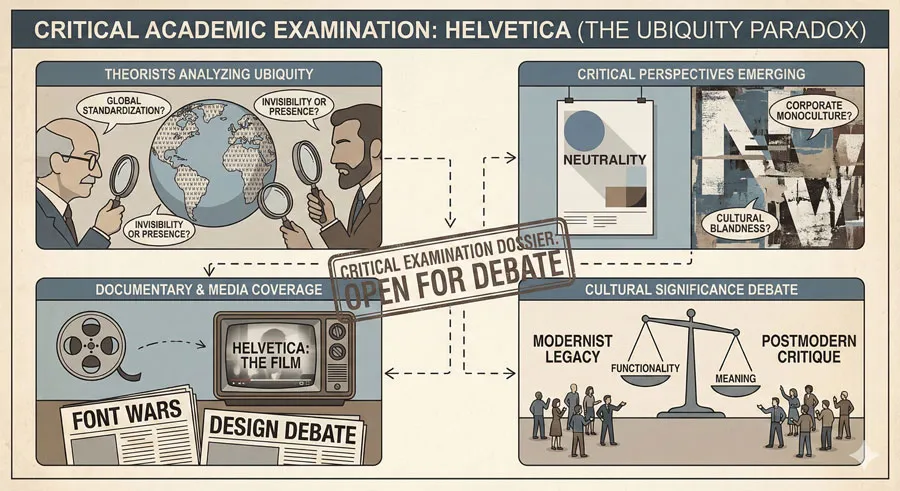
Design theorists and critics began examining Helvetica’s ubiquity as cultural phenomenon. Some criticized Helvetica for representing corporate homogenization and cultural standardization.
Designers and critics argued that Helvetica’s ubiquity represented design failure. Rather than celebrating excellent typeface, critics viewed ubiquity as evidence that design culture had stagnated, that designers had abandoned imagination in favor of safe, default choices.
The 2007 documentary “Helvetica” brought these debates to wider audience, presenting diverse perspectives on the typeface’s cultural significance.
Related Topics:
Critiques of Helvetica and Design Mediocrity
The Invisibility Problem
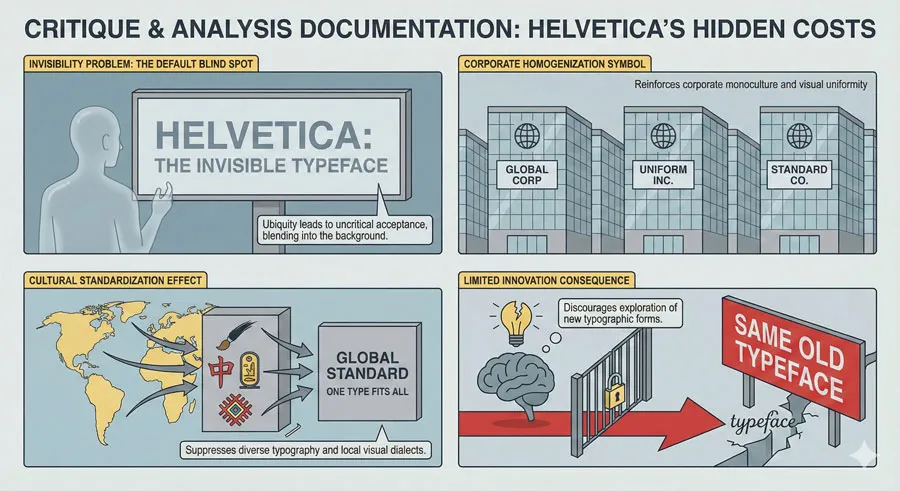
One major critique was that Helvetica’s ubiquity and neutrality made it invisible. The typeface no longer communicated anything except “professional” or “neutral.” Helvetica had become completely transparent.
Critics argued that invisible communication was problematic. Design should make distinctive choices. Helvetica represented failure to make distinctive design choices.
Corporate Homogenization
Helvetica was criticized as symbol of corporate design mediocrity. The typeface’s appearance on countless corporate logos and communications symbolized corporate sameness and lack of distinctiveness.
Critics argued that corporate America had abandoned design thinking in favor of safe, default choices. Helvetica represented this design failure.
Cultural Standardization
Some cultural critics argued that Helvetica’s ubiquity represented cultural homogenization. The typeface’s worldwide prevalence symbolized globalization erasing local design traditions.
Helvetica appeared in diverse cultural contexts, often replacing local design traditions and typefaces. This replacement was viewed as cultural loss.
Limited Innovation
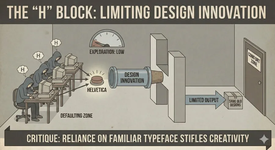
Critics argued that designers’ reliance on Helvetica represented failure of innovation. Rather than designing new typefaces or exploring diverse typographic solutions, designers defaulted to Helvetica.
This reliance on Helvetica was viewed as limiting design innovation and imagination.
Related Topics:
- Helvetica Effect: One Font Conquered Global Design
- Comic Sans: True Story Behind the World’s Most Hated Font
- Gotham: Font That Won an Election And Changed Design Forever
Defences of Helvetica and Modernist Achievement
Design Excellence and Appropriateness
Despite criticism, many designers continued arguing that Helvetica represented design excellence. The typeface was genuinely well-designed, legible, and appropriate for numerous contexts.
The typeface’s ubiquity was not failure but evidence of success. Helvetica was used because it worked well, because it was appropriate, because it was excellent.
Modernist Values and Democratic Design
Helvetica’s defenders argued that the typeface embodied modernist values. The neutral, accessible, universal character of Helvetica represented belief that good design should be democratic and accessible.
Helvetica’s ubiquity reflected modernist success, not failure. The typeface represented achievement of modernist goal of universal, accessible design.
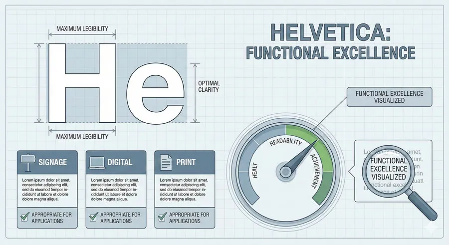
Functionality and Readability
Helvetica defenders emphasized the typeface’s functional qualities. Helvetica was selected for applications not because of design stagnation but because the typeface worked excellently for those applications.
The typeface’s legibility, clarity, and versatility made it genuinely appropriate for numerous contexts. Using Helvetica represented sound design judgment, not lack of imagination.
Time, Place and Context
Defenders argued that Helvetica criticism often misunderstood the typeface’s historical context. When Helvetica was created, it was revolutionary. When Helvetica became ubiquitous, it represented achievement of modernist vision.
Criticizing Helvetica for ubiquity was viewed as unfair. The typeface could not be blamed for its own success or for designers’ subsequent lack of imagination.
Related Topics:
- Futura: The Geometric Vision of Paul Renner
- Gill Sans: Eric Gill’s Humanist Masterpiece
- Baskerville: Elegant Serif That Shaped Print Typography
Contemporary Reassessment and Helvetica’s Continued Relevance
Renewed Appreciation
Contemporary design culture has developed more nuanced perspective on Helvetica. While some designers continue dismissing the typeface, others have renewed appreciation for its achievement.
Contemporary designers recognize Helvetica’s historical importance and design excellence. The typeface has gained status as classic, worthy of appreciation regardless of ubiquity.
Helvetica in Branding
Many contemporary brands continue using Helvetica intentionally, recognizing the typeface’s associations with modernism, professionalism, and timelessness.
Helvetica has become archetypal brand typeface, selected not by default but by deliberate choice recognizing the typeface’s cultural significance.
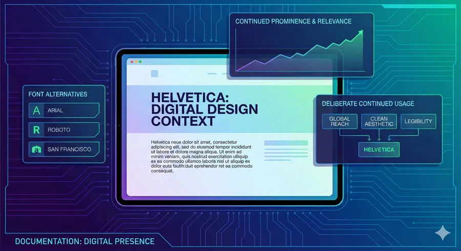
Helvetica’s Digital Future
Digital typography has enabled distinction between Helvetica and numerous alternatives. Contemporary designers have access to hundreds of typefaces.
However, Helvetica’s digital prominence continues. The typeface remains default in many systems. Web designers continue using Helvetica as safe, reliable choice.
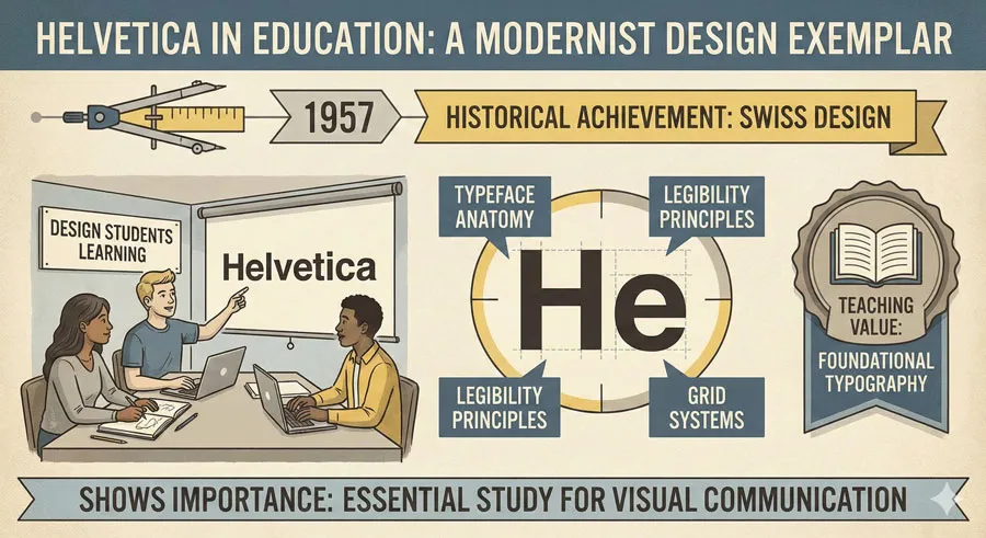
Typography Education and History
Helvetica occupies important position in typography education. The typeface is studied as exemplar of modernist design, as historical achievement worthy of understanding.
Students learn about Helvetica’s creation, its design principles, its cultural significance. Helvetica represents modernist design values.
Related Topics:
- Bodoni Font: Serif That Defined Luxury Typography
- Garamond: Timeless Serif That Defined Classical Typography
- The Worst Fonts in the World: A Typographic Hall of Shame
The Broader Design Questions Helvetica Raises
Excellence and Ubiquity
Helvetica raises questions about relationship between design excellence and ubiquity. Can excellent design become problematic through ubiquity? Does universal adoption undermine achievement?
The Helvetica crisis suggests these are complex questions without simple answers. Excellence can become invisible through ubiquity. However, ubiquity also represents success.
Design Innovation and Safety
Helvetica raises questions about balance between design innovation and safety. Designers face tension between innovative design choices and reliable, tested solutions.
Helvetica represents tested, reliable solution. Choosing Helvetica is safe choice. Innovation requires risking failure with less-proven alternatives.
Modernist Values and Contemporary Critique
Helvetica raises questions about modernist design values. Modernism emphasized clarity, functionality, universality, and democratic design.
Helvetica embodied these values. However, contemporary design culture sometimes critiques modernism as cold, emotionally empty, lacking humanity. These critiques implicitly critique Helvetica.
Design Culture and Fashion
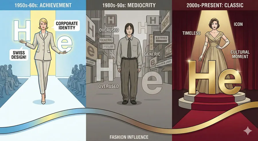
Helvetica suggests that design culture is subject to fashion and trend. Helvetica moved from revolutionary achievement to despised mediocrity to respected classic within decades.
This suggests design culture’s evaluation of design is influenced by fashion, trend, and cultural moment rather than solely by objective design principles.
Related Topics:
- Gill Sans and Tube: How Johnston and Gill Defined London
- Baskerville and Eaves: A Tale of Perfection, Passion and Revival
- Futura vs. The World: The Geometric Vision of Paul Renner
FAQ: Common Questions About Helvetica
Q: Is Helvetica actually a bad typeface?
A: No. Helvetica is widely recognized as excellent typeface. Criticism of Helvetica is primarily about ubiquity and cultural perception rather than design quality.
Q: Why is Helvetica so common?
A: Helvetica is common because it is excellent typeface appropriate for numerous contexts. The typeface is legible, versatile, and well-designed.
Q: Should designers avoid Helvetica?
A: No. Helvetica remains appropriate choice for many applications. Designers should choose typefaces based on appropriateness and design goals rather than fashion.
Q: Is Helvetica outdated?
A: No. Helvetica remains contemporary and relevant. The typeface has achieved timeless status.
Q: What typefaces are alternatives to Helvetica?
A: Numerous alternatives exist: Verdana, Open Sans, Inter, Segoe, Roboto, etc. However, alternatives serve different purposes and have different characteristics.
Q: Did the Helvetica documentary change people’s perception?
A: The documentary brought Helvetica debates to broader audience. Perception remains divided, but documentary increased awareness of Helvetica’s cultural significance.
Q: How does Helvetica Neue differ from original Helvetica?
A: Helvetica Neue (released 1983) refined and extended original typeface. Neue added weights, improved proportions, and added more characters.
Q: Is Helvetica appropriate for body text?
A: Yes. Helvetica is highly readable and works well for body text. However, other typefaces may be equally appropriate depending on context.
Q: Why don’t more people use alternative typefaces?
A: Helvetica remains default choice because it is reliable, available, and appropriate. Alternative typefaces may be less familiar or less universally available.
Q: What does Helvetica’s ubiquity say about design culture?
A: Helvetica’s ubiquity reflects both design excellence (the typeface genuinely is excellent) and design stagnation (designers sometimes default to Helvetica without considering alternatives).
Related Topics:
- Legibility vs. Readability: What Every Designer Needs to Know
- Secret Life of Symbols: History of Ampersand and Interrobang
Conclusion: Helvetica’s Paradoxical Legacy
Helvetica represents one of design’s great paradoxes:
- a typeface simultaneously celebrated as design excellence and criticized as symbol of design mediocrity.
This paradox reveals important truths about design, about culture, and about how we evaluate design achievement.
Helvetica was genuinely revolutionary when created. The typeface embodied modernist design principles and proved ideal for post-war design needs. Helvetica’s design excellence is undeniable.
However, Helvetica’s ubiquity created problems. The typeface became so omnipresent that it became invisible. Designers experienced fatigue at constant Helvetica presence. Helvetica became default choice, often made without conscious consideration.
The Helvetica crisis reveals tension in design culture: between celebrating excellence and seeking innovation, between reliability and distinctiveness, between universal principles and individual expression. These tensions are inherent to design practice.
Contemporary design culture has developed more nuanced perspective on Helvetica. The typeface is recognized as historical achievement worthy of respect while acknowledging that ubiquity has created different cultural context.
Helvetica’s legacy is complex. The typeface represents modernist achievement, design excellence, and successful universal design. Simultaneously, it represents design stagnation, corporate homogenization, and cultural standardization.
Perhaps Helvetica’s true significance lies not in the typeface itself but in what Helvetica reveals about design culture. Helvetica demonstrates that design evaluation is influenced by cultural moment, fashion, and context—not solely by objective design principles.
Helvetica shows that excellence can become invisible through ubiquity. Helvetica reveals tensions between innovation and reliability, between distinctiveness and universality.
Understanding Helvetica means understanding design’s complex relationship with excellence, achievement, ubiquity, and cultural meaning. Helvetica remains important not because it is perfect solution but because its paradoxes illuminate fundamental design questions.
About the Author
Lalit M. S. Adhikari is a Digital Nomad and Educator since 2009 in design education, graphic design and animation. He’s taught 500+ students and created 200+ educational articles on design topics. His teaching approach emphasizes clarity, practical application and helping learners.
Learn more about Lalit Adhikari.


