Discover how Paul Renner’s visionary Futura typeface revolutionized typography with geometric modernism, challenged design conventions, and influenced design worldwide—from corporate branding to space exploration.
My name is Lalit Adhikari and we are at LTY. Let’s begin!
Table of Contents
Introduction: A Typeface That Defied Convention
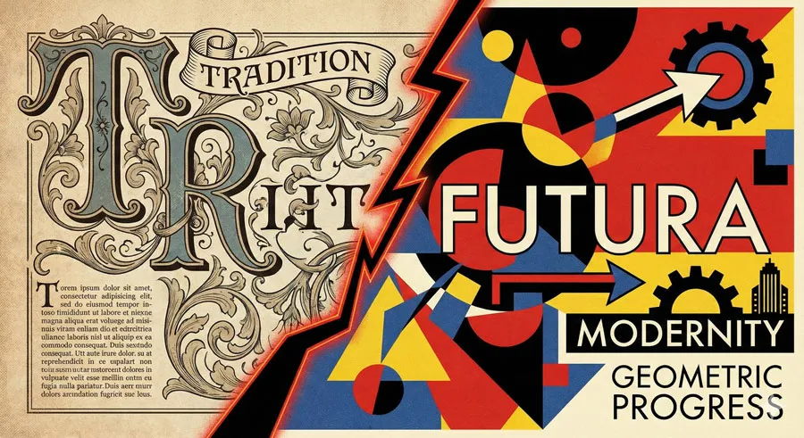
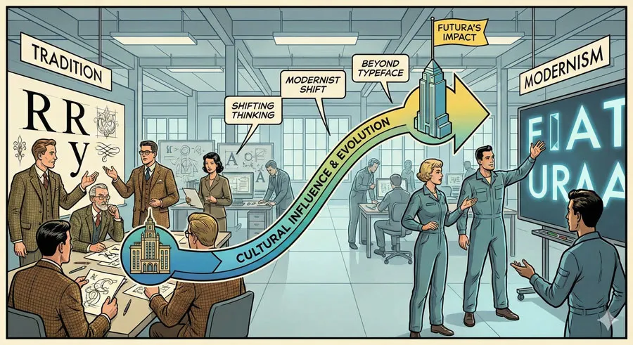
In the 1920s, when typography was dominated by traditional serif typefaces and ornamental design, Paul Renner proposed something radically different:
- a typeface built entirely on geometric principles, stripped of decoration, representing pure modernist vision. That typeface was Futura.
Futura was not merely a typeface—it was a manifesto in letterforms. The typeface embodied beliefs about design, modernity, functionality, and progress.
Futura rejected tradition in favour of innovation. It rejected ornament in favour of pure geometric form. It challenged designers to think differently about what typography could be.
The development and promotion of Futura occurred during one of the most vibrant and turbulent periods in design history. The 1920s and 1930s saw competing visions of modernity:
- the experimental avant-garde, the rationalist modernism of the Bauhaus, the machine aesthetic, the futurism movement.
Renner’s Futura synthesized these diverse influences into a typeface that was simultaneously revolutionary and practical.
Yet Futura’s geometric vision also generated resistance and criticism. Conservative designers dismissed Futura as too radical, too cold, too divorced from traditional typography. Critics argued that geometric purity ignored the nuances of letterform design developed over centuries of printing.
Despite opposition, Futura achieved remarkable success. The typeface became adopted for corporate branding, advertising, public signage, and countless design applications.
The typeface appeared on NASA spacecraft and in contemporary design contexts. Futura became one of the most influential typefaces of the twentieth century.
The story of Futura and Paul Renner reveals something essential about design innovation: revolutionary design often requires visionary individuals willing to challenge conventions, defend unconventional approaches against criticism, and persist despite resistance.
It reveals how geometric vision, mathematical principles, and modernist philosophy can generate beautiful, functional design. It reveals how typefaces embody ideological positions about progress, modernity, and design excellence.
This comprehensive exploration examines Paul Renner’s life and design philosophy, traces Futura’s development and revolutionary characteristics, explores the resistance Futura faced and how Renner defended his vision, analyzes Futura’s global influence and adoption, considers how geometric principles generated innovation, and ultimately asks:
- what can designers learn from Renner’s visionary approach, and how do revolutionary typefaces shape design culture?
Related Topics:
- Legibility vs. Readability: What Every Designer Needs to Know
- Secret Life of Symbols: History of Ampersand and Interrobang
- Helvetica – Swiss Modernism’s Ubiquity Crisis
Paul Renner: The Visionary Designer
Early Life and Design Education
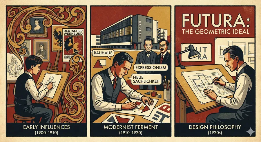
Paul Renner was born in 1878 in Werdum, Germany. He studied art and design during a period when German design culture was particularly vibrant and experimental. Germany in the early twentieth century was a crucible of design innovation:
- the Deutscher Werkbund movement emphasized quality design, the Bauhaus was revolutionizing design education, expressionism and avant-garde movements were challenging artistic conventions.
Renner was exposed to these diverse influences and contributed to this ferment of design innovation. He trained as a painter and sculptor before transitioning to typography and graphic design. This combination of artistic training and design practice gave Renner a distinctive perspective.
Design Philosophy and Modernist Commitment
Central to Renner’s design philosophy was commitment to modernism and belief in design’s role in creating better society.
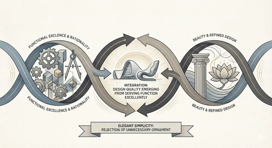
Like many Bauhaus-influenced designers, Renner believed that design should serve social good, that beauty should emerge from functional excellence, and that design should embrace machine production and modern manufacturing.
Renner rejected the ornamental aesthetics that had dominated nineteenth-century design. He believed that modern times required modern design—design that expressed the spirit of the age, that embraced new materials and technologies, that was democratic rather than elitist.
This modernist commitment shaped everything Renner designed. He approached typography not as preservation of traditional forms but as opportunity to invent new forms expressing modern sensibility.
Teaching and Design Leadership
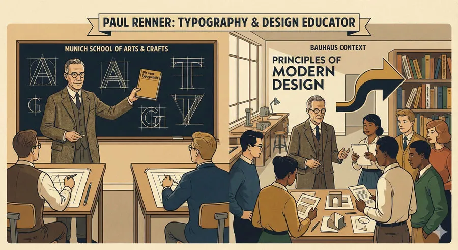
Renner was influential not just as a designer but as a design educator and theorist. He taught at the Kunstgewerbeschule München (Munich School of Arts and Crafts) and later at the Bauhaus. Through teaching, Renner influenced numerous designers and helped establish principles of modern typography.
Renner published writings on design and typography articulating his philosophical position. These writings helped establish theoretical foundation for geometric modernism in typography.
Related Topics:
- Comic Sans – Accessibility & Gatekeeping Critique
- Gotham – Political Design & Elections Power
- Futura – Geometric Modernism Revolution
Futura Development: Revolutionary Design Process
Context and Design Motivation
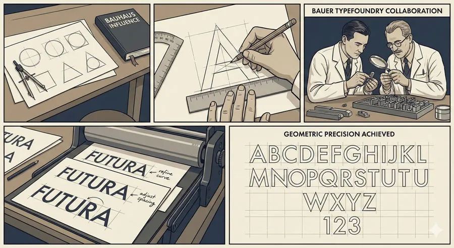
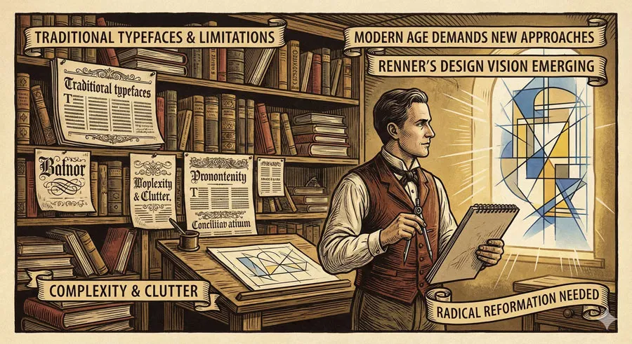
Futura was developed in the mid-1920s by Renner and the foundry Bauer Typefoundry. The typeface emerged from Renner’s conviction that typography needed radical reformation.
Existing typefaces were rooted in centuries of tradition. Renner believed that modern age required fundamentally new approach to typeface design.
Futura was explicitly designed to represent modern sensibility. The name itself—Futura, meaning “the future”—expressed Renner’s belief that the typeface represented future direction of typography.
Geometric Design Principles
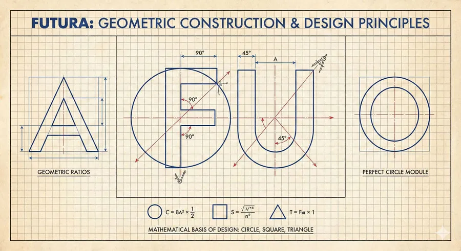
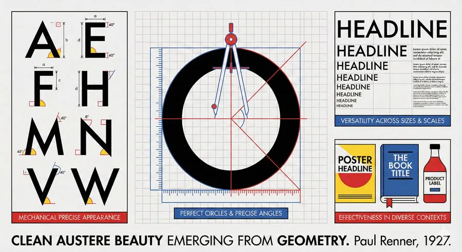
What distinguished Futura was its uncompromising commitment to geometric principles. The letterforms were based on simple geometric shapes: circles, triangles, and straight lines. Every letterform was constructed as if from basic geometric modules.
This geometric approach was radical because traditional typefaces were based on organic proportions developed through centuries of handwriting and metal type practice. Futura rejected this organic tradition in favor of pure geometric rationality.
The geometric approach generated distinctive characteristics:
- Perfect circles and regular angles
- High x-height for improved readability
- Minimal serifs (eventually eliminated entirely)
- Regular proportions across letterforms
- Clean, austere appearance
- Cold, rational aesthetic
Design Iterations and Refinement
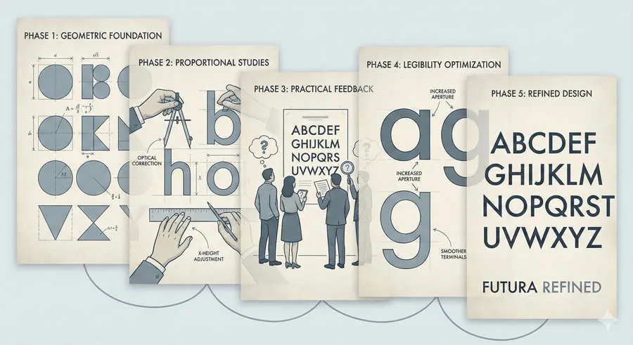
Futura was refined through multiple iterations. Renner and the Bauer Type foundry recognized that pure geometric perfection sometimes conflicted with legibility and aesthetic refinement. The development process involved testing letterforms, refining proportions, and balancing geometric purity with practical functionality.
This willingness to compromise geometric ideology for practical improvement distinguished Futura from purely theoretical geometric designs. Futura was radical but remained readable and functional.
Related Topics:
- Gill Sans – Humanist Alternative Modernism
- Baskerville – Print Excellence & Love Story
- Bodoni – Theatrical Prestige Aesthetics
Futura’s Revolutionary Characteristics
The Geometric Aesthetic
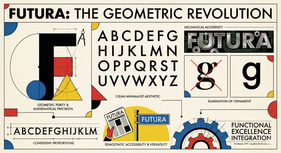
Futura’s most distinctive characteristic was its geometric purity. The typeface appeared almost mechanical—as if designed by mathematical formula rather than artistic sensibility. This mechanical aesthetic was precisely the point:
- Futura embodied modernist belief that design should express machine production and scientific rationality.
The geometric approach also generated remarkable versatility. The consistent geometric logic meant the typeface worked well at various sizes and weights. The typeface was equally effective in advertising, signage, body text, and display applications.
Stripping Ornament and Tradition
Futura represented radical departure from typographic tradition. Traditional typefaces included serifs and organic letterform variations developed through centuries of practice. Futura eliminated this accumulated tradition in favor of pure simplicity.
This stripping of tradition was ideological as well as aesthetic. By eliminating decorative elements, Futura expressed modernist belief that decoration was unnecessary, that beauty emerged from functional excellence.
Democratic Accessibility
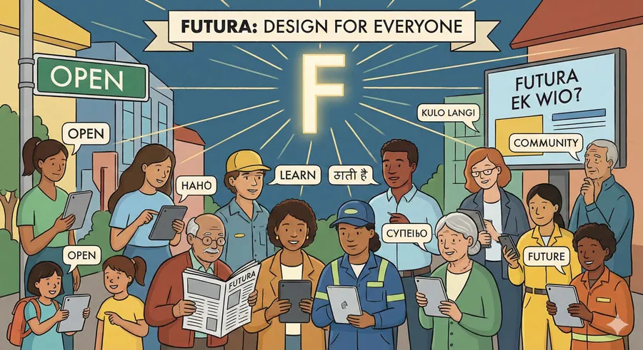
An important characteristic of Futura was its democratic accessibility. The typeface was designed to be readable and clear for everyone. Unlike ornamental or stylized typefaces that required educated aesthetic appreciation, Futura communicated directly and clearly to all audiences.
This democratic dimension reflected modernist belief that good design should be accessible, not elitist. Futura embodied belief that design excellence could be democratic and available to everyone.
Related Topics:
- Garamond – Classical Foundation Principles
- Worst Fonts – Criticism & Gatekeeping Analysis
- Gill Sans & The Tube – Urban Identity Infrastructure
Resistance and Defense: Futura Versus Tradition
Conservative Opposition
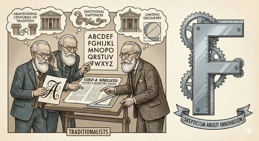
Futura generated significant resistance from conservative designers and typographers who valued tradition. Critics argued that:
- Geometric purity ignored centuries of refined typographic practice
- The typeface was cold and emotionally empty
- Geometric design sacrificed beauty for rationality
- The typeface was trendy rather than timeless
- Eliminating tradition meant losing accumulated design wisdom
This conservative criticism represented genuine typographic and design principle concerns. Geometry alone does not guarantee beauty or legibility. The typeface’s radical departure from tradition meant abandoning some principles that had worked well for centuries.
Renner’s Defense and Visionary Position
Renner vigorously defended Futura against conservative criticism. He argued that:
- Modernism required new design approaches appropriate to contemporary age
- Geometric principles were not arbitrary but represented deeper design truth
- Tradition was valuable but should not prevent innovation
- The typeface’s apparent coldness reflected modern sensibility, not design failure
- Futura represented progress and future direction of typography
Renner’s defence was not merely polemical but grounded in design theory. He articulated philosophical position about modernism, progress, and design excellence. He convinced many designers and typographers that Futura represented genuine design advancement, not merely fashion.
Design Debates and Influence
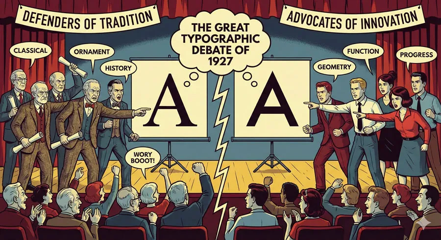
The controversy over Futura generated productive design debate. Conservative designers defended traditional typography while modernists championed Futura’s radical approach. This debate influenced how designers thought about typeface design, modernism, and design principles.
Ultimately, Futura’s success suggested that Renner’s vision had merit. The typeface proved functional, beautiful in its austere way, and widely applicable. Conservative criticism did not prevent Futura’s adoption and influence.
Related Topics:
- Baskerville & Mrs. Eaves – Love, Partnership & Revival
- Futura & Paul Renner – Geometric Vision & Revolution
- Legibility vs. Readability – Typography Fundamentals
Futura’s Global Influence and Adoption
Corporate and Commercial Success
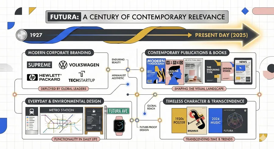
Futura achieved remarkable commercial success. Major corporations adopted Futura for branding. Advertising agencies used Futura extensively. The typeface became ubiquitous in commercial and corporate contexts.
This commercial success partially reflected practical advantages: Futura was readable, versatile, and modern-appearing. However, commercial success also reflected cultural shift toward modernism and acceptance of Futura’s geometric vision.
Design Movement Influence
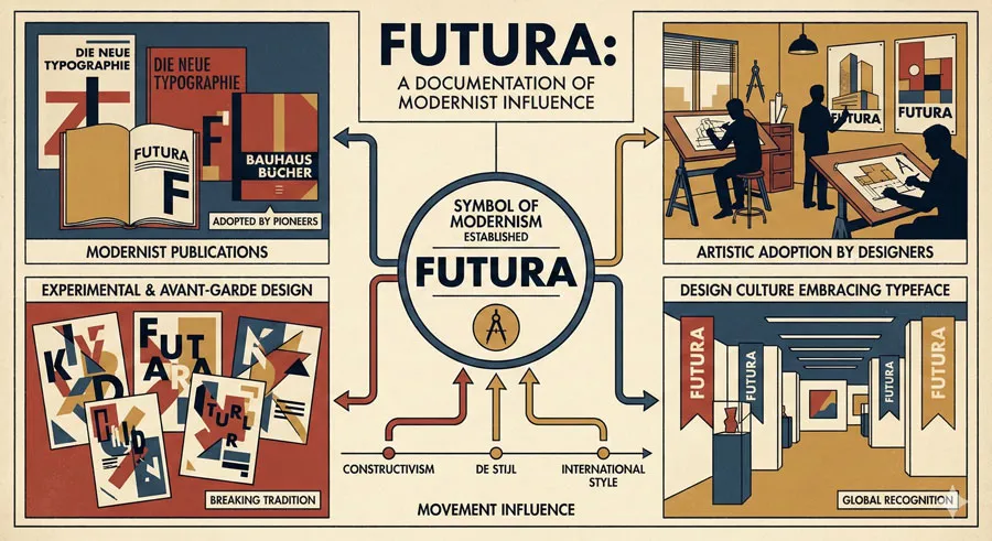
Beyond commercial success, Futura influenced design movements and design culture. The typeface became symbol of modernism. Designers embraced Futura as expression of modern sensibility. The typeface appeared in avant-garde publications, experimental design, and artistic contexts.
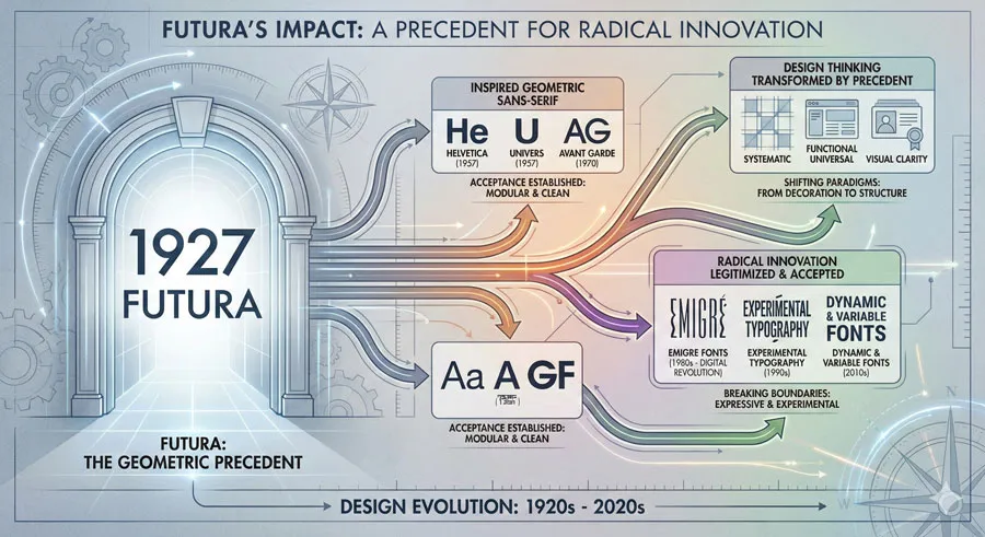
Futura’s success demonstrated that radical design innovation could achieve cultural acceptance and commercial success. The typeface showed that modernism was not merely theoretical but could achieve practical realization.
Institutional Adoption
Important institutions adopted Futura. Government agencies used Futura for public signage. Transportation systems deployed Futura for wayfinding. Cultural institutions used Futura for publications and signage. This institutional adoption gave Futura cultural authority and legitimacy.
Contemporary Relevance
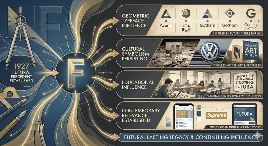
Nearly a century after its creation, Futura remains widely used and beloved. The typeface appears in contemporary design, branding, publishing, and countless applications. Major corporations continue using Futura. Contemporary designers appreciate the typeface’s geometric elegance and modernist character.
This contemporary relevance suggests that Futura transcends fashion. The typeface achieved status of timeless design rather than period curiosity.
Related Topics:
Geometric Principles and Design Innovation
Mathematics and Beauty
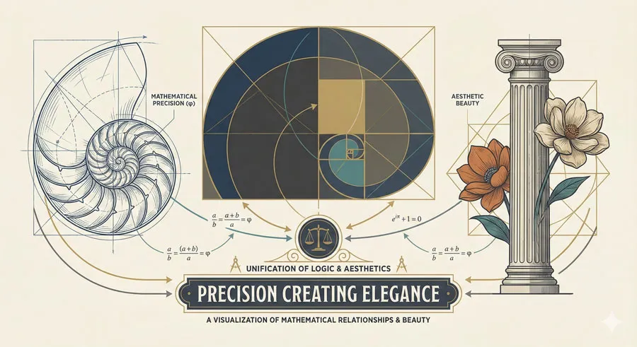
One of Futura’s most important contributions was demonstrating that geometric and mathematical principles could generate beautiful design. The typeface proved that geometric rationality was not incompatible with aesthetic excellence.
This was revolutionary insight. Previous design culture had often opposed rationality and beauty. Futura showed these could be unified—that mathematical precision could express beauty rather than contradict it.
Systematic Design Thinking
Futura embodied systematic design thinking. The typeface was designed as system where each letterform followed consistent geometric principles. This systematic approach meant the typeface maintained visual coherence while appearing in diverse contexts and applications.
This systematic thinking influenced subsequent design approaches. The idea of design as system rather than collection of individual solutions became increasingly important throughout twentieth century.
Rationality and Function
Futura demonstrated that rationality and function could generate excellent design. The typeface proved that rejecting ornament did not mean rejecting beauty, that functional design could be elegant and refined.
This lesson influenced modernist design more broadly. Functionalism became design principle: beauty would emerge from serving function excellently. Futura demonstrated this principle in practice.
Related Topics:
- Helvetica Effect: One Font Conquered Global Design
- Comic Sans: True Story Behind the World’s Most Hated Font
- Gotham: Font That Won an Election And Changed Design Forever
Futura’s Legacy and Continued Influence
Design Precedent
Futura established precedent for radical typeface design innovation. The typeface showed that designers could completely reimagine typographic form, challenge convention, and achieve success through visionary design.
Subsequent geometric sans-serif typefaces (like Avant Garde, Twentieth Century, and others) drew inspiration from Futura’s approach. Geometric design became accepted approach to typeface design.
Cultural Symbolism
Futura became cultural symbol of modernism and progress. The typeface appeared on NASA spacecraft, symbolizing technological advancement and future orientation. This cultural symbolism reflected Futura’s success in embodying modern sensibility.
Educational Influence
Futura’s influence extended to design education. The typeface appeared in design textbooks and curricula as example of excellent modern design. Design students studied Futura to understand modernist principles and geometric design.
This educational influence meant that successive generations of designers learned from Futura’s approach. The typeface influenced how designers were trained to think about typography and design principles.
Related Topics:
- Futura: The Geometric Vision of Paul Renner
- Gill Sans: Eric Gill’s Humanist Masterpiece
- Baskerville: Elegant Serif That Shaped Print Typography
Paul Renner’s Continuing Vision
Design Philosophy Relevance
Paul Renner’s design philosophy remains relevant. The belief that design should embrace modernity, reject unnecessary ornament, and pursue functional excellence continues to influence contemporary design.
Contemporary designers return to Renner’s writings and thinking to understand modern design principles. His theoretical position about design and modernism provides foundation for contemporary design practice.
Design Innovation Lessons
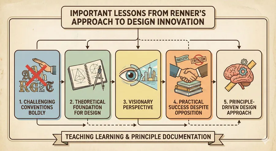
Renner’s approach to innovation offers lessons for contemporary designers:
- Visionary design requires willingness to challenge conventions
- Revolutionary design needs theoretical foundation, not merely aesthetic preference
- Defense of unconventional design requires articulate argument
- Radical innovation can achieve practical success and cultural acceptance
- Design principles should emerge from deeper understanding, not merely fashion
Modernism Reassessment
Contemporary design increasingly reassesses modernism and geometric design. Some contemporary designers celebrate modernist principles while others critique modernism for coldness or lack of humanity.
This reassessment often acknowledges Futura and Renner’s achievements while questioning whether geometric perfection represents complete design vision. The debate continues about balance between rationality and emotion, system and intuition, modernism and other design values.
Related Topics:
- Bodoni Font: Serif That Defined Luxury Typography
- Garamond: Timeless Serif That Defined Classical Typography
- The Worst Fonts in the World: A Typographic Hall of Shame
FAQ: Common Questions About Futura and Paul Renner
Q: Why is Futura called “the future” typeface?
A: Renner named the typeface Futura (meaning “the future”) to express his belief that the typeface represented future direction of typography and modern design.
Q: Is Futura still used in contemporary design?
A: Yes, extensively. Futura remains one of the most widely used typefaces globally in corporate branding, publishing, and design applications.
Q: How does Futura compare to other geometric sans-serif typefaces?
A: Futura is the archetypal geometric sans-serif. Later geometric typefaces (like Avant Garde or Twentieth Century) built on Futura’s foundation but with different design choices.
Q: Was Paul Renner’s geometric approach controversial when Futura was created?
A: Yes. Conservative typographers criticized the typeface as too radical, too cold, too divorced from typographic tradition.
Q: How did Renner defend Futura against criticism?
A: Renner argued that modernism required new design approaches, that geometric principles represented deeper design truth, and that tradition should not prevent innovation.
Q: Does Futura work well for body text?
A: Yes, Futura is highly readable. The typeface was designed to work at various sizes and applications, including extended body text.
Q: Why is Futura used on NASA spacecraft?
A: NASA selected Futura for its modern appearance and association with progress and technology—qualities aligned with space exploration mission.
Q: What makes Futura’s geometric design distinctive?
A: Futura’s letterforms are constructed from basic geometric shapes (circles, lines, triangles) applied consistently across all characters.
Q: How did Futura influence design culture?
A: Futura demonstrated that radical design innovation could achieve cultural acceptance and commercial success. The typeface influenced how designers approached modernism and geometric design.
Q: Can I use Futura in contemporary design?
A: Absolutely. Futura remains relevant and appropriate for numerous design applications, particularly where modernism or geometric elegance is desired.
Related Topics:
- Gill Sans and Tube: How Johnston and Gill Defined London
- Baskerville and Eaves: A Tale of Perfection, Passion and Revival
Conclusion: Geometric Vision and Design Revolution
Paul Renner’s Futura represents one of typography’s most significant achievements precisely because it was controversial, challenged convention, and ultimately proved visionary. The typeface did not merely present aesthetic innovation but embodied philosophical position about design, modernity, and progress.
Futura’s geometric vision emerged not from arbitrary stylistic preference but from deeper conviction that modernism required new design approaches. Renner believed that contemporary age demanded design expressing machine production, scientific rationality, and democratic accessibility. Futura embodied these beliefs through geometric forms, stripped ornament, and pure simplicity.
The resistance Futura faced was not unfounded criticism but genuine debate about design principles. Conservative typographers were right that geometric purity alone does not guarantee beauty or legibility.
However, Renner’s achievement was demonstrating that geometric principles, thoughtfully applied, could generate excellent design transcending initial skepticism.
Futura’s continued influence nearly a century later suggests that Renner’s vision had merit. The typeface remains beautiful, readable, and culturally resonant. The typeface continues to represent modernism and progress while remaining practical tool for contemporary designers.
Contemporary designers can learn from Renner’s approach: that revolutionary design requires visionary perspective grounded in principle, that challenging convention requires articulate defense, that radical innovation can achieve cultural acceptance, and that design excellence emerges from pursuing vision despite resistance.
Futura also reminds us that typefaces are not neutral tools but embodiments of design philosophy and cultural values. The geometric forms of Futura express modernist beliefs about design, progress, and society.
In this sense, Futura is not merely typeface but statement about design’s role in shaping modern world.
About the Author
Lalit M. S. Adhikari is a Digital Nomad and Educator since 2009 in design education, graphic design and animation. He’s taught 500+ students and created 200+ educational articles on design topics. His teaching approach emphasizes clarity, practical application and helping learners.
Learn more about Lalit Adhikari.


