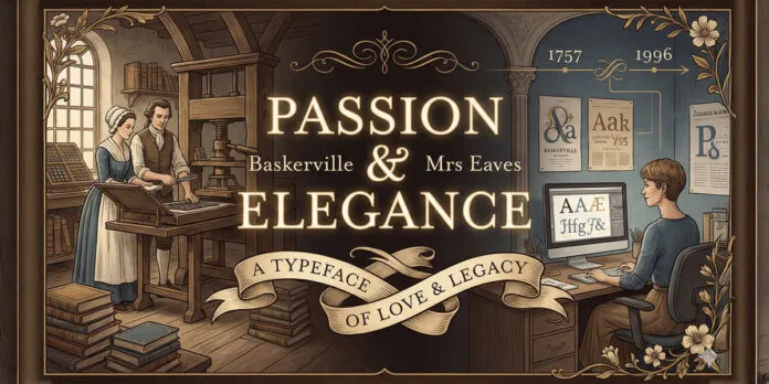
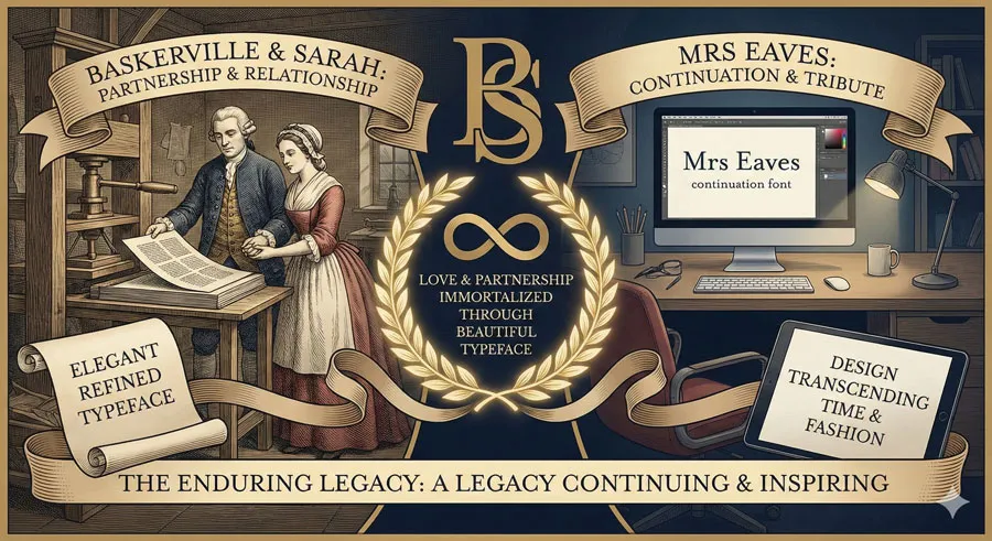
Explore the passionate relationship between John Baskerville and Sarah Eaves, the woman who inspired typography, and how their love story shaped one of history’s most beautiful typefaces and its modern revival.
My name is Lalit Adhikari and we are at LTY. Let’s begin!
Table of Contents
Introduction: Love, Typography, and Immortality
Behind every great design achievement lies human drama, sacrifice, passion, and often profound personal relationships. The story of John Baskerville’s elegant serif typeface is inseparable from the woman who shared his life: Sarah Eaves, known to history as Mrs. Baskerville.
John Baskerville was a printer and typographer whose commitment to perfection in printing transformed the aesthetic of eighteenth-century book design. His typeface, designed to embody elegance and refinement, became one of the most respected and influential typefaces in history.
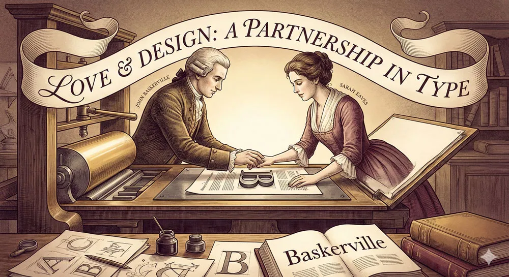
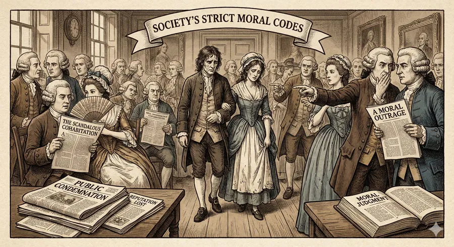
Yet Baskerville’s success was intertwined with his relationship with Sarah Eaves. Sarah was a printer’s widow with two children when she met Baskerville. Their relationship scandalized Georgian society—they lived together unmarried for years before finally marrying.
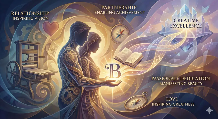
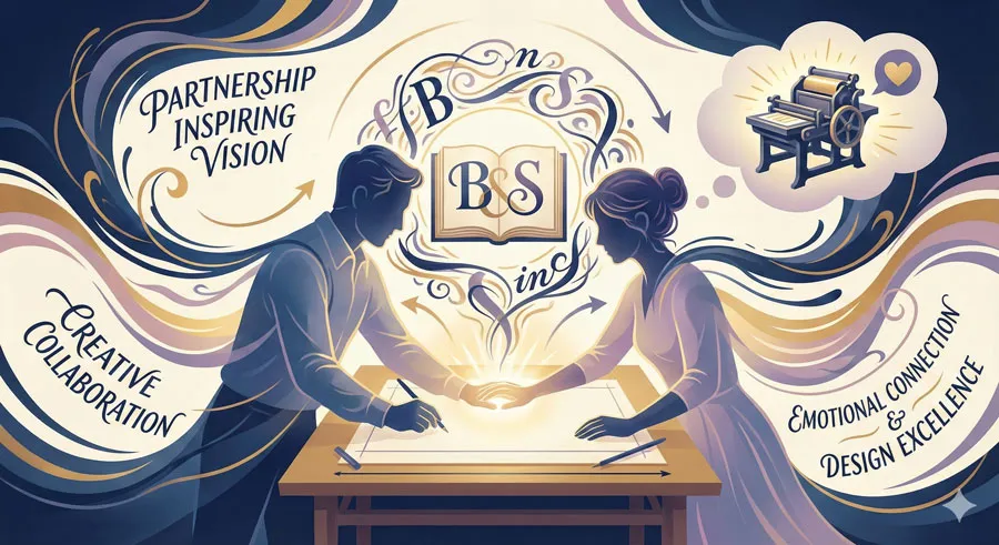
Sarah was not merely a companion; she was a partner in Baskerville’s creative enterprise, supporting his vision and managing aspects of his printing business.
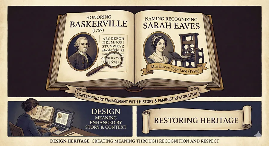
The connection between Baskerville and Sarah Eaves was so profound that it endured beyond death. In recent decades, type designer Zuzana Licko created Mrs. Eaves, a contemporary typeface inspired by Baskerville but named in honor of Sarah Eaves.
Mrs. Eaves is both homage to Baskerville’s elegance and acknowledgment of Sarah’s role in creating that elegance.
The story of Baskerville and Mrs. Eaves reveals something profound about typography: typefaces are not merely technical artifacts but embodiments of human passion, creativity, relationship, and vision.
The elegance of Baskerville’s typeface reflects not just technical mastery but the refined sensibility that emerged from Baskerville and Sarah’s shared creative vision.
This comprehensive exploration traces John Baskerville’s life and his relationship with Sarah Eaves, examines Baskerville typeface design and innovation, explores the social scandal and eventual triumph of their relationship, analyzes contemporary revival of Baskerville through Mrs Eaves typeface, considers how personal relationships shape creative achievement, and ultimately asks:
- what does the Baskerville-Mrs Eaves story reveal about the intersection of personal passion and creative excellence, about how relationships inspire design, and about how we honor creative legacies?
Related Topics:
- Futura vs. The World: The Geometric Vision of Paul Renner
- Legibility vs. Readability: What Every Designer Needs to Know
- Secret Life of Symbols: History of Ampersand and Interrobang
John Baskerville: The Perfectionist Printer
A Life Devoted to Excellence
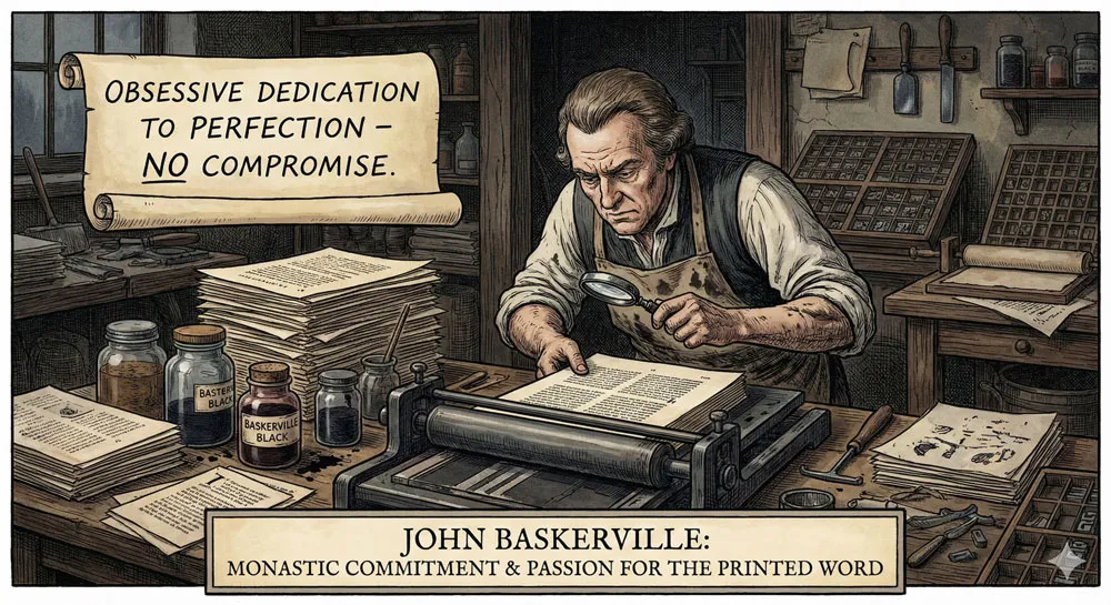
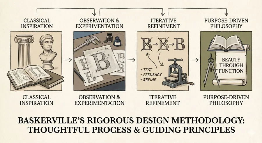
John Baskerville was born in 1706 in Worcestershire, England. He began his career as a printer and businessman. However, unlike many printers who were satisfied with technical competence, Baskerville became obsessed with perfection—with creating printing that was not merely functional but beautiful.
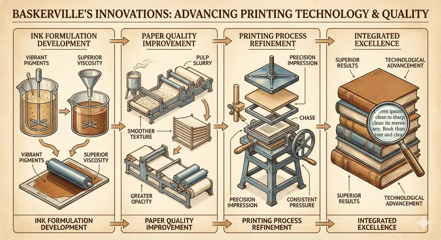
Baskerville’s commitment to excellence was nearly monastic. He invested extensively in developing superior papers, researching new ink formulations, and perfecting printing techniques. He studied typeface design extensively. He was willing to delay publication of books to ensure every element was executed perfectly.
This perfectionism was not profitable in the short term. Baskerville’s books were expensive to produce and commanded premium prices. However, the quality of his work earned him reputation and prestige. Collectors and institutions sought Baskerville-printed books.
The Printing Business and Creative Vision
Baskerville established his own printing business in Birmingham, then an industrial city transforming through manufacturing innovation. Baskerville’s printing business was integrated with his typeface design work—he created typefaces specifically for his own printing.
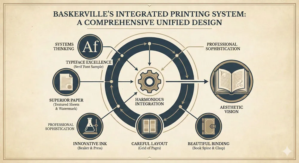
Baskerville’s approach was revolutionary because he understood printing as an integrated system: typeface, paper, ink, layout, and binding all worked together to create beautiful books. He was not simply a printer using available tools but a designer creating comprehensive aesthetic systems.
Baskerville’s Philosophy of Beauty and Function
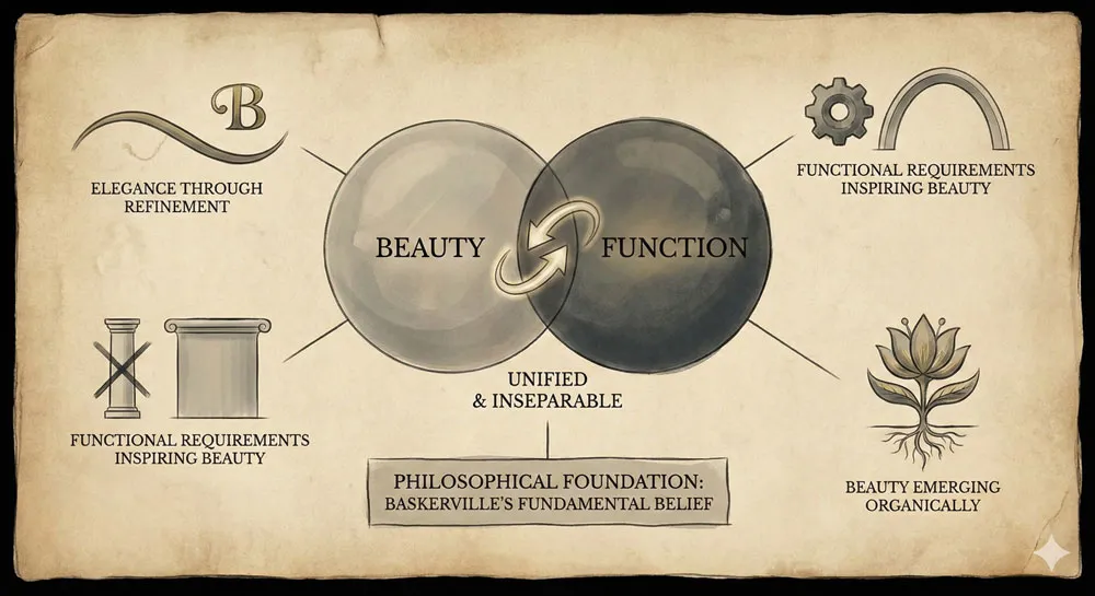
Central to Baskerville’s philosophy was the belief that beauty and function were not separate concerns but unified. Beautiful design emerged from perfect attention to functional requirements. The typeface should be readable and functional, but this functionality should manifest as beauty.
This philosophy distinguished Baskerville from some contemporary approaches. While some designers pursued ornament or decoration for its own sake, Baskerville pursued elegance through refinement of functional forms.
Related Topics:
- Helvetica – Swiss Modernism’s Ubiquity Crisis
- Comic Sans – Accessibility & Gatekeeping Critique
- Gotham – Political Design & Elections Power
Sarah Eaves: Partner, Support, and Muse
A Woman of Courage and Capability
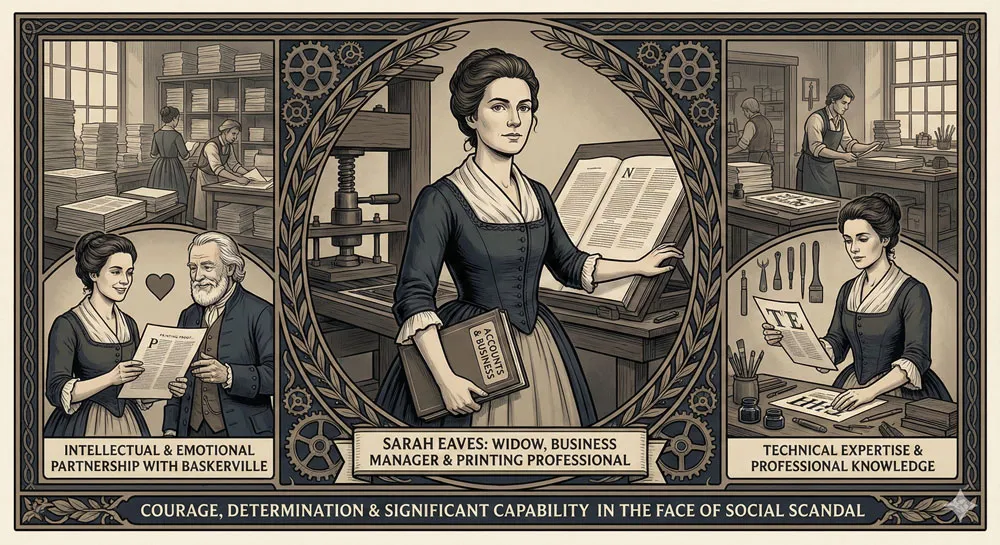
Sarah Eaves was born around 1709. She married John Eaves, a printer, and had two children. When John Eaves died, Sarah was left as a widow with dependents in a male-dominated profession where women had limited economic opportunities.
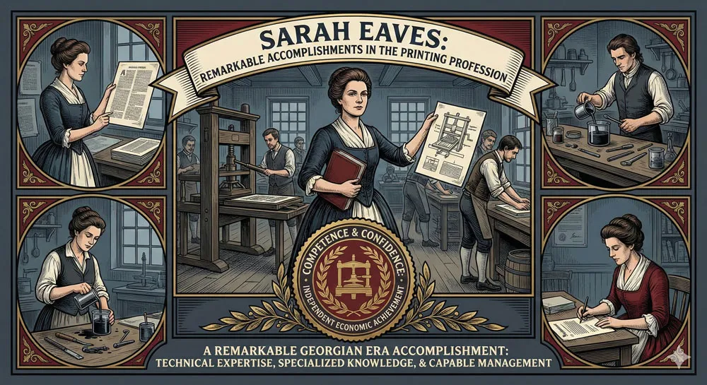
Sarah entered the printing business herself, working as a printer and managing printing operations. She developed genuine expertise in the technical aspects of printing. This was remarkable for the time—women in printing were rare, and women managing printing operations were nearly unheard.
Meeting and Relationship with John Baskerville
Sarah and John Baskerville met through the printing business. When they met, Sarah was a widow of ten years, established in the printing profession. Baskerville was building his printing business and seeking someone who could understand and support his vision.
Their relationship became romantic and professional partnership. They lived together for many years before marrying, a scandalous arrangement in eighteenth-century England. Their unmarried cohabitation generated significant social disapproval and gossip.
Despite social scandal, their relationship proved durable and productive. Sarah understood Baskerville’s perfectionism and his vision. She managed aspects of his business and supported his creative work. By all accounts, their relationship was characterized by genuine affection and mutual respect.
The Role of Partnership in Creative Achievement
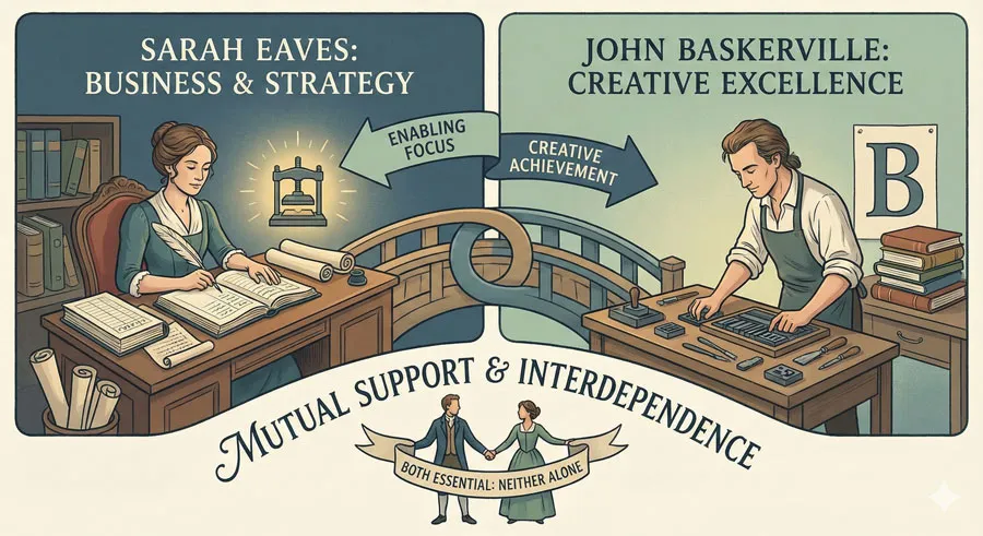
What is remarkable about Sarah’s role is how she enabled Baskerville’s achievement. Sarah managed business operations, allowing Baskerville to focus on design and innovation. Sarah likely advised on aspects of typeface design and aesthetic decisions, bringing her own expertise and sensibility.
The relationship demonstrates that major creative achievements often depend on partnership and support. Baskerville’s typeface was not created in isolation but emerged from a relationship and creative partnership with Sarah.
Related Topics:
- Futura – Geometric Modernism Revolution
- Gill Sans – Humanist Alternative Modernism
- Baskerville – Print Excellence & Love Story
Baskerville Typeface: Design Innovation and Refinement
The Design Process and Philosophy
Baskerville typeface was created in the mid-eighteenth century as part of Baskerville’s commitment to printing excellence. The typeface incorporated principles Baskerville had studied and refined through years of observation and experimentation.
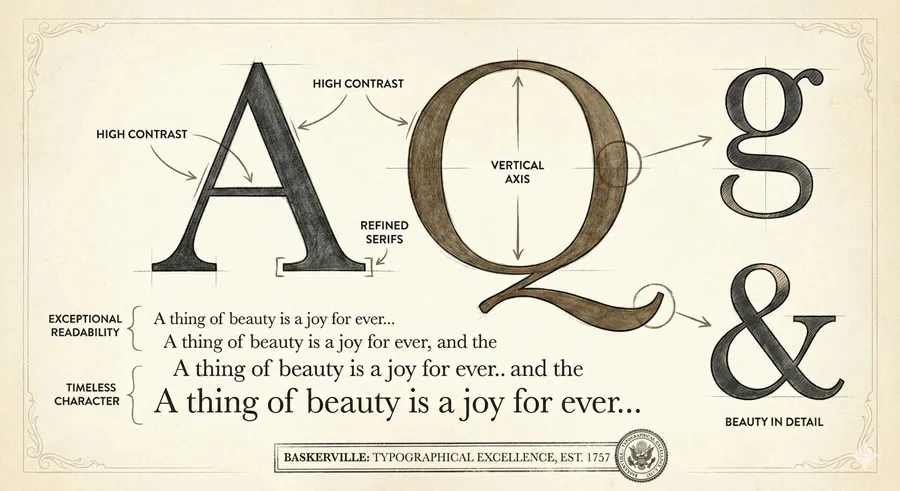
Baskerville based his typeface on classical serif proportions while introducing innovations. The typeface featured high contrast between thick and thin strokes, refined serifs, and elegant proportions. The typeface was designed to be readable at various sizes while maintaining exceptional beauty.
Technical Innovation and Printing Advancement
Beyond the typeface itself, Baskerville contributed to printing advancement through ink and paper innovation. He developed new ink formulations that printed more sharply and evenly. He commissioned superior papers that displayed his typeface to optimal effect.
This comprehensive approach to printing—innovating typeface, paper, ink, and technique simultaneously—created printing of unprecedented quality.
Baskerville’s Elegance and Enduring Appeal
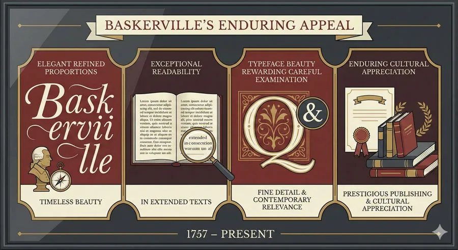
What distinguishes Baskerville typeface is its elegant refinement combined with exceptional readability. The typeface reads beautifully in extended text while maintaining exceptional beauty. The letterforms have proportions and character that reward close examination.
This combination of elegance and functionality has given Baskerville extraordinary longevity. Nearly three centuries after its creation, Baskerville remains widely used in literary and prestige publishing contexts.
Related Topics:
- Bodoni – Theatrical Prestige Aesthetics
- Garamond – Classical Foundation Principles
- Worst Fonts – Criticism & Gatekeeping Analysis
Scandal, Marriage, and Triumph
Social Scandal and Moral Judgment
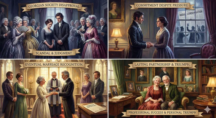
John Baskerville and Sarah Eaves’ relationship scandalized Georgian society. Living together unmarried was considered morally transgressive and damaging to reputation. The relationship generated gossip and moral judgment.
Despite—or perhaps because of—the scandal, their relationship endured. Eventually, after many years of cohabitation, Baskerville and Sarah married in 1764. By this time, both were established in their respective positions, and the marriage was less scandalous than their earlier cohabitation.
Personal Sacrifice and Commitment
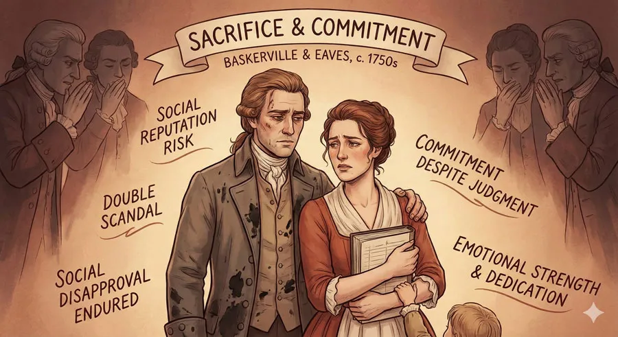
Both Baskerville and Sarah made sacrifices for their relationship. Baskerville endured social disapproval and potential damage to his business reputation. Sarah, already a scandal as a widow managing a printing business, further scandalized society through her relationship with Baskerville.
Yet both seemed willing to accept social judgment in service of their commitment to each other and to their creative work.
The Legacy of Their Partnership
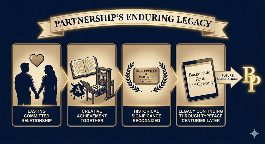
In historical perspective, Baskerville and Sarah’s relationship appears as a passionate partnership between two dedicated professionals. Their cohabitation and eventual marriage were ahead of their time in assuming women’s right to economic independence and equality in professional partnership.
The relationship endured until Baskerville’s death in 1775. Sarah survived him by many years, dying in 1829 at an advanced age. She appears to have maintained and managed Baskerville’s printing legacy after his death.
Related Topics:
- Gill Sans & The Tube – Urban Identity Infrastructure
- Baskerville & Mrs. Eaves – Love, Partnership & Revival
- Futura & Paul Renner – Geometric Vision & Revolution
Mrs. Eaves: Contemporary Revival and Homage
Zuzana Licko and Type Design Innovation
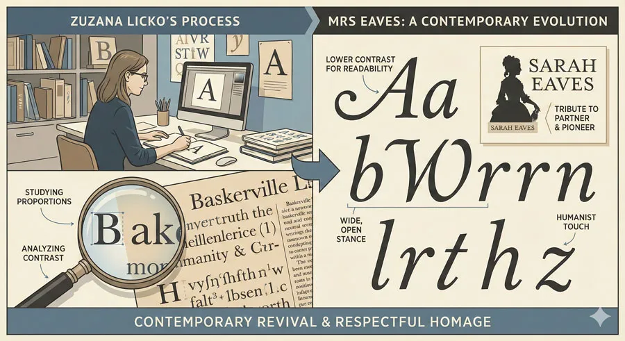
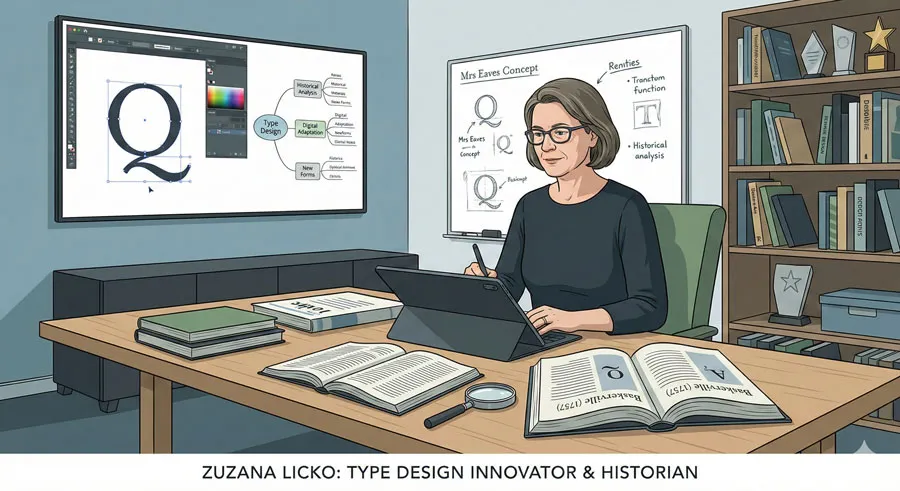
Contemporary type designer Zuzana Licko created Mrs. Eaves typeface in 1996 as homage to both Baskerville and Sarah Eaves. Licko is known for creating typefaces that bridge historical reference and contemporary digital requirements.
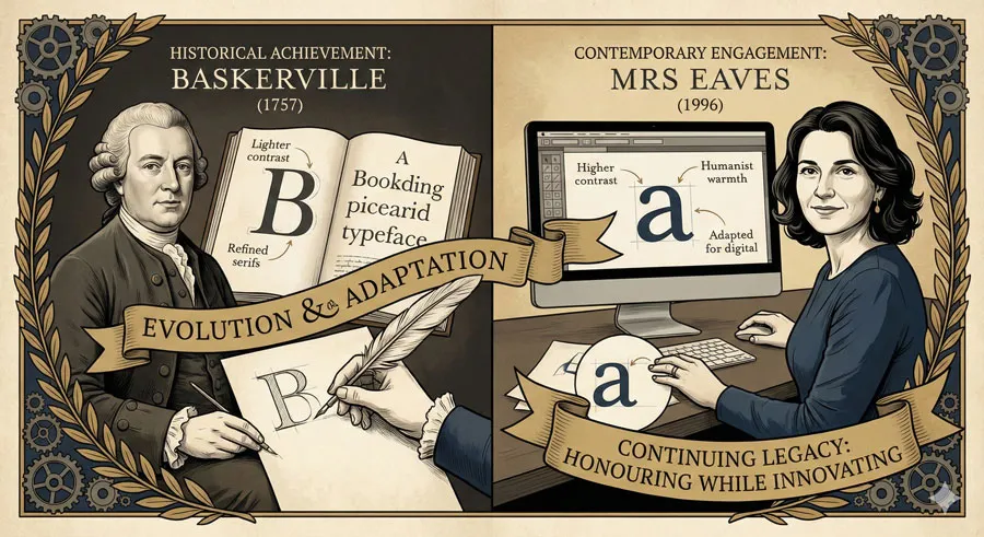
Licko studied Baskerville extensively and created Mrs. Eaves as evolution of Baskerville’s principles adapted for contemporary use. The typeface maintains essential characteristics of Baskerville while introducing refinements and variations suited to contemporary design and digital contexts.
Mrs. Eaves: Design and Characteristics
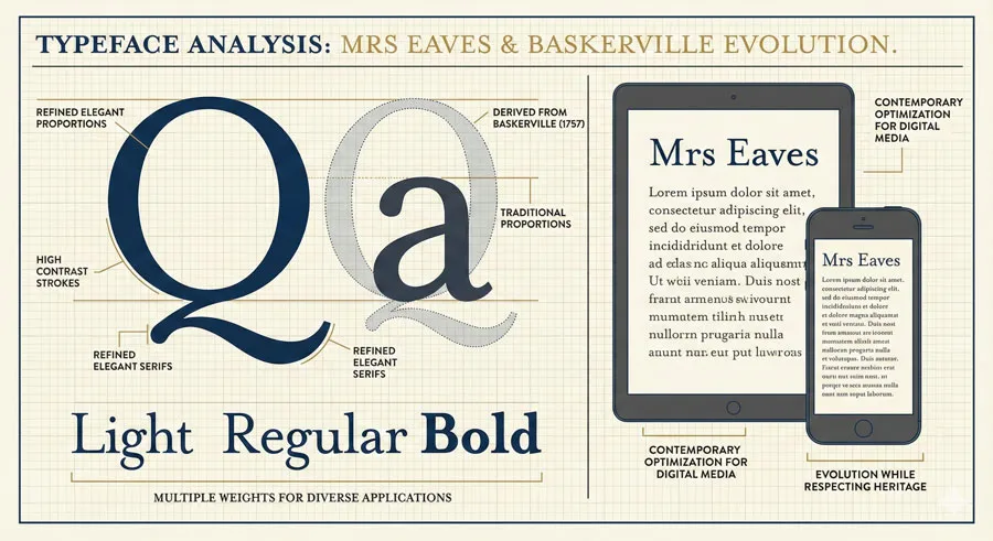
Mrs. Eaves is characterized by:
- Refined elegant proportions derived from Baskerville
- High contrast between thick and thin strokes
- Refined serifs with subtle contemporary refinement
- Multiple weights and styles for diverse applications
- Distinctive character while maintaining Baskerville’s essential elegance
- Optimization for both print and digital media
What distinguishes Mrs. Eaves is that it is not simply a digital copy of Baskerville but a thoughtful evolution respecting Baskerville’s principles while acknowledging contemporary needs and aesthetic sensibilities.
The Name as Tribute
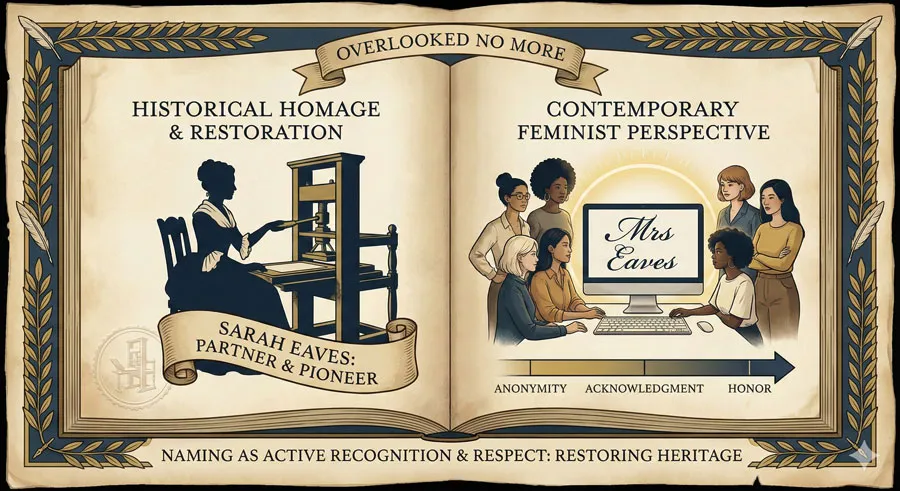
The choice to name the typeface Mrs. Eaves is remarkable—a deliberate acknowledgment of Sarah Eaves’ role in Baskerville’s life and legacy. In naming the typeface after Sarah, Licko acknowledges that behind great design achievements often stand significant relationships and supportive partnerships.
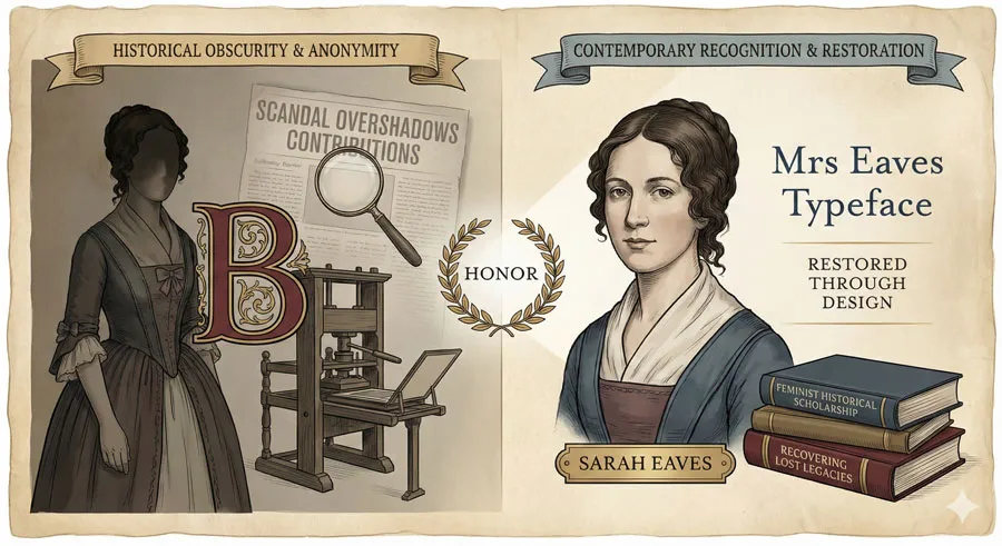
The name Mrs. Eaves also reclaims Sarah Eaves’ history and presence. For centuries, Sarah was known primarily as “Mrs. Baskerville” or in relation to the scandal of her relationship. Naming the contemporary typeface after her restores her individual identity.
Mrs. Eaves’ Adoption and Influence
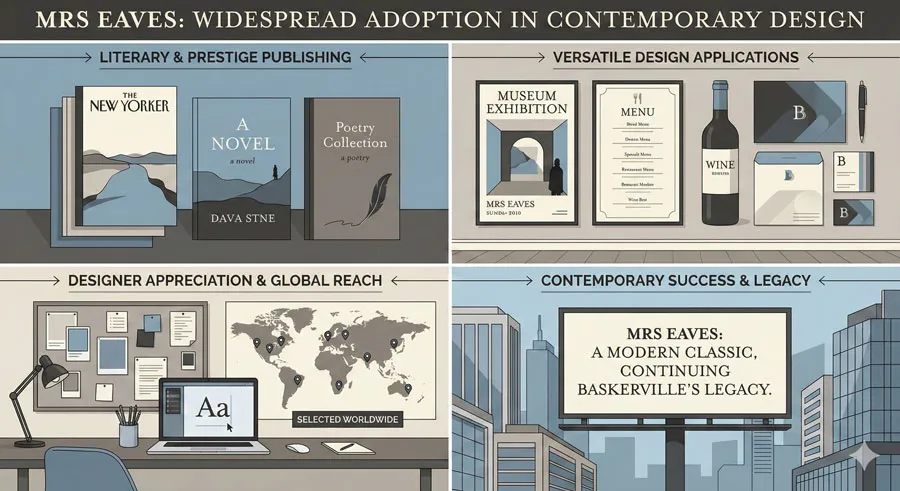
Mrs Eaves has become widely used in contemporary design, particularly in literary and prestige publishing contexts. The typeface appeals to designers seeking Baskerville’s elegance while needing a typeface optimized for contemporary media and design requirements.
The typeface’s adoption demonstrates that contemporary designers appreciate the principles Baskerville embodied while recognizing the need for evolution and adaptation.
Related Topics:
- Legibility vs. Readability – Typography Fundamentals
- Ampersand & Interrobang – Symbol Histories
- Typography
Love, Passion, and Creative Excellence
How Relationships Inspire Design
The Baskerville-Mrs Eaves story demonstrates that personal relationships profoundly influence creative achievement. Baskerville’s typeface emerged not from isolated genius but from a partnership with Sarah Eaves.
This theme extends beyond Baskerville. Throughout design and art history, significant creative achievements often emerge from relationships—professional partnerships, romantic relationships, mentorship relationships, family relationships.
The Role of Support and Partnership
Sarah’s support was crucial to Baskerville’s achievement. By managing business operations and providing counsel, Sarah enabled Baskerville to focus on design innovation. This division of labor and mutual support characterizes many successful creative partnerships.
Contemporary design culture sometimes emphasizes individual genius and isolated creativity. However, examining historical design achievement reveals how often partnerships, support systems, and relationships enable excellence.
Passion as Design Principle
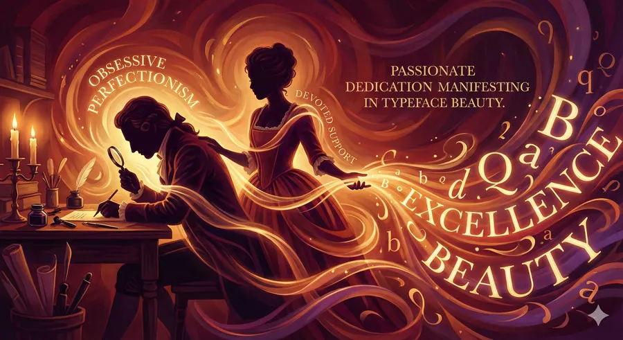
Both Baskerville and Sarah brought passion to their work. Baskerville’s obsessive commitment to perfection, his willingness to invest resources and time in achieving excellence, his refusal to compromise quality—these reflect passionate dedication to craft.
Sarah’s commitment to maintaining and supporting Baskerville’s vision, her willingness to accept social scandal for their partnership, her continued management of the business after his death—these reflect equally passionate commitment.
This passion manifests in the typeface itself. Baskerville has a distinctive character that communicates refined elegance—a character that emerges from passionate dedication to perfection.
Related Topics:
- The Psychology of Typography: Font Influence
- Helvetica Effect: One Font Conquered Global Design
- Comic Sans: True Story Behind the World’s Most Hated Font
Design Heritage and Meaning-Making
How We Honor Creative Legacies
The creation of Mrs. Eaves demonstrates how contemporary designers honor historical achievements. Rather than simply copying Baskerville or dismissing it as historical, Licko created a typeface that evolved Baskerville’s principles while respecting its legacy.
This approach—respectful evolution rather than copying or dismissal—characterizes thoughtful engagement with design heritage.
Sarah Eaves’ Recognition and Restoration
Naming Mrs. Eaves after Sarah Eaves serves a secondary but important function: it restores recognition to Sarah’s role in Baskerville’s achievement. For centuries, Sarah was largely forgotten or known only in relation to scandal or as “Mrs. Baskerville.”
Contemporary feminist scholarship increasingly recognizes the historical roles of women in creative and technical fields. Naming a contemporary typeface after Sarah Eaves contributes to this recognition and restoration of historical women’s contributions.
The Intimate Connection Between Design and Story
The power of Mrs. Eaves typeface is enhanced by knowledge of its naming and historical context. Understanding the Baskerville-Mrs. Eaves story adds meaning to the typeface. The typeface becomes not merely a tool for communication but a embodiment of a historical relationship and creative partnership.
This suggests that design meaning extends beyond formal characteristics. Context, history, and story invest design with deeper meaning.
Related Topics:
- Gotham: Font That Won an Election And Changed Design Forever
- Futura: The Geometric Vision of Paul Renner
- Gill Sans: Eric Gill’s Humanist Masterpiece
FAQ: Common Questions About Baskerville and Mrs. Eaves
Q: Was Baskerville’s relationship with Sarah Eaves really scandalous?
A: Yes. In eighteenth-century England, living together unmarried was considered morally transgressive. Their relationship generated significant social disapproval and gossip.
Q: Did Sarah Eaves contribute to designing Baskerville typeface?
A: While there is no documentary evidence that Sarah directly participated in typeface design, she was certainly involved in the printing business and likely influenced design decisions through consultation and partnership.
Q: Is Mrs Eaves typeface a direct digital copy of Baskerville?
A: No. Zuzana Licko created Mrs Eaves as an evolution of Baskerville principles, adapted for contemporary needs and digital media. The typeface respects Baskerville’s heritage while introducing distinctive contemporary refinements.
Q: Why did Zuzana Licko name the typeface “Mrs Eaves”?
A: Licko named the typeface as homage to Sarah Eaves and acknowledgment of her role in Baskerville’s life and achievement. The name also serves to restore recognition to Sarah’s historical significance.
Q: Is Baskerville typeface still used in contemporary design?
A: Yes. Baskerville remains widely used in literary publishing, prestige branding, and contexts where elegant refinement is valued.
Q: Can I use both Baskerville and Mrs Eaves in the same design?
A: Absolutely. The typefaces share enough common DNA that they work well together while offering distinct characteristics and versatility.
Q: What other contemporary typefaces reference historical designs?
A: Many contemporary typefaces reference and evolve historical designs—this is common practice in type design. Examples include Garamond revisions, contemporary interpretations of historical typefaces, and designs like Mrs Eaves that explicitly acknowledge historical sources.
Q: How did Sarah Eaves’ printing expertise influence the printing quality?
A: Sarah’s expertise in printing operations likely contributed to the technical excellence Baskerville achieved. Her knowledge and input on paper, ink, and printing technique would have been valuable consultation for Baskerville.
Q: What happened to the Baskerville printing business after John died?
A: Sarah managed and maintained the printing business after Baskerville’s death. The business continued and maintained its reputation for quality. Sarah lived for many decades after Baskerville’s death.
Q: Are there other examples of creative partnerships producing significant design achievements?
A: Yes, many. Design history is full of partnerships and collaborations. The emphasis on individual genius sometimes obscures the collaborative nature of creative achievement.
Related Topics:
- Baskerville: Elegant Serif That Shaped Print Typography
- Bodoni Font: Serif That Defined Luxury Typography
- Garamond: Timeless Serif That Defined Classical Typography
Conclusion: Design, Love, and Immortality Through Typeface
The story of John Baskerville and Sarah Eaves reveals something essential about typography and design: typefaces are not merely technical artifacts but embodiments of human passion, creativity, relationship, and vision.
Baskerville typeface is elegant and refined. But understanding the story of John Baskerville’s obsessive dedication to perfection, and Sarah Eaves’ partnership and support, adds layers of meaning to that elegance. The typeface becomes a physical manifestation of their relationship and shared creative vision.
Contemporary type designer Zuzana Licko’s creation of Mrs. Eaves perpetuates and honors this story while serving contemporary needs. The decision to name the typeface after Sarah Eaves—rather than, for example, after Licko—demonstrates respect for historical legacy and acknowledgment of women’s historical contributions.
The Baskerville-Mrs. Eaves story suggests important lessons for contemporary designers: that creative excellence emerges from partnership and support, that acknowledging and honoring historical achievements is important, that design heritage can inspire and inform contemporary work, and that the stories behind designs add meaning and significance.
In creating Mrs. Eaves, Licko honored Baskerville’s legacy while creating something contemporary and new. In naming the typeface after Sarah Eaves, she restored recognition to a woman whose contributions were largely forgotten. In thoughtfully evolving Baskerville’s principles while respecting its heritage, she demonstrated how to engage respectfully with design history.
The elegance of both Baskerville and Mrs. Eaves typefaces reflects not just technical mastery but passionate human commitment to beauty and excellence.
That passion emerges from and is expressed through the relationship between John Baskerville and Sarah Eaves—a relationship that created not just beautiful books but a typeface that continues to communicate elegance and refined sophistication nearly three centuries after its creation.
Related Topics:
- The Worst Fonts in the World: A Typographic Hall of Shame
- Gill Sans and Tube: How Johnston and Gill Defined London
About the Author
Lalit M. S. Adhikari is a Digital Nomad and Educator since 2009 in design education, graphic design and animation. He’s taught 500+ students and created 200+ educational articles on design topics. His teaching approach emphasizes clarity, practical application and helping learners.
Learn more about Lalit Adhikari.
This guide is regularly updated with the latest information about Adobe tools and design best practices. Last Updated: May 2026


