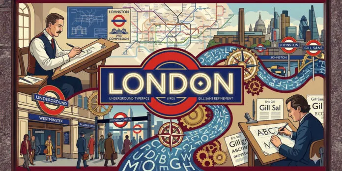
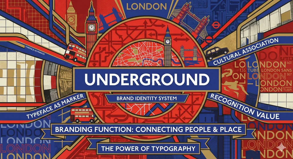
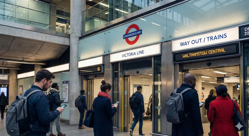
Discover how Edward Johnston’s revolutionary Underground typeface and Eric Gill’s refined sans-serif transformed London’s visual identity, creating the foundation for modern wayfinding and public signage design.
My name is Lalit Adhikari and we are at LTY. Let’s begin!
Table of Contents
Introduction: When Typography Shaped a City
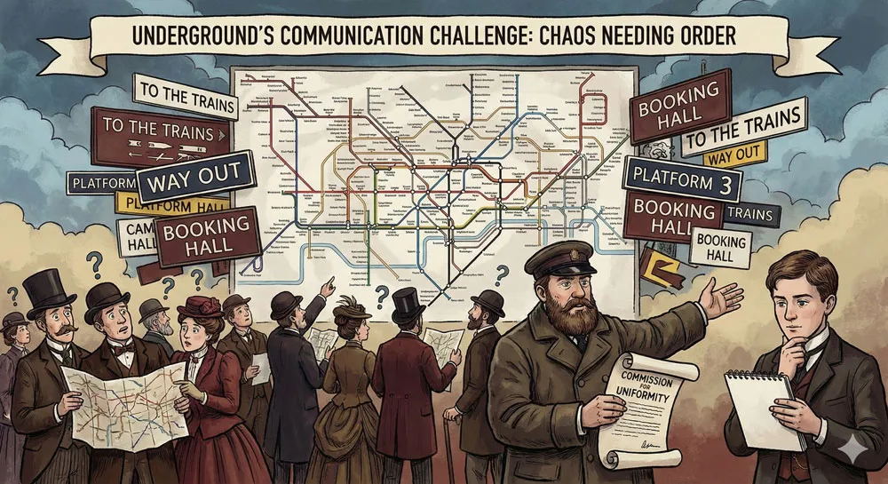
In the early twentieth century, London’s Underground Railway faced a critical challenge: how to communicate clearly and efficiently with millions of passengers navigating an increasingly complex network of tunnels, stations, and lines.
The solution came from an unexpected source: a radical rethinking of typography and signage design that would ultimately transform not just London’s visual landscape but influence public signage and wayfinding design worldwide.
The story begins with Edward Johnston, a visionary typographer who, in 1913, created a distinctive sans-serif typeface specifically for the Underground Railway.
Johnston’s typeface was revolutionary:
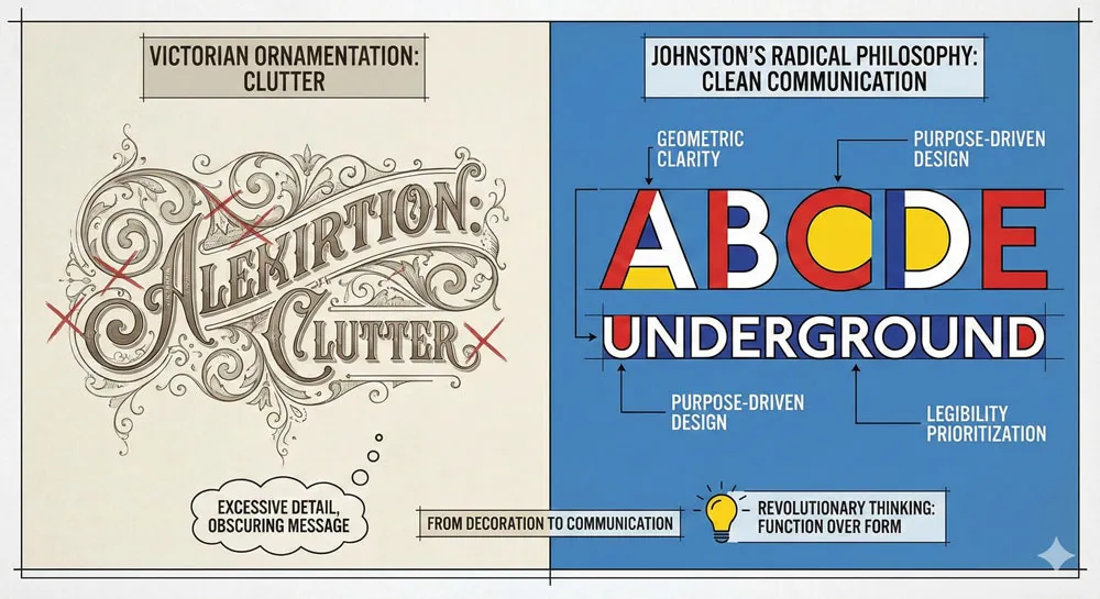
- it rejected the ornamental typography of the Victorian era and embraced clean
- modern letterforms designed explicitly for legibility and clarity in public spaces.
The typeface became inseparable from the London Underground brand and remains one of the most iconic typefaces in the world.
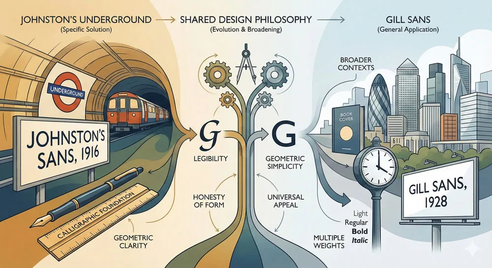
Later, Eric Gill—student and assistant of Edward Johnston—would refine and expand upon Johnston’s principles to create Gill Sans, a typeface that took Johnston’s radical modernism and evolved it into something more refined and broadly applicable.
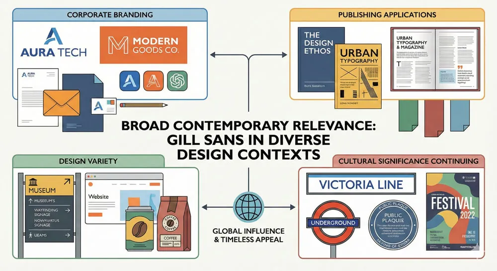
Gill Sans became one of the most influential typefaces of the twentieth century, used in contexts ranging from corporate branding to fine book design.
Yet the connection between Johnston’s Underground typeface and Gill Sans reveals something profound about typography’s role in shaping urban identity.
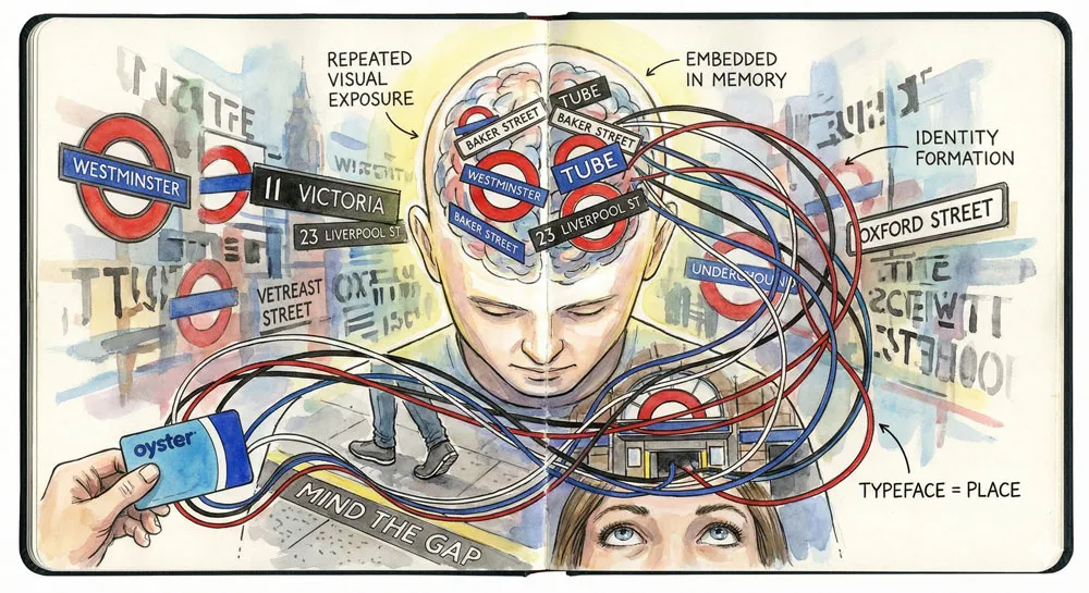
When a city adopts a distinctive typeface for public signage, that typeface becomes embedded in the visual experience of living in that city.
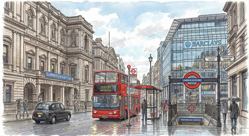
Londoners navigated the Underground using Johnston’s typeface. They saw Gill Sans on buses, on institutional signage, on the fabric of their city. These typefaces became visual representations of London itself.
This comprehensive exploration examines Edward Johnston’s revolutionary design for the London Underground, traces how his principles influenced Eric Gill’s development of Gill Sans, explores how these typefaces shaped London’s visual identity, analyzes the principles of effective public and wayfinding typography, considers how typefaces communicate brand identity and cultural values, and ultimately asks:
- how do typefaces shape our experience of cities, and what can designers learn from the successful integration of typography into urban environments?
Related Topics:
- Baskerville and Eaves: A Tale of Perfection, Passion and Revival
- Futura vs. The World: The Geometric Vision of Paul Renner
- Legibility vs. Readability: What Every Designer Needs to Know
Edward Johnston: The Typographic Visionary
A Life in Lettering and Design
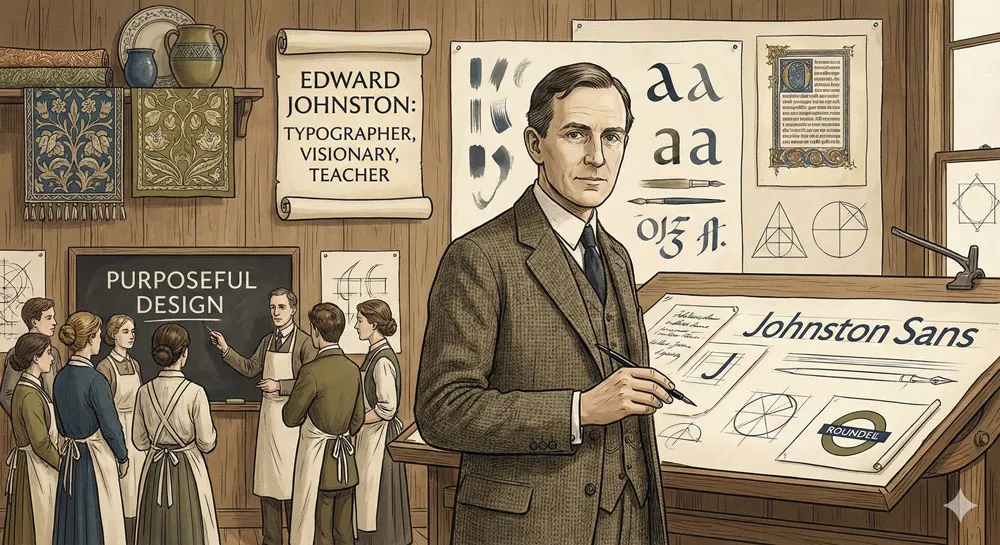
Edward Johnston was born in 1872 and trained as a calligrapher, architect, and design educator. He came of age during a period when design reform movements were questioning industrial production and advocating for craftsmanship, beauty, and purposeful design.
Johnston was profoundly influenced by the Arts and Crafts movement, which believed that design should be integrated with craft and that beauty should serve function.
However, unlike some Arts and Crafts adherents who looked backward nostalgically, Johnston looked forward. He believed that modern design could be beautiful, that contemporary materials and purposes could inspire excellent design.
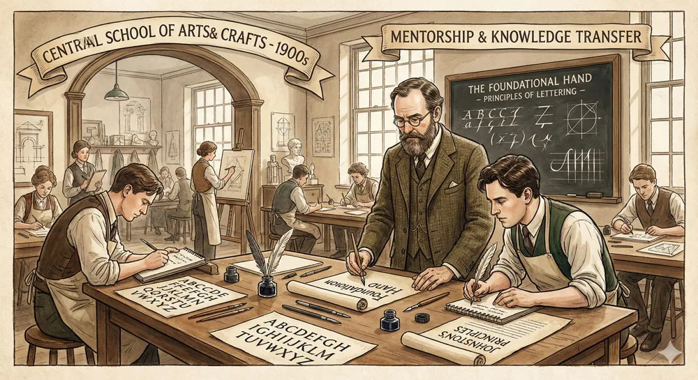
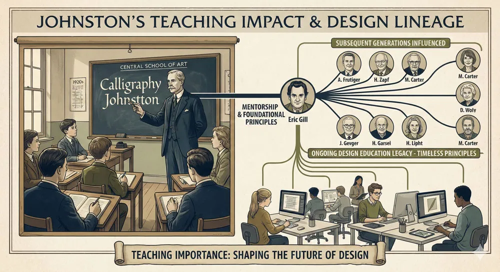
Johnston’s career spanned typography, lettering, calligraphy, and teaching. He taught at the Central School of Art in London and influenced countless designers and typographers through his teaching and his published work on lettering and design principles.
The Underground Railway Challenge
In 1913, Johnston received a commission from the Underground Railway to design a new typeface for the public transportation system.
At this time, the Underground was expanding rapidly, with new lines and stations constantly being added. The existing visual communications were inconsistent, chaotic, and difficult to navigate.
The Underground needed a typeface that could be used consistently across all signage, from station names to line identification to directional wayfinding.
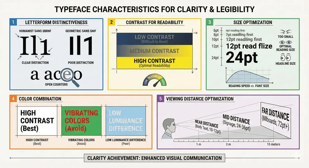
The typeface needed to be highly legible—readable quickly and clearly even in poor lighting conditions, from distances, and in the chaos of crowded stations.
Johnston’s Revolutionary Design Philosophy
Edward Johnston’s approach to the Underground typeface was revolutionary because it rejected prevailing design conventions.
Rather than using an existing classical typeface or creating an ornamental Art Nouveau design (fashionable at the time), Johnston created a radically simplified, geometric sans-serif specifically designed for its purpose.
Johnston’s typeface featured:
- Simple, clear letterforms with no ornament
- Geometric proportions based on the circle
- Consistent weight and balance
- High legibility and clarity even at small sizes
- Distinctive character despite simplicity
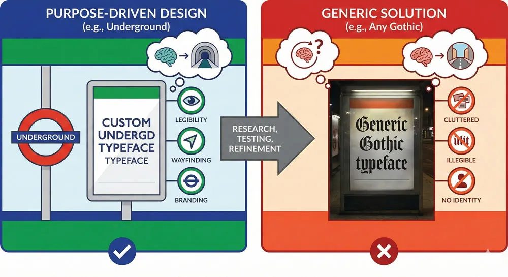
What distinguished Johnston’s design was that it was purpose-driven.
Every design decision was made in service of the typeface’s function: rapid, reliable communication in a public transportation context.
Johnston rejected ornament not out of aesthetic minimalism but out of functional necessity.
Related Topics:
- Secret Life of Symbols: History of Ampersand and Interrobang
- Helvetica – Swiss Modernism’s Ubiquity Crisis
- Comic Sans – Accessibility & Gatekeeping Critique
Johnston’s Underground Typeface: Design Innovation and Impact
The Design Process and Development
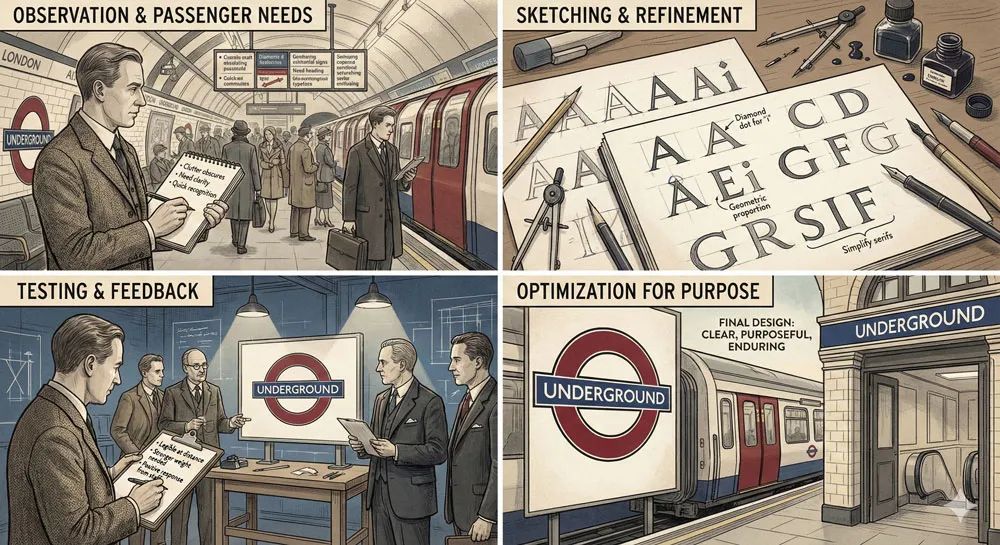
Johnston worked closely with the Underground Railway to understand their specific needs. He studied how passengers navigated stations, how they read signage, what sizes and distances information needed to communicate across.
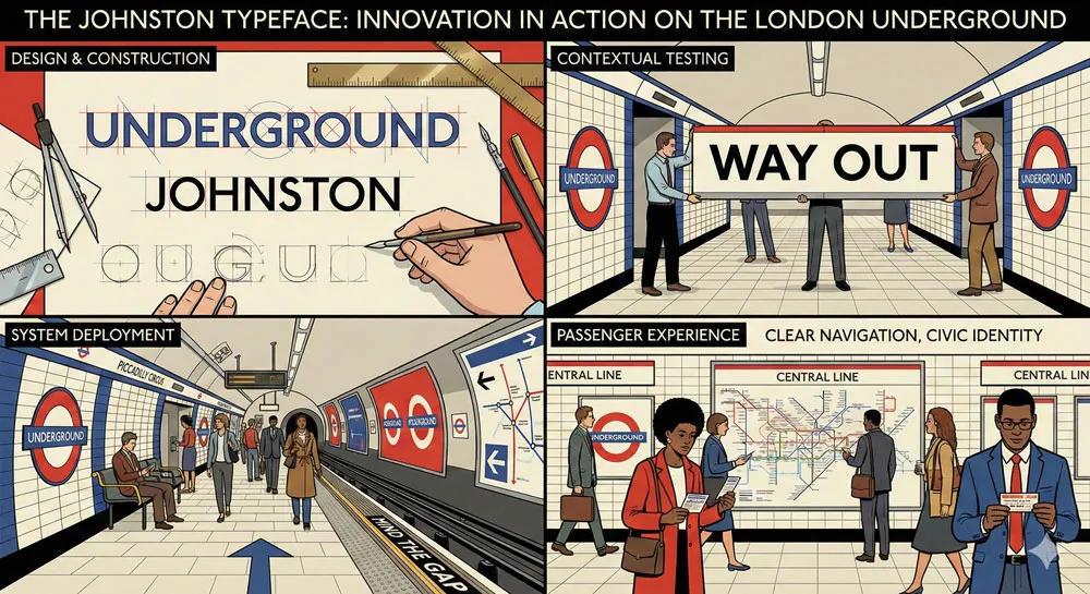
The resulting typeface was refined through extensive testing and practical deployment. Johnston created multiple weights and sizes to work in different contexts. The typeface was tested in actual Underground stations to ensure it functioned properly.
This collaborative, iterative design process—working directly with the client to understand their needs, testing solutions in real-world contexts, refining based on practical feedback—became a model for effective design practice.
Impact on Public Signage and Wayfinding
Johnston’s Underground typeface had immediate impact on London’s visual landscape. The typeface became synonymous with the Underground brand.
As the Underground expanded and modernized, Johnston’s typeface remained consistent, creating visual unity across an increasingly complex system.
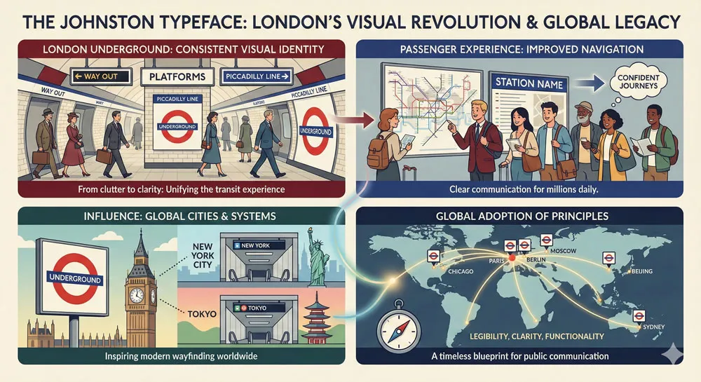
More broadly, Johnston’s approach influenced how public transportation systems worldwide approached typography and signage.
The principle that typefaces should be purpose-designed for specific contexts, that typography serves communication function, and that consistency creates clarity and brand identity became foundational to modern wayfinding design.
The Red Circle Logo and Brand System
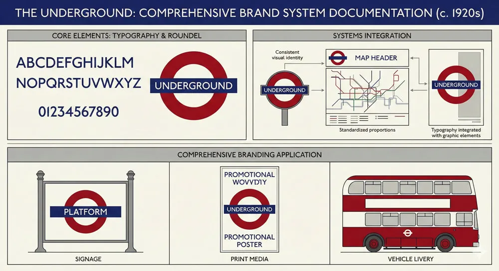
Importantly, Johnston’s typeface was part of a comprehensive visual identity system. The Underground adopted a distinctive red circle logo and a consistent visual system using Johnston’s typeface.
This comprehensive branding approach—creating a unified visual identity across typography, symbols, and graphic elements—was pioneering for its time and influenced subsequent corporate branding systems.
Related Topics:
- Gotham – Political Design & Elections Power
- Futura – Geometric Modernism Revolution
- Gill Sans – Humanist Alternative Modernism
Eric Gill: Student, Innovator, and Developer
Gill as Johnston’s Student and Assistant
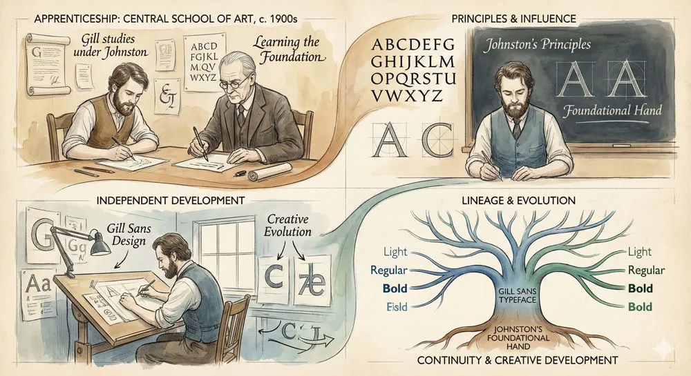
Eric Gill studied under Edward Johnston at the Central School of Art. Gill was profoundly influenced by Johnston’s design philosophy and his belief in the integration of craft, beauty, and function.
However, Gill was not simply copying Johnston’s approach. Rather, Gill took Johnston’s principles and developed them further, creating something both rooted in Johnston’s vision and distinctly Gill’s own creation.
The Development of Gill Sans
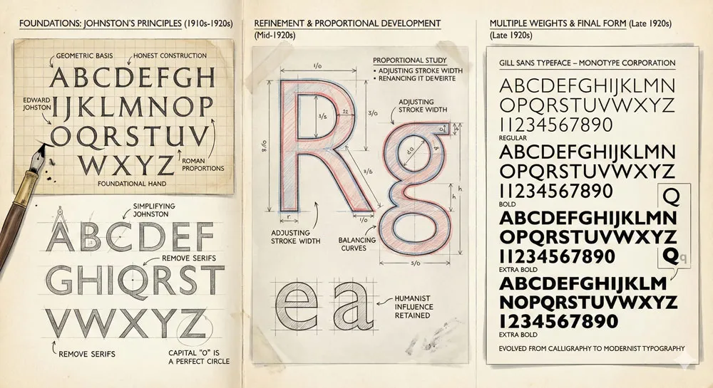
In the 1920s, Eric Gill designed Gill Sans, a typeface that took Johnston’s radical modernism and refined it for broader application.
Where Johnston’s Underground typeface was specifically designed for public transportation, Gill Sans was designed as a more generally applicable sans-serif typeface.
Gill Sans maintained Johnston’s design philosophy—clarity, purpose-driven design, rejection of ornament—while adding refinements:
- More refined proportions
- Subtle humanistic character distinguishing it from purely geometric sans-serifs
- Multiple weights and styles for different applications
- Adaptability to diverse contexts beyond transportation
Gill Sans as Evolution of Johnston’s Principles
The relationship between Johnston’s Underground typeface and Gill Sans demonstrates important design evolution. Gill took specific solutions developed for a specific context (public transportation) and evolved them into more general principles applicable to broader contexts.
This process of evolution—taking specific solutions and generalizing them, testing in diverse contexts, refining based on practical deployment—characterizes successful design thinking.
Related Topics:
- Baskerville – Print Excellence & Love Story
- Bodoni – Theatrical Prestige Aesthetics
- Garamond – Classical Foundation Principles
Typography and Urban Identity: London’s Visual Character
How Typefaces Shape Urban Experience
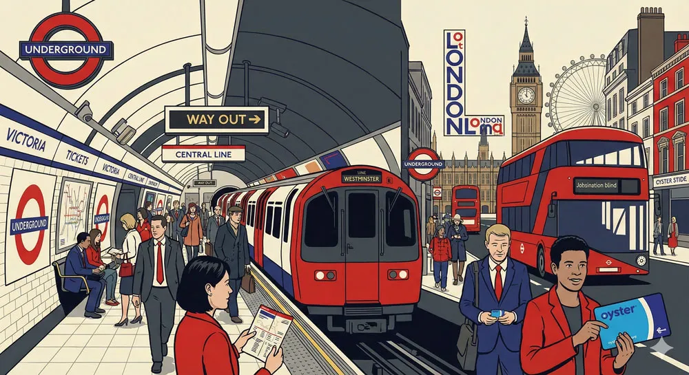
One of the most important dimensions of the Johnston/Gill story is how typefaces shape the visual character and experience of cities. When Londoners navigated the Underground, they encountered Johnston’s typeface constantly. The typeface became embedded in their daily experience.
Over time, the typeface became inseparable from London’s identity. Encountering Johnston’s typeface evokes London, the Underground, British design expertise. The typeface functions as a visual representation of the city itself.
Johnston and Gill Sans in London’s Visual Landscape
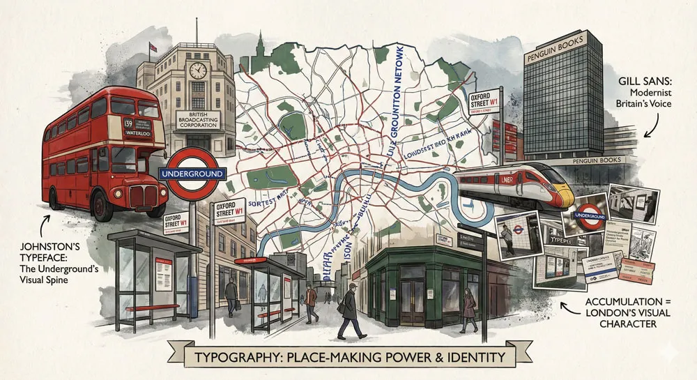
Beyond the Underground, both Johnston’s typeface and Gill Sans appeared throughout London’s visual landscape: on bus signage, on institutional buildings, on corporate branding, on street signage. These typefaces became the visual vocabulary of London.
This consistency created a distinctive visual character recognizable as specifically London. Visitors to London would see these typefaces and recognize them as part of the city’s character.
Branding and Cultural Identity Through Typography
The London Underground and Johnston’s typeface pioneered the concept of using typography as a core element of brand and cultural identity. The Underground created a unified visual system recognizable across all contexts.
This approach influenced subsequent cities and organizations to adopt distinctive typefaces as part of their visual identity. Typography became recognized as a tool for shaping how people experience and identify with places.
Related Topics:
- Worst Fonts – Criticism & Gatekeeping Analysis
- Gill Sans & The Tube – Urban Identity Infrastructure
- Baskerville & Mrs. Eaves – Love, Partnership & Revival
Principles of Effective Public Signage and Wayfinding
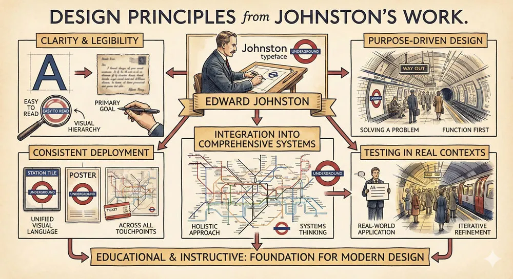
Clarity and Legibility as Primary Goals
Both Johnston and Gill understood that public signage had one primary purpose: to communicate clearly and reliably. This understanding led to design decisions that prioritized clarity above all other concerns.
Contemporary wayfinding design principles largely derive from these early lessons: legibility must never be compromised for aesthetic concerns, typefaces should be tested in actual use contexts, consistency creates clarity and reduces cognitive load.
Purpose-Driven Design
A crucial principle emerging from Johnston’s work is that typefaces should be designed for specific purposes. Johnston didn’t adapt an existing typeface; he created a new typeface specifically for the Underground’s needs.
This principle—designing specifically for purpose rather than adopting generic solutions—remains central to excellent design practice.
Consistency and Visual Unity
The Underground’s success with Johnston’s typeface depended on consistent deployment across all contexts. Every station used the same typeface, same weights, same visual system. This consistency created unity and made the system easier to understand.
Contemporary branding and design emphasize consistency as crucial for creating recognizable, effective communications. This principle was pioneered through Johnston’s Underground work.
Related Topics:
- Futura & Paul Renner – Geometric Vision & Revolution
- Legibility vs. Readability – Typography Fundamentals
- Ampersand & Interrobang – Symbol Histories
The Tube as Design System: Lessons from Harry Beck
The Interplay of Typography and Information Design
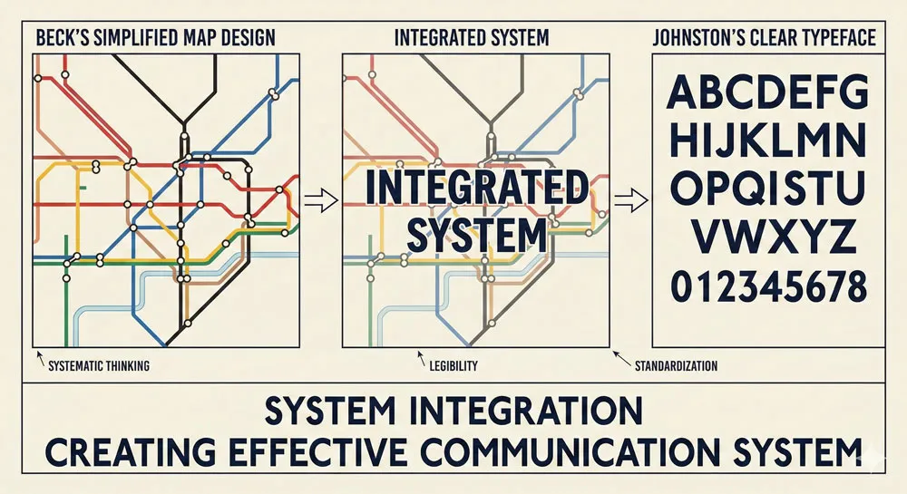
While Edward Johnston created the typeface, the Underground’s visual success also depended on revolutionary information design. Harry Beck’s 1933 Underground map was a masterpiece of information design that complemented Johnston’s typography.
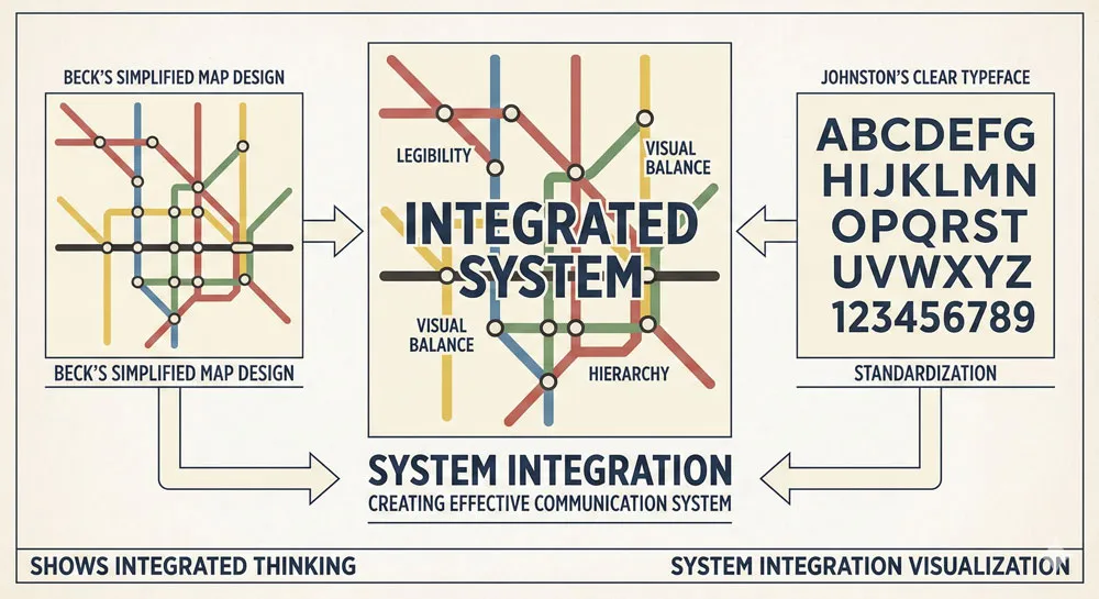
The combination of Johnston’s typeface with Beck’s map design created an integrated system where typography and graphic design worked together to communicate complex information clearly.
Typeface as Part of Larger System
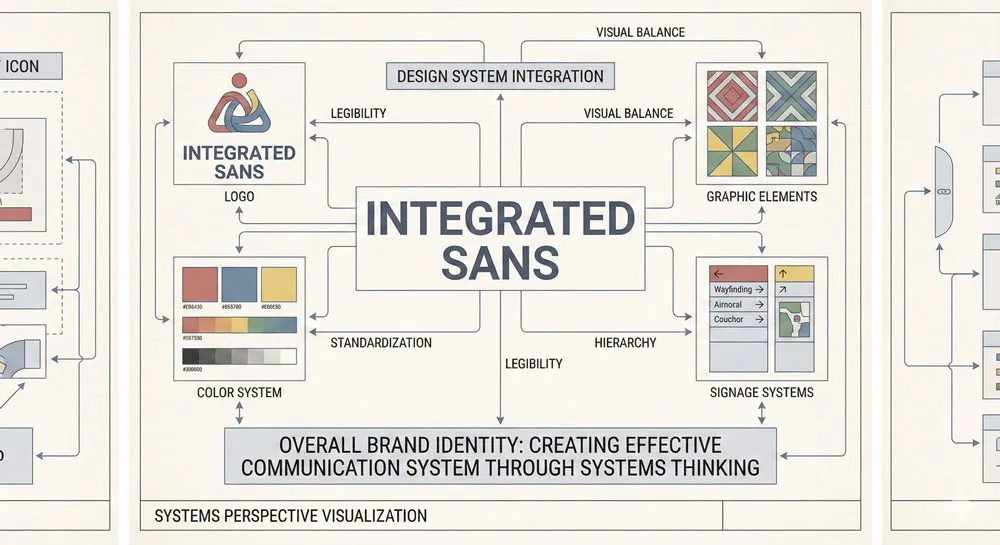
An important lesson from the Underground is that typefaces function as part of larger design systems. Johnston’s typeface couldn’t be evaluated in isolation; it functioned as part of comprehensive visual identity including logos, color systems, map design, and signage systems.
Contemporary design emphasizes systems thinking—understanding how individual design elements work together to create unified, effective communications.
Related Topics:
- Typography
- The Psychology of Typography: Font Influence
- Helvetica Effect: One Font Conquered Global Design
Contemporary Relevance and Legacy
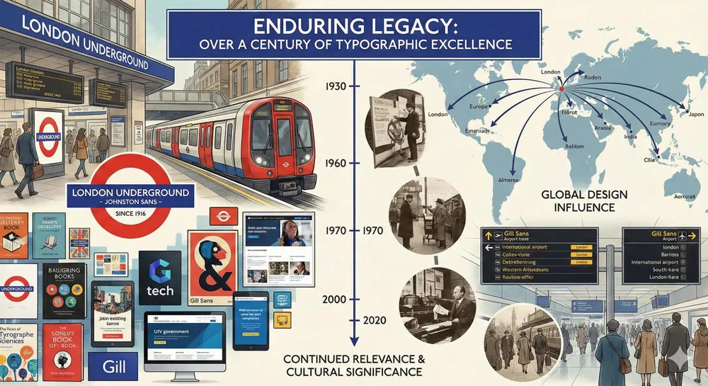
Johnston Typeface in Modern London
Today, over a century after its creation, Johnston’s original Underground typeface remains in use on the London Underground. While it has been digitized and refined, the essential character remains unchanged.
This extraordinary longevity demonstrates the quality of Johnston’s original design. The typeface functions as effectively today as when first created, suggesting that excellent design based on sound principles transcends specific historical moments.
Gill Sans in Contemporary Design
Gill Sans remains one of the most widely used typefaces globally. The typeface appears in corporate branding, publishing, design of all types. The typeface’s connection to London and the Underground gives it distinctive cultural weight.
Design Education and Influence
Johnston’s work at the Central School of Art influenced countless designers through teaching. Gill learned from Johnston and subsequently influenced subsequent generations. The Underground project demonstrates the value of good design education and the importance of master-apprentice relationships in design culture.
Related Topics:
- Comic Sans: True Story Behind the World’s Most Hated Font
- Gotham: Font That Won an Election And Changed Design Forever
- Futura: The Geometric Vision of Paul Renner
FAQ: Common Questions About Johnston, Gill Sans, and the Tube
Q: Is Johnston’s typeface still used on the London Underground?
A: Yes. The original Johnston typeface remains the basis for Underground signage. The typeface has been digitized and refined for contemporary use, but its essential character remains unchanged from the original 1913 design.
Q: How is Johnston’s Underground typeface different from Gill Sans?
A: Johnston’s typeface was designed specifically for the Underground and features geometric forms optimized for public signage. Gill Sans is a broader, more refined typeface designed for general application. However, both share Johnston’s design philosophy.
Q: Why is typeface choice important for public signage?
A: Typeface choice directly affects legibility, clarity, and how effectively information communicates. Poor typeface choices can make signage confusing or difficult to read. Excellent typeface choices enhance communication and user experience.
Q: How did Johnston’s work influence Eric Gill?
A: Gill studied under Johnston at the Central School of Art. Johnston’s design philosophy—clarity, purpose-driven design, integration of craft and function—directly influenced Gill’s approach. Gill Sans is an evolution of Johnston’s principles.
Q: What makes Johnston’s typeface work so well for the Underground?
A: Johnston’s typeface features high legibility, clear letterforms, consistent weight, and distinctive character. The typeface was tested in actual use contexts and refined based on practical feedback. The typeface design is inseparable from understanding the Underground’s specific communication needs.
Q: Can I use Johnston’s Underground typeface in my designs?
A: Johnston’s original typeface is proprietary to the London Underground. However, similar typefaces inspired by Johnston’s principles are available. Additionally, Gill Sans (inspired by Johnston’s work) is widely available and demonstrates similar design principles.
Q: Why is the Underground’s visual identity so iconic?
A: The Underground created a unified visual identity using Johnston’s typeface, a distinctive logo, and systematic design across all touchpoints. This comprehensive approach made the brand immediately recognizable and iconic.
Q: How have typefaces shaped London’s identity?
A: Londoners encounter Johnston’s typeface and Gill Sans constantly in their city. These typefaces have become embedded in the visual experience of London. They’ve become visual representations of London’s design culture and modernity.
Q: What lessons from Johnston’s work apply to contemporary design?
A: Key lessons include: design specifically for purpose, test solutions in real contexts, consistency creates clarity, typefaces should enhance communication function, comprehensive visual systems are more effective than isolated design decisions.
Q: Has Johnston’s typeface been updated for digital contexts?
A: Yes. The typeface has been digitized and adapted for digital screens, electronic signage, and contemporary applications. However, the essential character remains recognizable as Johnston’s design.
Related Topics:
- Gill Sans: Eric Gill’s Humanist Masterpiece
- Baskerville: Elegant Serif That Shaped Print Typography
- Bodoni Font: Serif That Defined Luxury Typography
Conclusion: Typography as Civic Infrastructure
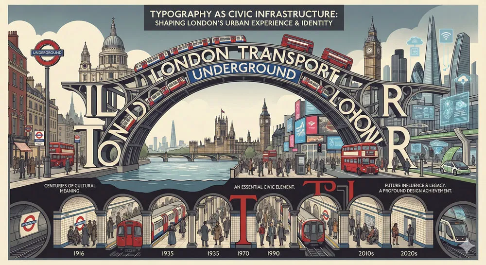
Edward Johnston and Eric Gill’s work on the London Underground and the subsequent development of Gill Sans demonstrate something profound: typography is not merely aesthetic ornament but civic infrastructure.
When a city adopts a distinctive typeface for public use, that typeface becomes part of the city’s infrastructure—as essential to navigation and communication as the roads and railways themselves.
Johnston’s insight—that typeface should be purpose-designed, that clarity must be paramount, that consistency creates effective communication—remains central to design practice over a century later. Gin Sans, evolved from Johnston’s principles, has influenced typography globally.
The London Underground remains one of the most successful examples of integrated design—where typography, graphic design, information design, and architectural design work together to create a system that is simultaneously beautiful, functional, and culturally iconic.
London’s visual identity is inseparable from Johnston’s typeface and Gill Sans. When designers think about how typography shapes place and culture, they can look to London as the paradigmatic example: a city where thoughtful design decisions, maintained over decades, created a distinctive visual identity recognized worldwide.
Related Topics:
- Garamond: Timeless Serif That Defined Classical Typography
- The Worst Fonts in the World: A Typographic Hall of Shame
About the Author
Lalit M. S. Adhikari is a Digital Nomad and Educator since 2009 in design education, graphic design and animation. He’s taught 500+ students and created 200+ educational articles on design topics. His teaching approach emphasizes clarity, practical application and helping learners.
Learn more about Lalit Adhikari.
This guide is regularly updated with the latest information about Adobe tools and design best practices. Last Updated: Mar 2026


