Explore Futura’s revolutionary design history, Paul Renner’s geometric vision, and how this 1927 typeface shaped modernism, design movements, and contemporary typography.
My name is Lalit Adhikari and we are at LTY. Let’s begin!
Table of Contents
Introduction: The Typeface That Embodied a Utopian Dream
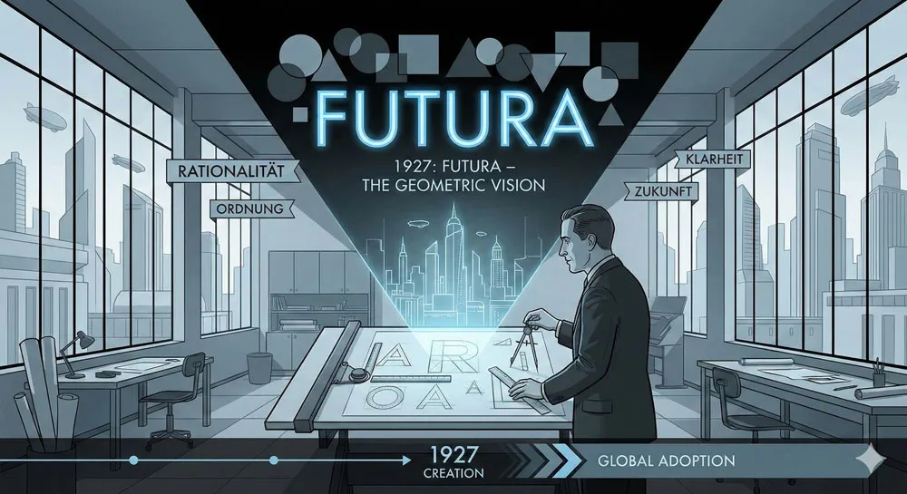
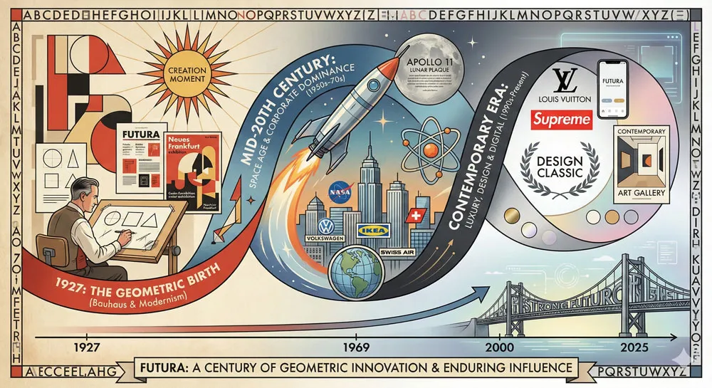
In 1927, during one of the most creatively fertile periods in design history, a German typographer and designer named Paul Renner created a typeface that would become one of the most influential and iconic in the entire history of typography.
The typeface was Futura, and it emerged from a specific historical moment when modernist design was reaching its peak, when artists and designers believed that rational design based on geometric principles could help create a more perfect and equitable society.
Futura was not created by accident or casual artistic impulse. Renner designed Futura with explicit philosophical intention. He believed that typography could communicate not just words but ideals—that the geometric purity of a typeface could embody modernist principles of clarity, rationality, and universal accessibility.
Renner believed that through careful geometric design, he could create a typeface that would feel contemporary, rational, and forward-thinking, while also remaining accessible and legible to everyone who encountered it.
The result was revolutionary. Futura was geometrically pure in ways that no widely-adopted typeface had been before. The letterforms were constructed from basic geometric shapes: circles for curves, squares and rectangles for vertical and horizontal strokes.
This geometric purity was not accidental refinement; it was the entire philosophical foundation of the design. Renner believed that geometric purity communicated modernist principles of rational order, scientific thinking, and progress toward a better future.
What is remarkable about Futura is that despite its radical geometric purity, the typeface succeeded commercially and aesthetically. Futura was adopted by businesses, designers, and institutions.
It appeared on product packaging, in advertising, in signage, and in editorial design. Futura became not just a professional typeface but a cultural force that shaped how the 20th century visualized modernity and progress.
Nearly a century later, Futura remains one of the most recognizable and influential typefaces in the world. The typeface has been used in countless contexts—from corporate branding to space program documentation to luxury product design.
Futura has influenced virtually every subsequent geometric sans-serif typeface designed after it. The typeface is taught in design schools, studied by design historians, and respected by professional designers worldwide.
This comprehensive exploration of Futura examines Paul Renner’s life and design philosophy, traces the typeface’s creation within the modernist movement context, analyzes Futura’s distinctive geometric characteristics and psychological effects, explores the typeface’s adoption and cultural impact throughout the 20th century, examines Futura’s lasting influence on subsequent typeface design, and ultimately asks:
- what does Futura reveal about design, modernism, geometry, and the relationship between aesthetic form and cultural values?
Related Topics:
- Gill Sans: Eric Gill’s Humanist Masterpiece
- Baskerville: Elegant Serif That Shaped Print Typography
- Bodoni Font: Serif That Defined Luxury Typography
Paul Renner: The Designer and His Vision
A Life in Typography and Design
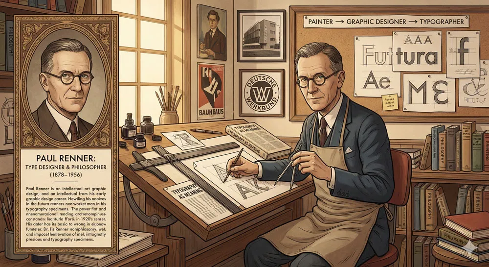
Paul Renner was born in 1878 in Wernigerode, Germany. He came of age during a period of extraordinary ferment in German design and culture. Germany was experiencing rapid industrialization, urbanization, and social change.
Artists, designers, and architects were questioning traditional aesthetics and seeking new visual languages appropriate to contemporary life.
Renner initially trained as a painter and graphic designer. He studied at the Academy of Fine Arts in Munich and began his career creating book designs, typographic work, and graphic art.
However, throughout his early career, Renner became increasingly interested in typography specifically and in the relationship between letterforms and communication. He believed that typography was not merely a utilitarian tool for reproducing text; typography was a form of visual art and a form of communication with profound psychological and cultural significance.
Renner’s design philosophy was shaped by the design movements emerging in early 20th-century Germany. He was influenced by the Deutsche Werkbund (German Work Federation), a design movement advocating for the integration of fine art and industrial production, and by the Bauhaus, the revolutionary school founded by Walter Gropius that sought to unify art, craft, and industrial design.
These movements shared a belief that design could serve social purposes, that aesthetic excellence and industrial production were not contradictory, and that rational design based on systematic principles could improve everyday life.
Renner’s design practice reflected these influences. He believed that typography and typeface design were essential components of modern visual communication. He believed that typeface design could embody modernist principles.
He believed that a well-designed typeface could be simultaneously beautiful, functional, and socially progressive.
Renner’s Design Philosophy: Geometry, Clarity, and Progress
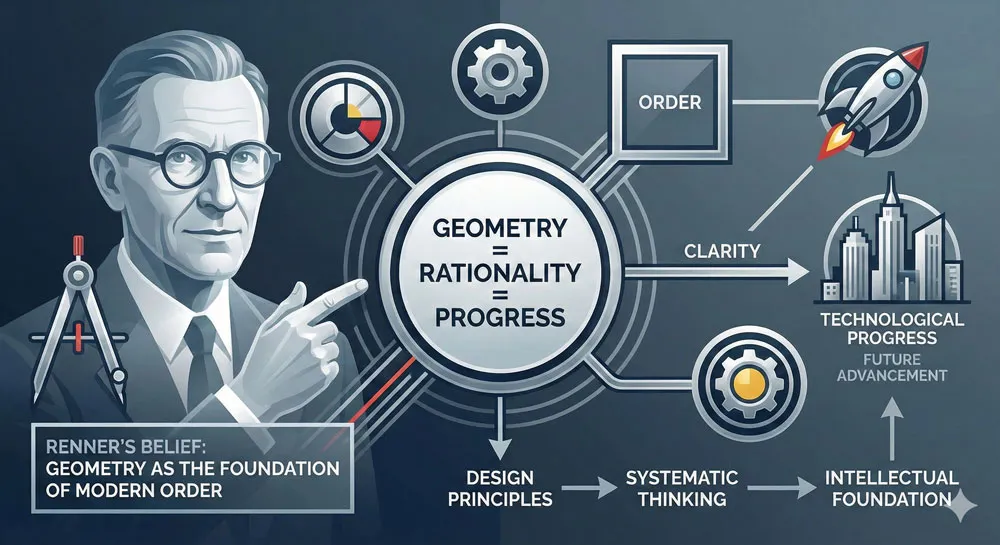
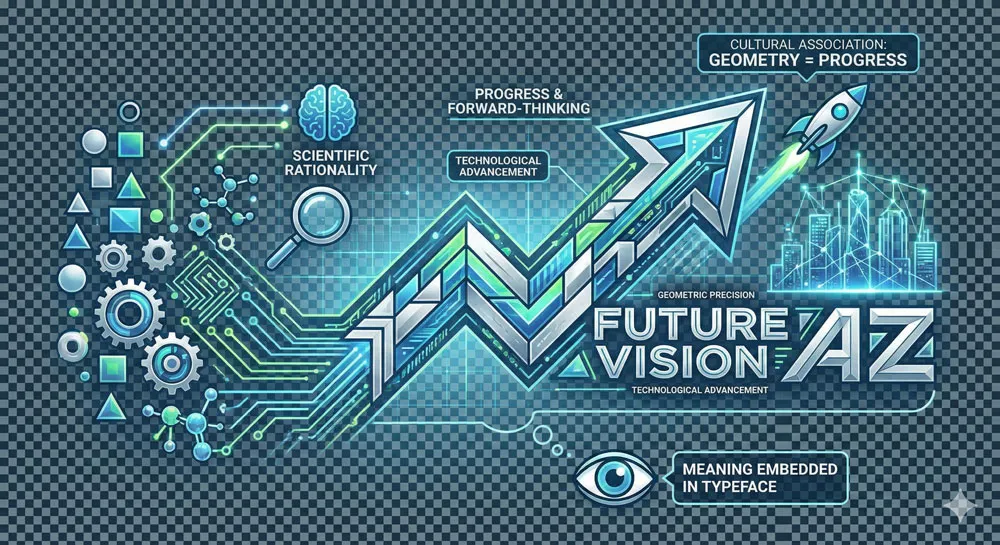
Central to Paul Renner’s design philosophy was the belief that geometry represented order, rationality, and progress. In the modernist worldview of the 1920s, geometry symbolized scientific thinking, technological advancement, and the triumph of reason over tradition. Geometric forms represented the future; ornamental, historically-derived forms represented the past.
This belief shaped everything Renner designed. In his typography, Renner favored sans-serif typefaces (typefaces without serifs or decorative flourishes). Sans-serif typefaces, in the modernist view, represented clarity and functionality unencumbered by historical ornament. They communicated that form followed function, that beauty emerged from rational simplification rather than decorative elaboration.
Renner believed that a typeface based on pure geometric principles—where letterforms were constructed from circles, squares, and lines—could achieve unprecedented clarity and communication effectiveness. Such a typeface would communicate not just words but modernist values: rationality, order, progress, and a belief in design’s power to improve human experience.
This philosophy was not merely aesthetic. For Renner and other modernist designers, geometry was invested with moral and social meaning. A geometrically pure typeface was not just beautiful; it was ethically right. It communicated correct values. It embodied progress.
The Modernist Context: 1920s Design and Utopian Vision
To understand Futura, you must understand the specific historical moment of its creation. The 1920s in Germany were characterized by extraordinary cultural ferment and utopian vision.
The devastation of World War I had created a desire for radical social and cultural transformation. Artists and designers believed that new aesthetic forms—based on geometric principles, on functional rationality, on rejection of historical ornament—could help create a more rational, equitable, and progressive society.
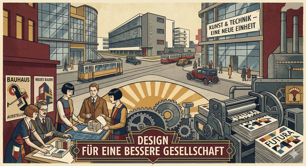
The Bauhaus, founded in 1919 and reaching its peak influence in the 1920s, exemplified this utopian design vision. The Bauhaus believed that systematic design education and design thinking could transform society.
Bauhaus designers believed that industrial production and fine art could be integrated, that mass production did not preclude aesthetic excellence, and that good design could be accessible to everyone.
Futura emerged from this utopian modernist context. Renner designed the typeface as an expression of modernist principles. The typeface embodied the belief that geometric rationality represented progress and that design could communicate ideals and values.
Related Topics:
- Garamond: Timeless Serif That Defined Classical Typography
- The Worst Fonts in the World: A Typographic Hall of Shame
- Gill Sans and Tube: How Johnston and Gill Defined London
The Design of Futura: Geometric Purity and Construction
Geometric Principles as Foundation
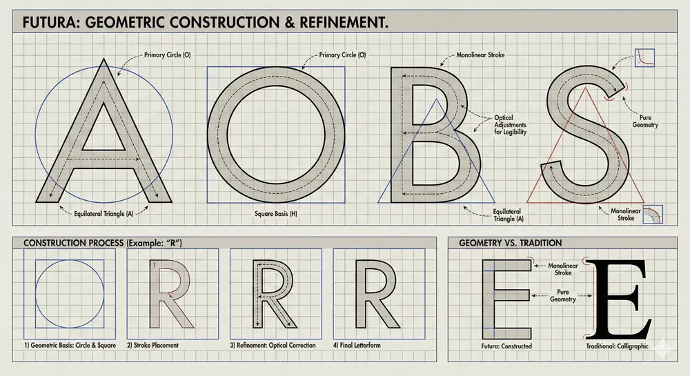
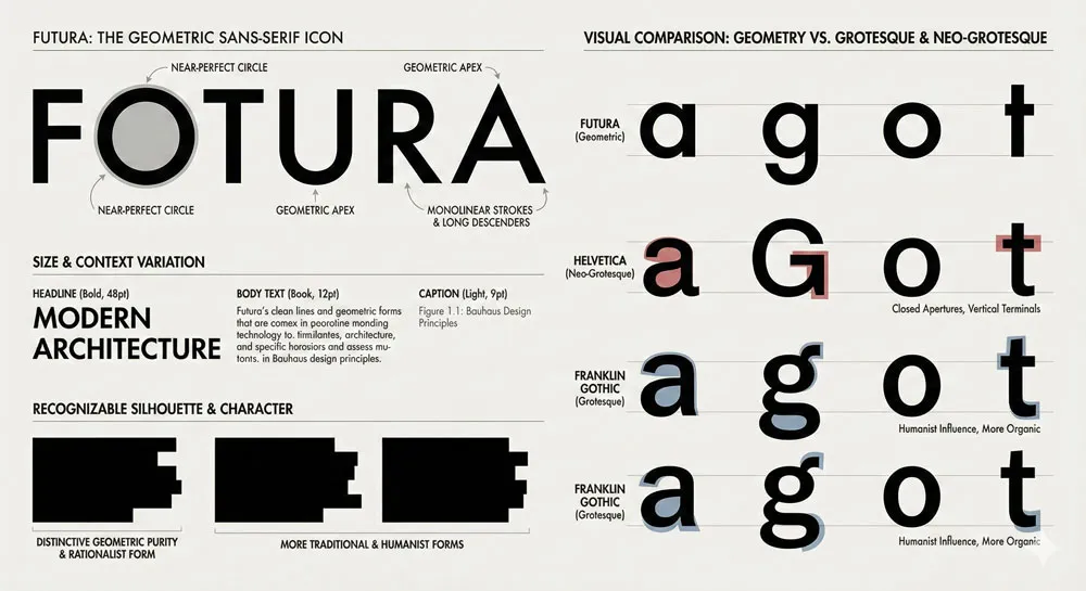
What distinguishes Futura from all previous typefaces is the explicitness with which Renner based letterform construction on geometric principles. While previous type designers had used geometric forms in typeface design, Renner took this principle to its most radical conclusion:
- Futura’s letterforms are constructed from basic geometric shapes—circles, squares, rectangles, and triangles.
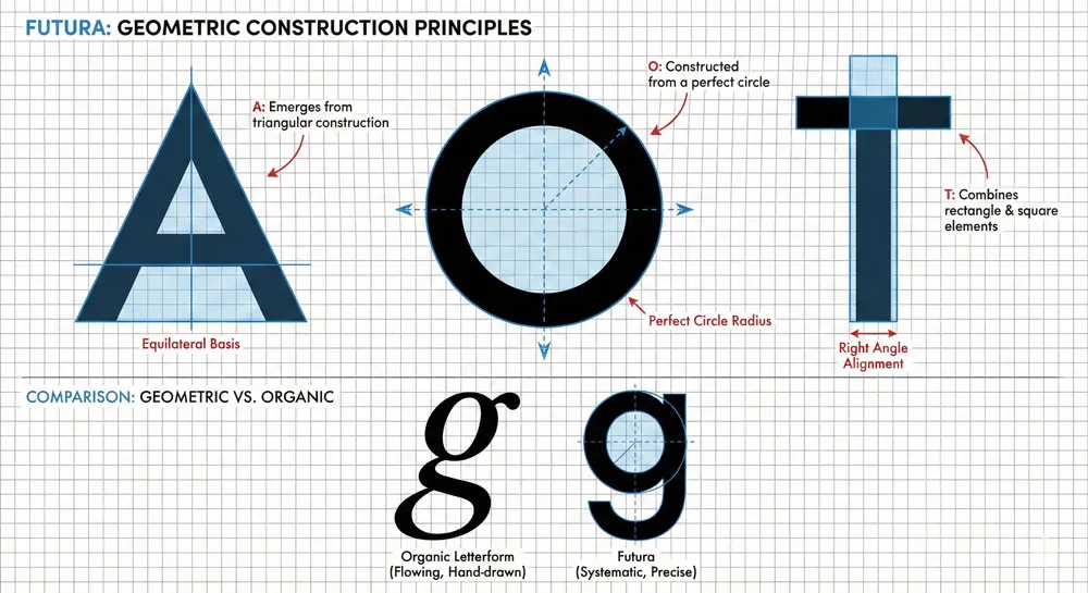
This is not merely poetic language. The geometric construction of Futura is fundamental to understanding the typeface. Consider the capital letter “O”: in Futura, this letter is literally a perfect circle.
Consider the capital letter “A”: the letterform is constructed from two angled lines meeting at a point, resembling a geometric triangle. Consider the letter “T”: it is literally a rectangle balanced atop a square.
This geometric purity had profound implications. First, it meant that Futura’s letterforms looked radically different from traditional typefaces, which had evolved through centuries of handwriting, calligraphy, and craft traditions.
Futura looked genuinely new—geometrically pure in a way that human handwriting could never be. This newness communicated modernity and forward-thinking vision.
Second, geometric construction meant that Futura was internally consistent. All letterforms followed the same geometric principles and proportions. The typeface felt systematic and rational. Every letter seemed to emerge from the same underlying geometric logic.
Third, geometric construction created a distinctive visual character. Futura looks like Futura. The geometric forms are immediately recognizable. You cannot mistake Futura for some other typeface.
This distinctiveness is partly what has made Futura so enduring—the typeface has a genuine personality despite (or perhaps because of) its geometric severity.
The Proportional System and Mathematical Relationships
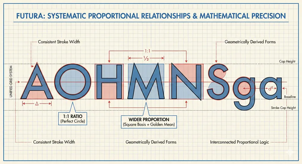
Renner did not design Futura arbitrarily. Instead, he developed a systematic proportional system in which all letterforms related to each other through mathematical relationships.
The proportional relationships were based on geometric principles: the square, the circle, the regular polygons.
This systematic approach meant that Futura’s letterforms were not designed individually but as part of an integrated system. Each letterform related to every other letterform through proportional consistency. The typeface felt unified and systematic rather than merely a collection of individual characters.
This systematic approach was revolutionary in typeface design. While previous type designers had certainly paid attention to letterform relationships and proportional consistency, Renner made the systematic proportional approach explicit and fundamental. The typeface was designed as a geometric system, not as a collection of individual letterforms.
The mathematical precision required for this systematic approach was significant. Renner had to ensure that the proportional relationships were consistent, that the visual weight of letters was balanced across the alphabet, and that the overall appearance remained legible despite the geometric severity.
The Tension Between Geometry and Readability
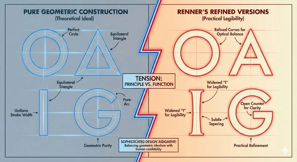
One of the most interesting aspects of Futura’s design is the tension between geometric purity and practical readability. Pure geometric construction, if taken to its logical extreme, would create letters that are geometrically perfect but potentially difficult to read.
For example, the capital letter “I” would be literally a vertical line with no serifs and minimal width—potentially difficult to distinguish from the number “1” or the lowercase “l”.
Renner had to make adjustments to pure geometric principles to ensure Futura remained legible and functionally useful. These adjustments reveal Renner’s design sophistication.
He understood that the best typeface design balances pure principle with practical consideration. The typeface needed to be geometrically pure enough to communicate modernist ideals, yet legible enough to function in actual communication contexts.
For example, Renner slightly widened certain letterforms (like the capital “I”) to improve legibility. He refined certain curves slightly beyond pure geometric precision to improve visual balance.
These refinements were subtle—most viewers would not consciously notice them—but they were essential to Futura’s success as a working typeface.
Related Topics:
- Baskerville and Eaves: A Tale of Perfection, Passion and Revival
- Futura vs. The World: The Geometric Vision of Paul Renner
- Legibility vs. Readability: What Every Designer Needs to Know
Futura’s Historical Context: Modernism and Design Innovation
The Geometric Sans-Serif Tradition Before Futura
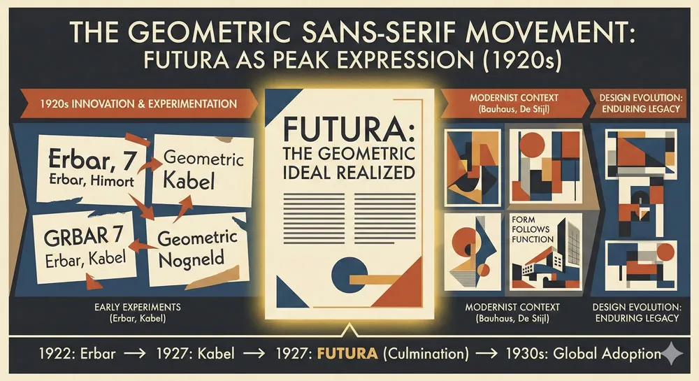
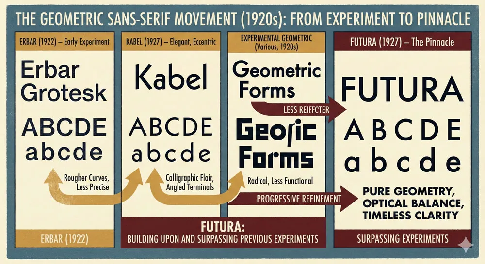
While Futura was revolutionary in its explicit geometric construction, the typeface did not emerge from nothing. Geometric sans-serif typefaces had been developed before Futura, though none had achieved Futura’s combination of geometric purity and commercial success.
Early geometric sans-serifs included typefaces like Erbar (designed by Jakob Erbar in 1922) and Kabel (designed by Rudolf Koch in 1927, around the same time as Futura).
These typefaces demonstrated that there was market interest in geometric sans-serifs and that the design community was ready for typefaces based on geometric principles rather than historical tradition.
However, Futura achieved something that previous geometric sans-serifs had not fully achieved: a geometric typeface that was simultaneously pure in principle, beautiful in form, and commercially successful.
Futura succeeded not just as a theoretical exercise in geometric design but as a practical, widely-adopted typeface that designers and businesses chose to use because it worked effectively for their communication purposes.
The 1920s Design Innovation Moment
The late 1920s represented a crucial moment in design history. The modernist movement, which had been developing throughout the 1920s, was reaching its peak influence.
The Bauhaus, despite being suppressed by increasingly authoritarian German politics, was producing extraordinary design innovation and exerting enormous influence on design thinking globally.
It was precisely in this moment that Futura was created and launched. The typeface’s geometric purity aligned perfectly with contemporary design thinking.
Designers and design-conscious businesses were hungry for typefaces that embodied modernist principles. Futura arrived at precisely the right moment to be embraced by the design community.
Futura’s commercial success was rapid. The typeface was adopted by progressive designers and design-conscious businesses.
It appeared in advertising, in book design, in signage. Futura became visually associated with modernism and with contemporary, forward-thinking design.
Futura and the Bauhaus: Design Education and Dissemination
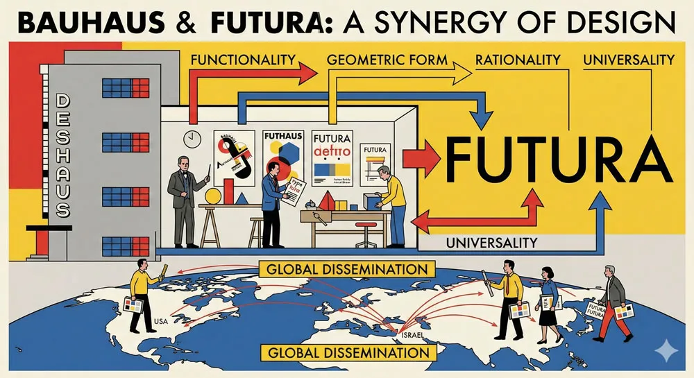
While Paul Renner was not himself a Bauhaus faculty member, Futura was deeply aligned with Bauhaus principles and was championed by Bauhaus designers and educators.
The typeface embodied Bauhaus beliefs about systematic design, about the integration of art and industry, about design’s role in improving everyday life.
Bauhaus teachers and students used Futura extensively. The typeface appeared in Bauhaus publications, in Bauhaus-influenced design, and in the work of designers who had studied at or been influenced by the Bauhaus.
This association with the Bauhaus, one of the most influential design schools in history, contributed significantly to Futura’s influence and prestige.
The Bauhaus was eventually closed by the Nazi regime in 1933. However, by that time, Futura was already well-established and continuing to spread.
Bauhaus-trained designers and educators emigrated to other countries, carrying Bauhaus design principles (and often Futura typeface usage) with them. Through this diaspora, Futura’s influence spread globally.
Related Topics:
- Secret Life of Symbols: History of Ampersand and Interrobang
- Helvetica – Swiss Modernism’s Ubiquity Crisis
- Comic Sans – Accessibility & Gatekeeping Critique
Futura’s Design Characteristics: Visual Language and Psychology
Distinctive Visual Character
Futura has an unmistakable visual character. The letterforms are distinctive and recognizable. A viewer who has seen Futura multiple times can usually identify the typeface even without explicit training in typography.
Several characteristics contribute to this distinctiveness. The geometric letterforms look fundamentally different from traditional typefaces.
The consistent, clean stroke weight communicates clarity and precision. The overall aesthetic is cool, rational, and contemporary rather than warm or historical.
Futura’s letterforms also have distinctive proportions. The typeface tends toward geometric regularity—the letterforms feel systematic and proportionally consistent.
There is a mathematical quality to Futura that is immediately perceptible even to viewers without formal design training.
Psychological Associations and Cultural Meaning
Futura’s geometric character and design origin created strong psychological associations and cultural meanings. The typeface became associated with modernity, progress, rationality, and scientific thinking.
Because Futura embodied geometric modernist principles, viewers unconsciously associated the typeface with those principles.
Futura also became associated with the future. In the modernist imagination of the 1920s-1940s, geometric forms represented the future.
When designers selected Futura for packaging, for advertising, for signage, they were making a statement that their product or organization represented the future, progress, and contemporary vision.
This association with the future has proven remarkably durable. Futura continued to communicate futurism and forward-thinking vision throughout the 20th century, even as “the future” changed.
In the 1950s-1960s, Futura appeared on space program materials, space capsules, and other symbols of technological progress. This association reinforced Futura’s status as the typeface of the future and of technological advancement.
The Cool Rationality of Futura
Perhaps most significantly, Futura communicates a specific emotional and psychological quality: cool rationality. The typeface feels intellectual, systematic, and rational. It does not feel warm or emotional; it feels like the embodiment of clear thinking and logical order.
This quality has made Futura attractive to designers and organizations wanting to communicate rationality, scientific rigor, and intellectual seriousness.
However, this same quality has also made Futura feel somewhat cold or detached in contexts where warmth or emotional connection would be beneficial.
Understanding Futura’s psychology is crucial to understanding its uses and effects. Futura does not communicate warmth or approachability; it communicates rationality and order.
Organizations selecting Futura are making a statement about their values and their desired perception.
Related Topics:
- Gotham – Political Design & Elections Power
- Futura – Geometric Modernism Revolution
- Gill Sans – Humanist Alternative Modernism
Futura’s Adoption and 20th-Century Impact
Commercial Success and Rapid Adoption
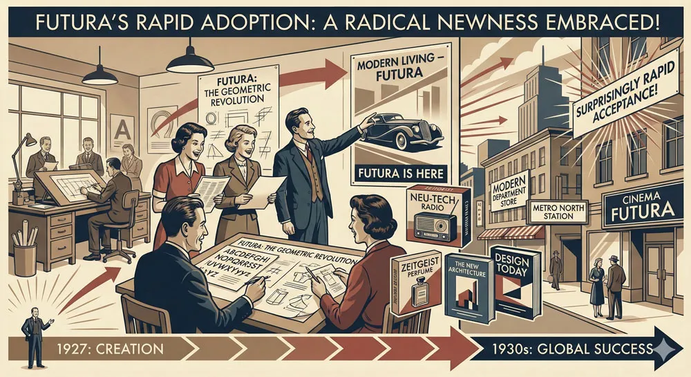
Despite its geometric severity and radical newness, Futura was commercially successful from its introduction. The typeface was quickly adopted by designers, advertisers, and design-conscious businesses.
This rapid adoption was remarkable—many revolutionary design innovations never achieve significant commercial traction. Futura’s success suggests that the design and business community recognized the typeface’s value and appropriateness.
Futura appeared in numerous high-profile applications. The typeface was used in advertising, product packaging, book design, signage, and editorial contexts. Progressive companies and organizations used Futura to communicate that they were contemporary and forward-thinking.
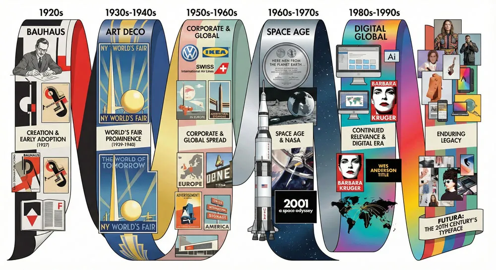
One particularly notable early adoption was in the 1939-1940 World’s Fair in New York. The World’s Fair was designed to showcase contemporary design and technological progress.
Futura appeared extensively throughout the World’s Fair, reinforcing the typeface’s association with progress, the future, and contemporary vision.
Futura and the Space Age
One of the most culturally significant aspects of Futura’s 20th-century history is its association with the space age and space exploration.
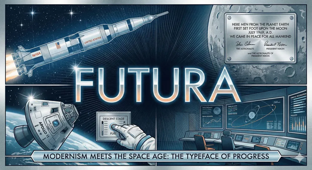
Beginning in the 1960s, Futura appeared on space program materials, spacecraft, and mission documents. The typeface was used for NASA communications, space capsule markings, and mission documentation.
This association was not accidental. Space programs selected Futura deliberately because the typeface’s geometric purity, clarity, and association with the future aligned perfectly with the mission of space exploration.
Futura was the perfect visual embodiment of technological progress, scientific advancement, and humanity reaching toward the future.
The space program association has been remarkably durable and culturally significant. For many people, Futura became permanently associated with space exploration.
The typeface appeared on Apollo spacecraft, Apollo mission materials, and other iconic space program documents. This association has reinforced Futura’s status as the typeface of technological progress and the future.
Futura in Corporate and Institutional Contexts
Throughout the late 20th century, Futura became a favored typeface for corporate and institutional branding. Large corporations, government agencies, and institutional organizations adopted Futura for their visual identities.
The typeface’s associations with rationality, progress, and contemporary vision made it attractive to organizations wanting to communicate these qualities.
Futura appeared in corporate logos, corporate signage, corporate communications, and institutional materials. The typeface became visually associated with institutional authority and progressive corporatism. Futura communicated that an organization was contemporary, rational, and forward-thinking.
However, by the 1980s and 1990s, as design fashion evolved, some of the corporations and institutions that had adopted Futura began to move toward other typefaces. Futura started to feel somewhat dated—associated with mid-20th-century modernism rather than contemporary design.
While Futura remained widely used and respected, the typeface was no longer the cutting-edge contemporary choice it had been in the mid-20th century.
Related Topics:
- Baskerville – Print Excellence & Love Story
- Bodoni – Theatrical Prestige Aesthetics
- Garamond – Classical Foundation Principles
Futura’s Influence on Subsequent Typeface Design
Geometric Sans-Serifs: Futura’s Design Legacy
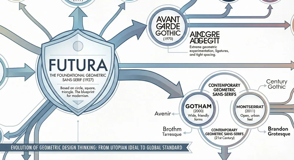
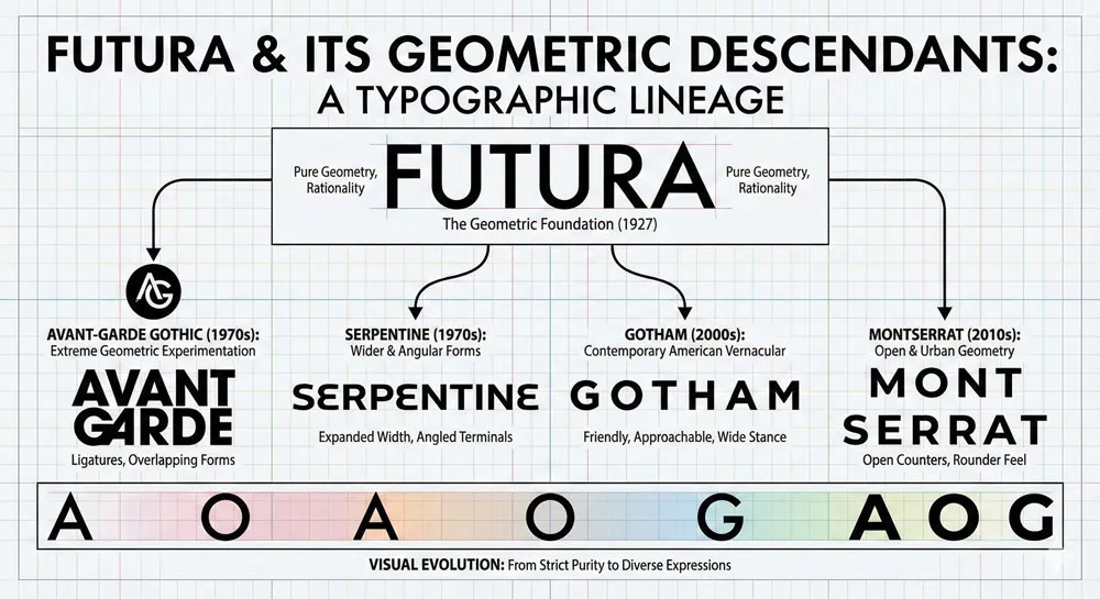
Perhaps Futura’s most significant lasting impact has been on subsequent geometric sans-serif typeface design. After Futura’s success, countless designers created geometric sans-serif typefaces influenced by Futura’s approach.
Typefaces like Avant-Garde, Serpentine, and many contemporary geometric sans-serifs owe explicit debt to Futura’s design philosophy.
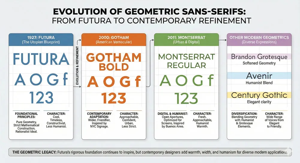
Contemporary geometric sans-serifs like Gotham, Montserrat, and others emerge from the geometric sans-serif tradition that Futura established and perfected.
These typefaces demonstrate Renner’s lasting influence—designers continue to create geometric sans-serifs because the approach Renner pioneered continues to be viable and valuable.
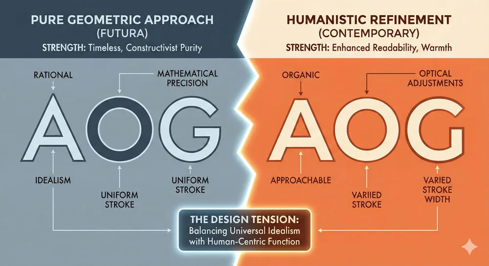
However, many contemporary geometric sans-serifs move beyond Futura’s pure geometric approach. Contemporary geometric sans-serifs often incorporate humanistic refinements, warmth, and character while maintaining geometric clarity.
Designers have learned from Futura’s success while also recognizing that pure geometric severity can feel cold and detached. Contemporary typefaces often seek to balance geometric rationality with humanistic warmth.
The Question of Pure Geometry vs. Humanistic Refinement
Futura represents a particular approach to type design: prioritizing geometric purity and systematic principle. However, subsequent typeface designers have often questioned whether pure geometry is always optimal for communication effectiveness.
Humanistic sans-serifs, which are based on geometric clarity but incorporate humanistic refinement and warmth, have gained significant influence and adoption.
Typefaces like Gill Sans and contemporary humanistic sans-serifs demonstrate that geometric clarity can be combined with humanistic character.
This tension between pure geometry and humanistic refinement represents an ongoing question in typeface design. Futura answered this question by prioritizing geometric purity. Contemporary designers often answer it by seeking balance between geometric and humanistic principles.
Futura’s Pedagogical Influence
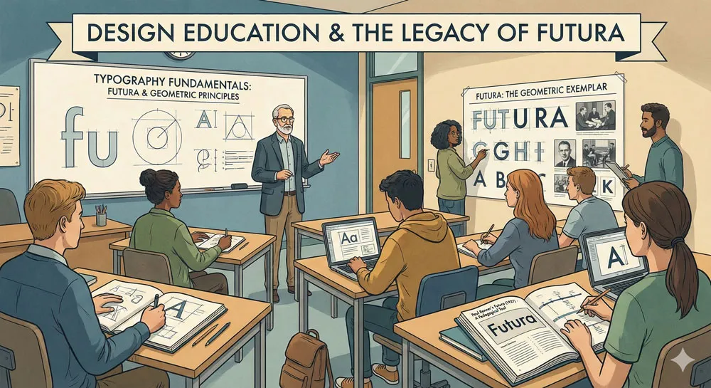
Beyond direct typeface design imitation, Futura has had enormous pedagogical influence. Futura is taught extensively in design schools as an exemplary typeface demonstrating modernist design principles.
Design students study Futura to understand geometric construction, proportional systems, and systematic design thinking.
This pedagogical role means that Futura continues to influence design thinking even among designers who never use the typeface directly.
Designers learn from studying Futura about systematic design, about geometric principles, about the relationship between form and meaning.
Related Topics:
- Worst Fonts – Criticism & Gatekeeping Analysis
- Gill Sans & The Tube – Urban Identity Infrastructure
- Baskerville & Mrs. Eaves – Love, Partnership & Revival
Futura in Contemporary Design: Enduring Relevance and Critique
Futura’s Continued Presence
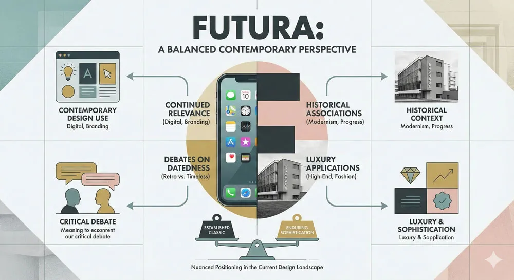
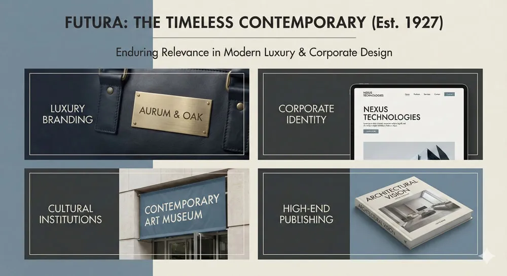
Despite being nearly 100 years old, Futura remains a widely-used and respected typeface in contemporary design. The typeface continues to appear in corporate contexts, in luxury branding, in design-conscious applications. Organizations continue to select Futura for communication purposes.
However, Futura’s role in contemporary design has shifted somewhat. Rather than representing cutting-edge contemporary design (as it did in the mid-20th century), Futura now often represents geometric modernism as a historical style.
Organizations selecting Futura in contemporary design often do so deliberately, understanding that the typeface carries specific cultural and historical associations.
The Question of Datedness
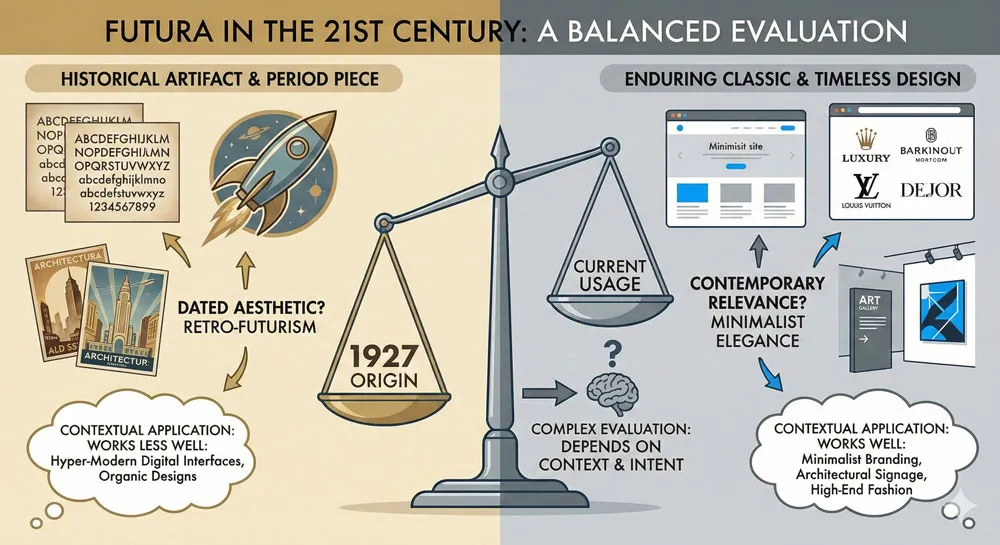
One question that arises in contemporary design is whether Futura feels dated. Some design professionals argue that Futura’s associations with mid-20th-century modernism make the typeface feel somewhat historical rather than contemporary.
The typeface’s cool rationality and geometric severity can feel like it belongs to the 1950s-1960s rather than the contemporary moment.
However, other designers and organizations continue to find Futura relevant and appropriate for contemporary communication. The typeface’s clean clarity and geometric confidence remain valuable in many contexts.
Futura’s association with modernism, while historical, can also be understood as association with enduring design principles rather than dated fashion.
Luxury and High-End Design Applications
Interestingly, Futura has found significant application in luxury and high-end design contexts in the 21st century.
Luxury brands, fashion designers, and high-end organizations have adopted Futura, often in refined, sophisticated applications. Futura’s geometric purity and cool rationality communicate luxury minimalism and sophisticated restraint.
This application demonstrates that Futura’s meaning and associations are not fixed. The typeface that was designed to communicate modernist utopian vision in the 1920s can also communicate luxury minimalism and refined simplicity in contemporary design. Context and application determine meaning.
Related Topics:
- Futura & Paul Renner – Geometric Vision & Revolution
- Legibility vs. Readability – Typography Fundamentals
- Ampersand & Interrobang – Symbol Histories
Comparing Futura to Other Geometric and Sans-Serif Typefaces
Futura vs. Helvetica: Different Modernisms
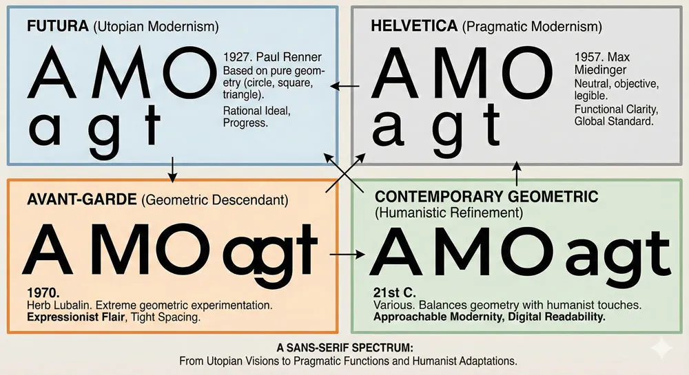
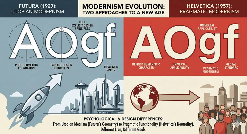
Comparing Futura and Helvetica reveals two different approaches to modernist typeface design. Futura (1927) represents utopian modernism—explicit commitment to geometric principles and revolutionary design thinking.
Helvetica (1957) represents commercial modernism—a refined geometric sans-serif designed for universal applicability in commercial and institutional contexts.
Futura is geometrically purer and more explicitly based on geometric principles. Helvetica is more refined and humanistic, sacrificing some geometric purity for improved readability and universal applicability. Futura communicates rational idealism; Helvetica communicates rational pragmatism.
Futura vs. Avant-Garde: Futura’s Descendant
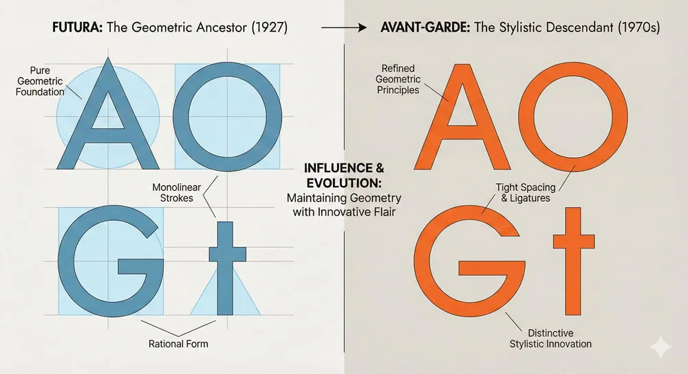
Avant-Garde (1970s), designed by Herb Lubalin, represents a direct descendant of Futura. Avant-Garde maintains Futura’s geometric approach while incorporating additional refinements and distinctive stylistic choices.
Avant-Garde’s extreme geometric character and distinctiveness make it less universally applicable than Helvetica or even Futura, but its geometric innovation influenced design significantly.
Futura vs. Contemporary Geometric Sans-Serifs
Contemporary geometric sans-serifs like Gotham, Montserrat, and others represent evolution of the geometric sans-serif approach that Futura pioneered.
These typefaces maintain geometric clarity and systematic approach while incorporating contemporary refinements, humanistic warmth, and digital optimization.
These contemporary typefaces demonstrate that the geometric sans-serif approach remains viable and valuable, while also showing how designers have evolved beyond Futura’s pure geometric severity toward approaches that balance geometric rationality with humanistic character.
Related Topics:
- Gotham: Font That Won an Election And Changed Design Forever
- Comic Sans: True Story Behind the World’s Most Hated Font
- Helvetica Effect: One Font Conquered Global Design
The Philosophy of Futura: What the Typeface Communicates
Modernist Idealism and Design’s Social Role
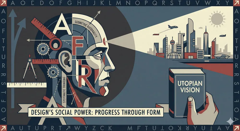
Futura embodies a specific philosophy about design’s role and potential. The typeface represents the belief that rational design based on geometric principles could contribute to creating a more perfect society.
This belief—that good design could improve human experience—was central to modernist design thinking.
When you encounter Futura, you are encountering the embodiment of this modernist philosophy. The typeface communicates that order, rationality, and systematic thinking are valuable.
The typeface communicates that the future will be better than the past. The typeface communicates that design matters.
The Aesthetic of Progress
Futura’s geometric forms communicate progress in a very specific way. Geometric forms feel scientific, rational, and future-oriented in a way that traditional or organic forms do not.
When designers and organizations select Futura, they are making a statement that they represent progress, rationality, and forward-thinking vision.
This association between geometric forms and progress is culturally constructed—there is nothing inherent in geometry that necessarily means progress.
However, the association is powerful and pervasive. Futura leverages this cultural association to communicate specific psychological messages.
Cool Rationality as a Value
Finally, Futura communicates that cool rationality is a value to be celebrated. The typeface does not attempt to be warm or welcoming or emotional. It is deliberately cool and rational.
This communication of rationality as a virtue reflects a specific worldview and set of values—the modernist belief that rationality and systematic thinking are higher values than emotion or tradition.
Related Topics:
FAQ: Common Questions About Futura
Q: Who designed Futura and when?
A: Paul Renner designed Futura in 1927. Renner was a German typographer and designer deeply influenced by the modernist movement and the Bauhaus.
Q: Why is Futura so geometrically pure?
A: Renner designed Futura with explicit geometric principles as a fundamental design philosophy. He believed that geometric purity could communicate modernist values of rationality, progress, and systematic order.
Q: Is Futura still used in contemporary design?
A: Yes, Futura remains a widely-used typeface in contemporary design. The typeface appears in corporate branding, luxury design, institutional applications, and numerous other contexts. However, Futura is no longer cutting-edge contemporary design—it is now understood as a classic typeface associated with 20th-century modernism.
Q: How does Futura compare to Helvetica?
A: Futura and Helvetica represent different modernist approaches. Futura is geometrically purer and more explicitly based on geometric principles. Helvetica is more refined and humanistic. Futura communicates utopian modernism; Helvetica communicates pragmatic modernism.
Q: Why does Futura feel cold or impersonal?
A: Futura’s cool rationality emerges from its geometric forms and explicit rejection of warmth or emotional appeal. The typeface was designed to communicate reason and order rather than emotion or personality. This cool quality is intentional, not a design failure.
Q: Did Futura really go to space?
A: Futura was used extensively on NASA space program materials and spacecraft. The typeface’s association with progress and the future made it an appropriate choice for space exploration communications.
Q: Is Futura better than other geometric typefaces?
A: This is subjective and context-dependent. Futura is a historically significant and influential typeface, but it is not universally “better” than all other options. Different typefaces are appropriate in different contexts. Futura’s pure geometric approach is excellent for some applications and inappropriate for others.
Q: Can I use Futura in contemporary branding?
A: It depends on your specific context and branding goals. Futura’s associations with 20th-century modernism might be appropriate if you want to communicate classic, timeless design or geometric modernism. However, if you want to feel cutting-edge contemporary, other typefaces might be more appropriate.
Q: Where can I get Futura?
A: Futura is available from multiple type foundries and digital font retailers. The typeface has been licensed and distributed by various foundries since its creation. Futura is widely available in digital form for both professional and personal use.
Q: How did Renner’s Nazi-era experiences affect Futura’s legacy?
A: Paul Renner lived through the Nazi period in Germany. While Futura was not explicitly rejected by the Nazi regime (unlike some modernist design), Renner himself had to navigate the political complexities of designing during this era. Futura’s legacy is complicated by its existence within this historical context.
Conclusion: A Typeface That Defined an Era and Endured
Futura is remarkable not just for its design excellence but for its extraordinary longevity and influence. A typeface created in 1927 to embody modernist principles remains widely used, studied, and respected nearly 100 years later.
This longevity is testament to both Renner’s design skill and the enduring power of the principles Futura embodies.
Paul Renner created Futura with explicit intention to communicate modernist values through geometric purity and systematic design. He succeeded beyond what anyone could have predicted.
The typeface became one of the most influential typefaces in history. It shaped how generations of designers thought about type design. It influenced countless subsequent typefaces. It became visually associated with progress, the future, and technological advancement.
What is most remarkable about Futura is that despite being nearly 100 years old and despite substantial changes in design fashion, the typeface remains relevant and respected. This speaks to the power of thoughtful, principle-based design.
A typeface designed with genuine philosophical intention and executed with design excellence endures. Futura’s geometric purity and cool rationality, which might seem limiting, have instead proven to be qualities that allow the typeface to transcend historical moment and fashion.
Futura represents what modernist design at its best can achieve: a beautiful, functional, intellectually coherent design solution that communicates specific values and principles.
In Futura, Paul Renner created not just a typeface but an embodiment of modernist philosophy. And in doing so, he created something that has endured and influenced design for generations to come.
About the Author
Lalit M. S. Adhikari is a Digital Nomad and Educator since 2009 in design education, graphic design and animation. He’s taught 500+ students and created 200+ educational articles on design topics. His teaching approach emphasizes clarity, practical application and helping learners.
Learn more about Lalit Adhikari.


