Explore how Helvetica became the world’s most ubiquitous typeface. Learn its history, design principles, cultural impact, and why it dominates branding and corporate identity worldwide.
My name is Lalit Adhikari and we are at LTY. Let’s begin!
Table of Contents
Introduction: The Font That Became Invisible
In 1957, two Swiss designers—Max Miedinger and Eduard Hoffmann—created a typeface at the Haas Type Foundry in Münchenstein, Switzerland. They called it Haas Grotesk. Within a year, Linotype licensed the typeface, renamed it Helvetica (after the Latin name for Switzerland), and launched it internationally.
No one predicted that this clean, geometric sans-serif would become the most recognizable, most widely used, and most culturally significant typeface in the history of typography.
Today, Helvetica is everywhere. It appears on subway systems, street signs, corporate logos, government documents, packaging, websites, and virtually every other visual medium.
It has become so ubiquitous that most people stop noticing it. It is the definition of invisible success—present everywhere yet perceived as a neutral backdrop rather than a deliberate design choice.
This paradox is at the heart of the “Helvetica Effect.” The typeface was so successful at communicating institutional authority and functional clarity that it essentially disappeared from conscious notice.
Yet this very invisibility reveals something profound about how typography works, how design shapes culture, and how a single artifact can reshape visual communication across an entire civilization.
This comprehensive exploration of Helvetica traces its origins in Swiss design philosophy, examines the technical and psychological reasons for its dominance, explores its cultural impact across industries and decades, addresses its imitators and competitors, and ultimately asks: what does Helvetica tell us about design, technology, and the invisible forces that shape how we see the world?
Related Topics:
- Comic Sans: True Story Behind the World’s Most Hated Font
- Gotham: Font That Won an Election And Changed Design Forever
- Futura: The Geometric Vision of Paul Renner
The Swiss Design Movement: Context for Helvetica’s Birth
Understanding Swiss Style Typography
To understand Helvetica, you must first understand the Swiss Design Movement that produced it. Swiss style—also called International Style or Swiss International Style—emerged in Switzerland during the 1950s as a response to the excesses of 1920s and 1930s design movements.
While other design movements emphasized ornament, decoration, and individual expression, Swiss style emphasized clarity, order, and functional efficiency.
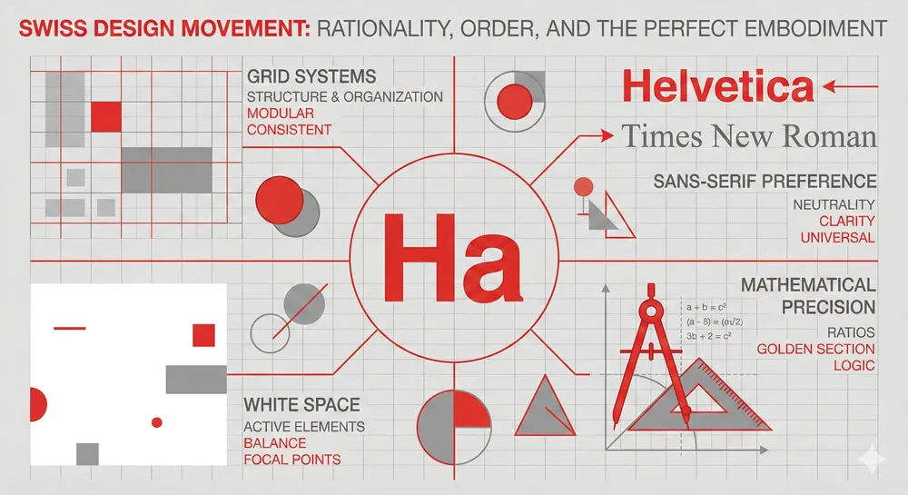
Swiss designers developed a philosophy grounded in grid systems, sans-serif typefaces, generous white space, and mathematical precision. The goal was not beauty in a traditional sense, but rather the clear communication of information.
Swiss style rejected the idea that design should be decorative or expressive. Instead, design should be transparent—it should communicate without calling attention to itself.
This philosophy emerged partly from Swiss culture and geography. Switzerland has multiple languages, multiple cultural regions, and a tradition of political neutrality. Swiss designers reasoned that typography and design should reflect these values—they should be neutral, accessible to speakers of different languages, and capable of conveying information clearly without cultural baggage or decorative flourish.
Helvetica would become the ultimate embodiment of this Swiss design philosophy. As Simon Garfield notes in “Just My Type,” Helvetica and its Swiss cousin Univers both emerged in 1957 from Swiss foundries, and they “went out to shape the modern world.” They were not merely typefaces; they were manifestos. They were declarations that design could be rational, functional, and universal.
The Historical Context: Post-War Modernism
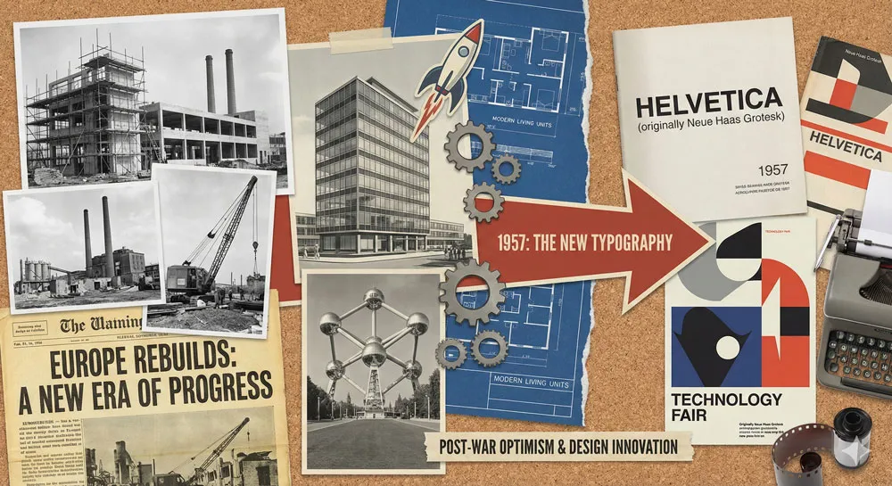
Helvetica did not emerge in a vacuum. It was born at a specific historical moment—the 1950s—when post-war Europe was rebuilding itself, when modernism was triumphant, and when the design profession was establishing its intellectual foundations.
The 1950s were characterized by optimism about technological progress, faith in rational systems, and a belief that good design could improve human life. The International Style in architecture, emerging from the Bauhaus and Le Corbusier’s principles, embodied this belief.
Designers embraced grid systems, standardized components, and the elimination of ornamental excess. They believed that a well-designed chair, building, or system of visual communication could make the world more efficient, more beautiful, and more humane.
Helvetica emerged directly from this intellectual and cultural context. It represented the belief that a carefully designed sans-serif typeface could transcend national boundaries, language barriers, and cultural differences. It could be “Swiss”—neutral and rational—while simultaneously being universal.
The post-war period was also characterized by rapid industrialization and the rise of corporate institutions. Large multinational corporations needed visual identities that communicated across borders. They needed typefaces that were neutral, professional, and widely available. Helvetica satisfied these needs perfectly.
The Haas Type Foundry and Swiss Craftsmanship
Before Helvetica became a global phenomenon, it had to be designed and manufactured. This process reveals important truths about the relationship between technology, craft, and typography.
The Haas Type Foundry, located in Münchenstein, Switzerland, was one of Europe’s most respected type foundries. It had a long history of producing high-quality metal type—physical typefaces cast in metal that would be used in printing presses.
The foundry employed skilled craftspeople who understood not just the theory of type design but also the practical realities of manufacturing typefaces and the technical requirements of printing.
Max Miedinger, the lead designer of Helvetica, worked at the Haas foundry. He was not a famous designer with an international reputation; he was a working craftsperson embedded in the practical realities of type manufacturing.
This grounding in craft is important because it means that Helvetica was not a theoretical exercise or an artistic vision divorced from practical manufacturing constraints. It was a typeface designed with full awareness of how it would actually be manufactured and used.
Eduard Hoffmann, the director of Haas, contributed to the design philosophy. Hoffmann wanted to update and improve upon earlier geometric sans-serifs. He wanted a typeface that was clean and modern but also highly legible and practical for commercial printing. Miedinger translated these requirements into letterforms.
The result was a typeface that reflected Swiss design values: rational, legible, functional, and refined. But it was also a typeface that reflected the craft traditions of type manufacturing—it was designed to work beautifully when cast in metal and used in a printing press.
Related Topics:
- Gill Sans: Eric Gill’s Humanist Masterpiece
- Baskerville: Elegant Serif That Shaped Print Typography
- Bodoni Font: Serif That Defined Luxury Typography
The Design of Helvetica: Technical Mastery and Psychological Precision
The Geometric Foundation: Why Helvetica Looks “Swiss”
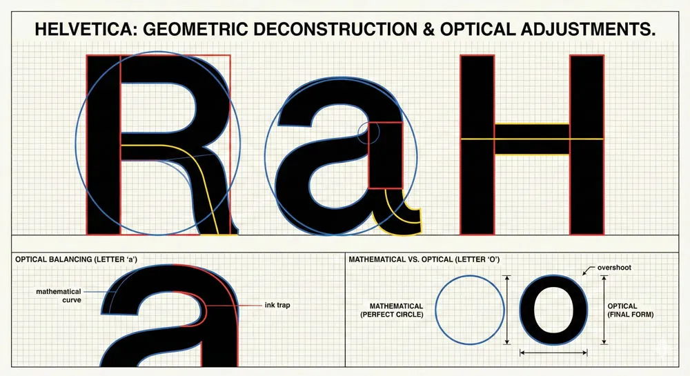
Helvetica’s visual characteristics emerge directly from Swiss design philosophy. The typeface is based on geometric principles—its letterforms are derived from circles, squares, and simple mathematical relationships. This geometric foundation gives Helvetica its characteristic appearance: clean, rational, and seemingly “neutral.”
However, this geometric foundation is not as mathematically pure as it might initially appear. If you examine Helvetica’s letterforms closely, you notice subtle optical adjustments that deviate from pure geometry. These adjustments—which type designers call “optical compensation”—are precisely what make Helvetica so legible and aesthetically balanced.
For example, the circular letterforms (O, Q, C) are not mathematically perfect circles. They are slightly adjusted so that they appear optically balanced against the straight-sided letterforms (H, I, T). Similarly, the weight of the typeface is adjusted in subtle ways throughout the alphabet to ensure visual harmony.
This combination of geometric principles with subtle optical refinement is what makes Helvetica so successful. It appears rational and systematic—qualities that align with Swiss design philosophy—while actually incorporating sophisticated design judgment and craft knowledge.
The typeface is not a computer-generated geometric pattern; it is a carefully crafted design that uses geometric principles as a starting point and then refines them through human judgment and visual sensitivity.
Stroke Weight and Counter Space: The Helvetica Signature
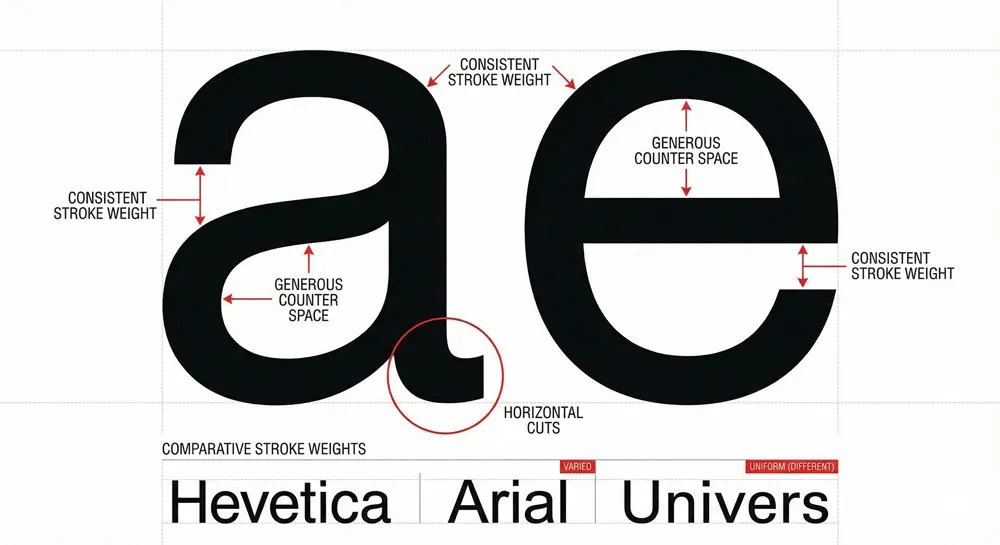
One of Helvetica’s most distinctive characteristics is its consistent stroke weight and generous counter space (the internal white space within letterforms). Unlike serifs or humanist fonts that vary stroke weight dramatically, Helvetica maintains relatively consistent stroke width throughout the alphabet. This consistency communicates rationality and order.
The generous counter space contributes to Helvetica’s exceptional legibility. Letters like “a,” “e,” and “s” are instantly recognizable because their internal forms are clear and distinct. This is why Helvetica remains legible even at very small sizes, which was an important practical consideration in 1957 when photocopying and offset printing were new technologies that often degraded type quality.
The consistent stroke weight and generous counters also contribute to Helvetica’s psychological effect. The typeface feels stable, balanced, and trustworthy. It does not demand attention; instead, it creates a sense of calm, rational authority.
This combination of technical characteristics produces a specific psychological impact—the feeling that you are being addressed by an institution that is organized, rational, and reliable.
The Family System: Flexibility Through Variation
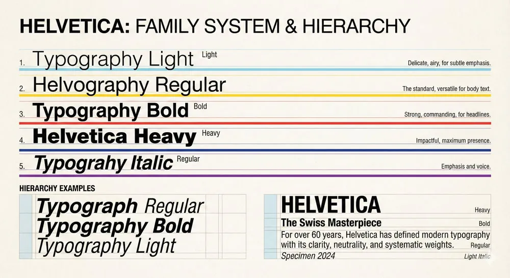
One of Helvetica’s innovations was its comprehensive family of related typefaces. Helvetica was not released as a single weight; it was released as a family with multiple weights (Light, Regular, Bold, Heavy) and styles (Roman, Italic). This family system allowed designers to create visual hierarchy and variation while maintaining overall design coherence.
The Helvetica family system was revolutionary for its time. Earlier typefaces often had limited weight variations, which meant that designers could not create much visual variety with a single typeface family.
Helvetica’s comprehensive family system meant that designers could work with a single typeface across entire design systems—newspapers, corporate identities, signage systems—creating visual hierarchy and variation while maintaining consistency.
This family system was also technically significant. It demonstrated that a typeface could be systematized—that you could create multiple related versions according to rational principles—while still maintaining visual quality and distinctiveness across all versions. This principle of systematic variation has become fundamental to contemporary type design.
Related Topics:
- Garamond: Timeless Serif That Defined Classical Typography
- The Worst Fonts in the World: A Typographic Hall of Shame
- Gill Sans and Tube: How Johnston and Gill Defined London
Helvetica’s Global Rise: From Swiss Foundry to Universal Standard
Linotype’s Role: Making Helvetica Available Worldwide
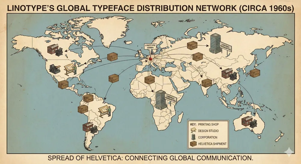
Helvetica’s journey from obscurity to ubiquity began with a corporate decision. Linotype, one of the world’s largest and most powerful type foundries, licensed Helvetica and launched it internationally in 1957.
This licensing decision was crucial because Linotype had the manufacturing capacity and distribution network to make Helvetica available not just in Switzerland, but worldwide.
Linotype also renamed the typeface from “Haas Grotesk” to “Helvetica”—a marketing decision that proved brilliant. The name “Helvetica” (derived from “Helvetia,” the Latin name for Switzerland) positioned the typeface as embodying Swiss design values.
The name communicated rationality, precision, and international neutrality. It was a name that evoked Swiss watches, Swiss banks, and Swiss precision engineering.
Linotype’s global distribution network meant that Helvetica became available to printing shops, design studios, and corporations worldwide. This was especially significant in America, where Linotype had a dominant market position.
American designers and corporations quickly adopted Helvetica because it communicated the qualities they valued: modernity, efficiency, and professional authority.
Corporate Adoption: The Rise of Helvetica as Corporate Standard
By the 1960s, Helvetica had become the default typeface for corporate branding and institutional communication. American corporations, in particular, embraced Helvetica as the typeface that communicated their values and identity.
The reasons for Helvetica’s corporate adoption are partly technical and partly psychological. Technically, Helvetica was widely available, easy to use, and worked well in printing and copying processes. Psychologically, Helvetica communicated qualities that corporations valued: rationality, efficiency, reliability, and forward-thinking modernity.
This period saw the rise of the modernist corporate identity—the movement led by designers like Paul Rand, Saul Bass, and Ivan Chermayeff, who believed that a company’s visual identity should embody its corporate values and strategy.
These designers often relied on Helvetica because it was the typeface that most perfectly communicated the modernist values of rationality, clarity, and systematic organization.
Major corporations adopted Helvetica for their logos and branding: American Apparel, Bayer, BMW, Fendi, Hermès, Jeep, Kraft, Microsoft, Nestlé, and hundreds of others.
Each corporation was making the same implicit choice: we want to be perceived as modern, rational, and professionally managed. Helvetica communicated this message better than any other typeface.
The Subway Revolution: Helvetica as Public Institution
One of the most iconic applications of Helvetica emerged in American cities: the adoption of Helvetica by public transit systems as the standard typeface for signage.
In New York, the Metropolitan Transportation Authority (MTA) adopted Helvetica for the redesigned subway system in the 1970s. In countless other cities—Washington DC, San Francisco, Chicago—public transit systems adopted Helvetica for wayfinding signage.
This adoption of Helvetica for public signage was significant for several reasons. First, it meant that Helvetica was no longer just a typeface used by corporations; it was a typeface used by public institutions to communicate with the general population. Every subway rider in New York, whether they knew anything about typography or not, was reading Helvetica daily.
Second, this application demonstrated Helvetica’s exceptional performance in real-world conditions. Helvetica remained legible at various distances, sizes, and viewing angles. It worked beautifully on illuminated signs, printed maps, and architectural applications. The typeface proved that it was not just theoretically rational but practically superior for complex communication systems.
Third, this public adoption of Helvetica by major American cities cemented its status as the typeface of American institutional authority. When you see Helvetica on a subway sign or a government document, you unconsciously receive a message: this is official, this is from a trustworthy institution, this information is important and accurate.
Government and Institutional Adoption
Following the corporate and public transit adoption of Helvetica, government institutions and large institutions worldwide adopted Helvetica as their standard typeface. The Federal Government of the United States adopted Helvetica (or Helvetica-like fonts) for official documents and communication. The British Government’s use of Helvetica signaled British adoption of modernist design principles.
The adoption of Helvetica by institutions reflects the broader acceptance of Swiss design philosophy by institutions worldwide. Helvetica became synonymous with institutional authority, bureaucratic efficiency, and neutral communication. When a government agency, a bank, or a large corporation needed to communicate with the public, Helvetica was the default choice.
This institutional adoption had an interesting psychological effect: Helvetica became so associated with institutional authority that it started to feel almost invisible. People did not consciously notice Helvetica on government documents or corporate letterheads; they simply absorbed the message: “This is official, this is trustworthy, this is important.”
Related Topics:
- Baskerville and Eaves: A Tale of Perfection, Passion and Revival
- Futura vs. The World: The Geometric Vision of Paul Renner
- Legibility vs. Readability: What Every Designer Needs to Know
The Digital Revolution: Helvetica in the Computer Age
The Transition from Metal Type to Digital Fonts
The transition from metal type to digital fonts in the 1980s and 1990s could have been the end of Helvetica’s dominance. Digital technology made it easy to create new typefaces and to distribute them widely.
Designers suddenly had access to thousands of typefaces they had never encountered before. The universal availability of fonts seemed to threaten the hegemony of a single typeface like Helvetica.
But something interesting happened: Helvetica actually became more dominant in the digital age, not less. As Helvetica was digitized and bundled with computer operating systems (Apple included Helvetica in its system fonts; Windows later released Arial, a close Helvetica derivative), it became even more widely used.
The reason Helvetica thrived in the digital age is revealing. Most digital fonts are technically inferior to well-designed metal typefaces. They are often poorly spaced, crudely hinted (the digital instructions that make fonts render correctly at small sizes), and aesthetically crude. By comparison, Helvetica—even in its early digital incarnations—represented sophisticated, refined design.
Moreover, digital technology did not replace the values that Helvetica embodied; it reinforced them. As companies built digital brands and corporate identities, they valued the same qualities that Helvetica communicated: clarity, efficiency, modernity, and reliability. Helvetica remained the default choice.
Arial and the Clone Wars
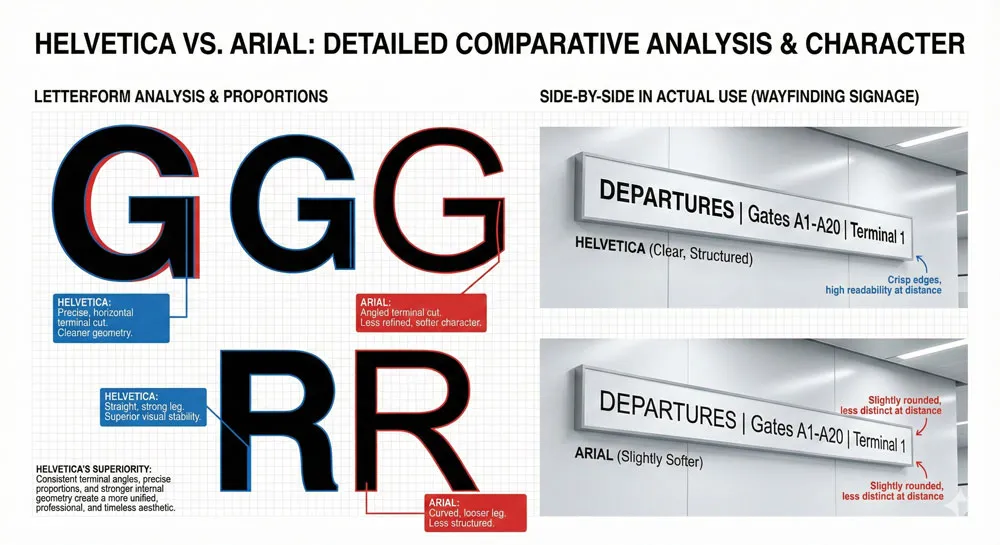
One significant development in the digital era was the creation of Arial by Monotype. Arial is a Helvetica derivative—a typeface that closely mimics Helvetica’s design but makes minor modifications. Microsoft bundled Arial with Windows, making it widely available on Windows computers, just as Apple bundled Helvetica with the Macintosh.
The emergence of Arial sparked what designers call the “Helvetica vs. Arial” debate. Type designers argue that Arial is inferior to Helvetica—its proportions are less refined, its optical adjustments less subtle, its overall design less sophisticated. Arial exists largely because of licensing and business reasons (Monotype wanted to create a Helvetica alternative that they owned) rather than because it is a superior design.
However, Arial’s existence actually reinforced Helvetica’s status. The fact that Microsoft needed to create an Arial substitute rather than simply license Helvetica demonstrates Helvetica’s dominance.
Even as a clone, Arial could never quite match Helvetica’s quality or cultural status. Among designers and typographic professionals, Helvetica remains the gold standard; Arial is viewed as a pale imitation.
The Helvetica vs. Arial debate also reveals something interesting about typography in the digital age. Even as digital technology made typeface creation and distribution easy, quality still mattered. Helvetica’s superior design ensured its continued dominance, even in the face of free or cheaper alternatives.
Helvetica and the Web
The early web presented another potential threat to Helvetica’s dominance. Web browsers displayed text using system fonts—typefaces installed on the user’s computer. This meant that web designers could not guarantee that their carefully chosen typeface would display on the user’s screen. If the user did not have Helvetica installed, the browser would substitute a different font.
This limitation led many web designers to use generic font names—”sans-serif,” “serif,” “monospace”—which would fall back to whatever default sans-serif, serif, or monospace font the browser provided.
However, most operating systems were configured so that the default sans-serif font was Helvetica or Helvetica-like. This meant that even when web designers were not explicitly choosing Helvetica, the web often defaulted to Helvetica.
The development of web-safe fonts and later web font technologies (which allow designers to embed custom fonts in web pages) created more typographic diversity on the web. However, Helvetica’s cultural status meant that it remained a common choice for web design, particularly for corporate and institutional websites.
Related Topics:
- Secret Life of Symbols: History of Ampersand and Interrobang
- Helvetica – Swiss Modernism’s Ubiquity Crisis
- Comic Sans – Accessibility & Gatekeeping Critique
The Psychology of Helvetica: Why It Feels “Corporate” and “Official”
The Invisibility of Authority
One of the most interesting psychological characteristics of Helvetica is its invisibility. Most people cannot name Helvetica or describe its characteristics. Yet Helvetica is the most recognizable typeface in the world. This paradox reveals something profound about how typography communicates.
Helvetica communicates so efficiently that it becomes transparent. When you read Helvetica, you do not think about the typeface; you simply read the content.
The typeface does not call attention to itself; instead, it directs all attention to the message. This transparency is precisely what makes Helvetica so effective for institutional and corporate communication.
The psychology of this transparency is revealing. Helvetica makes viewers unconsciously believe that what they are reading comes from an organized, rational, and trustworthy source.
The typeface is not making this claim explicitly; it is communicating it implicitly through its visual characteristics and through the accumulated cultural associations of decades of institutional use.
Helvetica as the Voice of Authority
Because Helvetica has been used by governments, corporations, and institutions for over six decades, it has accumulated powerful psychological associations with authority and institutional power. When you see Helvetica, you unconsciously receive a message: this is official, this is from an important institution, this is trustworthy.
This psychological association is so strong that it has become almost independent of content. Helvetica could be used to communicate false information, yet the typeface itself would lend an aura of authority and trustworthiness to that information. This reveals the power of typography to shape how we perceive and interpret information.
The association of Helvetica with authority is also partly generational and cultural. For people who grew up in the 1960s-1980s, Helvetica is the typeface of official communication.
Government documents, corporate communications, institutional signs—these were all printed in Helvetica. The accumulated experience of a lifetime of reading Helvetica in authoritative contexts creates a psychological association between the typeface and authority itself.
The Modernist Promise
Helvetica also communicates the promises of modernism. It embodies the belief that rational design can improve communication and human life.
It communicates that information should be clear, accessible, and free from unnecessary ornament or decoration. It suggests that well-designed systems can serve everyone equally.
This modernist promise is one reason that Helvetica appeals to institutions and corporations. By choosing Helvetica, an organization is implicitly claiming membership in a community of rational, well-designed institutions.
The typeface is a way of saying: “We are modern, we are efficient, we are designed with care and attention to clarity.”
However, this modernist promise has also made Helvetica a target of criticism. Critics argue that Helvetica’s ubiquity represents the hegemony of corporate modernism—a homogenization of visual culture in service of institutional control.
If everywhere looks like Helvetica, then everywhere looks like an institution. If all official communication is printed in Helvetica, then the visual world becomes increasingly corporate and institutional rather than personal or individual.
Related Topics:
- Gotham – Political Design & Elections Power
- Futura – Geometric Modernism Revolution
- Gill Sans – Humanist Alternative Modernism
The Helvetica Documentary: Cultural Reckoning and Criticism
2007: Gary Hustwit’s Film Examines Helvetica
In 2007, filmmaker Gary Hustwit released a feature-length documentary titled simply “Helvetica.” The film examined the typeface’s history, cultural impact, and contested legacy. It featured interviews with type designers, graphic designers, architects, and cultural critics who offered diverse perspectives on Helvetica.
The film is significant because it raised questions about Helvetica that had been largely unexamined in popular culture. Was Helvetica a triumph of modernist design that had genuinely improved communication? Or was it a symbol of corporate conformity and the erasure of individual expression? Was Helvetica’s ubiquity a sign of its excellence, or evidence of a design monoculture?
The documentary revealed that these questions generated genuine disagreement among design professionals. Some designers viewed Helvetica as a masterpiece—a typeface so well-designed that it achieved its goal of transparent, efficient communication. These designers celebrated Helvetica’s ubiquity as evidence of its success.
Other designers viewed Helvetica’s dominance with suspicion or even hostility. They argued that Helvetica had become so ubiquitous that it represented a limitation on visual diversity and creative expression.
They saw Helvetica’s use as representing a capitulation to corporate design values. Some of these designers argued for the deliberate rejection of Helvetica in favor of more distinctive, challenging typefaces.
The Case for Helvetica: Design Excellence and Functional Perfection
The defenders of Helvetica made a powerful case. They argued that Helvetica’s success was not accidental; it was the result of superior design. Helvetica achieved optical balance, legibility, and functional efficiency in a way that few other typefaces have matched.
Moreover, defenders argued that Helvetica’s ubiquity was not evidence of conformity but rather evidence of merit. If Helvetica was so widely adopted, it must be because designers and institutions recognized its excellence. The typeface was not forced upon the public; it was chosen repeatedly by millions of decisions across decades.
Defenders also argued that criticizing Helvetica for being used by corporations and institutions was misdirected. Of course corporations and institutions use Helvetica—they should!
These organizations have a responsibility to communicate clearly and efficiently with the public. Helvetica enables this clear communication. Using a more distinctive or challenging typeface would be putting design values above communication values, which is arguably irresponsible.
Furthermore, defenders noted that Helvetica’s availability actually democratized design. Before Helvetica became a digital font bundled with computer operating systems, it was available primarily to professional designers and large corporations.
The digitization of Helvetica meant that small businesses, nonprofits, and individuals could access a world-class typeface that had previously been unavailable to them.
The Case Against Helvetica: Conformity and Visual Homogenization
Critics of Helvetica offered a different perspective. They argued that while Helvetica might be excellently designed, its ubiquity had created a visual monoculture. If all institutions used Helvetica, then all institutions looked the same. Visual diversity was being erased in the name of functional efficiency.
Critics also questioned whether Helvetica’s transparency was entirely positive. Yes, Helvetica communicates efficiently, but this efficiency came at the cost of personality and character.
A typeface with more personality might communicate additional meanings beyond the literal text. By choosing a neutral typeface like Helvetica, designers were making a choice to eliminate expressive or emotive dimensions of communication.
Furthermore, critics argued that Helvetica’s association with institutional authority was not incidental; it was the result of decades of deliberate use by institutions seeking to establish authority and control.
By choosing Helvetica, institutions were tapping into the psychological power of the typeface to suggest institutional legitimacy. This was not bad design; it was powerful design—perhaps too powerful. It was design used as an instrument of institutional control.
Critics also noted that Helvetica’s universality was not as universal as it appeared. Helvetica worked well for certain contexts—particularly corporate and governmental contexts in Western countries.
For other contexts—intimate communication, artistic expression, subcultural identity—other typefaces might be more appropriate. Yet Helvetica’s dominance meant that designers often defaulted to Helvetica even when other choices might have been more meaningful.
Synthesis: Beyond the Binary
The most interesting perspective emerged not from defenders or critics of Helvetica, but from designers and thinkers who attempted to synthesize both positions. They argued that Helvetica deserves recognition as an excellent typeface, but this recognition should not preclude critical examination of its role in shaping visual culture.
Helvetica is evidence both of excellent design and of the hegemony of corporate modernism. Both statements are true. Helvetica’s success demonstrates that good design matters—that careful attention to proportion, legibility, and visual balance creates a typeface that functions better than alternatives.
Yet Helvetica’s ubiquity also demonstrates how design choices can gradually homogenize visual culture, creating a world where all official communication looks similar.
The challenge, then, is not to reject Helvetica but to use it more thoughtfully. Helvetica is an appropriate choice for many contexts—corporate branding, institutional signage, public communication where clarity is paramount.
However, it should not be the default choice for all contexts. For intimate communication, artistic expression, and contexts where personality and distinctiveness matter, other typefaces are often more appropriate.
Related Topics:
- Baskerville – Print Excellence & Love Story
- Bodoni – Theatrical Prestige Aesthetics
- Garamond – Classical Foundation Principles
Helvetica Across Industries: From Fashion to Finance
Corporate Branding: Helvetica as the Default
The most obvious application of Helvetica is corporate branding. Hundreds of major corporations and brands use Helvetica as their primary typeface: American Apparel, Bayer, BMW, Crate and Barrel, Evian, Fendi, Hermès, Jeep, Kraft, Levis, Microsoft, Motorola, Nestlé, The North Face, Panasonic, and Toyota, among many others.
The prevalence of Helvetica in corporate branding reflects the values that corporations seek to communicate: modernity, efficiency, reliability, and professional expertise. When a corporation chooses Helvetica, it is making an implicit claim about its identity and values. The typeface is saying: “We are organized, we are modern, we are trustworthy.”
However, Helvetica’s prevalence in corporate branding also raises questions about brand differentiation. If multiple corporations use Helvetica, does this undermine each corporation’s ability to establish a distinctive visual identity? Or does the quality and excellence of Helvetica as a typeface transcend this concern?
Different corporations answer this question differently. Some corporations use Helvetica as their primary typeface but differentiate through other design elements—color, layout, logo design. Others have moved away from Helvetica toward more distinctive or custom typefaces that help them stand out in a crowded corporate landscape.
Technology and Innovation: Helvetica as the Future
Technology companies have long embraced Helvetica as the typeface that communicates innovation and forward-thinking progress. Apple, Google, Microsoft, IBM, and other tech giants have all used Helvetica or Helvetica-derived fonts in their branding and interface design.
The association of Helvetica with technology is revealing. Helvetica emerged as a modernist typeface grounded in rational design principles. These same values—rationality, efficiency, systematic thinking—are valued in technology and computer science. Helvetica communicates that a technology company is thinking rationally about its design and user experience.
However, some contemporary tech companies have moved away from Helvetica toward custom typefaces. Google developed Roboto, an open-source sans-serif typeface designed specifically for screen use.
Facebook commissioned Helvetica Neue substitutes but eventually developed more distinctive approaches to typography. This evolution suggests that even in technology, companies are seeking to establish more distinctive visual identities rather than defaulting to Helvetica.
Luxury and Fashion: The Paradox of Helvetica Elegance
One of the most interesting applications of Helvetica is its use in luxury and fashion branding. Brands like Hermès, Fendi, and Celine use Helvetica or closely related typefaces in their branding. This might seem paradoxical—doesn’t luxury usually demand ornate, distinctive, hand-crafted typefaces?
However, the use of Helvetica in luxury branding reveals something subtle about how luxury brands communicate. Luxury brands often eschew obvious decoration and ornament in favor of refined simplicity. The idea is that true luxury does not need to announce itself through flashy typography; it communicates through restraint and elegance.
Helvetica is a perfect vehicle for this communication of refined simplicity. Its clean, geometric forms communicate that the brand is confident in its quality and does not need ornate decoration to establish its status. The choice of Helvetica paradoxically communicates sophistication and exclusivity precisely because it seems so understated.
Government and Institutions: Helvetica as Official
Government agencies, public transit systems, educational institutions, and large bureaucratic organizations have long relied on Helvetica for public communication. When you walk into a government office, ride the subway, or check into a hospital, you are likely reading Helvetica.
The use of Helvetica in these contexts communicates official authority and trustworthiness. Citizens unconsciously absorb the message: this is an official institution, the information I am reading is accurate and reliable. Helvetica makes government and institutions feel organized and well-designed.
However, this raises interesting questions about the relationship between typeface and institutional power. Does Helvetica make institutions more trustworthy, or does it exploit our psychological associations to create an illusion of trustworthiness?
When a government or institution uses Helvetica, is it doing so because Helvetica genuinely communicates clearly, or because Helvetica lends an aura of authority that makes citizens more likely to accept official information without question?
Related Topics:
- Worst Fonts – Criticism & Gatekeeping Analysis
- Gill Sans & The Tube – Urban Identity Infrastructure
- Baskerville & Mrs. Eaves – Love, Partnership & Revival
Helvetica Criticism: The Countermovement and Alternatives
The Anti-Helvetica Movement
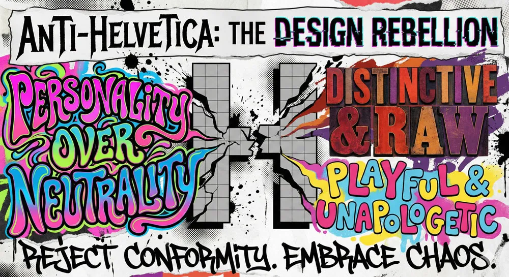
Not all designers have embraced Helvetica. Beginning in the 1980s and accelerating in the 1990s-2000s, some designers deliberately rejected Helvetica in favor of typefaces that were more distinctive, challenging, or expressive.
This anti-Helvetica movement was partly aesthetic (these designers simply preferred other typefaces), partly ideological (they viewed Helvetica as representing corporate conformity), and partly generational (younger designers wanted to establish their own design voice rather than defaulting to earlier generations’ choices).
The anti-Helvetica movement created typefaces and design movements that emphasized alternative values: distinctiveness, personality, playfulness, and cultural specificity. Designers like David Carson, Neville Brody, and others created provocative, challenging designs that consciously rejected Helvetica’s transparency and rationality.
This countermovement is significant because it demonstrates that Helvetica’s dominance was never absolute. Alternative typefaces existed, designers used them, and distinct visual cultures emerged that were not based on Helvetica.
The fact that these alternatives remained minority positions testifies to Helvetica’s enduring appeal, but the countermovement shows that different design philosophies were always possible.
Alternative Sans-Serifs: Choices Beyond Helvetica
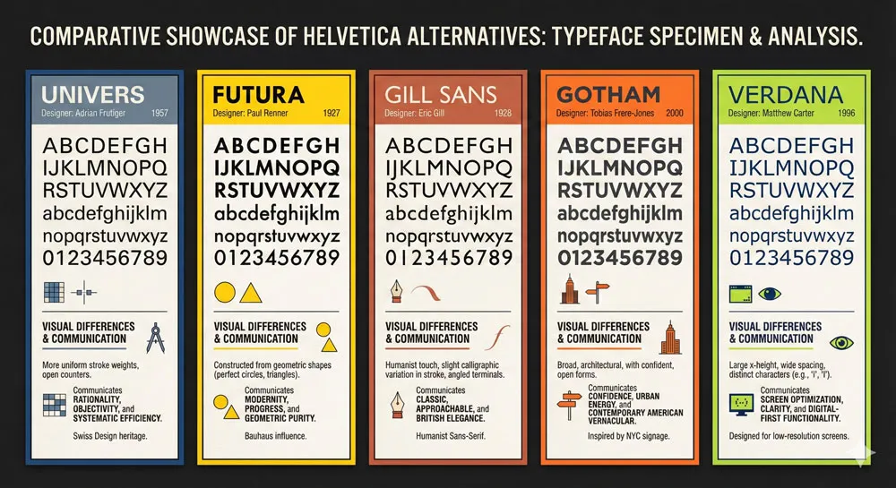
For designers seeking to move beyond Helvetica, numerous alternatives exist. Each offers different visual characteristics and psychological effects:
- Univers (designed by Adrian Frutiger, also released in 1957) is Helvetica’s closest competitor. Univers is equally rational and modern but offers slightly different proportions and a more extensive family system. Univers has slightly more personality than Helvetica—it feels marginally warmer and more humanistic, though the difference is subtle.
- Futura (designed by Paul Renner in the 1920s) is a more geometric, condensed sans-serif that communicates a different kind of modernity—one associated with technological optimism and futurism. Futura feels more distinctive and personality-driven than Helvetica.
- Gill Sans (designed by Eric Gill in the 1920s) is a humanist sans-serif that retains characteristics of handwriting while maintaining geometric clarity. Gill Sans communicates warmth and accessibility without sacrificing modernity.
- Gotham (designed by Tobias Frere-Jones) is a contemporary geometric sans-serif that combines American vernacular design with refined craftsmanship. Gotham communicates forward-thinking optimism and has become popular with tech companies and political campaigns.
- Verdana and Georgia (designed by Matthew Carter for screen use) are typefaces specifically optimized for digital display. They communicate clarity and accessibility and have become the defaults for web design.
Each of these alternatives offers designers choices beyond Helvetica. A designer choosing Univers instead of Helvetica is making a subtle but meaningful statement. They are saying: “I want the same rational, modern aesthetic as Helvetica, but with slightly different proportions and personality.”
The “Bad Helvetica” Phenomenon: When Helvetica Goes Wrong
Interestingly, criticism of Helvetica has sometimes emerged not because Helvetica is inherently bad, but because Helvetica is often used badly. Helvetica is such a good, functional typeface that it is easy to use it competently even with minimal design skill.
This has led to countless examples of poor Helvetica use—bad spacing, inappropriate sizing, layouts that do not take advantage of Helvetica’s qualities.
When you see poorly designed Helvetica, the typeface’s weaknesses become apparent. Helvetica’s dependence on generous spacing and careful sizing means that when these factors are neglected, Helvetica can look cramped and generic.
This has led some critics to blame Helvetica for bad design that is really the responsibility of the designer’s poor execution.
This phenomenon reveals an interesting truth: an excellent typeface in the hands of a skilled designer creates excellent results, but the same typeface in the hands of an unskilled designer can look generic or even bad.
Helvetica has been democratized to the point where it is used by people with minimal design training, and this has led to countless examples of mediocre Helvetica use.
Related Topics:
- Futura & Paul Renner – Geometric Vision & Revolution
- Legibility vs. Readability – Typography Fundamentals
- Ampersand & Interrobang – Symbol Histories
The Digital Era: Helvetica in Contemporary Design
Helvetica Neue: The Digital Upgrade
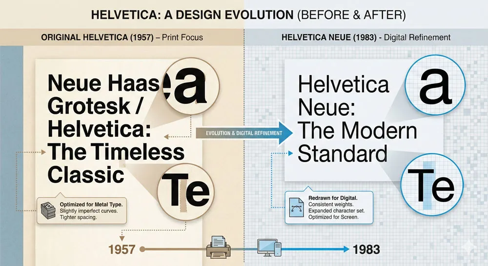
In 1983, Linotype released Helvetica Neue, a comprehensive redesign of the original Helvetica optimized for digital printing and photocomposition. Helvetica Neue updated and refined the original design while maintaining its core characteristics. Helvetica Neue became the standard version of Helvetica used in contemporary design.
The release of Helvetica Neue raised interesting questions: is Helvetica Neue an improvement on the original Helvetica, or is it a dilution of the original design? Some purists argued that the original Helvetica had a character and refinement that Helvetica Neue lacked. Others argued that Helvetica Neue was a necessary evolution of the typeface for new printing and design technologies.
This debate reveals something interesting about how we relate to design classics. Once a design becomes culturally significant, every update or revision generates debate. People become attached to specific versions of designs, and changes to those designs feel like potential betrayals or corruptions.
Helvetica in Contemporary Graphic Design
In contemporary graphic design, Helvetica occupies an interesting position. It remains widely used, particularly by corporations and institutions seeking to communicate authority and professionalism. Yet younger designers often view Helvetica as somewhat dated or clichéd. They seek typefaces that feel more distinctive or expressive.
However, Helvetica has also undergone a kind of cultural rehabilitation. Some contemporary designers deliberately choose Helvetica as a reaction against trendy typeface choices. They argue that Helvetica’s stability and refinement make it a better choice than ephemeral trend-driven typefaces.
This position is sometimes called “neo-modernism” or “updated modernism”—a deliberate embrace of modernist design principles combined with contemporary design sensibility.
Helvetica and Web Design: The Screen Era
In web design, Helvetica’s dominance has been somewhat diluted by the proliferation of web-safe fonts and web font technologies. However, Helvetica (or Helvetica alternatives) remains widely used for web design, particularly in corporate and institutional contexts.
The challenge of Helvetica on screens (as opposed to print) is that screen rendering of Helvetica can look less refined than printed Helvetica. The pixels of digital displays can make Helvetica’s delicate proportions look harsh or overly geometric.
This has led some web designers to choose typefaces specifically designed for screen use, like Verdana or custom web fonts optimized for screen display.
However, many web designers continue to use Helvetica variants for web design because of the typeface’s cultural status and psychological associations. Even if Helvetica looks less refined on screen than in print, it still communicates the professional authority and institutional power that organizations seek to project.
Related Topics:
Helvetica’s Legacy: Lessons About Design, Culture, and Ubiquity
What Helvetica Teaches Us About Design Excellence
Helvetica’s 65+ year dominance offers profound lessons about design excellence. First, Helvetica demonstrates that superior design can create lasting impact.
Helvetica was not imposed by decree; it was adopted repeatedly by millions of designers and institutions because they recognized its quality. This suggests that good design matters—that careful attention to proportion, legibility, and functional efficiency creates work that stands the test of time.
Second, Helvetica demonstrates the power of systematic thinking in design. Helvetica’s family system, its logical structure, and its rational design principles enabled it to be applied across countless contexts while maintaining visual coherence.
This systematic approach to design has influenced how contemporary designers think about typefaces and design systems.
Third, Helvetica demonstrates that transparent design—design that does not call attention to itself—can be more powerful than design that seeks to express the designer’s personality. Helvetica’s invisibility is its strength.
By getting out of the way, Helvetica enables clear communication. This has influenced how many contemporary designers think about user experience and communication design.
What Helvetica Teaches Us About Cultural Homogenization
However, Helvetica also teaches cautionary lessons about cultural homogenization. If one typeface becomes so dominant that it is used in almost all institutional and corporate communication, the visual landscape becomes homogenized.
Every subway system, every corporate logo, every government document looks similar. This homogenization, while efficient, comes at the cost of visual diversity and distinct cultural expression.
Helvetica demonstrates how design choices can reshape visual culture at scale. When millions of design decisions are made using the same typeface, the cumulative effect is a fundamental transformation of how the visual world looks.
This raises important questions: Is the homogenization created by Helvetica’s dominance a positive development (efficient, rational, reducing visual noise) or a negative development (suppressing diversity, enforcing conformity, erasing alternative visual cultures)?
The answer is likely both. Helvetica’s ubiquity has genuine benefits—it has enabled clear communication across institutions. Yet it has also created a visual landscape that reflects particular design values (rationality, efficiency, institutional authority) while marginalizing other values (distinctiveness, personality, cultural specificity).
The Principle of “Good Enough”
Helvetica also teaches us about the principle of “good enough.” In many contexts, designers choose Helvetica not because it is the theoretically perfect choice for that specific application, but because Helvetica is “good enough.”
It will work well in almost any context. It communicates clearly. It is familiar and trustworthy. Why take the risk of choosing a less familiar typeface when Helvetica will almost certainly work?
This “good enough” principle has profound implications. It suggests that in design, as in other fields, practitioners often default to solutions that are safe and proven rather than seeking optimal solutions for specific contexts.
Helvetica’s existence enables this defaulting. The availability of an excellent, widely-trusted typeface means that designers can rely on Helvetica rather than thinking through whether a different typeface might be more appropriate for their specific context.
This principle is not necessarily negative. Sometimes “good enough” really is good enough. Sometimes the safest choice is the best choice. However, the prevalence of “good enough” thinking can also suppress design innovation.
If designers always choose Helvetica, they never explore whether other typeface choices might be more meaningful or effective in specific contexts.
Related Topics:
Helvetica and Globalization: The International Typeface
Helvetica as a Globalizing Force
One of Helvetica’s most significant roles has been as a typeface of globalization. As multinational corporations expanded globally in the 1960s-1990s, they often adopted Helvetica as their global typeface.
Helvetica was available worldwide, it communicated across language barriers, and it represented values that were appealing to institutions seeking to present themselves as modern, rational, and internationally oriented.
The adoption of Helvetica by global corporations has been part of a broader process of visual globalization. As multinational companies expanded, they brought their visual identities with them. Helvetica became a visual symbol of globalization—of the worldwide spread of modernist design values and corporate capitalism.
This role of Helvetica in globalization is significant because it reveals how design is not politically or culturally neutral. When a global corporation presents itself using Helvetica, it is presenting a specific cultural perspective—a Swiss-derived, modernist, Western design philosophy.
This visual language, while presented as universal and neutral, actually represents particular cultural values.
Helvetica and Linguistic Diversity
One interesting aspect of Helvetica’s role in globalization is its relationship to linguistic diversity. Helvetica was designed to work across multiple languages without losing its character.
The typeface’s geometric neutrality meant that it functioned equally well with Latin characters, and it could theoretically be adapted for other writing systems.
This linguistic adaptability was important for Swiss design philosophy. Switzerland has four official languages, and Swiss designers wanted typefaces that could serve all linguistic communities equally well. Helvetica’s success across languages contributed to its global appeal.
However, the assumption that Helvetica could be applied to any language and culture without modification has been criticized. Different languages have different typographic requirements.
Arabic requires different spacing and flow than Latin characters. Chinese characters have different visual properties than alphabetic characters.
Applying the same Helvetica solution to all languages and contexts can suppress the specific visual requirements of different writing systems and cultures.
Related Topics:
FAQ: Common Questions About Helvetica
Q: Is Helvetica really everywhere?
A: Helvetica is extraordinarily ubiquitous, but not truly “everywhere.” Many contemporary designers deliberately choose alternative typefaces. However, Helvetica remains the default choice for many corporations and institutions, and its variants are used so widely that you encounter Helvetica regularly in daily life.
Q: Why is Helvetica so popular if it’s “boring”?
A: Helvetica is not popular because it is boring; it is popular because it is excellent. Its refined proportions, exceptional legibility, and comprehensive family system make it one of the best-designed typefaces ever created. What some perceive as “boring” is actually sophisticated design that effectively communicates without calling attention to itself.
Q: Can I use Helvetica for my small business?
A: Absolutely. Helvetica works well for most applications—business correspondence, signage, branding, and printed materials. However, consider whether Helvetica is the best choice for your specific context. Does Helvetica communicate what you want to communicate about your business? Would a different typeface be more distinctive or better aligned with your brand personality?
Q: What’s the difference between Helvetica and Arial?
A: Arial is a Helvetica clone created by Monotype. It shares many visual characteristics with Helvetica but differs in subtle proportions and details. Most designers prefer Helvetica to Arial because Helvetica’s proportions are more refined. However, for most practical purposes, the differences between Helvetica and Arial are subtle and might not matter for your specific application.
Q: Is Helvetica outdated?
A: Helvetica is neither outdated nor trendy. It occupies a position as a “classic” typeface—widely recognized and respected, but also perceived by some as dated or clichéd. Whether Helvetica is appropriate for your project depends on the specific context and your brand identity.
Q: Should I use Helvetica Neue or original Helvetica?
A: Helvetica Neue is the contemporary standard version of Helvetica. Unless you have a specific reason to use original Helvetica, Helvetica Neue is the better choice because it is optimized for digital printing and contemporary use.
Q: Can I use Helvetica on my website?
A: You can specify Helvetica in your website’s typography, but it will only display if the user has Helvetica installed on their computer. Most operating systems include Helvetica or similar fonts, so your Helvetica specification will likely work. However, it is good practice to specify fallback fonts in case Helvetica is not available.
Q: Does font choice really affect how people perceive my message?
A: Yes, font choice significantly affects perception. Research demonstrates that people perceive the same message differently depending on the typeface used. This is not just about legibility; it is about the psychological and cultural associations people have with different typefaces.
Q: Is it wrong to use Helvetica?
A: No, it is not wrong to use Helvetica. It remains an excellent typeface that works well in many contexts. However, use it intentionally rather than defaulting to it simply because it is the most familiar option. Consider whether Helvetica is the best choice for your specific communication goals, audience, and context.
Related Topics:
Conclusion: The Typeface That Became a Symbol
Helvetica is more than a typeface. It is a symbol of modernist design philosophy, the spread of corporate capitalism, globalization, and the invisible forces that shape visual culture.
It is evidence that excellence in design matters—that a carefully designed typeface can achieve extraordinary longevity and impact. It is also evidence of cultural homogenization—of how design values can gradually reshape visual landscapes at scale.
Helvetica’s 65-year dominance reveals profound truths about design, technology, and culture. Good design persists. Systematic thinking enables broad application. Transparency can be more powerful than personality.
Yet these positive lessons about design excellence are inseparable from questions about conformity, corporate power, and the homogenization of visual culture.
The future of Helvetica is uncertain. Contemporary designers have more options than ever before—thousands of typefaces are available digitally at minimal cost. Yet Helvetica persists.
New generations of designers continue to use Helvetica because they recognize its quality. Helvetica remains the default choice in many institutional and corporate contexts because it communicates authority and reliability so effectively.
Perhaps the most important lesson Helvetica teaches is that design choices matter. Every typeface choice is a choice about what values to communicate, what aesthetic to adopt, what visual culture to create.
When you choose Helvetica, you are making a specific choice about meaning and identity. When you choose something else, you are making a different choice. The key is to make these choices intentionally, with full awareness of their implications.
As you encounter Helvetica in your daily life—on subway signs, corporate letterheads, government documents, websites, and countless other contexts—remember that this typeface is not neutral. It is communicating. It is shaping your perception and the perception of everyone around you.
Understanding Helvetica’s history and psychology makes you a more conscious consumer of visual culture and, if you are a designer, a more thoughtful creator of it.
Related Topics:
About the Author
Lalit M. S. Adhikari is a Digital Nomad and Educator since 2009 in design education, graphic design and animation. He’s taught 500+ students and created 200+ educational articles on design topics. His teaching approach emphasizes clarity, practical application and helping learners.
Learn more about Lalit Adhikari.
This guide is regularly updated with the latest information about Adobe tools and design best practices. Last Updated: Mar 2026
Related Topics:


