In June 2005, Steve Jobs stood before Stanford University students and described a moment that would change his life. A decade earlier, as a dropout at Reed College in Portland, he had wandered into a calligraphy class.
There, surrounded by beautiful hand-lettered posters and meticulously labeled drawers, Jobs learned about serifs, sans-serifs, and the subtle art of spacing between letters. He thought it would never matter. He was wrong.
Ten years later, when Jobs designed the Macintosh computer, he embedded that calligraphy lesson directly into its operating system. The Mac became the first personal computer with a real choice of typefaces.
Users could select from Chicago, Geneva, New York, Times New Roman, and Helvetica—each evoking a different mood, a different purpose, a different feeling. Within a decade, the ability to choose a font had transformed from a privilege reserved for professional designers into something every computer user took for granted.
But what was happening in those split-second moments when a user clicked on a font menu? What made Geneva feel “corporate” and Los Angeles feel “playful”? Why did one typeface inspire trust while another seemed frivolous or threatening?
The answer lies in font psychology—the complex, often invisible relationship between typefaces and human emotion, behavior, and decision-making. When you choose a font, you are not simply selecting a collection of letterforms.
You are choosing a voice, a personality, a promise to your audience. You are communicating something beyond the literal meaning of your words.
This comprehensive guide explores how typography shapes the way we think, feel, and act. Whether you are a designer selecting typefaces for a brand identity, a content creator building a blog, a marketer crafting persuasive copy, or simply someone curious about the silent power of letters, understanding font psychology will change the way you see every word you read.
My name is Lalit Adhikari and we are at LTY. Let’s begin!
Table of Contents
Understanding Font Psychology: The Basics
What Is Font Psychology?
Font psychology is the study of how typefaces influence human perception, emotion, and behavior. It operates at the intersection of design, neuroscience, marketing, and human behavior.
Every typeface carries cultural, historical, and emotional weight. A font is never “neutral”—even the most minimal, geometric sans-serif communicates something to the viewer.
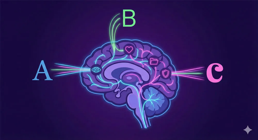
When you encounter a typeface, your brain does not simply recognize the shapes of letters and decode their meaning. Instead, you undergo a rapid, largely unconscious process of emotional and contextual evaluation.
You assess whether the font feels trustworthy, professional, playful, dangerous, intimate, or distant. Within milliseconds, before you have even finished reading the content, the typeface has already communicated a meta-message about that content.
This psychological response is rooted in several factors: personal experience, cultural conditioning, historical association, and design principles. A typeface that feels “old-fashioned” to a modern viewer does so because it resembles letterforms from a previous era—not because there is anything inherently old about straight lines and serifs.
A font that feels “friendly” often does so because it has rounded letterforms that psychologically remind us of softer, less threatening shapes.
How Fonts Communicate Without Words
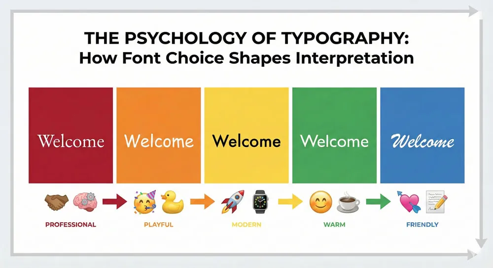
Typography is a language unto itself. Just as the tone of voice in speech affects how we interpret spoken words, the typeface in which words are printed dramatically affects how we interpret written language. Consider the phrase “Welcome to our store.”
Print this in Garamond, a traditional serif font with historical roots, and it conveys a sense of established reputation and timeless quality. Print the same phrase in Comic Sans, a rounded sans-serif designed to feel friendly and approachable, and it conveys a casual, welcoming atmosphere—or, to many modern viewers, an unintentionally humorous tone.
Simon Garfield, in his exploration of typography culture, noted that typefaces carry implicit meanings that go far beyond their function of displaying text. A typeface tells a story about the organization, publication, or individual using it.
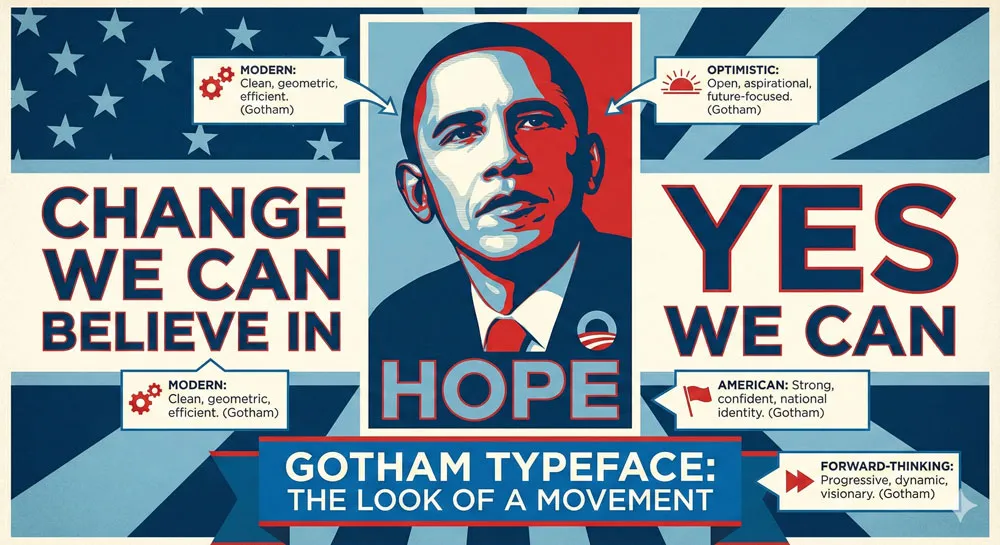
When Barack Obama’s 2008 presidential campaign selected the typeface Gotham, they were making a deliberate psychological choice. Gotham, a geometric sans-serif with American roots and contemporary appeal, communicates modernity, strength, and forward-thinking optimism. It is no accident that this typeface has become synonymous with political hope and change.
Fonts communicate through several distinct channels:
Visual Association:
Typefaces that resemble handwriting or calligraphy feel personal and informal. Typefaces with thick, heavy strokes feel powerful and commanding. Typefaces with thin, delicate strokes feel refined and elegant. These visual properties trigger immediate psychological responses based on evolutionary and cultural conditioning.
Historical Context:
A typeface that was popular in the 1970s carries psychological baggage from that era. Using Futura, Paul Renner’s geometric masterpiece from the 1920s, immediately evokes mid-century modernism and can feel either authentically retro or nostalgically dated depending on context.
Legibility and Effort:
Fonts that are easy to read feel comfortable and approachable. Fonts that require conscious effort to decipher feel exclusive, artistic, or deliberately challenging. The psychology of readability directly impacts how we emotionally engage with text.
Cultural Meaning:
In many cultures, certain typefaces have taken on symbolic meanings. Helvetica, the ubiquitous Swiss sans-serif, has become so associated with corporate professionalism and institutional authority that it feels “official” and “corporate” to viewers in Western contexts.
The Neuroscience Behind Font Perception
Recent neuroscience research has begun to map exactly how the brain processes typefaces. Studies using eye-tracking and fMRI imaging show that when we encounter unfamiliar or unusual typefaces, our brains activate regions associated with reward and cognitive processing. When we encounter familiar typefaces, our brains process them more efficiently, with less cognitive load.
This efficiency has psychological consequences. When a typeface is easy to read and familiar, we allocate our cognitive resources to understanding the content rather than decoding the letterforms.
This ease of processing creates a subtle psychological bias: we are more likely to agree with or trust messages presented in easily readable, familiar fonts than the same messages presented in difficult fonts.
Conversely, when a typeface is unfamiliar or difficult to read, our brains must work harder to process it. This increased cognitive load can create a subtle sense of unease or distrust. In some contexts, this effect can be deliberately exploited—an artistic designer might choose a challenging typeface to communicate that the content is provocative or requires active engagement.
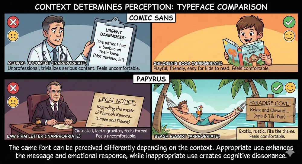
In other contexts, this effect is entirely unintended and counterproductive, as when Comic Sans appears in a medical brochure, creating cognitive dissonance between the serious content and the playful typeface.
The psychology of font perception is also influenced by emotional congruence. When a typeface’s perceived personality aligns with the message’s content, the communication feels coherent and trustworthy.
When there is a mismatch—playful typography paired with serious content, or overly formal typography paired with casual, approachable messaging—viewers experience a subtle sense of wrongness. This is why marketing teams spend enormous resources ensuring that their brand typography aligns perfectly with their brand personality.
Related Topics:
- Helvetica Effect: One Font Conquered Global Design
- Comic Sans: True Story Behind the World’s Most Hated Font
- Gotham: Font That Won an Election And Changed Design Forever
The Big Divide: Serif Typefaces and Their Psychological Impact
What Are Serif Fonts?
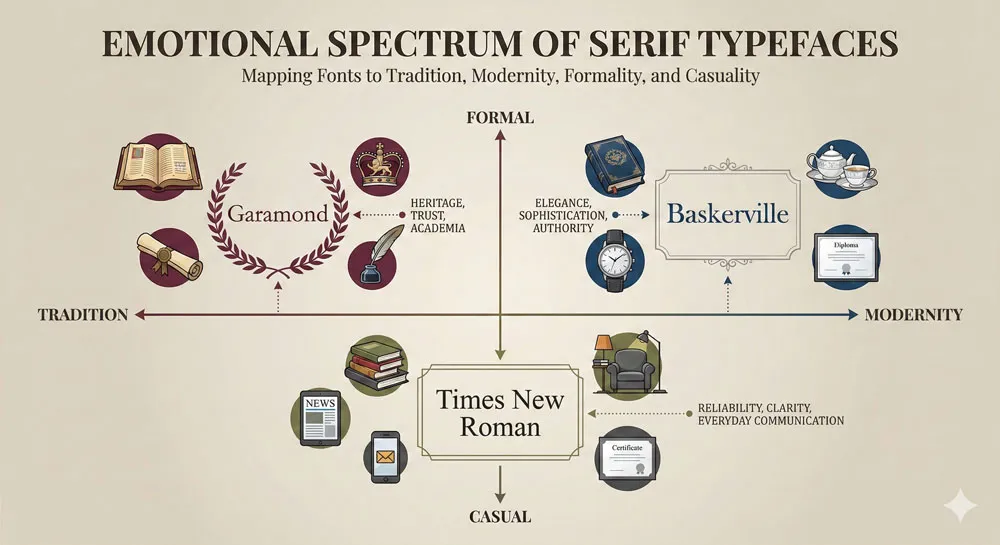
Serif typefaces are characterized by small decorative lines, called serifs, that extend from the ends of letterforms. These decorative terminals can be subtle (as in Garamond or Times New Roman) or prominent and bracketed (as in Baskerville or Palatino).
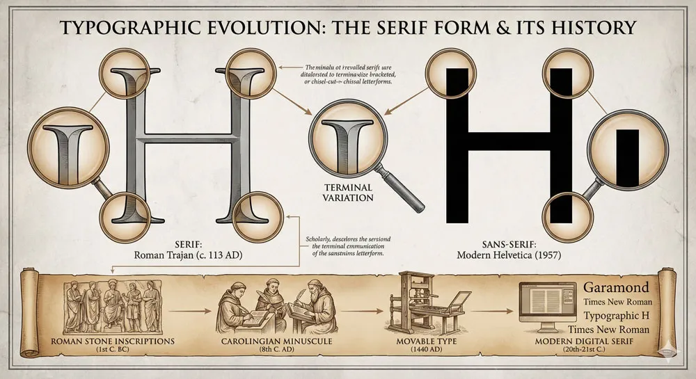
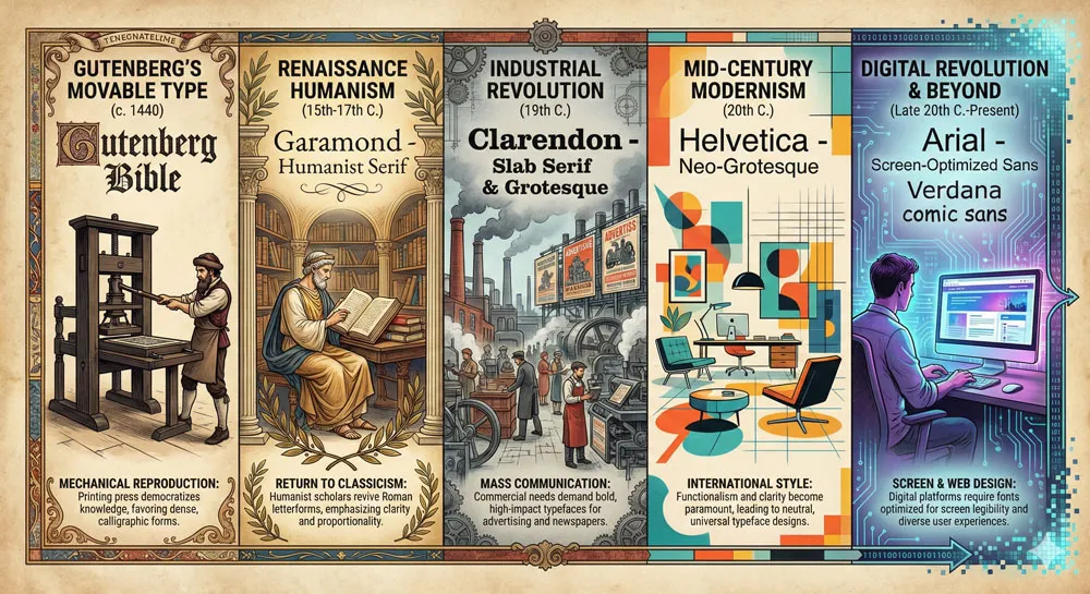
The origin of serifs is a matter of historical debate, but most scholars agree they evolved from the way Roman stonemasons would finish the edges of letters carved into stone. Over centuries, serifs became an integral part of Western typography and took on psychological meanings far beyond their mechanical origins.
Serifs are most common in print typography, where they were traditionally believed to improve readability by helping the eye move horizontally across lines of text.
Whether or not this is technically true remains a subject of typographic debate, but the psychological perception is unambiguous: serif typefaces are strongly associated with authority, tradition, and formality.
The Emotions Serifs Evoke: Tradition, Trust, and Sophistication
When you see a serif typeface, your brain triggers psychological associations with several powerful concepts:
Tradition and Heritage:
Serif typefaces have been the dominant form of book typography for over 400 years. When you encounter serif fonts, you are subconsciously drawn to perceive the text as part of a long, established tradition.
This is why literary magazines, academic journals, and prestigious publications almost universally use serif typefaces. The serifs are saying, “This text comes from people with experience, with authority, with a track record.”
Formality and Professionalism:
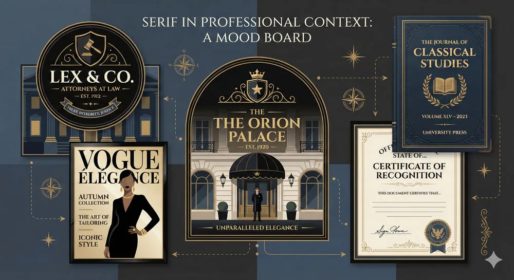
Serif typefaces are strongly associated with formal communication. Law firms, government institutions, and financial services companies frequently use serif typefaces in their branding and communications. When you need to communicate that something is official, legal, or binding, a serif typeface is the default choice.
Trust and Reliability:
In one famous psychology experiment, researchers found that people perceived text set in certain serif typefaces (particularly Times New Roman) as more trustworthy and authoritative than the same text set in sans-serif typefaces.
This effect is particularly strong in contexts where authority is expected—legal documents, financial statements, academic papers. The serif typeface is not making the information any more accurate, but it is psychologically positioning the reader to be more receptive and trusting.
Sophistication and Elegance:
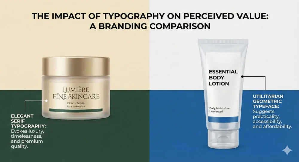
Serif typefaces with delicate proportions and high contrast between thick and thin strokes (such as Didot, Bodoni, or the elegant Mrs Eaves) trigger psychological associations with luxury, refinement, and sophistication.
Fashion brands, luxury hotels, and high-end restaurants frequently use these typefaces because they communicate exclusivity and taste.
Best Uses for Serif Fonts in Branding and Design
Serif typefaces are particularly effective in the following contexts:
Book and magazine publishing:
Long-form reading benefits psychologically from serif typefaces, partly due to tradition and partly due to the genuine readability advantages.
Luxury brands and high-end products:
When you want to communicate sophistication and exclusivity, serif typefaces are the default choice.
Legal, financial, and governmental communication:
These institutions rely on serif typefaces to communicate authority and formality.
Academic and editorial contexts:
Universities, research institutions, and publications use serif typefaces to establish credibility and connection to tradition.
Premium or heritage brands:
Companies with long histories often employ serif typefaces to emphasize their track record and reliability.
Examples: Garamond, Times New Roman, Baskerville
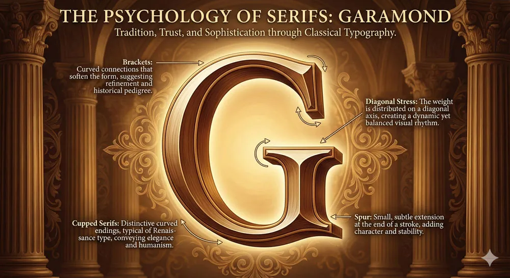
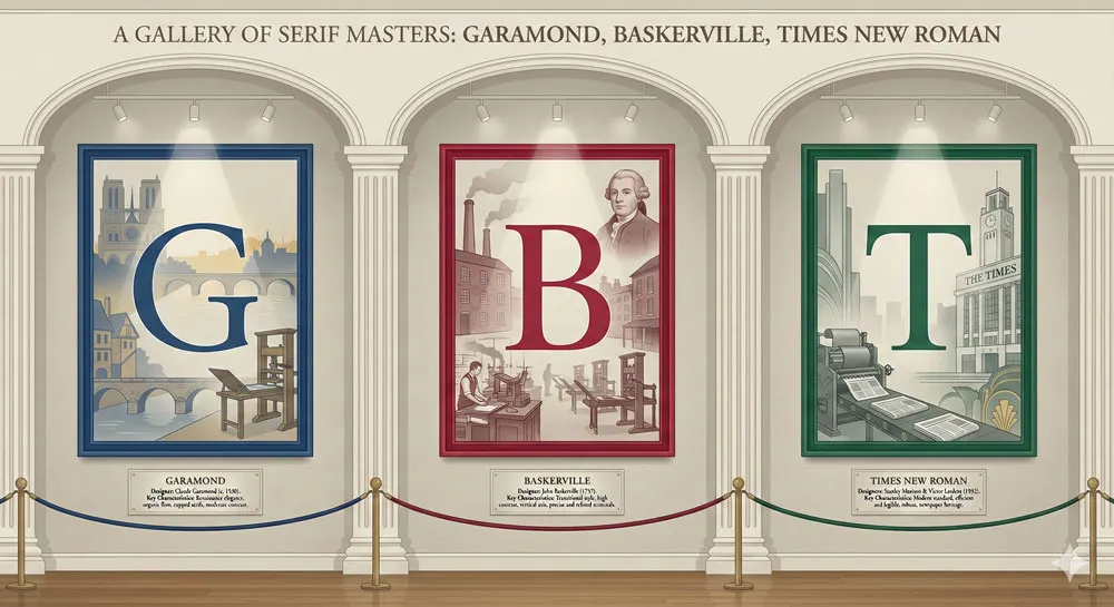
- Garamond is perhaps the quintessential serif typeface for body text. Originally designed by Claude Garamond in 16th-century Paris, it feels both classical and readable. Garamond communicates elegance without ostentation. It was used for the American Declaration of Independence and remains a favorite for literary publications.
- Times New Roman is the default serif font for academic papers and professional correspondence. Designed by Stanley Morison in 1932 for The Times newspaper, it is perhaps the most ubiquitous serif font in the world.
Its overuse has made it feel somewhat generic, yet it remains the default choice when formality and tradition are required. Simon Garfield notes that Times New Roman’s very ubiquity has rendered it simultaneously authoritative and boring—a font so familiar that we often fail to consciously notice it.
- Baskerville represents serif typography at its most refined. Designed by John Baskerville in 18th-century Birmingham, Baskerville features delicate proportions and high contrast between thick and thin strokes.
It is transitional between old-style serifs and modern serifs, and it triggers psychological associations with both tradition and contemporary sophistication. Baskerville is frequently used by luxury brands and premium publications because it communicates both heritage and refinement.
Related Topics:
- Futura: The Geometric Vision of Paul Renner
- Gill Sans: Eric Gill’s Humanist Masterpiece
- Baskerville: Elegant Serif That Shaped Print Typography
The Modern Choice: Sans-Serif Typefaces and Clean Aesthetics
Understanding Sans-Serif Fonts
Sans-serif typefaces are characterized by the absence of serifs—hence the French prefix “sans,” meaning “without.” Sans-serif letterforms consist of simple geometric shapes: straight lines and curves without decorative terminals.
While sans-serif typefaces have existed since the early 1800s, they did not become widespread until the 20th century, when modernist design movements embraced their clean, functional aesthetic.
The shift from serif to sans-serif was not merely stylistic. It represented a fundamental change in how Western culture thought about design and communication.
Serifs were seen as decorative remnants from an earlier era; sans-serifs were modern, rational, and forward-thinking.
Today, sans-serif typefaces dominate contemporary design, particularly in digital contexts where their clean, minimal appearance is easier to render on screens.
The Psychology of Minimalism: Why Brands Choose Sans-Serifs
Sans-serif typefaces trigger distinctly different psychological associations than their serif counterparts:
Modernity and Progress:
A sans-serif font immediately communicates that a brand or organization is contemporary, forward-thinking, and progressive. This is why tech companies almost universally use sans-serif typefaces. Apple, Microsoft, Google, and virtually every other technology company relies on sans-serif typography to communicate innovation and cutting-edge thinking.
Cleanliness and Clarity:
The geometric simplicity of sans-serif typefaces is psychologically associated with clarity, transparency, and straightforwardness. When you want to communicate that information is accessible and easy to understand, a sans-serif typeface is an excellent choice.
Accessibility and Inclusivity:
Modern sans-serif typefaces, particularly those designed for screen use, are often perceived as more accessible and democratic than serif typefaces. They feel less “elite” or “exclusive.”
This psychological effect makes sans-serifs popular for institutional communications, public health messages, and any context where you want to reach a broad audience.
Efficiency and Functionality:
Sans-serifs trigger psychological associations with efficiency, functionality, and stripped-down design. They communicate “this is the essential information, no fluff.” This is why subway systems, airport signage, and instructional materials universally employ sans-serif typefaces.
Neutrality and Corporate Authority:
While serif typefaces communicate tradition and cultural authority, sans-serif typefaces communicate institutional authority and contemporary professionalism.
Helvetica, the quintessential corporate sans-serif, became so associated with institutional power that it essentially became invisible—so ubiquitous that viewers stop consciously noticing it and simply absorb its message of authority and formality.
Humanist vs. Geometric Sans-Serifs
Not all sans-serif typefaces are psychologically identical. There are two major categories, each with distinct psychological properties:
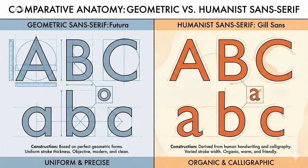
- Geometric Sans-Serifs are based on pure geometric forms—circles, squares, and simple mathematical relationships. Futura, the archetypal geometric sans-serif, is composed of circles and straight lines.
Gotham is a more contemporary geometric sans-serif with slightly less mathematical purity. Geometric sans-serifs trigger psychological associations with modernity, optimism, and forward-thinking rationality. They feel aspirational and futuristic.
- Humanist Sans-Serifs retain subtle characteristics of handwriting and calligraphy, despite their lack of serifs. Gill Sans, designed by Eric Gill in the 1920s, maintains a human warmth despite its clean, modern appearance.
Verdana, designed by Matthew Carter for screen use, incorporates humanist principles by varying the width of letterforms slightly to improve readability. Humanist sans-serifs trigger psychological associations with approachability, warmth, and human-centered design. They feel modern but not cold; efficient but not robotic.
The distinction is subtle but psychologically significant. A geometric sans-serif like Futura communicates “we are efficient, rational, and forward-thinking.” A humanist sans-serif like Gill Sans communicates “we are modern and efficient, but we also care about human experience and warmth.”
Case Study: Helvetica’s Rise to Dominance
Helvetica is perhaps the most important typeface in modern history, and understanding its psychological power provides insight into the broader psychology of typography.
Designed in Switzerland in 1957 by Max Miedinger and Eduard Hoffmann, Helvetica emerged at a moment when the modernist design movement was at its peak. The typeface represented the perfect marriage of Swiss rationalism, geometric clarity, and functional efficiency.
Helvetica was immediately adopted by major corporations, government institutions, and public agencies. Within a decade, it became the de facto typeface for institutional communication.
The New York subway system, American Airlines, and countless corporate logos adopted Helvetica. By the 1980s, Helvetica was so ubiquitous that it had essentially disappeared into the background of contemporary visual culture.
The psychology of Helvetica’s dominance is revealing. The typeface communicates authority, neutrality, and institutional power so effectively that viewers stop consciously noticing it.
This is both Helvetica’s greatest strength and its primary weakness. As a corporate branding tool, Helvetica’s invisibility is precisely what makes it effective—the viewer’s attention remains on the message rather than on the typeface itself.
But this invisibility also makes Helvetica feel generic and impersonal when viewed from a contemporary perspective.
In 2007, filmmaker Gary Hustwit released a documentary called “Helvetica” that examined the typeface’s cultural impact. The film featured interviews with designers, architects, and cultural critics who debated whether Helvetica represented the best of modernist design or had become a symbol of corporate conformity and the erasure of individual expression.
The film is instructive because it reveals that font psychology is not merely individual—it is deeply cultural and contested. Helvetica means different things to different people depending on their relationship to modernism, corporate culture, and design history.
Related Topics:
- Bodoni Font: Serif That Defined Luxury Typography
- Garamond: Timeless Serif That Defined Classical Typography
- The Worst Fonts in the World: A Typographic Hall of Shame
Legibility vs. Readability: The Psychology of Comfort and Function
Legibility: Recognition at a Glance
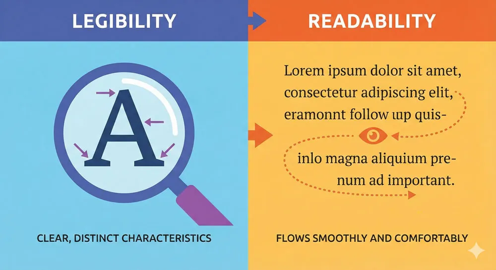
Legibility refers to how easily individual letterforms can be distinguished from one another. A legible typeface has clear, distinct letterforms with sufficient differentiation between similar letters.
For example, the lowercase “l” (letter ell), the number “1” (one), and the uppercase “I” (eye) should be visually distinct in a legible typeface. In Comic Sans, they are often confused, which is one reason typographic professionals consider it illegible in certain contexts.
The psychology of legibility is primarily about efficiency and recognition. When letterforms are legible, the viewer’s brain can rapidly process individual characters without conscious effort. This creates a psychological sense of ease and clarity. The viewer does not have to “work” to understand what they are reading.
Conversely, when a typeface has poor legibility, the viewer’s brain must expend additional cognitive resources to distinguish between similar letterforms. This additional cognitive load creates a subtle psychological sense of frustration and discomfort. Over time, reading an illegible typeface is cognitively exhausting and creates negative associations with the content.
Readability: The Comfort of Extended Text
Readability refers to how comfortable a typeface is for reading longer passages of text. While legibility is about individual character recognition, readability encompasses factors like line length, leading (vertical spacing between lines), kerning (horizontal spacing between letter pairs), and the overall aesthetic coherence of the typeface.
A readable typeface might have perfect legibility but still be uncomfortable to read for extended periods if factors like leading or line length are suboptimal. Conversely, some typefaces with slightly lower legibility remain highly readable because their overall aesthetic creates a comfortable, flowing reading experience.
The psychology of readability is primarily about comfort and sustained engagement. When a typeface is readable, the viewer can immerse themselves in the content without distraction. They experience a psychological state similar to flow—focused attention on meaning rather than form. This state of flow creates positive psychological associations with the content.
How Psychology Shapes These Distinctions
Research in cognitive psychology reveals that the distinction between legibility and readability maps onto the distinction between shallow and deep processing. Shallow processing occurs when we recognize individual characters with minimal cognitive effort. Deep processing occurs when we understand meaning and context, often through sustained, comfortable reading.
When a typeface is legible, viewers are more likely to engage in deep processing because they do not have to expend cognitive resources on character recognition. When a typeface has poor legibility, viewers’ cognitive resources are partially consumed by the act of decoding letterforms, leaving fewer resources for deep processing of meaning.
This has profound implications for communication. If you want your message to be understood deeply and remembered, choose a legible typeface that enables deep processing.
If you want your message to be noticed and to stand out, you might deliberately choose a less legible typeface to capture attention—but be aware that you will sacrifice deep processing and message comprehension.
Kerning, Leading, and Spacing: The Hidden Psychology
Three technical aspects of typeface design have outsized psychological impact: kerning, leading, and word spacing.
- Kerning refers to the adjustment of horizontal space between specific letter pairs. For example, the letter combination “AV” looks visually unbalanced without kerning because the A and V create a large gap.
Good kerning adjusts this space to create visual balance. Poor kerning creates a visual sense of disorder and carelessness. This is why Comic Sans, which lacks sophisticated kerning, often looks amateurish even in contexts where the basic letterforms are appropriate.
The psychology of kerning is subtle but powerful. Viewers do not consciously notice good kerning, but they immediately notice bad kerning. Poor kerning creates a subliminal sense that the communication is unprofessional or careless, which creates negative associations with the content.
- Leading (pronounced “leading,” from the lead strips historically used to separate lines of type) refers to the vertical space between lines of text. Tight leading makes text feel cramped and difficult to read.
Generous leading makes text feel airy and comfortable. The psychology of leading is about rhythm and breathing. Text with generous leading feels like it is giving you space to think; text with tight leading feels claustrophobic.
- Word spacing refers to the horizontal space between words. Typefaces with poor word spacing create a visual sense of disorganization. The psychology of word spacing is partly about legibility—adequate spacing makes individual words easier to distinguish—and partly about aesthetics. Well-spaced typography feels carefully designed; poorly spaced typography feels careless.
The psychological impact of these technical aspects of typography is often unconscious. Viewers do not typically think, “Ah, this typeface has excellent kerning,” but they do experience a subtle sense that the communication is professional and well-executed. This subliminal impression influences their trust in and receptivity to the message.
Related Topics:
- Gill Sans and Tube: How Johnston and Gill Defined London
- Baskerville and Eaves: A Tale of Perfection, Passion and Revival
- Futura vs. The World: The Geometric Vision of Paul Renner
Typeface Personality: The Six Core Emotional Dimensions
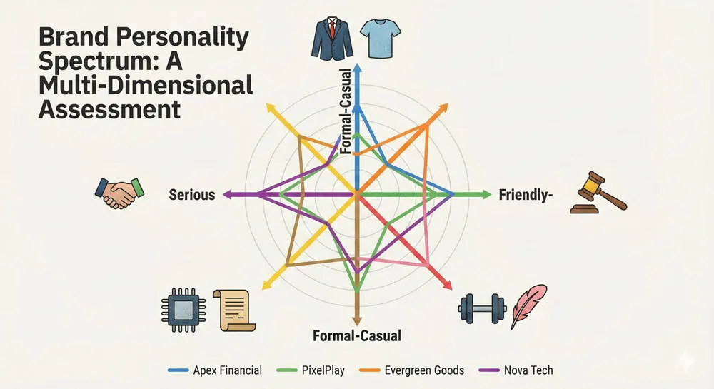
One of the most useful frameworks in font psychology is the concept of typeface personality. Just as individual human personalities can be described along various emotional and behavioral dimensions, typefaces can be positioned along personality axes.
Understanding these dimensions helps designers make intentional choices about which typefaces best match their communication goals.
Formal vs. Casual
The formal-casual axis describes how professional and structured a typeface appears. Formal typefaces communicate authority, professionalism, and institutional power.
These include serif typefaces like Garamond, Baskerville, and Times New Roman, as well as geometric sans-serifs like Futura.
Casual typefaces feel approachable, friendly, and informal. These include humanist sans-serifs like Gill Sans, playful typefaces like Comic Sans, and script fonts that resemble handwriting.
The psychology of this axis relates to social distance and formality. Formal typefaces create psychological distance between the communicator and the audience, which is appropriate for institutional or official communication.
Casual typefaces reduce psychological distance, which is appropriate for personal communication or community-oriented messaging.
Friendly vs. Serious
The friendly-serious axis describes the emotional warmth a typeface conveys. Friendly typefaces have rounded letterforms, open counters (the internal white space within letters), and often incorporate slight irregularities that suggest human intervention.
Serious typefaces have more geometric precision and often incorporate high contrast between thick and thin strokes, which creates a sense of visual intensity.
The psychology of this axis relates to emotional tone and approachability. Friendly typefaces trigger psychological associations with warmth, approachability, and care. Serious typefaces trigger associations with gravitas, importance, and demands for attention.
Strong vs. Delicate
The strong-delicate axis describes the visual weight and intensity of a typeface. Strong typefaces have thick strokes, bold letterforms, and substantial visual presence.
Delicate typefaces have thin strokes, subtle letterforms, and refined visual presence. Futura Bold is strong; Bodoni Thin is delicate.
The psychology of this axis relates to power and refinement. Strong typefaces communicate power, confidence, and importance. Delicate typefaces communicate refinement, subtlety, and sophistication.
A luxury fashion brand might choose a delicate typeface to communicate refined taste; a sports brand might choose a strong typeface to communicate power and athleticism.
Modern vs. Classical
The modern-classical axis describes how contemporary or historical a typeface feels. Modern typefaces incorporate contemporary design principles and often feature geometric clarity and minimal ornamentation.
Classical typefaces incorporate historical design principles and often feature serifs, bracketed letterforms, or other characteristics associated with earlier eras.
The psychology of this axis relates to progression and tradition. Modern typefaces communicate innovation, progress, and forward-thinking. Classical typefaces communicate heritage, tradition, and connection to the past.
Technical vs. Humanistic
The technical-humanistic axis describes whether a typeface feels designed by machines or by humans. Technical typefaces feature geometric precision, consistent stroke weights, and mathematical relationships between letterforms.
Humanistic typefaces incorporate irregularities, variable stroke weights, and characteristics that suggest human intervention.
The psychology of this axis relates to warmth and efficiency. Technical typefaces communicate efficiency, rationality, and precision. Humanistic typefaces communicate warmth, empathy, and human-centered design.
Related Topics:
- Legibility vs. Readability: What Every Designer Needs to Know
- Secret Life of Symbols: History of Ampersand and Interrobang
- Helvetica – Swiss Modernism’s Ubiquity Crisis
Font Psychology in Branding and Marketing
How Fortune 500 Companies Use Typography
The world’s largest companies invest enormous resources in typography because they understand, often intuitively, the psychological power of font choice. These investments reveal important truths about font psychology.
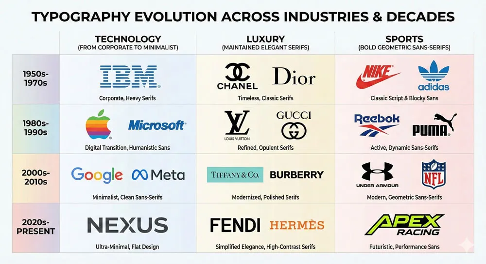
Consider the evolution of technology company branding. In the 1990s, companies like Microsoft and Apple both relied on sans-serif typefaces, but with subtle differences in personality. Apple’s branding emphasized humanist sans-serifs that communicated innovation tempered with human-centered design.
Microsoft’s branding emphasized more geometric sans-serifs that communicated cutting-edge technology and corporate efficiency. Both companies understood that their typeface choices would psychologically position them in specific ways relative to competitors.
Luxury brands reveal another pattern. Fashion houses like Louis Vuitton, Chanel, and Gucci typically employ elegant serif typefaces or custom typefaces with refined proportions. These typeface choices communicate exclusivity and refined taste. The psychological message is clear: we are sophisticated, we have heritage, and our products are for people who understand quality.
Financial institutions like JPMorgan Chase, Goldman Sachs, and the New York Stock Exchange all employ serif typefaces. The psychological message is equally clear: we are established, authoritative, and trustworthy.
Your money is in capable hands. The serif typeface is not making the institution any more trustworthy in reality, but it is psychologically positioning the institution to appear more trustworthy.
Sports brands reveal yet another pattern. Nike, Adidas, and Puma employ strong, geometric sans-serifs that communicate power, athleticism, and forward-thinking innovation. The psychological message: we are dynamic, we are winners, and you can achieve athletic excellence through our products.
The Role of Font Choice in Brand Identity
Font choice is often one of the most neglected elements of brand identity, yet it is also one of the most psychologically powerful. A brand’s typeface choice communicates core values and personality more efficiently than any other design element except color.
This is why brand guidelines are so specific about typeface usage. When a company specifies that the brand typeface is “Helvetica for headlines, Georgia for body text,” they are making a psychological choice about how the brand will be perceived.
They are saying, “We want our headlines to communicate institutional authority and clarity (Helvetica), but we want our body text to feel readable and traditional (Georgia).”
Changing a brand’s typeface is a major undertaking precisely because it changes how the brand is psychologically perceived. When companies like Gap or Firefox redesign their logos and typeface treatments, the change in font psychology often generates significant public reaction—sometimes positive, sometimes negative.
The psychology of font choice is so powerful that changing it can fundamentally alter how people perceive the brand.
Typography and Consumer Trust
Research in marketing psychology has established a clear relationship between typography and consumer trust. In general, consumers trust brands that use typefaces they are familiar with. This is why most established brands do not take radical risks with typography.
They use typefaces like Helvetica, Garamond, or other classic typefaces because these typefaces are familiar and therefore trustworthy.
However, there is a paradox here. Typefaces that are too familiar can feel generic and uninspiring. A brand that uses Helvetica communicates authority and trust, but it also risks appearing unimaginative or corporate in a negative sense.
This is why many contemporary brands attempt to strike a balance—using familiar typeface families or familiar typeface characteristics, but with subtle customization or unusual pairing to communicate both trust and distinction.
The psychology of consumer trust also relates to congruence between typeface and brand values. If a brand communicates that it values innovation, using an excessively traditional serif typeface creates cognitive dissonance that reduces trust.
Conversely, if a brand communicates institutional authority, using a playful or experimental typeface creates similar cognitive dissonance.
The Gotham Effect: Politics and Persuasion
The most famous contemporary example of font psychology in persuasion is Gotham’s role in Barack Obama’s 2008 presidential campaign. Designed by Tobias Frere-Jones and published by the Hoefler & Frere-Jones foundry, Gotham is a geometric sans-serif that combines American roots with contemporary design sensibility.
The Obama campaign chose Gotham for its psychological properties. The typeface communicates optimism, forward-thinking, and American strength. It feels contemporary without being radical; authoritative without being hierarchical; inspirational without being hyperbolic. The choice of Gotham was so successful that it became permanently associated with the Obama brand and the “hope and change” messaging of the 2008 campaign.
Since then, Gotham has been adopted by numerous political campaigns and brands seeking to communicate similar qualities. The typeface has become associated with political optimism and forward-thinking progressivism—associations that emerged from its successful deployment in political persuasion.
The Gotham case study reveals several important principles about font psychology in persuasion:
- Congruence: The typeface aligned perfectly with the campaign’s messaging and values.
- Distinctiveness: While Gotham is a modern typeface, it was not so radical as to alienate mainstream voters.
- Psychological Associations: The typeface triggered subconscious associations with American strength, innovation, and progress.
- Consistency: The typeface was used consistently across all campaign materials, building cumulative psychological impact.
Related Topics:
- Comic Sans – Accessibility & Gatekeeping Critique
- Gotham – Political Design & Elections Power
- Futura – Geometric Modernism Revolution
Web Typography and User Experience Psychology
Screen Fonts vs. Print Fonts
The psychology of typography changes fundamentally when typefaces move from print to screen. Print typography evolved over centuries to optimize for the viewing conditions of printed books and magazines—steady lighting, physical proximity, and stable positioning.
Screen typography must account for very different viewing conditions: variable lighting, variable distance, and dynamic content that changes as users scroll.
In the early days of digital typography, designers simply transferred print typefaces to screens with disappointing results. Typefaces like Times New Roman, optimized for printed books, looked jagged and difficult to read on screen due to the limited resolution of digital displays.
This led to the development of screen-optimized typefaces like Verdana and Georgia, specifically designed by Matthew Carter to remain legible and readable at small sizes on low-resolution screens.
The psychology of screen typography emphasizes efficiency and speed. Print reading is typically a sustained activity—you read a book for hours. Screen reading is typically fragmented—you scan, you skim, you jump between pages.
Screen typefaces therefore prioritize legibility and rapid character recognition over the aesthetic qualities that make print typography beautiful.
Readability on Small Screens
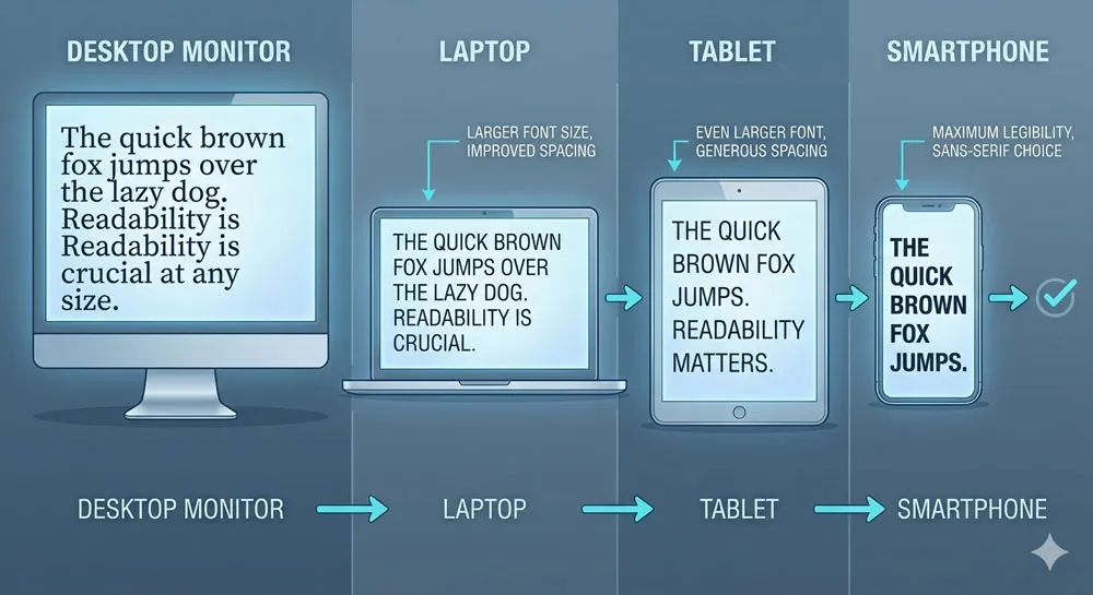
The rise of mobile devices has fundamentally changed typography psychology. Text that is comfortable to read on a large desktop monitor becomes cramped and difficult on a 5-inch smartphone screen.
This shift has driven the adoption of sans-serif typefaces for digital design and the development of variable fonts that automatically adjust their proportions based on viewing conditions.
The psychology of small-screen typography is about recognition and comfort under constraint. When text is small, legibility becomes paramount. Serif typefaces, which are beautiful in print and comfortable in large sizes on desktop screens, often become difficult to read at small sizes on mobile devices because their delicate serifs disappear or become pixelated.
This is why virtually all contemporary digital design guidelines recommend sans-serif typefaces for mobile screens. Sans-serif typefaces maintain legibility and readability at small sizes and on low-resolution displays.
They are the best choice not because they are aesthetically superior, but because they are psychologically optimized for the constraints of small-screen viewing.
Font Size, Color, and Cognitive Load
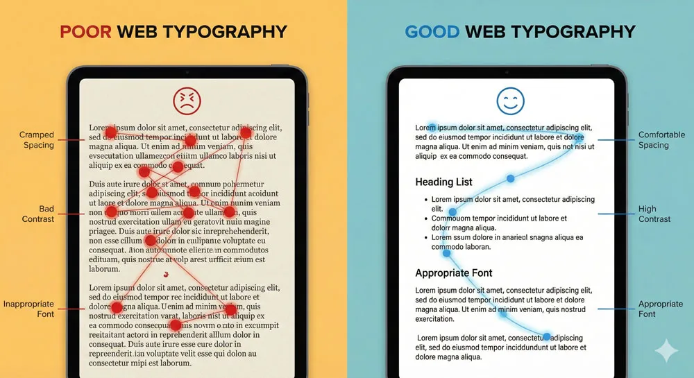
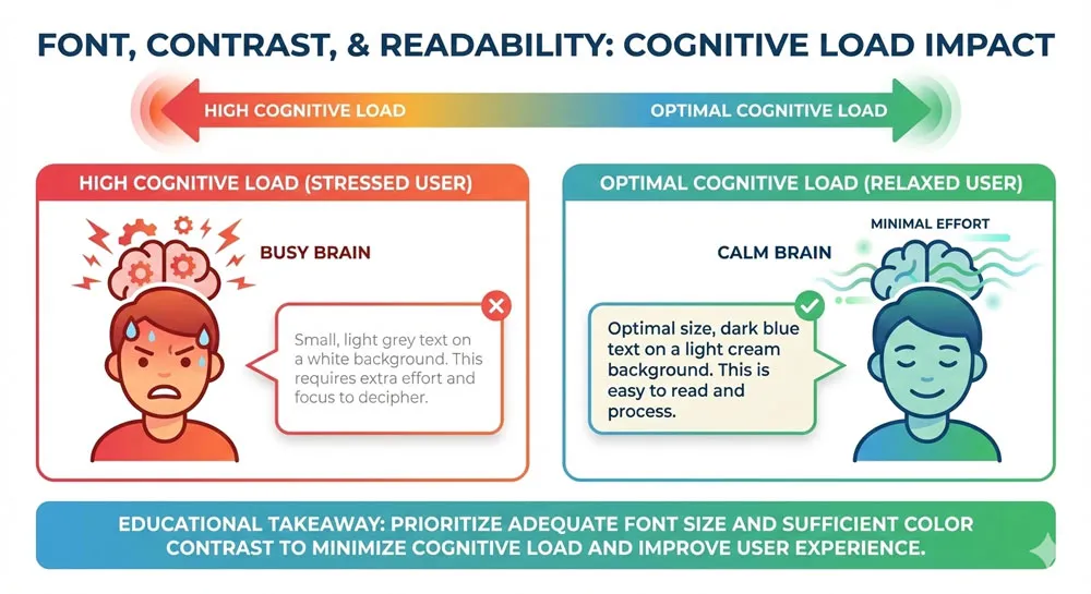
The psychology of web typography also involves the interaction between typeface, font size, and color. A typeface that is perfectly readable in 12pt black text on white background might become difficult to read when sized at 8pt or when displayed in light gray on a light background.
Font size has psychological implications beyond mere readability. Large text communicates importance and demands attention. Small text communicates subordination and secondary importance.
This is why calls-to-action are typically set in larger font sizes than supporting text. The larger size communicates that this is the primary message; smaller supporting text communicates that this is secondary information.
Color also interacts psychologically with typeface choice. High-contrast color combinations (black text on white background, white text on dark background) are easier to read but can feel harsh and clinical.
Lower-contrast combinations (dark gray on light gray, light text on medium backgrounds) are slightly more difficult to read but often feel more aesthetically refined and easier on the eyes. The psychological trade-off is between legibility and comfort.
The Psychology of Scrolling and Line Length
Contemporary web design has revealed important psychological truths about line length and reading behavior. The optimal line length for reading sustained text is approximately 50-75 characters per line.
When lines are longer, the reader’s eyes have difficulty tracking from the end of one line to the beginning of the next. When lines are shorter, the reader experiences too many line breaks, which disrupts the reading flow.
This is not merely a technical constraint; it is a psychological one. When line length is optimal, readers enter a flow state and comprehension improves. When line length is suboptimal, readers experience cognitive strain and their attention wavers.
The rise of responsive web design has brought renewed attention to line length psychology. Designers must ensure that text remains within optimal line-length ranges across all device sizes.
This often requires adjusting font size, margins, and column width based on the viewing device. The goal is to maintain the psychological conditions for comfortable, uninterrupted reading.
Related Topics:
- Gill Sans – Humanist Alternative Modernism
- Baskerville – Print Excellence & Love Story
- Bodoni – Theatrical Prestige Aesthetics
The Psychology of “Bad” Fonts: Comic Sans and Beyond
Why We Love to Hate Comic Sans
No contemporary font has become more culturally iconic—or more culturally despised—than Comic Sans. Designed in 1994 by Vincent Connare for Microsoft’s Bob software project, Comic Sans was intended to be a friendly, approachable typeface for non-technical users. The design was successful—it achieved the goal of feeling warm, informal, and accessible.
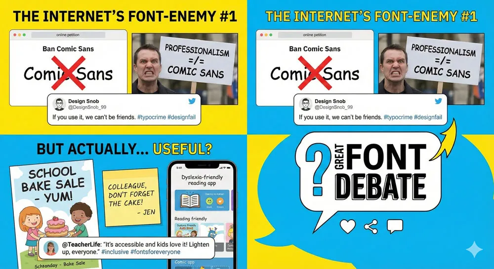
Yet Comic Sans became the subject of a massive internet hate campaign. Websites dedicated to banning Comic Sans appeared. Design professionals expressed public disgust at its proliferation. Comic Sans became a symbol of poor typography, amateur design, and cultural bad taste.
The psychology of Comic Sans hatred reveals important truths about font psychology in general. Comic Sans is not inherently “bad” in a technical sense. It is legible, it is functional, and it is particularly well-regarded by specialists who work with dyslexic readers because its letterforms are distinct and unambiguous. The hatred of Comic Sans is not about technical shortcomings; it is about contextual inappropriateness and cultural snobbery.
Comic Sans triggers psychological revulsion when used in contexts where it seems inappropriate. A doctor’s office using Comic Sans in a medical brochure triggers cognitive dissonance: the serious, clinical content is undermined by a typeface designed to communicate friendliness and informality.
A funeral home using Comic Sans on a gravestone triggers similar cognitive dissonance: the gravity of the occasion is undermined by a typeface designed to feel playful.
However, Comic Sans is entirely appropriate in certain contexts. When used in children’s books, on candy packaging, or in informal, playful communications, Comic Sans is perfect. It communicates exactly what these contexts call for: friendliness, warmth, and informality.
The psychology of Comic Sans hatred also involves cultural and class dimensions. Design professionals developed a shared cultural narrative that Comic Sans is “bad,” and this narrative became self-reinforcing.
Once a font becomes culturally coded as “bad,” people are primed to dislike it and to interpret its use as evidence of poor design judgment, regardless of context. This is a powerful example of how font psychology is not merely individual—it is cultural and socially constructed.
Context Matters: When Bad Fonts Become Appropriate
The Comic Sans example illuminates a broader principle: there are no universally “bad” fonts, only contextually inappropriate fonts. Vincent Connare himself has articulated this perspective with characteristic humor:
“If you love Comic Sans, you don’t know much about typography. If you hate it, you really don’t know much about typography either, and you should get another hobby.”
A typeface that is entirely inappropriate for a luxury brand is perfectly appropriate for a children’s restaurant. A typeface that is too playful for a legal document might be exactly right for a wedding invitation.
The psychology of “bad” fonts is really the psychology of contextual mismatch—the typeface does not align with the psychological and cultural meaning of the content.
This principle has important implications for designers. Rather than thinking of fonts as inherently “good” or “bad,” it is more useful to think of fonts as contextually appropriate or inappropriate.
The right question is not “Is this a good font?” but rather “Is this font appropriate for this specific context, audience, and communication goal?”
Other Controversial Typefaces and Their Psychology
While Comic Sans is the most famous example of a controversial typeface, other fonts have generated similar cultural reactions:
Papyrus is frequently derided by designers for being overused and inappropriate in most professional contexts. Yet it is entirely appropriate for certain contexts—tropical restaurants, vacation resorts, casual outdoor contexts. The cultural hatred of Papyrus is similar to the hatred of Comic Sans: once the font became coded as “bad,” people began interpreting all instances of its use as evidence of poor design judgment.
Souvenir was wildly popular in the 1970s but is now viewed as dated and retro. Interestingly, contemporary designers sometimes deliberately use Souvenir to communicate exactly that sense of 1970s nostalgia. The same typeface that was considered “bad” becomes acceptable when its dated quality is intentional and contextually appropriate.
Impact is often used inappropriately in design contexts but is entirely appropriate for its original purpose—creating high-visibility signage and headlines where maximum legibility is required. The psychology of Impact is that it communicates urgency and demands immediate attention.
Lessons from Typography Fails
The cultural narratives around “bad” fonts offer important lessons for designers:
- Context is everything: The appropriateness of a typeface depends entirely on the context, audience, and communication goal. No font is universally bad or good.
- Cultural narratives shape perception: Once a font becomes culturally coded as “bad,” people interpret all instances of its use negatively, regardless of whether the use is contextually appropriate.
- Class and snobbery are involved: Some of the hatred directed at fonts like Comic Sans involves aesthetic snobbery and professional gatekeeping. Design professionals’ shared narratives about “bad” fonts are not merely technical judgments; they are cultural judgments that often involve class dimensions.
- Emotional associations matter: Fonts trigger emotional associations based on past experiences, cultural conditioning, and personal taste. These emotional associations are powerful and often operate beneath conscious awareness.
- Intention matters: A deliberately ironic or nostalgic use of a “bad” font is experienced very differently from an unintentional, contextually inappropriate use of the same font.
Related Topics:
- Garamond – Classical Foundation Principles
- Worst Fonts – Criticism & Gatekeeping Analysis
- Gill Sans & The Tube – Urban Identity Infrastructure
Cultural and Historical Context in Typography
How History Shapes Our Font Preferences
Every typeface carries historical weight. A typeface that feels “old-fashioned” to a contemporary viewer does so not because there is anything inherently old about letterforms, but because that typeface was designed in an earlier era and carries visual characteristics that remind us of that era.
This historical awareness shapes our font preferences in profound ways. Typefaces from the 1970s carry psychological associations with that era. When designers use Futura (originally designed in 1927 but popularized again in mid-century modernism), they are drawing on associations with 1950s-60s optimism and technological progress. When designers use Souvenir (originally designed in 1914 but popularized in the 1970s), they are drawing on associations with 1970s retro aesthetic.
The psychology of historical association is powerful because it operates largely outside conscious awareness. A viewer who did not experience the 1970s might still feel a psychological sense of “retro” when seeing Souvenir because they have absorbed cultural associations with that typeface through media, design, and cultural narratives.
Typography Across Cultures
Font psychology also varies significantly across cultures. A typeface that communicates authority and formality in Western contexts might communicate different qualities in non-Western contexts.
This is because cultural associations with letterforms, serifs, and geometric shapes vary based on cultural history and aesthetic traditions.
For example, typefaces with very thick, heavy strokes might communicate power and authority in Western design traditions, but they might trigger different associations in cultures with different calligraphic traditions.
Similarly, serif typefaces carry different psychological weight depending on a culture’s history with written language and printing traditions.
This creates challenges and opportunities for global brands. When a company operates across multiple cultures, it must decide whether to use the same typeface globally (which makes the brand consistent but might trigger culturally specific misunderstandings) or to use culturally adapted typefaces (which might better fit local contexts but might make the brand feel less consistent globally).
The Psychology of Novelty vs. Familiarity
There is a fundamental tension in font psychology between novelty and familiarity. Familiar typefaces are psychologically comfortable and trustworthy—they reduce cognitive load and enable deep processing of content. Novel typefaces capture attention and create a sense of distinctiveness and creativity.
Most successful brands navigate this tension by using familiar typeface families with subtle customization. For example, a brand might use Helvetica (a familiar, comfortable typeface) but modify the letterforms slightly to create custom details that make the font distinctive. This approach preserves the psychological benefits of familiarity while adding uniqueness.
The psychology of novelty vs. familiarity also relates to the life cycle of typefaces. When a typeface is first designed, it might feel radically novel and distinctive. As it becomes widely adopted and familiar, it begins to feel normal and eventually dated.
Contemporary designers often resist using typefaces that have become too familiar because they feel generic. Yet these “generic” typefaces might be precisely the right choice for contexts where trust and clarity matter more than distinctiveness.
Why Certain Fonts Feel “Expensive” or “Cheap”
One of the most interesting phenomena in font psychology is the perception that certain fonts communicate luxury and sophistication while others communicate cheapness or lack of taste. This perception is not based on any technical property of the fonts themselves; rather, it emerges from cultural associations and psychological congruence.
Fonts feel “expensive” when they are associated with luxury brands, premium publications, and high-end design contexts. Thin, elegant serif typefaces like Didot or Bodoni feel expensive because they are frequently used in luxury fashion branding. Fonts feel “cheap” when they are associated with discount retailers, low-end mass production, or amateur design.
Importantly, these associations are not fixed. A font’s perception of luxury or cheapness can change over time as its cultural associations change. Comic Sans was considered sophisticated when it was designed and in its early applications. It only became coded as “cheap” or “bad” after the internet hate campaign.
Related Topics:
- Baskerville & Mrs. Eaves – Love, Partnership & Revival
- Futura & Paul Renner – Geometric Vision & Revolution
- Legibility vs. Readability – Typography Fundamentals
Practical Applications: Choosing the Right Font for Your Project
Defining Your Brand Personality
The first step in making strategic font choices is to clearly define your brand personality. What are your core values? How do you want to be perceived? What emotions do you want to trigger in your audience?
If your brand values sophistication, heritage, and established reputation, serif typefaces like Garamond or Baskerville are appropriate choices.
If your brand values innovation, efficiency, and forward-thinking progress, sans-serif typefaces like Gotham or a contemporary geometric sans-serif are appropriate choices.
If your brand values warmth, approachability, and human connection, humanist sans-serifs like Gill Sans are appropriate choices.
This does not mean that your brand personality must perfectly match a single typeface personality. Clever designers often create distinction by choosing typefaces that are slightly unexpected but still psychologically appropriate for the context.
For example, a technology company might choose an elegant serif typeface to communicate that technology can be refined and beautiful, not just efficient and functional.
Matching Fonts to Your Audience
Different audiences have different psychological associations with and preferences for typefaces. Young, digital-native audiences often prefer contemporary sans-serif typefaces and are more tolerant of experimental, playful fonts. Older, print-literate audiences often prefer familiar serif typefaces and might find experimental fonts off-putting.
Understanding your audience’s demographic characteristics, cultural background, and aesthetic preferences is crucial for making effective font choices.
A typeface that resonates with a creative, design-conscious audience might alienate a conservative, traditional audience. Conversely, a typeface that communicates trust to an older demographic might seem boring and generic to younger audiences.
This does not mean you should always choose the typeface that your audience most prefers. Sometimes effective communication requires slightly challenging your audience’s expectations—using a typeface that is slightly unexpected but still psychologically appropriate for your context.
However, this approach carries risk and should be undertaken deliberately, not accidentally.
The Psychology of Font Pairing
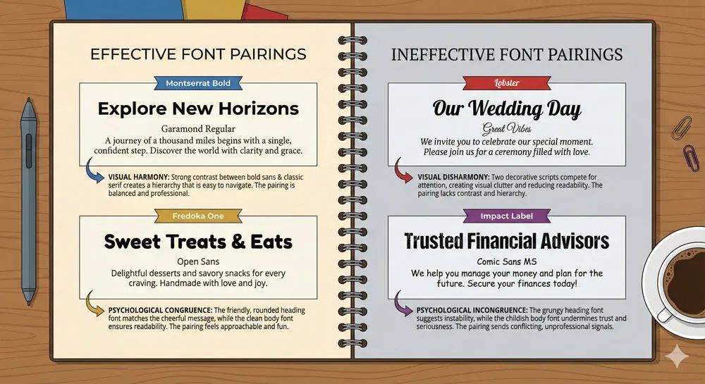
Choosing a single font is one thing; choosing a pair of complementary fonts is a more complex psychological exercise. The goal of effective font pairing is usually to create hierarchy and visual interest while maintaining overall coherence.
The traditional approach to font pairing is to combine fonts from different families with contrasting visual characteristics. Pairing a serif headline font with a sans-serif body font, or a geometric sans-serif with a humanist sans-serif, creates visual contrast that helps differentiate different content types.
However, the psychology of font pairing is more subtle than mere visual contrast. Effective font pairs share certain psychological qualities while differing in others. For example, a pair of Futura (geometric, modern, formal) and Verdana (humanist, modern, accessible) share modernity but contrast in their formal-casual and geometric-humanist dimensions. This creates visual interest while maintaining overall coherence.
Ineffective font pairs are often those where the typefaces have conflicting psychological messages. Pairing Helvetica (modern, corporate, neutral) with Papyrus (historical, casual, organic) creates cognitive dissonance because the typefaces are communicating conflicting messages about the brand’s identity.
Testing and Iteration: The User’s Perspective
The final step in making effective font choices is testing with actual users. Designers’ intuitions about font psychology are often biased by their professional training and aesthetic preferences. Testing with real users reveals whether the typeface choices are actually communicating the intended messages.
A/B testing can reveal whether users perceive a brand differently when presented with different typefaces. Eye-tracking studies can reveal whether users are reading efficiently and comfortably. Surveys and interviews can reveal what emotions and associations users associate with different typefaces.
This user-centered approach to font psychology acknowledges that font psychology is not merely individual—it is social and cultural. A typeface’s psychological impact emerges through interaction between the designer’s intention, the typeface’s visual characteristics, and the viewer’s cultural background, personal experience, and aesthetic preferences.
Testing with real users ensures that the designer’s intentions actually align with user perception.
Related Topics:
FAQ: Common Questions About Font Psychology
Q: Does serif vs. sans-serif really matter?
A: Yes, but the effect is subtle and contextual. Serif typefaces are traditionally associated with formality and tradition, while sans-serif typefaces are associated with modernity and clarity. However, these associations are culturally constructed and can be subverted through clever design choices. What matters most is congruence between the typeface choice and the intended message.
Q: Can a font make my brand look professional?
A: A professional typeface choice can contribute to a professional overall impression, but it is not sufficient on its own. Professional design involves many elements beyond typography—color, layout, hierarchy, and visual clarity. Typography is one important component of professional design, but it is not a substitute for thoughtful overall design strategy.
Q: What is the best font for readability?
A: There is no universally “best” font. Readability depends on context—screen vs. print, large vs. small sizes, technical vs. literary content. For web content, sans-serif typefaces generally perform better than serif typefaces at small sizes. For long-form printed text, serif typefaces have traditionally been preferred. Test your specific font choices with your actual audience in your actual context.
Q: Should I use trendy fonts?
A: Trendy fonts can communicate that your brand is contemporary and aware of current design trends. However, trendy fonts also risk looking dated quickly as design trends evolve. Consider whether you are building a brand that should feel permanently contemporary (in which case trendy fonts are risky) or a campaign that is explicitly time-bound (in which case trendy fonts might be appropriate).
Q: How many fonts should I use?
A: The general rule is 2-3 fonts maximum. Too many fonts create visual chaos and undermine hierarchy. However, this is a principle, not a rule. Some sophisticated design systems use more fonts intentionally to create rich visual variety. The key principle is intentionality—every font should serve a specific purpose and contribute to overall coherence.
Q: Does font size matter as much as font choice?
A: Font size often matters more than font choice. A typeface that is too small to read comfortably undermines all the psychology of typeface choice. Conversely, appropriate font sizing can make even modest typeface choices feel more legible and comfortable. The psychology of typography involves the interaction of many factors beyond the typeface itself.
Q: Can I use Comic Sans?
A: Yes, in appropriate contexts. Comic Sans is a legitimate typeface with specific psychological properties that make it appropriate for certain applications. The question is not whether Comic Sans is good or bad, but whether it is appropriate for your specific context and intended audience. Use it intentionally, not accidentally.
Q: How do I know if my font choice is working?
A: Test with real users. Ask them what emotions the typeface evokes, whether it is comfortable to read, whether it seems appropriate for the content, and whether it aligns with their perception of your brand. Pay attention to their spontaneous comments—do they notice or appreciate the font, or does it fade into the background? Different contexts call for different results.
Related Topics:
Conclusion: Typography as a Silent Persuader
When Steve Jobs sat in that calligraphy class at Reed College decades ago, he did not imagine that his casual interest in letterforms would transform the world of typography.
Yet his choice to embed font choice directly into the Macintosh operating system created a democratization of typography that changed everything.
Suddenly, everyone was a typographer. Everyone had opinions about fonts. Everyone recognized that typefaces were communicating something beyond the literal meaning of words.
This comprehensive exploration of font psychology reveals that typography is far more powerful than most people realize. Every time you choose a typeface, you are making a psychological choice.
You are selecting a voice, a personality, a promise to your audience. You are communicating not just through words, but through the visual characteristics of those words.
Font psychology operates at the intersection of psychology, culture, history, and design. Typefaces are not neutral vessels for text; they are active participants in meaning-making. A serif typeface communicates tradition and authority. A sans-serif typeface communicates modernity and clarity. A playful typeface communicates warmth and approachability. These psychological associations emerge through a complex interaction of visual characteristics, historical context, cultural conditioning, and individual experience.
Understanding font psychology makes you a more strategic communicator. Whether you are designing a brand identity, writing a blog, creating marketing materials, or simply choosing a typeface for a document, conscious awareness of font psychology helps you make intentional choices that align with your communication goals. You are no longer choosing fonts randomly or habitually; you are choosing fonts strategically, with full awareness of their psychological impact.
Font psychology also reminds us that design is never neutral. Every design choice is a choice about what to communicate, what to emphasize, and what emotions to evoke. Typography is a silent persuader—it communicates its messages so efficiently and unobtrusively that viewers often fail to consciously notice it. Yet this invisibility is precisely what makes typography so powerful. It shapes our perception and behavior without our full awareness.
As you move forward in your design practice, creative endeavors, or everyday choices about how to communicate, remember the power of typography. Choose your fonts with intention. Consider the context, your audience, and your communication goals. Think about what emotions you want to evoke and what associations you want to build. Test your choices with real users and iterate based on feedback.
And remember: there are no universally “good” or “bad” fonts, only contextually appropriate or inappropriate ones. A font is bad only when it undermines your intended communication. A font is good when it supports your intended message and psychological goals. Typography matters because every letter you choose is a choice about how you want to be perceived, what you want to communicate, and what you want your audience to feel.
Related Topics:
About the Author
Lalit M. S. Adhikari is a Digital Nomad and Educator since 2009 in design education, graphic design and animation. He’s taught 500+ students and created 200+ educational articles on design topics. His teaching approach emphasizes clarity, practical application and helping learners.
Learn more about Lalit Adhikari.
This guide is regularly updated with the latest information about Adobe tools and design best practices.
Related Topics:


