You’ve decided to design a logo. Maybe it’s for your new business, a client project or just to build your design skills. You’ve heard Adobe Illustrator is the industry standard for logo design but staring at that blank artboard can feel overwhelming.
Where do you even start? I’ve been teaching logo design for more than a decade now and I’ve guided hundreds of students through their first logo projects.
Here’s what I tell them on day one: Logo design isn’t about being an artistic genius. It’s about understanding a process, using the right tools and making thoughtful decisions at each step.
This tutorial walks you through the complete process—from understanding what makes a good logo, to planning your concept, to building it step-by-step in Illustrator, to exporting professional files.
By the end, you’ll have created a real, usable logo and understood the principles behind every decision you made.
My name is Lalit Adhikari and we are at LTY. Let’s begin!
Table of Contents
Understanding Logo Fundamentals (Before Opening Illustrator)
Before you touch a single tool in Illustrator, you need to understand what you’re actually creating.
What Makes a Good Logo?
A logo isn’t just “cool artwork.” It’s a strategic design tool that must work across dozens of contexts. Professional logos share these characteristics:
Simplicity
- Recognizable at a glance
- Works at thumbnail size (favicon, app icon)
- Easy to remember after one viewing
- Minimal elements, maximum impact
Versatility
- Works in full color, black and white, and grayscale
- Scales from business card to billboard without losing clarity
- Works on light and dark backgrounds
- Functions in square, horizontal and vertical layouts
Appropriateness
- Matches the industry and brand personality
- Appeals to the target audience
- Conveys the right emotional tone
- Feels professional, not amateurish
Memorability
- Distinctive enough to stand out from competitors
- Has a unique element or twist
- Creates an impression that lasts
- Tells a story or communicates meaning
Timelessness
- Not overly dependent on current design trends
- Will still look good in 5-10 years
- Classic principles over trendy effects
- Substance over style
Why Illustrator? Understanding Vector Graphics
Here’s the critical concept: Logos must be vector-based, not pixel-based.
Vector graphics are made of mathematical paths and anchor points. You can scale them infinitely—from a tiny favicon to a building-sized banner—and they remain perfectly crisp.
Raster graphics (like photos) are made of pixels. Scale them up and they become blurry and pixelated.
Illustrator creates vectors. Photoshop works with pixels. That’s why every professional logo is designed in Illustrator.
Real-world example: Your logo needs to work at 16×16 pixels (favicon) and 50 feet wide (trade show banner). Only vectors can do both perfectly.
The Five Types of Logos
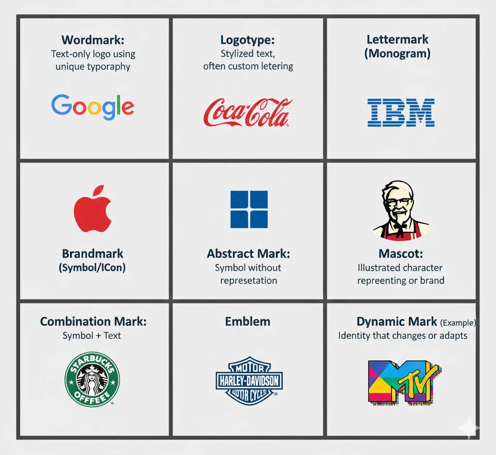
Before you design, choose which type fits your project:
Wordmark (Logotype)
- The brand name as the logo
- Examples: Google, Coca-Cola, FedEx
- Best for: Distinctive brand names, name recognition priority
Lettermark (Monogram)
- Initials or abbreviated letters
- Examples: IBM, HBO, NASA
- Best for: Long company names, established brands
Brandmark (Symbol/ Icon/ Abstract)
- Symbol without text
- Examples: Apple, Nike swoosh, Twitter bird
- Best for: Established brands with strong recognition
Emblem
- Text inside a shape or badge
- Examples: Starbucks, Harley-Davidson, NFL teams
- Best for: Traditional industries, clubs, government
Combination Mark
- Text + symbol together
- Examples: Adidas, Burger King, Lacoste
- Best for: New brands building recognition (most versatile)
For beginners, I recommend starting with a combination mark. It’s versatile, professional, and teaches you both typography and iconography skills.
Related Topics:
Planning Your Logo: Research, Sketching and Concept Development
The worst mistake beginners make is opening Illustrator immediately and “seeing what happens.” Professional logo design starts on paper, not on screen.
Step 1: Understand the Brand (The Design Brief)
Before drawing anything, answer these questions:
About the Business
- What does this company do?
- What products or services do they offer?
- What makes them different from competitors?
- What’s their history or founding story?
About the Audience
- Who are the primary customers?
- What age range, demographics, interests?
- What matters to them? (price, quality, speed, luxury, etc.)
- Where will they see this logo most often?
About the Brand Personality
Choose 3-5 adjectives that describe the brand:
- Modern or Traditional?
- Playful or Serious?
- Luxury or Accessible?
- Bold or Subtle?
- Innovative or Established?
Practical Requirements
- Any mandatory colors or elements?
- Any colors or styles to avoid?
- Where will the logo be used most? (website, packaging, signage)
- Are there any existing brand elements to incorporate?
Step 2: Research and Create a Moodboard
Professional designers don’t design in a vacuum. They research.
Collect 15-20 visual references
- Logos in the same industry
- Logos with similar personality traits
- Typography you like
- Color palettes that feel appropriate
- Shapes and forms that resonate
Create a digital moodboard
- Use Pinterest, Milanote, or a simple folder of saved images
- Look for patterns: Do you gravitate toward geometric or organic shapes?
- Note what you like: “clean sans-serif fonts” or “circular shapes” or “limited color palettes”
Competitive analysis
- Look at 5-10 direct competitors’ logos
- Identify opportunities: What style is oversaturated in the industry?
- Find the gap: How can your logo stand out while still fitting the category?
Step 3: Sketch on Paper (The Most Important Step)
This step separates amateurs from professionals.
Why sketch first
- Paper is faster than Illustrator
- You focus on ideas, not tools
- You generate more concepts in less time
- You solve problems before you invest time in execution
How to sketch effectively
- Set a timer for 30 minutes
- Draw 15-20 rough thumbnails (small, 1-2 inches each)
- Don’t judge, just explore:
- Try different letter combinations
- Experiment with negative space
- Combine shapes in unexpected ways
- Play with symmetry and asymmetry
- No details yet: Stick figures and simple shapes only
- Circle your top 3-5 favorites
- Refine those 3-5 into larger, more detailed sketches
Common beginner mistake: Spending 2 hours perfecting one sketch. Don’t. Generate volume first, refine later.
Step 4: Choose One Direction to Execute
From your sketches, pick ONE concept to build in Illustrator.
How to choose
- Which concept is simplest but most memorable?
- Which one works at small sizes?
- Which feels most appropriate for the brand?
- Which one excites you most?
Don’t try to combine multiple concepts. Commit to one and execute it well.
Related Topics:
Setting Up Your Illustrator Workspace for Logo Design
Now we open Illustrator. Finally.
Creating a New Document
- Open Adobe Illustrator
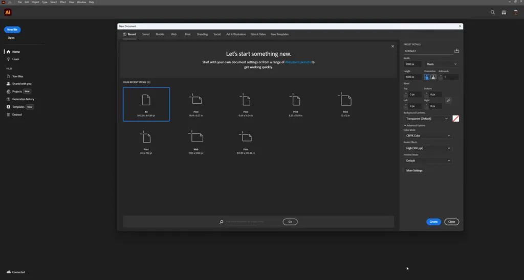
- Go to File → New (or press Ctrl/Cmd + N)
- In the New Document dialog:
- Width: 1000 px
- Height: 1000 px
- Units: Pixels
- Color Mode: RGB (for digital-first projects) or CMYK (if primarily for print)
- Raster Effects: High (300 ppi)
- Artboards: Start with 1, we’ll add more later
- Click Create
Why these settings
- 1000×1000 px gives you plenty of space to work
- Square format works well for initial design
- RGB for screen, CMYK for print (you can convert later)
- Multiple artboards come later for variations
Setting Up Your Workspace
Show essential panels
- Window → Layers (organize elements)
- Window → Pathfinder (combine shapes)
- Window → Align (align objects precisely)
- Window → Color and Window → Swatches (manage colors)
Enable helpful views
- View → Rulers (Ctrl/Cmd + R) – shows rulers for measurement
- View → Show Grid (Ctrl/Cmd + ‘) – optional alignment grid
- View → Smart Guides (Ctrl/Cmd + U) – shows alignment hints
Importing Your Sketch (Optional but Recommended)
If you have a sketch you want to trace:
- Scan or photograph your sketch
- Go to File → Place
- Select your sketch image
- Click on the artboard to place it
- In the Layers panel, lock that layer and reduce opacity to 50%
- Create a new layer above it for your vector work
This gives you a guide to trace over while building clean vectors.
Related Topics:
Essential Illustrator Tools Every Logo Designer Must Know
Let me introduce you to the 8 tools you’ll use for 90% of logo design.
Selection Tool (V) [The Black Arrow]
What it does: Selects and moves entire object(s).
When to use it
- Moving shapes around the artboard
- Selecting multiple objects
- Transforming entire objects (scale, rotate)
Shortcut: Press V
Direct Selection Tool (A) [The White Arrow]
What it does: Selects individual anchor points and path segments.
When to use it
- Editing specific points on a shape
- Adjusting curves and handles
- Fine-tuning shapes after creation
Shortcut: Press A
Key difference: Black arrow selects whole objects. White arrow selects parts of objects.
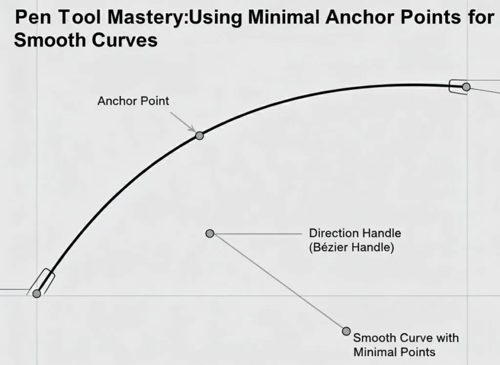
Pen Tool (P) – The Most Powerful Tool
What it does: Creates custom paths and shapes.
How to use it
- Click to create straight line segments
- Click and drag to create curves (Bezier curves)
- Close the path by clicking on the starting point
- Use as few anchor points as possible for smooth curves
The secret: Great logo designers use minimal points. More points = messier curves.
Practice exercise: Try drawing a simple leaf shape with only 4 anchor points.
Shape Tools – Your Building Blocks
Rectangle Tool (M)
- Click and drag to draw rectangles
- Hold Shift to create perfect squares
- Essential for geometric logos
Ellipse Tool (L)
- Click and drag to draw ovals
- Hold Shift to create perfect circles
- Great for icons and circular badges
Polygon Tool
- Creates triangles, hexagons, etc.
- Double-click to set number of sides
- Perfect for geometric designs
Star Tool
- Creates stars with adjustable points
- Hold Ctrl/Cmd while dragging to adjust inner radius
- Useful for badges and decorative elements
Type Tool (T) – For Text
What it does: Creates and edits text.
Key operations
- Click once to start text
- Click and drag to create a text box
- Change font, size, and spacing in the Character panel
- Convert to outlines (Type → Create Outlines) when done editing
Important: Always work with live text until you’re completely done. Once you convert to outlines, you can’t edit the text anymore.
Pathfinder Panel – Shape Combinations
What it does: Combines shapes in powerful ways.
Essential operations
- Unite: Merges multiple shapes into one.
- Example: Two overlapping circles become one combined shape
- Minus Front: Subtracts top shape from bottom.
- Example: Small circle over large circle creates a donut
- Intersect: Keeps only overlapping areas.
- Example: Two circles create a lens shape
- Divide: Splits overlapping shapes into separate pieces
- Example: Grid of shapes becomes individual segments
Pro tip: Always duplicate shapes before using Pathfinder in case you need to undo.
Stroke and Fill Controls
Fill: The inside color of a shape.
Stroke: The outline/border of a shape.
Key shortcuts
- X – Switch between fill and stroke
- / – No fill or stroke
- Shift + X – Swap fill and stroke colors
Logo design tip: Most professional logos use no stroke, only fills. Strokes can create scaling issues.
Transform Tools
Rotate Tool (R)
- Click on object, then click again to set rotation center
- Drag to rotate freely or hold Shift for 45° increments
Scale Tool (S)
- Resize objects from a center point
- Hold Shift to scale proportionally
Reflect Tool (O)
- Create mirror images
- Essential for symmetrical logos
Related Topics:
Step-by-Step: Creating Your First Logo (Complete Walkthrough)
Let’s create a complete logo together. I’ll use a fictional brand as an example: “Peak Coffee” – a premium coffee roaster targeting outdoor enthusiasts.
Brand personality: Adventure, quality, natural, energetic.
Logo type: Combination mark (icon + wordmark)
Concept: Mountain peak combined with coffee elements
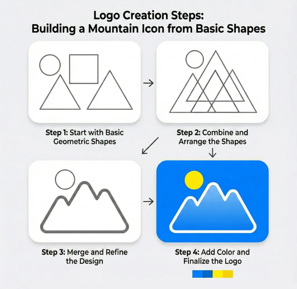
Step 1: Create the Icon Foundation
Building a mountain shape
- Select the Pen Tool (P)
- Click to create the mountain outline:
- Start at bottom left
- Click at peak (top center)
- Click at bottom right
- Click back at starting point to close the path
- You now have a simple triangle mountain
Refining the shape
- Switch to Direct Selection Tool (A)
- Select the top point (the peak)
- Drag it slightly to the right to make it feel more natural (mountains aren’t perfectly centered)
- Select one of the bottom points and drag to widen the base
Adding detail
- Select the Pen Tool again
- Draw a second, smaller mountain peak overlapping the first
- This creates depth and visual interest
Step 2: Combine Shapes with Pathfinder
- Select both mountain shapes
- Open Window → Pathfinder
- Click Unite to merge them into one shape
- You now have a unified mountain icon
Step 3: Add a Coffee Element
Creating a simple coffee bean
- Select the Ellipse Tool (L)
- Hold Shift and drag to create a perfect circle
- With Direct Selection Tool (A), click the right anchor point
- Convert to Corner (click the corner widget that appears)
- Repeat on the left point
- You now have a leaf/bean shape
Adding the center line
- Use the Pen Tool to draw a curved S-shape down the center
- This represents the coffee bean’s characteristic line
Positioning
- Scale the coffee bean small (about 1/3 the size of the mountain)
- Position it integrated into the mountain design (maybe replacing the peak, or nestled below)
Step 4: Final Icon Composition
- Select all icon elements
- Use Align panel to center them properly
- Group them together (Ctrl/Cmd + G)
- Name this group “Icon” in the Layers panel
Your icon is complete. It’s simple, recognizable, and communicates the brand (coffee + outdoor/mountain).
Step 5: Add the Wordmark
Creating the text
- Select Type Tool (T)
- Click on the artboard and type “PEAK”
- Select a strong, modern sans-serif font (try Montserrat Bold, Futura, or similar)
- Increase font size to approximately match the icon height
- Set tracking (letter spacing) to 50-100 for a more spacious, premium feel
Adding the subtitle
- Create a new text box and type “COFFEE”
- Use the same font but in a lighter weight
- Make it smaller (about 60% of “PEAK” size)
- Increase tracking even more (100-150)
Step 6: Arrange Icon and Text
Creating the primary horizontal layout
- Position the icon on the left
- Place “PEAK” to the right of the icon
- Place “COFFEE” below “PEAK”, aligned left with it
- Leave comfortable space between icon and text (approximately half the icon width)
Alignment
- Select icon and “PEAK”
- Use Align panel → Vertical Align Center
- Visually check that everything feels balanced
Step 7: Refine Spacing and Proportions
This is where design sense comes in:
- Does the icon feel too big or too small relative to text?
- Is there enough space between elements?
- Does it feel balanced, or does one side feel heavier?
- Try moving elements slightly and see what feels better
Professional tip: Sometimes “optically balanced” isn’t mathematically centered. Trust your eye.
Related Topics:
Typography in Logo Design: Choosing and Customizing Fonts
Typography can make or break your logo. Here’s how to get it right.
Choosing the Right Font
For beginners, follow these guidelines
Sans-serif fonts (no decorative ends):
- Modern, clean, versatile
- Examples: Montserrat, Poppins, Futura, Gotham
- Best for: Tech, modern brands, clean aesthetics
Serif fonts (with decorative ends):
- Traditional, established, sophisticated
- Examples: Playfair Display, Garamond, Bodoni
- Best for: Law firms, luxury brands, traditional businesses
Script fonts:
- Elegant, personal, decorative
- Examples: Pacifico, Allura, Satisfy
- Best for: Boutiques, salons, artisan brands
- Warning: Often overused and hard to read at small sizes
Display fonts:
- Unique, decorative, attention-grabbing
- Custom or highly stylized
- Best for: When you need maximum personality
- Warning: Can date quickly, use sparingly
Logo design rule: If in doubt, choose a clean sans-serif. You can’t go wrong.
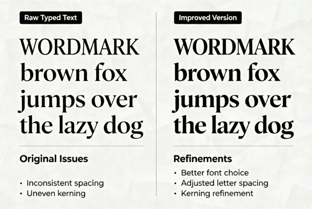
Adjusting Typography
Never use a font at default settings. Always customize:
Tracking (Letter Spacing)
- Increase tracking for a more premium, spacious feel
- Decrease tracking for compact, energetic feel
- Logo average: +50 to +150 tracking
Kerning (Space Between Specific Letter Pairs)
- Some letter combinations look awkward (AV, WA, To, etc.)
- Manually adjust space between problem pairs
- Use Alt/Option + Left/Right arrows for fine control
Leading (Line Spacing)
- Only matters if your wordmark has multiple lines
- Tighter leading for more compact feel
- Wider leading for elegant, spacious feel
Weight
- Bold for strength and confidence
- Light for elegance and sophistication
- Don’t use too many weights in one logo
Customizing Fonts for Uniqueness
After choosing a font, make it unique:
Method 1: Simple modifications
- Type → Create Outlines (converts text to shapes)
- Use Direct Selection Tool to adjust specific letters
- Maybe extend one stroke, round a corner, etc.
Method 2: Combining fonts
- Use one font for main word
- Different font for descriptor or tagline
- Make sure they complement each other (e.g., bold sans + light serif)
Method 3: Custom ligatures
- Combine letters in unique ways
- Connect T and H, or overlap letters
- Creates custom, ownable typography
Warning: Don’t overdo customization. Subtle is better than drastic.
Related Topics:
Color Strategy: Choosing Colors That Work
Color is emotional and strategic. Let’s do this right.
Start in Black and White
Always design in black first:
- Keep everything black and white initially
- This forces you to design strong form and composition
- A good logo works in black and white—color enhances, doesn’t save
Test: Place your black logo on white and dark gray backgrounds. Does it work on both?
Understanding Color Psychology
Different colors communicate different messages:
- Blue: Trust, professionalism, calm (banks, tech, healthcare)
- Red: Energy, passion, urgency (food, entertainment, sports)
- Green: Growth, health, nature (organic, environmental, wellness)
- Yellow/Orange: Optimism, creativity, friendly (food, children, creative)
- Purple: Luxury, creativity, sophistication (beauty, luxury, spirituality)
- Black: Sophistication, power, elegance (luxury, fashion, tech)
- Gray: Professional, modern, neutral (corporate, tech, minimalist)
For our Peak Coffee example: Earthy brown + forest green communicates natural/outdoor + quality coffee.
Building Your Color Palette
Keep it simple for logos:
Option 1: Monochromatic
- One color in different shades
- Safe, professional, clean
Option 2: Two colors
- Primary brand color
- Accent or secondary color
- Most versatile for most logos
Option 3: Three colors
- Primary, secondary, accent
- Only if necessary (often too complex)
Logo design rule: Fewer colors = more versatile and professional.
Applying Color to Your Logo
For Peak Coffee:
- Icon (mountain): Deep forest green (#2C5F2D)
- “PEAK”: Dark charcoal gray (#2B2B2B)
- “COFFEE”: Warm brown (#6F4E37)
Or alternative:
- Entire logo: Single color (forest green)
- Different contexts use different single colors (black, white, green)
Creating Color Variations
Every logo needs these versions:
- Full color – Your primary version
- Black – For black and white printing
- White – For dark backgrounds
- Grayscale – For when color isn’t available
- Single color alternatives – For special uses
Create all of these on separate artboards.
Related Topics:
Refining Your Logo: Professional Polish and Details
The difference between amateur and professional logos is in the refinement.
Optical Adjustments
Mathematical perfection ≠ Visual perfection
Examples:
Optical spacing: Letters that are mathematically equidistant might not look equidistant. Trust your eye and adjust manually.
Optical sizing: Two shapes of equal mathematical size might appear different sizes (circles look smaller than squares of equal dimensions). Adjust to what looks right, not what measures right.
Optical weight: Horizontal and vertical lines of equal thickness look different. Horizontals often need to be slightly thinner.
Alignment and Consistency
Use guides and grids:
- View → Guides → Make Guides to create alignment guides
- Snap elements to guides for consistency
- Check that all curves are smooth (no bumps or irregular curves)
Check for consistency:
- Are all rounded corners the same radius?
- Are all line weights consistent?
- Are all angles consistent (e.g., all 45° or all 60°)?
Simplification Pass
Ask yourself:
- Can I remove any element without losing meaning?
- Are there unnecessary details that complicate the design?
- Does this work at favicon size (16×16 px)?
Professional rule: When in doubt, simplify.
Related Topics:
Creating Logo Variations for Different Uses
A complete logo system includes multiple variations.
Primary Logo
Your main, go-to version:
- Icon + full wordmark
- Full color
- Horizontal or square orientation
Horizontal Version
For website headers, email signatures, letterheads:
- Icon + wordmark in a wide format
- Everything in one line
Stacked Version
For square spaces like social media profiles:
- Icon on top
- Wordmark stacked below
- Vertically oriented
Icon-Only Version
For when space is extremely limited:
- Just the icon/symbol
- Used for: favicons, app icons, social media avatars
- Only works if your icon is strong and recognizable
Alternate Color Versions
Create versions for different backgrounds:Create versions for different backgrounds:
- Light version (for dark backgrounds)
- Dark version (for light backgrounds)
- Monochrome version (single color)
How to organize
Create separate artboards for each:
- Artboard 1: Primary logo
- Artboard 2: Horizontal
- Artboard 3: Stacked
- Artboard 4: Icon only
- Artboard 5: Black version
- Artboard 6: White version
Related Topics:
Exporting Your Logo: File Formats for Every Situation
Professional logo delivery requires multiple file formats.
Saving the Master File
First, save your editable master:
- File → Save As
- Choose Adobe Illustrator (.AI) format
- Name it clearly: PeakCoffee_Logo_Master.ai
- This is your working file—never give this to clients unless requested
Exporting for Web and Digital Use
SVG (Scalable Vector Graphics)
When to use: Websites, apps, anywhere that supports vectors
- File → Export → Export As
- Choose SVG
- Settings:
- Styling: Presentation Attributes
- Font: Convert to Outlines
- Decimal Places: 2
- Click Export
PNG (Raster with Transparency)
When to use: Email signatures, PowerPoint, social media (when SVG isn’t supported)
- File → Export → Export for Screens
- Select your artboards
- Add PNG format
- Choose scale: 1x, 2x, and 3x (for different screen densities)
- Check “Transparent Background”
- Click Export Artboards
JPEG (Raster without Transparency)
When to use: Rarely for logos (use PNG instead), but some platforms require it
- Same process as PNG
- Choose JPEG instead
- Set Quality to Maximum
- Background will be white (not transparent)
Exporting for Print
PDF (Print-Ready)
When to use: Sending to print shops, professional printing
- File → Save As
- Choose Adobe PDF
- Preset: High Quality Print or PDF/X-4
- Ensure “Preserve Illustrator Editing Capabilities” is checked
- Click Save PDF
EPS (Encapsulated PostScript)
When to use: Legacy print workflows, some sign makers
- File → Save As
- Choose EPS
- Version: Illustrator CS6 or later
- Check “Convert text to outlines” if fonts aren’t embedded
Color Mode Considerations
RGB vs CMYK
- RGB = Screen (web, digital, monitors)
- CMYK = Print (business cards, brochures, packaging)
Best practice
- Design in RGB
- Convert a copy to CMYK for print: File → Document Color Mode → CMYK Color
Complete Delivery Package
For client delivery, provide:
Folder Structure:
PeakCoffee_Logo_Files/
├── Master/
│ └── PeakCoffee_Logo_Master.ai
├── Print/
│ ├── PeakCoffee_Logo_CMYK.pdf
│ └── PeakCoffee_Logo_CMYK.eps
├── Web/
│ ├── PeakCoffee_Logo.svg
│ ├── PeakCoffee_Logo_1x.png
│ ├── PeakCoffee_Logo_2x.png
│ ├── PeakCoffee_Logo_3x.png
│ └── PeakCoffee_Icon.png
└── Usage_Guide.pdf
Related Topics:
Common Beginner Mistakes (And How to Avoid Them)
Let me save you months of learning by showing you the mistakes I see every semester.
Mistake 1: Using Too Many Effects
The problem:
Beginners discover gradients, drop shadows, glows and use them everywhere.
Why it fails:
- Logos must work in flat, single-color applications
- Effects don’t scale well
- Looks dated quickly
- Increases file size and complexity
The fix:
Design flat first. Add subtle effects only if absolutely necessary and only in specific contexts.
Mistake 2: Choosing Fonts That “Look Cool” Instead of Appropriate
The problem:
You choose a font because you like it, not because it fits the brand.
Why it fails:
- A playful script font looks wrong on a law firm logo
- An ultra-modern font looks wrong on a heritage brand
- The font personality doesn’t match the business personality
The fix:
List 5 adjectives describing the brand FIRST, then choose fonts that embody those adjectives.
Mistake 3: Not Testing at Small Sizes
The problem:
Your logo looks great at 1000px but becomes unreadable at favicon size (16x16px).
Why it fails:
- Thin lines disappear
- Details merge together
- Text becomes illegible
- Logo loses recognition
The fix:
Test your logo at multiple sizes WHILE designing. Zoom out frequently. If it doesn’t work small, simplify.
Mistake #4: Relying on Default Font Spacing
The problem:
You type text and leave it at default spacing without adjustment.
Why it fails:
- Default spacing is rarely optimal for logos
- Letter combinations create awkward gaps
- Logo feels generic and unfinished
The fix:
Always adjust tracking (overall letter spacing) and kerning (specific letter pairs). This one step instantly elevates your logo.
Mistake 5: Not Creating Variations
The problem:
You design one horizontal logo and call it done.
Why it fails:
- Can’t use it in square profile pictures
- Doesn’t fit in tight spaces
- Not versatile enough for real-world use
The fix:
Create primary, horizontal, stacked and icon-only versions from the start.
Mistake 6: Using Images Instead of Vectors
The problem:
You place a raster image (photograph) in your logo or use raster effects.
Why it fails:
- Doesn’t scale properly
- Large file sizes
- Not truly professional
- Will look blurry when enlarged
The fix:
Everything in a logo should be pure vector. If you need a photographic element, trace it as a vector.
Mistake 7: Overcomplicating the Design
The problem:
Your logo has 7 colors, 3 fonts, 10 shapes, and multiple effects.
Why it fails:
- Too complex to remember
- Doesn’t work in simple applications
- Looks amateurish
- Hard to reproduce consistently
The fix:
Simplify ruthlessly. Remove one element at a time until removing more would damage meaning.
Related Topics:
Testing Your Logo: Does It Actually Work?
Before you call your logo finished, test it in real conditions.
The Size Test
Test at these sizes:
- Favicon size: 16×16 px or 32×32 px
- Is it still recognizable?
- Can you tell what it is?
- App icon size: 192×192 px or 512×512 px
- Does it work in a square?
- Is it clear and uncluttered?
- Business card size: About 1 inch wide
- Are details visible?
- Is text readable?
- Billboard size: Imagine 20 feet wide
- Does it still look good?
- Are edges clean and crisp?
The Background Test
Place your logo on:
- White background – Does it have enough contrast?
- Black background – Do you need a white version?
- Gray background – Does it still stand out?
- Colored backgrounds – Does it work on non-neutral colors?
- Busy backgrounds – Can you still see it clearly?
The Color Test
Create these versions and check:
- Full color – Your primary version
- Black only – Does it still work?
- White only – Can you use it on dark?
- Single color – Does it work in just one color?
- Grayscale – What about when color isn’t available?
The Context Test
Mock up your logo in real scenarios:
- Business card – Does it fit well?
- Website header – Does it work horizontally?
- Social media profile – Does the square version work?
- Product packaging – How does it look on actual products?
- Signage – Imagine it on a storefront
The Time Test
Print or save your logo, then:
- Walk away for 24 hours
- Come back with fresh eyes
- First impression: Does it still feel right?
- What would you change now?
Professional tip: Never deliver a logo the same day you create it. Fresh eyes catch issues.
Related Topics:
Next Steps: From First Logo to Professional Portfolio
You’ve created your first logo. What now?
Building Your Skills
Practice projects:
- Redesign existing logos (don’t publish, just practice)
- Create 30-day logo challenge (one logo concept per day)
- Logo variations practice (take one concept, create 10 variations)
- Typography-only logos (practice type treatment)
- Icon-only logos (practice symbol design)
Learning Advanced Techniques
Next skills to master:
- Golden ratio and grid systems in logo design
- Negative space techniques for clever logo designs
- Monogram creation for elegant lettermarks
- Hand-lettering for custom type
- Logo animation basics (if moving into motion)
Building a Portfolio
Portfolio best practices:
- Show process, not just final result:
- Sketches
- Concept variations
- Final logo
- Mockups
- Quality over quantity:
- 5 great logos > 20 mediocre ones
- Only show work you’re proud of
- Case study format:
- Challenge/brief
- Research and sketches
- Design solution
- Final deliverables
- Results (if available)
- Context matters:
- Always show logos in mockups
- Business cards, websites, products, signage
- Helps clients envision the logo in use
Getting Your First Clients
Starting strategies:
- Friends and family businesses – Offer discounted rates for testimonials
- Local businesses – Approach small businesses needing rebrand
- Freelance platforms – Upwork, Fiverr (start small to build portfolio)
- 99designs/logo contests – Practice and possible income
- Cold outreach – Identify businesses with poor logos, offer redesign
Pricing starter advice:
- First 3-5 logos: $50-150 (portfolio building)
- Next 10 logos: $200-500 (establishing yourself)
- After 20+ logos: $500-1500+ (professional rates)
- Eventually: $1500-5000+ (expert level)
Continuous Learning
Resources to keep growing:
- Books:
- “Logo Design Love” by David Airey
- “Designing Brand Identity” by Alina Wheeler
- “Logo Modernism” by Jens Müller
- Websites:
- Behance (portfolio inspiration)
- Dribbble (logo designs and trends)
- Learn That Yourself
- Logopond (logo-specific showcase)
- Brand New (logo redesign critiques)
- Courses:
- LinkedIn Learning: Logo design courses
- Skillshare: Logo design workshops
- YouTube: Free tutorials (Learn That Yourself, Satori Graphics, The Futur, Will Paterson)
- Communities:
- Discord: Design feedback servers
- Facebook groups: Logo design communities
- Quora: Learn That Yourself
- Reddit: r/logodesign
Related Topics:
Conclusion: You’ve Learned the Process, Now Master the Craft
Creating a logo in Adobe Illustrator isn’t about magical talent or artistic genius. It’s about following a process:
- Understand the fundamentals of good logo design
- Research the brand and competition thoroughly
- Sketch multiple concepts before touching the computer
- Execute one strong concept in Illustrator with clean vectors
- Refine typography, color, and details to professional standards
- Test across sizes, backgrounds, and contexts
- Export proper file formats for every use case
This tutorial gave you the complete process. Now it’s about practice. Your first logo won’t be perfect. Your tenth will be better. Your fiftieth will be professional.
The secret: Every professional logo designer you admire started exactly where you are now—confused, overwhelmed, and unsure. They just kept practicing.
Your action step: Don’t just read this tutorial. Open Illustrator right now and start. Pick a fictional business, sketch 10 concepts and build one in Illustrator. Finish it completely, export all files, and save it in your portfolio.
Then do it again. And again.
That’s how you become a professional logo designer.
Questions or struggling with a specific step? Drop a comment below. I respond to every genuine question and love helping beginners work through challenges.
Want more advanced techniques? Check out my complete guide to [Typography in Logo Design] and [Advanced Pathfinder Techniques for Complex Logos].
Ready to build your design skills? Subscribe to Learn That Yourself for weekly tutorials, design theory, and practical advice for aspiring designers.
Related Topics:
About the Author
Lalit M. S. Adhikari is a Digital Nomad and Educator since 2009 in design education, graphic design and animation. He’s taught 500+ students and created 200+ educational articles on design topics. His teaching approach emphasizes clarity, practical application and helping learners.
Learn more about Lalit Adhikari.
Last Updated: December 2025
This guide is regularly updated with the latest information about Adobe tools and design best practices. Last Updated: Mar 2026
Related Topics:


